Porting Takua Renderer to Windows on Arm
Table of Contents
Introduction
A few years ago I ported Takua Renderer to build and run on arm64 systems. Porting to arm64 proved to be a major effort (see Parts 1, 2, 3, and 4) which wound up paying off in spades; I learned a lot, found and fixed various longstanding platform-specific bugs in the renderer, and wound up being perfectly timed for Apple transitioning the Mac to arm64-based Apple Silicon. As a result, for the past few years I have been routinely building and running Takua Renderer on arm64 Linux and macOS, in addition to building and runninng on x86-64 Linux/Mac/Windows. Even though I take somewhat of a Mac-first approach for personal projects since I daily drive macOS, I make a point of maintaining robust cross-platform support for Takua Renderer for reasons I wrote about in the first part of this series.
Up until recently though, my supported platforms list for Takua Renderer notably did not include Windows on Arm. There are two main reasons why I never ported Takua Renderer to build and run on Windows on Arm. The first reason is that Microsoft’s own support for Windows on Arm has up until recently been in a fairly nascent state. Windows RT added Arm support in 2012 but only for 32-bit processors, and Windows 10 added arm64 support in 2016 but lacked a lot of native applications and developer support; notably, Visual Studio didn’t gain native arm64 support until late in 2022. The second reason I never got around to adding Windows on Arm support is simply that I don’t have any Windows on Arm hardware sitting around and generally there just have not been many good Windows on Arm devices available in the market. However, with the advent of Qualcomm’s Oryon-based Snapdragon X SoCs and Microsoft’s push for a new generation of arm64 PCs using the Snapdragon X SoCs, all of the above finally seems to be changing. Microsoft also authorized arm64 editions of Windows 11 for use in virtual machines on Apple Silicon Macs at the beginning of this year. With Windows on Arm now clearly signaled as a major part of the future of Windows and clearly signaled as here to stay, and now that spinning up a Windows 11 on Arm VM is both formally supported and easy to do, a few weeks ago I finally got around to getting Takua Renderer up and running on native arm64 Windows 11.
Overall this process was very easy compared with my previous efforts to add support for arm64 Mac and Linux. This was not because porting architectures is easier on Windows but rather is a consequence of the fact that I had already solved all of the major architecture-related porting problems for Mac and Linux; the Windows 11 on Arm port just piggy-backed on those efforts. Because of how relatively straightforward this process was, this will be a shorter post, but there were a few interesting gotchas and details that I think are worth noting in case they’re useful to anyone else porting graphics stuff to Windows on Arm.
Note that everything in this post uses arm64 Windows 11 Pro 23H2 and Visual Studio 2022 17.10.x. Noting the specific versions used here is important since Microsoft is still actively fleshing out arm64 support in Windows 11 and Visual Studio 2022; later versions will likely see improvements to problems discussed in this post.
OpenGL on arm64 Windows 11
Takua has two user interface systems: a macOS-specific UI written using a combination of Dear Imgui, Metal, and AppKit, and a cross-platform UI written using a combination of Dear Imgui, OpenGL, and GLFW. On macOS, OpenGL is provided by the operating system itself as part of the standard system frameworks. On most desktop Linux distributions, OpenGL can be provided by several different sources: one option is entirely through the operating system’s provided Mesa graphics stack, another option is through a combination of Mesa for the graphics API and a proprietary driver for the backend hardware support, and the last option is entirely through a proprietary driver (such as with Nvidia’s official drivers). On Windows, however, the operating system does not provide modern OpenGL (“modern” meaning OpenGL 3.3 or newer), support whatsoever and the OpenGL 1.1 support that is available is a wrapper around Direct3D; modern OpenGL support on Windows has to be provided entirely by the graphics driver.
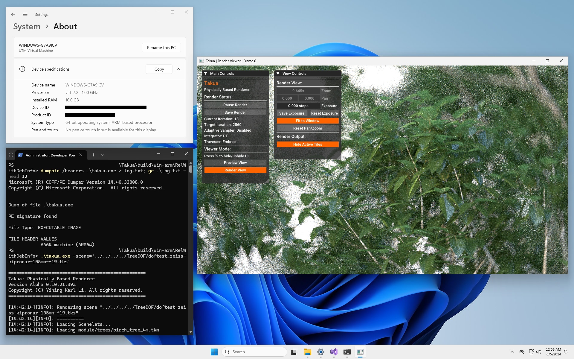
I don’t actually have any native arm64 Windows 11 hardware, so for this porting project, I ran arm64 Windows 11 as a virtual machine on two of my Apple Silicon Macs. I used the excellent UTM app (which under the hood uses QEMU) as the hypervisor. However, UTM does not provide any kind of GPU emulation/virtualization to Windows virtual machines, so the first problem I ran into was that my arm64 Windows 11 environment did not have any kind of modern OpenGL support due to the lack of a GPU driver with OpenGL. Therefore, I had no way to build and run Takua’s UI system.
Fortunately, because OpenGL is so widespread in commonly used applications and games, this is a problem that Microsoft has already anticipated and come up with a solution for. A few years ago, Microsoft developed and released an OpenGL/OpenCL Compatability Pack for Windows on Arm, and they’ve since also added Vulkan support to the compatability pack as well. The compatability pack is available for free on the Windows Store. Under the hood, the compatability pack uses a combination of Microsoft-developed client drivers and a bunch of components from Mesa to translate from OpenGL/OpenCL/Vulkan to Direct3D [Jiang 2020]. This system was originally developed to provide support for specifically Photoshop on arm64 Windows, but has since been expanded to provide general OpenGL 3.3, OpenCL 3.0, and Vulkan 1.2 support to all applications on arm64 Windows. Installing the compatability pack allowed me to get GLFW building and to get GLFW’s example demos working.
Takua’s cross-platform UI is capable of running either using OpenGL 4.5 on systems with support for the latest fanciest OpenGL API version, or using OpenGL 3.3 on systems that only have older OpenGL support (examples include macOS when not using the native Metal-based UI and include many SBC Linux devices such as Raspberry Pi). Since the arm64 Windows compatability pack only fully supports up to OpenGL 3.3, I set up Takua’s arm64 Windows build to fall back to only use the OpenGL 3.3 code path, which was enough to get things up and running. However, I immediately noticed that everything in the UI looked wrong; specifically, everything was clearly not in the correct color space.
The problem turned out to be that the Windows OpenGL/OpenCL/Vulkan compatability pack doesn’t seem to correctly implement GL_FRAMEBUFFER_SRGB; calling glEnable(GL_FRAMEBUFFER_SRGB) did not have any impact on the actual color space that the framebuffer rendered with.
To work around this problem, I simply added software sRGB emulation to the output fragment shader and added some code to detect if GL_FRAMEBUFFER_SRGB was working or not and if not, fall back to the fragment shader’s implementation.
Implementing the sRGB transform is extremely easy and is something that every graphics programmer inevitably ends up doing a bunch of times throughout one’s career:
float sRGB(float x) {
    if (x <= 0.00031308)
        return 12.92 * x;
    else
        return 1.055*pow(x,(1.0 / 2.4) ) - 0.055;
}
With this fix, Takua’s UI now fully works on arm64 Windows 11 and displays renders correctly:
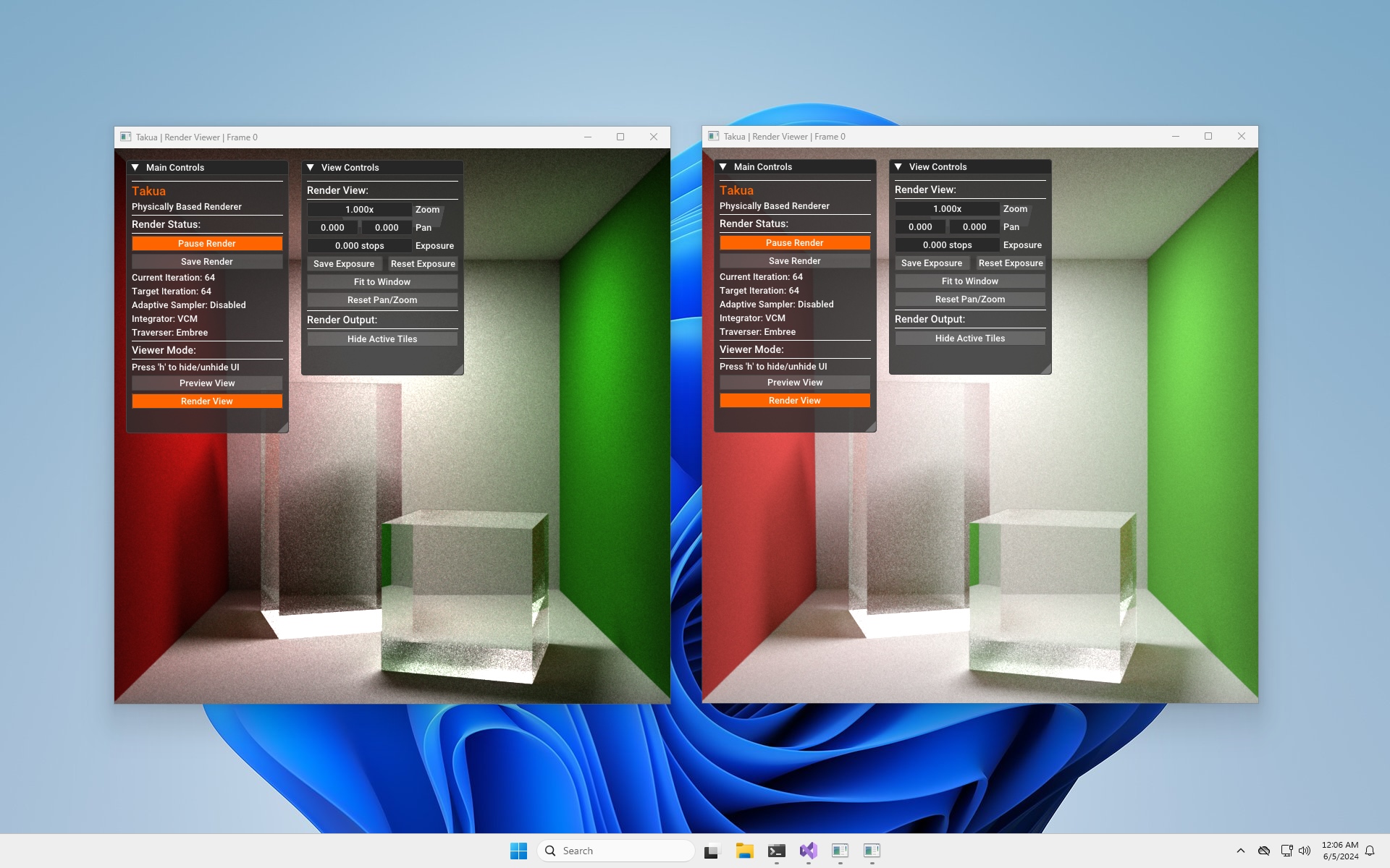
Building Embree on arm64 Windows 11
Takua has a moderately sized dependency base, and getting all of the dependency base compiled during my ports to arm64 Linux and arm64 macOS was a very large part of the overall effort since arm64 support across the board was still in an early stage in the graphics field three years ago. However, now that libraries such as Embree and OpenEXR and even TBB have been building and running on arm64 for years now, I was expecting that getting Takua’s full dependency base brought up on Windows on Arm would be straightforward. Indeed this was the case for everything except Embree, which proved to be somewhat tricky to get working. I was surprised that Embree proved to be difficult, since Embree for a few years now has had excellent arm64 support on macOS and Linux. Thanks to a contribution from Apple’s Developer Ecosystem Engineer team, arm64 Embree now even has a neat double-pumped NEON option for emulating AVX2 instructions.
As of the time of writing this post, compiling Embree 4.3.1 for arm64 using MSVC 19.x (which ships with Visual Studio 2022) simply does not work. Initially just to get the renderer up and running in some form at all, I disabled Embree in the build. Takua has both an Embree-based traversal system and a standalone traversal system that uses my own custom BVH implementation; I keep both systems at parity with each other because Takua at the end of the day is a hobby renderer that I work on for fun, and writing BVH code is fun! However, a secondary reason for keeping both traversal systems around is because in the past having a non-Embree code path has been useful for getting the renderer bootstrapped on platforms that Embree doesn’t fully support yet, and this was another case of that.
Right off the bat, building Embree with MSVC runs into a bunch of problems with detecting the platform as being a 64-bit platform and also runs into all kinds of problems with including immintrin.h, which is where vector data types and other x86-64 intrinsics stuff is defined.
After hacking my way through solving those problems, the next issue I ran into is that MSVC really does not like how Embree carries out static initialisation of NEON datatypes; this is a known problem in MSVC.
Supposedly this issue was fixed in MSVC some time ago, but I haven’t been able to get it to work at all.
Fixing this issue requires some extensive reworking of how Embree does static initialisation of vector datatypes, which is not a very trivial task; Anthony Roberts previously attempted to actually make these changes in support of getting Embree on Windows on Arm working for use in Blender, but eventually gave up since making these changes while also making sure Embree still passes all of its internal tests proved to be challenging.
In the end, I found a much easier solution to be to just compile Embree using Visual Studio’s version of clang instead of MSVC. This has to be done from the command line; I wasn’t able to get this to work from within Visual Studio’s regular GUI. From within a Developer PowerShell for Visual Studio session, the following worked for me:
cmake -G "Ninja" ../../ -DCMAKE_C_COMPILER="clang-cl" `
                        -DCMAKE_CXX_COMPILER="clang-cl" `
                        -DCMAKE_C_FLAGS_INIT="--target=arm64-pc-windows-msvc" `
                        -DCMAKE_CXX_FLAGS_INIT="--target=arm64-pc-windows-msvc" `
                        -DCMAKE_BUILD_TYPE=Release `
                        -DTBB_ROOT="[TBB LOCATION HERE]" `
                        -DCMAKE_INSTALL_PREFIX="[INSTALL PREFIX HERE]"
To do the above, of course you will need both CMake and Ninja installed; fortunately both come with pre-built arm64 Windows binaries on their respective websites. You will also need to install the “C++ Clang Compiler for Windows” component in the Visual Studio Installer application if you haven’t already.
Just building with clang is also the solution that Blender eventually settled on for Windows on Arm, although Blender’s version of this solution is a bit more complex since Blender builds Embree using its own internal clang and LLVM build instead of just using the clang that ships with Visual Studio.
An additional limitation in compiling Embree 4.3.1 for arm64 on Windows right now is that ISPC support seems to be broken. On arm64 macOS and Linux this works just fine; the ISPC project provides prebuilt arm64 binaries on both platforms, and even without a prebuilt arm64 binary, I found that running the x86-64 build of ISPC on arm64 macOS via Rosetta 2 worked without a problem when building Embree. However, on arm64 Windows 11, even though the x86-64 emulation system ran the x86-64 build of ISPC just fine standalone, trying to run it as part of the Embree build didn’t work for me despite me trying a variety of ways to get it to work. I’m not sure if this works with a native arm64 build of ISPC; building ISPC is a sufficiently involved process that I decided it was out of scope for this project.
Running x86-64 code on arm64 Windows 11
Much like how Apple provides Rosetta 2 for running x86-64 applications on arm64 macOS, Microsoft provides a translation layer for running x86 and x86-64 applications on arm64 Windows 11. In my post on porting to arm64 macOS, I included a lengthy section discussing and performance testing Rosetta 2. This time around, I haven’t looked as deeply into x86-64 emulation on arm64 Windows, but I did do some basic testing. Part of why I didn’t go as deeply into this area on Windows is because I’m running arm64 Windows 11 in a virtual machine instead of on native hardware- the comparison won’t be super fair anyway. Another part of why I didn’t go in as deeply is because x86-64 emulation is something that continues to be in an active state of development on Windows; Windows 11 24H2 is supposed to introduce a new x86-64 emulation system called Prism that Microsoft promises to be much faster than the current system in 23H2 [Mehdi 2024]. As of writing though, little to no information is available yet on how Prism works and how it improves on the current system.
The current system for emulating x86 and x86-64 on arm64 Windows is a fairly complex system that differs greatly from Rosetta 2 in a lot of ways. First, arm64 Windows 11 supports emulating both 32-bit x86 and 64-bit x86-64, whereas macOS dropped any kind of 32-bit support long ago and only needs to support 64-bit x86-64 on 64-bit arm64. Windows actually handles 32-bit x86 and 64-bit x86-64 through two basically completely different systems. 32-bit x86 is handled through an extension of the WoW64 (Windows 32-bit on Windows 64-bit) system, while 64-bit x86-64 uses a different system. The 32-bit system uses a JIT compiler called xtajit.dll [Radich et al. 2020, Beneš 2018] to translate blocks of x86 assembly to arm64 assembly and has a caching mechanism for JITed code blocks similar to Rosetta 2 to speed up execution of x86 code that has already been run through the emulation system before [Cylance Research Team 2019]. In the 32-bit system, overall support for providing system calls and whatnot are handled as part of the larger WoW64 system.
The 64-bit system relies on a newer mechanism. The core binary translation system is similar to the 32-bit system, but providing system calls and support for the rest of the surrounding operatin system doesn’t happen through WoW64 at all and instead relies on something that is in some ways similar to Rosetta 2, but is in other crucial ways radically different from Rosetta 2 or the 32-bit WoW64 approach. In Rosetta 2, arm64 code that comes from translation uses a completely different ABI from native arm64 code; the translated arm64 ABI contains a direct mapping between x86-64 and arm64 registers. Microsoft similarly uses a different ABI for translated arm64 code compared with native arm64 code; in Windows, translated arm64 code uses the arm64EC (EC for “Emulation Compatible”) ABI. Here though we find the first major difference between the macOS and Windows 11 approaches. In Rosetta 2, the translated arm64 ABI is an internal implementation detail that is not exposed to users or developers whatsoever; by default there is no way to compile source code against the translated arm64 ABI in Xcode. In the Windows 11 system though, the arm64EC ABI is directly available to developers; Visual Studio 2022 supports compiling source code against either the native arm64 or the translation-focused arm64EC ABI. Code built as arm64EC is capable of interoperating with emulated x86-64 code within the same process, the idea being that this approach allows developers to incrementally port applications to arm64 piece-by-piece while leaving other pieces as x86-64 [Sweetgall et al. 2023]. This… is actually kind of wild if you think about it!
The second major difference between the macOS and Windows 11 approaches is even bigger than the first. On macOS, application binaries can be fat binaries (Apple calls these universal binaries), which contain both full arm64 and x86-64 versions of an application and share non-code resources within a single universal binary file. The entirety of macOS’s core system and frameworks ship as universal binaries, such that at runtime Rosetta 2 can simply translate both the entirety of the user application and all system libraries that the application calls out to into arm64. Windows 11 takes a different approach- on arm64, Windows 11 extends the standard Windows portable executable format (aka .exe files) to be a hybrid binary format called arm64X (X for eXtension). The arm64X format allows for arm64 code compiled against the arm64EC ABI and emulated x86-64 code to interoperate within the same binary; x86-64 code in the binary is translated to arm64EC as needed. Pretty much every 64-bit system component of Windows 11 on Arm ships as arm64X binaries [Niehaus 2021]. Darek Mihocka has a fantastic article that goes into extensive depth about how arm64EC and arm64X work, and Koh Nakagawa has done an extensive analysis of this system as well.
One thing that Windows 11’s emulation system does not seem to be able to do is make special accomodations for TSO memory ordering. As I explored previously, Rosetta 2 gains a very significant performance boost from Apple Silicon’s hardware-level support for emulating x86-64’s strong memory ordering. However, since Microsoft cannot control and custom tailor the hardware that Windows 11 will be running on, arm64 Windows 11 can’t make any guarantees about hardware-level TSO memory ordering support. I don’t know if this situation is any different with the new Prism emulator running on the Snapdragon X Pro/Elite, but in the case of the current emulation framework, the lack of hardware TSO support is likely a huge problem for performance. In my testing of Rosetta 2, I found that Takua typically ran about 10-15% slower as x86-64 under Rosetta 2 with TSO mode enabled (the default) compared with native arm64, but ran 40-50% slower as x86-64 under Rosetta 2 with TSO mode disabled compared with native arm64.
Below are some numbers comparing running Takua on arm64 Windows 11 as a native arm64 application versus as an emulated x86-64 application. The tests used are the same as the ones I used in my Rosetta 2 tests, with the same settings as before. In this case though, because this was all running in a virtual machine (with 6 allocated cores) instead of directly on hardware, the absolute numbers are not as important as the relative difference between native and emulated modes:
| CORNELL BOX | ||
|---|---|---|
| 1024x1024, PT | ||
| Test: | Wall Time: | Core-Seconds: |
| Native arm64 (VM): | 60.219 s | approx 361.314 s |
| Emulated x86-64 (VM): | 202.242 s | approx 1273.45 s |
| TEA CUP | ||
|---|---|---|
| 1920x1080, VCM | ||
| Test: | Wall Time: | Core-Seconds: |
| Native arm64 (VM): | 244.37 s | approx 1466.22 s |
| Emulated x86-64 (VM): | 681.539 s | approx 4089.24 s |
| BEDROOM | ||
|---|---|---|
| 1920x1080, PT | ||
| Test: | Wall Time: | Core-Seconds: |
| Native arm64 (VM): | 530.261 s | approx 3181.57 s |
| Emulated x86-64 (VM): | 1578.76 s | approx 9472.57 s |
| SCANDINAVIAN ROOM | ||
|---|---|---|
| 1920x1080, PT | ||
| Test: | Wall Time: | Core-Seconds: |
| Native arm64 (VM): | 993.075 s | approx 5958.45 s |
| Emulated x86-64 (VM): | 1745.5 s | approx 10473.0 s |
The emulated results are… not great; for compute-heavy workloads like path tracing, x86-64 emulation on arm64 Windows 11 seems to to be around 1.7x to 3x slower than native arm64 code. These results are much slower compared with how Rosetta 2 performs, which generally sees only a 10-15% performance penalty over native arm64 when running Takua Renderer. However, a critical caveat has to be pointed out here: reportedly Windows 11’s x86-64 emulation works worse in a VM on Apple Silicon than it does on native hardware because Arm RCpc instructions on Apple Silicon are relatively slow. For Rosetta 2 this behavior doesn’t matter because Rosetta 2 uses TSO mode instead of RCpc instructions for emulating strong memory ordering, but since Windows on Arm does rely on RCpc for emulating strong memory ordering, this means that the results above are likely not fully representative of emulation performance on native Windows on Arm hardware. Nonetheless though, having any form of x86-64 emulation at all is an important part of making Windows on Arm viable for mainstream adoption, and I’m looking forward to see how much of an improvement the new Prism emulation system in Windows 11 24H2 brings. I’ll update these results with the Prism emulator once 24H2 is released, and I’ll also update these results to show comparisons on real Windows on Arm hardware whenever I actually get some real hardware to try out.
Conclusion
I don’t think that x86-64 is going away any time soon, but at the same time, the era of mainstream desktop arm64 adoption is here to stay. Apple’s transition to arm64-based Apple Silicon already made the viability of desktop arm64 unquestionable, and now that Windows on Arm is finally ready for the mainstream as well, I think we will now be living in a multi-architecture world in the desktop computing space for a long time. Having more competitors driving innovation ultimately is a good thing, and as new interesting Windows on Arm devices enter the market alongside Apple Silicon Macs, Takua Renderer is ready to go!
References
ARM Holdings. 2022. Load-Acquire and Store-Release instructions. Retrieved June 7, 2024.
Petr Beneš. 2018. Wow64 Internals: Re-Discovering Heaven’s Gate on ARM. Retrieved June 5, 2024.
Cylance Research Team. 2019. Teardown: Windows 10 on ARM - x86 Emulation. In BlackBerry Blog. Retrieved June 5, 2024.
Angela Jiang. 2020. Announcing the OpenCL™ and OpenGL® Compatibility Pack for Windows 10 on ARM. In DirectX Developer Blog. Retrieved June 5, 2024.
Yusuf Mehdi. 2024. Introducing Copilot+ PCs. In Official Microsoft Blog. Retrieved June 5, 2024.
Derek Mihocka. 2024. ARM64 Boot Camp. Retrieved June 5, 2024.
Koh M. Nakagawa. 2021. Discovering a new relocation entry of ARM64X in recent Windows 10 on Arm. In Project Chameleon. Retrieved June 5, 2024.
Koh M. Nakagawa. 2021. Relock 3.0: Relocation-based obfuscation revisited in Windows 11 on Arm. In Project Chameleon. Retrieved June 5, 2024.
Michael Niehaus. 2021. Running x64 on Windows 10 ARM64: How the heck does that work?. In Out of Office Hours. Retrieved June 5, 2024.
Quinn Radich, Karl Bridge, David Coulter, and Michael Satran. 2020. WOW64 Implementation Details. In Programming Guide for 64-bit Windows. Retrieved June 5, 2024.
Marc Sweetgall, Drew Batchelor, Scott Jones, and Matt Wojciakowski. 2023. Arm64EC - Build and port apps for native performance on ARM. Retrieved June 5, 2024.
Wikipedia. 2024. WoW64. Retrieved June 5, 2024.