RenderMan Art Challenge: Shipshape
Table of Contents
Introduction
Last year, I participated in one of Pixar’s RenderMan Art Challenges as a way to learn more about modern RenderMan [Christensen et al. 2018] and as a way to get some exposure to tools outside of my normal day-to-day toolset (Disney’s Hyperion Renderer professionally, Takua Renderer as a hobby and learning exercise). I had a lot of fun, and wound up doing better in the “Woodville” art challenge contest than I expected to! Recently, I entered another one of Pixar’s RenderMan Art Challenges, “Shipshape”. This time around I entered just for fun; since I had so much fun last time, I figured why not give it another shot! That being said though, I want to repeat the main point I made in my post about the previous “Woodville” art challenge: I believe that for rendering engineers, there is enormous value in learning to use tools and renderers that aren’t the ones we work on ourselves. Our field is filled with brilliant people on every major rendering team, and I find both a lot of useful information/ideas and a lot of joy in seeing the work that friends and peers across the field have put into commercial renderers such as RenderMan, Arnold, Vray, Corona, and others.
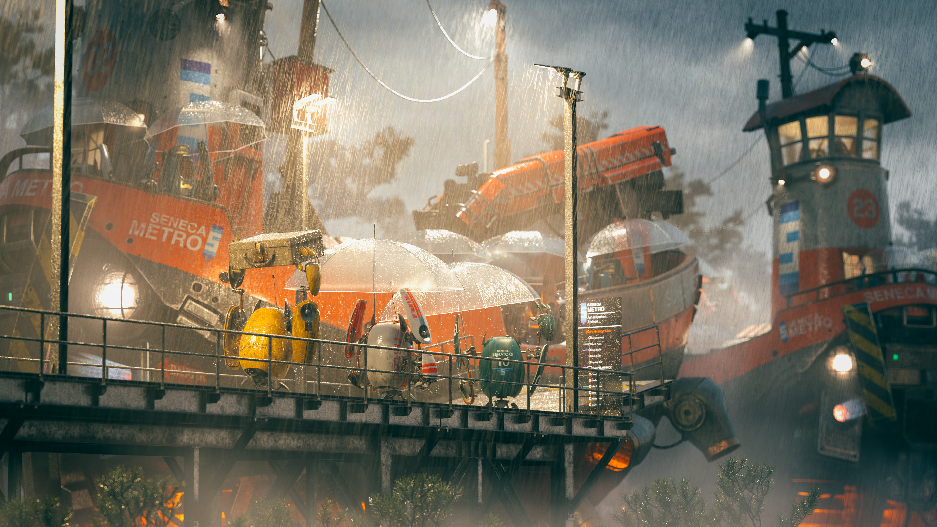
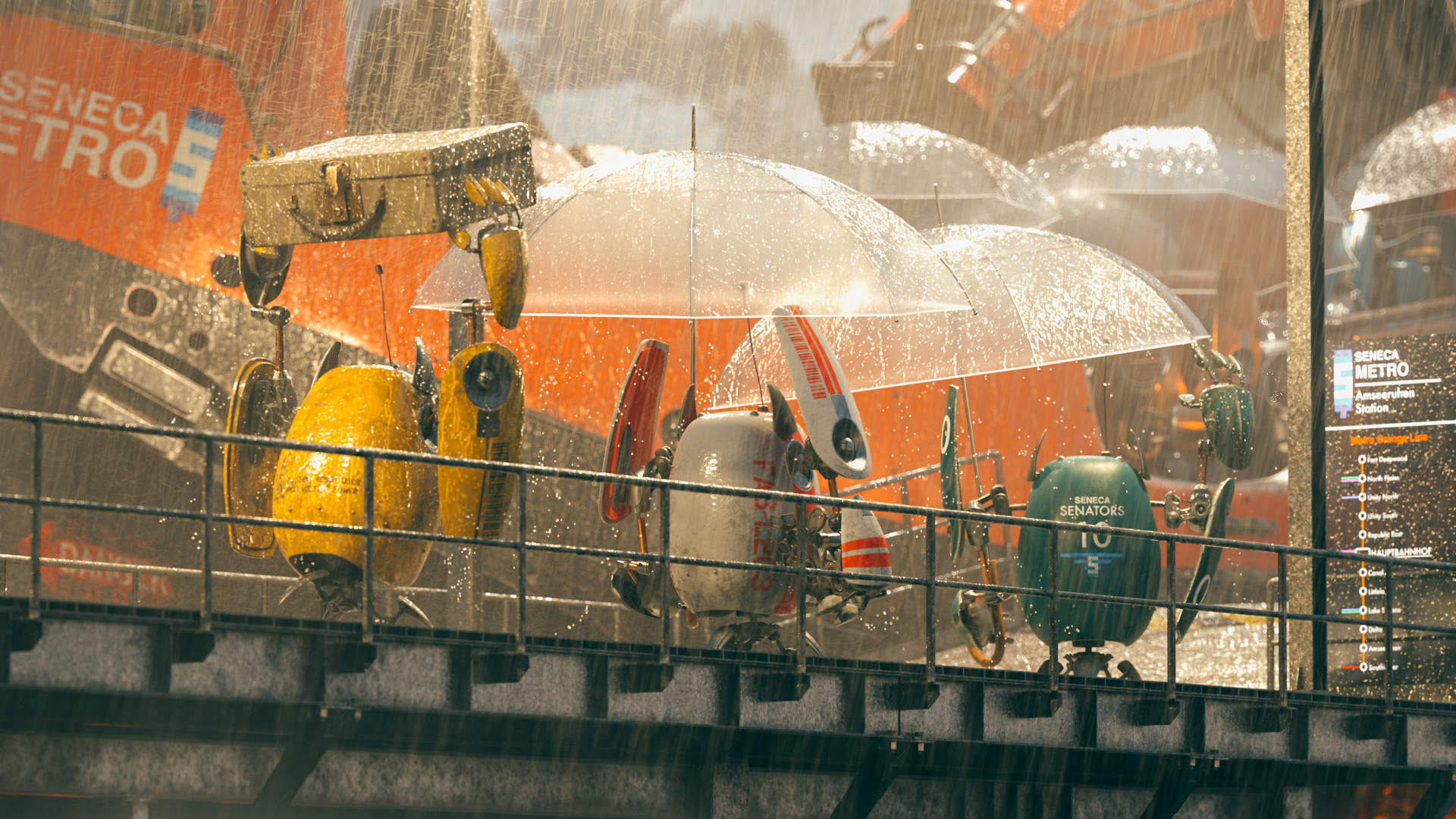
As usual for the RenderMan Art Challenges, Pixar supplied some base models without any uvs, texturing, shading, lighting or anything else, and challenge participants had to start with the base models and come up with a single compelling image for a final entry. I had a lot of fun spending evenings and weekends throughout the duration of the contest to create my final image, which is below. I got to explore and learn a lot of new things that I haven’t tried before, which this post will go through. To my enormous surprise, this time around my entry won first place in the contest!
Initial Explorations
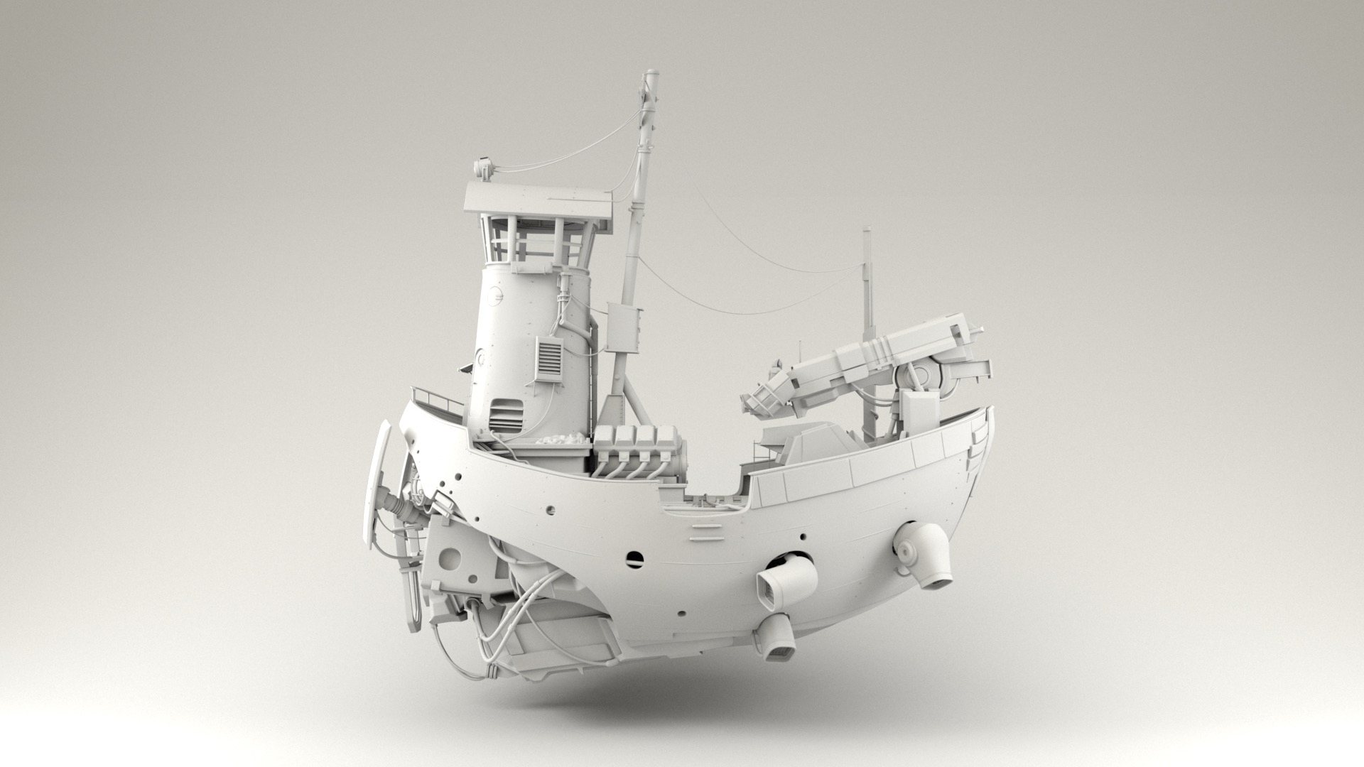
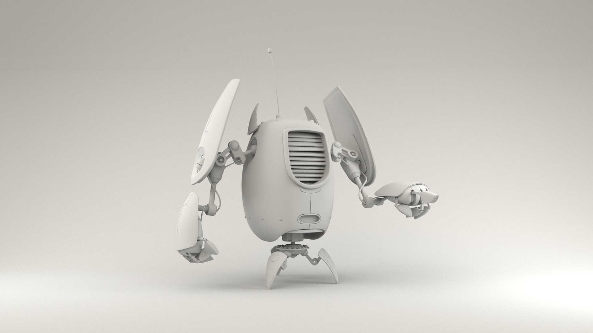
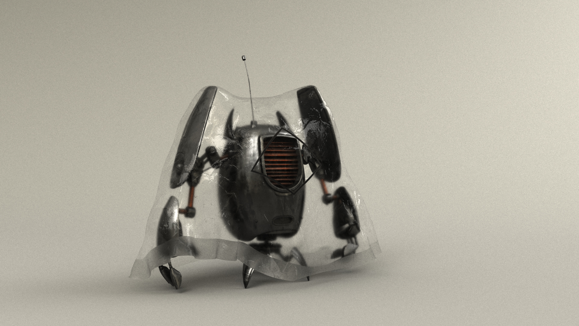
For this competition, Pixar provided five models: a futuristic scifi ship based on an Ian McQue concept, a robot based on a Ruslan Safarov concept, an old wooden boat, a butterfly, and a sextant. The fact that one of the models was based on an Ian McQue concept was enough to draw me in; I’ve been a big fan of Ian McQue’s work for many years now! I like to start these challenges by just rendering the provided assets as-is from a number of different angles, to try to get a sense of what I like about the assets and how I will want to showcase them in my final piece. I settled pretty quickly on wanting to focus on the scifi ship and the robot, and leave the other three models aside. I did find an opportunity to bring in the sextant in my final piece as well, but wound up dropping the old wooden boat and the butterfly altogether. Here are some simple renders showing what was provided out of the box for the scifi ship and the robot:
I initially had a lot of trouble settling on a concept and idea for this project; I actually started blocking out an entirely different idea before pivoting to the idea that eventually became my final image. My initial concept included the old wooden boat in addition the scifi ship and the robot; this initial concept was called “River Explorer”. My initial instinct was to try to show the scifi ship from a top-down view, in order to get a better view of the deck-boards and the big VG engine and the crane arm. I liked the idea of putting the camera at roughly forest canopy height, since forest canopy height is a bit of an unusual perspective for most photographs due to canopy height being this weird height that is too high off the ground for people to shoot from, but too low for helicopters or drones to be practical either. My initial idea was about a robot-piloted flying patrol boat exploring an old forgotten river in a forest; the ship would be approaching the old sunken boat in the river water. With this first concept, I got as far as initial compositional blocking and initial time-of-day lighting tests:
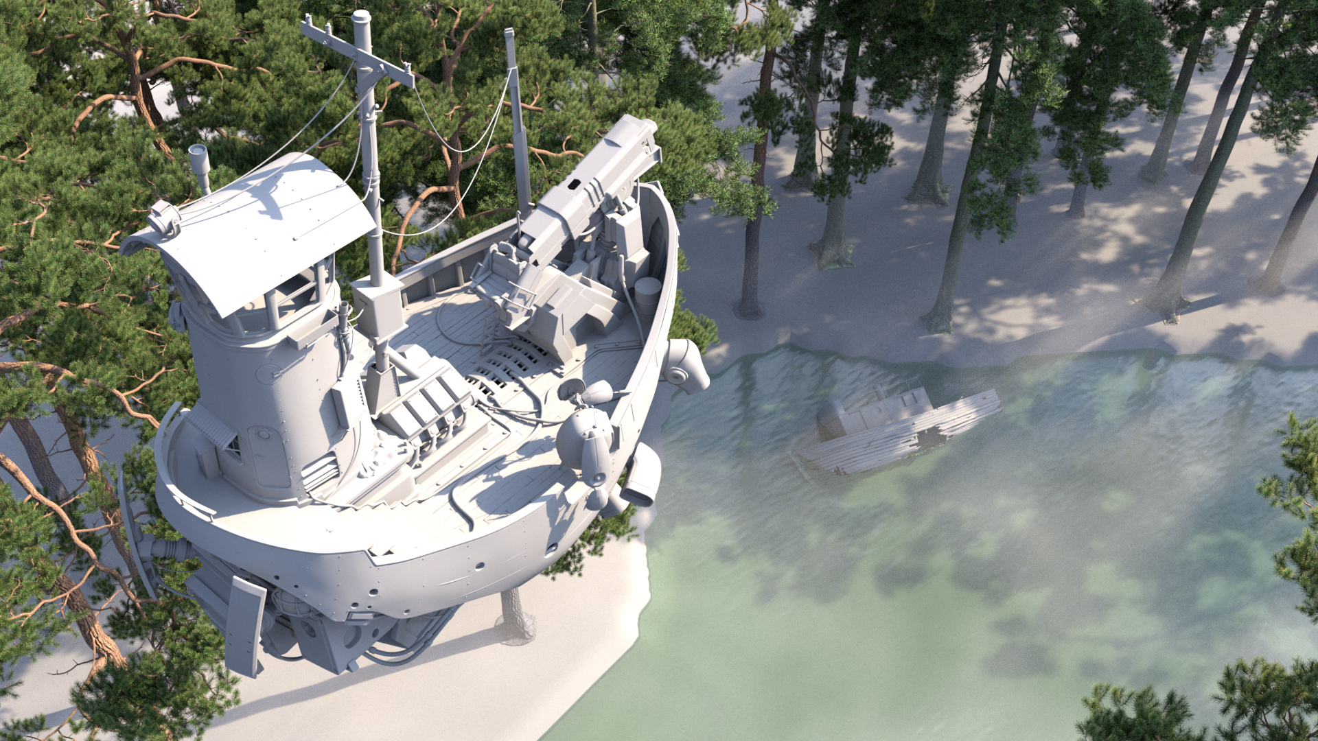
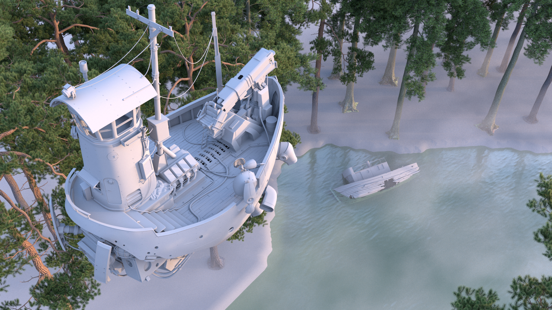
If you’ve followed my blog for a while now, those pine trees might look familiar. They’re actually the same trees from the forest scene I used a while back, ported from Takua’s shading system to RenderMan’s PxrSurface shader.
I wasn’t ever super happy with the “River Explorer” concept; I think the overall layout was okay, but it lacked a sense of dynamism and overall just felt very static to me, and the robot on the flying scifi ship felt kind of lost in the overall composition. Several other contestants wound up also going for similar top-down-ish views, which made me worry about getting lost in a crowd of similar-looking images. After a week of trying to get the “River Explorer” concept to work better, I started to play with some completely different ideas; I figured that this early in the process, a better idea was worth more than a week’s worth of sunk time.
Layout and Framing
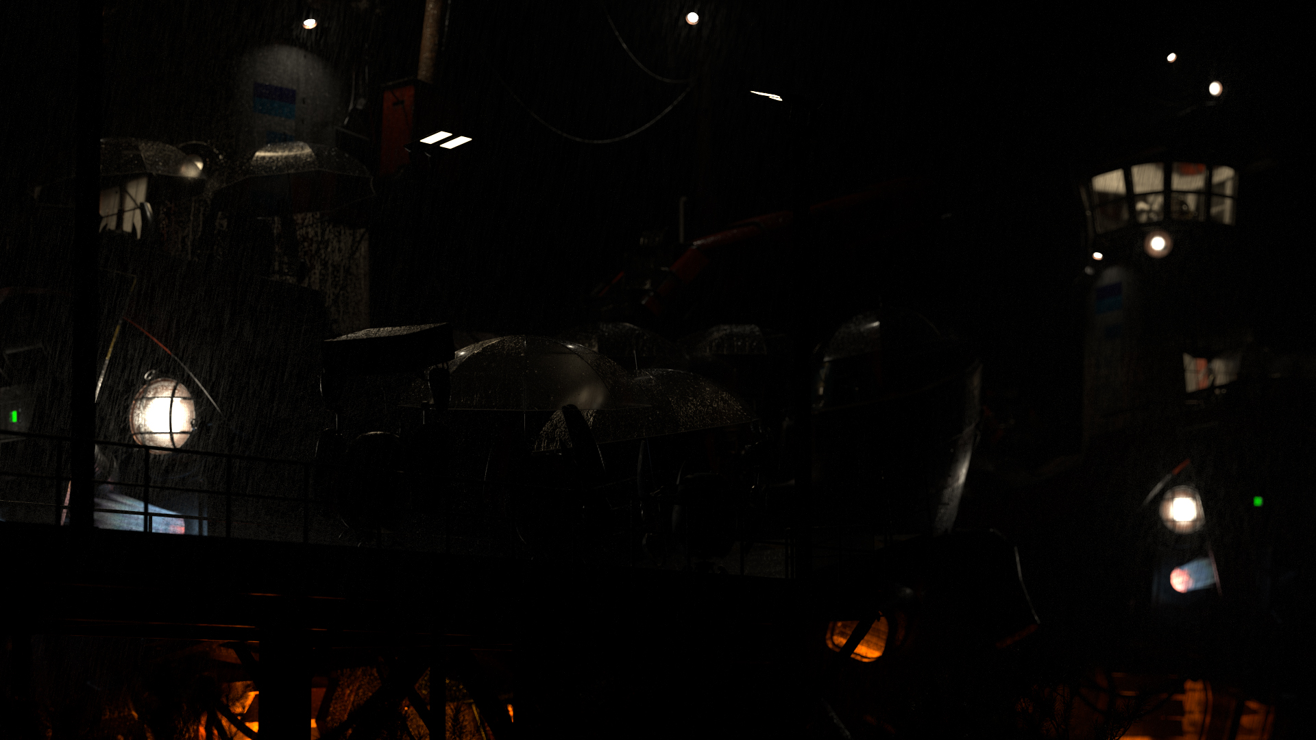
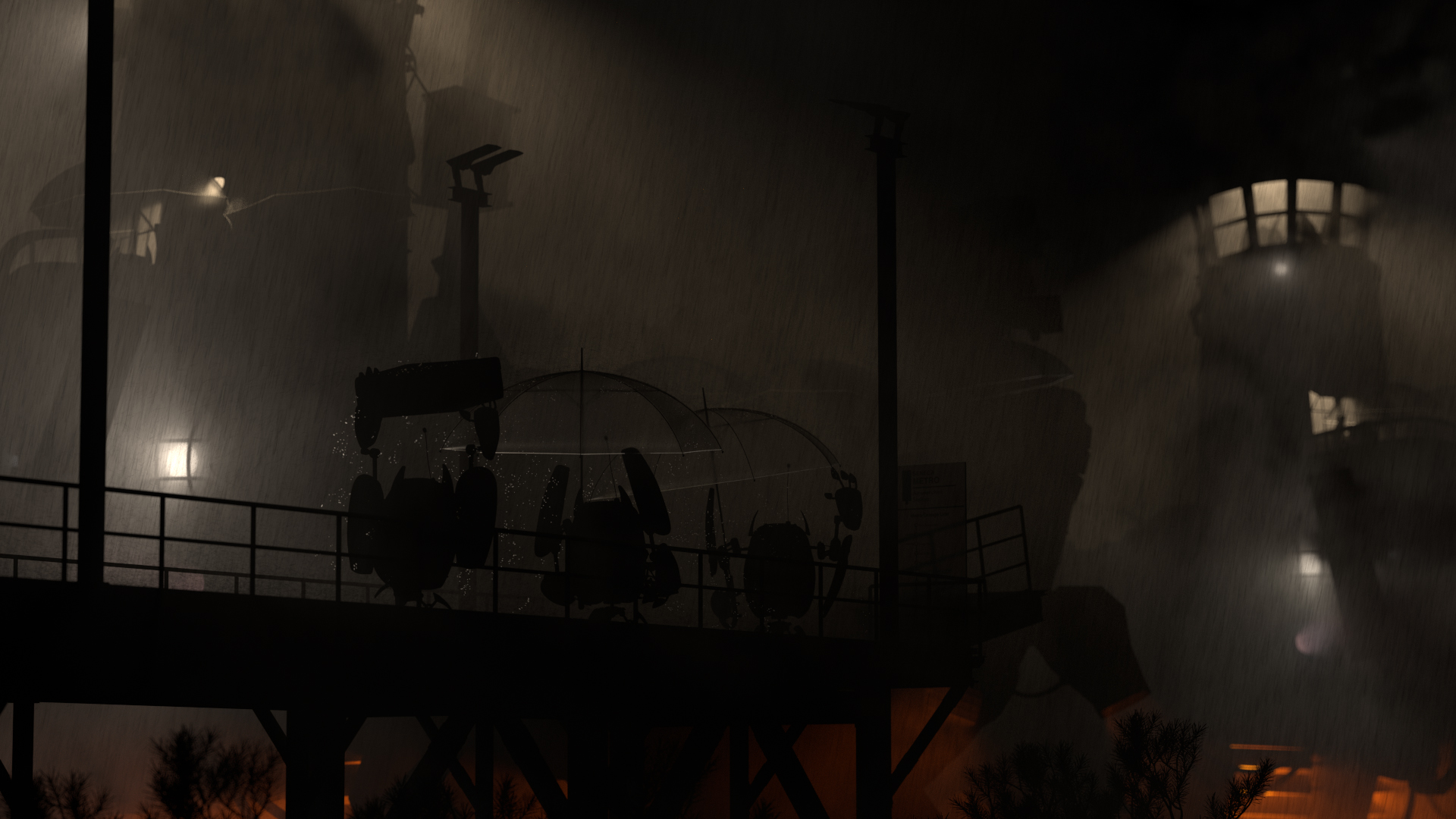
I had started UV unwrapping the ship already, and whilst tumbling around the ship unwrapping all of the components one-by-one, I got to see a lot more of the ship and a lot more interesting angles, and I suddenly came up with a completely different idea for my entry. The idea that popped into my head was to have a bunch of the little robots waiting to board one of the flying ships at a quay or something of the sort. I wanted to convey a sense of scale between the robots and the flying scifi ship, so I tried putting the camera far away and zooming in using a really long lens. Since long lenses have the effect of flattening perspective a bit, using a long lens helped make the ships feel huge compared to the robots. At this point I was just doing very rough, quick, AO render “sketches”. This is the AO sketch where my eventual final idea started:
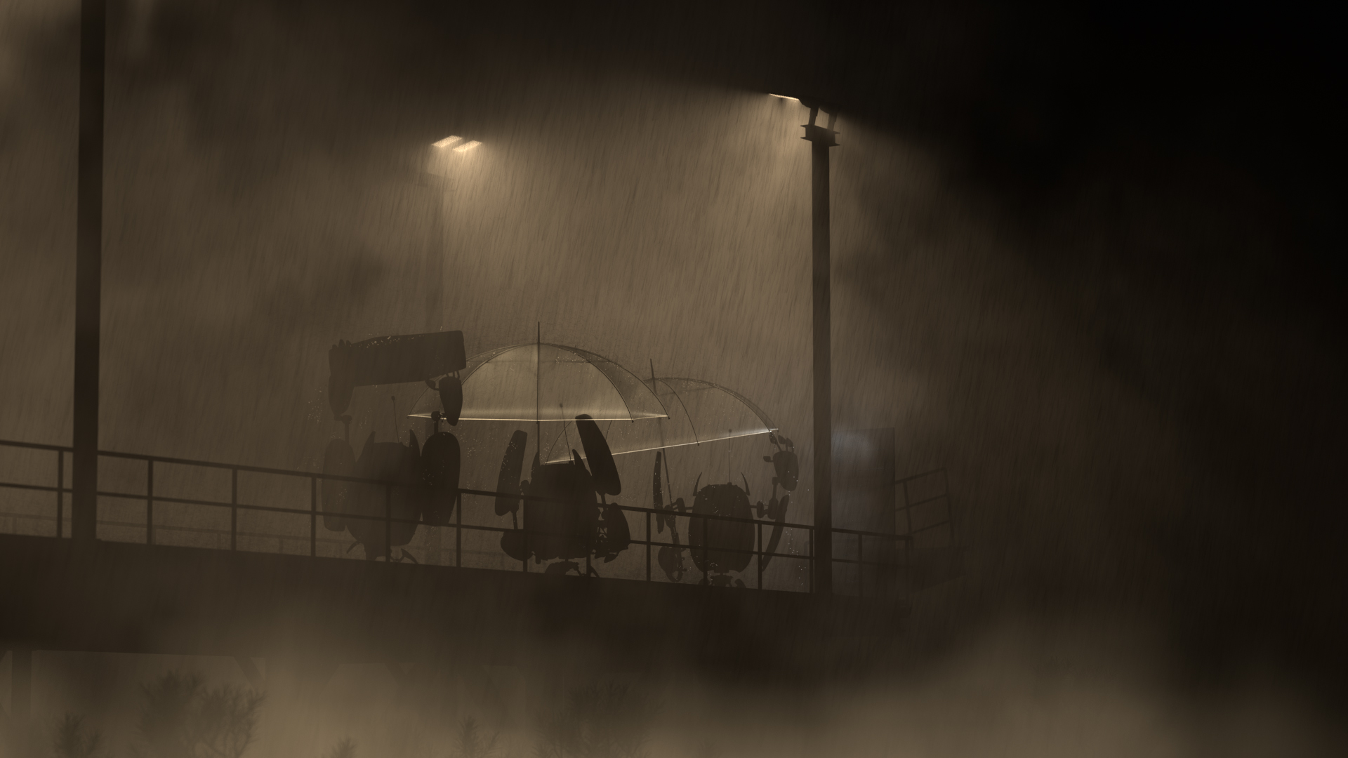
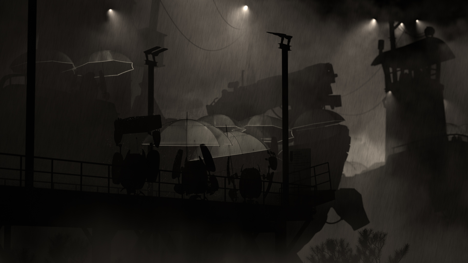
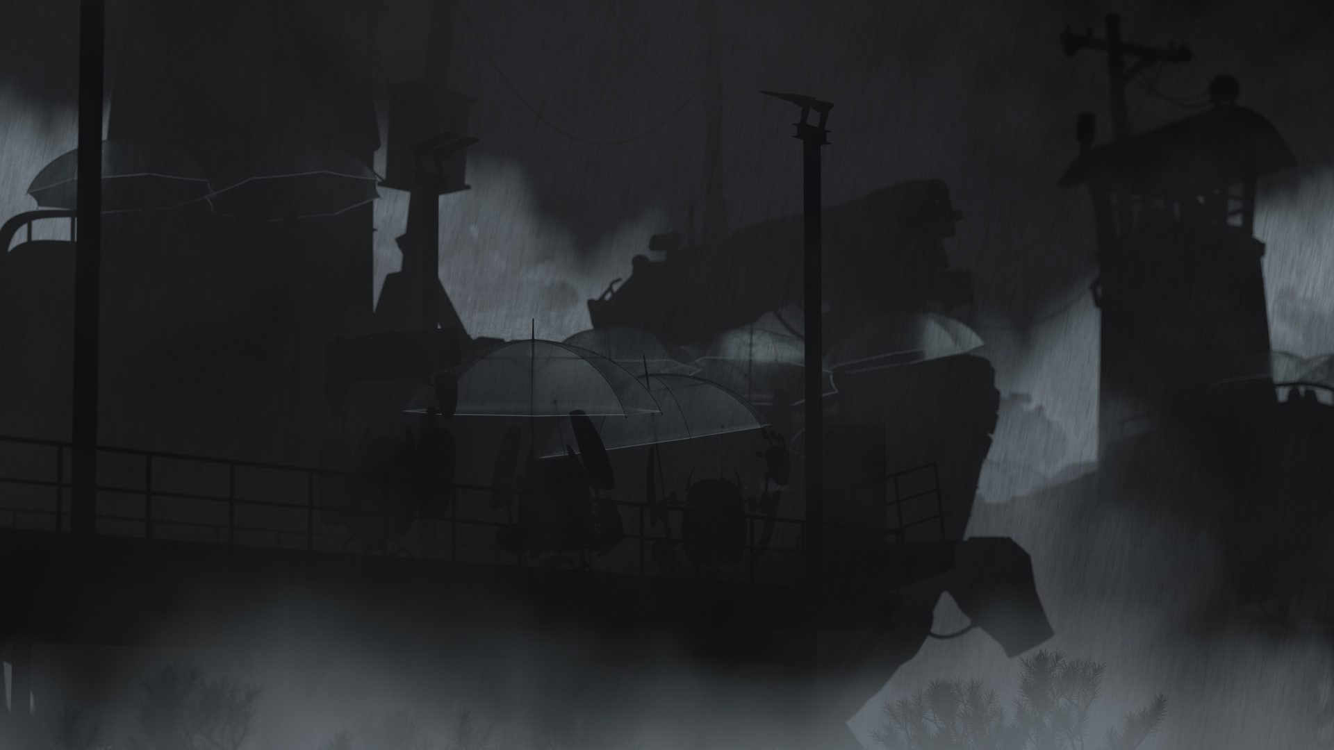
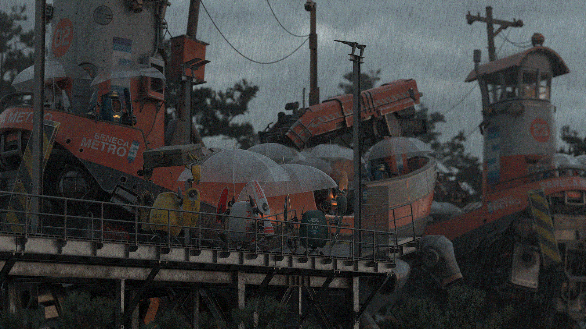
I’ve always loved the idea of the mundane fantastical; the flying scifi ship model is fairly fantastical, which led me to want to do something more everyday with them. I thought it would be fun to texture the scifi ship model as if it was just part of a regular metro system that the robots use to get around their world. My wife, Harmony, suggested a fun idea: set the entire scene in drizzly weather and give two of the robots umbrellas, but give the third robot a briefcase instead and have the robot use the briefcase as a makeshift umbrella, as if it had forgotten its umbrella at home. The umbrella-less robot’s reaction to seeing the ship arriving provided the title for my entry- “Oh Good, The Bus Is Here”. Harmony also pointed out that the back of the ship has a lot more interesting geometric detail compared to the front of the ship, and suggested placing the focus of the composition more on the robots than on the ships. To incorporate all of these ideas, I played more with the layout and framing until I arrived at the following image, which is broadly the final layout I used:
I chose to put an additional ship in the background flying away from the dock for two main reasons. First, I wanted to be able to showcase more of the ship, since the front ship is mostly obscured by the foreground dock. Second, the background ship helps fill out and balance the right side of the frame more, which would otherwise have been kind of empty.
In both this project and in the previous Art Challenge, my workflow for assembling the final scene relies heavily on Maya’s referencing capabilities. Each separate asset is kept in its own .ma file, and all of the .ma files are referenced into the main scene file. The only the things the main scene file contains are references to assets, along with scene-level lighting, overrides, and global-scale effects such as volumes and, in the case of this challenge, the rain streaks. So, even though the flying scifi ship appears in my scene twice, it is actually just the same .ma file referenced into the main scene twice instead of two separate ships.
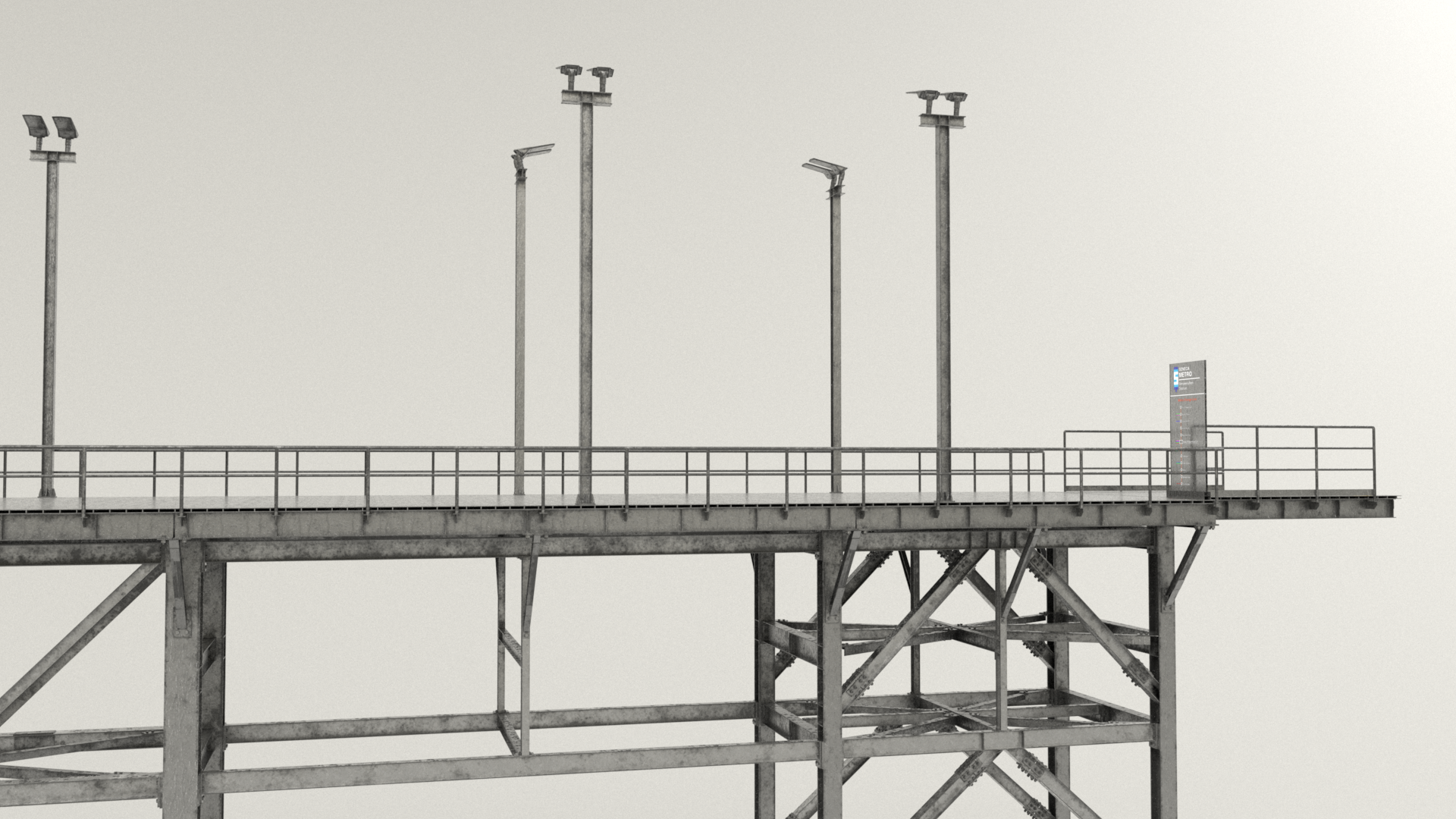
The idea of a rainy scene largely drove the later lighting direction of my entry; from this point I basically knew that the final scene was going to have to be overcast and drizzly, with a heavy reliance on volumes to add depth separation into the scene and to bring out practical lights on the ships. I had a lot of fun modeling out the dock and gangway, and may have gotten slightly carried away. I modeled every single bolt and rivet that you would expect to be there in real life, and I also added lampposts to use later as practical light sources for illuminating the dock and the robots. Once I had finished modeling the dock and had made a few more layout tweaks, I arrived at a point where I was happy to start with shading and initial light blocking. Zoom in if you want to see all of the rivets and bolts and stuff on the dock:
UV Unwrapping
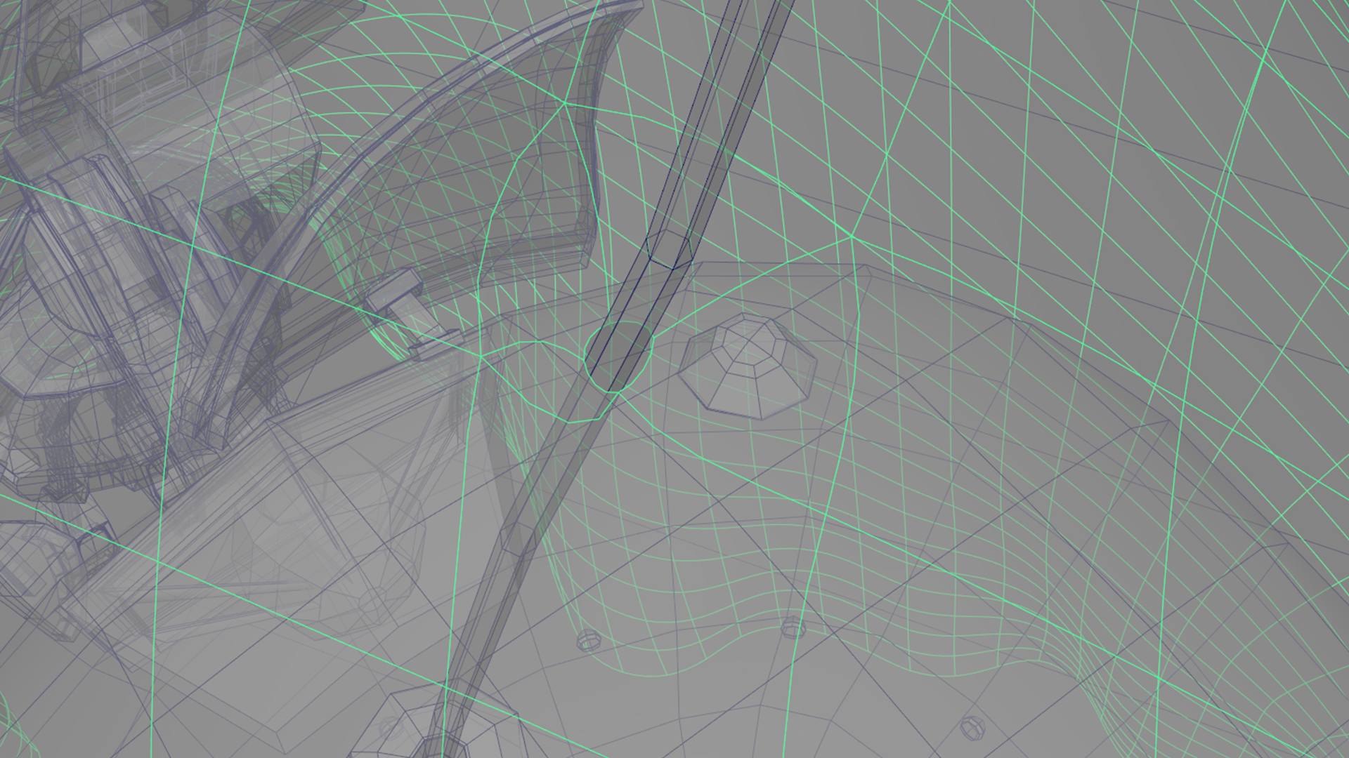
UV unwrapping the ship took a ton of time. For the last challenge, I relied on a combination of manual UV unwrapping by hand in Maya and using Houdini’s Auto UV SOP, but I found that the Auto UV SOP didn’t work as well on this challenge due to the ship and robot having a lot of strange geometry with really complex topology. On the treehouse in the last challenge, everything was more or less some version of a cylinder or a rectangular prism, with some morphs and warps and extra bits and bobs applied. Almost every piece of the ship aside from the floorboards are very complex shapes that aren’t easy to find good seams for, so the Auto UV SOP wound up making a lot of choices for UV cuts that I didn’t like. As a result, I basically manually UV unwrapped this entire challenge in Maya.
A lot of the complex undercarriage type stuff around the back thrusters on the ship was really insane to unwrap. The muffler manifold and mechanical parts of the crane arm were difficult too. Fortunately though, the models came with subdivision creases, and a lot of the subd crease tags wound up proving to be useful hints towards good places to place UV edge cuts. I also found that the new and improved UV tools in Maya 2020 performed way better than the UV tools in Maya 2019. For some meshes, I manually placed UV cuts and then used the unfold tool in Maya 2020, which I found generally worked a lot better than Maya 2019’s version of the same tool. For other meshes, Maya 2020’s auto unwrap actually often provided a useful starting place as long a I rotated the piece I was unwrapping into a more-or-less axis-aligned orientation and froze its transform. After using the auto-unwrap tool, I would then transfer the UVs back onto the piece in its original orientation using Maya’s Mesh Transfer Attributes tool. The auto unwrap tended to cut meshes into too many UV islands, so I would then re-stitch islands together and place new cuts where appropriate.
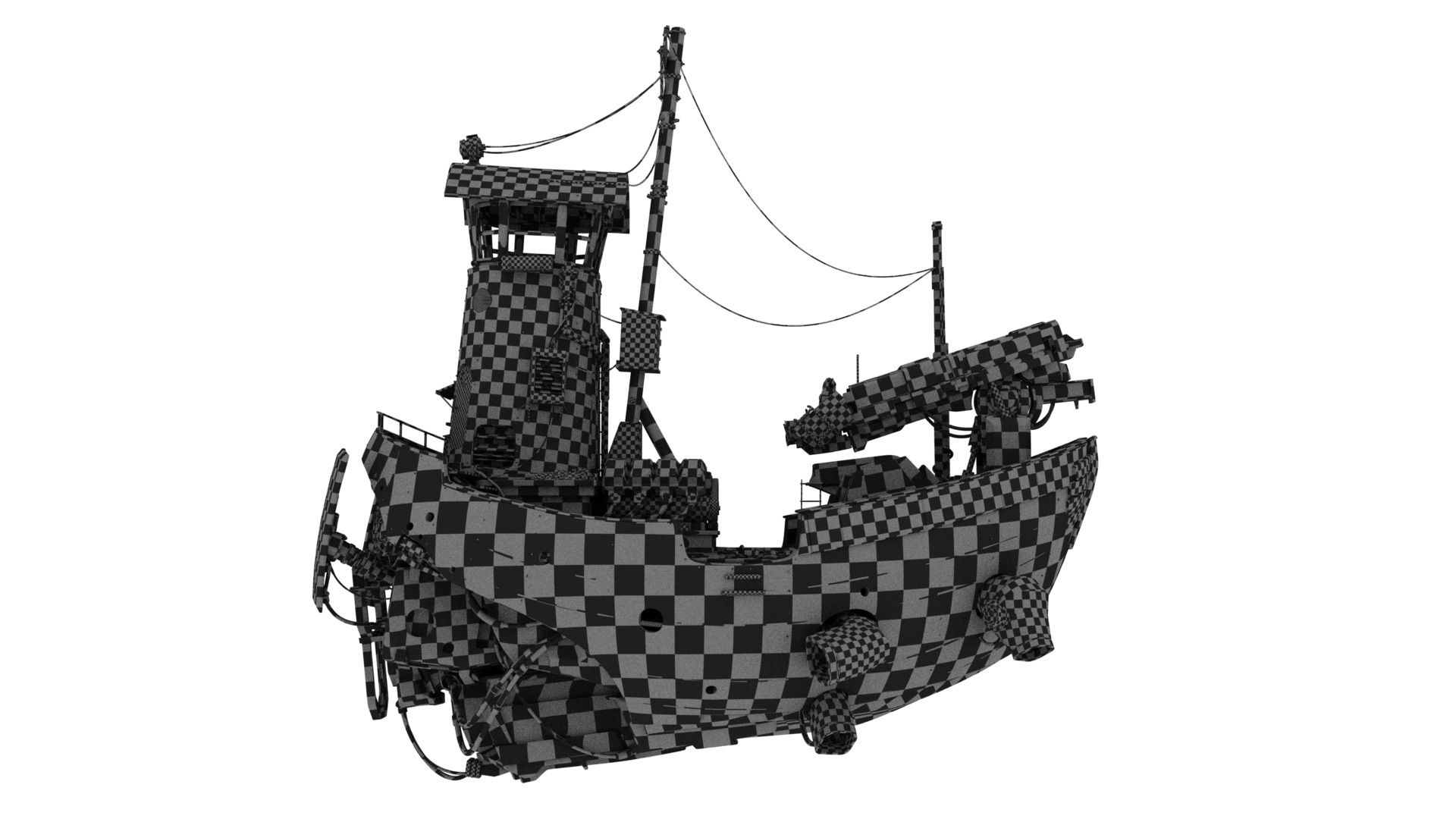
When UV unwrapping, a good test to see how good the resultant UVs are is to assign some sort of a checkerboard grid texture to the model and look for distortion in the checkerboard pattern. Overall I think I did an okay job here; not terrible, but could be better. I think I managed to hide the vast majority of seams pretty well, and the total distortion isn’t too bad (if you look closely, you’ll be able to pick out some less than perfect areas, but it was mostly okay). I wound up with a high degree of variability in the grid size between different areas, but I wasn’t too worried about that since my plan was to adjust texture resolutions to match.
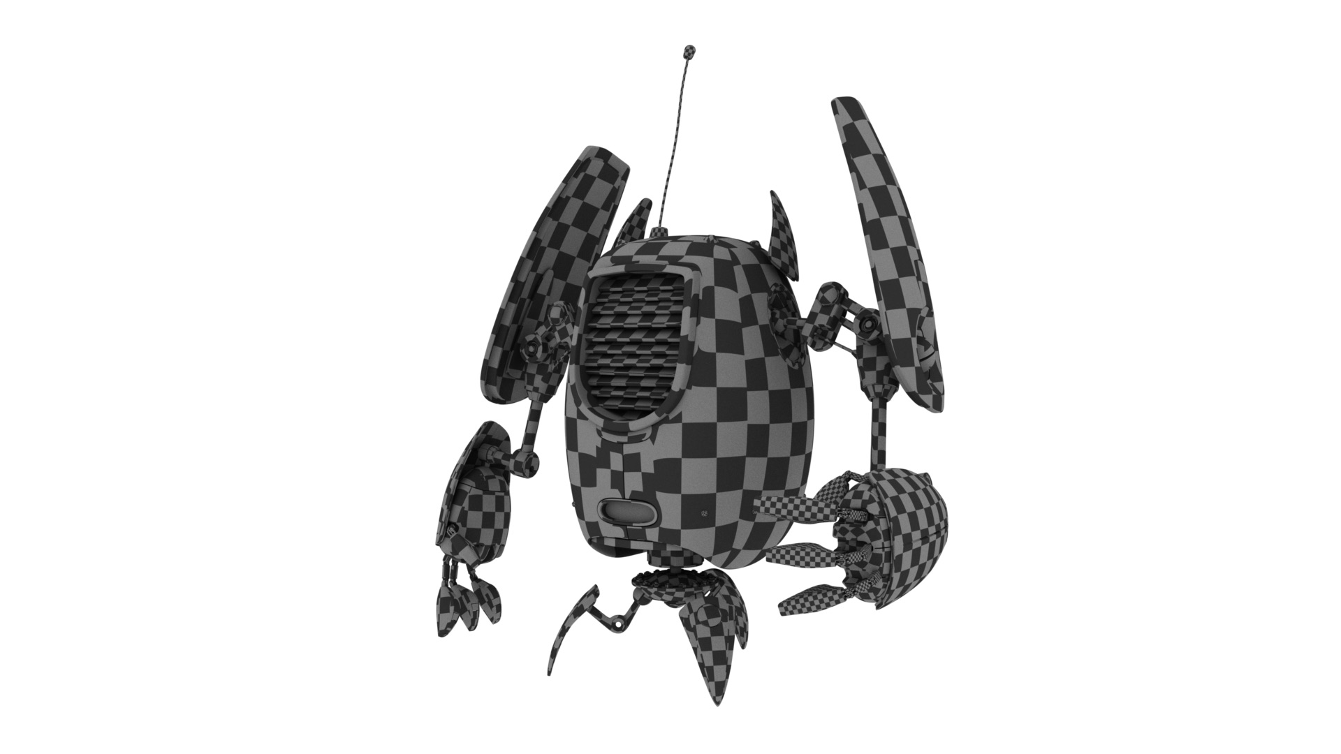
After UV unwrapping the ship, UV unwrapping the robot proved to be a lot easier in comparison. Many parts of the robot turn out to be the same mesh just duplicated and squash/stretch/scaled/rotated, which means that they share the same underlying topology. For all parts that share the same topology, I was able to just UV unwrap one of them, and then copy the UVs to all of the others. One great example is the robot’s fingers; most components across all fingers shared the same topology. Here’s the checkerboard test applied to my final UVs for the robot:
Texturing the Ship
After trying out Substance Painter for the previous RenderMan Art Challenge and getting fairly good results, I went with Substance Painter again on this project. The overall texturing workflow I used on this project was actually a lot simpler compared with the workflow I used for the previous Art Challenge. Last time I tried to leave a lot of final decisions about saturation and hue and whatnot as late as possible, which meant moving those decisions into the shader so that they could be changed at render-time. This time around, I decided to make those decisions upfront in Substance Painter; doing so makes the Substance Painter workflow much simpler since it means I can just paint colors directly in Substance Painter like a normal person would, as opposed to painting greyscale or desaturated maps in Substance Painter that are expected to be modulated in the shader later. Also, because of the nature of the objects in this project, I actually used very little displacement mapping; most detail was brought in through normal mapping, which makes more sense for hard surface metallic objects. Not having to worry about any kind of displacement mapping simplified the Substance Painter workflow a bit more too, since that was one fewer texture map type I had to worry about managing.
One the last challenge I relied on a lot of Quixel Megascans surfaces as starting points for texturing, but this time around I (unintentionally) found myself relying on Substance smart materials more for starting points. One thing I like about Substance Painter is how it comes with a number of good premade smart materials, and there are even more good smart materials on Substance Source. Importantly though, I believe that smart materials should only serve as a starting point; smart materials can look decent out-of-the-box, but to really make texturing shine, a lot more work is required on top of the out-of-the-box result in order to really create story and character and a unique look in texturing. I don’t like when I see renders online where a smart material was applied and left in its out-of-the-box state; something gets lost when I can tell which default smart material was used at a glance! For every place that I used a smart material in this project, I used a smart material (or several smart materials layered and kitbashed together) as a starting point, but then heavily customized on top with custom paint layers, custom masking, decals, additional layers, and often even heavy custom modifications to the smart material itself.
I was originally planning on using a UDIM workflow for bringing the ship into Substance Painter, but I wound up with so many UDIM tiles that things quickly became unmanageable and Substance Painter ground to a halt with a gigantic file containing 80 (!!!) 4K UDIM tiles. To work around this, I broke up the ship into a number of smaller groups of meshes and brought each group into Substance Painter separately. Within each group I was able to use a UDIM workflow with usually between 5 to 10 tiles.
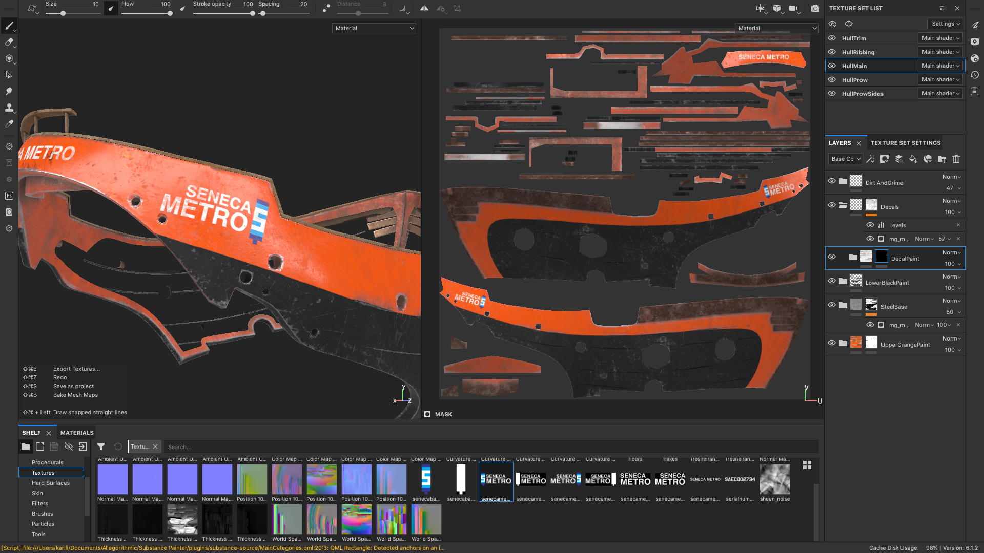
I had a lot of fun creating custom decals to apply to various parts of the ships and to some of the robots; even though a lot of the details and decals aren’t very visible in the final image, I still put a good amount of time into making them simply to keep things interesting for myself. All of the decals were made in Photoshop and Illustrator and then brought in to Substance Painter along with opacity masks and applied to surfaces using Substance Painter’s projection mode, either in world space or in UV space depending on situation. In Substance Painter, I created a new layer in with a custom paint material and painted the base color for the paint material by projecting the decal, and then masked the decal layer using the opacity mask I made using the same projection that I used for the base color. The “Seneca” logo seen throughout my scene has shown up on my blog before! A few years ago on a Minecraft server that I played a lot on, a bunch of other players and I had a city named Seneca; ever since then, I’ve tried to sneak in little references to Seneca in projects here and there as a small easter egg.
Many of the buses around where I live have an orange and silver color scheme, and while I was searching the internet for reference material, I also found pictures of the Glasgow Subway’s trains, which have an orange and black and white color scheme. Inspired by the above, I picked an orange and black color scheme for the ship’s Seneca Metro livery. I like orange as a color, and I figured that orange would bring a nice pop of color to what was going to be an overall relatively dark image, I made the upper part of the hull orange but kept the lower part of the hull black since the black section was going to be the backdrop that the robots would be in front of in the final image; the idea was that keeping that part of the hull darker would allow the robots to pop a bit more visually.
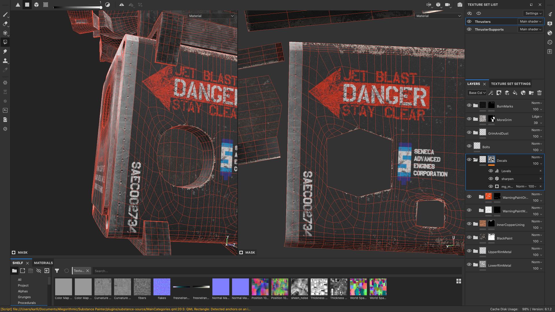
One really useful trick I used for masking different materials was to just follow edgeloops that were already part of the model. Since everything in this scene is very mechanical anyway, following straightedges in the UVs helps give everything a manufactured, mechanical look. For example, Figure 12 shows how I used Substance Painter’s Polygon Fill tool to mask out the black paint from the back metal section of the ship’s thrusters. In some other cases, I added new edgeloops to the existing models just so I could follow the edgeloops while masking different layers.
Shading the Ship
For the previous Art Challenge, I used a combination of PxrDisney and PxrSurface shaders; this time around, in order to get a better understanding of how PxrSurface works, I opted to go all-in on using PxrSurface for everything in the scene. Also, for the rain streaks effect (discussed later in this post), I needed some features that are available in the extended Disney Bsdf model [Burley 2015] and in PxrSurface [Hery et al. 2017], but RenderMan 23 only implements the base Disney Brdf [Burley 2012] without the extended Bsdf features; this basically meant I had to use PxrSuface.
One of the biggest differences I had to adjust to was how metallic color is controlled in PxrSurface. The Disney Bsdf drives the diffuse color and metallic color using the same base color parameter and shifts energy between the diffuse/spec and metallic lobes using a “metallic” parameter, but PxrSurface separates the diffuse and metallic colors entirely. PxrSurface uses a “Specular Face Color” parameter to directly drive the metallic lobe and has a separate “Specular Edge Color” control; this parameterization reminds me a lot of Framestore’s artist-friendly metallic fresnel parameterization [Gulbrandsen 2014], but I don’t know if this is actually what PxrSurface is doing under the hood. PxrSurface also has two different modes for its specular controls: an “artistic” mode and a “physical” mode; I only used the artistic mode. To be honest, while PxrSurface’s extensive controls are extremely powerful and offer an enormous degree of artistic control, I found trying to understand what every control did and how they interacted with each other to be kind of overwhelming. I wound up paring back the set of controls I used back to a small subset that I could mentally map back to what the Disney Bsdf or VRayMtl or Autodesk Standard Surface [Georgiev et al. 2019] models do.
Fortunately, converting from the Disney Bsdf’s baseColor/metallic parameterization to PxrSurface’s diffuse/specFaceColor is very easy:
The only gotcha to look out for is that everything needs to be in linear space first. Alternatively, Substance Painter already has a output template for PxrSurface as well. Once I had the maps in the right parameterization, for the most part all I had to do was plug the right maps into the right parameters in PxrSurface and then make minor manual adjustments to dial in the look. In addition to two different specular parameterization modes, PxrSurface also supports choosing from a few different microfacet models for the specular lobes; by default PxrSurface is set to use the Beckmann model [Beckmann and Spizzichino 1963], but I selected the GGX model [Walter et al. 2007] for everything in this scene since GGX is what I’m more used to.
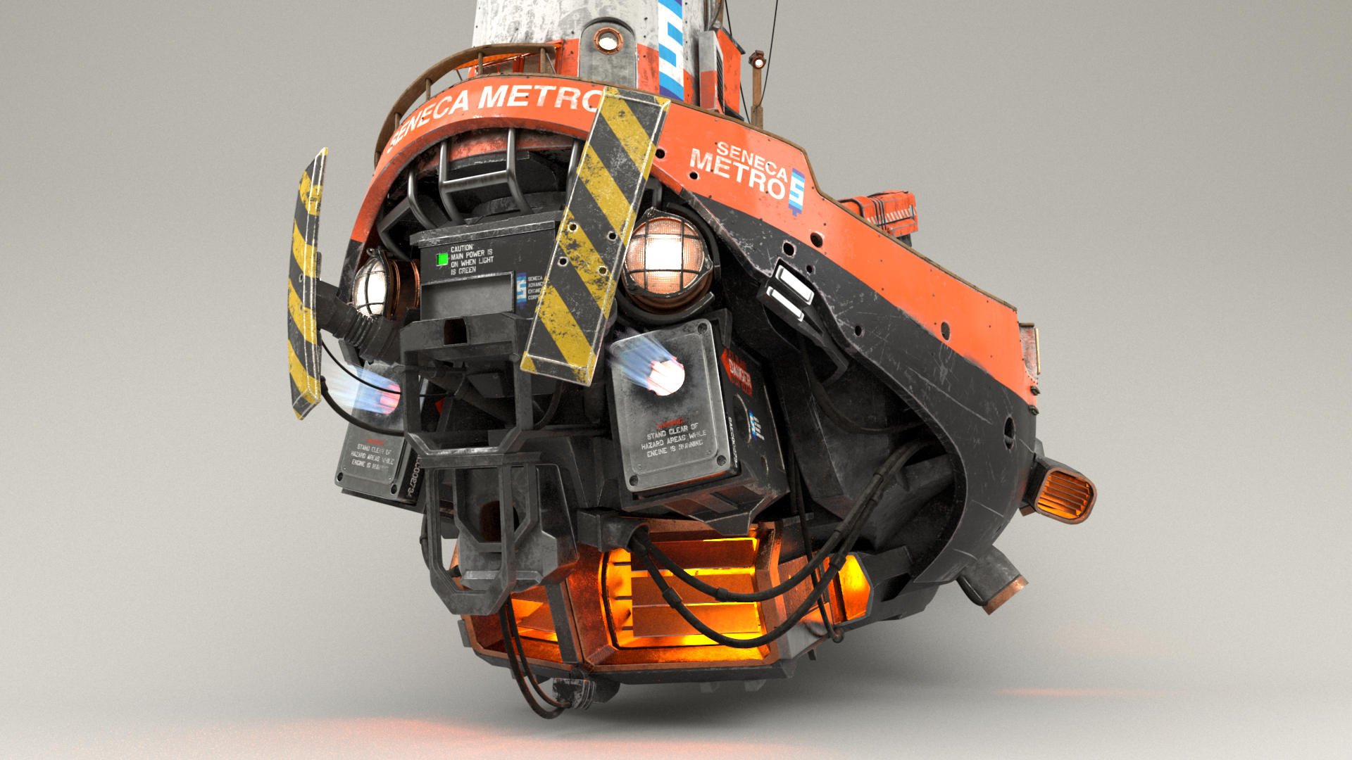
For the actual look of the ship, I didn’t want to go with the dilapidated look that a lot of the other contestants went with. Instead, I wanted the ship to look like it was a well maintained working vehicle, but with all of the grime and scratches that build up over daily use. So, there are scratches and dust and dirt streaks on the boat, but nothing is actually rusting. I also did modeled some glass for the windows at the top of the tower superstructure, and added some additional lamps to the top of the ship’s masts and on the tower superstructure for use in lighting later. After getting everything dialed, here is the “dry” look of the ship:

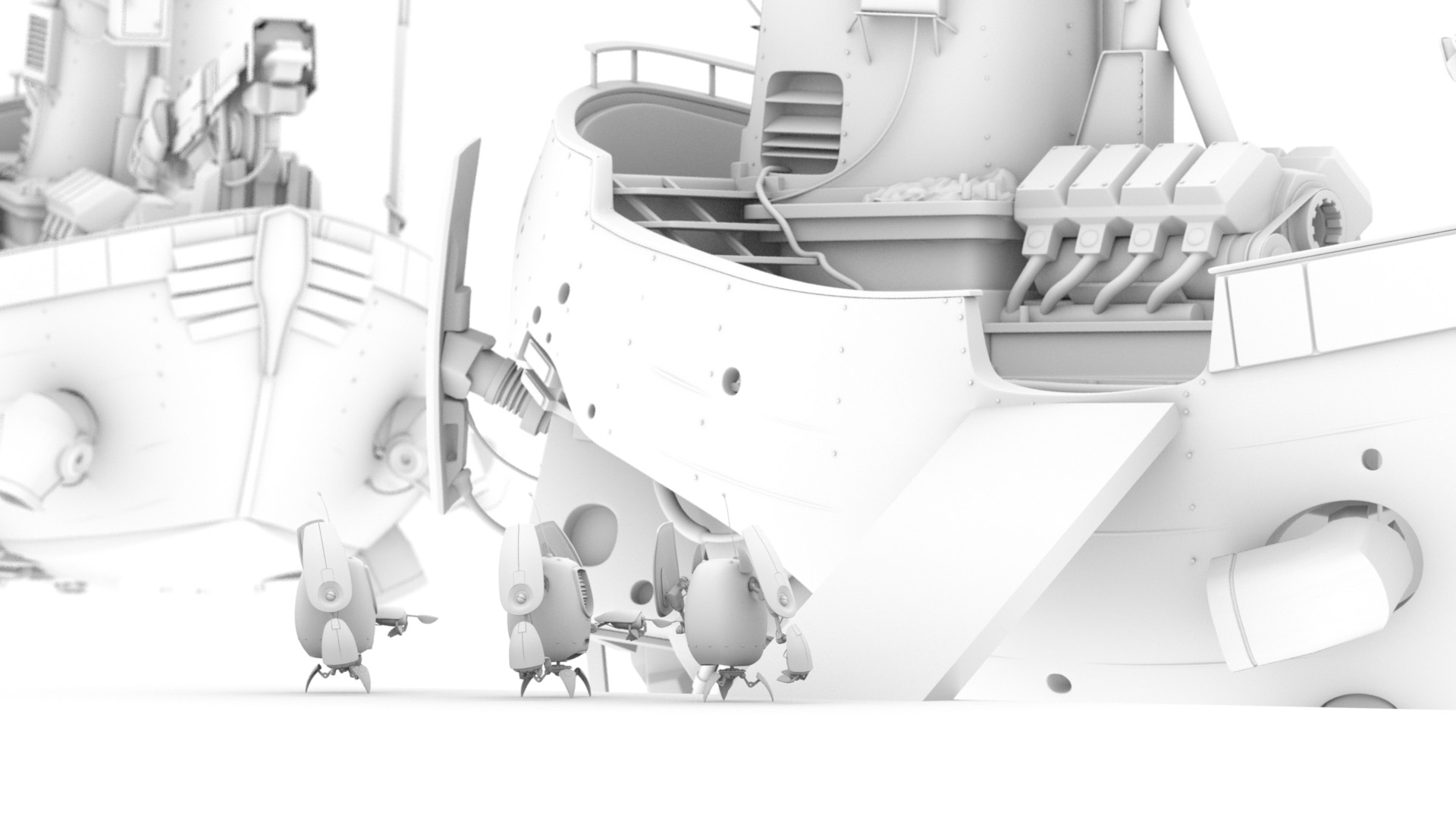
Here’s a close-up render of the back engine section of the ship, which has all kinds of interesting bits and bobs on it. The engine exhaust kind of looks like it could be a volume, but it’s not. I made the engine exhaust by making a bunch of cards, arranging them into a truncated cone, and texturing them with a blue gradient in the diffuse slot and a greyscale gradient in PxrSurface’s “presence” slot. The glow effect is done using the glow parameter in PxrSurface. The nice thing about using this more cheat-y approach instead of a real volume is that it’s way faster to render!

Most of the ship’s metal components are covered over using a black, semi-matte paint material, but in areas that I thought would be subjected to high temperatures, such as exhaust vents or the inside of the thrusters or the many floodlights on the ship, I chose to use a beaten copper material instead. Basically wherever I wound up placing a practical light, the housing around the practical light is made of beaten copper. Well, I guess it’s actually some kind of high-temperature copper alloy or copper-colored composite material, since real copper’s melting point is lower than real steel’s melting point. The copper color had an added nice effect of making practical lights look more yellow-orange, which I think helps sell the look of engine thrusters and hot exhaust vents more.
Each exhaust vent and engine thruster actually contains two practical lights: one extremely bright light near the back of the vent or thruster pointing into the vent or thruster, and one dimmer but more saturated light pointing outwards. This setup produces a nice effect where areas deeper into the vent or thruster look brighter and yellower, while areas closer to the outer edge of the vent or thruster look a bit dimmer and more orange. The light point outwards also casts light outside of the vent or thruster, providing some neat illumination on nearby surfaces or volumes. Later in this post, I’ll write more about how I made use of this in the final image.
Here’s a turntable video of the ship, showcasing all of the texturing and shading that I did. I had a lot of fun taking care of all of the tiny details that are part of the ship, even though many of them aren’t actually visible in my final image. The dripping wet rain effect is discussed later in this post.
Shading and Texturing the Robots
For the robots, I used the same Substance Painter based texturing workflow and the same PxrSurface based shading workflow that I used for the ship. However, since the robot has far fewer components than the ship, I was able to bring all of the robot’s UDIM tiles into Substance Painter at once. The main challenge with the robots wasn’t the sheer quantity of parts that had to be textured, but instead was in the variety of robot color schemes that had to be made. In order to populate the scene and give my final image a sense of life, I wanted to have a lot of robots on the ships, and I wanted all of the robots to have different paint and color schemes.
I knew from an early point that I wanted the robot carrying the suitcase to be yellow, and I knew I wanted a robot in some kind of conductor’s uniform, but aside from that, I didn’t much pre-planned for the robot paint schemes. As a result, coming up with different robot paint schemes was a lot of fun and involved a lot of just goofing around and improvisation in Substance Painted until I found ideas that I liked. To help unify how all of the robots looked and to help with speeding up the texturing process, I came up with a base metallic look for the robot’s legs and arms and various functional mechanical parts. I alternated between steel and copper parts to help bring some visual variety to all of the mechanical parts. The metallic parts are the same across all of the robots; the parts that vary between robots are the body shell and various outer casing parts on the arms:

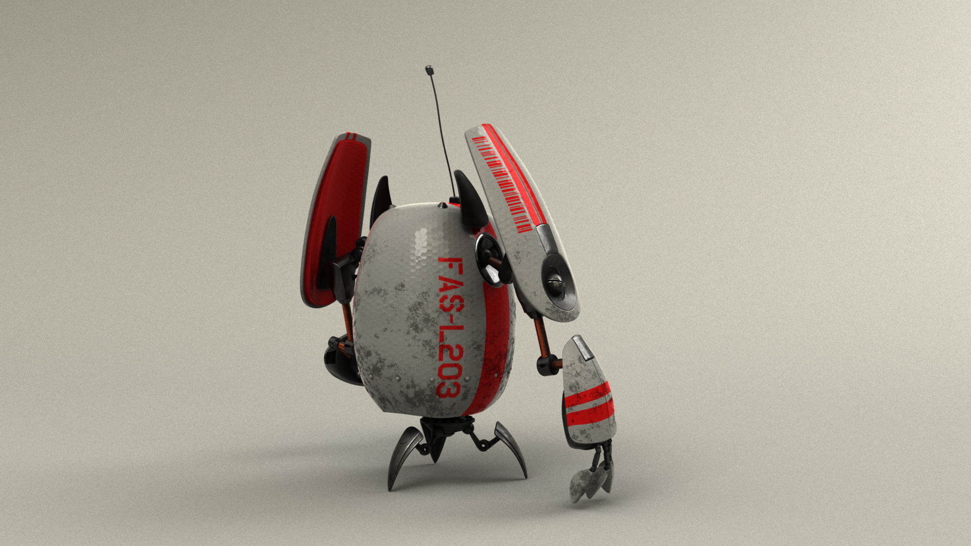
I wanted very different looks for the other two robots that are on the dock with the yellow robot. I gave one of them a more futuristic looking white glossy shell with a subtle hexagon imprint pattern and red accents. The hexagon imprint pattern is created using a hexagon pattern in the normal map. The red stripes use the same edgeloop-following technique that I used for masking some layers on the ship. I made the other robot a matte green color, and I thought it would be fun make him into a sports fan. He’s wearing the logo and colors of the local in-world sports team, the Seneca Senators! Since the robots don’t wear clothes per se, I guess maybe the sports team logo and numbers are some kind of temporary sticker? Or maybe this robot is such a bit fan that he had the logo permanently painted on… I don’t know! Since I knew these two robots would be seen from the back in the final image, I made sure to put all of the interesting stuff on their sides and back.

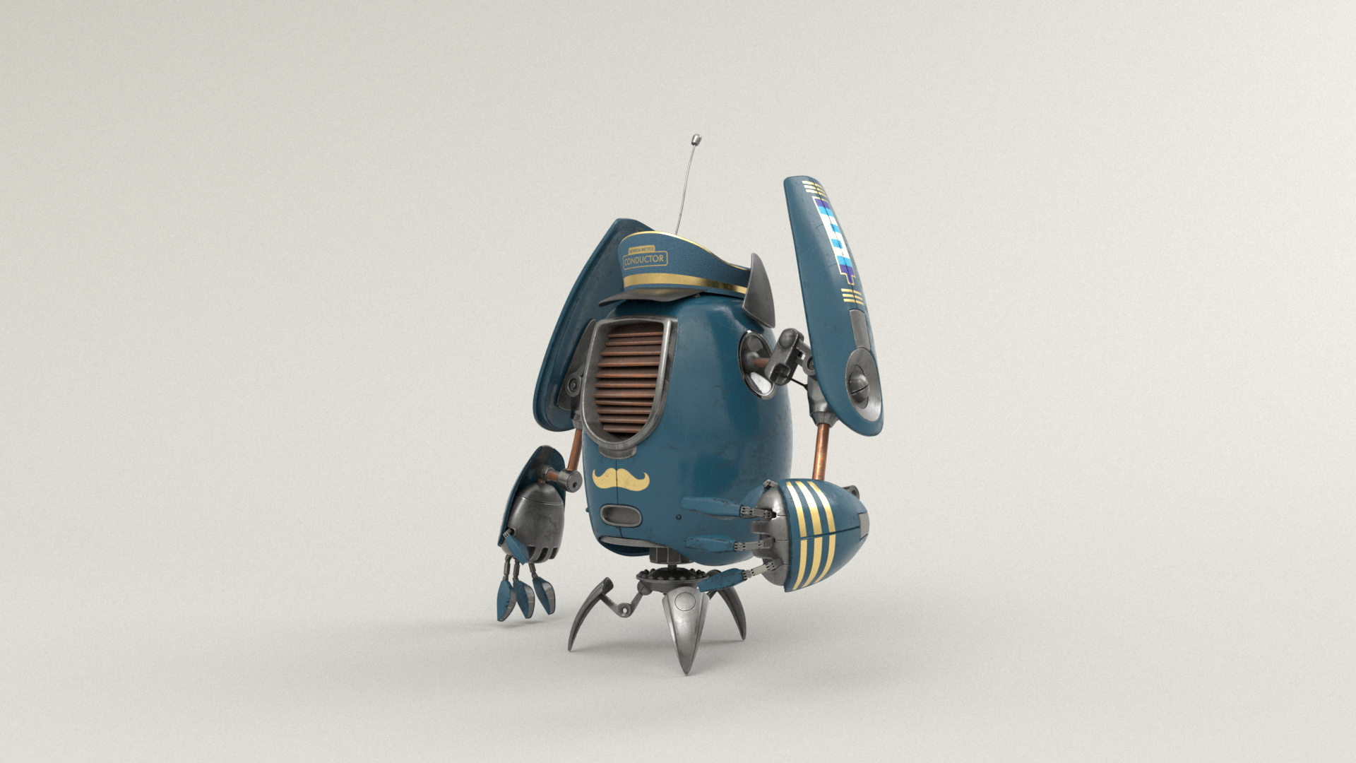
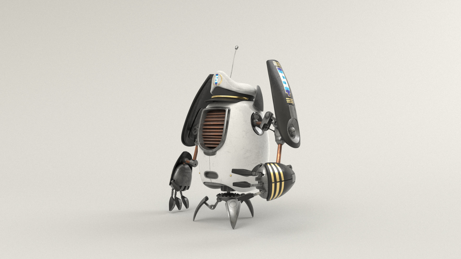
For the conductor robot, I chose a blue and gold color scheme based on real world conductor uniforms I’ve seen before. I made the conductor robot overall a bit more cleaned up compared to the other robots, since I figured the conductor robot should look a bit more crisp and professional. I also gave the conductor robot a gold mustache, for a bit of fun! To complete the look, I modeled a simple conductor’s hat for the conductor robot to wear. I also made a captain robot, which has a white/black/gold color scheme derived from the conductor robot. The white/black/gold color scheme is based on old-school ship’s captain uniforms. The captain robot required a bit of a different hat from the conductor hat; I made the captain hat a little bigger and a little bit more elaborate, complete with gold stitching on the front around the Seneca Metro emblem. In the final scene you don’t really see the captain robots, since they wound up inside of the wheelhouse at the top of the ship’s tower superstructure, but hey, at least the captain robots were fun to make, and at least I know that they’re there!
As a bit of a joke, I tried making a poncho for one of the robots. I thought it would look very silly, which for me was all the more reason to try! To make the poncho, I made a big flat disc in Maya and turned it into nCloth, and just let it fall onto the robot with the robot’s geometry acting as a static collider. This approach basically worked out-of-the-box, although I made some manual edits to the geometry afterwards just to get the poncho to billow a bit more on the bottom. The poncho’s shader is a simple glass PxrSurface shader, with the bottom frosted section and smooth diamond-shaped window section both driven using just roughness. The crinkly plastic sheet appearance is achieved entirely through a wrinkle normal map. The poncho bot is also not really visible in the final image, but somewhere in the final image, this robot is in the background on the deck of the front ship behind some other robots!
Don’t worry, I didn’t forget about the fact that the robots have antennae! For the poncho robot, I modeled a hole into the poncho for the antenna to pass through, and I modeled similar holes into the captain robot and conductor robot’s hats as well. Again, this is a detail that isn’t visible in the final image at all, but is there mostly just so that I can know that it’s there:
In total I created 12 different unique robot variants, which some variants duplicated in the final image. All 12 variants are actually present in the scene! Most of them are in the background (and a few variants are only on the background ship), so most of them aren’t very visible in the final image. You, the reader, have probably noticed a theme in this post now where I put a lot of effort into things that aren’t actually visible in the final image… for me, a large part of this project wasn’t necessarily about the final image and was instead just about having fun and getting some practice with the tools and workflows.
Here is a turntable showcasing all 12 robot variants. In the turntable, only the yellow robot has both a wet and dry variant, since all of the other robots in the scene remembered their umbrellas and were therefore able to stay dry. The green sports fan robot does have a variant with a wet right arm though, since in the final image the green sports fan robot’s right arm is extended beyond the umbrella to wave at the incoming ship.
The Wet Shader
Going into the shading process, the single problem that worried me the most was how I was going to make everything in the rain look wet. Having a good wet look is extremely important for selling the overall look of a rainy scene. I actually wasn’t too worried about the base dry shading, since hard metal/plastic surfaces are one of the things that CG is really good at by default. By contrast, getting a good wet rainy look took an enormous amount of experimentation and effort, and wound up even involving some custom tools.
From a cursory search online, I found some techniques for creating a wet rainy look that basically work by modulating the primary specular lobe and applying a normal map to the base normal of the surface. However, I didn’t really like how this looked; in some cases, this approach basically makes it look like the underlying surface itself has rivulets and dots in it, not like there’s water running on top of the surface. My hunch was to use PxrSurface’s clearcoat lobe instead, since from a physically motivated perspective, water streaks and droplets behave more like an additional transparent refractive coating layer on top of a base surface. A nice bonus from trying to use the clearcoat lobe is that PxrSurface supports using different normal maps for each specular lobe; this way, I could have a specific water droplets and streaks normal map plugged into the bump normal parameter for the clearcoat lobe without having to disturb whatever normal map I had plugged into the bump normal parameter to the base diffuse and primary specular lobes. My idea was to create a single shading graph for creating the wet rainy look, and then plug this graph into the clearcoat lobe parameters for any PxrSurface that I wanted a wet appearance for. Here’s what the final graph looked like:
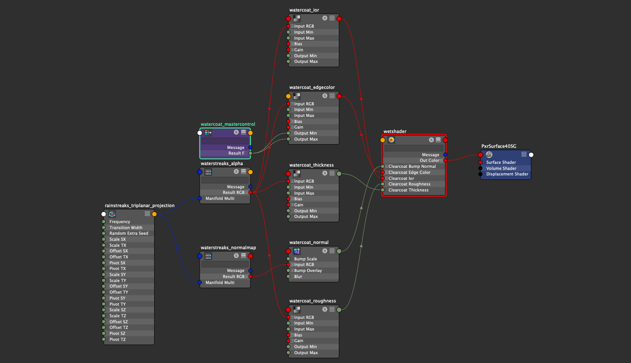
In the graph above, note how the input textures are fed into PxrRemap nodes for ior, edge color, thickness, and roughness; this is so I can rescale the 0-1 range inputs from the textures to whatever they need to be for each parameter. The node labeled “mastercontrol” allows for disabling the entire wet effect by feeding 0.0 into the clearcoat edge color parameter, which effectively disables the clearcoat lobe.
Having to manually connect this graph into all of the clearcoat parameters in each PxrSurface shader I used was a bit of a pain. Ideally I would have preferred if I could have just plugged all of the clearcoat parameters into a PxrLayer, disabled all non-clearcoat lobes in the PxrLayer, and then plugged the PxrLayer into a PxrLayerSurface on top of underlying base layers. Basically, I wish PxrLayerSurface supported enabling/disabling layers on a per-lobe basis, but this ability currently doesn’t exist in RenderMan 23. In Disney’s Hyperion Renderer, we support this functionality for sparsely layering Disney Bsdf parameters [Burley 2015], and it’s really really useful.
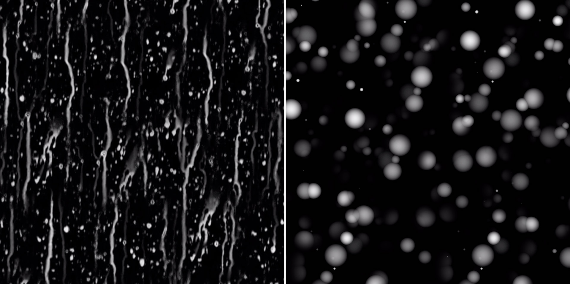
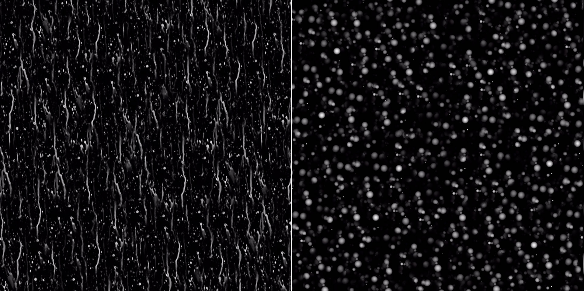
There are only four input maps required for the entire wet effect: a greyscale rain rivulets map, a corresponding rain rivulets normal map, a greyscale droplets map, and a corresponding droplets normal map. The rivulets maps are used for the sides of a PxrRoundCube projection node, while the droplets maps are used for the top of the PxrRoundCube projection node; this makes the wet effect look more like rain drop streaks the more vertical a surface is, and more like droplets splashing on a surface the more horizontal a surface is. Even though everything in my scene is UV mapped, I chose to use PxrRoundCube to project the wet effect on everything in order to make the wet effect as automatic as possible; to make sure that repetitions in the wet effect textures weren’t very visible, I used a wide transition width for the PxrRoundCube node and made sure that the PxrRoundCube’s projection was rotated around the Y-axis to not be aligned with any model in the scene.
To actually create the maps, I used a combination of Photoshop and a custom tool that I originally wrote for Takua Renderer. I started in Photoshop by kit-bashing together stuff I found online and hand-painting on top to produce a 1024 by 1024 pixel square example map with all of the characteristics I wanted. While in Photoshop, I didn’t worry about making sure that the example map could tile; tiling comes in the next step. After initial work in Photoshop, this is what I came up with:
Next, to make the maps repeatable and much larger, I used a custom tool I previously wrote that implements a practical form of histogram-blending hex tiling [Burley 2019]. Hex tiling with histogram preserving blending, originally introduced by Heitz and Neyret [2018], is one of the closest things to actual magic in recent computer graphics research; using hex tiling instead of normal rectilinear tiling basically completely hides obvious repetitions in the tiling from the human eye, and the histogram preserving blending makes sure that hex tile boundaries blend in a way that makes them completely invisible as well. I’ll write more about hex tiling and make my implementation publicly available in a future post. What matters for this project is hex tiling allowed me to convert my exemplar map from Photoshop into a much larger 8K seamlessly repeatable texture map with no visible repetition patterns. Below is a cropped section from each 8K map:
For the previous Art Challenge, I also made some custom textures that had to be tileable. Last time though, I used Substance Designer to make the textures tileable, which required setting up a big complicated node graph and produced results where obvious repetition was still visible. Conversely, hex tiling basically works automatically and doesn’t require any kind of manual setup or complex graphs or anything.
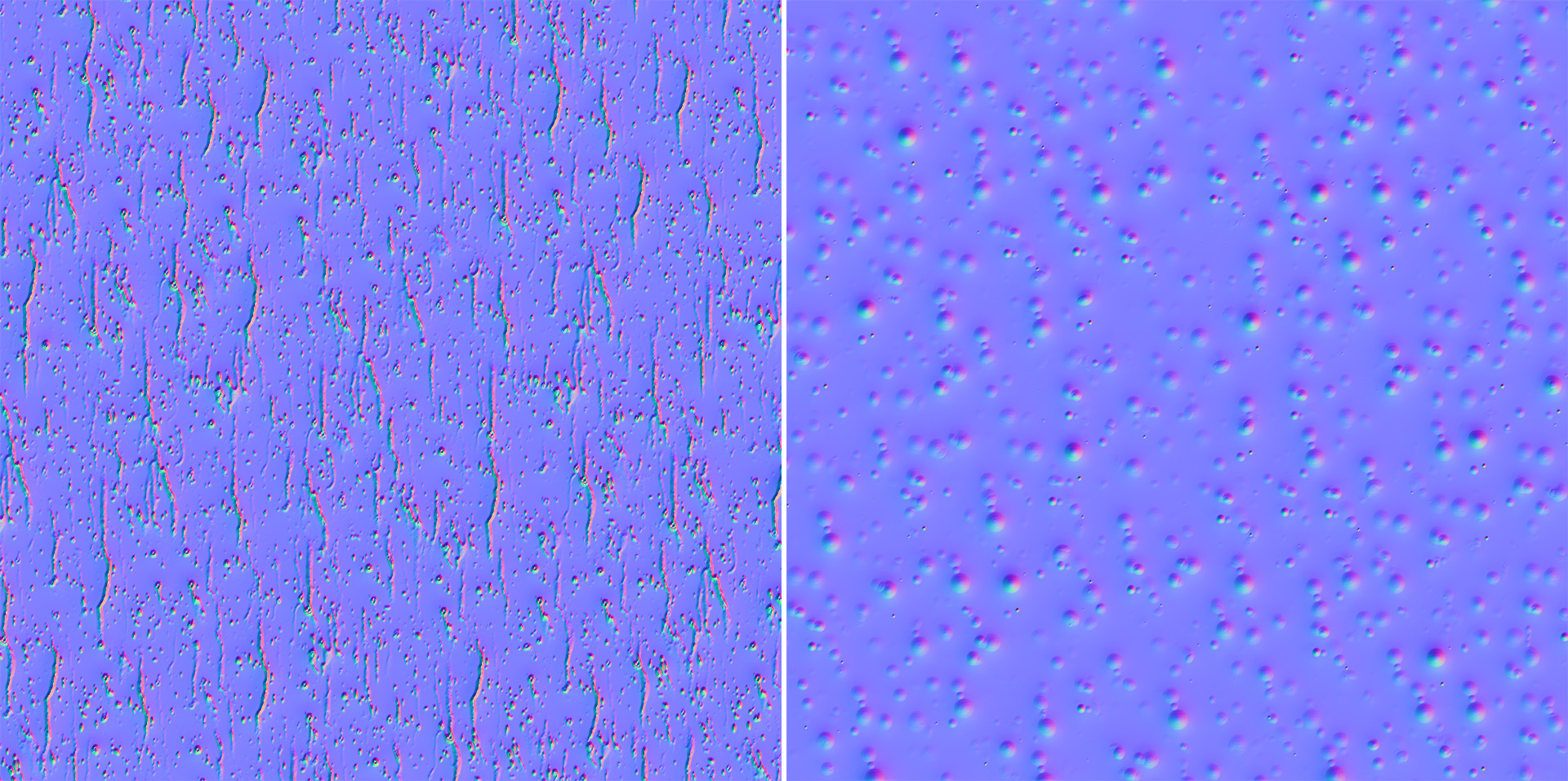
To generate the normal maps, I used Photoshop’s “Generate Normal Map” filter, which is found under “Filter > 3D”. For generating normal maps from simple greyscale heightmaps, this Photoshop feature works reasonably well. Because of the deterministic nature of the hex tiling implementation though, I could have also generated normal maps from the grey scale exemplars and then fed the normal map exemplars through the hex tiling tool with the same parameters as how I fed in the greyscale maps, and I would have gotten the same result as below.
For the wet effect’s clearcoat lobe, I chose to use the physical mode instead of the artistic mode (unlike for the base dry shaders, where I only used the artistic mode). The reason I used the physical mode for the wet effect is because of the layer thickness control, which darkens the underlying base shader according to how thick the clearcoat layer is supposed to be. I wanted this effect, since wet surfaces appear darker than their dry counterparts in real life. Using the greyscale wet map, I modulated the layer thickness control according to how much water there was supposed to be at each part of the surface.
Finally, after wiring everything together in Maya’s HyperShade editor, everything just worked! I think the wet look my approach produces looks reasonable convincing, especially from the distances that everything is from the camera in my final piece. Up close the effect still holds up okay, but isn’t as convincing as using real geometry for the water droplets with real refraction and caustics drive by manifold next event estimation [Hanika et al. 2015]. In the future, if I need to do close up water droplets, I’ll likely try an MNEE based approach instead; fortunately, RenderMan 23’s PxrUnified integrator already comes with an MNEE implementation as an option, along with various other strategies for handling caustic cases [Hery et al. 2016]. However, the approach I used for this project is far cheaper from a render time perspective compare to using geometry and MNEE, and from a mid to far distance, I’m pretty happy with how it turned out!
Below are some comparisons of the ship and robot with and without the wet effect applied. The ship renders are from the same camera angles as in Figures 13, 14, and 15. drag the slider left and right to compare:
Additional Props and Set Elements
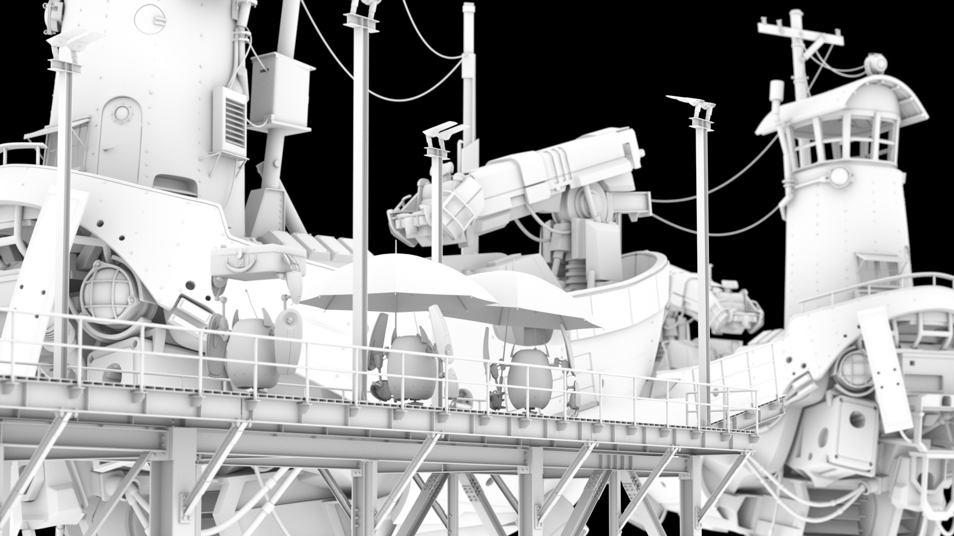
In addition to texturing and shading the flying scifi ship and robot models, I had to create from scratch several other elements to help support the story in the scene. By far the single largest new element that had to be created was the entire dock structure that the robots stand on top of. As mentioned earlier, I wound up modeling the dock to a fairly high level of detail; the dock model contains every single bolt and rivet and plate that would be necessary for holding together a similar real steel frame structure. Part of this level of detail is justifiable by the fact that the dock structure is in the foreground and therefore relatively close to camera, but part of having this level of detail is just because I could and I was having fun while modeling. To model the dock relatively quickly, I used a modular approach where I first modeled a toolkit of basic reusable elements like girders, connection points, bolts, and deckboards. Then, from these basic elements, I assembled larger pieces such as individual support legs and crossbeams and such, and then I assembled these larger pieces into the dock itself.
Shading the dock was relatively fast and straightforward; I created a basic galvanized metal material and applied it using a PxrRoundCube projection. To get a bit more detail and break up the base material a bit, I added a dirt layer on top that is basically just low-frequency noise multiplied by ambient occlusion. I did have to UV map the gangway section of the dock in order to add the yellow and black warning stripe at the end of the gangway; however, since the dock is made up almost entirely of essentially rectangular prisms oriented at 90 degree angles to each other, just using Maya’s automatic UV unwrapping provided something good enough to just use as-is. The yellow and black warning stripe uses the same thick worn paint material that the warning stripes on the ship uses. On top of all of this, I then applied my wet shader clearcoat lobe.
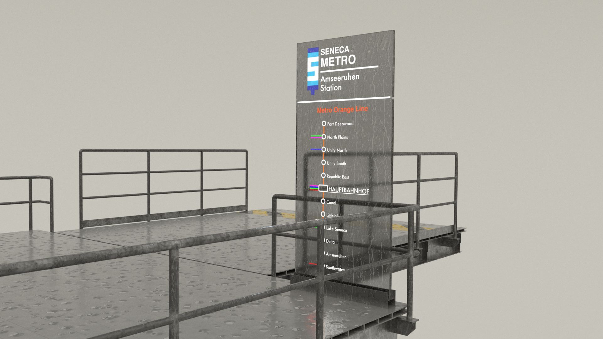
The metro sign on the dock is just a single rectangular prism with a dark glass material applied. The glowing text is a color texture map plugged into PxrSurface’s glow parameter; whereever there is glowing text, I also made the material diffuse instead of glass, with the diffuse color matching the glow color. To balance the intensity of the glow, I had to cheat a bit; turning the intensity of the glow down enough so that the text and colors read well means that the glow is no longer bright enough to show up in reflections or cast enough light to show up in a volume. My solution was to turn down the glow in the PxrSurface shader, and then add a PxrRectLight immediately in front of the metro sign driven by the same texture map. The PxrRectLight is set to be invisible to the camera. I suppose I could have done this in post using light path expressions, but cheating it this way was simpler and allowed for everything to just look right straight out of the render.
The suitcase was a really simple prop to make. Basically it’s just a rounded cube with some extra bits stuck on to it for the handles and latch; the little rivets are actually entirely in shading and aren’t part of the geometry at all. I threw on a basic burlap material for the main suitcase, multiplied on some noise to make it look a bit dirtier and worn, and applied basic brass and leather materials to the latch and handle, and that was pretty much it. Since the suitcase was going to serve as the yellow robot’s makeshift umbrella, making sure that the suitcase looked good with the wet effect applied turned out to be really important. Here’s a lookdev test render of the suitcase, with and without the wet effect applied (slide left and right to compare):
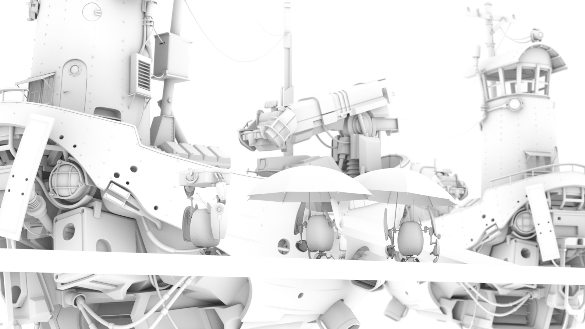
From early on, I was fairly worried about making the umbrellas look good; I knew that making sure the the umbrellas looked convincingly wet was going to be really important for selling the overall rainy day setting. I originally was going to make the umbrellas opaque, but realized that opaque umbrellas were going to cast a lot of shadows and block out a lot of parts of the frame. Switching to transparent umbrellas made out of clear plastic helped a lot with brightening up parts of the frame and making sure that large parts of the ship weren’t completely blocked out in the final image. As a bonus, I think the clear umbrellas also help the overall setting feel slightly more futuristic. I modeled the umbrella canopy as a single-sided mesh, so the “thin” setting in PxrSurface’s glass parameters was really useful here. Since the umbrella canopy is transparent with refraction roughness, having the wet effect work through the clearcoat lobe proved really important here since doing so allowed for the rain droplets and rivulets to have sharp specular highlights while simultaneously preserving the more blurred refraction in the underlying umbrella canopy material. In the end, lighting turned out to be really important for selling the look of the wet umbrella as well; I found that having tons of little specular highlights coming from all of the rain drops helped a lot.
As a bit of an aside, settling on a final umbrella canopy shape took a surprising amount of time! I started with a much flatter umbrella canopy, but eventually made it more bowed after looking at various umbrellas I have sitting around at home. Most clear umbrella references I found online are of these Japanese bubble umbrellas which are actually far more bowed than a standard umbrella, but I wanted a shape that more closely matched a standard opaque umbrella.
One late addition I made to the umbrella was the small lip at the bottom edge of the umbrella canopies; for much of the development process, I didn’t have this small lip and kept feeling like something was off about the umbrellas. I eventually realized that some real umbrellas have a bit of a lip to help catch and guide water runoff; adding this feature to the umbrellas helped them feel a bit more correct.

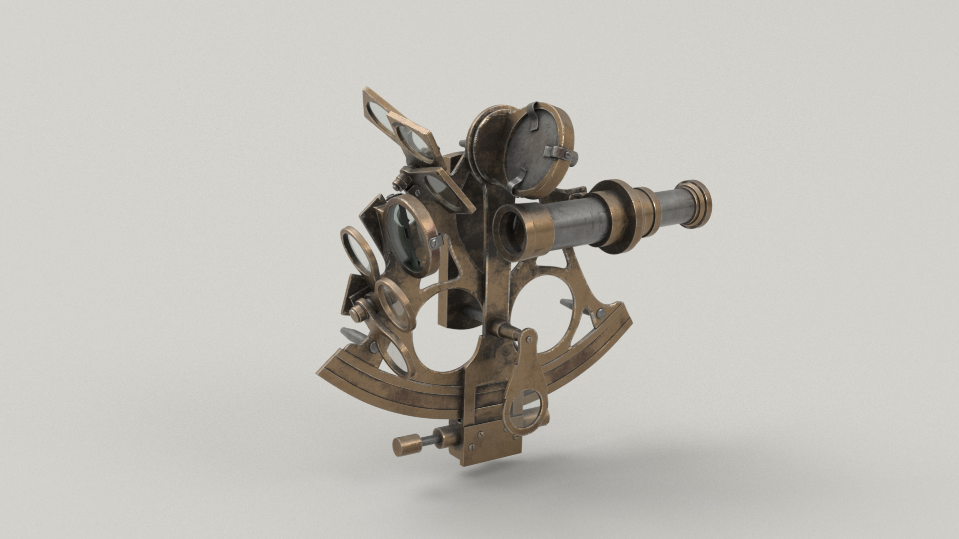
Shortly before the due date for the final image, I made a last-minute addition to my scene: I took the sextant that came with Pixar’s base models and made the white/red robot on the dock hold it. Since the green and yellow robots were both doing something a bit more dynamic than just standing around, I wanted the middle white/red robot to be doing something as well. Maybe the white/red robot is going to navigation school! I did a very quick-and-dirty shading job on the sextant using Maya’s automatic UVs; overall the sextant prop is not shaded to the same level of detail as most of the other elements in my scene, but considering how small the sextant is in the final image, I think it holds up okay. I still tried to add a plausible amount of wear and age to the metal materials on the sextant, but I didn’t have time to put in carved numbers and decals and grippy textures and stuff. There are also a few small areas where you can see visible texture stretching at UV seams, but again, in the final image, it didn’t matter too much.
Rain FX
Having a good wet surface look was one half of getting my scene to look convincingly rainy; the other major problem to solve was making the rain itself! My initial, extremely naive plan was to simulate all of the rainfall as one enormous FLIP sim in Houdini. However, I almost immediately realized what a bad idea that was, due to the scale of the scene. Instead, I opted to simulate the rain as nParticles in Maya.
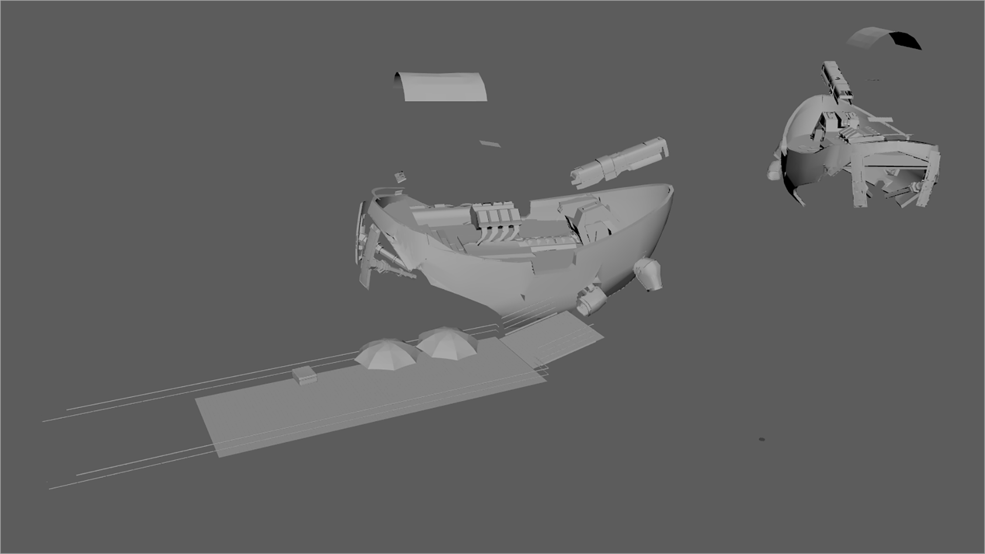
To start, I first duplicated all of the geometry that I wanted the rain to interact with, combined it all into one single huge mesh, and then decimated the mesh heavily and simplified as much as I could. This single mesh acted as a proxy for the full scene for use as a passive collider in the nParticles network. Using a decimated proxy for the collider instead of the full scene geometry was very important for making sure that the sim ran fast enough for me to be able to get in a good number of different iterations and attempts to find the look that I wanted. I mostly picked geometry that was upward facing for use in the proxy collider:
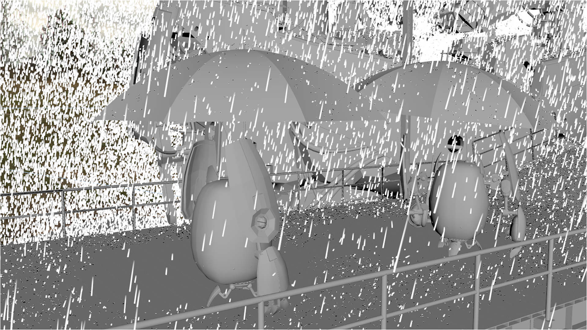
Next, I set up a huge volume nParticle emitter node above the scene, covering the region visible in the camera frustum. The only forces I set up were gravity and a small amount of wind, and then I ran the nParticles system and let it run until rain had filled all parts of the scene visible to the camera. To give the impression of fast moving motion-blurred rain droplets, I set the rendering mode of the nParticles to ‘multistreak’, which makes each particle look like a set of lines with lengths varying according to velocity. I had to play with the collider proxy mesh’s properties a bit to get the right amount of raindrops bouncing off of surfaces and to dial in how high raindrops bounced. I initially tried allowing particles to collide with each other as well, but this slowed the entire sim down to basically a halt, so for the final scene I have particle-to-particle collision disabled.
After a couple of rounds of iteration, I started getting something that looked reasonably like rain! Using the proxy collision geometry wa really useful for creating “rain shadows”, which are areas that rain isn’t present due to being stopped by something else. I also tuned the wind speed a lot in order to get rain particles bouncing off of the umbrellas to look like they were being blown aside in the wind. After getting a sim that I liked, I baked out the frame of the sim that I wanted for my final render using Maya’s nCache system, which caches the nParticle simulation to disk so that it can be rapidly loaded up later without having to re-run the entire simulation.
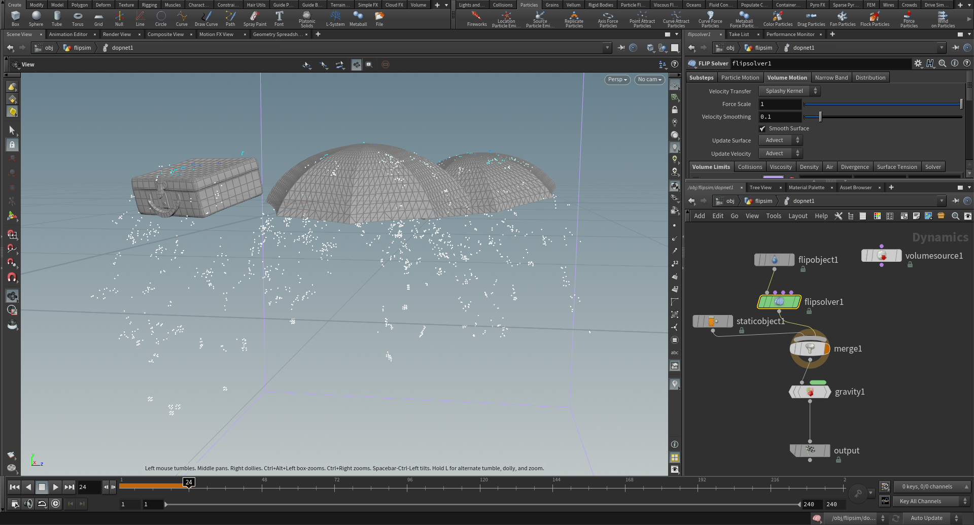
To add just an extra bit of detail and storytelling, near the end of the competition period I revisited my original idea for making the rain in Houdini using a FLIP solver. I wanted to add in some “hero” rain drops around the foreground robots, running off of their umbrellas and suitcases and stuff. To create these “hero” droplets, I brought the umbrella canopies and suitcase into Houdini and built a basic FLIP simulation, meshed the result, and brought it back into Maya to integrate back into the scene.
Dialing in the look of the rain required a lot of playing with both the width of the rain drop streaks and with the rain streak material. I was initially very wary of making the rain in my scene heavy, since I was concerned about how much a heavy rain look would prevent me from being able to pull good detail and contrast from the ships. However, after some successful initial tests, I felt a bit more confident about a heavier rain look. I took the test from yesterday with more rain, and tried increasing the amount of rain by around 10x. I originally started working on the sim with only around a million particles, but by the end I had bumped up the particle count to around 10 million. In order to prevent the increased amount of rain from completely washing out the scene, I made each rain drop streak on the thinner and shorter side, and also tweaked the material to be slightly more forward scattering. My rain material is basically a mix of a rough glass and grey diffuse, with the reasoning being rain needs to be a glass material since rain is water, but since the rain droplet streaks are meant to look motion blurred, throwing in some diffuse just helps them show up better in camera; making the rain material more forwards scattering in this case just means changing the ratio of glass/diffuse to be more glass. I eventually arrived at a ratio of 60% diffuse light grey to 40% glass, which I found helped the rain show up in the camera and catch light a bit better. I also used the “presence” parameter (which is really just opacity) in PxrShader to make final adjustments to balance how visible the rain was with how much it was washing out other details. For the “hero” droplets, I used a completely bog-standard glass material.
Figuring out how to simulate the rain and make it look good was by far the single largest source of worries for me in this whole project, so I was incredibly relieved at the end when it all came together and started looking good. Here’s a 2K crop from my final image showing the “hero” droplets and all of the surrounding rain streaks around the foreground robots.
Lighting and Compositing
Lighting this scene proved to be very interesting and very different from what I did for the previous challenge! Looking back, I think I actually may have “overlit” the scene in the previous challenge; I tend to prefer a slightly more naturalistic look, but while in the thick of lighting, it’s easy to get carried away and push things far beyond the point of looking naturalistic. Another aspect of this scene that it made it very different from anything I’ve tried before is both the sheer number of practical lights in the scene and the fact that practical lights are the primary source of all lighting in this scene!
The key lighting in this scene is provided by the overhead lampposts on the dock, which illuminate the foreground robots. I initially had a bunch of additional invisible PxrRectLights providing additional illumination and shaping on the robots, but I got rid of all of them and in the final image I relied only on the actual lights on the lampposts. To prevent the visible light surfaces themselves from blowing out an aliasing, I used two lights for every lamppost: one visible-to-camera PxrRectLight set to a low intensity that wouldn’t alias in the render, and one invisible-to-camera PxrRectLight set to a relatively higher intensity for providing the actual lighting. The visible-to-camera PxrRectLight is rendered out as the only element on a separate render layer, which can then be added back in to the main key lighting render layer.
To better light the ships, I added a number of additional floodlights to the ship that weren’t part of the original model; you can see these additional floodlights mounted on top of the various masts of the ships and also on the sides of the tower superstructure. These additional floodlights illuminate the decks of the ships and help provide specular highlights to all of the umbrellas on the deck of the foreground ship, which enhances the rainy water droplet covered look. For the foreground robots on the dock, the ship floodlights also act as something of a rim light. Each of the ship floodlights is modeled as a visible-to-camera PxrDiscLight behind a glass lens with a second invisible-to-camera PxrDiscLight in front of the glass lens. The light behind the glass lens is usually lower in intensity and is there to provide the in-camera look of the physical light, while the invisible light in front of the lens is usually higher in intensity and provides the actual illumination in the scene.
In general, one of the major lessons I learned on this project was that when lighting using practical lights that have to be be visible in camera, a good approach is to use two different lights: one visible-to-camera and one invisible-to-camera. This approach allows for separating how the light itself looks versus what kind of lighting it provides.
The overall fill lighting and time of day is provided by the skydome, which is of an overcast sky at dusk. I waffled back and forth for a while between a more mid-day setting versus a dusk setting, but eventually settled on the dusk skydome since the overall darker time of day allows the practical lights to stand out more. I think allowing the background trees to fade almost completely to black actually helps a lot in keeping the focus of the image on the main story elements in the foreground. One feature of RenderMan 23 that really helped in quickly testing different lighting setups and iterating on ideas was RenderMan’s IPR mode, which has come a long way since RendermMan first moved to path tracing. In fact, throughout this whole project, I used the IPR mode extensively for both shading tests and for the lighting process. I have a lot of thoughts about the huge, compelling improvements to artist workflows that will be brought by even better interactivity (RenderMan XPU is very exciting!), but writing all of those thoughts down is probably better material for a different blog post in the future.
In total I had five lighting render layers: the key from the lampposts, the foreground rim and background fill from the floodlights, overall fill from the skydome, and two practicals layers for the visible-to-camera parts of all of the practical lights. Below are the my lighting render layers, although with the two practicals layers merged:
I used a number of PxrRodLightFilters to knock down some distractingly bright highlights in the scene (especially on the foreground robots’ umbrellas in the center of the frame). As a rendering engineer, rod light filters are a constant source of annoyance due to the sampling problems they introduce; rods allow for arbitrarily increasing or decreasing the amount of light going through an area, which throws off energy conservation, which can mess up importance sampling strategies that depend on a degree of energy conservation. However, as a user, rod light filters have become one of my favorite go-to tools for shaping and adjusting lighting on a local basis, since they offer an enormous amount of localized artistic control.
To convey the humidity of a rainstorm and to provide volumetric glow around all of the practical lights in the scene, I made extensive use of volume rendering on this project as well. Every part of the scene visible in-camera has some sort of volume in it! There are generally two types of volumes in this scene: a group of thinner, less dense volumes to provide atmospherics, and then a group of thicker, denser “hero” volumes that provide some of the more visible mist below the foreground ship and swirling around the background ship. All of these volumes are heterogeneous volumes brought in as VDB files.
One odd thing I found with volumes was some major differences in sampling behavior between RenderMan 23’s PxrPathtracer and PxrUnified integrators. I found that by default, whenever I had a light that was embedded in a volume, areas in the volume near the light were extremely noisy when rendered using PxrUnified but rendered normally when using PxrPathtracer. I don’t know enough about the details of how PxrUnified and PxrPathtracer’s volume integration [Fong et al. 2017] approaches differ, but it almost looks to me like PxrPathtracer is correctly using RenderMan’s equiangular sampling implementation [Kulla and Fajardo 2012] in these areas and PxrUnified for some reason is not. As a result, for rendering all volume passes I relied on PxrPathtracer, which did a great job with quickly converging on all passes.
An interesting unintended side effect of filling the scene with volumes was in how the volumes interacted with the orange thruster and exhaust vent lights. I had originally calibrated the lights in the thrusters and exhaust vents to provide an indication of heat coming from those areas of the ship without being so bright as to distract from the rest of the image, but the orange glows these lights produced in the volumes made the entire bottom of the image orange, which was distracting anyway. As a result, I had to re-adjust the orange thruster and exhaust vent lights to be considerably dimmer than I had originally had them, so that when interacting with the volumes, everything would be brought up to the apparent image-wide intensity that I had originally wanted.
In total I had eight separate render passes for volumes; each of the consolidated lighting passes from above had two corresponding volume passes. Within the two volume passes for each consolidated lighting pass, one volume pass was for the atmospherics and one was for the heavier mist and fog. Below are the volume passes consolidated into four images, with each image showing both the atmospherics and mist/fog in one image:
One final detail I added in before final rendering was to adjust the bokeh shape to something more interesting than a uniform circle. RenderMan 23 offers a variety of controls for customizing the camera’s aperture shape, which in turn controls the bokeh shape when using depth of field. All of the depth of field in my final image is in-render, and because of all of the tiny specular hits from all of the raindrops and from the wet shader, there is a lot of visible bokeh going on. I wanted to make sure that all of this bokeh was interesting to look at! I picked a rounded 5-bladed aperture with a significant amount of non-uniform density (that is, the outer edges of the bokeh are much brighter than the center core).
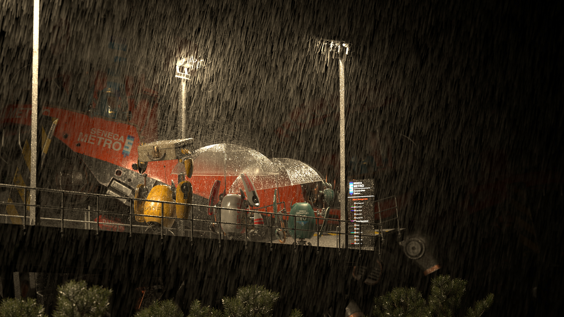
For final compositing, I used a basic Photoshop and Lightroom workflow like I did in the previous challenge, mostly because Photoshop is a tool I already know extremely well and I don’t have Nuke at home. I took a relatively light-handed approach to compositing this time around; adjustments to layers were limited to just exposure adjustments. All of the layers shown above already have the exposure adjustments I made baked in. After making adjustments in Photoshop and flattening out to a single layer, I then brought the image into Lightroom for final color grading. For the final color grade, I tried push the overall look to be a bit moodier and a bit more contrast-y, with the goal of having the contrast further draw the viewer’s eye to the foreground robots where the main story is. Figure 50 is a gif that visualizes the compositing process for my final image by showing how all of the successive layers are added on top of each other. Figure 51 shows what all of the lighting, comp, and color grading looks like applied to a 50% grey clay shaded version of the scene, and if you don’t want to scroll all the way back to the top of this post to see the final image, I’ve included it again as Figure 52.

Conclusion
On a whole, I’m happy with how this project turned out! I think a lot of what I did on this project represents a decent evolution over and applies a lot of lessons learned on the previous RenderMan Art Challenge. I started this project mostly as an excuse to just have fun, but along the way I still learned a lot more, and going forward I’m definitely hoping to be able to do more pure art projects alongside my main programming and technical projects.
Here is a progression video I put together from all of the test and in-progress renders that I made throughout this entire project:
My wife, Harmony Li, deserves an enormous amount of thanks on this project. First off, the final concept I went with is just as much her idea as it is mine, and throughout the entire project she provided valuable critiques and suggestions and direction. As usual with the RenderMan Art Challenges, Leif Pederson from Pixar’s RenderMan group provided a lot of useful tips, advice, feedback, and encouragement as well. Many other entrants in the Art Challenge also provided a ton of support and encouragement; the community that has built up around the Art Challenges is really great and a fantastic place to be inspired and encouraged. Finally, I owe an enormous thanks to all of the judges for this RenderMan Art Challenge, because they picked my image for first place! Winning first place in a contest like this is incredibly humbling, especially since I’ve never really considered myself as much of an artist. Various friends have since pointed out that with this project, I no longer have the right to deny being an artist! If you would like to see more about my contest entry, check out the work-in-progress thread I kept on Pixar’s Art Challenge forum, and I also made an Artstation post for this project.
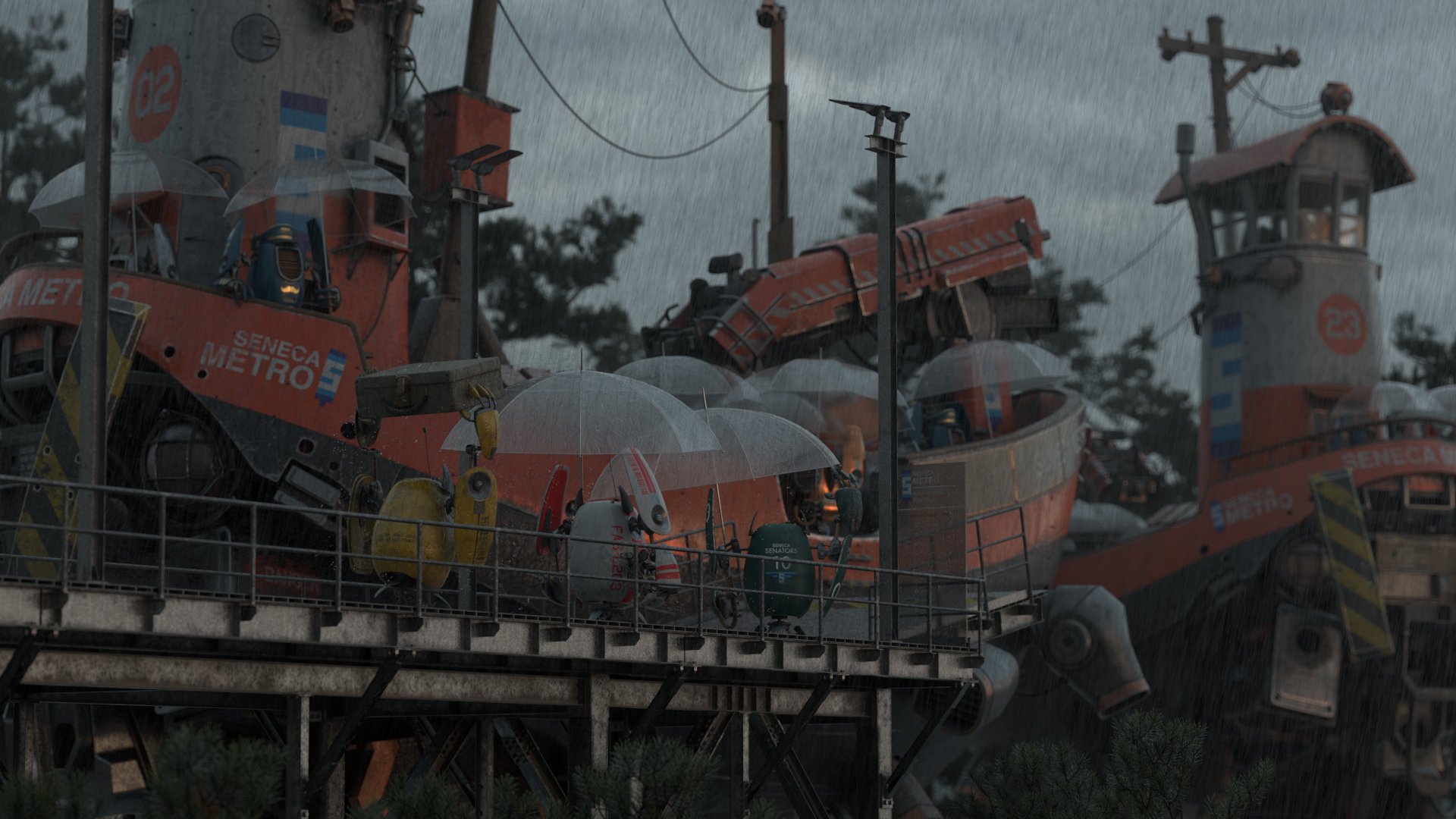
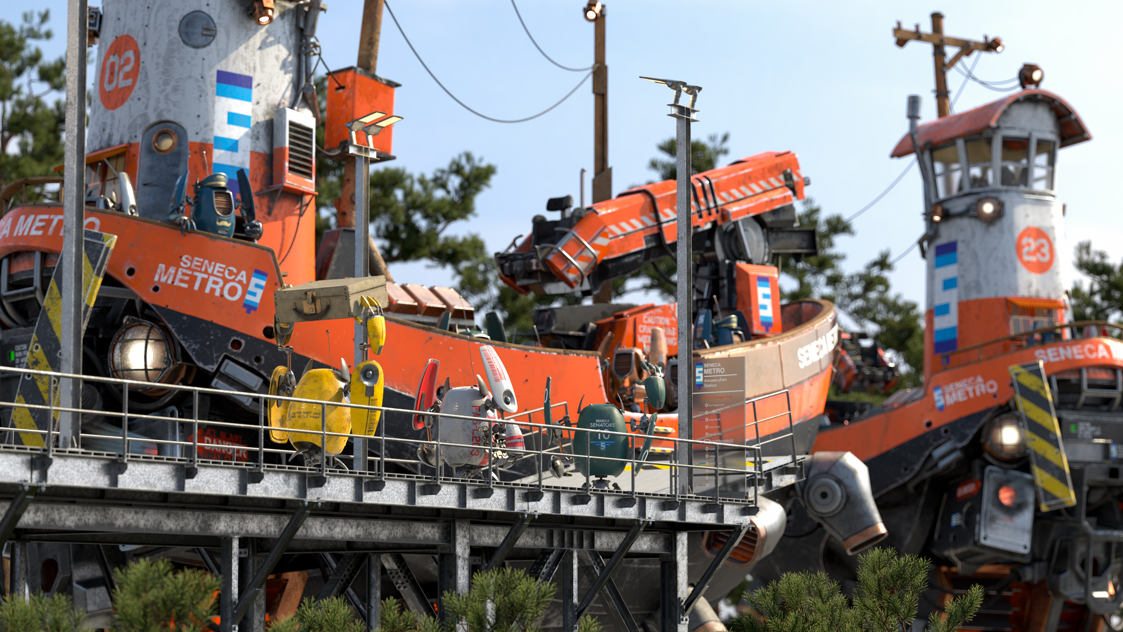
As a final bonus image, here’s a daylight version of the scene. My backup plan in case I wasn’t able to pull off the rainy look was to just go for a boring daylight setup; I figured that the lighting would be a lot more boring, but the additional visible detail would be an okay consolation prize for myself. Thankfully, the rainy look worked out and I didn’t have to go to my backup plan! After the contest wrapped up, I went back and made a daylight version out of curiosity:
References
Petr Beckmann and André Spizzichino. 1963. The Scattering of Electromagnetic Waves from Rough Surfaces.
Brent Burley. 2012. Physically Based Shading at Disney. In ACM SIGGRAPH 2012 Course Notes: Practical Physically-Based Shading in Film and Game Production.
Brent Burley. 2015. Extending the Disney BRDF to a BSDF with Integrated Subsurface Scattering. In ACM SIGGRAPH 2015 Course Notes: Physically Based Shading in Theory and Practice.
Brent Burley. 2019. On Histogram-Preserving Blending for Randomized Texture Tiling. Journal of Computer Graphics Techniques 8, 4 (Nov. 2019), 31-53.
Per Christensen, Julian Fong, Jonathan Shade, Wayne Wooten, Brenden Schubert, Andrew Kensler, Stephen Friedman, Charlie Kilpatrick, Cliff Ramshaw, Marc Bannister, Brenton Rayner, Jonathan Brouillat, and Max Liani. 2018. RenderMan: An Advanced Path-Tracing Architeture for Movie Rendering. ACM Transactions on Graphics 37, 3 (Jul. 2018), Article 30.
Johannes Hanika, Marc Droske, and Luca Fascione. 2015. Manifold Next Event Estimation. Computer Graphics Forum (Proc. of Eurographics Symposium on Rendering) 34, 4 (Jun. 2015), 87-97.
Eric Heitz and Fabrice Neyret. 2018. High-Performance By-Example Noise using a Histogram-Preserving Blending Operator. Proceedings of the ACM on Computer Graphics and Interactive Techniques (Proc. of High Performance Graphics) 1, 2 (Aug. 2018), Article 31.
Christophe Hery, Ryusuke Villemin, and Junyi Ling. 2017. Pixar’s Foundation for Materials: PxrSurface and PxrMarschnerHair. In ACM SIGGRAPH 2017 Course Notes: Physically Based Shading in Theory and Practice.
Christophe Hery, Ryusuke Villemin, and Florian Hecht. 2016. Towards Bidirectional Path Tracing at Pixar. In ACM SIGGRAPH 2016 Course Notes: Physically Based Shading in Theory and Practice.
Julian Fong, Magnus Wrenninge, Christopher Kulla, and Ralf Habel. 2017. Production Volume Rendering. In ACM SIGGRAPH 2017 Courses. Article 2.
Iliyan Georgiev, Jamie Portsmouth, Zap Andersson, Adrien Herubel, Alan King, Shinji Ogaki, Frederic Servant. 2019. Autodesk Standard Surface. Autodesk white paper.
Ole Gulbrandsen. 2014. Artistic Friendly Metallic Fresnel. Journal of Computer Graphics Techniques 3, 4 (Dec. 2014), 64-72.
Christopher Kulla and Marcos Fajardo. 2012. Important Sampling Techniques for Path Tracing in Participating Media. Computer Graphics Forum (Proc. of Eurographics Symposium on Rendering) 31, 4 (Jun. 2012), 1519-1528.
Bruce Walter, Steve Marschner, Hongsong Li, and Kenneth E. Torrance. 2007. Microfacet Models for Refraction through Rough Surfaces. In Proc. of Eurographics Symposium on Rendering (Rendering Techniques 2007), 195-206.