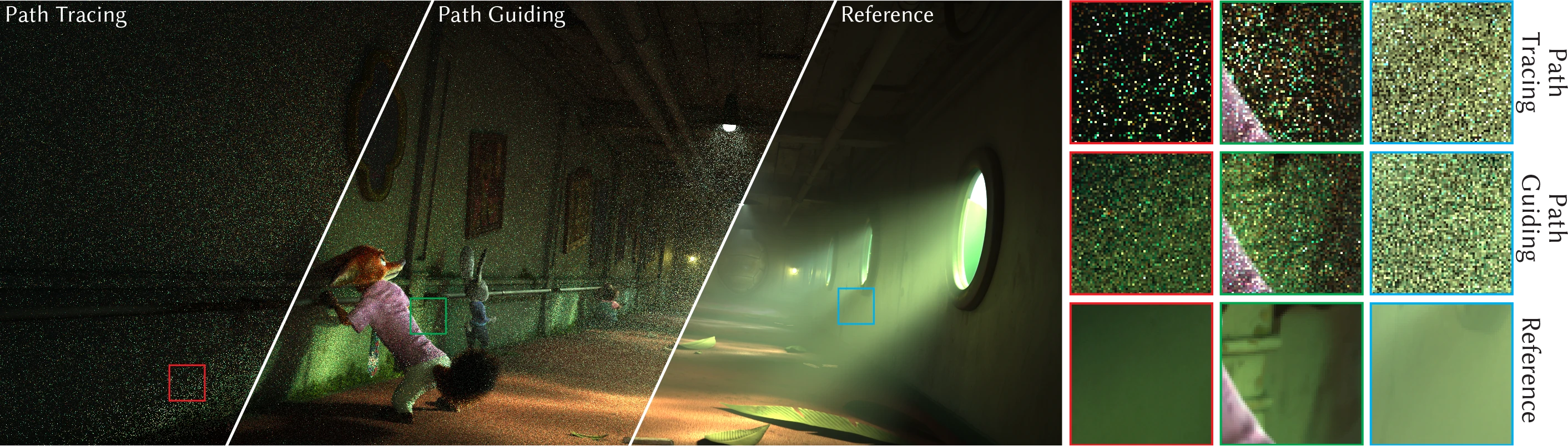
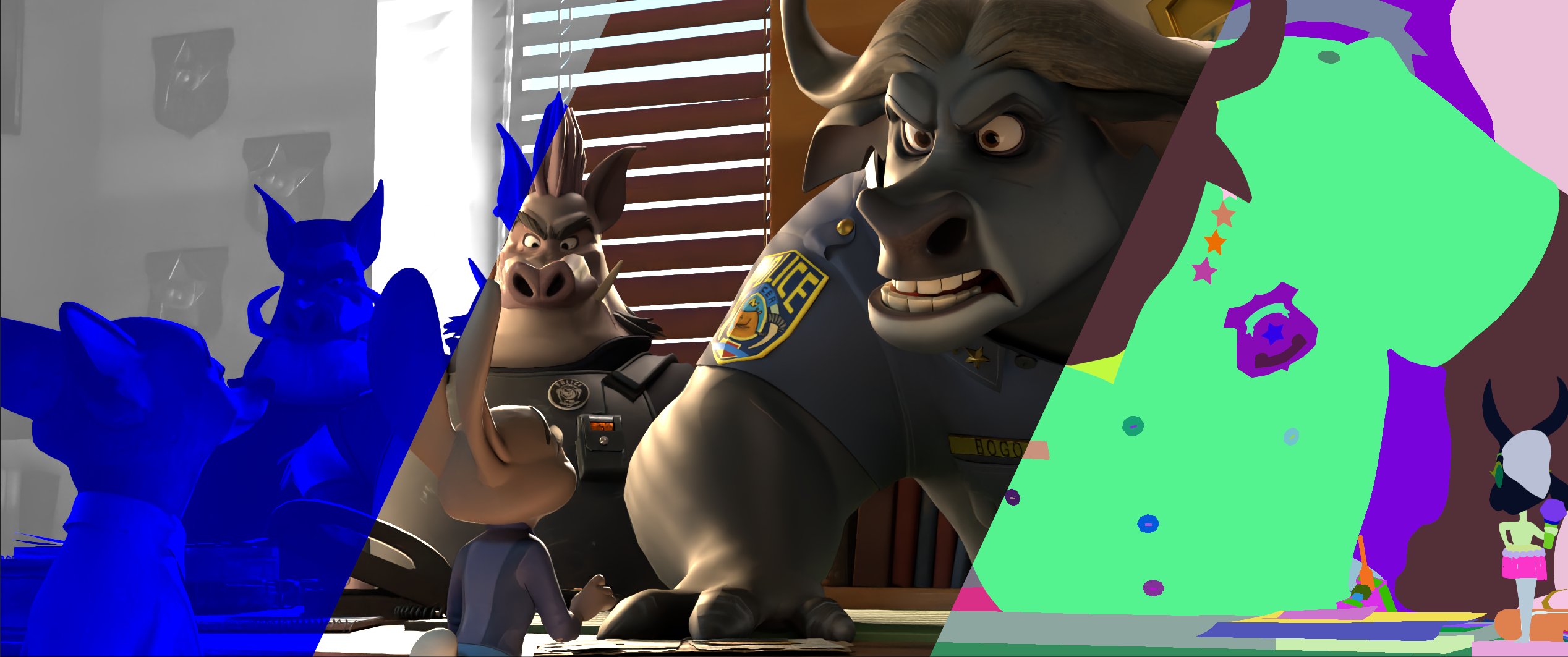
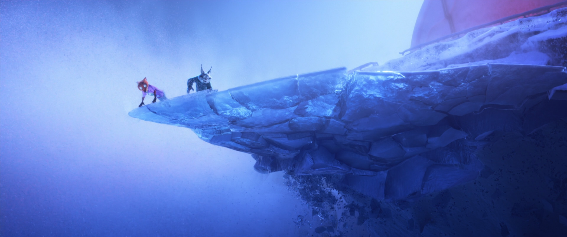
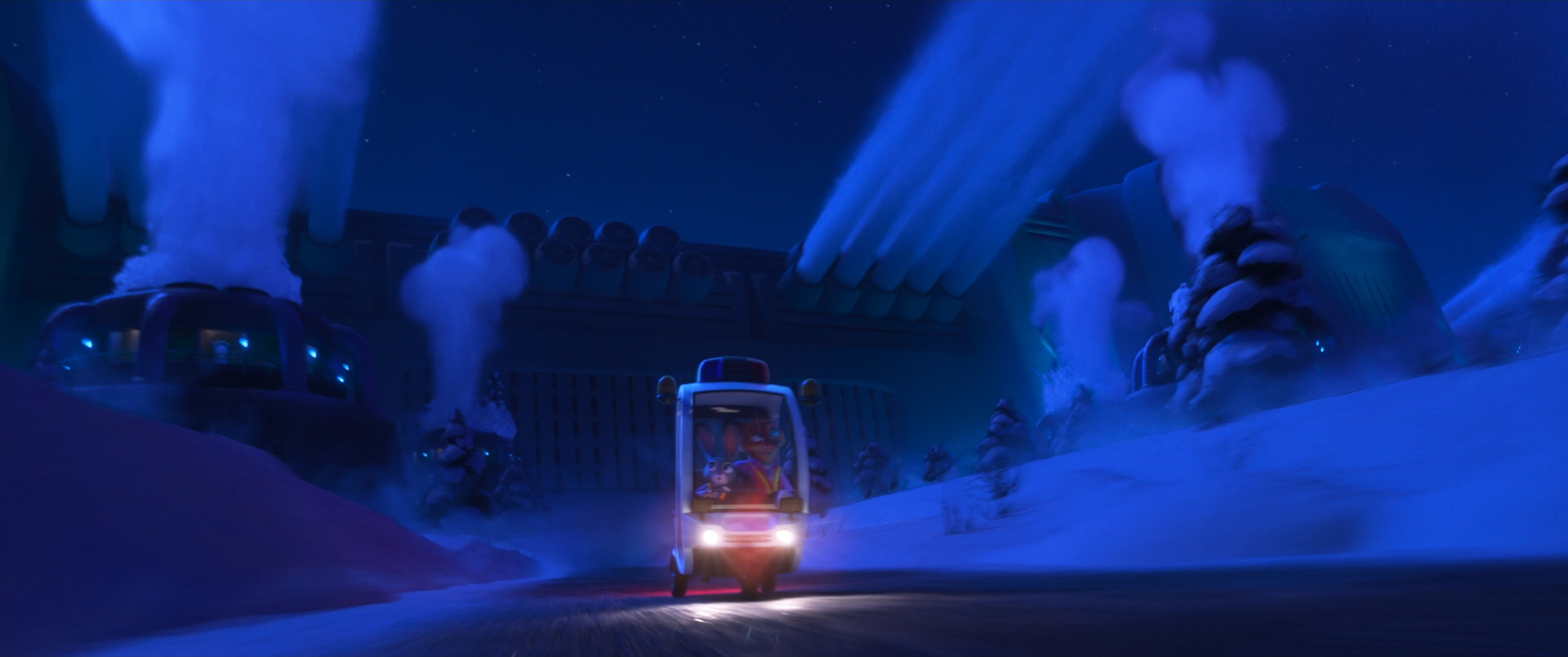
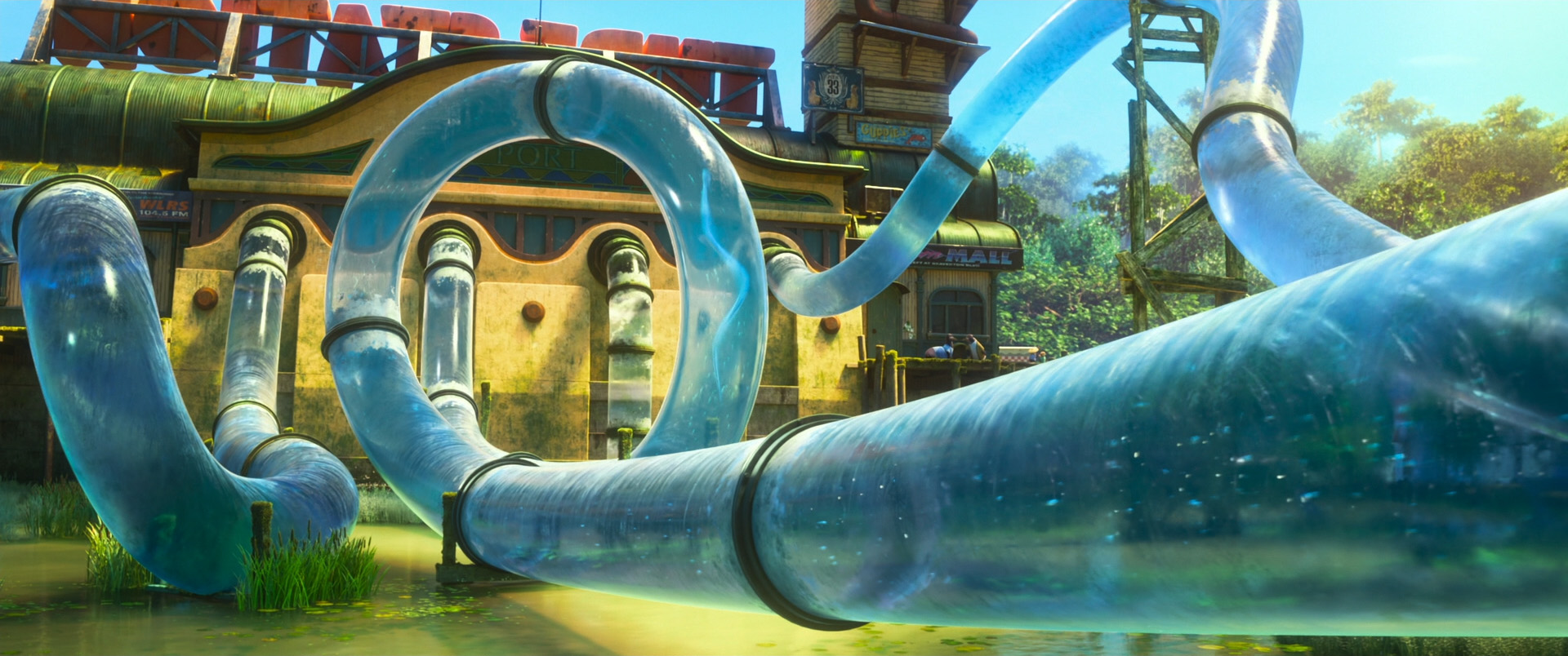
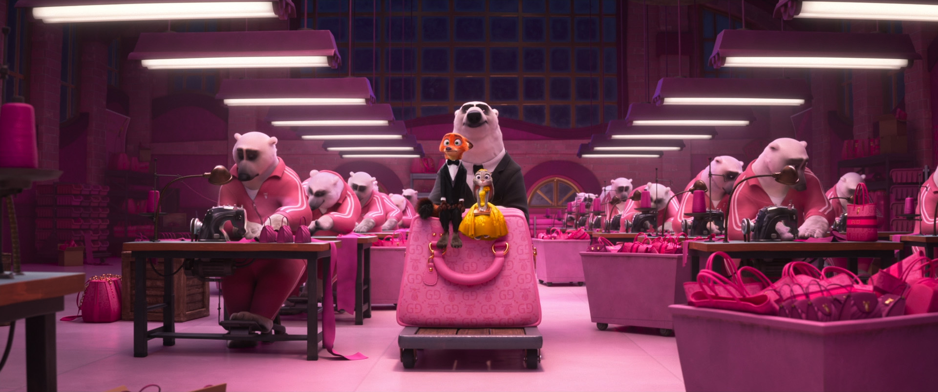
Last year at SIGGRAPH 2025, the Hyperion team from Disney Animation and the rendering research group at DisneyResearch|Studios presented our work developing Hyperion’s second-generation path guiding system for surfaces and volumes [Reichardt et al 2025], built on top of OpenPGL[Herholz and Dittebrandt 2022].
At SIGGRAPH 2026, we have a talk that serves as a followup to last year’s course; our talk this year is about how we used our second-generation path guiding system for the first time on Zootopia 2.
This talk contains several additional production-motivated improvements on top of what we presented last year, and goes through some concrete examples and data from Zootopia 2.
Lea Reichardt and I are presenting the talk together at SIGGRAPH 2026 in Los Angeles as part of the “Rendering and Volumes” session on Thursday, July 23rd.
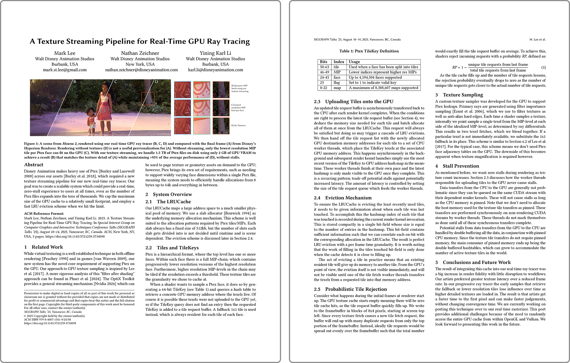
Here is the paper abstract:
Walt Disney Animation Studios’ “Zootopia 2” was the first film to make extensive use of Disney’s Hyperion Renderer’s [Burley et al. 2018] second-generation path guiding system, built on top of OpenPGL [Herholz and Dittebrandt 2022]. Jumping from initial implementation to at-scale production usage required us to solve additional practical problems on top of what we previously described in Reichardt et al. [2025]. We introduce two new methods: one for estimating the efficiency improvement path guiding gives over path tracing without the need for multiple long comparison renders, and one for allowing path guided results to match sources of bias common in production rendering introduced by common practical variance-reduction techniques. We also describe improvements to our radiance recorder mechanism. Finally, we will examine how our path guiding system was used on “Zootopia 2”, including artist experiences, complex and difficult scenes that path guiding enabled more efficient renders and better workflows on, and general lessons learned.
As usual, I’ve put all of the relevant paper materials on the project page, and this blog post is some additional personal notes that offer up my perspective on the project but isn’t necessary for understanding the technical details of the project.
An interesting quirk about how Disney Animation’s typically November-release-focused production cycle lines up with SIGGRAPH is that the work we present at SIGGRAPH often lags very far behind what we are actively working on.
Usually the work we present at SIGGRAPH would have been completed at least a full year ago, often around the time of the previous SIGGRAPH or earlier.
This is because in order to complete a film by November of each year, major technology development will have had to be wrapped up several months earlier, which means sometime in the summer, but we don’t present the work until the SIGGRAPH after the film is completed, which means waiting until the next summer.
In the case of this talk and our path guiding course last year, what this timeline means is that most of the work presented in this talk was actually underway while we were presenting the course last year, and the material presented in that course had been completed two years ago before this summer, during the production of Moana 2.
So, around the same time that we presented the course last year, behind the scenes we were simultaneously working on all three of the improvements presented in this talk.
The throughput clamp compensation mechanism was developed by Alexander Rath and productionized by Lea Reichardt, while the efficiency estimate mechanism was invented and prototyped by Marco Manzi and then I reworked it into the final production version and worked with Neelima Karanam to build out artist tooling around the efficiency estimate system.
While both of these projects were going on, Brian Green was developing the Radiance Recorder improvements.
As I wrote in my post about last year’s course, this project has been one of my all-time favorite projects I’ve worked on because of the way this project has spanned all the way from pure research with our peers at DisneyResearch|Studios to full production deployment on Zootopia 2, in close collaboration with Zootopia 2’s TD and lighting departments.
Being able to see a large collaborative project through from an abstract research idea all the way through to final pixels in a completed film is extraordinarily gratifying; it really exemplifies how what we do is a fusion of really cool technology with really amazing art.
For me, seeing our path guiding system used on large swaths of Zootopia 2 is even more satisfying because the road to getting some form of path guiding to a point where it truly is practical for production is a journey that goes even further back than the current incarnation of this project.
The current incarnation of this project was in a lot of ways born out of addressing the shortcomings of our first generation path guiding attempt, which dates all the way back to the early production of Frozen 2 some eight years ago and, despite some occasional limited usage, never achieved widespread adoption or applicability.
I think seeing the sheer number of things that had to come together in order for this project to be successful is also pretty amazing.
We were very fortunate to have Alexander Rath join DisneyResearch|Studios and take an interest in this project; his contributions have been critical to the project and he brought key ideas such as efficiency-awareness [Rath et al. 2022] to the project.
We’re also very fortunate to have the Disney Research deep-learning denoiser project [Vogels et al. 2018, Dahlberg et al. 2019] available to us; the efficiency estimate mechanism depends on having a really fast, really good denoiser to provide ground truth proxies, and luckily we had one already in production use!
We were also very fortunate to have studio leadership that understands the value of close research collaboration and greenlit us folding the DisneyResearch|Studios team directly into our internal studio development environment, allowing them to use and edit Hyperion directly as a research platform and test directly on real production data.
Furthermore, seeing how the success of this project is already spawning more cool research in related areas is also really interesting.
Now that we have a robust and complete framework in place in Hyperion to facilitate path guiding, the DisneyResearch|Studios team has already begun experimenting with extending the framework for even more advanced approaches to guiding, such as neural guiding with asynchronous GPU training [Rath et al. 2025].
The Radiance Recorder has also proven to be a super valuable data structure not just for path guiding, but in general for collecting path data for other purposes.
As an example, the Neural Render Proxies project [Sancho et al. 2026] that DisneyResearch|Studios presented at EGSR this year is built directly on top of the Radiance Recorder framework.
One of the most impactful lessons I learned from this project is the importance of not just partnering with production on ambitious research projects, but making sure that they are involved and are able to provide input and a production perspective early in the research process.
In the case of Zootopia 2, we brought the show’s TD and lighting leadership up to speed on the project very early in both the project’s existence and in the show’s production.
Because the show was involved early in the project, their confidence in the project grew as we made progress, and by the time we had everything ready to go on the research and development side, the show trusted that we knew what we were doing and that the project would be beneficial to the show.
Addressing the show’s concerns and needs was built into the development process from the start, instead of being treated as an afterthought.
Here is an example of how the trust and partnership between the research team, the Hyperion development team, and the show’s leadership worked.
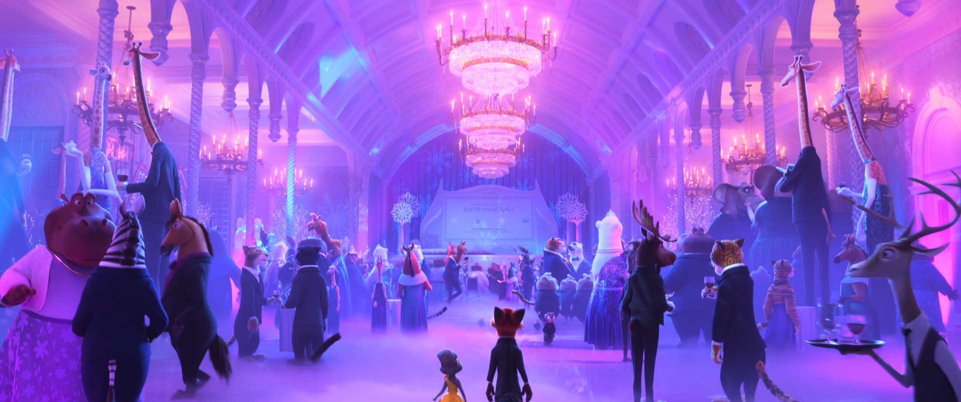
One of the early test Zootopia 2 shots we were evaluating path guiding on was the “Gala” scene that we show as a failure case in the talk’s expanded results.
The chandelier in that shot proved to be an interesting case; even though guiding did not help improve overall efficiency on this shot, lighters noticed early on that guiding did provide a visual benefit.
The chandeliers in the scene are made up of thousands of refractive glass elements with dispersion, which casts a ton of internal caustics, which Hyperion’s main unidirectional path tracing code path cannot handle well.
As a result, Hyperion usually clamps away most of the fireflies this type of case causes, but path guiding allowed the renderer to better learn how to sample this case and have it converge to a brighter, more colorful, less biased result compared to the standard renderer.
Our artists actually really liked this effect, despite it not matching the approved art direction for the shot.
This finding both helped motivate the clamping compensation work in order to meet the show’s already-approved art direction, but also helped motivate a larger re-evaluation of the need for throughput clamping in the modern renderer, and this re-evaluation eventually led us to conclude that we could remove throughput clamping entirely for future shows and instead depend on a combination of path guiding and our deep learning denoiser to reduce fireflies.
Early evaluation and testing from artists both helped shape the version of the system that we used on Zootopia 2 and tailor it to Zootopia 2’s needs, but also helped us revisit and reshape another part of the renderer to benefit all future shows.
An added bonus of the show being looped into the project early is that they got a front-row seat to what the DisneyResearch|Studios team did and therefore were able to better appreciate how crucial the DisneyResearch|Studios contribution to the project was.
As a result, Marios Papas and Marco Manzi were given credits on Zootopia 2 in recognition of their leadership and work on the project from the beginning.
I hope we get to do a lot more of this on future shows!
One last note: OpenPGL was recently accepted by the Academy Software Foundation as an official ASWF project, which is fantastic news.
Becoming an ASWF project guarantees that OpenPGL has a long and bright future ahead of it and will see continued long-term development and support.
From what I’ve heard from Sebastian Herholz and from friends more involved with ASWF governance matters, our use of OpenPGL as the basis of our second-generation path guiding system on Zootopia 2 was a large factor in convincing the ASWF of OpenPGL’s real-world production readiness and suitability as a ASWF project.
I’m sure Zootopia 2 was just one of several major convincing data points, but I’m very glad to hear that we played some role in helping convince the ASWF!
References
Brent Burley, David Adler, Matt Jen-Yuan Chiang, Hank Driskill, Ralf Habel, Patrick Kelly, Peter Kutz, Yining Karl Li, and Daniel Teece. 2018. The Design and Evolution of Disney’s Hyperion Renderer. ACM Transactions on Graphics 37, 3 (Jul. 2018), Article 33.
Alexander Rath, Pascal Grittman, Sebastian Herholz, Philippe Weier, and Philipp Slusallek. 2022. EARS: Efficiency-Aware Russian Roulette and Splitting. ACM Transactions on Graphics (Proc. of SIGGRAPH) 41, 4 (Jul. 2022), Article 81.
Alexander Rath, Marco Manzi, Farnood Salehi, Sebastian Weiss, Tiziano Portenier, Saeed Hadadan, and Marios Papas. 2025. Neural Resampling with Optimized Candidate Allocation. In Proc. of Eurographics Symposium on Rendering (EGSR 2025). Article 20251181.
Sergio Sancho, Alexander Rath, Marco Manzi, Pascal Chang, Amit Bermano, Derek Nowrouzezahrai, Markus Gross, and Marios Papas. 2026. Neural Render Proxies for Interactive and Differentiable Lighting. Computer Graphics Forum (Proc. of Eurographics Symposium on Rendering) 45, 4 (Jul. 2026), Article e70533.
Thijs Vogels, Fabrice Rousselle, Brian McWilliams, Gerhard Röthlin, Alex Harvill, David Adler, Mark Meyer, and Jan Novák. 2018. Denoising with Kernel Prediction and Asymmetric Loss Functions. ACM Transactions on Graphics (Proc. of SIGGRAPH) 37, 4 (Aug. 2018), Article 124.
At SIGGRAPH 2026, my teammate Andrew Bauer and I have a talk about the hybrid BVH structure we use in Disney Animation’s in-house real-time GPU ray tracing previsualization renderer1.
Our hybrid BVH structure is specifically designed around optimizing for 24 fps or better animation playback in large, complex production scenes.
I think the cool thing about this talk is that it’s not really about some kind of revolutionary magic new technique, but instead is about closely analyzing a specific problem domain and exploiting properties of the problem domain to accomplish otherwise difficult things.
Andrew is presenting the talk at SIGGRAPH 2026 in Los Angeles as part of the “Rendering and Volumes” session on Thursday, July 23rd.
Here is the paper abstract:
Choosing a bounding volume hierarchy (BVH) structure for accelerating ray tracing applications typically involves trading off between BVH build/update speed and BVH traversal speed. Two-level BVHs offer faster build/update speeds but lower traversal performance and can still have degraded build speed in pathological cases common to production scenes, while monolithic single-level BVHs provide ideal traversal performance but suffer from slower worst-case build speeds. We introduce a hybrid approach that combines the strengths of both while minimizing their downsides. Our system places instanced objects into a two-level BVH, while non-instanced objects are partitioned into three separate monolithic sub-BVHs based on specific change categories. This allows us to optimally determine when to use reuse, refit, or rebuild operations for maximum update efficiency. Our approach supports high-performance, interactive GPU ray tracing of complex production scenes, maintaining fluid updates even during real-time animation playback or active geometry editing by an artist.
As always, this blog post is a loose collection of some personal thoughts on this project. All of the actually useful technical information is in the paper and presentation.
One thing that is worth noting is that the results and demo video provided with the talk were generated using an older NVIDIA RTX 6000 Ada GPU, and not using the latest Blackwell card.
This was intentional; the results and demo show that our system already works great on Ada, but as you might imagine, it works even better on Blackwell.
In my post about our GPU Ptex talk last year, I wrote about the importance of building a first system to throw away in order to learn the lessons necessary to build a second, better version.
Well, this project is the result of something more like building three or four previous versions to throw away before finally building the real version that actually works.
That is to say, the approach presented in this talk wasn’t so much a singular brilliant idea that we had one day as it was something we arrived at through years of experimentation, trying a bunch of different ideas, and eventually converging on something that worked for our use case.
Mark Lee and I both developed multiple previous versions of the BVH construction system used in our interactive GPU ray tracer before Andrew came up with the version presented in this talk; each successive version was pretty radically different from its immediate predecessor in an attempt to address the shortcomings we found in the previous version.
Going through all of that history is a topic better left for another day, but the system in this paper is probably the most radical shift from a predecessor in the entire development history, and that’s saying something given how much the system changed from version to version.
That being said though, just because this version is very different from its predecessors doesn’t mean it doesn’t incorporate any lessons or ideas from its predecessors; in fact, it’s the way it is precisely because of what we learned from previous versions.
Sometimes the path to a good solution is through a single great idea, and sometimes it is simply through brute force trial and error and iterative progress.
A valid question about this talk is: why publish yet another talk about BVHs when there are already a zillion BVH related talks and papers out there?
After all, researchers and engineers have been publishing about BVH construction and BVH traversal and such for decades now; there used to be an entire Interactive Ray Tracing conference on the topic in the mid-2000s, which eventually merged with another Graphics Hardware conference to create the modern High Performance Graphics conference.
By the mid-2000s an enormous volume of research had been conducted on building BVHs suitable for interactive ray tracing [Wald et al. 2007], and the problem even to this day remains an active topic of research [Meister et al. 2021].
At the same time though, with the advent of hardware accelerated ray tracing on the GPU and just generally much faster computers, fast interactive ray tracing is already widely used in games [Netzel and Costa 2022, Knapik et al. 2024] and interactive authoring contexts [Llamas 2021, Vulchev 2025].
So how can fast, interactive-speed BVH structure and traversal simultaneously be a still-open research topic and something that is already actively used in production?
I think the answer is simply that there is no such thing as a single, one-size-fits-all solution to BVH structure and traversal; the best approach for any given use case is going to vary based on the specific details of that use case.
Essentially when thinking about BVH structure and traversal, there’s a fundamental tradeoff at play: BVH construction speed versus BVH quality (which by extension means BVH traversal speed).
Building a BVH quickly is an obvious requirement for fast interactive updates, but fast BVH construction approaches always require sacrificing BVH topology quality in some way, which in turn makes traversal speed slower.
Conversely, the highest quality imaginable BVHs typically require expensive, slow construction methods.
There’s a large number of degrees of freedom from which one can choose when designing a BVH layout, which means that the continuum between optimizing for fast builds and optimizing for fast traversal is an absolutely vast design space.
This is why fast BVHs are still such an active research space but also something that is actively in use in the real world: just because someone has come up with a workable solution for their specific use case does not mean that solution generalizes to any other use cases.
I think some of the most interesting recent publications I’ve seen about fast ray tracing are all about understanding a specific use case really well and finding a way to take advantage of known assumptions in that use case to optimize within the BVH design space [Koshlo 2024].
This is also why libraries such as OptiX [Parker et al. 2010] are not really designed as a singular one-size-fits-all system and instead are designed more as BVH toolkits that afford programs an enormous amount of control in deciding how to structure BVH topology and consequently how BVHs are built.
The answer to why publish this talk is therefore simply: we optimized our approach heavily around assumptions within our specific use case, and thought that the set of choices we were able to make given what we know about our use case represented an interesting point in the overall possible design space.
Our interactive ray tracing previz renderer is currently used primarily for what we call “foundation lighting”, which is a sort of rough blocking lighting pass that is carried out at the same time as layout and early animation, and well ahead of detailed set dressing, simulation, and effects work.
Because of where our tool is used in our production pipeline, we knew that supporting 24 fps playback of animated characters would be crucial, but things like an entire detailed forest with wind blowing around every single tree [van Antwerpen et al. 2026] wouldn’t be as common of a case.
Knowing that most of our scene will be static allows for a more streamlined approach than something like Gruen et al. [2026], which instead is optimized for the worst-case scenario of absolutely everything being animated.
Anyhow, just as our approach has evolved a lot already as we came to understand our use case more clearly, I’m sure that our approach will continue to evolve as the project evolves.
Maybe if things change again to something else interesting, we’ll publish that too at some point!
References
Dirk Gerrit van Antwerpen, Pascal Gautron, Edd Biddulph, Christoph Kubisch, Jan Schmid, and Martin Stich. 2026. Real-time Path Tracing of Massive Dynamic Foliage. Proc. of the ACM on Computer Graphics and Interactive Techniques (Proc. of High Performance Graphics) 9, 4 (Jul. 2026), Article 51.
Holger Gruen, Carsten Benthin, Michael Kern, and David McAllister. 2026. Ray Tracing Massive Amounts of Animated Geometry. Proc. of the ACM on Computer Graphics and Interactive Techniques (Proc. of High Performance Graphics) 9, 4 (Jul. 2026), Article 49.
Daniel Meister, Shinji Ogaki, Carsten Benthin, Michael J. Doyle, Michael Guthe, and
Jiri Bittner. 2021. A Survey on Bounding Volume Hierarchies for Ray Tracing. Computer Graphics Forum (Proc. of Eurographics) 40, 2 (May 2021), 683–712.
Steven G. Parker, James Bigler, Andreas Dietrich, Heiko Friedrich, Jared Hoberock, David Luebke, David McAllister, Morgan McGuire, Keith Morley, Austin Robison, and Martin Stich. 2010. OptiX: A General Purpose Ray Tracing Engine. ACM Transactions on Graphics (Proc. of SIGGRAPH) 29, 4 (Jul. 2010), Article 66.
Ingo Wald, William R. Mark, Johannes Günther, Solomon Boulos, Thiago Ize, Warren Hunt, Steven G. Parker, and Peter Shirley. 2007. State of the Art in Ray Tracing Animated Scenes. In Proc. of Eurographics 2007: State of the Art Reports. 89-116.
Footnotes
1Our previz renderer does have an actual name other than the long and awkward “Disney Animation’s in-house real-time GPU ray tracing previsualization renderer”. which hopefully we will be able to share sometime soon. But until then, “Disney Animation’s in-house real-time GPU ray tracing previsualization renderer” is what shall be publicly.
keyboard_return
I recently implemented several fun new features on my site: dark mode support, a sidebar table of contents when the browser window is sufficiently wide, HDR support, and justified text layout using a custom high-performance implementation of a simplified version of the Knuth-Plass algorithm. Over the past several years I’ve put occasional effort into dragging my site into the modern day with things like responsive layouts for different screen/windows sizes and a unified design across my blog and portfolio to both improve visual consistency and make maintenance and development easier.
These latest changes build on top of that previous work to finally do some things that I think are fun and interesting and new, while still keeping the design of the site grounded and reasonably restrained.
I’m not much of a designer or a web developer, so I might not have the best sense of this, but I think that in terms of how interesting each new feature is: the dark mode support is relatively pedestrian, the sidebar table of contents has some nifty tricks in it, the HDR support is relatively cutting edge, and the Knuth-Plass-style justified text layout is on the novel side in the web space.
In this post, we’ll go through each one of these.
Dark Mode
I have wanted to add a dark mode for a long time now, but implementing dark mode never percolated high enough to the top of my priority queue to get around to it until recently.
Now that my wife and I have a toddler though, my hobby project time has shifted pretty much 100% to at night after my kid is asleep, which means any time I work on a blog post or something and want to preview how the post looks on the site, I’m looking at the site at night with lights in the house either set to low or off.
After working on the site and getting blinded at night by my own site’s bright white theme one too many times, dark mode went right to the top of the priority queue, and here we are:
The reason why I previously kept putting off implementing dark mode for my site is because of a problem of my own making: as I’ve written about before, for historical reasons, this website is in fact two separate sites running on two completely different backends and tech stacks.
Last year I put a bunch of work into completely unifying the design and navigation system for both halves of the site such that to the reader they present as a seamless, unified whole, but under the hood the two halves of the site were still using different layout systems with completely separate stylesheets that were meticulously implemented to produce matching results.
In retrospect I should have just ported one of the halves to use the same layout and stylesheet and everything as the other half to make a truly unified system; making the two separate implementations match took way more work than I had initially hoped, and even then there were still inconsistencies in some places.
On top of all of that, making any sitewide change required doing the whole matching process again.
Implementing dark mode this way sounded like an awful slog, so I just didn’t do it.
In order to make implementing dark mode way easier, the first thing I did was finally port the portfolio half of my site to use the same layout and stylesheet as the blog half of the site.
The portfolio site still isn’t on Jekyll on the backend, but at least all of the HTML/CSS/JS stuff is exactly the same between the two now, so I only had to implement the dark mode changes a single time.
The dark mode system is implemented in four major parts: CSS properties, theme-aware media, theme settings storage/loading, and the theme settings UI.
The CSS properties part is super standard; in the site’s CSS file, the light and dark themes are defined as custom property sets, with the light theme as the default :root set and the dark mode theme just overrides all of the same variables.
All of the site’s various selectors then just consume these via CSS’s var() function.
To set which theme the site should select, the site’s Javascript simply sets the theme as an attribute on the root html element, which then flows down to everything else.
There’s absolutely nothing remarkable about this approach, and as far as I’m aware this is one of the bog-standard way to implement a dark mode unless you’re using something insane like Tailwind CSS.
This approach isn’t as fancy as the modern approach using the light-dark() CSS function, but the nice advantage of this approach is that it allows for manual selection of the theme instead of just relying on auto-matching the system theme.
The hardest bit of implementing this part was picking out good colors for the dark mode theme.
Since the light theme for the site is already all greyscale with red accents, the easiest thing to do would have been just to invert the lights and darks, keep the same red accents, and call it a day.
However, I found that this actually looked terrible; the light mode site uses a pure white background with extremely dark grey (but not quite fully black) text; inverting this produces a pure black background with light grey text, which to me looked pretty bad, and swapping instead of inverting produces pure white text on a dark grey background, which somehow was both blinding and felt like it lacked contrast.
The light mode site’s red accents use pure #ff0000 red, and I found that using this in dark mode was also way too bright.
Since the whole point of the dark mode is to be easier on the eyes in a dark setting, I found that the best approach was to mute down the brights while preventing anything from going pure black.
Dark themes generally should have lower contrast than light themes in order to reduce eye strain, and this is because a small amount of bright objects on a dark background is perceived by the human eye as having more contrast than if the bright and dark were simply swapped on the same setup.
So, the dark mode for this site uses very light grey text on a darker grey background, and for the dark mode, instead of using #ff0000 red for accents, I chose a less bright #ee3333 red that is closer to being a strawberry color without going too much into pink.
Here is a comparison of the light and dark mode themes:
Figure 2: Comparison of the site's light (left) and dark (right) mode themes. For a full screen comparison, click here.
The most time consuming step was implementing theme-aware media.
I went through my entire blog archive and all of the pages in the portfolio to find every image that would also need to be adapted for dark mode.
Most images on my blog are renders or photos that don’t need to be adapted, but there’s also various posts and pages with screenshots, diagrams, and figures from papers that are on white backgrounds.
These looked terrible against the dark mode theme, so for every one of these images, I made a new dark mode version.
Dark mode versions either have a transparent background or a solid background color-matched to the dark mode background grey, and in many cases I had to also swap out text and outline colors to work on the dark mode background.
Light and dark mode media are specified as attributes on img and iframe elements, and the site’s Javascript looks for these attributes and swaps them in for the element as appropriate based on the theme.
Most sites that I’ve seen with light/dark mode tend to allow users to pick which theme to use via a two-way switch.
However, in my opinion, a two-way switch is incorrect and the true correct solution is a three-way switch between light, dark, and auto, where auto matches whatever the system theme is and is the default choice.
I usually prefer sites to follow the system theme, but sometimes I want to be able to manually pick something that doesn’t match the system.
This site’s Javascript resolves the theme on auto mode via window.matchMedia('(prefers-color-scheme: dark)'); otherwise the resolved theme is just the user’s explicit light or dark mode choice.
In order to remember the reader’s theme choice, the site uses a minimal shared cookie.
Needing a cookie here is unfortunate; I used to have a statement on the site’s colophon proudly declaring that the site uses no cookies whatsoever, but now this is no longer true and the colophon has been updated accordingly.
I had originally hoped to remember theme settings by just using localStorage, but because the site is spread across two subdomains and localStorage is local per subdomain, a localStorage based solution would mean that settings won’t work across both halves of the site together.
Instead, a shared cookie set for all subdomains of the site is the only workable solution that also allows the site’s backend to remain completely static and stateless.
The shared cookie is set and read only locally by the site’s Javascript and is never read, used, or tracked by the server.
One tricky detail about my approach to implementing light/dark mode is that all of the Javascript stuff to set an attribute on the root html element has to happen before CSS is even loaded, otherwise the page can flash the default theme first briefly on load before repainting with the user’s saved theme.
So, I directly inlined a small minimal theme loading script into each page’s header that runs synchronously before CSS load and takes care of reading the user’s settings from the shared cookie and setting the theme attribute.
This snippet is directly inlined into the page to prevent needing an additional render-blocking request on page load, which would be required if it were a separate small file.
The bulk of the dark mode system, such as the theme-aware media swapping, is then implemented in the site’s main Javascript file.
Coming up with a UI I liked for a three-way light/dark/auto mode switch took some experimentation.
One downside of a three-way switch is that there aren’t as many ways to keep the design as clean as a two-way switch.
A two-way light/dark mode switch can be implemented with a single button that simply swaps the state, but in my opinion, a single button that rotates between three states hides too much state to be discoverable or useful.
However, I also didn’t want to clutter up the overall design of the site with three always-present buttons or a big three-state toggle; I like the idea that UI should be as explicit and clear as possible when needed, but otherwise recede and not call attention to itself when not needed.
One approach I tinkered with was to put a three-way switch in the site footer, but I quickly abandoned that idea since burying the switch in the footer means that very few users who might want to use such a switch will ever actually find it, or will only find it after they’re finished reading instead of before.
The solution I eventually arrived is to use an expanding “pill” in the site header which stays small and minimal when not needed and expands on mouse hover.
In its closed minimal state, the pill shows only symbols for the currently active theme and text justification settings on the site, and on mouseover, the pill expands to show the full three button switch for light/dark/auto mode and a two button switch for text justification.
Once the mouse leaves the expanded pill, the pill collapses back to its minimal form.
On touch devices without mouse hover states, the pill expands and closes on tap.
For accessibility users, the pill also opens on focus into the control and closes on hitting the escape key or focus leaving the control.
Figure 3: Pill expanding and collapsing on mouseover. To see this video in a full window, click here.
Under the hood, the pill is implemented entirely in Javascript; even its HTML elements are injected into the page by Javascript instead of being inlined into the page.
Compared with how the rest of the entire site is implemented, this all-Javascript approach is somewhat unusual, but I found that for something with this much animation and interaction, working entirely in Javascript was the most conducive approach for quick prototyping.
Implementing the pill entirely in Javascript also made porting it between the blog and portfolio halves of the site really easy; all I had to do was sync the main Javascript file from one to the other without needing to touch any HTML template stuff.
All of the animation for the pill opening and closing is just implemented through some simple CSS fades and slides.
Sidebar Table of Contents
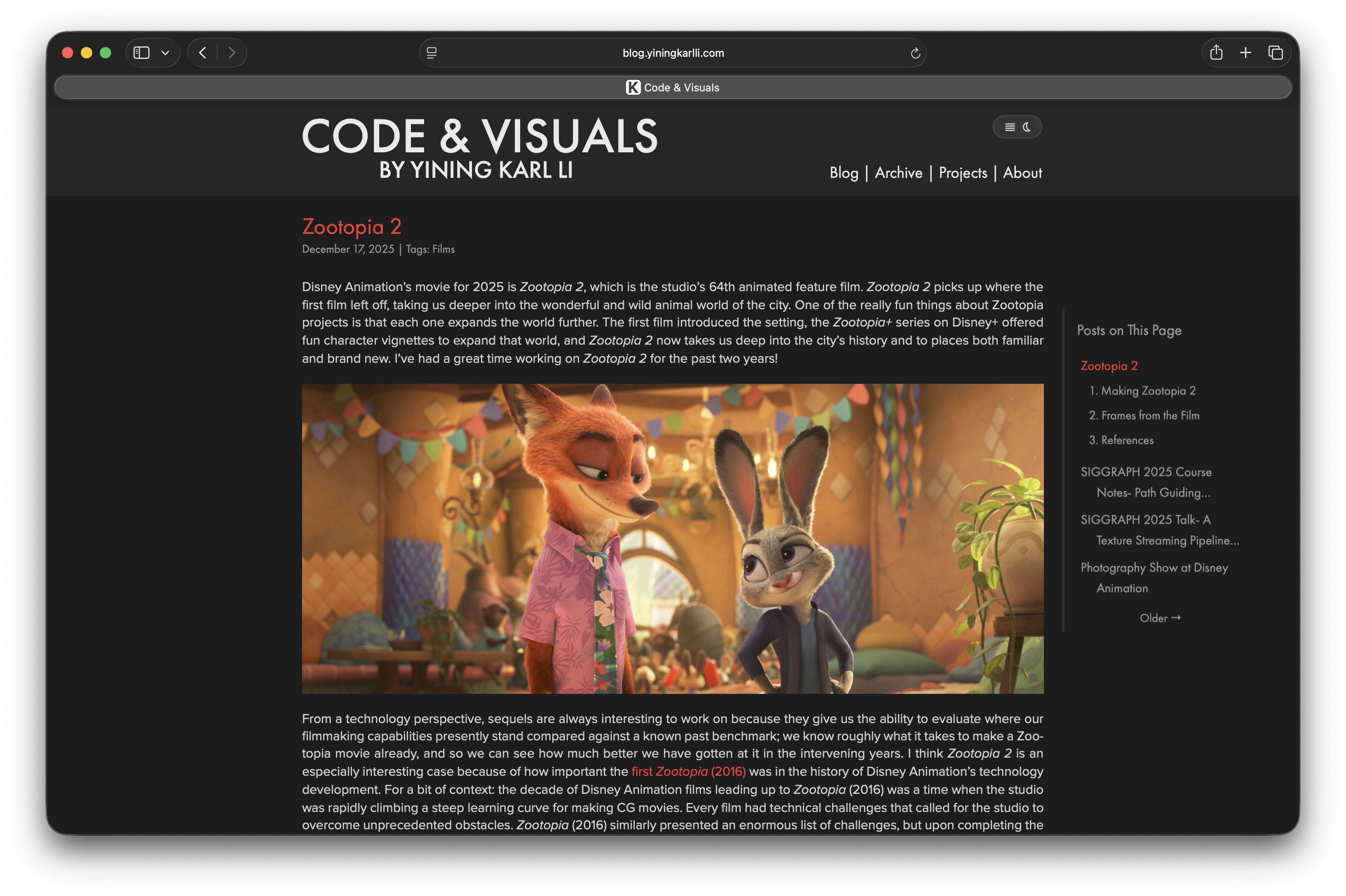
A few years ago I started adding tables of contents to longer blog posts and project pages.
I added the table of contents per post or page as just a section at the very top of the page, using up to three columns depending on how much space was required.
Just sticking the table of contents at the top of each post or page was the simplest possible solution and nicely mirrors print solutions, but I started noticing some sites using a neat pinned sidebar table of contents when the browser window is wide enough.
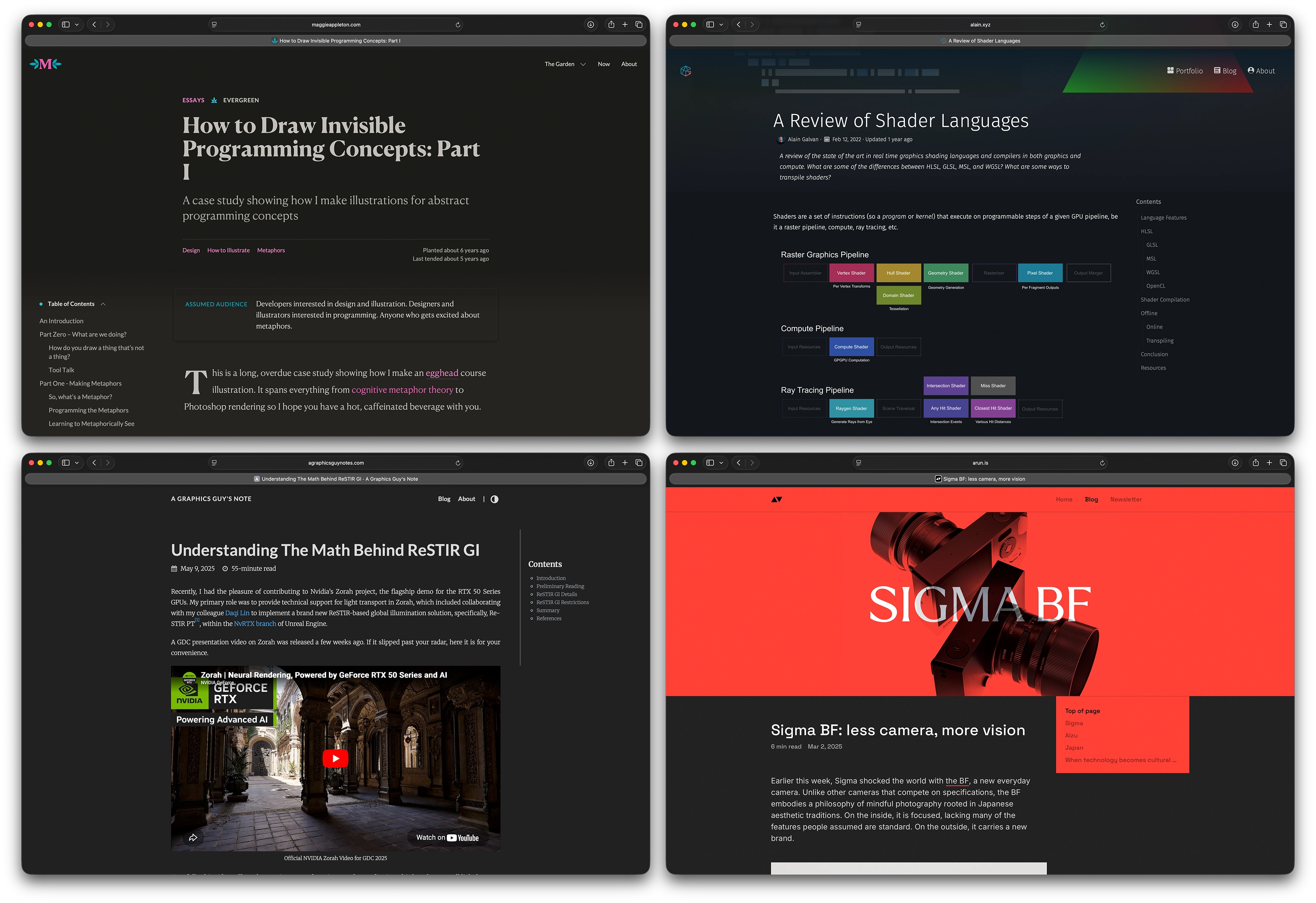
Here are a few of my favorite examples from some blogs that I keep up with:
Figure 4: Four examples of sites with sidebar table of contents implementations that I like and drew inspiration from. Starting from the top left, going around clockwise: Maggie Appleton, Alain Galvan, Arun Venkatesan, and Jiayin Cao.
Another solution I have seen on a lot of sites is a floating sort of combo progress indicator and chapter selector pinned to the top of the window.
I’m personally not a big fan of this approach; typically on desktop monitor, vertical space is at a premium, and on smaller mobile devices, any space at all is at a premium, so taking up valuable vertical space with any kind of floating pinned UI seems wasteful to me.
I got rid of my site’s pinned navbar a few years back for this very reason.
I think most types of pinned floating UI are basically nice to haves when there is enough space, and I think that definitely applies to a table of contents.
Even in ebook readers, the table of contents is a UI element that is typically hidden or tucked away off to some side until needed.
So for my site, my approach is that the sidebar table of contents should only show up and replace the top-of-page table of contents when the window is sufficiently wide enough that there’s plenty of extra space in which we can fit a sidebar in a nondisruptive way.
In narrower windows, the table of contents simply stays at the top of the page.
The design of my sidebar table of contents implementation is pretty simple.
On individual blog posts and project pages, the sidebar table of contents simply lists all of the sections on the page, and the section the reader is currently on automatically gets highlighted in the site’s red accent color.
On multi-post pages, such as the blog’s landing page and chronological back catalog, the sidebar table of contents shows the title of each post on the current page, and expands to include all of the sections for whichever post the reader is currently on.
Any title or section in the sidebar table of contents is truncated after two lines, unless that entry is the active highlighted section, in which case the sidebar table of contents allows the title or section name to be fully expanded out over as many lines as needed.
All of the expands and contracts and entries highlighting and whatnot are carried out with some nice simple animated slides and fades and whatnot.
One of my favorite small details is that if the sidebar table of contents is too tall to fit in the current viewport, the parts of the sidebar that run off of the viewport fade out gradually instead of having a hard cutoff.
Figure 5: Sidebar table of contents reacting to page scroll. To see this video in a full window, click here.
While the design is kept pretty simple, the technical implementation under the hood has quite a bit of complexity to it.
Most of this complexity comes from the sidebar table of contents system having to support effectively three different input data models.
For individual blog posts that already have a table of contents at the top of the post, the system simply has to read the existing table of contents and construct the sidebar from that.
However, for my personal project pages, I don’t have a table of contents at the top of the project pages and I don’t want to add them either because I don’t think having a table of contents at the top fits well with the designed presentation of those pages.
For those pages, the sidebar table of contents system instead has to go through the entire page and pull out all of the major section headings in order to construct the sidebar.
For multi-post pages, the system has to find every post on the page and then for every post that has a table of contents, that information needs to be extracted as well.
Which data model the sidebar system has to run on top of is specified by what class the page’s body element uses.
Figuring out what entry in the sidebar table of contents to highlight as active is done via a custom scrollspy implementation.
For all three page types that can have a sidebar table of contents, the scrollspy system is the same, but with different trigger behavior depending on page type.
For single-post and portfolio pages, the system first builds a list of section DOM elements and their corresponding sidebar DOM link element.
The current scroll position is then used to decide which section is currently active, with active defined as the last tracked section whose top has passed a small threshold from the top of the visible viewport.
For multi-post pages, some extra work is needed: the system first tracks which post is currently being actively viewed by checking which .post class contains the vertical midpoint of the viewport.
Within each post, the same logic that single-post and portfolio pages is used to determine the active section.
To prevent this system from being too computationally intensive to run, the whole system doesn’t run on every scroll event.
Instead, the system is debounced so that it only runs after scrolling has paused for 50ms; otherwise, the system would have to do super expensive DOM reads for every pixel of scroll, which would be super laggy.
The way clicking to smoothly scroll to a section is implemented is that the system requires sections be manually assigned a unique id when I write a post or project page.
When a sidebar table of contents link is clicked, the system figures out the appropriate element id from the link, queries the DOM for the matching anchor div via the usual document.getElementById() call, calculates the offset from the current location to the anchor div, and feeds that into a 300ms jQuery smooth scroll animation.
I originally had clicking on sidebar table of contents links jump immediately to the target section, but felt that the immediate jump was kind of disorienting.
I found that an animated scroll helped a lot, but I didn’t want to make the scroll waste a huge amount of time, so it’s kept basically as fast as I was able to make it without it feeling disorienting as well.
For now the entire sidebar table of contents system is only available when the browser window is at least 1400 pixels wide, which admittedly is pretty wide.
I experimented with various approaches to make the sidebar table of contents work on narrower windows, but doing so inevitably requires either making the body text narrower, making the sidebar narrower, or keeping the widths the same but shifting the body text left off of the center.
I didn’t like any of these approaches; the sidebar is meant to be an additive helper to the body content, but the content really is the focus of the page, not the sidebar nav, so taking away any width from the body content is not the right approach.
For the same reason I also don’t like shifting the main body content off of being centered on the page.
Making the sidebar narrower is the only solution that doesn’t require taking away focus from the body content, but a super narrow sidebar both doesn’t look particularly nice and isn’t very useful as a practical navigation tool.
At some point if I think of a better way to make the sidebar work on narrower and mobile layouts, I’ll extend it to do so, but until then, I’m happy with leaving it as a nice bonus navigation tool when the window is wide enough to be able to afford the space.
HDR Support
Over the past few years, native browser support for displaying HDR images and video has finally started to take off1.
As of writing, the latest versions of Safari and Chrome have extensive support for HDR video playback and for various gain map based HDR image formats; Firefox lags somewhat behind but is starting to implement support as well.
HDR display hardware (Apple calls these XDR displays, for Extreme Dynamic Range) has also been getting more widespread, with most iPhones and flagship Android phones today shipping with 1000+ nit HDR-capable displays, Apple shipping iPad Pros, MacBook Pros, and some desktop displays with 1000+ nit HDR-capable displays, and various other PC companies shipping HDR-capable laptops and displays as well.
Overall, I wouldn’t call HDR display capability universal just yet, but it’s certainly no longer the rarity that it was even five years ago.
With all of that in mind, starting a couple of years ago, I moved my entire photography processing workflow and my entire hobby CG art post-production workflow to be HDR native and now I export both SDR and adaptive HDR versions for all photos and hobby CG art (the details of which I’ll write about some other day).
Last spring when I wrote a post about a small photo show I did, I wanted to try adding an HDR option for readers with HDR display capabilities.
However, at the time, there was a wrinkle to actually displaying HDR images in the browser: while Chrome supported displaying adaptive HDR JPG files natively, Safari didn’t (Safari only gained support with macOS/iOS/iPadOS 26 at the end of last year).
Safari did support HDR videos already though, which provided a (somewhat hacky) opening.
The solution for Safari was to display a single-frame HDR video wherever an HDR image was needed.
I learned this trick from Pixelmator’s development blog, where they used this trick to display HDR images when they announced HDR support in Pixelmator Pro 3.5.
Pixelmator Pro includes a single-frame HDR video export option for HDR images for this specific reason!
Today, newer versions of Safari (version 26 and up) and Chrome (version 1160 and up) support displaying gain-map HDR images in a variety of formats (most commonly JPEG, HEIC, and AVIF), which is a lot nicer and easier to work with than single-frame HDR videos.
So, as of writing, the current version of this site’s HDR display system makes use of gain-map JPEG and AVIF files whenever possible.
However, because these versions (or newer) of Chrome and Safari are still making their way to near-universal adoption, I still also keep a single-frame HDR video fallback path for older browser versions that have HDR video support but not HDR still image support.
So, wherever I want an HDR image, the HTML has to contain three images, each in their own div with a specific label: a SDR still image with div class name sdr, a HDR gain map based still image with div class name hdr, and a single-frame HDR video with div class name hdr-video.
Both HDR options set to style="display: none" by default.
Because just naively displaying HDR images or video on a non-HDR-capable display can result in washed out colors and clipped highlights and stuff, I implemented a simple check for HDR display capability before giving readers the option to enable HDR display on the site.
The check is carried out by simply calling window.matchMedia("(dynamic-range: high)"), which returns whether or not the display the browser window is currently on supports HDR.
If this check fails, the site just falls back to SDR-only display and enables HTML elements with a class attribute of hdr-disabled; this allows for displaying a short message to the reader about HDR display status.
If the check succeeds, then the site displays a toggle for enabling/disabling HDR content.
Under the hood the toggle is just a checkbox, but made to look like a nice round animated toggle-switch entirely through CSS.
The toggle is always there, but by default its style is set to display: none.
I originally considered just making the site always display HDR if the HDR check passes, but I think that giving the option to switch back and forth between the HDR and SDR images is a neat feature for showcasing the difference good HDR color grading makes.
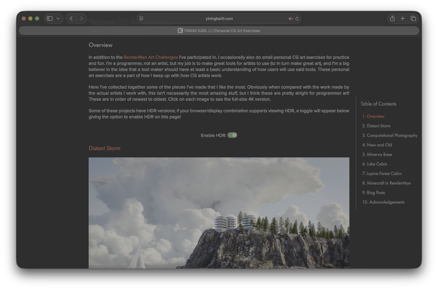
This next screenshot has a HDR version, so here’s the HDR toggle in action:
HDR is not supported on this browser/display.
Enable HDR:
Toggling the switch does two things: first check the browser version in order to determine if HDR images are supported, and then second, based on whether HDR images are supported or not, hide all divs with class sdrand then unhide one of the two HDR divs.
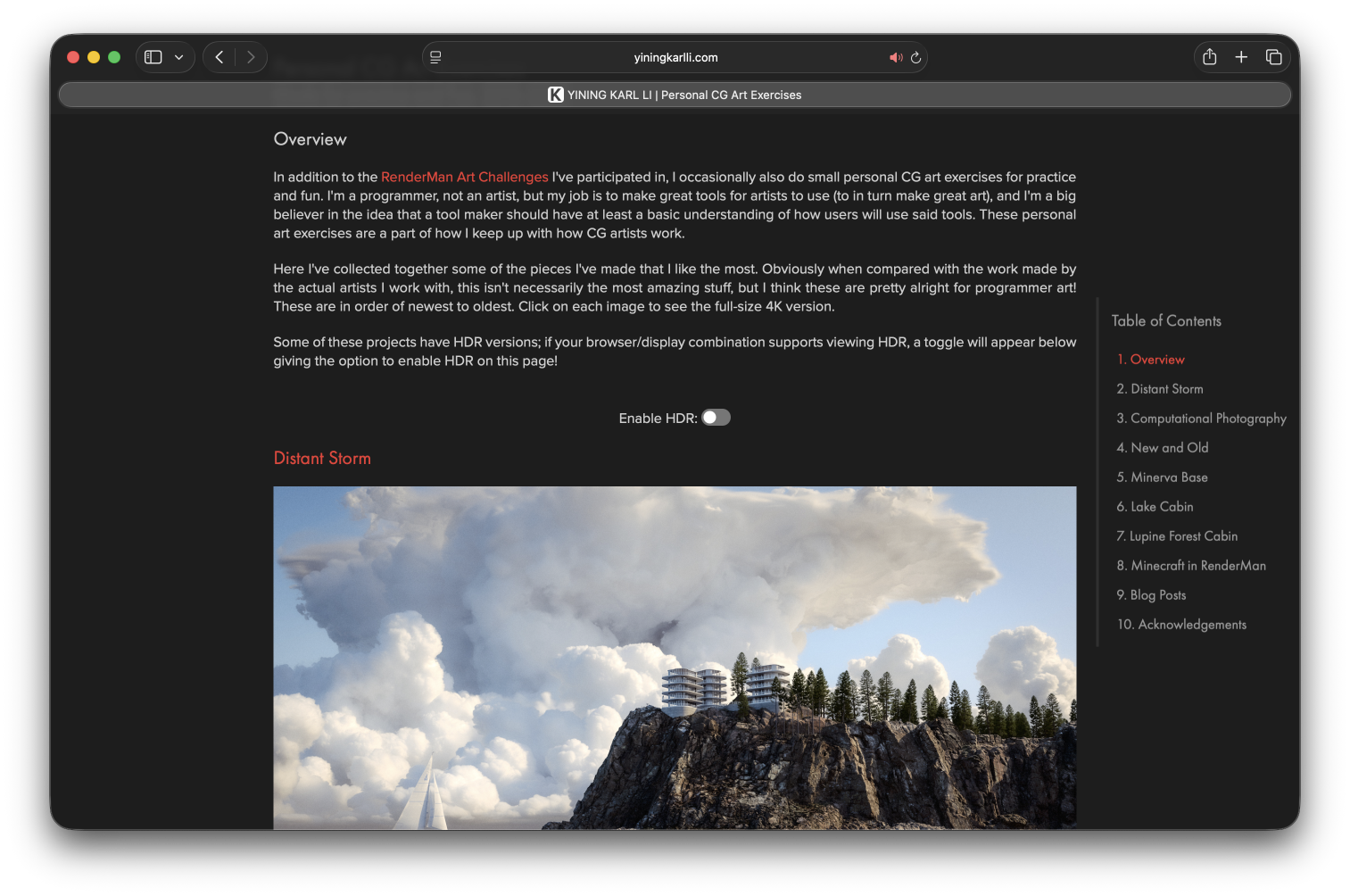
Here is what the switch looks like on my Personal CG Art Exercises project page, in case you are reading on a display that is not HDR-capable:
One trick that I think is pretty nice is that the page will automatically switch between displaying the HDR toggle and the “HDR is not supported” message when the browser window gets moved between HDR-capable and non-HDR-capable displays.
This automatic update is done by listening for change events on the (dynamic-range: high) media query and calling the HDR setup code when the change event does fire, which is triggered when the browser re-evaluates that media query, which in turn is triggered by the user moving the browser window between displays.
I do wish that there was a way to display EXR files directly in a browser, with proper HDR display.
Some Disney Research folks actually did open source an in-browser EXR viewer project called JERI a while back, built from the C++ OpenEXR library using Emscripten, but JERI only displays in SDR and requires exposing up and down to see the full range of data in the EXR file.
As of writing, Chrome also has an experimental feature allowing HDR rendering from within a canvas element, so maybe there’s a path to true HDR EXR display in the browser by extending JERI using HDR canvas rendering.
But that’s an idea for another day; for now, being able to display gain map HDR and HDR video in the browser is already pretty cool!
Knuth-Plass Style Justified Text Layout
The last and, in my opinion most interesting, new feature I added is Knuth-Plass-style justified text.
If you’re not familiar with some of the deeper details of how justified text works, then justified text may not sound like a particularly complicated or interesting feature.
After all, the text-align: justify property has existed in CSS since the very beginning of CSS!
However, for ages now, the conventional wisdom for text layout on the web is to always use left or right justification (depending on language) and never use justified layouts on the web.
The reason most of the web avoids justified text is because, well, justified text as rendered by modern browsers tends to be really ugly.
Justified text on the web tends to mean uneven spacing between different lines, creating typographical “rivers”.
In typography, there’s a concept called “type color” which basically means how dense text appears on a page; justified layouts on the web tend to produce uneven type color, or density, within each block of text:
Figure 7: Left-aligned text in the browser (left side) versus justified text in the browser (right side). Note how the browser justified text has uneven text density from line to line, with some lines have very wide gaps between words leading to typographic "rivers". For a full screen comparison, click here.
Contrast with printed media such as books and magazines which tend to be typeset using QuarkXPress or Adobe InDesign, and with most academic papers which tend to be typeset using LaTeX; these are almost always typeset with justified text.
Unlike the web though, justified layouts in print and academic papers look beautiful, with uniform density throughout:
Figure 8: Justified text as laid out by LaTeX using the Knuth-Plass algorithm. Note the uniform density of text throughout.
The reason justified text on the web tends to look terrible but justified text in print and in LaTeX tends to look great comes down to what algorithm is used to justify the text; not all justified text is created equal!
Browsers use a simple greedy approach to laying out justified text, where words are put into the current line until the next word can’t fit anymore, and then spacing between words in the current line is simply adjusted until the line fills the entire width of the text column.
However, the tradeoff for using a relatively dumb approach to justified text is that the dumb approach by being simple is also really fast, which becomes important for things browsers have to handle such as window resizing (which can force relayout for the entire page) or mixed / variable fonts, which make calculating spacing and widths more challenging.
In more recent browser versions, this simple greedy approach can be somewhat improved by adding the hyphens: auto CSS property.
This property allows the browser’s justified layout algorithm to be a bit smarter; for a word at the end of a line that don’t fit, the browser can try various hyphenation opportunities to break the word across lines.
If no workable hyphenation options are found, then the word gets pushed to the next line.
Using a greedy approach with hyphenation can get pretty far, but can still produce too wide spacing and rivers when hyphenation fails, and hyphenation can fail pretty often in practice.
Figure 9: Naive justified text in the browser (left side) versus justified text with browser hyphenation in the browser (right side). The browser-hyphenated version is better than the naive version, but still exhibits uneven spacing and rivers wherever the simple browser hyphenation strategy fails. For a full screen comparison, click here.
Achieving ideal justified text layout that perfectly balances optimal spacing and hyphenation requires more than a simple greedy approach.
In fact, for some richer document-layout problems such as pagination while factoring in global constraints, the problem can become NP-complete[Plass 1981]; even without sitting down and formally mapping it out, you can see how the optimal text layout problem has structural connections to the Knapsack Problem.
For other more relaxed definitions of perfect the problem isn’t necessarily NP-complete but is nonetheless likely still practically challenging in a reasonable amount of time while still producing good results [Knuth and Plass 1981].
Fortunately, much like how the Knapsack problem can be solved in a good-enough fashion using approaches such as dynamic programming, good-enough solutions exist here too.
Global Optimization Across Paragraphs
The approach that print media and LaTeX use is global optimization across entire paragraphs, instead of greedy local optimization per-line.
One of the more tried-and-true algorithms that is used for global optimization is the Knuth-Plass line-breaking algorithm (yes, that Knuth).
The Knuth-Plass algorithm unifies the justified layout and hyphenation problems into a single algorithm which uses dynamic programming to minimize a global loss function across the entire paragraph [Knuth and Plass 1981], where the loss function mainly scores how much spaces must stretch or shrink, plus penalties for undesirable breakpoints such as hyphenation and consecutive flagged breaks.
Modern variants can add other typographic heuristics for things like avoiding rivers or short last lines.
LaTeX famously uses the Knuth-Plass algorithm by default, and Adobe InDesign and QuarkXPress both implement variations as well.
The tradeoff of the Knuth-Plass algorithm though is that relative to the simple greedy approach, in exchange for being much more sophisticated, Knuth-Plass can be far more computationally expensive to run.
The simple greedy approach has a simple linear runtime complexity of O(n), where n is the total number of breakpoints to consider; in the greedy case without hyphenation, the total number of breakpoints really just means the total number of words since a break can only happen after a whole word.
Knuth-Plass, on the other hand, has a theoretical worse-case complexity of O(n2), and here n breakpoints can be more than just the number of words since words can be hyphenated.
In practice this can be optimized with heuristics to something like O(kn), where k is the number of words per line [Hurst et al. 2009].
Practically this means Knuth-Plass can be close to linear, but that k constant can have a big influence!
This property of Knuth-Plass is the major reason browsers historically haven’t implemented Knuth-Plass justified text; it was considered potentially too computationally expensive.
Knuth-Plass in the Browser
Because browser windows are typically resizable, text layout in the browser has to run fast enough to keep up with a potentially continuously resizing dimensions, whereas in print media and fixed layout PDF files, text layout can be arbitrarily slow because it only needs to be done once.
CSS very recently gained a new text-wrap: pretty property that is meant to further improve browser justified text, but not every browser has support yet at time of writing, and even with this new option, the result still is not a globally optimized result.
As of when I’m writing this post, Blink implements text-wrap: pretty using a version of Knuth-Plass, but only for the last few lines of a paragraph to try to optimize away large gaps and dangling words on the last line, while Webkit implements text-wrap: pretty not using Knuth-Plass but instead using a similar full paragraph lookahead approach.
However, while no browser engine fully implements Knuth-Plass for justified text layout, there are several Javascript implementations floating out there.
Knuth-Plass has a reputation for being somewhat tricky to implement due to its dynamic programming approach, although I think that this isn’t so scary once you get into it.
Admittedly though, I think the original Knuth-Plass paper is a challenging read and while I found it interesting, I had a bit of a hard time building an understanding of the algorithm from the paper.
The original paper isn’t really written like a modern algorithms paper; it is very long, requires a bunch of definitions before getting to the core algorithm, and goes on a lot of detours.
There’s like six entire pages dedicated to a brief history of multi-lingual editions of the Bible; interesting stuff, but definitely somewhat meandering!
There’s a great article by Peter West that somehow both is by far the best summary of the original paper I’ve come across [West 2007] and also is just as inscrutable as the original paper (if not more so) if one is trying to build an understanding of the approach from scratch.
I found that this article by Jacob Smith was a far more useful and approachable guide [Smith 2018]; I referred to this one a lot for this project.
There are already several great Javascript implementations of the Knuth-Plass algorithm out there, and I found that going through these alongside the paper and the Peter West and Jacob Smith articles was really helpful.
How did the people who wrote these implementations do it without having another implementation to consult?
The answer is that they’re probably a lot smarter and more patient than I am!
The two reference implementations that I found to be the most helpful were Bram Stein’s “typeset” project, and Robert Knight’s “tex-breakpoint” library.
Interestingly, Bram Stein’s implementation was apparently done as part of some initial exploration that was done some 15 years ago into implementing Knuth-Plass in Firefox, but evidently this effort didn’t go anywhere.
While these existing implementations were really useful for better understanding the algorithm, I found that just dropping them onto my site and calling it a day wasn’t a viable approach, because in practice these existing implementations don’t have the best performance once applied to real use cases.
Measuring Text Widths in the Browser
There is a fundamental limitation in how Javascript interacts with the browser that makes implementing Knuth-Plass with decent performance challenging.
Knuth-Plass requires measuring text metrics such as the width of individual words, and both of the common ways to do this are pretty expensive.
One approach is to wrap each individual word in its own <span> and then call getBoundingClientRect() on said <span>.
Unfortunately this approach is insanely slow, because calling getBoundingClientRect() on any DOM node forces a layout flush that in practice can often mean a reflow of the whole page: the browser has to synchronously halt Javascript execution, flush all queued CSS changes, and potentially re-render the entire page if invalidation occurred before performing the measurement needed to return an answer to getBoundingClientRect().
Doing this for every single word in a paragraph means potentially hundreds of reflows just to get the basic information needed to run the Knuth-Plass algorithm; this is already bad enough, and then for really long pages this process may need to be repeated for dozens to hundreds of paragraphs.
The other main approach to measure text widths in Javascript is to use the Canvas API’s measureText() function, which under the hood works by directly calling the browser’s font engine, bypassing the need to do super slow DOM reflows.
However, the measureText() approach comes with a major catch: while in theory the measured width from measureText() should match the result from getBoundingClientRect(), in practice this may not be true!
These two approaches use fundamentally different codepaths under the hood, and differences in subpixel character rendering and font kerning and ligature rendering and such can mean the results from the two approaches can drift [Gündel 2018].
Over time this has gotten better; as of writing, the latest versions of Chrome (Blink) and Safari (Webkit) both mostly give pretty closely matching results with occasional mismatches, but Firefox (Gecko) still exhibits considerable drift.
Even though the differences are typically relatively minute per word, the drift can accumulate over many many words, leading to significant discrepancies between what we think word widths are via Canvas measurement versus how they are actually laid out in the DOM, and when used for Knuth-Plass, this means our justified text might not line up perfectly, or hyphenation choices can be made incorrectly, or any other number of issues.
I’ve always liked the look of Knuth-Plass justified text way more than the left-aligned standard on
the web; I’ve always found books and magazines and academic papers laid out this way to have much more pleasant visual and reading experiences than long-form text on the web.
I had at various points in the past considered trying to implement Knuth-Plass justified text on my own in Javascript on my site, but I never did because of the above practical challenges.
Then, earlier this year in March, Cheng Luo released a new library called Pretext, which inspired me to come back to this idea.
The Pretext library does two things: first, it implements a really fast path for accurately measuring text widths that bypasses touching the DOM, and second, it implements a really fast layout path that is purely arithmetic based and therefore also bypasses touching the DOM.
The measuring step is built on top of measureText(), but crucially is quite a bit smarter than just calling measureText() per word.
Instead, Pretext calls measureText() at grapheme resolution to account for ligatures and kerning, applies browser engine specific fit tolerance adjustments, and also encodes/applies a bunch of browser-specific text analysis rules before carrying out measurement, which makes sure that the segmentation measurement uses matches the browser’s layout engine.
Pretext’s measuring system notably also supports a dizzying array of different languages and even emoji characters, all of which present their own complications to measurement.
All of these are tuned using a brute force validation system, which gives Pretext a super high degree of accuracy for matching to what the DOM is really doing.
Pretext does all of this once per prepare() call and caches everything.
Using the cached measurements, Pretext is then able to run custom text layout extremely quickly by calculating line breaks using pure arithmetic; you give Pretext the line dimensions that you want, and Pretext will just add up word widths and spaces until it overflows the maximum line width, upon which a line break is placed.
No individual piece of Pretext is necessarily a new idea (in fact, the two libraries I mentioned earlier use a simpler version of the same measureText() approach Pretext uses [Stein 2012, Knight 2018]), but Pretext combines it all into a single, easy to use, super powerful library.
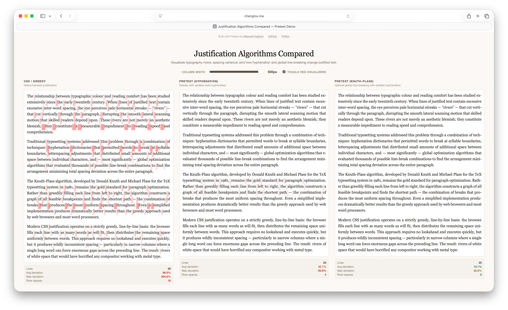
Figure 10: Pretext demo comparing browser-default greedy text justification, greedy text justification with hyphenation, and Knuth-Plass style justification.
There are a whole bunch of cool flashy demos of what can be done with Pretext, but the one demo that really caught my eye was… a small implementation of Knuth-Plass styled text justification using Pretext’s measurement system!
Seeing this demo made me realize that using Pretext’s fast width measurement and caching implementation, I could probably build a usable Knuth-Plass styled justified text layout engine.
Actually, the really important insight that this demo unlocked is that I don’t need a full implementation of the Knuth-Plass algorithm; instead, I just need to implement enough ideas from Knuth-Plass to get good looking justified text layout for my specific needs, and I could ignore any other part of the algorithm that I don’t need.
The Pretext Knuth-Plass demo does exactly this: it implements quite a lot of the full Knuth-Plass approach, but not all of it; only enough for the demo is actually implemented.
So, the idea I settled on was: instead of trying to retrofit one of the existing Javascript Knuth-Plass libraries onto my site and make it performant, I instead would try to build a minimal Knuth-Plass inspired solver on top of Pretext, implementing only what is absolutely needed while simplifying as much as possible to keep performance reasonable.
My Implementation Part 1: Overall Structure, Segmentation and Measurement
The layout system the site now uses is built around a couple of key ideas and takes advantage of several key in-built assumptions around how my site works.
The single most important concept that the system is built around is independent paragraph-level solves with a progressive scheduler.
Since my writing style tends to use relatively short paragraphs, solving text layout for individual paragraphs in my writing is pretty fast even with a more complex algorithm.
So, the way my layout system works is: on page load, the system goes through and segments all body text into individual layout work units, with each unit being essentially a paragraph (or in the case of captions and other things, potentially smaller chunks of text).
All body text starts as left-aligned but is hidden on load, to prevent visible flashing as paragraphs are laid out and re-rendered.
After body text has been segmented into work units, the work units are placed into a waiting queue to be processed; paragraphs that are in the visible viewport (plus some buffer above and below the viewport to account for differences in final paragraph height between left-aligned and our custom justified layouts) are marked and placed at the head of the queue.
The layout system then flushes, solves layout for, and renders, and unhides as many paragraphs as it can from the queue in an 8ms frame budget before returning control to the browser and then picking up where it left off on the next frame.
Because the system always returns control to the browser every 8ms, resizing the browser window remains completely smooth and doesn’t visibly stall while waiting for text layout to finish running.
When the browser window does resize, existing layout work is halted, and the entire queue is discarded and rebuilt with ordering recalculated to place whatever is now in the resized viewport at the highest priority in the queue.
Even on my 12 year old 2014 11 inch MacBook Air, with the browser window taking up the entirety of a 4K external display, this approach allows my website to run custom text layout and justified text rendering in the visible viewport with essentially zero visible lag or flicker.
Text layout and rendering for the remaining text outside of the viewport can take a bit longer, but even for the longest posts on my blog, the system typically finishes laying out and rendering the entire post within at most a few hundred ms.
Here is what my system produces compared with the browser-native greedy approach with hyphenation; I think my system’s result is considerably nicer than the greedy approach even with hyphenation.
Figure 12: Browser-native greedy justified text layout with hyphenation (left side) versus my custom Knuth-Plass style justified text layout (right side). For a full screen comparison, click here.
Text layout and rendering happens in three distinct phases: text segmentation and measurement, the core layout solver, and then rendering back into the DOM.
There are two segmentation and measurement frontends, which both feed a single unified Knuth-Plass style solver, and then there are three different rendering backends depending on the complexity of the individual paragraph being processed.
Any combination of frontend paths and backend rendering paths can be used together, since everything routes through the same common solver in the middle.
Originally my plan was to just use Pretext for all text segmentation and measurement; after all, Pretext implementing everything needed for a good, fast segmentation and measurement system was the whole reason I decided to try implementing this system!
However, as of when I’m writing, Pretext has a hard requirement that all input text be the same size and font and be plaintext: no fancy CSS decorations or whatnot applied.
This requirement means that paragraphs containing mixed fonts or styles, inline boxes, and whatnot cannot run through Pretext for segmentation and measurement.
For most paragraphs on my blog, this requirement is not a problem, but on occasion I do have paragraphs that contains some bold or italicized text, or contains embedded code snippets which use an inline box style combined with a monospace font (Berkeley Mono) instead of the standard body text font (Proxima Nova).
For these paragraphs, I wound up implementing my own segmentation and measurement fallback codepath.
This fallback path broadly basically looks like a slower, dumber, but more general version of Pretext’s segmentation and measurement system; Pretext uses Javascript’s built in Intl.Segmenter system for smart locale-aware text segmentation, whereas the fallback path just does a simple white-space delimited word-level segmentation strategy.
I found that the fallback path being slower generally was not a major problem since the vast majority of the paragraphs I write are plaintext and therefore can run through the faster Pretext path; being able to take advantage of inbuilt assumptions like this is one of the nice advantages of building something that is specifically tailored to only me!
My Implementation Part 2: Core Dynamic Programming Solver
I call the solver at the center of my system “Knuth-Plass styled” instead of just “Knuth-Plass” because it implements the high level scoring and dynamic programming approach that Knuth-Plass does, but differs in a lot of details and simplifies or just outright ignores some stuff that I found I didn’t need.
The Knuth-Plass algorithm is characterized by a couple of important properties.
The first property is the scoring system for evaluating line break candidates.
In the greedy approach, the way scoring effectively works is that the algorithm is trying to minimize the difference between the maximum line length and current line length by appending words to the current line, but without ever going over the max line length.
In Knuth-Plass, there still is a maximum line length, but there’s also an ideal line length that is something less than the maximum line length.
The maximum line length still serves as a hard cutoff, but the specific value Knuth-Plass is trying to minimize is the square difference between the current line length and the ideal line length; going over or under the ideal line length by some amount is okay and even preferred sometimes.
In both cases, after a line break has been found, then spacing is added or removed to the line to get its length to match the maximum line length.
In the greedy approach, making successive lines as close to optimal as possible tends to then result in a line that severely underrun the maximum line length, requiring wider spacing to be added in, while Knuth-Plass by having a range of acceptable lengths, may not ever pack any given line as optimally as the greedy approach can, but on a whole will keep packing more even across all lines.
However, achieving this property efficiently requires the second key property of Knuth-Plass: dynamic programming.
Dynamic programming is a fancy sounding name that you probably remember from algorithms class, but in the Knuth-Plass case it actually refers to something relatively straightforward.
To find the best set of line breaks for a paragraph, the obvious approach is to find all possible candidate line breaks, score all of them using “demerits”, and then pick the lowest scoring set of line breaks.
In the Knuth-Plass algorithm, this step is done using a recurrance relationship: for a given candidate breakpoint j, the best way to reach j is from the best previous breakpoint i, plus the cost of making the text from i to j into one line, where cost is defined by some badness metric.
So, starting from the beginning of a paragraph, Knuth-Plass finds a set of feasible next breakpoint candidates, scores them, and then for each of those candidates, finds the next set of feasible breakpoints, and so on and so forth until the end of the paragraph is reached.
Then, the algorithm walks backwards from the end of the paragraph to construct the lowest score walk back to the start of the paragraph, which gives the final set of line breaks.
Unfortunately, the number of combinations of all possible breaks in a reasonably-lengthed paragraph is absolutely vast, and made even more so if the segmentation granularity is small enough to allow for things like hyphenation.
Naively, as discussed earlier, trying every previous breakpoint i for every later breakpoint j produces quadratic runtime complexity.
The clever bit in Knuth-Plass is how it sidesteps this problem.
In the original paper, Knuth and Plass observe that if a line from i to j already is too long to fit into a single line, then all future lines as j advances will also be too long, so i can be culled entirely from further consideration.
The remaining candidate breakpoints that can still produce valid paths is called the active list.
By detecting and culling impossible paths, Knuth-Plass brings the runtime complexity down to close to linear in practice.
My implementation uses the same active list solver based dynamic programming approach from the original paper along with a somewhat simplified version of the same demerit system, but takes a lot of liberties with the scoring system.
A major simplification I made is in dealing with the concept of “glue”.
Knuth-Plass thinks of paragraphs as being composed of boxes, glue, and penalties, where boxes are fixed-width things like words, glue are flexible spaces that can squash and stretch, and penalties are optional breakpoints such as hyphens that incur a penalty cost.
The full Knuth-Plass algorithm treats each glue component as capable of independent squash and stretch, whereas in my implementation, all spaces across the same line are treated as always uniform in width.
Another major simplification (really omission) is in fitness classes.
Knuth-Plass buckets lines into fitness classes based on how tightly or loosely packed they are and factors this into calculating demerits; I just… completely ignore this.
For applications like packing text into non-uniform-rectangle shapes (such as for flowing around figures), this fitness system is pretty important to maintaining even density across paragraphs, but I found that for my use case, which is only ever rectangular paragraph blocks, not having it generally still produces decent results and simplifies the implementation a bit.
Some other major differences are in how my implementation deals with last-line behavior and hyphenation.
In my system, no attempt is made at all to get the last line in a paragraph to be justified (but it must still fit in the maximum line width), whereas Knuth-Plass puts in a best effort to keep the last line justified if possible.
Also, Knuth-Plass uses a fancy pattern-based hyphenation system, whereas mine just uses a pile of hacked-together heuristics along with a manual override list for specific words that I’ve found to be problematic.
In the rare cases where the solver fails to find a good justified layout for the paragraph, I implemented a retry system that loosens various thresholds and attempt layout again, and repeats a few times with successively looser requirements.
If still no solution is found after several retries, the system simply gives up and falls back to the default left-aligned layout for the paragraph.
I don’t have any specific metric or system for detecting and preventing typographic rivers, but I found that generally when the solver finds a good layout, simply by nature of the layout being relatively evenly packed, rivers tend not to be a problem.
In general I think one particularly neat thing about the Knuth-Plass algorithm is how amenable it is to being adjusted and tweaked; the core concepts hold up even when a lot of the implementation details are changed and moved around.
The original version of the algorithm was meant for static text layout in TeX, but I’ve found that with my simplifications, it works great for my site as well.
Another cool example I ran across is a set of adaptations to make Knuth-Plass work for finding line breaks for music notation with lyrics [Crow 2026].
Indeed, Donald Knuth has stated before that he both expected and intended for the algorithm to be changed and extended to suit different needs.
My Implementation Part 3: Rendering Back Into the DOM
After finding an optimal set of line breaks using the solver, the last remaining step is to render the results back into the webpage’s DOM.
My system has three different rendering paths, named roughly for how each one works: “line clone”, “tree replay”, and “inline flow”.
All three rendering paths take the same input, which is just the output from the Knuth-Plass style solver, and the main thing that must be done is find a way to map solver-space word and line break positions back into DOM-space.
Also, all three paths begin on a normalized version of the text that was captured during the segmentation and measurement step.
The choice of which rendering path to use is made on a paragraph by paragraph basis.
The “line clone” backend is the simplest and fastest of the three backends; it only operates over plain text and takes advantage of a plain text assumption to be really simple and fast.
Since most paragraphs on my blog are plain text, this backend is by far the most commonly used one.
This backend builds a text-node index over the original DOM, maps each solved normalized line range back to raw textContent offsets, creates a DOM Range, clones that range with range.cloneContents() (hence the “line clone” name), wraps the clone in a custom span, and appends one span per solved line.
Spacing is handled using CSS’s word-spacing property with widths calculated by the solver, and CSS is also used to make sure each line doesn’t accidentally wrap.
The “tree replay” backend is most capable backend, but is also by far the most complex and slowest.
This backend supports paragraphs that have inline markup, links, mixed fonts, and so on and so forth.
Before rendering, this backend snapshots the entire DOM tree for the paragraph and builds normalized-text boundary arrays to track where inline elements begin and end and if their range spans a normalized boundary.
The backend then rebuilds the paragraph from the normalized text and boundary information by walking every normalized boundary, appending hyphens as needed, closing inline elements whose ranges end at a boundary, inserting breaks, opening new inline elements whose ranges need to start again after a break, and insert spaces as needed.
As you can see, this backend is named “tree replay” because it replays the entire process of constructing the paragraph’s DOM tree, modified to account for our solved line breaks.
The most important reason for going to all of this effort is to preserve a continuous inline tree across inserted line breaks; without this property, a link that spans lines will get broken into two separate links (one on each side of the break), whereas with this approach, links correctly stay as one single link when spanning lines.
Keeping links as a single link across lines may seem like a small detail, but I found that the alternative feels really bizarre; when I hover my mouse over a link, I expect the whole link to get highlighted across lines; I don’t expect only the part of the link on the current line to get highlighted!
The “inline flow” is essentially a much simpler version of the “tree replay” backend.
Instead of rebuilding the entire DOM tree, this backend keeps the existing tree and replaces only text nodes by walking each original text node character by character while mapping solver offsets to normalized offsets, and then inserts breaks where needed and inserts fixed width spans wherever spacing adjustments are needed.
This approach solves the same multi-line link preservation issue that the “tree replay” backend does, but this approach only works for links.
So, this backend is essentially a fallback path that only works for paragraphs that, other than having links, are otherwise all plaintext.
Actually, because this backend involves so much DOM churn, in practice “tree replay” is often faster than this backend unless the paragraph is really short, so this backend is not really used that much at all.
It’s only around because I implemented it before I implemented the “tree replay” backend, and I’ll probably eventually remove it whenever I get around to it.
My Implementation Part 4: Fallbacks and Debugging
One minor downside to the way all three rendering backends work is that they all break text selection.
Text selection and copy/paste still mostly works (as opposed to if I had used a pure canvas-based solution), but because the layout is enforced using tricks such as fixed-width spans and hard <br> tags, copied text may not flow correctly when pasted into an editor.
I’m not really worried about this downside since the primary goal was to build a good visual reading experience, but as a fallback in case a user really does want to select and copy/paste text, I added an option in the site’s settings pill to switch between a normal vanilla left-aligned layout and the fancy custom Knuth-Plass style justified layout.
Since the left-aligned mode isn’t doing any custom layout work under the hood, selection and copy/paste work as they normally do.
Figure 13: Left-aligned text (left side) versus my custom Knuth-Plass style justified text layout (right side). For a full screen comparison, click here.
For now left-aligned is also the final fallback behavior for paragraphs that the custom layout system fails on for whatever reason.
I suppose falling back to browser-native greedy justification with hyphenation would probably be more visually cohesive, but I find having a more visually jarring last-resort fallback path to be more useful for quickly spotting when this happens so that I can go debug it.
In practice this doesn’t happen really at all anymore anyways.
Another small downside is that for links that span across a line break, the “tree replay” system breaks how underlines on mouse hover work.
Because of this quirk, for links that span line breaks, I have a small amount of custom CSS that recreates the underline on hover.
On Chrome and Firefox, the result is pretty much seamless, but on Safari, there’s a small downside.
Safari handles underlines in a slightly more fancy fashion; on Safari, underlines have gaps whenever a text descender overlaps the underline.
I don’t have a way to easily recreate this effect via CSS, so my recreated underlines on Safari look subtly different from native Safari underlines.
I think this is an acceptable drawback for now though; maybe at some point I’ll revisit this issue.
To help with debugging, I also built a small visualization and debug tool.
This tool is just an extra script that, when active, draws boxes around each independent work unit considered by the layout system and marks what combination of measurement/segmentation codepath and backend rendering codepath were used for that work unit.
In the event that a paragraph fails layout, the debug tool shows the reason why layout failed and any relevant debug output or errors.
Here is what the debug tool looks like in action:
Figure 14: The debug and interactive setting editor mode for my Knuth-Plass style justified text layout system. The combination of segmentation/measurement frontend and DOM rendering backend for each paragraph is displayed, along with spacing visualization and highlighting for any specialized text that is forcing use of the slower custom frontend.
The debug tool also has a basic set of sliders to interactively tune the various different heuristics, settings, and thresholds that drive the whole system.
I found that having an interactive tuning mode was really useful when I was trying to adjust the spacing to work well on smaller, narrower mobile layouts.
I didn’t put really any effort into optimizing the debug tool, so it definitely chugs a bit when running.
However, it’s not served up as part of the published site, so I didn’t worry about it.
The published site serves all Javascript in minified form with debug utilities and such either stripped or blanked out.
Overall the entire custom justified text layout system works a lot better than I had dared hope it would, and even on pretty old hardware it is usably fast.
Even with the layout system, I measured that my site still loads far faster than most big popular websites do.
That being said, I’m still feeling out how the site looks and feels with the justified text layout on by default; it still feels like an awful lot of code and computation just for some nicely spaced text.
I currently think there’s maybe a 60% chance that by the end of the year I’ll still have it as the default; we’ll see!
Conclusion
Over the past few years I’ve slowly been dragging this site’s layout and design into something vaguely up to date with modern standards, while trying to keep things reasonably performant and without going overboard with superfluous design elements and such.
I’m pretty happy with this latest set of changes; for me, a lot of the point of having a personal site is to have a place that I can make work exactly the way I want it to and sweat all of the tiny little details, no matter how insignificant.
The Knuth-Plass style justified text definitely falls into that “sweat the details” category, especially given the huge amount of effort it took when weighed against the reality that likely most readers won’t even notice it (but I notice it!).
With this latest set of changes, I think I’ve gotten things to a place where I can leave it alone for a while.
Who knows though; last year I said the same thing and as this post proves, that didn’t turn out to be true at all.
For me, working on personal website stuff is always a weird tradeoff between wanting things to work well and look nice versus the fact that I do not really enjoy doing web programming stuff.
Everything in the web space just feels way more complicated than it has any reason to be, and that’s saying something given my day job.
I also don’t consider myself to be particularly good at web stuff because it’s just not something I spend a lot of time doing except for every once in a while when I get back around to fixing up my site.
For the sidebar table of contents, dark mode, and Knuth-Plass style justified text layout implementations, I thought I’d give Codex and Claude Code a try, since those tools have been all the rage recently.
I’m deeply skeptical of generative AI for image and video generation and things like that, but for code assist, I thought it looked interesting enough to give it an initial try on something low stakes like personal website stuff.
Porting my portfolio site to use the same layout and stylesheet as my blog site was a great first test for Claude Code; I spent an early Saturday morning to do an example port of one page by hand, pointed Claude Code at the example as a template and set it up with Playwright, walked away to go spend the day playing with my daughter, and came back after her bedtime to find the whole port done.
After checking through everything and fixing a few small things that Claude missed, everything was good to go for moving on to the dark mode implementation.
For the Knuth-Plass style text layout implementation, out of curiosity, I initially tried just letting Claude and Codex attempt to one-shot the whole thing, and the result for both was a complete disaster.
They both certainly produced something, but both results barely worked, were filled with all kinds of weird bugs and quirks, and had absolutely atrocious performance.
I guess I wasn’t super surprised by this, but at the same time, it was interesting to see how far they got on their own.
For the actual implementation, I took a far more conservative approach; I wrote out the entire algorithm myself as essentially pseudocode so that I wouldn’t have to worry about Javascript syntax and details initially, then translated this initial pseudocode into working Javascript using manual coding for some parts and AI code assist for other parts, and then iterated a bunch on top of that.
For parts that I implemented manually, I still found it useful to be able to ask the AI assistant for help when I couldn’t remember or didn’t know how some specific Javascript or DOM thing worked.
This approach generally produced reasonable results, but I had to check every line myself to make sure things stayed reasonable.
There’s quite a lot of debate online about Codex versus Claude, but at least for this project I found them to be pretty much interchangeable in terms of results when using models with similar capability levels.
I found using AI code assist in this way to be pretty helpful; I certainly finished the project quite a bit faster than I would have otherwise (although still way slower than the AI vibe-coding enthusiasts claim possible), and I learned quite a lot through the process.
I suppose one could argue that I could have learned even more had I just ground against the project without using AI tools, but I think the likelier outcome is that I just wouldn’t have bothered doing this project at all.
My goal here wasn’t to spend all of my time mastering web programming stuff; my goal was just to build what I wanted to build in the vanishingly small amount of free time that I now have outside of all-important family time.
On a whole though, my feelings are mixed on AI code assist; taken in isolation, the technology is undeniably useful and is a good tool to have available, but using AI code assist responsibly takes far more care and thought than the loudest AI enthusiast voices would have you believe.
In my opinion there’s a huge amount of AI psychosis going on out there leading to some wildly silly takes by tech folks.
Also, the larger overwhelmingly negative societal impacts of the generative AI industry loom large.
I’m not above using AI code assist to help with developing infrastructure for my site, but I refuse to use it for generating the actual content of my site.
On my site colophon I’ve had a guarantee for a while now that the text, images, and general content of this blog will never be made by AI; if you’re going to take the effort to come here and read what I’ve written, then I will take the effort to make sure that what you are reading is in fact written by me.
I don’t have any plans for or interest in making all of the things described in this post into a proper open-source project or library or npm package or whatever.
Everything here really falls under the category of houseplant programming[Robertson 2025], which is to say, it’s all custom tailored for only my site and is really closely coupled with the specifics of my site (especially the Knuth-Plass style justified text layout system, which has a ton of site-specific hardcoded dependencies and assumptions).
I built it all just for me.
However, if you did want to take a look at how things are implemented out of curiosity, I’ll always keep a copy of the non-minified latest versions around under a MIT license.
Feel free to poke around and borrow/repurpose things for your own use, but I’m not going to provide any support or a proper repo for any of this stuff.
Here are the non-minified files, but be warned that it’s likely not the best Javascript you’ve ever seen.
I think the code is still better than pure vibe-coded spaghetti, but given that I’m not a very good Javascript programmer and that this is all houseplant code, it may not be better by much:
custom.js: implements most of the site’s core functionality
pretext-layout.js: implements the Knuth-Plass style justified text layout system. The name is a bit of a misnomer; it started as just some experiments on top of the Pretext library before growing into its own thing, but I never changed the name.
pretext-spacing-visualizer.js: implements optional visualization and debug utilities for the Knuth-Plass style justified text layout system.
Okay, that’s pretty much all I can think of to write about this latest set of website updates.
On one hand I’m pretty happy with where the site’s design and layout is now and there’s not much more I can think of that I want to tweak on the site for now, but on the other hand, I thought the same thing the last few times too.
So who knows; we shall see!
Nathan Hurst, Wilmot Li, and Kim Marriott. 2009. Review of Automatic Document Formatting. In DocEng 2009: Proceedings of the 9th ACM Symposium on Document Engineering. 99-108.
Robert Knight. 2018. tex-breakpoint. Retrieved May 20, 2026.
Donald E. Knuth and Michael Frederick Plass. 1981. Breaking Paragraphs into Lines. Software: Practice and Experience 11, 11 (Nov. 1981), 1119-1184.
1 By HDR, I mean images and video that have brights that go beyond the maximum 1.0 brightness in SDR images and videos, as opposed to the thing where highlights and shadows from multiple exposure brackets are blended into an HDR image and then tone-map back down into a single SDR image. So, by HDR, I mean gain-map based photos (what Apple calls Adaptive HDR and Google calls Ultra HDR), and things like Dolby Vision and HDR10/HDR10+ video.
keyboard_return
Disney Animation’s movie for 2025 is Zootopia 2, which is the studio’s 64th animated feature film. Zootopia 2 picks up where the first film left off, taking us deeper into the wonderful and wild animal world of the city.
One of the really fun things about Zootopia projects is that each one expands the world further.
The first film introduced the setting, the Zootopia+ series on Disney+ offered fun character vignettes to expand that world, and Zootopia 2 now takes us deep into the city’s history and to places both familiar and brand new.
I’ve had a great time working on Zootopia 2 for the past two years!
From a technology perspective, sequels are always interesting to work on because they give us the ability to evaluate where our filmmaking capabilities presently stand compared against a known past benchmark; we know roughly what it takes to make a Zootopia movie already, and so we can see how much better we have gotten at it in the intervening years.
I think Zootopia 2 is an especially interesting case because of how important the first Zootopia (2016) was in the history of Disney Animation’s technology development.
For a bit of context: the decade of Disney Animation films leading up to Zootopia (2016) was a time when the studio was rapidly climbing a steep learning curve for making CG movies.
Every film had technical challenges that called for the studio to overcome unprecedented obstacles.
Zootopia (2016) similarly presented an enormous list of challenges, but upon completing the film I felt there was a stronger sense of confidence in what the studio could achieve together.
A small anecdote about Zootopia (2016) that I am very proud of is that at SIGGRAPH 2017, I heard from a friend at a major peer feature animation studio that they were blown away and had absolutely no idea how we had made Zootopia.
Ever since then, the sense in the studio has always been “this movie will be hard to make, but we know how to make it.”
This isn’t to say that we don’t have interesting and difficult challenges to overcome in each movie we make; we always do!
Our studio tools and pipeline are constantly evolving to meet new challenges, to the point where the Zootopia 2 era studio pipeline is almost unrecognizable when compared with Zootopia (2016), despite being descended from Zootopia (2016)’s pipeline; I’ve written about this a lot in past posts for Moana 2 and Encanto.
But, ever since Zootopia (2016)’s completion, I think we’ve been able to approach the challenges in each movie with greater confidence that we will be able to find solutions.
The major technology challenges on Zootopia 2 ultimately were pretty similar to the challenges on Zootopia (2016): everything is about detail and scale [Burkhard et al. 2016], just pushed even further on Zootopia 2.
The world of Zootopia is incredibly detailed and visually rich, and that detail has to hold up at scales ranging from a tiny shrew to the tallest giraffe.
Most characters are covered in detailed fur and hair, and because the setting is a modern city, shots can have hundreds or even thousands of characters on screen all at the same time, surrounded by all of the vehicles and lights and zillions of other props and details one expects in a city.
Almost every shot in the movie has some form of complex simulation or FX work, and the nature of the story takes us through every environment and lighting scenario imaginable, all of which we have to be able to render cohesively and efficiently.
Going back and rewatching Zootopia (2016), I still notice how much incredible geometry and shading detail is packed into every frame, and in the nine years since, our artists have only pushed things even further.
To give an example of the amazing amount of detail in Zootopia 2: at one point during production, our rendering team noticed some shots that had incredibly detailed snow with tons of tiny glints, so out of curiosity we opened up the shots to see how the artists had shaded the snow, and we found that they had constructed the snow out of zillions upon zillions of individual ice crystals.
We were completely blown away; constructing snow this way was an idea that Disney Research had explored shortly after the first Frozen movie was made [Müller et al. 2016], but at the time it was purely a theoretical research idea, and a decade later our artists were just going ahead and actually doing it.
The result in the final film looks absolutely amazing, and on top of that, instead of needing a specialized technology solution to make this approach feasible, in the past decade both our renderer and computers in general have gotten so much faster and our artists have improved their workflows so much that a brute-force solution was good enough to achieve this effect without much trouble at all.
Another great example of a place where artists on Zootopia 2 went with brute force geometry instead of an easier but ultimately lower quality solution is in Gary De’Snake’s scales.
Early on the show, tests were done with making Gary’s scales using a purely texture-based approach, but the show eventually decided to go with fully geometry-based scales, which looked and behaved far more convincingly and held up far better up close [Stratton et al. 2026].
Of course, all of these brute force geometric solutions meant that in terms of sheer data, Zootopia 2 was a far larger project than Zootopia (2016), leading to work outside of rendering to beef up the studio’s ability to efficiently handle tons of huge-scale data [Vinson et al. 2026].
One of the largest rendering advancements we made on Zootopia (2016) was the development of the Chiang hair shading model, which has since become the de-facto industry standard for fur/hair shading and is implemented in most major production renderers.
For Zootopia 2, we kept the Chiang hair shading model [Chiang et al. 2016] as-is, but instead put a lot of effort into improving the accuracy and performance of our hair ray-geometry intersection algorithms.
Making improvements to our ray-curve intersector actually took a large amount of close iteration with our Look Development artists.
This may sound surprising since we didn’t change the fur shader at all, but the final look of our fur is an effect that arises from extensive multiple-scattering between fur strands, for which small energy differences that arise from inaccuracies in ray-curve intersection can multiply over many bounces into pretty significant overall look differences.
In an original film, if the look of a character’s hair drifts slightly during early preproduction due to underlying renderer changes, generally these small visual changes can be tolerated and factored in as the look of the film evolves, but in a sequel with established characters that have a known target look that we must meet, we have to be a lot more careful.
I’ve been lucky enough to have gotten to work on a wide variety of types and scales of projects over the past decade at Disney Animation, and for Zootopia 2 I got to work on two of my absolute favorite types of projects.
The first type of favorite project is the ones where we get to work on a custom solution for a very specific visual need in the film; these are the projects where I can point out a specific thing in final frames that is there because I wrote the code for it.
My second type of favorite project is ones where we get to take something super bleeding edge from pure research and take it all the way through to practical, wide production usage.
Getting to do both of these types of projects on the same film was a real treat!
On Zootopia 2, working on the water tubes sequence was the first project type, and working closely with Disney Research Studios to widely deploy our next-generation path guiding system was the second project type.
Here’s a quick recap of the path guiding project:
One of the big projects I worked on for Moana 2 was a total, from-scratch rethink of our entire approach to rendering water.
For the most part the same system we used on Moana 2 proved to be equally successful on Zootopia 2, but for the sequence where Nick, Judy, and Gary De’Snake zoom across the city in a water tube transport system, we had to extend the water rendering system from Moana 2 a little bit further.
During this sequence, our characters are inside of glass tubes filled with water moving at something like a hundred miles per hour, with the surrounding environment visible through the tubes and whizzing by.
In order to achieve the desired art direction, the tubes had to be modeled with actual water geometry inside since things like bubbles and sloshes and murk and such had to be visible, so going from inside to outside the geometry we had to render was characters inside of water inside of double-sided glass tubes set in huge complex forest and city environments.
To both give artists the ability to efficiently model this setup and efficiently render these shots, we wound up building out a customized version of the standard nested dielectrics solution [Schmidt and Budge 2002].
Normally nested dielectrics is pretty straightforward to implement in a simple academic renderer (I’ve written about implementing nested dielectrics in my hobby renderer before), but implementing nested dielectrics to work correctly with the myriad of other advanced features in a production renderer while also remaining performant and robust within the context of a wavefront path tracing architecture proved to require a bit more work compared with in a toy renderer.
During Moana 2’s production, we started work with Disney Research|Studios on a next-generation path guiding system in Hyperion that supports both volumes and surfaces (unlike our previous path guiding system, which only supported surfaces); this new system is built on top of the excellent and state-of-the-art Open Path Guiding (OpenPGL) library [Herholz and Dittebrandt 2022].
Zootopia 2 is the first film where we’ve been able to deploy our next-generation path guiding on a wide scale, rendering about 12% of the entire movie using this system.
We presented a lot of the technical details of this new system in our course on path guiding [Reichardt et al. 2025] at SIGGRAPH 2025, but a lot more work beyond what we presented in that course had to go into making path guiding a really production scalable renderer feature [Li et al. 2026].
This effort required deep collaboration between a handful of developers on the Hyperion team and a bunch of folks at Disney Research|Studios, to the point where over the past few years Disney Research|Studios has been using Hyperion essentially as one of their primary in-house research renderer platforms and Disney Research staff have been working directly with us on the same codebase.
Having come from a more academic rendering background, I think this is one of the coolest things that being part of the larger Walt Disney Company enables our team and studio to do.
Our next-generation path guiding system proved to be a really valuable tool on Zootopia 2; in several parts of the movie, entire sequences that we had anticipated to be extraordinarily difficult to render saw enormous efficiency and workflow improvements thanks to path guiding and wound up going through with relative ease!
One particularly fun thing about working on Zootopia 2 was that my wife, Harmony Li, was one of the movie’s Associate Technical Supervisors; this title means she was one of the leads for Zootopia 2’s TD department.
Harmony being a supervisor on the show meant I got to work closely with her on a few things!
She oversaw character look, simulation, technical animation, crowds, and something that Disney Animation calls “Tactics”, which is essentially optimization across the entire show ranging from pipeline and workflows all the way to render efficiency.
As part of Zootopia 2’s Tactics strategy, the rendering team was folded more closely into the asset building process than in previous shows.
Having huge crowds of thousands of characters on screen [Meister and Richards 2026] meant that every single individual character needed to be as optimized as possible, and to that end the rendering team helped provide guidance and best practices early in the character modeling and look development process to try to keep everything optimized while not compromising on final look.
However, render optimization was only a small part of making the huge crowds in Zootopia 2 possible; various production technology teams and the TD department put enormous groundbreaking work into developing new ways to efficiently author and represent crowd rigs in USD [Billingham et al. 2026], to interactively visualize huge crowds covered in fur inside of our 3D software packages [Reid 2026], and to introspect and debug complex USD composition issues that can arise when authoring tons of fur [Hickman 2026].
All of this also had to be done while, for the first time on a feature film project, Disney Animation switched from Maya to Presto for animation, and all on a movie which by necessity contains by far the greatest variety of different rig types and characters in any of our films (possible in any animated film, period).
I think all of the things I’ve written about in this post are just a few great examples of why I think having a dedicated in-house technology development team is so valuable to the way we make films- Disney Animation’s charter is to always be making animated films that push the limits of the art form, and making sure our films are the best looking films we can possibly make is a huge part of that goal.
As an example, while Hyperion has a lot of cool features and unique technologies that are custom tailored to support Disney Animation’s needs and workflows, in my opinion the real value Hyperion brings at the end of the day is that our rendering team partners extremely closely with our artists and TDs to build exactly the tools that are needed for each of our movies, with maximum flexibility and customization since we know and develop the renderer from top to bottom.
This is true of every technology team at Disney Animation, and it’s a big part of why I love working on our movies.
I’ve written only about the projects I worked directly on in this post, which is a tiny subset of the whole of what went into making this movie.
Making Zootopia 2 took dozens and dozens of these types of projects to achieve [Fulmer et al. 2026], and I’m so glad to have gotten to be a part of it!
On another small personal note, my wife and I had our first kid during the production of Zootopia 2, and our baby’s name is in the credits in the production babies section.
What a cool tradition, and what a cool thing that our baby will forever be a part of!
Below are some beautiful frames from Zootopia 2 from the Blu-Ray, 100% rendered using Disney’s Hyperion Renderer.
Every last detail in this movie was hand-crafted by hundreds of artists and TDs and engineers out of a dedication to and love for animation as an art form, and I promise this movie is worth seeing on the biggest screen you can find!
Here are three credits frames from Zootopia 2.
The first frame is my wife Harmony Li’s hero credit frame for being an Associate Technical Supervisor on the movie.
The second frame is for the Hyperion team, along with a special additional credit for Marco Manzi, Marios Papas, and Lukas Mehl from DisneyResearch|Studios in recognition of their crucial contributions to the technology used to make Zootopia 2.
The third frame is all of the babies born during the production of Zootopia 2; Harmony’s and my baby is in there!
All images in this post are courtesy of and the property of Walt Disney Animation Studios.
References
Cameron Billingham, Patricio Ricaud Cavazos, Abraham Stolk, Nellie Robinson, Moe El-Ali, and Harmony M. Li. 2026. A Scalable UsdSkel Instancer for Crowds. In ACM SIGGRAPH 2026 Talks. Article 36.
Yining Karl Li, Lea Reichardt, Marco Manzi, Alexander Rath, Brian Green, and Neelima Karanam. 2026. Path Guiding in Disney’s “Zootopia 2”. In ACM SIGGRAPH 2026 Talks. Article 56.