New Responsive Layout and Blog Plans
I recently noticed that my blog and personal website’s layout looked really bad on mobile devices and in smaller browser windows. When I originally created the current layout for this blog and for my personal website back in 2013, I didn’t really design the layout with mobile in mind whatsoever. Back in 2013, responsive web design had only just started to take off, and being focused entirely on renderer development and computer graphics, I wasn’t paying much attention to the web design world that much! I then proceeded to not notice at all how bad the layout on mobile and in small windows was because… well, I don’t really visit my own website and blog very much, because why would I? I know everything that’s on them already!
Well, I finally visited my site on my iPhone, and immediately noticed how terrible the layout looked. On an iPhone, the layout was just the full desktop browser layout shrunk down to an unreadable size! So, last week, I spent two evenings extending the current layout to incorporate responsive web design principles. Responsive web design principles call for a site’s layout to adjust itself according to the device and window size such that the site renders in a way that is maximally readable in a variety of different viewing contexts. Generally this means that content and images and stuff should resize so that its always at a readable size, and elements on the page should be on a fluid grid that can reflow instead of being located at fixed locations.
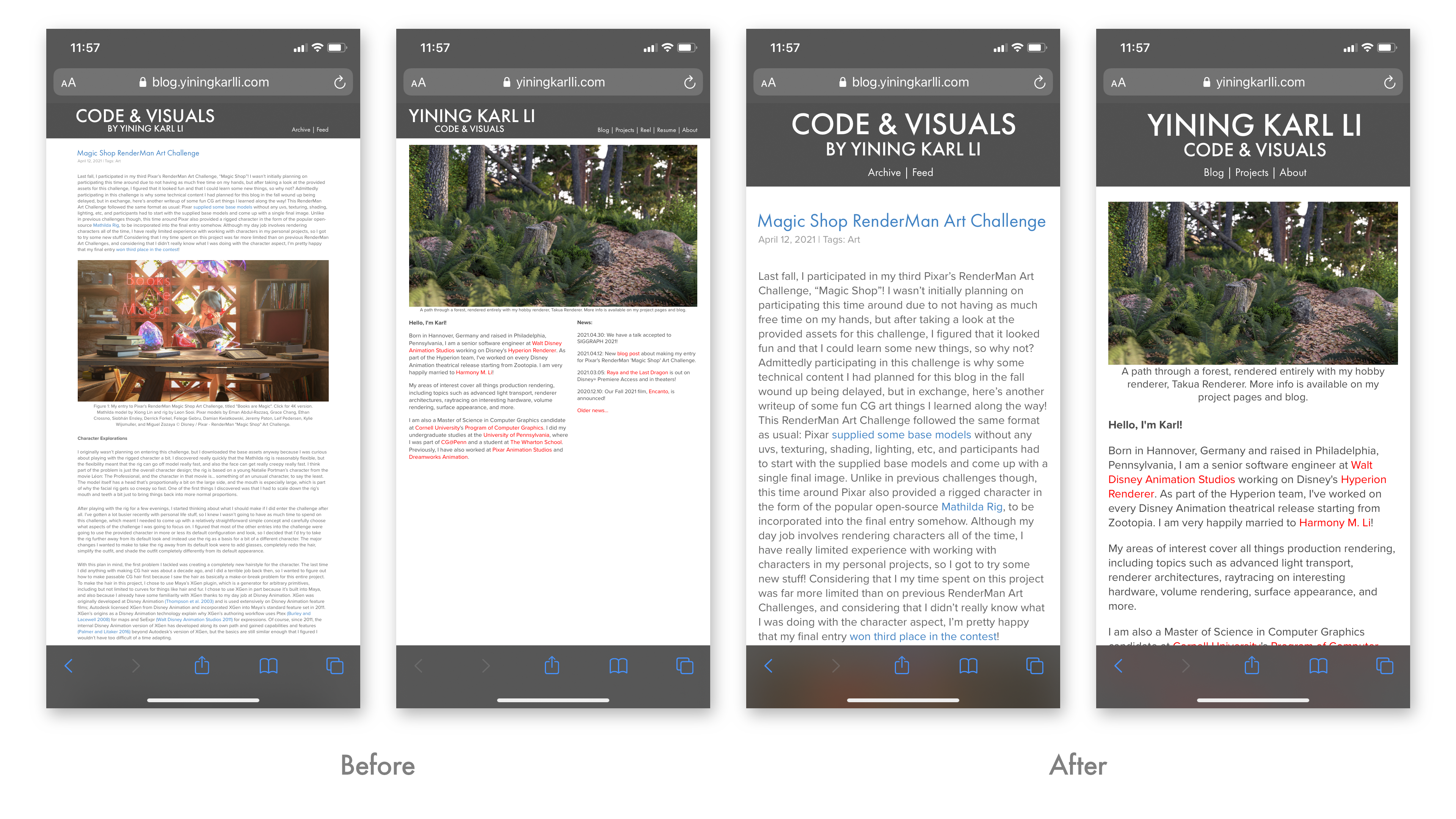
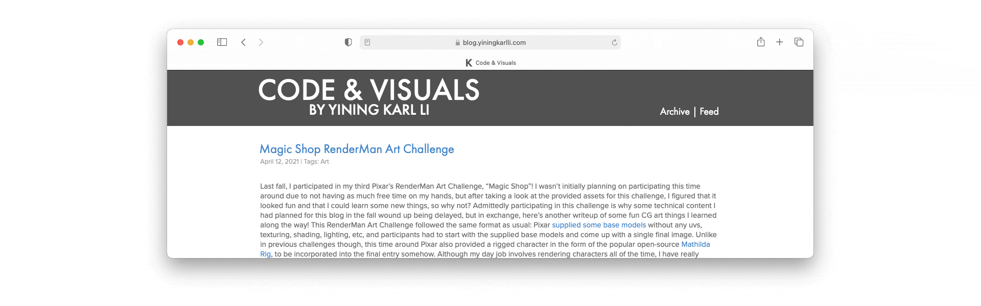
Here is how the layout used by my blog and personal site used to look on an iPhone 11 display, compared with how the layout looks now with modern responsive web design principles implemented:
So why did I bother with implementing these improvements to my blog and personal site now, some eight years after I first deployed the current layout and current version of the blog? To answer this (self-asked) question, I want to first write a bit about how the purpose of this blog has evolved over the years. I originally started this blog back when I first started college, and it originally didn’t have any clear purpose. If anything, starting a blog really was just an excuse to rewrite and expand a custom content management system that I had written in PHP 5 back in high school. Sometime in late 2010, as I got more interested in computer graphics, this blog became something of a personal journal to document my progress in exploring computer graphics. Around this time I also decided that I wanted to focus all of my attention on computer graphics, so I dropped most of the web-related projects I had at the time and moved this blog from my own custom CMS to Blogger. In grad school, I started to experiment with writing longer-form posts; for the first time for this blog, these posts were written primarily with a reader other than my future self in mind. In other words, this is the point where I actually started to write posts intended for an external audience. At this point I also moved the blog from Blogger to running on Jekyll hosted through Github Pages, and that’s when the first iterations of the current layout were put into place.
Fast forward to today; I’ve now been working at Disney Animation for six years, and (to my constant surprise) this blog has picked up a small but steady readership in the computer graphics field! The purpose I see for this blog now is to provide high quality, in-depth writeups of whatever projects I find interesting, with the hope that 1. my friends and colleagues and other folks in the field will find the posts similarly interesting and 2. that the posts I write can be informative and inspiring for aspirational students that might stumble upon this blog. When I was a student, I drew a lot of inspiration from reading a lot of really cool computer graphics and programming blogs, and I want to be able to give back the same to future students! Similarly, my personal site, which uses an extended version of the blog’s layout, now serves primarily as a place to collect and showcase projects that I’ve worked on with an eye towards hopefully inspiring other people, as opposed to serving as a tool to get recruited.
The rate that I post at now is much slower than when I was in school, but the reason for this slowdown is because I put far more thought and effort into each post now, and while the rate at which new posts appear has slowed down, I like to think that I’ve vastly improved both the quality and quantity of content within each post.
I recently ran wc -w on the blog’s archives, which yielded some interesting numbers.
From 2014 to now, I’ve only written 38 posts, but these 38 posts total a bit over 96,000 words (which averages to roughly 2,500 words per post).
Contrast with 2010 through the end of 2013, when I wrote 78 posts that together total only about 28,000 words (which averages to roughly 360 words per post)!
Those early posts came frequently, but a lot of those early posts are basically garbage; I only leave them there so that new students can see that my stuff wasn’t very good when I started either.
When I put the current layout into place eight years ago, I wanted the layout to have as little clutter as possible and focus on presenting a clear, optimized reading experience. I wanted computer graphics enthusiasts that come to read this blog to be able to focus on the content and imagery with as little distraction from the site’s layout as possible, and that meant keeping the layout as simple and minimal as possible while still looking good. Since the main topic this blog focuses on is computer graphics, and obviously computer graphics is all about pictures and the code that generates those pictures (hence the name of the blog being “Code & Visuals”), I wanted the layout to allow for large, full-width images. The focus on large full-width images is why the blog is single-column with no sidebars of any sort; in many ways, the layout is actually more about the images than the text, hence why text never wraps around an image either. Over the years I have also added additional capabilities to the layout in support of computer graphics content, such as MathJax integration so that I can embed beautiful LaTeX math equations, and an embedded sliding image comparison tool so that I can show before/after images with a wiping interface.
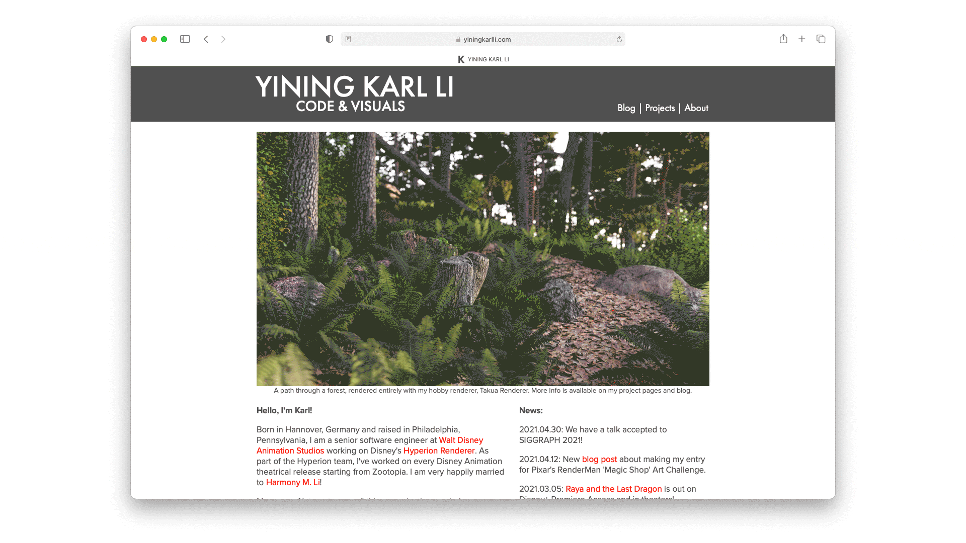
So with all of the above in mind, the reason for finally making the layout responsive is simple: I want the blog to be as clear and as readable as I can reasonably make it, and that means clear and readable on any device, not just in a desktop browser with a large window! I think a lot of modern “minimal” designs tend to use too much whitespace and sacrifice information and text density; a key driving principle behind my layout is to maintain a clean and simple look while still maintaining a reasonable level of information and text density. However, the old non-responsive layout’s density in smaller viewports was just ridiculous; nothing could be read without zooming in a lot, which on phones then meant a lot of swiping both up/down and left/right just to read a single sentence. For the new responsive improvements, I wanted to make everything readable in small viewports without any zooming or swiping left/right. I think the new responsive version of the layout largely accomplishes this goal; here’s an animation of how the layout resizes as the content window shrinks, as applied to the landing page of my personal site:
Adapting my layout to be responsive was surprisingly easy and straightforward! My blog and personal site use the same layout design, but the actual implementations are a bit different. The blog’s layout is a highly modified version of an old layout called N-Coded, which in turn is an homage to what Ghost’s default Casper layout looked like back in 2014 (Casper looks completely different today). Since the blog’s layout inherited some bits of responsive functionality from the layout that I forked from, getting most things working just required updating, fixing, and activating some already existing but inactive parts of the CSS. My personal site, on the other hand, reimplements the same layout using completely hand-written CSS instead of using the same CSS as the blog; the reason for this difference is because my personal site extends the design language of the layout for a number of more customized pages such as project pages, publication pages, and more. Getting my personal site’s layout updated with responsive functionality required writing more new CSS from scratch.
I used to be fairly well versed in web stuff back in high school, but obviously the web world has moved on considerably since then.
I’ve forgotten most of what I knew back then anyway since it’s been well over a decade, so I kind of had to relearn a lot of things.
However, I guess a lot of things in programming are similar to riding a bicycle- once you learn, you never fully forget!
Relearning what I had forgotten was pretty easy, and I quickly figured out that the only really new thing I needed to understand for implementing responsive stuff was the CSS @media rule, which was introduced in 2009 but only gained full support across all major browsers in 2012.
For the totally unfamiliar with web stuff: the @media rule allows for checking things like the width and height and resolution of the current viewport and allows for specifying CSS rule overrides per media query.
Obviously this capability is super useful for responsive layouts; implementing responsive layouts really boils down to just making sure that positions are specified as percentages or relative positions instead of fixed positions and then using @media rules to make larger adjustments to the layout as the viewport size reaches different thresholds.
For example, I use @media rules to determine when to reorganize from a two-column layout into stacked single-column layout, and I also use @media rules to determine when to adjust font sizes and margins and stuff.
The other important part to implementing a responsive layout is to instruct the browser to set the width of the page to follow the screen-width of the viewing device on mobile.
The easiest way to implement this requirement by far is to just insert the following into every page’s HTML headers:
<meta name="viewport" content="width=device-width">
For the most part, the new responsive layout actually doesn’t really noticeably change how my blog and personal site look on full desktop browsers and in large windows much, aside from some minor cleanups to spacing and stuff. However, there is one big noticeable change: I got rid of the shrinking pinned functionality for the navbar. Previously, as a user scrolled down, the header for my blog and personal site would shrink and gradually transform into a more compact version that would then stay pinned to the top of the browser window:
The shrinking pinned navbar functionality was implemented by using a small piece of JavaScript to read how far down the user had scrolled and dynamically adjusting the CSS for the navbar accordingly. This feature was actually one of my favorite things that I implemented for my blog and site layout! However, I decided to get rid of it because on mobile, space in the layout is already at a premium, and taking up space that otherwise could be used for content with a pinned navbar just to have my name always at the top of the browser window felt wasteful. I thought about changing the navbar so that as the user scrolled down, the nav links would turn into a hidden menu accessible through a hamburger button, but I personally don’t actually really like the additional level of indirection and complexity that hamburger buttons add. So, the navbar is now just fixed and scrolls just like a normal element of each page:

I think a fixed navbar is fine for now; I figure that if someone is already reading a post on my blog or something on my personal site, they’ll already know where they are and don’t need a big pinned banner with my name on it to remind them of where they are. However, if I start to find that scrolling up to reach nav links is getting annoying, I guess I’ll put some more thought into if I can come up with a design that I like for a smaller pinned navbar that doesn’t take up too much space in smaller viewports.
While I was in the code, I also made a few other small improvements to both the blog and my personal site. On the blog, I made a small improvement for embedded code snippets: embedded code snippets now include line numbers on the side! The line numbers are implemented using a small bit of JavaScript and exist entirely through CSS, so they don’t interfere with selecting and copying text out of the embedded code snippets. On my personal site, removing the shrinking/pinning aspect of the navbar actually allowed me to completely remove almost all JavaScript includes on the site, aside from some analytics code. On the blog, JavaScript is still present for some small things like the code line numbers, some caption features, MathJax, and analytics, but otherwise is at a bare minimum.
Over time I’d like to pare back what includes my layout uses even further to help improve load times even more.
One of the big motivators for moving my blog from Blogger to Jekyll was simply for page loading speed; under the hood Blogger is a big fancy dynamic CMS, whereas Jekyll just serves up static pages that are pre-generated once from Markdown files.
A few years ago, I similarly moved my personal site from using a simple dynamic templating engine I had written in PHP to instead be entirely 100% static; I now just write each page on my personal site directly as simple HTML and serve everything statically as well.
As a result, my personal site loads extremely fast!
My current layout definitely still has room for optimization though; currently, I use fonts from TypeKit because I like nice typography and having nice fonts like Futura and Proxima Nova is a big part of the overall “look” of the layout.
Fonts can add a lot of weight if not optimized carefully though, so maybe down the line I’ll need to streamline how fonts work in my layout.
Also, since the blog has a ton of images, I think updating the blog to use native browser lazy loading of images through the loading="lazy" attribute on img tags should help a lot with load speeds, but not all major browsers support this attribute yet.
Some day I’d like to get my site down to something as minimal and lightweight as Tom MacWright’s blog, but still, for now I think things are in decent shape.
If for some reason you’re curious to see how all of the improvements mentioned in this post are implemented, the source code for both my blog and my personal site are available on my Github. Please feel free to either steal any bits of the layout that you may find useful, or if you want, feel free to even fork the entire layout to use as a basis for your own site. Although, if you do fork the entire layout, I would suggest and really prefer that you put some effort into personalizing the layout and really making it your own instead of just using it exactly as how I have it!
Hopefully this is the last time for a very long while that I’ll write a blog post about the blog itself; I’m an excruciating slow writer these days, but I currently have the largest simultaneous number of posts near completion that I’ve had in a long time, and I’ll be posting them soon. As early as later this week I’ll be posting the first part of a two-part series about porting Takua Renderer to 64-bit ARM; get ready for a deep dive into some fun concurrency and atomics-related problems at the x86-64 and arm64 assembly level in this post. The second part of this series should come soon too, and over the summer I’m also hoping to finish posts about hex-tiling in Takua and on implementing/using different light visibility modes. Stay-at-home during the pandemic has also given me time to slowly chip away on the long-delayed second and third parts of what was supposed to be a series on mipmapped tiled texture caching, so with some luck maybe those posts will finally appear this year too. Beyond that, I’ve started some very initial steps on new next-generation from-the-ground-up reimplementations of Takua in CUDA/Optix and in Metal, and I’ve started to dip my toes into Rust as well, so who knows, maybe I’ll have stuff to write about that too in the future!