New Unified Site Design
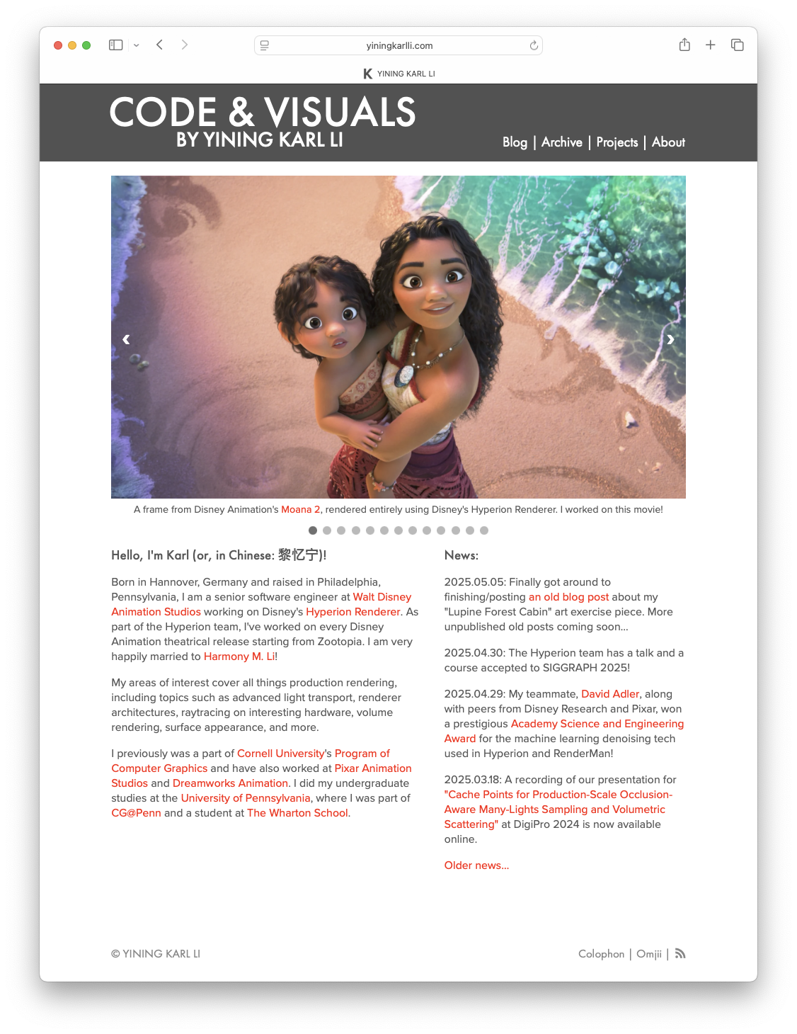
Over the past month or so, I’ve undertaken another overhaul of my blog and website, this time to address a bunch of niggling things that have annoyed me for a long time. In terms of pure technical change, this round’s changes are not as extensive as the ones I had to make to implement a responsive layout a few years ago. Most of this round was polishing and tweaking and refining things, but enough things were touched that in the aggregate this set of change represents the largest number of visual updates to the site in a long time. Broadly things still look similar to before, but everything is a little bit tighter and more coherent and the details are sweated over just a little bit more. The biggest change this round of updates brings is that the blog and portfolio halves of my site now have a completely unified design, and both halves are now stiched together into one cohesive site instead of feeling and working like two separate sites. So, in the grand tradition of writing about making one’s website on one’s own website, here’s an overview of what’s changed and how I approached building the new unified design.
One unusual quirk of my site is that the portfolio half of the site and the blog half of the site run on completely different tech stacks. Both halves of the site are fundamentally based on static site generators, but pretty much everything under the hood is different, down to the very servers they are hosted on. The blog is built using Jekyll and served from Github Pages, fronted using Cloudflare. The portfolio, meanwhile, is built using a custom minimal static site generator called OmjiiCMS. When I say minimal, I really do mean minimal- OmjiiCMS is essentially just a fancy script that takes in hand-written HTML files containing the raw content of each page and simply glues on the sitewide header, footer, and nav menu. Calling it a CMS is a misnomer because it really doesn’t do any content management at all- the name is a holdover from back when my personal site and blog both ran on a custom PHP-based content management and publishing system that I wrote in high school. I eventually moved my blog to Wordpress briefly, which I found far too complicated for what I needed, and then landed on Blogger for a few years, and then in 2013 I moved to Ghost for approximately one week because Ghost had good Markdown support before I realized that if I wanted to write Markdown files, I should just use Jekyll. The blog has been powered by Jekyll ever since. As a bonus, moving to a static site generator made everything both way faster and way easier. Meanwhile, the portfolio part of the site has always been a completely custom thing because the portfolio site has a lot of specific custom layouts and I always found that building those layouts by hand was easier and simpler than trying to hammer some pre-existing framework into the shape I wanted. Over time I stripped away more and more of the underlying CMS until I realized I didn’t need one at all, at which point I gutted the entire CMS and made the portfolio site just a bunch of hand-written HTML files with a simple script to apply the site’s theming to every page before uploading to my web server. This dual-stack setup has stuck for a long time now because at least for me it allows me to run a blog and personal website with a minimal amount of fuss; the goal is to spend far more time actually writing posts than mucking around with the site’s underlying tech stack.
However, one unfortunate net result of these two different evolutionary paths is that while I have always aimed to make the blog and portfolio sites look similar, they’ve always looked kind of different from each other, sometimes in strange ways. The blog and portfolio have always had different header bars and navigation menus, even if the overall style of the header was similar. Both parts of the site always used the same typefaces, but in different places for different things, with completely inconsistent letter spacing, sizing, line heights, and more. Captions have always worked differently between the two parts of the site as well. Even the responsive layout system worked differently between the blog and portfolio, with layout changes happening at different window widths and different margins and paddings taking effect at the same window widths between the two. These differences have always bothered me, and about a month ago they finally bothered me enough for me to do something about it and finally undertake the effort of visually aligning and unifying both sites, down to the smallest details. Before breaking things down, here’s some before and afters:
The process I took to unify the designs for the two halves was to start from near scratch on new CSS files and rebuild the original look of both halves as closely as possible, while resolving differences one by one. The end result is that the blog didn’t just wholesale take on the details of the portfolio, or vice versa- instead, wherever differences arose, I thought about what I wanted the design to accomplish and decided on what to do from there. All of this was pretty easy to do because despite running on different tech stacks, both parts of the site were built using as much adherence to semantic HTML as possible, with all styling provided by two CSS files; one for each half. To me, a single CSS file containing all styling separate from the HTML is the obvious way to build web stuff and is how I learned to do CSS over a decade ago from the CSS Zen Garden, but apparently a bunch of popular alternative methods exist today such as Tailwind, which directly embeds CSS snippets in the HTML markup. I don’t know a whole lot about what the cool web kids do today, but Tailwind seems completely insane to me; if I had built my site with CSS snippets scattered throughout the HTML markup, then this unifying project would have taken absolute ages to complete instead of just a few hours spread over a weekend or two. Instead, this project was easy to do because all I had to do was make new CSS files for both parts of the site and I barely had to touch the HTML at all, aside from an extra wrapper div or two.
The general philosophy of this site’s design has always been to put content first and keep things information dense, all with a modern look and presentation. The last big revision of the site added responsive design as a major element and also pared back some unneeded flourishes with the goal of keeping the site lightweight. For the new unified design, I wanted to keep all of the above and also lean more into a lightweight site and improve general readability and clarity, all while keeping the site true to its preexisting design.
Here’s the list of what went into the new unified design:
- Previously the blog’s body text was fairly dense and had very little spacing between lines, while the portfolio’s body text was slightly too large and too spaced out. The unified design now defines a single body text style with a font size somewhere in between what the two halves previously had, and with line spacing that grants the text a bit more room to breathe visually for improved readability while still maintaining relatively high density.
- Page titles, section headings, and so on now use the same font size, color, letter spacing, margins, etc. between both halves.
- I experimented with some different typefaces, but in the end I still like what I had before, which is Proxima Nova for easy-to-read body text and Futura for titles, section headings, etc; previously how these two typefaces were applied was inconsistent though, and the new unified design makes all of this uniform.
- Code and monospaced text is now typeset in Berkeley Mono by US Graphics Company.
- Image caption styles are now the same across the entire site and now do a neat trick where if they fit on a single line, they are center aligned, but as soon as the caption spills over onto more than one line, the caption becomes left aligned. While the image caption system does use some simple Javascript to set up, the line count dependent alignment trick is pure CSS. Here is a comparison:
- The blog now uses red as its accent color, to match the portfolio site. The old blue accent color was a holdover from when the blog’s theme was first derived from what is now a super old variant of Ghost’s Casper theme.
- Links now are underlined on hover for better visibility.
- Both sites now share an identical header and navigation bar. Previously the portfolio and blog had different wordmarks and had different navigation items; they now share the same “Code & Visuals” wordmark and same navigation items.
- As part of unifying the top navigation bars, the blog’s Atom feed is no longer part of the top navigation but instead is linked to from the blog archive and is in the site’s new footer.
- The site now has a footer, which I found useful for delineating the end of pages. The new footer has a minimal amount of information in it: just copyright notice, a link to the site’s colophon, and the Atom feed. The footer always stays at the bottom of the page, unless the page is smaller than the current browser window size, in which case the footer floats at the bottom of the browser window, and the neat thing is that this is implemented entirely using CSS with no Javascript.
- Responsive layouts now kick in at the same window widths for both parts of the site, and the margins and various text size changes applied for responsive layouts are the same between both halves as well. As a result, the site now looks the same across both halves at all responsive layout widths across all devices.
- All analytics and tracking code has been completely removed from both halves of the site.
- The “About” section of the site has been reorganized with several informational slash pages. Navigation between the various subpages of the About section is integrated into the page headings.
- The “Projects” section of the site used to just be one giant list of projects; this list is now reorganized into subpages for easier navigation, and navigation is also integrated into the Project section’s page headings.
- Footnotes and full screen image comparison pages now include backlinks to where they were linked to from main body text.
- Long posts with multiple subsections now include a table of contents at the beginning.
Two big influences on how I’ve approached building and designing my site over the past few years have been Tom Macwright’s site and Craig Mod’s site. From Tom Macwright’s site, I love the ultra-brutalist and super lightweight design, and I also like his site navigation, choice of sections, and slash pages. From Craig Mod’s site, I really admire the typography and how the site presents his various extensive writings with excellent readability and beautiful layouts. My site doesn’t really resemble those two sites at all visually (and I wouldn’t want it to; I like my own thing!), but I drew a lot of influence from both of those sites when it comes to how I thought about an overall approach to design. In addition to the two sites mentioned above, I regularly draw inspiration from a whole bunch of other sites and collections of online work; I keep an ongoing list on my about page if you’re curious.
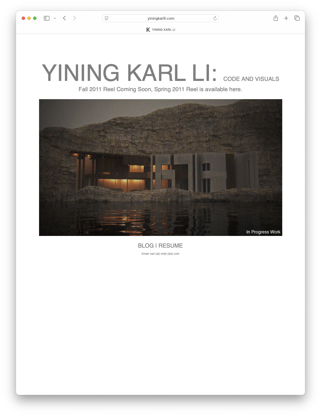
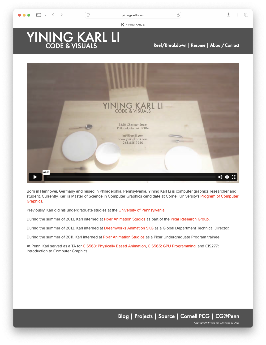
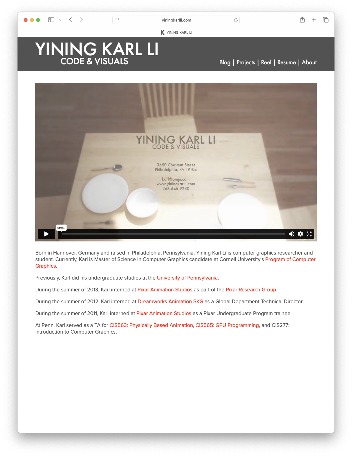
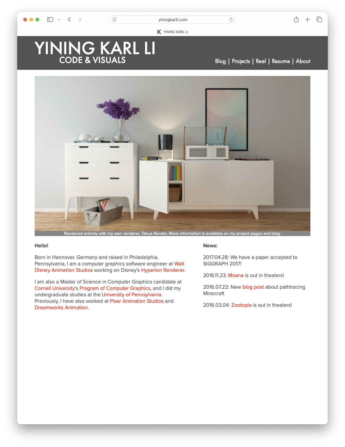
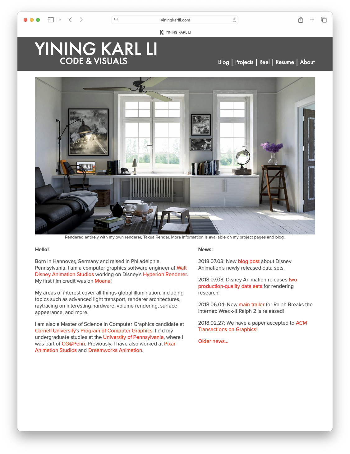
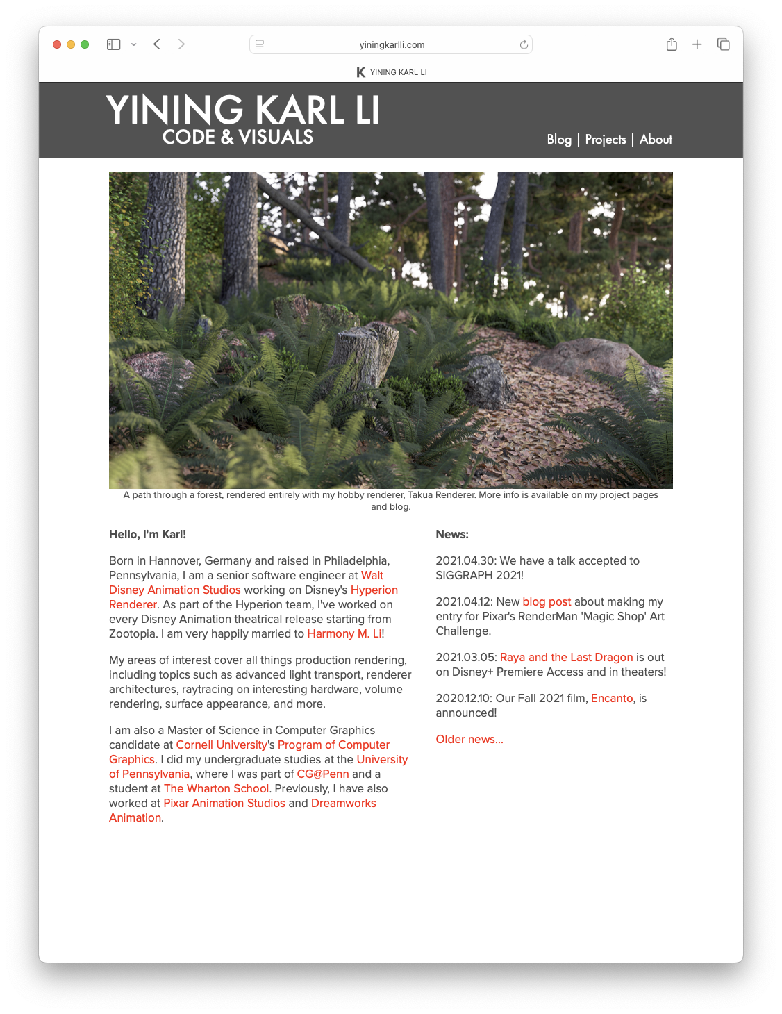
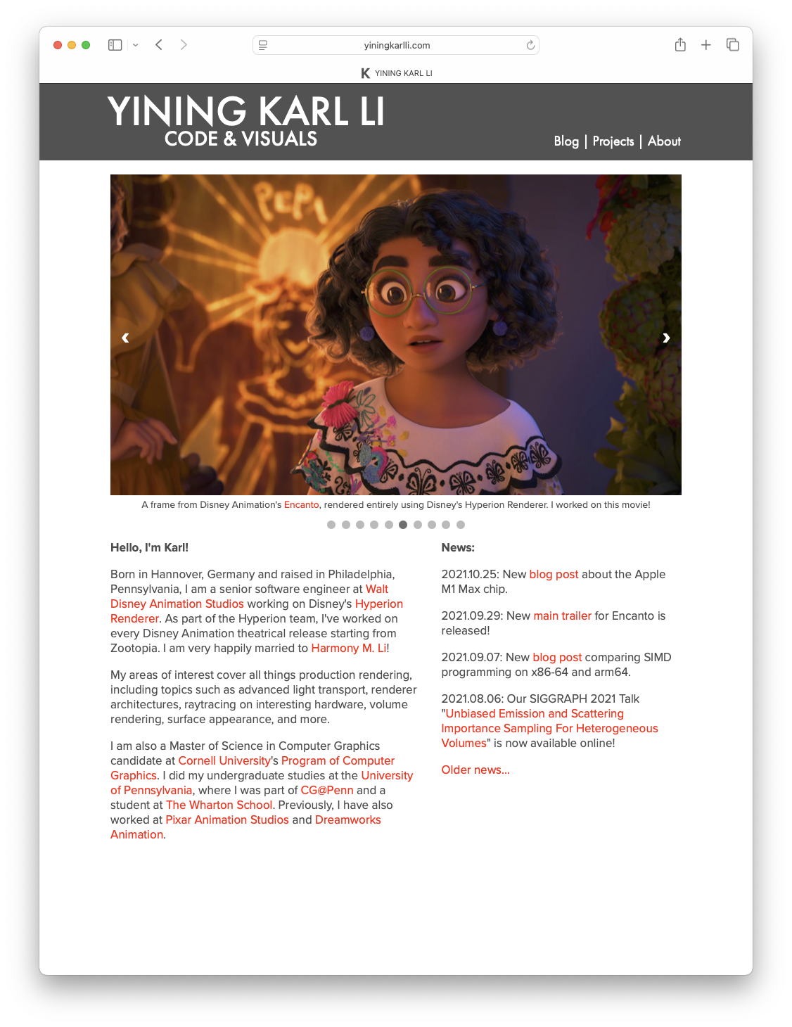
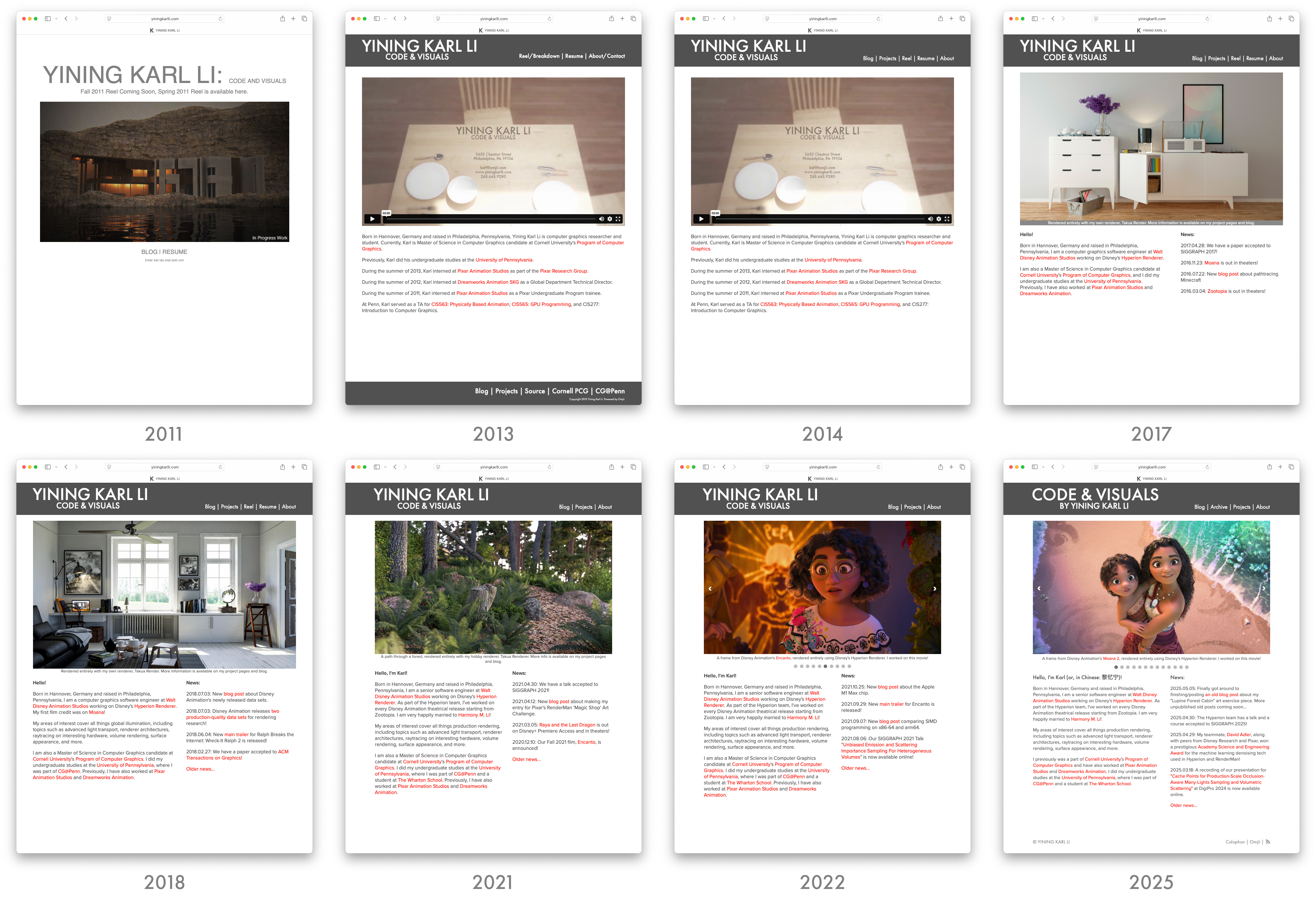
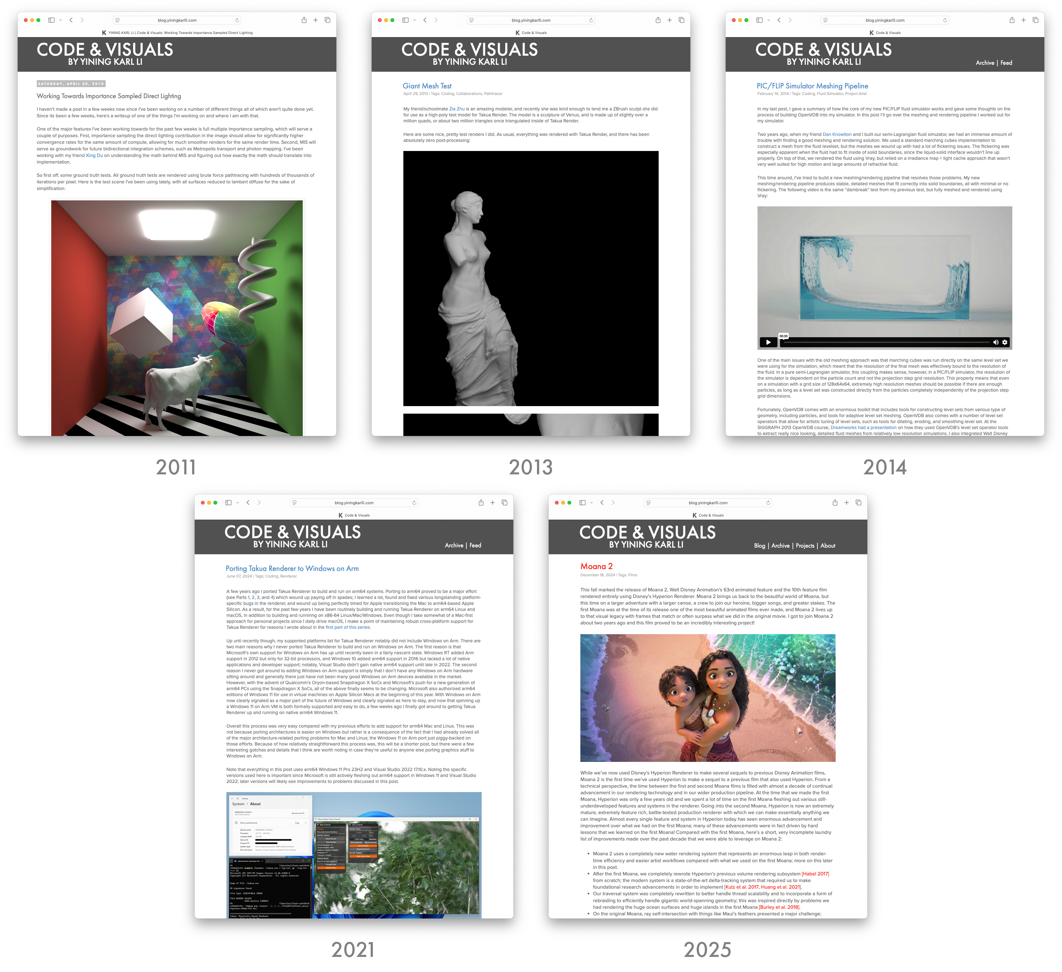
Hee’s a brief overview of how the portfolio half of the site has changed over the years. The earliest 2011 version was just a temporary site I threw together while I was applying to the Pixar Undergraduate Program internship (and it worked!); in some ways I kind of miss the ultra-brutalist utilitarian design of this version. I actually still keep that old version around for fun. The 2013 version was the first version of the overall design that continues to this day, but was really heavy-handed with both a header and footer that hovered in place when scrolling. The 2014 version consolidated the header and footer into just a single header that still hovered in place but shrunk down when scrolling. The 2017 version added dual-column layouts to the home page and project pages, and the 2018 version cleaned up a bunch of details. The 2021 version was a complete rebuild that introduced responsive design, and the 2022 version was a minor iteration that added things like a image carousel to the home page. The latest version rounds out the evolutionary history up to now:
Meanwhile, the blog has actually seen less change overall. Unfortuantely I don’t have any screenshots or a working version of the codebase for the pre-2011 version of the blog anymore, but by the 2011 version the blog was on Blogger with a custom theme that I spent forever fighting against Blogger’s theming system to implement; that custom theme is actually the origin of my site’s entire look. The 2013 version was a wholesale port to Jekyll and as part of the port I built a new Jekyll theme that carried over much of the previous design. The 2014 version of the blog added an archive page and Atom feed, and then the blog more or less stayed untouched until the 2021 version’s responsve design overhaul. This latest version is the largest overhaul the blog has seen in a very long time:
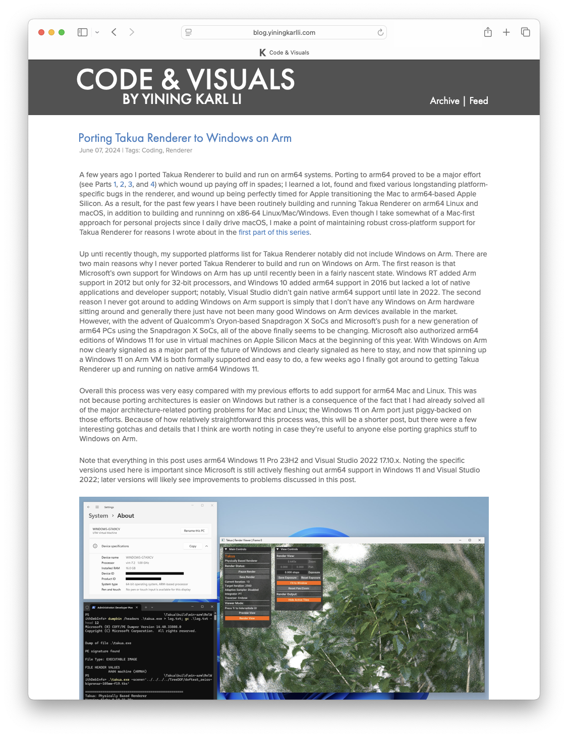
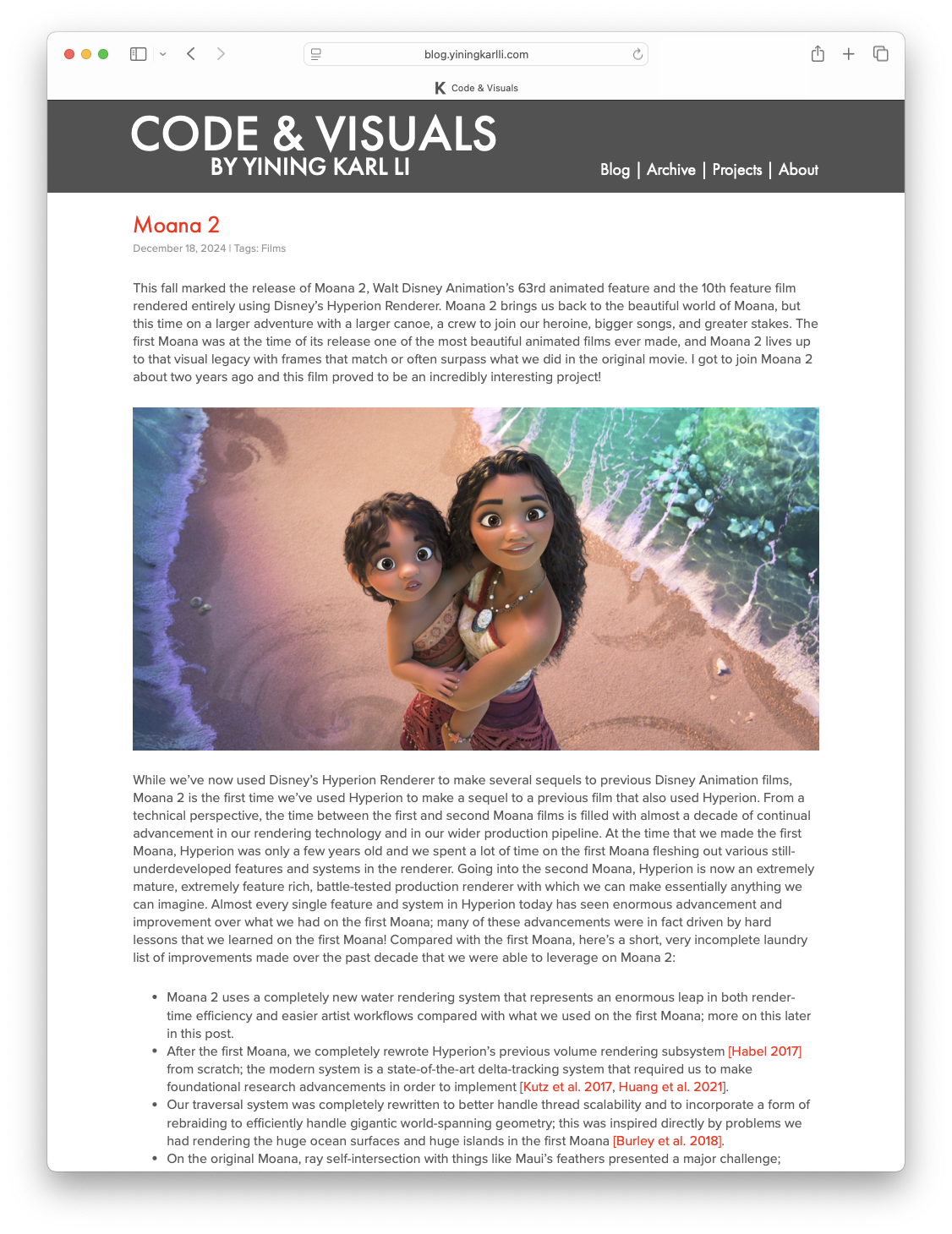
I’m pretty happy with how the new unified design turned out; both halves of the site now feel like one integrated, cohesive whole, and the fact that the two halves of the site run different tech stacks on different webservers is no longer made obvious to visitors and readers. I named the new unified site theme Einheitsgrafik, which translates roughly to “uniform graphic” or “standard graphic”, which I think is fitting. With this iteration, there are no longer any major things that annoy me every time I visit the site to double check things; hopefully that means that the site is also a better experience for visitors and readers now. I think that this particular iteration of the site is going to last a very long time!