SIGGRAPH 2025 Course Notes- Path Guiding Surfaces and Volumes in Disney's Hyperion Renderer- A Case Study

This year at SIGGRAPH 2025, Sebastian Herholz from Intel organized a followup to 2019’s Path Guiding in Production Course [Vorba et al. 2019]. This year’s edition of the course includes presentations by Sebastian on Intel’s Open Path Guiding library and on general advice for integrating path guiding techniques into a unidirectional path tracing renderer, a presentation by Martin Šik on how Chaos’s Corona Renderer uses advanced photon guiding techniques in their caustics solver, and a presentation by Lea Reichardt and Marco Manzi on the work Disney Animation and DisneyResearch|Studios have put into Hyperion’s second-generation path guiding system for surfaces and volumes. I strongly encourage checking out the whole course, but wanted to highlight Lea and Marco’s presentation in particular; they put a ton of care and effort into what I think is a really cool and unique look into what it takes to bridge cutting edge research into a production rendering environment. The course notes were written by the four presenters above, in addition to Brian Green and myself from the Hyperion development team.

The course will be presented on Tuesday August 12th, startng at 3:45 PM.
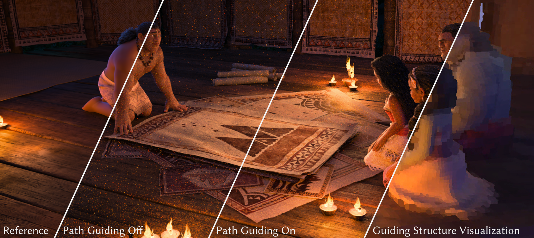
Figure 1 from the paper. A production scene from <em>Moana 2</em>, rendered using path guiding in Disney’s Hyperion Renderer. From left to right: reference baseline, 64 SPP without path guiding, 64 SPP with path guiding, and visualization of the path guiding spatio-directional field at 256 SPP. © 2025 Disney.

Here is the abstract:

We present our approach to implementing a second-generation path guiding system in Disney’s Hyperion Renderer, which draws upon many lessons learned from our earlier first-generation path guiding system. We start by focusing on the technical challenges associated with implementing path guiding in a wavefront style path tracer and present our novel solutions to these challenges. We will then present some powerful visualization and debugging tools that we developed along the way to both help us validate our implementation’s correctness and help us gain deeper insight into how path guiding performs in a complex production setting. Deploying path guiding in a complex production setting raises various interesting challenges that are not present in purely academic settings; we will explore what we learned from solving many of these challenges. Finally, we will look at some concrete production test results and discuss how these results inform our large scale deployment of path guiding in production. By providing a comprehensive review of what it took for us to achieve this deployment on a large scale in our production environment, we hope that we can provide useful lessons and inspiration for anyone else looking to similarly deploy path guiding in production, and also provide motivation for interesting future research directions.

The paper and related materials can be found at:

All of the technical details are in the paper and presentation (and with 80 pages of course notes, of which 36 pages is the Disney Animation / DisneyResearch|Studios chapter, there are technical details for days!), so this blog post is just some personal thoughts on this project.

As mentioned in the abstract, what we’re presenting in this course is our second-generation path guiding system. Disney Animation and DisneyResearch|Studios have a long history of working on path guiding; one of landmark papers in modern path guiding was Practical Path Guiding (PPG) [Müller et al. 2017], which came out of DisneyResearch|Studios, and Hyperion was one of the first production renderers to implement PPG [Müller 2019]. We’ve used path guiding on a limited number of shots on most movies starting with Frozen 2, but as the course notes go into more detail on, for a variety of reasons our first generation path guiding system never gained widespread adoption. Several years ago, based on a research proposal drafted by Wei-Feng Wayne Huang while he was still at Disney Animation, we kicked off of a large scale project to further improve path guiding and bring it to a point where we could get widespread adoption and provide significant benefits to production. This project is a collaboration between DisneyResearch|Studios, Disney Animation, Pixar, ILM, and Sebastian Herholz from Intel; the second-generation path guiding system in Hyperion is a product of this project.

Personally, this project is one of my all-time favorite projects that I’ve gotten to be a part of, and I think this project really highlights what an incredible research organization DisneyResearch|Studios is. Getting to collaborate with rendering colleagues from across multiple labs and studios is always fun and interesting, and I think for projects like this, the huge amount of production and engineering expertise that the various Disney studios bring combined with the world-class research talent at DisneyResearch|Studios and ETH Zürich (which DisneyResearch|Studios is academically partnered with) gives unique perspectives and capabilities for tackling difficult problems. On top of the production experience from three cutting edge studios, DisneyResearch|Studios also has deep access to both source code and the engineering teams for not one but two extremely mature production rendering systems, Hyperion [Burley et al. 2018] and RenderMan [Christensen et al. 2018]; I don’t think there’s anything else quite like this setup in our industry, and I think it’s insanely cool that we get to work together like this!

One of the largest focus points for our second-generation path guiding efforts was to find a way to guide jointly for both surfaces and volumes; our first-generation PPG based system only supported surfaces. Over the past decade our artists have made heavier and heavier use of volumetrics in each successive project, to the point where now almost every shot in our movies contains some form of volumetrics, ranging from subtly atmospherics all the way to enormously complex setups like the storm battle at the end of Moana 2. We already knew from past experience that extending PPG to volumes wasn’t as easy as it might look, and a second-generation path guiding system would likely need to be a significant departure from PPG. Towards the start of this project we learned that Sebastian Herholz at Intel was working in a similar direction and had incorporated a wide swath of recent path guiding research [Müller et al. 2017, Herholz et al. 2019, Ruppert et al. 2020, Xu et al. 2024] into Intel’s open source OpenPGL library; at this point the project was expanded to include a collaboration with Sebastian. This collaboration has been extraordinarily fruitful, with work from the Disney side of things helping inform development for OpenPGL and expertise from Sebastian helping us build on top of OpenPGL.

An interesting aspect of our next-generation path guiding project is that this project has been both an academic research project and a production engineering project; over the past several years, this project has spawned a series of cool research papers, but has also included a huge effort to get all of this research implemented in Hyperion and RenderMan and into artists’ hands to actually make movies with, which means solving tons of practical production problems that sit outside of the usual research focus. On the research side, so far the project has spawned three papers. Dodik et al. [2022] improved upon PPG by using spatio-directional mixture models to improve guiding’s ability to learn and product sample arbitrarily oriented BSDFs. Xu et al. [2024] introduces a way to guide volume scattering probaiblity (which is indirectly related to distance sampling) in volume rendering, which historically has been a major missing piece in path guiding in volumes. The most recent paper, Rath et al. [2025], looks at how to incorporate GPU based neural forms of path guiding into existing CPU based renderers. Each of these research papers tackles a major challenge we’ve found while working towards making path guiding practical in production.

To bridge between the research work and building a practical production system, we’ve put a lot of work into solving both more architectural technical challenges, and more artist facing user experience challenges. One of the largest architectural technical challenges has been fitting path guiding, which learns from full path histories, into Hyperion’s wavefront rendering architecture [Eisenacher et al. 2013], in which path histories are not kept beyond the current bounce for each path (RenderMan XPU [Christensen et al. 2025] is also a wavefront system, so the challenges there are similar). Artist facing user experience challenges involve the reality that production renderers include many features that break physics to allow for better artistic control and more predictable results, which are difficult to account for when developing path guiding techniques in a purely academic renderer. Solving these engineering and user experience challenges in order to build a practical production system is the focus of our part of the course this year. What we’re presenting in the course is really a snapshot of where we were at the beginning of the year; the material in the course represents enormous progress towards a robust practical system, but this project is very much still in progress and we’ve made additional advancements since we finished writing the course materials; hopefully we can present even more next year!

My favorite part of working on these projects is always getting to work with and learn from really cool people. On the DisneyResearch|Studios side, this project has been led by Marco Manzi and Marios Papas, with significant contributions by Alexander Rath, Tiziano Portenier, and engineering support from Lento Manickathan. On the Disney Animation side, Lea Reichardt, Brian Green, and I have been working closely with Marco to build out the production system. Of course we have a long list of artists and TDs to thank on the production side for supporting and trying out this project; a full list of acknowledgements can be found on my project page and in the course notes. Pushing path guiding forward in research and production together has been the type of project where everyone on the project learns a lot from each other, the studios learn a lot and gain incredibly powerful and useful new tools, and the wider research community benefits as a whole. Investing in these types of large scale, longer term research projects is always a daunting task, and the fact that our studio leadership has given so much support this project and given us the time and resources to really make it a big success is just another testament towards the commitment Disney as a whole has towards making the best movies we can possibly make!

References

Brent Burley, David Adler, Matt Jen-Yuan Chiang, Hank Driskill, Ralf Habel, Patrick Kelly, Peter Kutz, Yining Karl Li, and Daniel Teece. 2018. The Design and Evolution of Disney’s Hyperion Renderer. ACM Transactions on Graphics. 37, 3 (2018), Article 33.

Per H. Christensen, Julian Fong, Jonathan Shade, Wayne L Wooten, Brenden Schubert, Andrew Kensler, Stephen Friedman, Charlie Kilpatrick, Cliff Ramshaw, Marc Bannister, Brenton Rayner, Jonathan Brouillat, and Max Liani. 2018. RenderMan: An Advanced Path Tracing Architecture for Movie Rendering. ACM Transactions on Graphics. 37, 3 (2018), Article 30.

Per H. Christensen, Julian Fong, Charlie Kilpatrick, Francisco Gonzalez Garcia, Srinath Ravichandran, Akshay Shah, Ethan Jaszewski, Stephen Friedman, James Burgess, Trina M. Roy, Tom Nettleship, Meghana Seshadri, and Susan Salituro, 2025. RenderMan XPU: A Hybrid CPU+GPU Renderer for Interactive and Final-Frame Rendering. Computer Graphics Forum (Proc. of High Performance Graphics) 44, 8 (Jun. 2025), Article e70218.

Ana Dodik, Marios Papas, Cengiz Öztireli, and Thomas Müller. 2022. Path Guiding Using Spatio-Directional Mixture Models. Computer Graphics Forum (Proc. of Eurographics) 41, 1 (Feb. 2022), 172-189.

Christian Eisenacher, Gregory Nichols, Andrew Selle, and Brent Burley. 2013. Sorted Deferred Shading for Production Path Tracing. Computer Graphics Forum. 32, 4 (2013), 125-132.

Sebastian Herholz, Yangyang Zhao, Oskar Elek, Derek Nowrouzezahrai, Hendrik P. A. Lensch, and Jaroslav Křivánek. 2019. Volume Path Guiding Based on Zero-Variance Random Walk Theory. ACM Transactions on Graphics (Proc. of SIGGRAPH) 38, 3 (Jun 2019), Article 25.

Thomas Müller, Markus Gross, and Jan Novák. 2017. Practical Path Guiding for Efficient Light-Transport Simulation. Computer Graphics Forum (Proc. of Eurographics Symposium on Rendering) 36, 4 (Jun. 2017), 91-100.

Thomas Müller. 2019. Practical Path Guiding in Production. In ACM SIGGRAPH 2019 Course Notes: Path Guiding in Production. 37-50.

Alexander Rath, Marco Manzi, Farnood Salehi, Sebastian Weiss, Tiziano Portenier, Saeed Hadadan, and Marios Papas. 2025. Neural Resampling with Optimized Candidate Allocation. In Proc. of Eurographics Symposium on Rendering (EGSR 2025). Article 20251181.

Lukas Ruppert, Sebastian Herholz, and Hendrik P. A. Lensch. 2020. Robust Fitting of Parallax-Aware Mixtures for Path Guiding. ACM Transactions on Graphics (Proc. of SIGGRAPH) 39, 4 (Aug 2020), Article 147.

Jiří Vorba, Johannes Hanika, Sebastian Herholz, Thomas Müller, Jaroslav Křivánek, and Alexander Keller. 2019. Path Guiding in Production. In ACM SIGGRAPH 2019 Courses. Article 18.

Kehan Xu, Sebastian Herholz, Marco Manzi, Marios Papas, and Markus Gross. 2024. Volume Scattering Probability Guiding. ACM Transactions on Graphics (Proc. of SIGGRAPH Asia) 43, 6 (Nov. 2024), Article 184.
SIGGRAPH 2025 Talk- A Texture Streaming Pipeline for Real-Time GPU Ray Tracing

This year at SIGGRAPH 2025, Mark Lee, Nathan Zeichner, and I have a talk about a GPU texture streaming system we’ve been working on for Disney Animation’s in-house real-time GPU ray tracing previsualization renderer. Of course, GPU texture streaming systems are not exactly something novel; pretty much every game engine and every GPU-based production renderer out there has one. However, because Disney Animation’s texturing workflow is 100% based on Ptex, our texture streaming system has to be built to support Ptex really well, and this imposes some interesting design requirements and constraints on the problem. We thought that these design choices would make for an interesting talk!

Nathan will be presenting the talk at SIGGRAPH 2025 in Vancouver as part of the “Real-Time and Mobile Techniques” session on Sunday August 10th, starting at 9am.

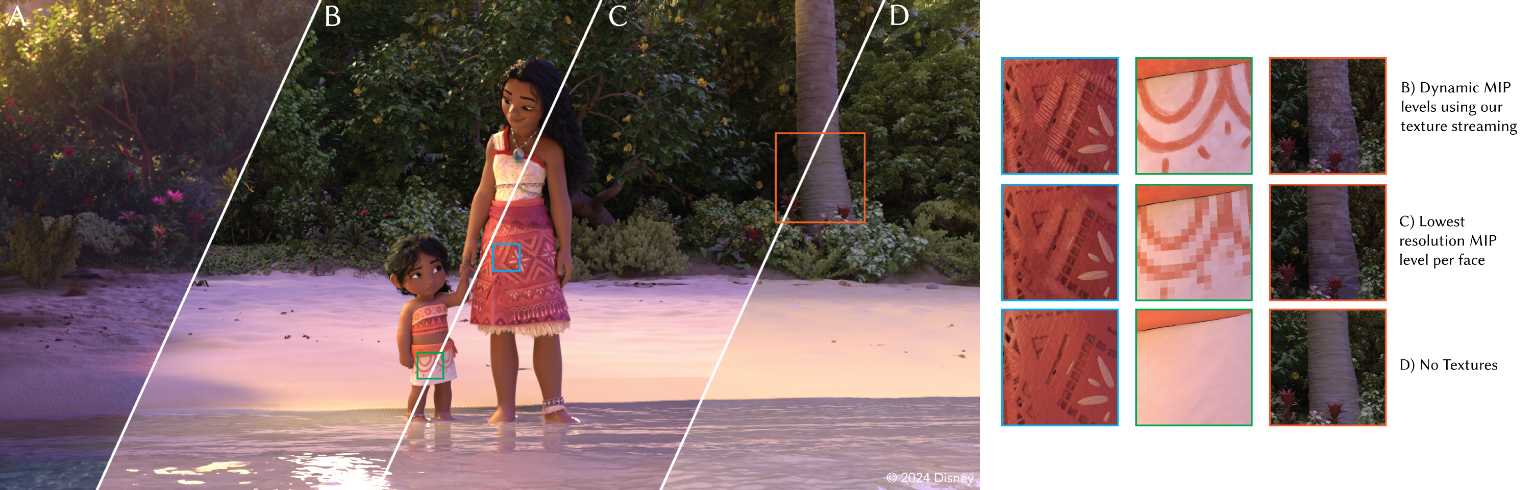
A higher-res version of Figure 1 from the paper. A scene from <em>Moana 2</em>, rendered using our real-time GPU ray tracer (B, C, D) and compared with the final frame (A) from Disney’s Hyperion Renderer. Rendering without textures (D) is not a useful previsualization for (A). Without streaming, only the lowest resolution MIP tile per Ptex face can fit on the GPU (C). With our texture streaming, we handle 1.5 TB of Ptex files on disk using only 2 GB of GPU VRAM to achieve a result (B) that matches the texture detail of (A) while maintaining >95% of the average performance of (D), without stalls.

Here is the paper abstract:

Disney Animation makes heavy use of Ptex [Burley and Lacewell 2008] across our assets [Burley et al. 2018], which required a new texture streaming pipeline for our new real-time ray tracer. Our goal was to create a scalable system which could provide a real-time, zero-stall experience to users at all times, even as the number of Ptex files expands into the tens of thousands. We cap the maximum size of the GPU cache to a relatively small footprint, and employ a fast LRU eviction scheme when we hit the limit.

The paper and related materials can be found at:

As usual, all of the technical details are in the paper and presentation, so this blog post is just my personal notes on this project.

We’ve been working on this project for a pretty long while, and what we’re presenting in this talk is actually the second generation our team has built of a GPU texture streaming system with Ptex support. The earlier first prototype of our GPU Ptex system was largely written by Joe Schutte, who we are very indebted to for paving the way and proving out various ideas, such as the use of cuckoo hashing [Erlingsson 2006] for storing keys. We learned a ton of lessons from that first prototype, which informed the modern incarnation of the system. The core of the modern system was primarily written by Mark, with a lot of additional work from Nathan to generalize the system to support both our CUDA/Optix based GPU ray tracing previsualization renderer, and our in-house fork of Hydra’s Storm rasterizer. My role on the project was pretty small; I essentially was just a consultant contributing to some ideas and brainstorming, so I’m very grateful to Mark and Nathan for having allowed me to contribute to this talk!

One of the biggest lessons I’ve learned during my professional career has been the value of building systems twice- Chapter 11 of the famous Mythical Man Month book by Frederick Brooks is all about the value of building a first version to throw away, because much of what is required to build an actually good solution can only be learned through the process of attempting to build a solution in the first place. A lot of the design choices that went into the system described in our talk draws from both the earlier prototype that was built, and also upon past experience building texture streaming systems in other renderers. For example, one big lesson that Mark and I both learned independently is that texture filtering is extremely hard (and it’s famously even harder in Ptex due to the need to filter across faces with potentially very different resolutions), and in a stochastic ray tracing renderer, a better solution is often to just point sample and lineraly interpolate between the two closest MIP levels. Mark learned this on Moonray [Lee et al. 2017], and I’ve written about learning this on the blog before. I think this project is a great example of both learning from previous attempts at the same general problem domain, but also avoiding the second-system effect; what we have today is really fast, really robust, and given how hard texture streaming generally is as a problem domain, I think Mark and Nathan did an impressive job in keeping the actual implementation compact, elegant, and easy to work with.

Of course we need to acknowledge that there have in fact been previous attempts at implementing Ptex on the GPU, with varying degrees of success. McDonald & Burley [2011] was the first demonstrated implementation of Ptex on the GPU, but required a preprocessing step and had to deal with various complications imposed by using OpenGL/DirectX hardware texturing; this early implementation also didn’t support texture streaming. Our implementation is built primarily in CUDA and bypasses all of the traditional graphics API stuff for texturing; we deal with the per-face textures at the raw memory block level, which allows us to have zero preprocessing steps and have robust fast streaming from the CPU to the GPU. Kim et al. [2011]’s solution was to pack all of the individual per-face textures into a single giant atlased texture; back when I worked on Pixar’s Optix-based preview path tracer (called RTP) this essentially was the solution that we used. However, this solution faces major problems with MIP mapping, since faces that are next to each other in the atlas but non-adjacent in the mesh topology can bleed into each other while filtering to generate each level in the MIP chain for the single giant atlas. By streaming the original per-face textures to the GPU and using exactly the same data as what’s in the CPU Ptex implementation, we avoid all of the issues with atlasing.

An interesting thing that I think our system demonstrates is that some of the preexisting assumptions about Ptex that float around in the wider industry aren’t necessarily true. For some time now there’s been an assumption that Ptex cannot be fast for incoherent access; while it is true that Hyperion gains performance advantages from coherent shading [Eisenacher et al. 2013] and therefore coherent Ptex reads, I don’t think this is really a property of Ptex itself (as hinted at by PBRT’s integration of Ptex). One notable thing about our interactive GPU path tracing use case is that the Ptex access pattern is totally incoherent for secondary bounces- we use depth-first integrators in our previz path tracer. The demo video we included with the talk doesn’t really show this since in the demo video we just show a headlight-shaded view for the sake of clearly illustrating the texture streaming behavior, but in actual production usage our texture streaming system serves multi-bounce depth-first path tracing at interactive rates without a problem.

A final note on the demo video- unfortunately I had to capture the demo video over remote desktop at the time, so there are a few frame hitches and stalls in the video. Those hitches and stalls come entirely from recording over remote desktop, not from the texture streaming system; in Nathan’s presentation, we have some better demo videos that were recorded via direct video capture off of HDMI, and in those videos there are zero frame drops or stalls even when we force-evict the entire contents of the on-GPU texture cache.

I want to thank both the Hyperion development and Interactive Visualization development teams at Disney Animation for supporting this project, and of course we thank Brent Burley and Daniel Teece for their feedback and assistance with various Ptex topics. Finally, thanks again to Mark and Nathan for being such great collaborators. I’ve had the pleasure of working closely with Mark on a number of super cool projects over the years and I’ve learned vast amounts from him. Nathan and I go back a very long way; we first met in school and we’ve been friends for around 15 years now, but this was the first time we’ve actually gotten to do a talk together, which was great fun!

That’s all of my personal notes for this talk. If this is interesting to you, please go check out the paper and catch the presentation either live at the conference or recorded afterwards!

References

Frederick P. Brooks, Jr. 1975. The Mythical Man-Month: Essays on Software Engineering, 1st ed. Addison-Wesley.

Brent Burley and Dylan Lacewell. 2008. Ptex: Per-face Texture Mapping for Production Rendering. Computer Graphics Forum (Proc. of Eurographics Symposium on Rendering) 27, 4 (Jun. 2008), 1155-1164.

Brent Burley, David Adler, Matt Jen-Yuan Chiang, Hank Driskill, Ralf Habel, Patrick Kelly, Peter Kutz, Yining Karl Li, and Daniel Teece. 2018. The Design and Evolution of Disney’s Hyperion Renderer. ACM Transactions on Graphics. 37, 3 (2018), Article 33.

Christian Eisenacher, Gregory Nichols, Andrew Selle, and Brent Burley. 2013. Sorted Deferred Shading for Production Path Tracing. Computer Graphics Forum (Proc. of Eurographics Symposium on Rendering) 32, 4 (Jul. 2013), 125-132.

Ulfar Erlingsson, Mark Manasse, and Frank Mcsherry. 2006. A Cool and Practical Alternative to Traditional Hash Tables. Microsoft Research Tech Report.

Sujeong Kim, Karl Hillesland, and Justin Hensley. 2011. A Space-efficient and Hardware-friendly Implementation of Ptex. In ACM SIGGRAPH Asia 2011 Sketches. Article 31.

Mark Lee, Brian Green, Feng Xie, and Eric Tabellion. 2017. Vectorized Production Path Tracing. In Proc. of High Performance Graphics (HPG 2017). Article 10.

John McDonald and Brent Burley. 2011. Per-Face Texture Mapping for Real-time Rendering. In ACM SIGGRAPH 2011 Talks. Article 10.

Photography Show at Disney Animation

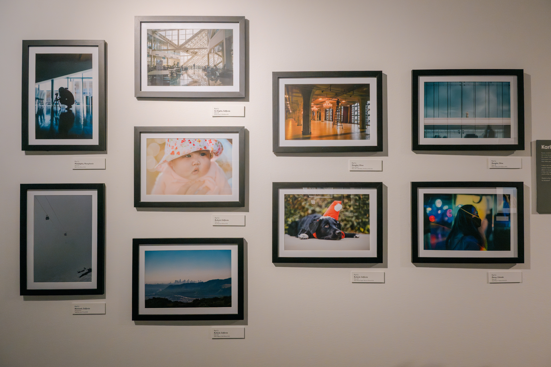
The inside of Disney Animation’s Burbank building is basically one gigantic museum-quality art gallery that happens to have an animation studio embedded within, and one really cool thing that the studio does from time to time is to put on an internal art show with work from various Disney Animation employees. The latest show is a photography show, and I got to be a part of it and show some of my photos! The show, titled HAVE CAMERA, WILL TRAVEL, was coordinated and designed by the amazing Justin Hilden from Disney Animation’s legendary Animation Research Library, and features work from seven Disney Animation photographers: Alisha Andrews, Rehan Butt, Joel Dagang, Brian Gaugler, Ashley Lam, Madison Kennaugh, and myself. My peers in the show are all incredible photographers whose work I find really inspiring; I encourage checking out their photography work online! The show will be up inside of Disney Animation’s Burbank studio for several months.

Ever since my dad gave my brother and me a camera when I was in high school, photography has been a major hobby of mine. Today I have several cameras, a bunch of weird and fun and interesting lenses that I have collected over the years, and I take a lot of photos every year (which has only ramped up even more after I became a dad myself). However, I rarely, if ever, post or share my photos publicly; for me, my photography hobby is purely for myself and my close friends and family. Participating in a photography show was a bit of a leap of faith for me, even within the restricted domain of inside of my workplace instead of in the general public. I think I’m a passable photographer at this point, but certainly nowhere near amazing. However, one advantage of having taken tens of thousands of photos over the past 15 years is that even if only a tiny percentage of my photos are good enough to show, a tiny percentage of tens of thousands is still enough to pull together a small collection to show.

I thought I’d share the photos I have in the show here on my blog as well. There isn’t really a coherent theme; these are just photos I’ve taken that I liked from the past several years. Some are travel photos, some are of my family, and others are just interesting moments that I noticed. I won’t go into my photography and editing process and whatnot here; I’ll save that for a future post.

I color grade my photos for both SDR and HDR; if you are using a device/browser that supports HDR1 , a toggle will appear below giving the ability to enable HDR on this page. Give it a try!

HDR is not supported on this browser/display.

Enable HDR:

I wrote a small artist’s statement for the show:

To me, a camera is actually a time machine. Taking photos gives me a way to connect back to moments and places in the past; for this reason I take a lot of photos mostly for my own memory, and every once in a rare while one of them is actually good enough to show other people!

I shoot with whatever camera I happen to have on me at the moment. Sometimes it’s a big fancy DSLR, sometimes it’s the phone in my pocket, sometimes it’s something in between. I learned a long time ago that the best camera is just whatever one is in reach at the moment.

Thanks to Harmony for her patience every time I fumbled a lens in my backpack.

Here are my photos from the show, presented in no particular order:

Los Angeles, California | Nikon Z8 | Smena Lomo T-43 40mm ƒ/4 | Display Mode: SDR
Los Angeles, California | Nikon Z8 | Smena Lomo T-43 40mm ƒ/4 | Display Mode: HDR

Denver, Colorado | Nikon Z8 | Zeiss Planar T* 50mm ƒ/1.4 C/Y | Display Mode: SDR
Denver, Colorado | Nikon Z8 | Zeiss Planar T* 50mm ƒ/1.4 C/Y | Display Mode: HDR

Mammoth, California | iPhone 14 Pro | Telephoto Lens 77mm ƒ/2.8 | Display Mode: SDR
Mammoth, California | iPhone 14 Pro | Telephoto Lens 77mm ƒ/2.8 | Display Mode: HDR

Burbank, California | Nikon Z8 | Zeiss Kipronar 105mm ƒ/1.9 | Display Mode: SDR
Burbank, California | Nikon Z8 | Zeiss Kipronar 105mm ƒ/1.9 | Display Mode: HDR

Shanghai, China | Nikon Z8 | Nikon Nikkor Z 24-120mm ƒ/4 S | Display Mode: SDR
Shanghai, China | Nikon Z8 | Nikon Nikkor Z 24-120mm ƒ/4 S | Display Mode: HDR

Burbank, California | Nikon Z8 | Asahi Pentax Super-Takumar 50mm ƒ/1.4 | Display Mode: SDR
Burbank, California | Nikon Z8 | Asahi Pentax Super-Takumar 50mm ƒ/1.4 | Display Mode: HDR

Philadelphia, Pennsylvania | iPhone 5s | Main Lens 29mm ƒ/2.2 | Display Mode: SDR
Philadelphia, Pennsylvania | iPhone 5s | Main Lens 29mm ƒ/2.2 | Display Mode: HDR

Shanghai, China | Nikon D5100 | Nikon AF-S DX NIkkor 18-55mm ƒ/3.5-5.6 | Display Mode: SDR
Shanghai, China | Nikon D5100 | Nikon AF-S DX NIkkor 18-55mm ƒ/3.5-5.6 | Display Mode: HDR

Burbank, California | Nikon Z8 | Nikon Nikkor Z 24-120mm ƒ/4 S | Display Mode: SDR
Burbank, California | Nikon Z8 | Nikon Nikkor Z 24-120mm ƒ/4 S | Display Mode: HDR

Additionally, there were a few photos that I had originally picked out for the show but didn’t make the cut in the end due to limited wall space. I thought I’d include them here as well:

Hualien, Taiwan | Nikon Z8 | Nikon Nikkor Z 24-120mm ƒ/4 S | Display Mode: SDR
Hualien, Taiwan | Nikon Z8 | Nikon Nikkor Z 24-120mm ƒ/4 S | Display Mode: HDR

Burbank, California | Fujifilm X-M1 | Fujifilm Fujinon XF 27mm ƒ/2.8 | Display Mode: SDR
Burbank, California | Fujifilm X-M1 | Fujifilm Fujinon XF 27mm ƒ/2.8 | Display Mode: HDR

Los Angeles, California | iPhone 5s | Main Lens 29mm ƒ/2.2 | Display Mode: SDR
Los Angeles, California | iPhone 5s | Main Lens 29mm ƒ/2.2 | Display Mode: HDR

Here’s some additional commentary for each of the photos, presented in the same order that the photos are in:

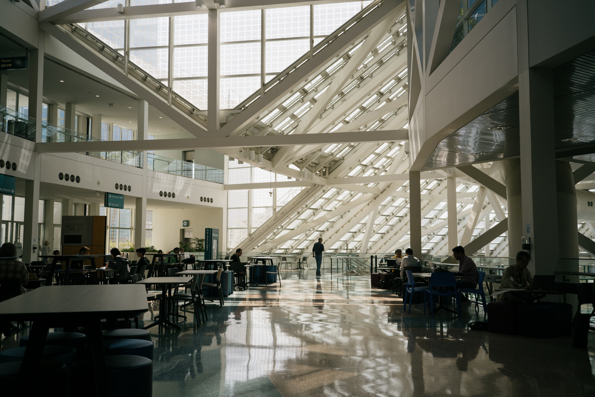
  1. The south hall of the Los Angeles Convention Center, taken while walking between sessions at a past SIGGRAPH.
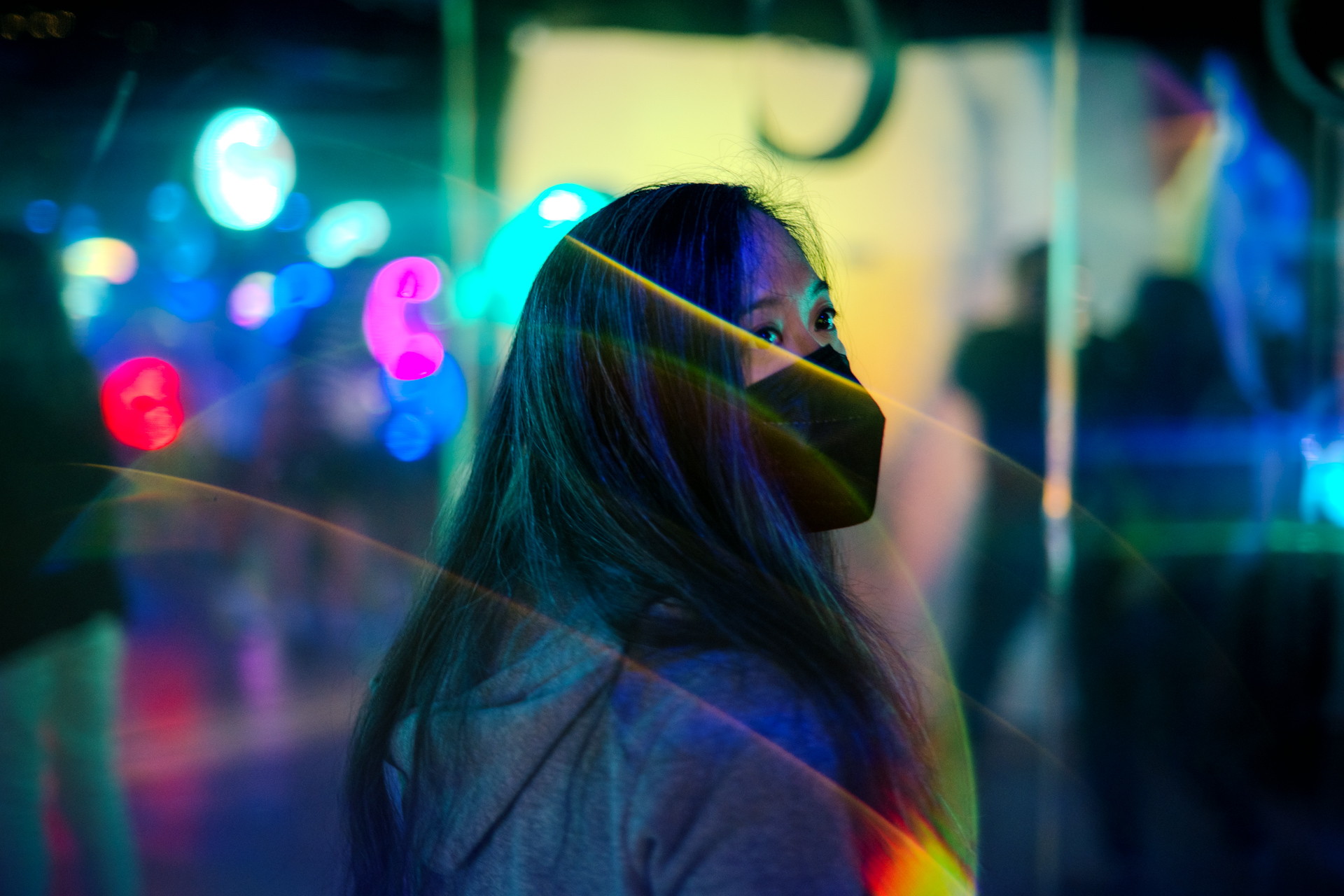
  2. My wife, Harmony Li, at Meow Wolf’s Convergence Station art installation. The lens flares were a total happy accident.
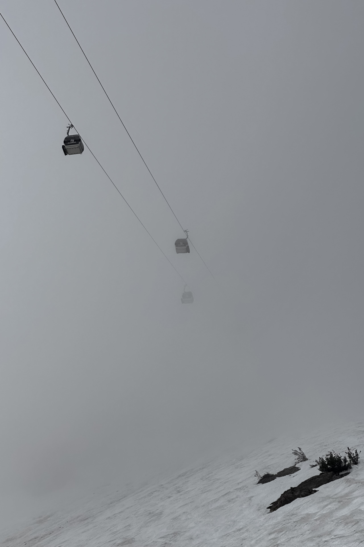
  3. The Panorama Gondola disappearing into a quickly descending blizzard near the top of Mammoth, taken while we were getting off of the mountain as quickly as we could. It doesn’t look like it, but this is actually a color photograph.
  4. Our then-four-month-old daughter hanging out with her grandparents in our backyard. This was the day she held a flower for the first time.
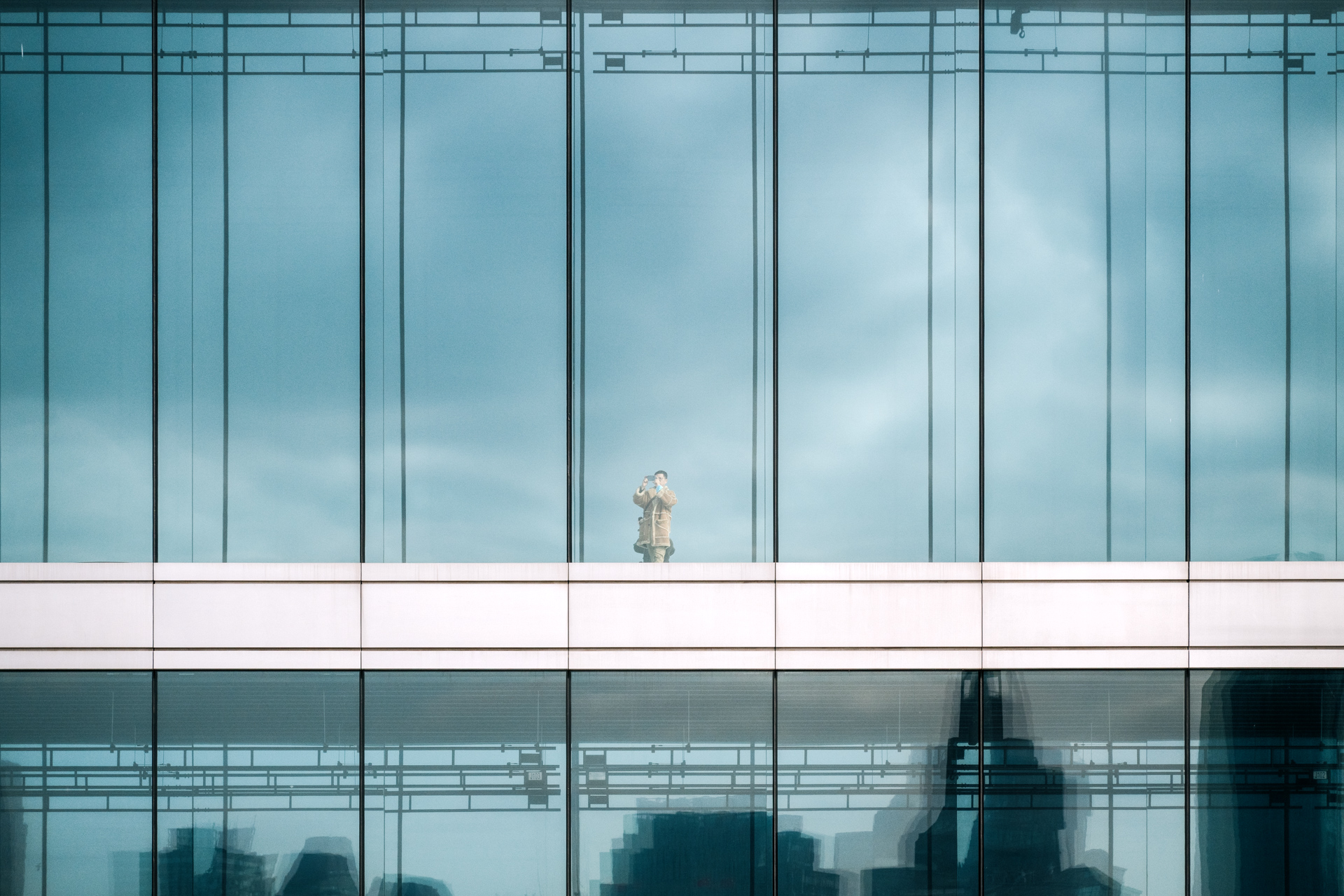
  5. Someone taking a photo from inside of Shanghai’s Museum of Art Pudong. I wonder if I’m in his photo too.
  6. Our half border collie / half golden retriever, Tux, in a Santa hat for a Christmas shoot. I think my wife actually took this one, but she insisted that I include it in the show.
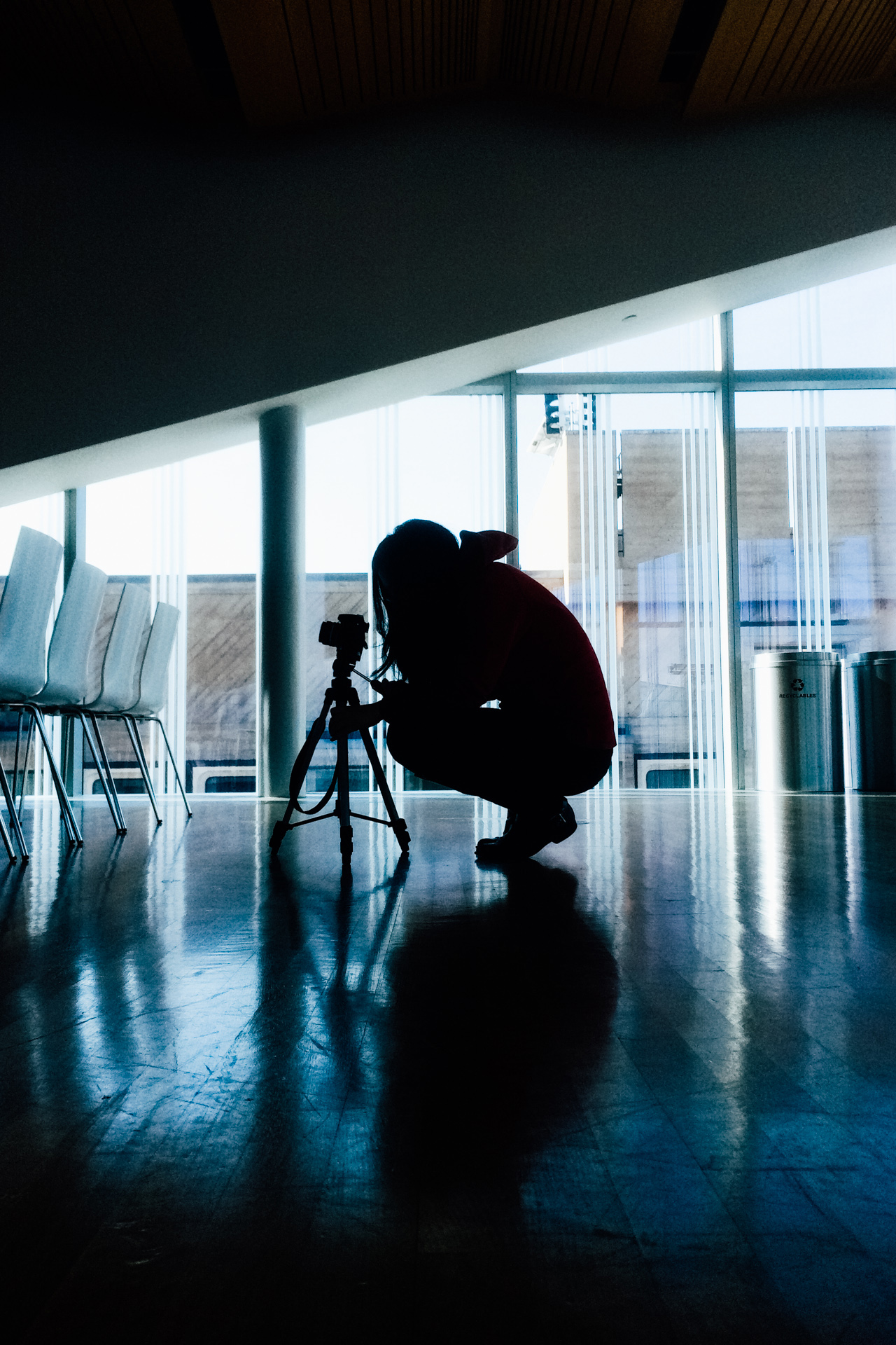
  7. My then-girlfriend now-wife shooting a video project when we were in university. This was in Penn’s Singh Center for Nanotechnology building.
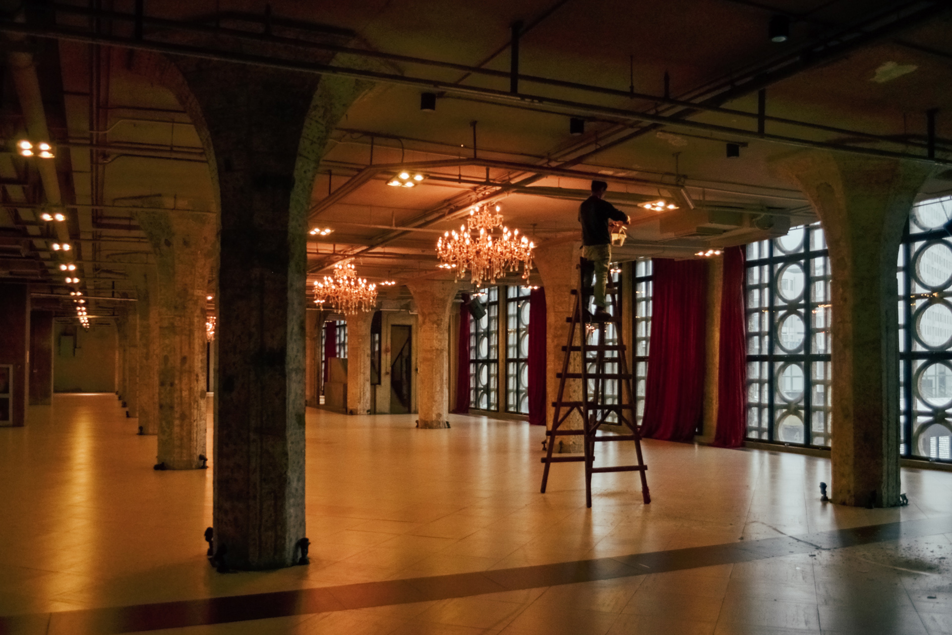
  8. A worker hanging a chandelier in Shanghai’s 1933 Laoyangfang complex. This place used to be a municipal slaughterhouse but now contains creative spaces.
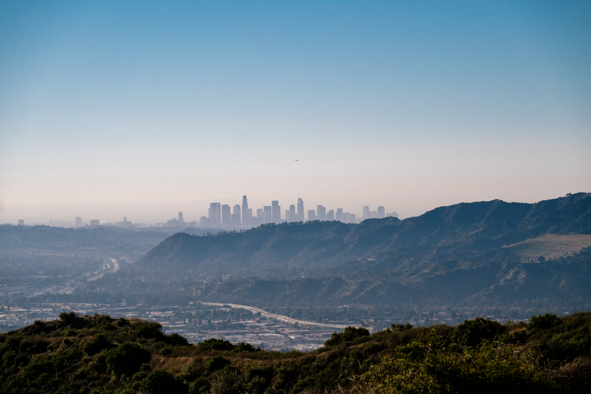
  9. The Los Angeles skyline, as seen from the Stough Canyon trail above Burbank. The tiny dot in the center of the frame is actually a plane on landing approach to LAX.
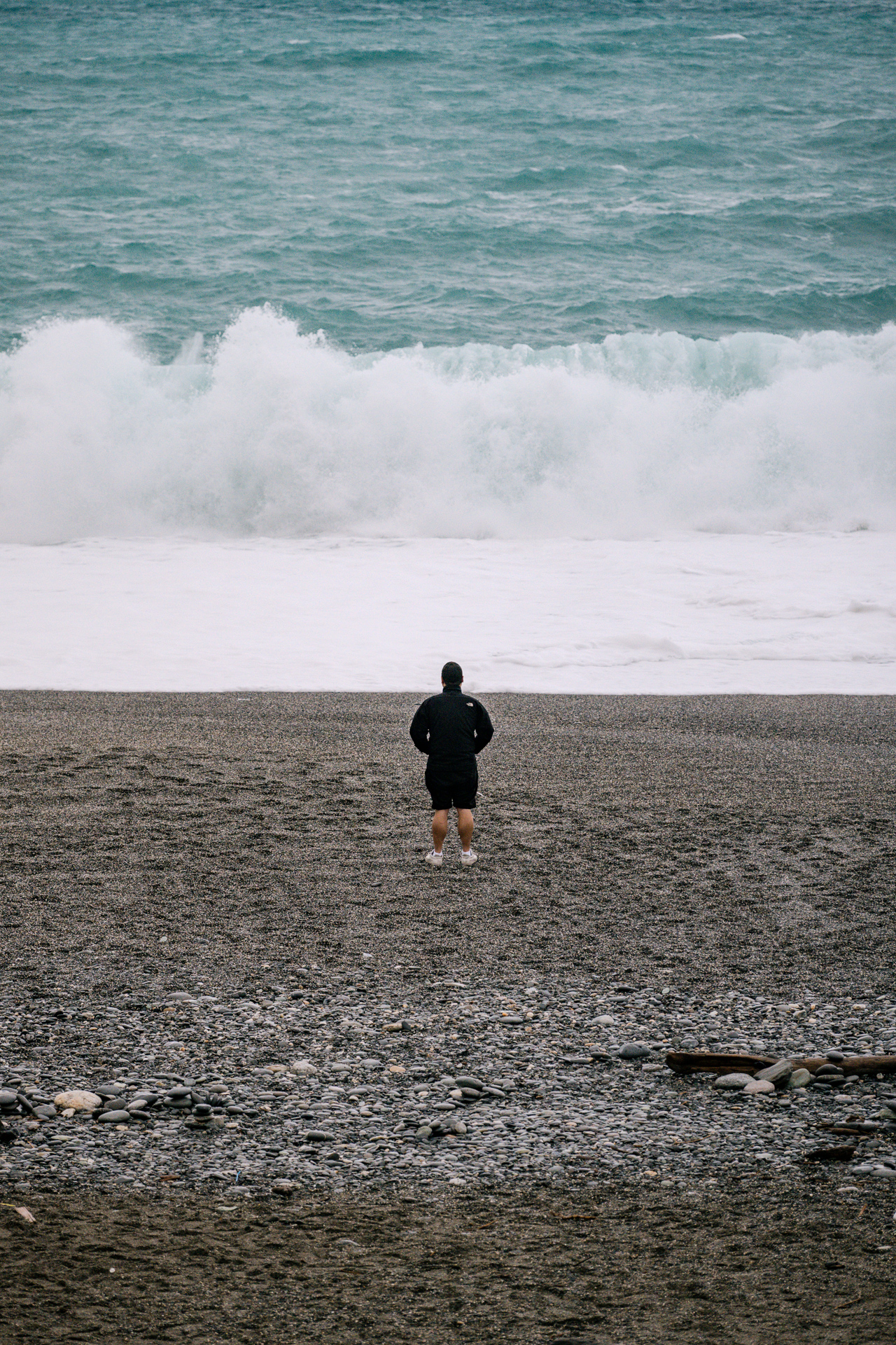
  10. My friend Alex stopping to take in the waves as a storm was approaching the eastern coast of Taiwan.
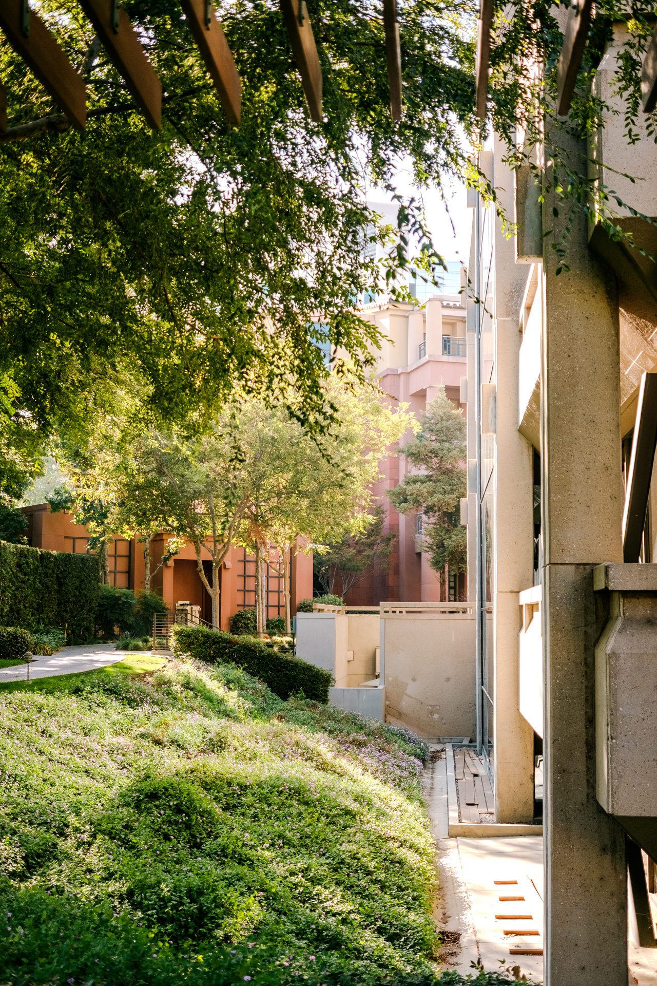
  11. Looking past the Roy O. Disney building towards the Team Disney headquarters building on Disney’s Burbank studio lot.
  12. A past SIGGRAPH party somewhere in the fashion district in downtown Los Angeles.

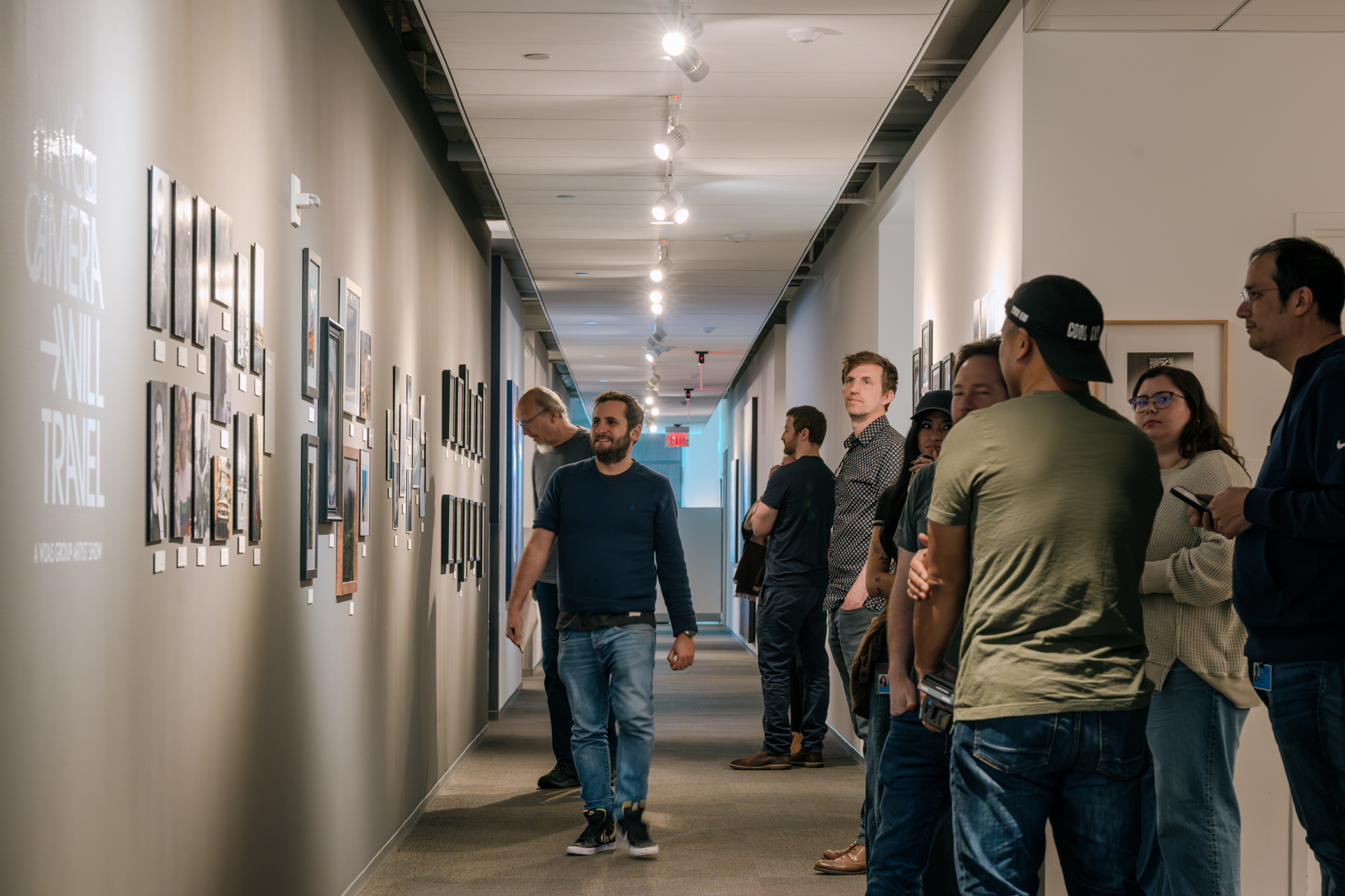
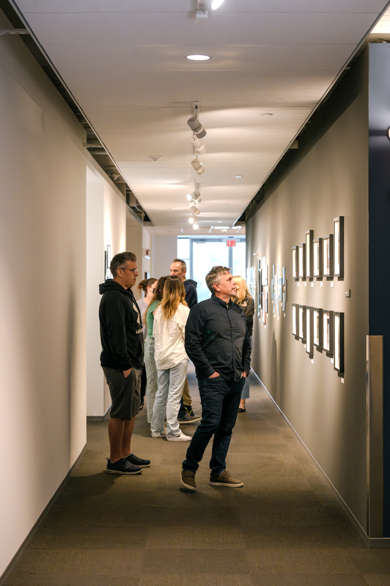
Finally, here’s a few snapshots of what the show looks like, towards the end of the show’s opening. The opening had a great turnout; thanks to everyone that came by!

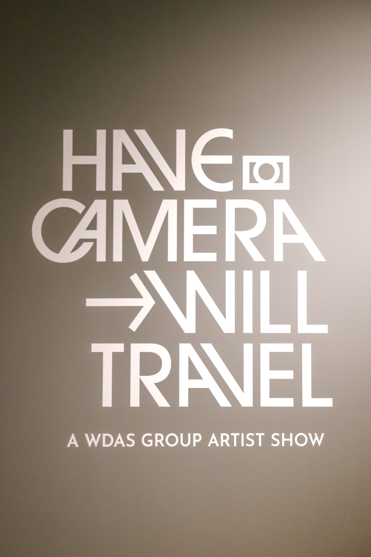
Justin's awesome logo for the show. | Display Mode: SDR
Justin's awesome logo for the show. | Display Mode: HDR

Crowds dying down towards the end of the show's opening. | Display Mode: SDR
Crowds dying down towards the end of the show's opening. | Display Mode: HDR

The gallery hallway looking in the other direction. | Display Mode: SDR
\
The gallery hallway looking in the other direction. | Display Mode: HDR

My pieces framed and on the wall. | Display Mode: SDR
My pieces framed and on the wall. | Display Mode: HDR


Footnotes

1 At time of posting, this post’s HDR mode makes use of browser HDR video support to display HDR pictures as single-frame HDR videos, since no browser has HDR image support enabled by default yet. The following devices/browsers are known to support HDR videos by default:

  • Safari on iOS 14 or newer, running on the iPhone 12 generation or newer, and on iPhone 11 Pro.
  • Safari on iPadOS 14 or newer, running on the 12 inch iPad Pros with M1 or M2 chip, and on all iPad Pros with M4 chip or newer.
  • Safari or Chrome 87 or newer on macOS Big Sur or newer, running on the 2021 14 and 16 inch MacBook Pros or newer, or any Mac using a Pro Display XDR or other compatible HDR monitor.
  • Chrome 87 or newer, or Edge 87 or newer, on Windows 10 or newer, running on any PC with a compatible DisplayHDR-1000 or higher display (examples: any monitor on this list). You may also need to adjust HDR settings in Windows.
  • Chrome 87 or newer on Android 14 or newer, running on devices with an Android Ultra HDR compatible display (examples: Google Pixel 8 generation or newer, Samsung Galaxy S21 generation or newer, OnePlus 12 or newer, and various others).

On Apple devices without HDR-capable displays, iOS and macOS’s EDR system may still allow HDR imagery to look correct under specific circumstances. keyboard_return

New Unified Site Design

Over the past month or so, I’ve undertaken another overhaul of my blog and website, this time to address a bunch of niggling things that have annoyed me for a long time. In terms of pure technical change, this round’s changes are not as extensive as the ones I had to make to implement a responsive layout a few years ago. Most of this round was polishing and tweaking and refining things, but enough things were touched that in the aggregate this set of change represents the largest number of visual updates to the site in a long time. Broadly things still look similar to before, but everything is a little bit tighter and more coherent and the details are sweated over just a little bit more. The biggest change this round of updates brings is that the blog and portfolio halves of my site now have a completely unified design, and both halves are now stiched together into one cohesive site instead of feeling and working like two separate sites. So, in the grand tradition of writing about making one’s website on one’s own website, here’s an overview of what’s changed and how I approached building the new unified design.

One unusual quirk of my site is that the portfolio half of the site and the blog half of the site run on completely different tech stacks. Both halves of the site are fundamentally based on static site generators, but pretty much everything under the hood is different, down to the very servers they are hosted on. The blog is built using Jekyll and served from Github Pages, fronted using Cloudflare. The portfolio, meanwhile, is built using a custom minimal static site generator called OmjiiCMS. When I say minimal, I really do mean minimal- OmjiiCMS is essentially just a fancy script that takes in hand-written HTML files containing the raw content of each page and simply glues on the sitewide header, footer, and nav menu. Calling it a CMS is a misnomer because it really doesn’t do any content management at all- the name is a holdover from back when my personal site and blog both ran on a custom PHP-based content management and publishing system that I wrote in high school. I eventually moved my blog to Wordpress briefly, which I found far too complicated for what I needed, and then landed on Blogger for a few years, and then in 2013 I moved to Ghost for approximately one week because Ghost had good Markdown support before I realized that if I wanted to write Markdown files, I should just use Jekyll. The blog has been powered by Jekyll ever since. As a bonus, moving to a static site generator made everything both way faster and way easier. Meanwhile, the portfolio part of the site has always been a completely custom thing because the portfolio site has a lot of specific custom layouts and I always found that building those layouts by hand was easier and simpler than trying to hammer some pre-existing framework into the shape I wanted. Over time I stripped away more and more of the underlying CMS until I realized I didn’t need one at all, at which point I gutted the entire CMS and made the portfolio site just a bunch of hand-written HTML files with a simple script to apply the site’s theming to every page before uploading to my web server. This dual-stack setup has stuck for a long time now because at least for me it allows me to run a blog and personal website with a minimal amount of fuss; the goal is to spend far more time actually writing posts than mucking around with the site’s underlying tech stack.

However, one unfortunate net result of these two different evolutionary paths is that while I have always aimed to make the blog and portfolio sites look similar, they’ve always looked kind of different from each other, sometimes in strange ways. The blog and portfolio have always had different header bars and navigation menus, even if the overall style of the header was similar. Both parts of the site always used the same typefaces, but in different places for different things, with completely inconsistent letter spacing, sizing, line heights, and more. Captions have always worked differently between the two parts of the site as well. Even the responsive layout system worked differently between the blog and portfolio, with layout changes happening at different window widths and different margins and paddings taking effect at the same window widths between the two. These differences have always bothered me, and about a month ago they finally bothered me enough for me to do something about it and finally undertake the effort of visually aligning and unifying both sites, down to the smallest details. Before breaking things down, here’s some before and afters:

Figure 1: Main site home page, before (left) and after (right) applying the new unified theme. For a full screen comparison, click here.

Figure 2: Blog front page, before (left) and after (right) applying the new unified theme. For a full screen comparison, click here.

The process I took to unify the designs for the two halves was to start from near scratch on new CSS files and rebuild the original look of both halves as closely as possible, while resolving differences one by one. The end result is that the blog didn’t just wholesale take on the details of the portfolio, or vice versa- instead, wherever differences arose, I thought about what I wanted the design to accomplish and decided on what to do from there. All of this was pretty easy to do because despite running on different tech stacks, both parts of the site were built using as much adherence to semantic HTML as possible, with all styling provided by two CSS files; one for each half. To me, a single CSS file containing all styling separate from the HTML is the obvious way to build web stuff and is how I learned to do CSS over a decade ago from the CSS Zen Garden, but apparently a bunch of popular alternative methods exist today such as Tailwind, which directly embeds CSS snippets in the HTML markup. I don’t know a whole lot about what the cool web kids do today, but Tailwind seems completely insane to me; if I had built my site with CSS snippets scattered throughout the HTML markup, then this unifying project would have taken absolute ages to complete instead of just a few hours spread over a weekend or two. Instead, this project was easy to do because all I had to do was make new CSS files for both parts of the site and I barely had to touch the HTML at all, aside from an extra wrapper div or two.

The general philosophy of this site’s design has always been to put content first and keep things information dense, all with a modern look and presentation. The last big revision of the site added responsive design as a major element and also pared back some unneeded flourishes with the goal of keeping the site lightweight. For the new unified design, I wanted to keep all of the above and also lean more into a lightweight site and improve general readability and clarity, all while keeping the site true to its preexisting design.

Here’s the list of what went into the new unified design:

  • Previously the blog’s body text was fairly dense and had very little spacing between lines, while the portfolio’s body text was slightly too large and too spaced out. The unified design now defines a single body text style with a font size somewhere in between what the two halves previously had, and with line spacing that grants the text a bit more room to breathe visually for improved readability while still maintaining relatively high density.
  • Page titles, section headings, and so on now use the same font size, color, letter spacing, margins, etc. between both halves.
  • I experimented with some different typefaces, but in the end I still like what I had before, which is Proxima Nova for easy-to-read body text and Futura for titles, section headings, etc; previously how these two typefaces were applied was inconsistent though, and the new unified design makes all of this uniform.
  • Code and monospaced text is now typeset in Berkeley Mono by US Graphics Company.
  • Image caption styles are now the same across the entire site and now do a neat trick where if they fit on a single line, they are center aligned, but as soon as the caption spills over onto more than one line, the caption becomes left aligned. While the image caption system does use some simple Javascript to set up, the line count dependent alignment trick is pure CSS. Here is a comparison:
Figure 3: Image caption, before (left) and after (right) applying the new unified theme. Before, captions were always center aligned, whereas now, captions are center aligned if they fit on one line but automatically become left aligned if they spill onto more than one line. For a full screen comparison, click here.

  • The blog now uses red as its accent color, to match the portfolio site. The old blue accent color was a holdover from when the blog’s theme was first derived from what is now a super old variant of Ghost’s Casper theme.
  • Links now are underlined on hover for better visibility.
  • Both sites now share an identical header and navigation bar. Previously the portfolio and blog had different wordmarks and had different navigation items; they now share the same “Code & Visuals” wordmark and same navigation items.
  • As part of unifying the top navigation bars, the blog’s Atom feed is no longer part of the top navigation but instead is linked to from the blog archive and is in the site’s new footer.
  • The site now has a footer, which I found useful for delineating the end of pages. The new footer has a minimal amount of information in it: just copyright notice, a link to the site’s colophon, and the Atom feed. The footer always stays at the bottom of the page, unless the page is smaller than the current browser window size, in which case the footer floats at the bottom of the browser window, and the neat thing is that this is implemented entirely using CSS with no Javascript.
  • Responsive layouts now kick in at the same window widths for both parts of the site, and the margins and various text size changes applied for responsive layouts are the same between both halves as well. As a result, the site now looks the same across both halves at all responsive layout widths across all devices.
  • All analytics and tracking code has been completely removed from both halves of the site.
  • The “About” section of the site has been reorganized with several informational slash pages. Navigation between the various subpages of the About section is integrated into the page headings.
  • The “Projects” section of the site used to just be one giant list of projects; this list is now reorganized into subpages for easier navigation, and navigation is also integrated into the Project section’s page headings.
  • Footnotes and full screen image comparison pages now include backlinks to where they were linked to from main body text.
  • Long posts with multiple subsections now include a table of contents at the beginning.

Two big influences on how I’ve approached building and designing my site over the past few years have been Tom Macwright’s site and Craig Mod’s site. From Tom Macwright’s site, I love the ultra-brutalist and super lightweight design, and I also like his site navigation, choice of sections, and slash pages. From Craig Mod’s site, I really admire the typography and how the site presents his various extensive writings with excellent readability and beautiful layouts. My site doesn’t really resemble those two sites at all visually (and I wouldn’t want it to; I like my own thing!), but I drew a lot of influence from both of those sites when it comes to how I thought about an overall approach to design. In addition to the two sites mentioned above, I regularly draw inspiration from a whole bunch of other sites and collections of online work; I keep an ongoing list on my about page if you’re curious.

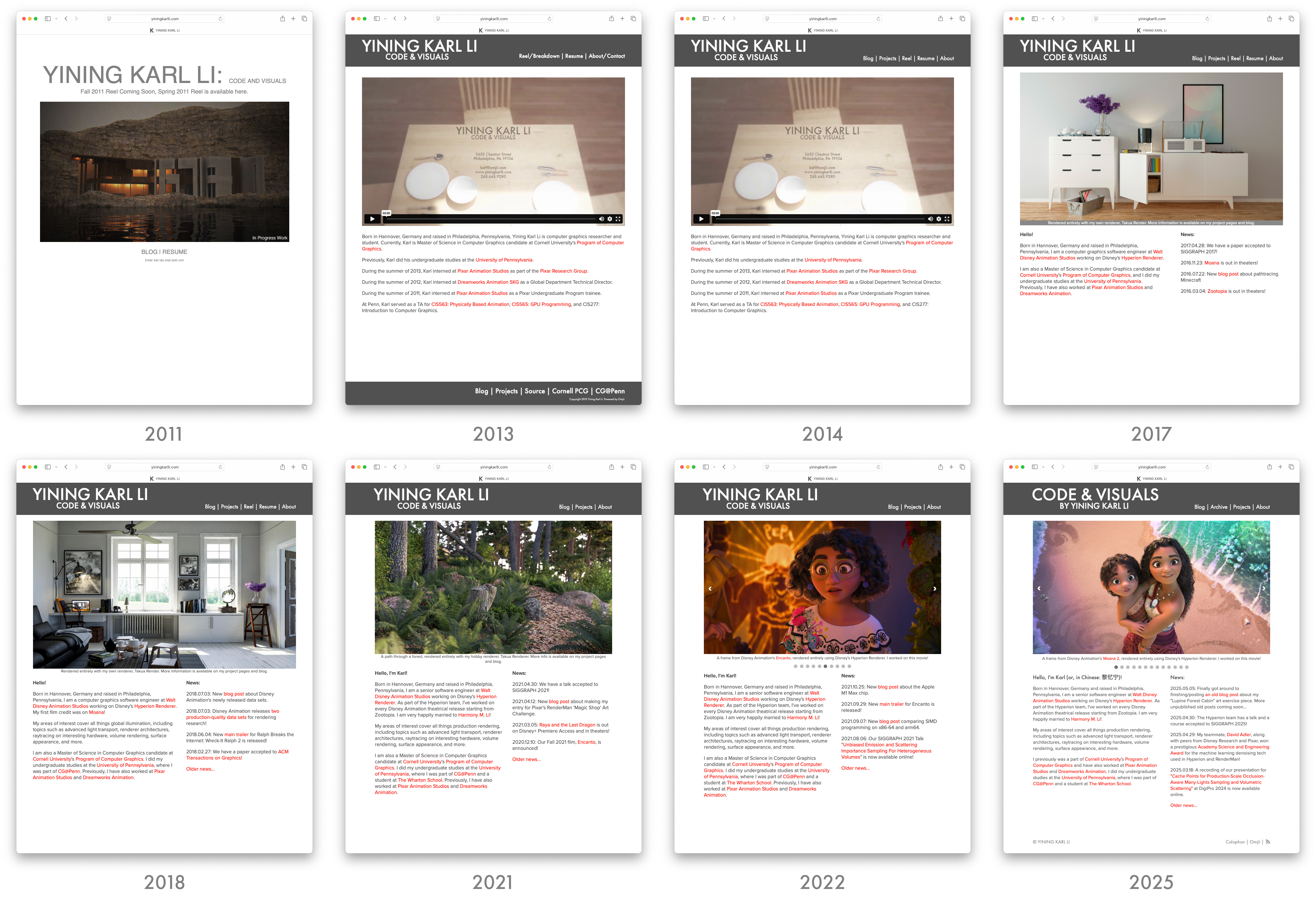
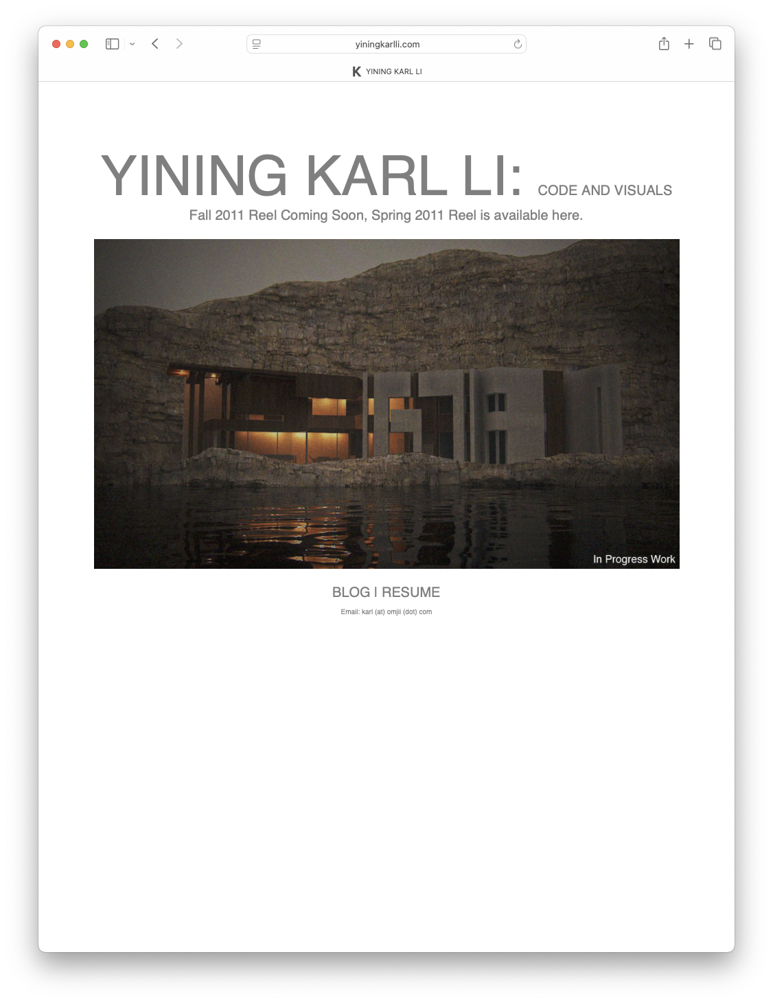
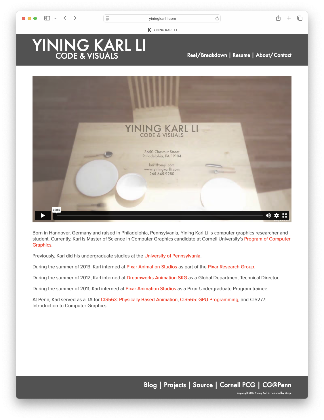
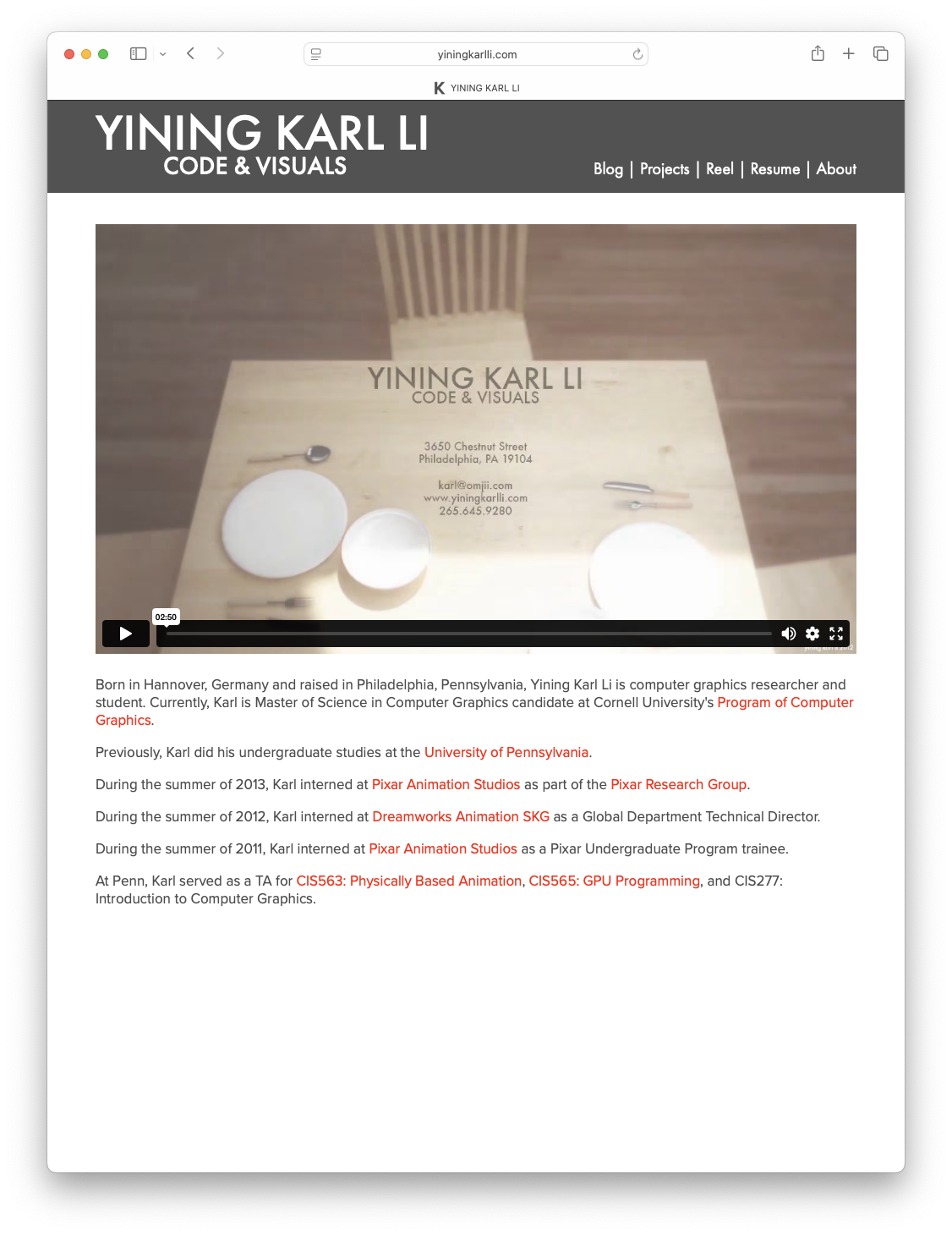
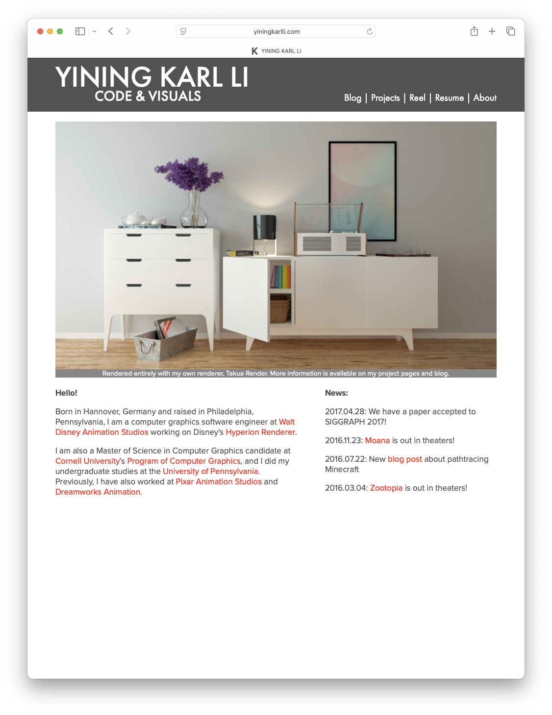
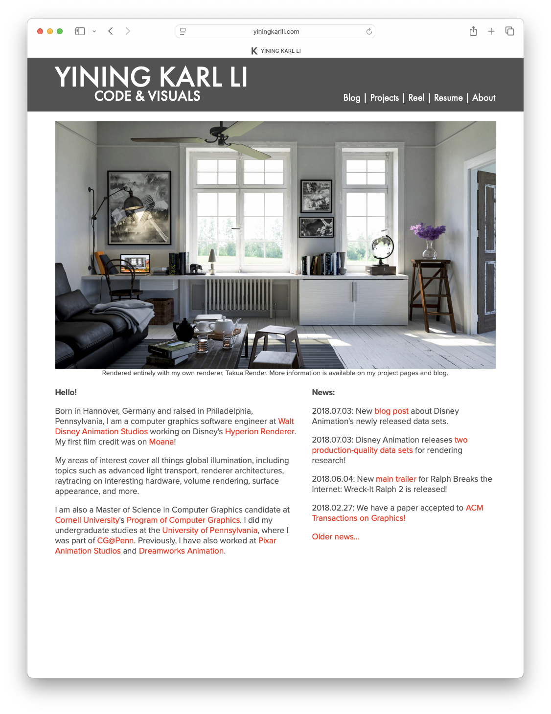
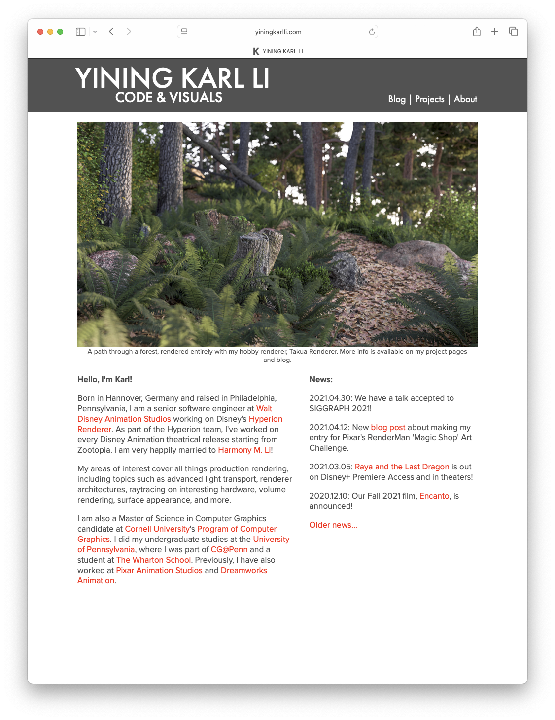
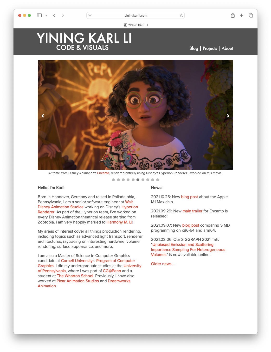
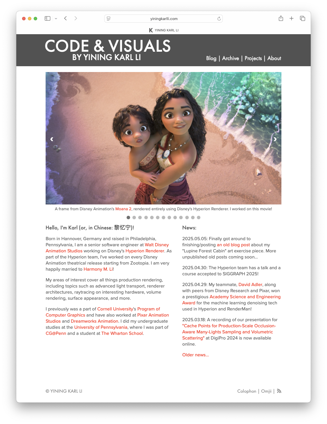
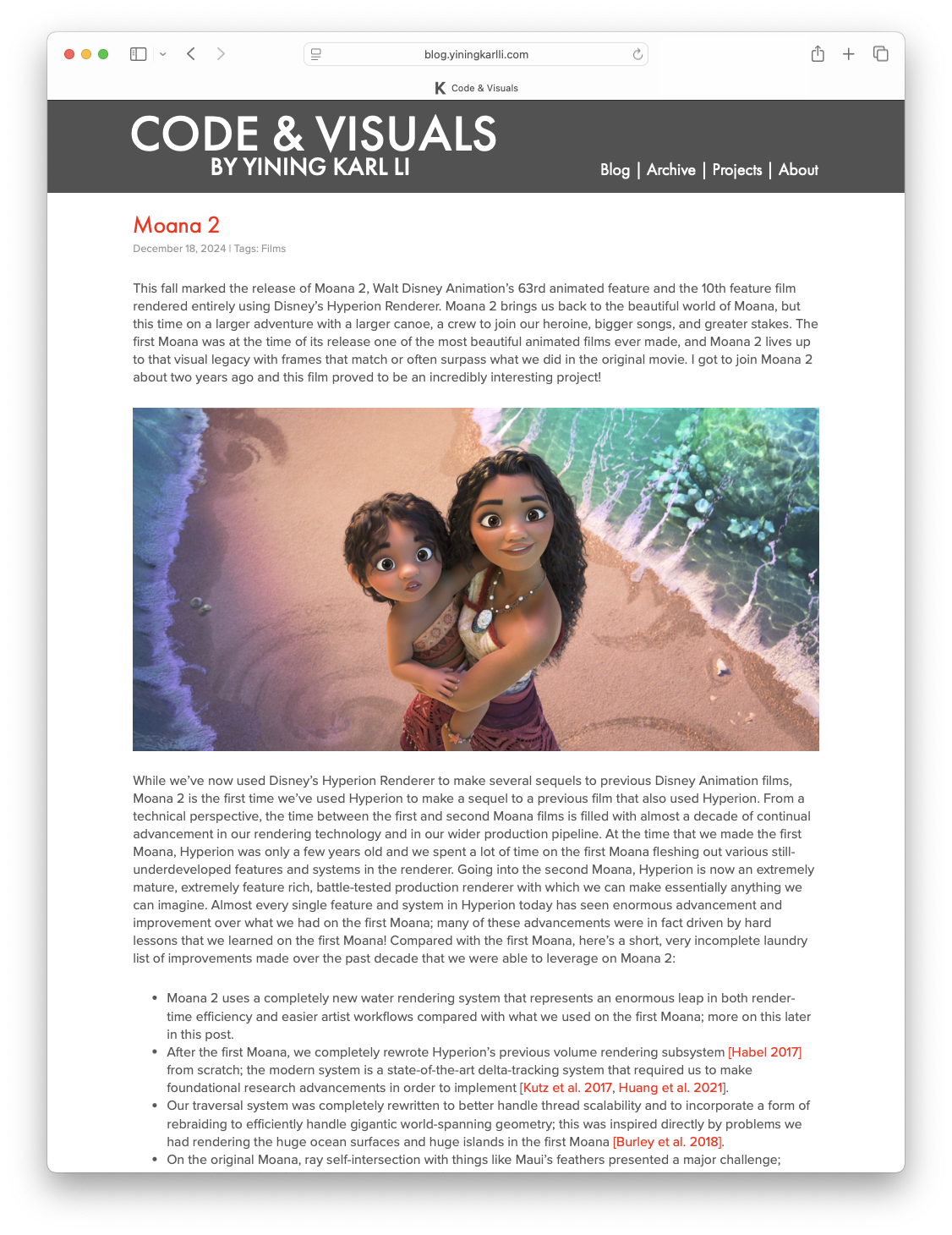
Hee’s a brief overview of how the portfolio half of the site has changed over the years. The earliest 2011 version was just a temporary site I threw together while I was applying to the Pixar Undergraduate Program internship (and it worked!); in some ways I kind of miss the ultra-brutalist utilitarian design of this version. I actually still keep that old version around for fun. The 2013 version was the first version of the overall design that continues to this day, but was really heavy-handed with both a header and footer that hovered in place when scrolling. The 2014 version consolidated the header and footer into just a single header that still hovered in place but shrunk down when scrolling. The 2017 version added dual-column layouts to the home page and project pages, and the 2018 version cleaned up a bunch of details. The 2021 version was a complete rebuild that introduced responsive design, and the 2022 version was a minor iteration that added things like a image carousel to the home page. The latest version rounds out the evolutionary history up to now:

Figure 4: Evolution of the portfolio half of the site from 2011 to today.

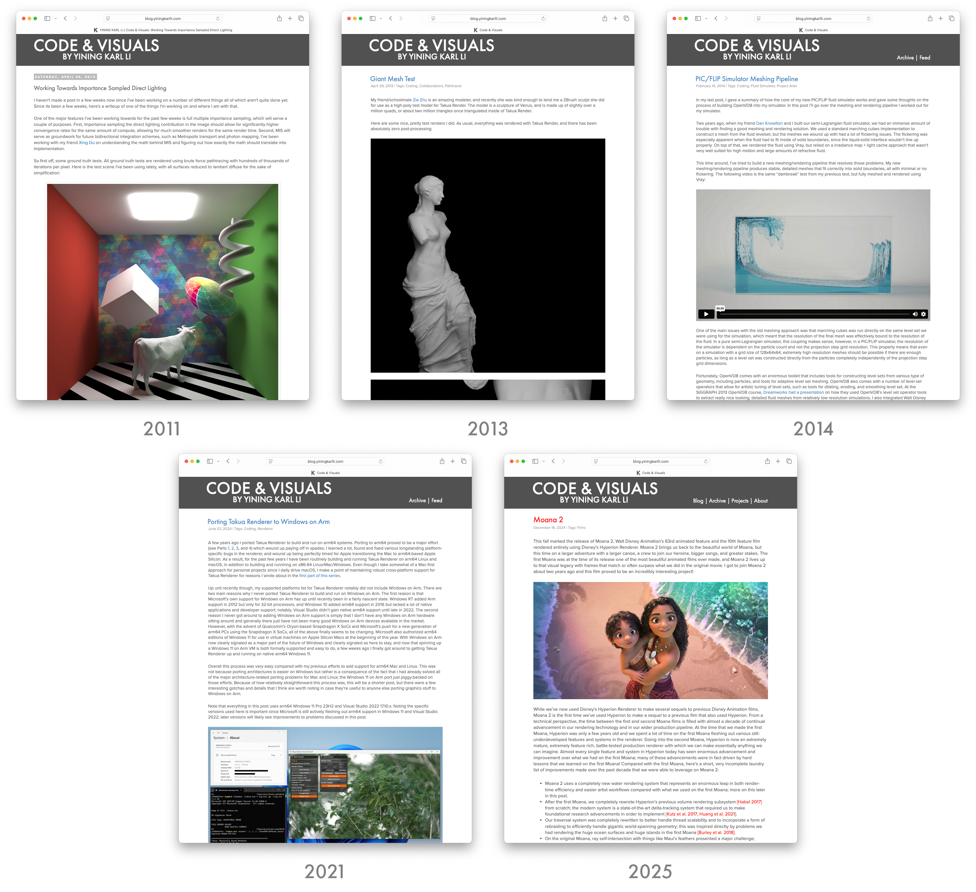
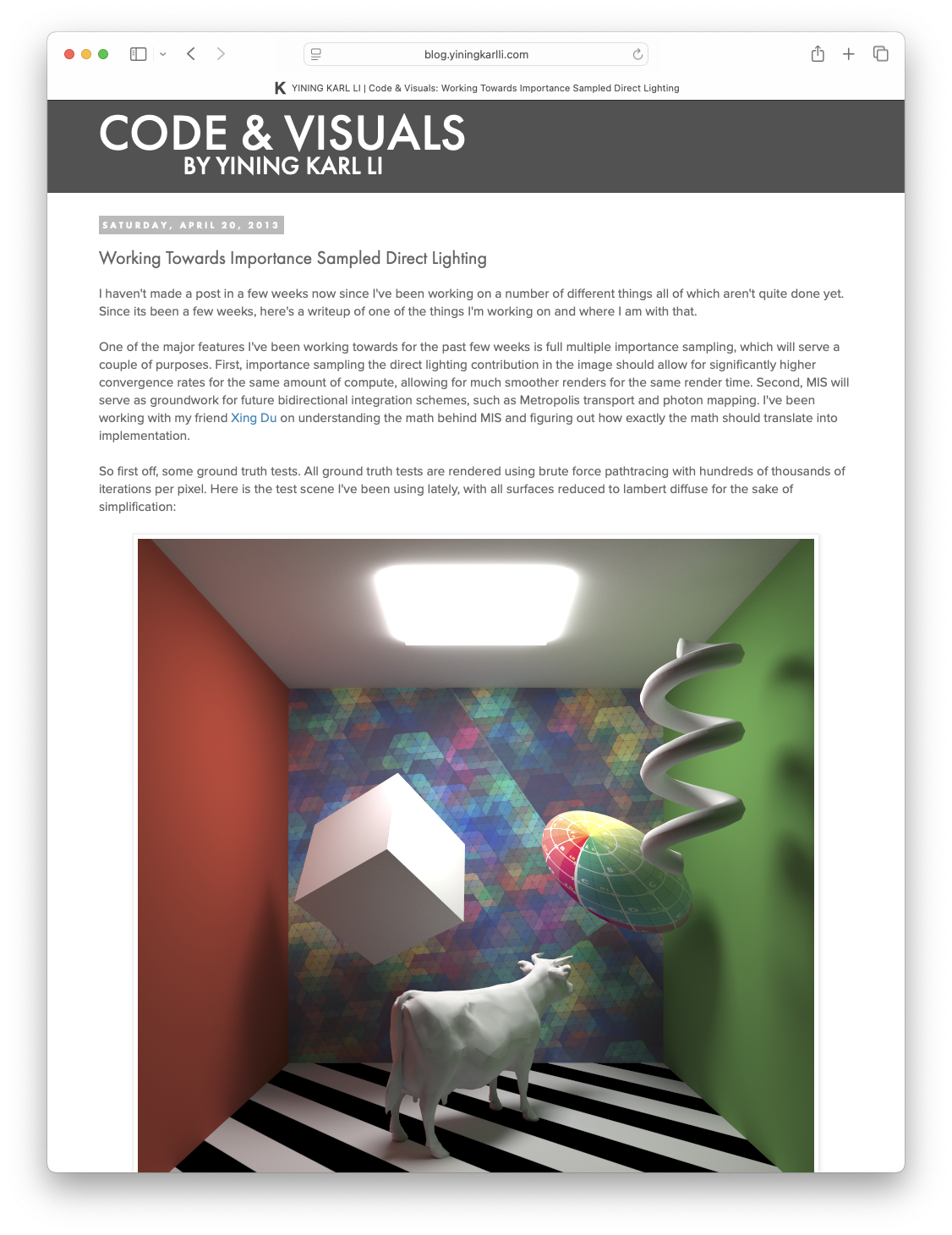
Meanwhile, the blog has actually seen less change overall. Unfortuantely I don’t have any screenshots or a working version of the codebase for the pre-2011 version of the blog anymore, but by the 2011 version the blog was on Blogger with a custom theme that I spent forever fighting against Blogger’s theming system to implement; that custom theme is actually the origin of my site’s entire look. The 2013 version was a wholesale port to Jekyll and as part of the port I built a new Jekyll theme that carried over much of the previous design. The 2014 version of the blog added an archive page and Atom feed, and then the blog more or less stayed untouched until the 2021 version’s responsve design overhaul. This latest version is the largest overhaul the blog has seen in a very long time:

Figure 5: Evolution of the blog half of the site from 2011 to today.

I’m pretty happy with how the new unified design turned out; both halves of the site now feel like one integrated, cohesive whole, and the fact that the two halves of the site run different tech stacks on different webservers is no longer made obvious to visitors and readers. I named the new unified site theme Einheitsgrafik, which translates roughly to “uniform graphic” or “standard graphic”, which I think is fitting. With this iteration, there are no longer any major things that annoy me every time I visit the site to double check things; hopefully that means that the site is also a better experience for visitors and readers now. I think that this particular iteration of the site is going to last a very long time!