Zootopia+
The second of Disney Animation’s two short-form television series in 2022 is Zootopia+, which was released in November of last year. Zootopia+ is comprised of six episodes set during Zootopia (2016), showing us events that are interwoven with the events of the original movie. Much like how Baymax! was made, Zootopia+ was produced entirely in-house at Disney Animation using the same tech and pipeline, and by the same artists, as our feature films. Furthermore, because Zootopia+ is interwoven with the original Zootopia, it had to be an exact match in terms of visual quality, even though at the time of release Zootopia was the most advanced and challenging film the studio had ever made. Getting to work on a project where we revisited Zootopia from some new angles was great fun!
Zootopia+ was made using essentially the same pipeline, toolset, and version of Disney’s Hyperion Renderer as Encanto. Notably since Encanto’s pipeline represented a massive jump forward from old proprietary data formats to an all-native-USD pipeline [Miller et al. 2022], Zootopia+ had to make the same jump. However, instead of starting with a clean slate of characters and assets as Encanto did, Zootopia+ had to port all of the familiar characters and assets from the original Zootopia forward from the studio’s legacy proprietary data formats into our new USD world. Interestingly, while much of the rest of the pipeline required a large porting effort to bring everything forward, on the rendering front, there was not actually much for us to do at all. Zootopia in a lot of senses was the first truly modern Hyperion show, where every rendering and shading feature used by the characters and assets back during the original production is still supported in the renderer today.
Big Hero 6 was the first show to make use of Hyperion, but Big Hero 6 represented something of a bridge period between the old REYES-based RenderMan world and the modern Hyperion world, and between Big Hero 6 and Zootopia, a lot of modernization happened that became the foundation of what we have today [Burley et al. 2017, Burley et al. 2018]. For example, Big Hero 6 is the only Hyperion show to not have used our modern fur/hair shading model, which was invented for Zootopia, and the old Tangled-era shading model [Sadeghi et al. 2010] was removed entirely from the renderer after the modern shading model [Chiang et al. 2016a] was put in place. We have since made many advancements on top of the features that Zootopia used, but all of the Zootopia-era shading features still exist and are supported in the renderer, so assets ported from Zootopia into our modern USD pipeline basically render more or less correctly out of the box without additional lookdev work. From a porting perspective, one useful aspect of the Zootopia world is that most characters are covered in fur, which means that even though characters ported from Zootopia are using our older normalized diffusion subsurface scattering model [Burley 2015] instead of the modern path traced subsurface scattering model [Chiang et al. 2016b], it doesn’t actually matter too much since bare skin is rarely seen anyway! One aspect of the renderer that has changed enormously since Zootopia and where the Zootopia-era system no longer exists is volume rendering; our modern volume rendering system completely replaced the old system [Kutz et al. 2017, Huang et al. 2021]. However, because volumes are typically used for shot-specific effects work, this wasn’t a problem for Zootopia+. Shot-specific effects didn’t need to be ported over from Zootopia because any volumetric effects needed for Zootopia+ would need to be newly made for the new shots anyway.
Much like on Once Upon A Snowman, because Zootopia+ has to interweave with the original Zootopia, the overall look of Zootopia+ has to match the look of the original Zootopia and look recognizable as being the same world at the same time. Unlike Once Upon A Snowman though, there wasn’t nearly as much of a visual gap to cross despite the 7 year gap, since Zootopia was also a modern Hyperion show whereas Once Upon A Snowman had to bridge the gap between a rasterized world without multi-bounce global illumination and the modern path traced world. Really I think what this speaks to is how successful the jump to path traced global illumination has been at Disney Animation and across the animation and VFX industry broadly. At the time of Zootopia, we were just barely past the point where path traced global illumination at scale was practical, but as a field we’ve now gotten incredibly good at it and now most of our research and development has moved away from trying to make path tracing practical at all and instead building better and more efficient features and workflows on top of path tracing. For the most part Zootopia+ matches Zootopia visually exactly, but a few episodes of Zootopia+ diverge and do something slightly different in order to serve the episode’s story. One of the ways this manifests is in varying aspect ratios; most of Zootopia+ uses the studio’s house-standard 2.39:1 Cinemascope widescreen aspect ratio, but a few episodes use a more widescreen TV styled 16:9 (or 1.78:1) aspect ratio, and one episode uses a throwback 1.85:1 old-school theatrical aspect ratio.
One area unrelated to rendering where Zootopia+ made an enormous technical jump is in rigging and animation. Historically Disney Animation has been a Maya shop when it comes to rigging and character animation, but Zootopia+ is the first project at Disney Animation to make use of Presto for rigging and character animation instead of Maya. Presto was originally Pixar’s proprietary in-house rigging and animation package [ElKoura 2014], first used on Brave, but going forward, Disney Animation is planning on using Presto as well and is moving all rigging and character animation over to Presto. To support this adoption effort, Presto is now co-developed by the two studios. So, even though porting characters from Zootopia to Zootopia+ required very little to no additional work on the shading and rendering side of things, some characters had to be completely re-rigged from scratch in Presto. Tools such as Disney Animation’s procedural rig authoring system, dRig [Smith et al. 2012], also had to be ported to work with Presto. Animating part of Zootopia+ in Presto and the rest in Maya is a great example of the type of workflows and capabilities that a fully native USD pipeline unlocks; previously a lot of our workflows were tied to specific DCCs because of proprietary data formats, but now in our pipeline, any DCC can be used once it has been customized to work with our internal flavor of USD.
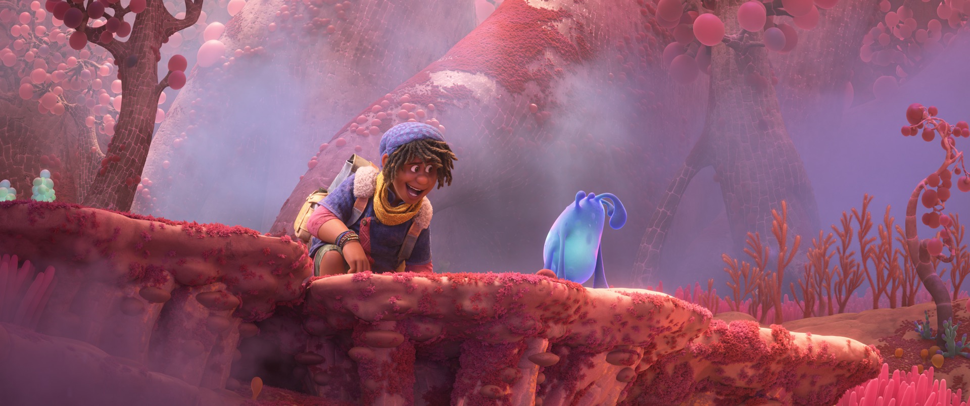
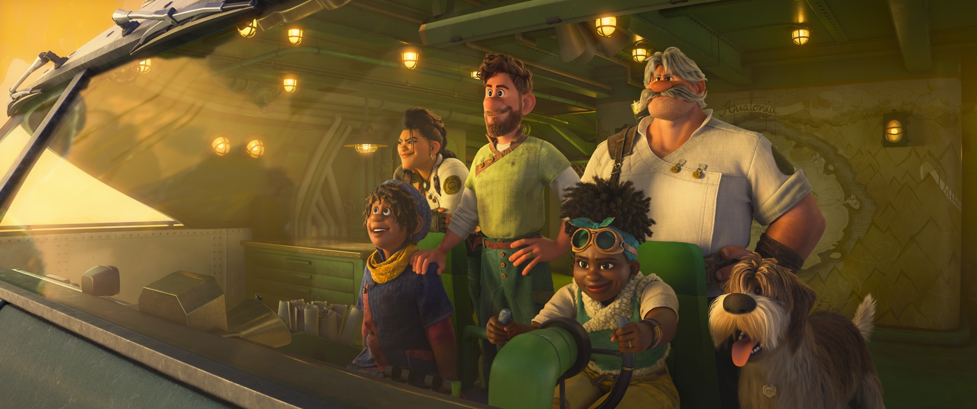
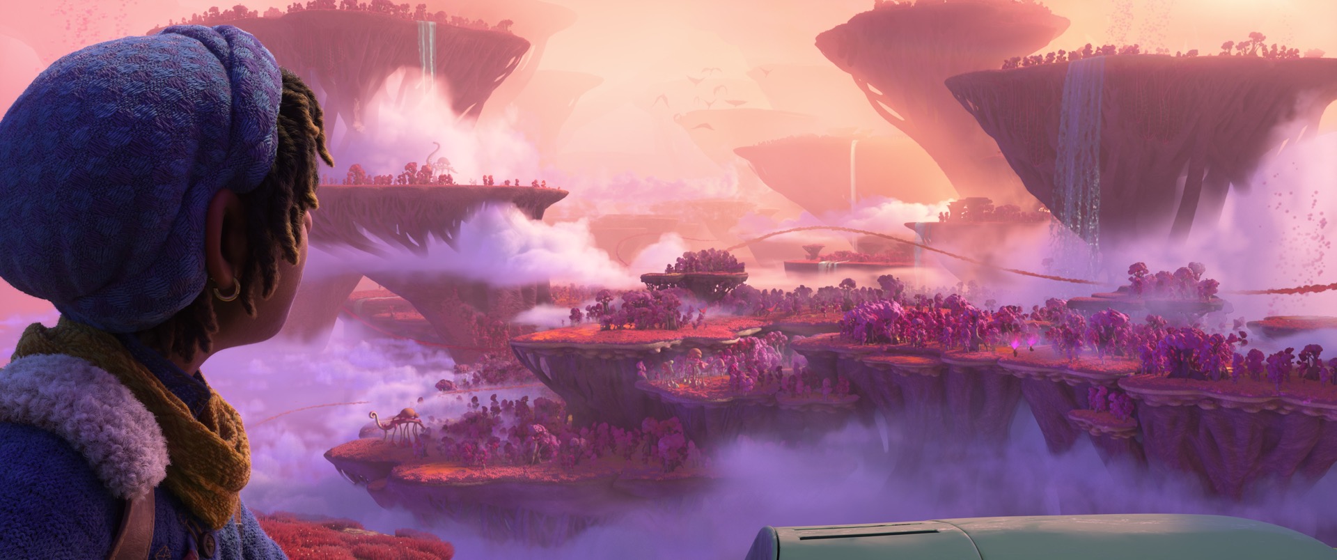
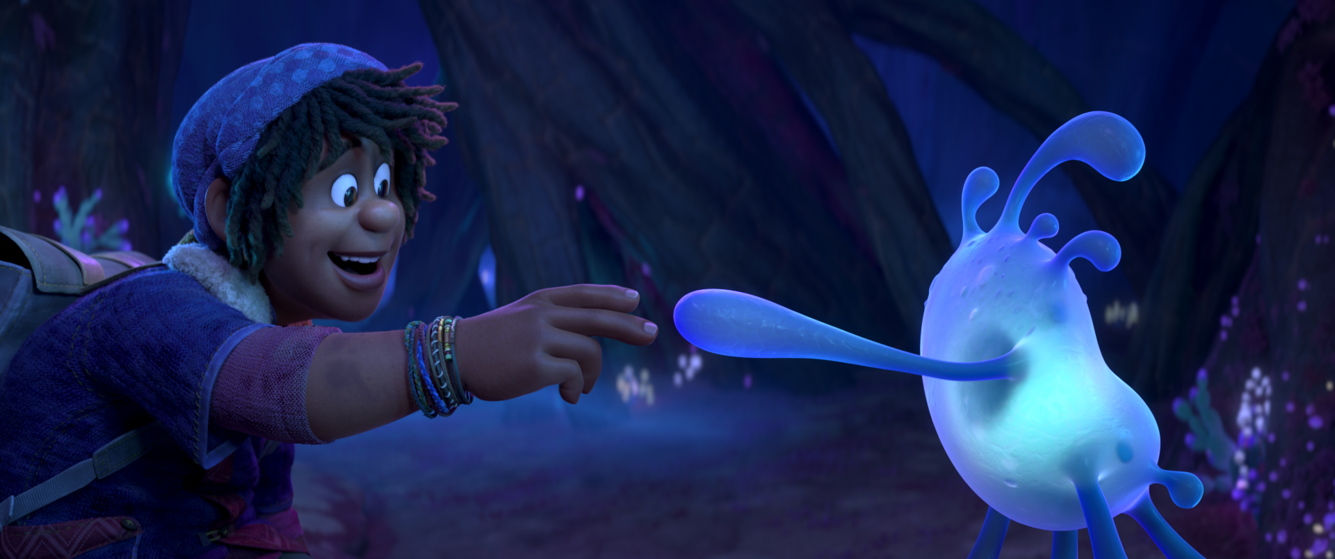
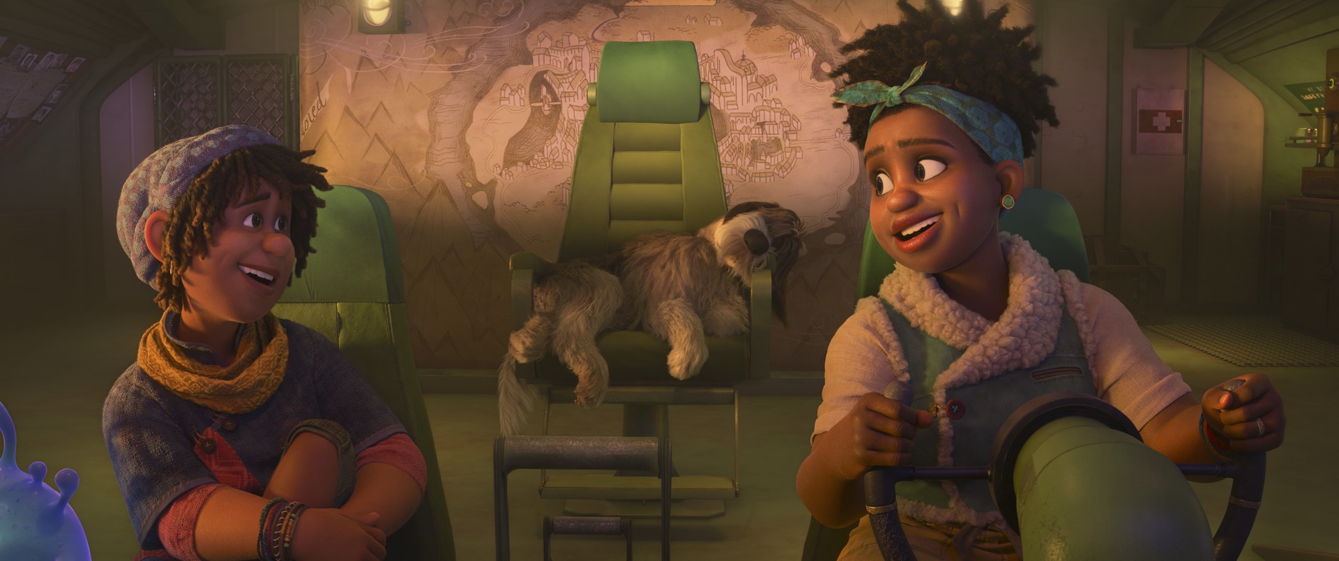
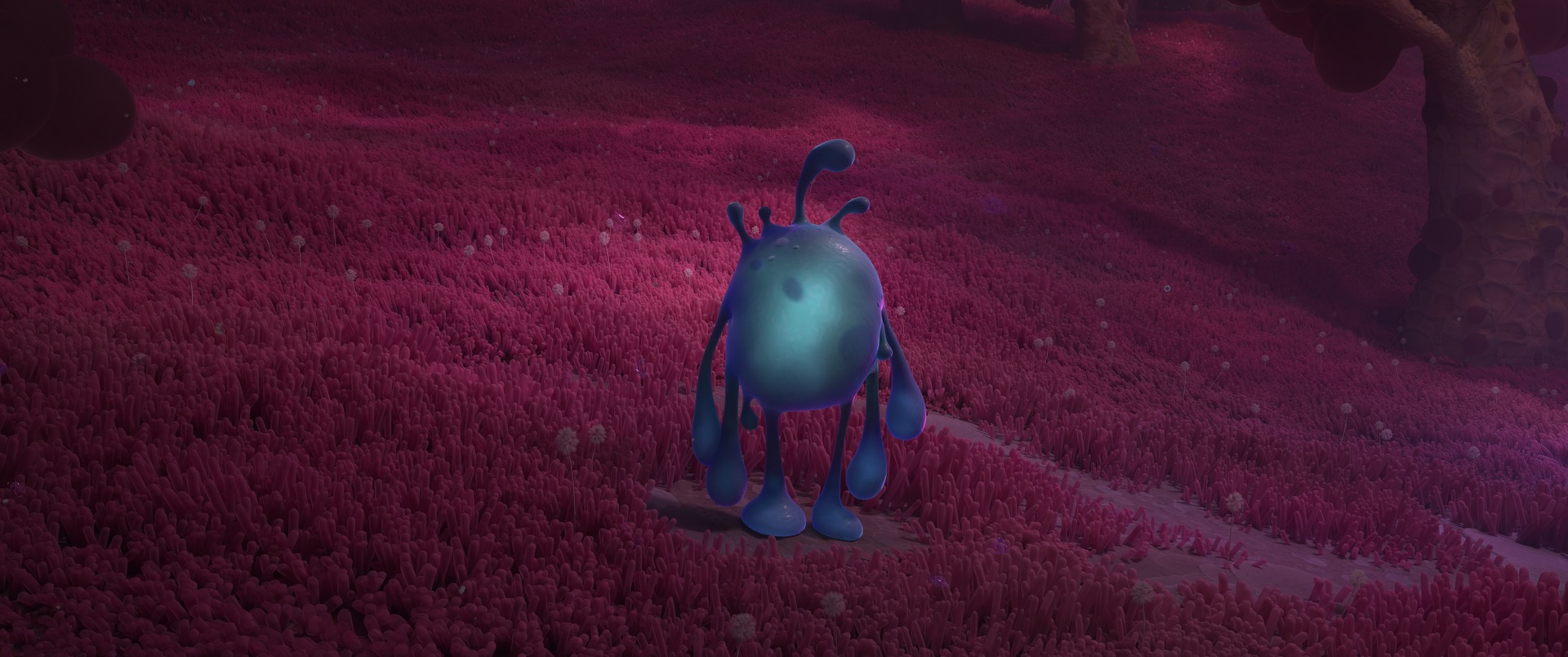
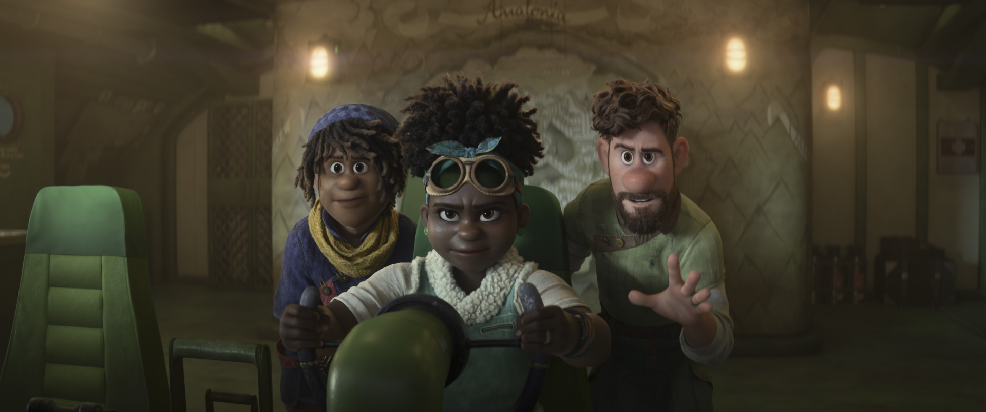
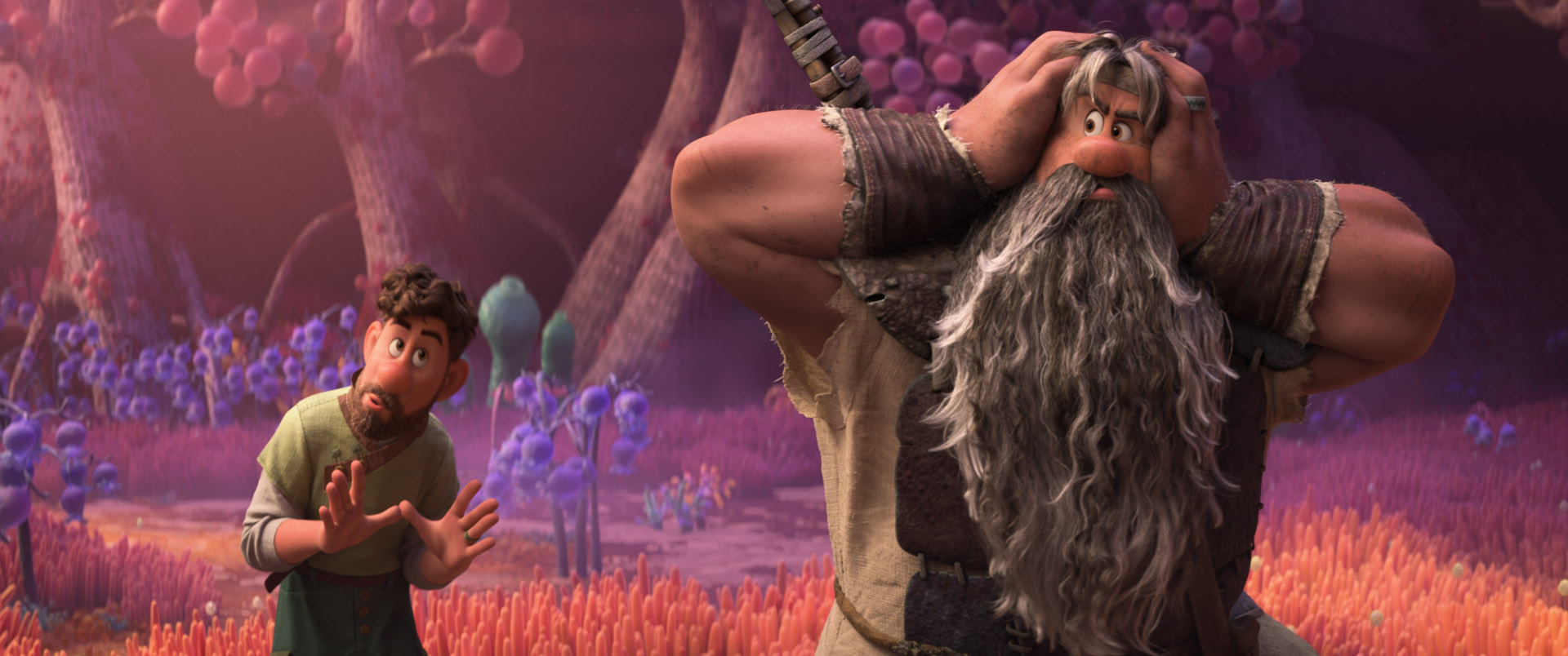
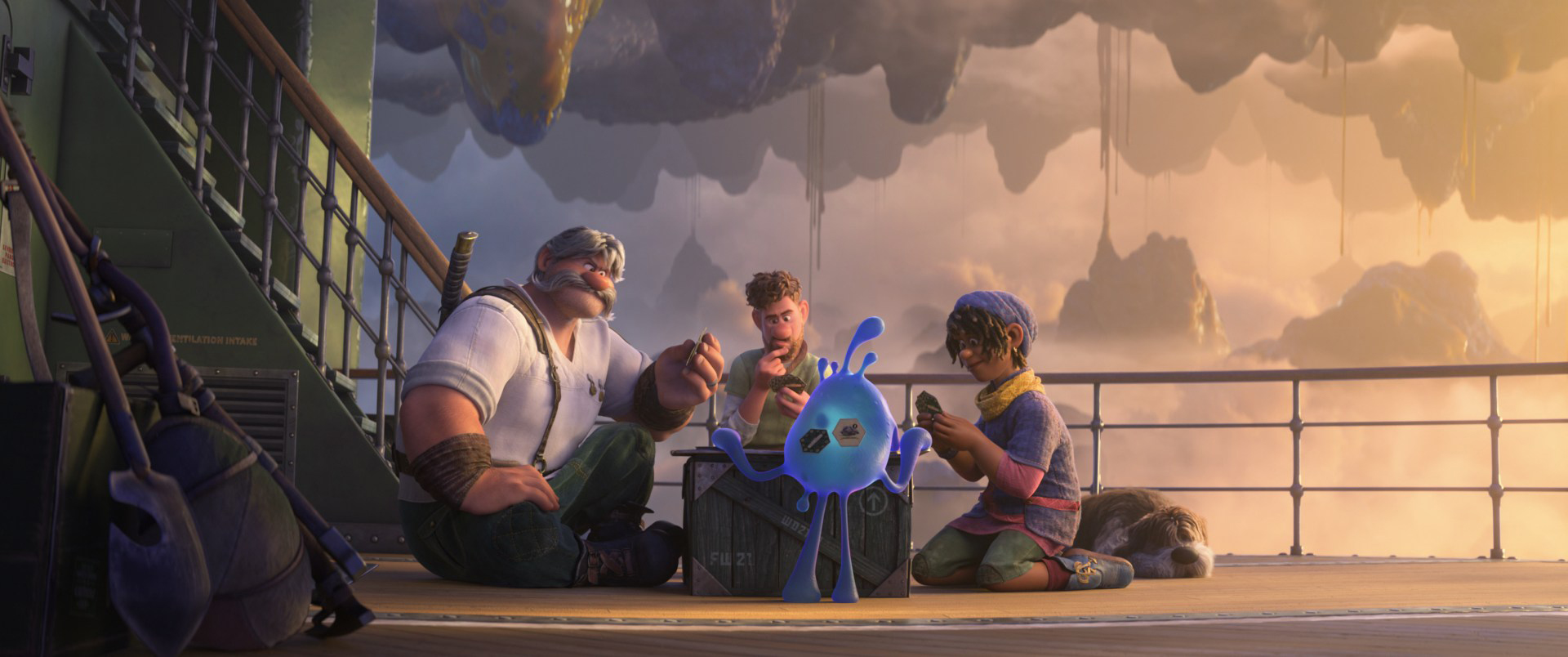
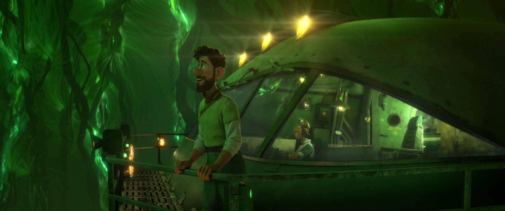
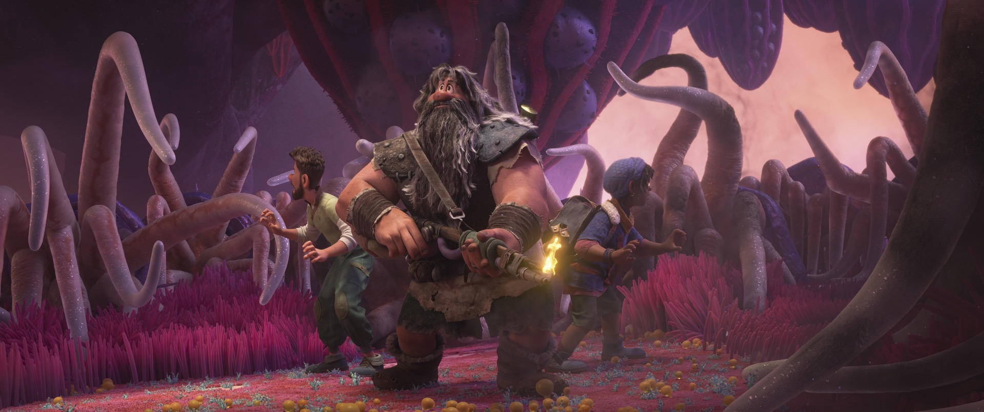
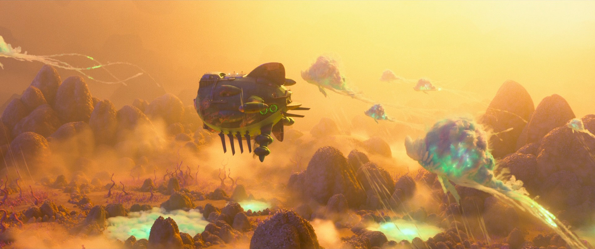
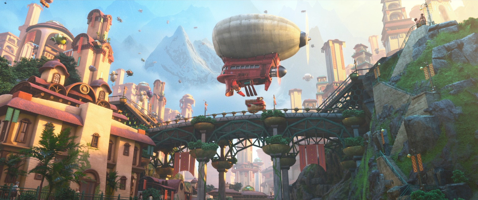
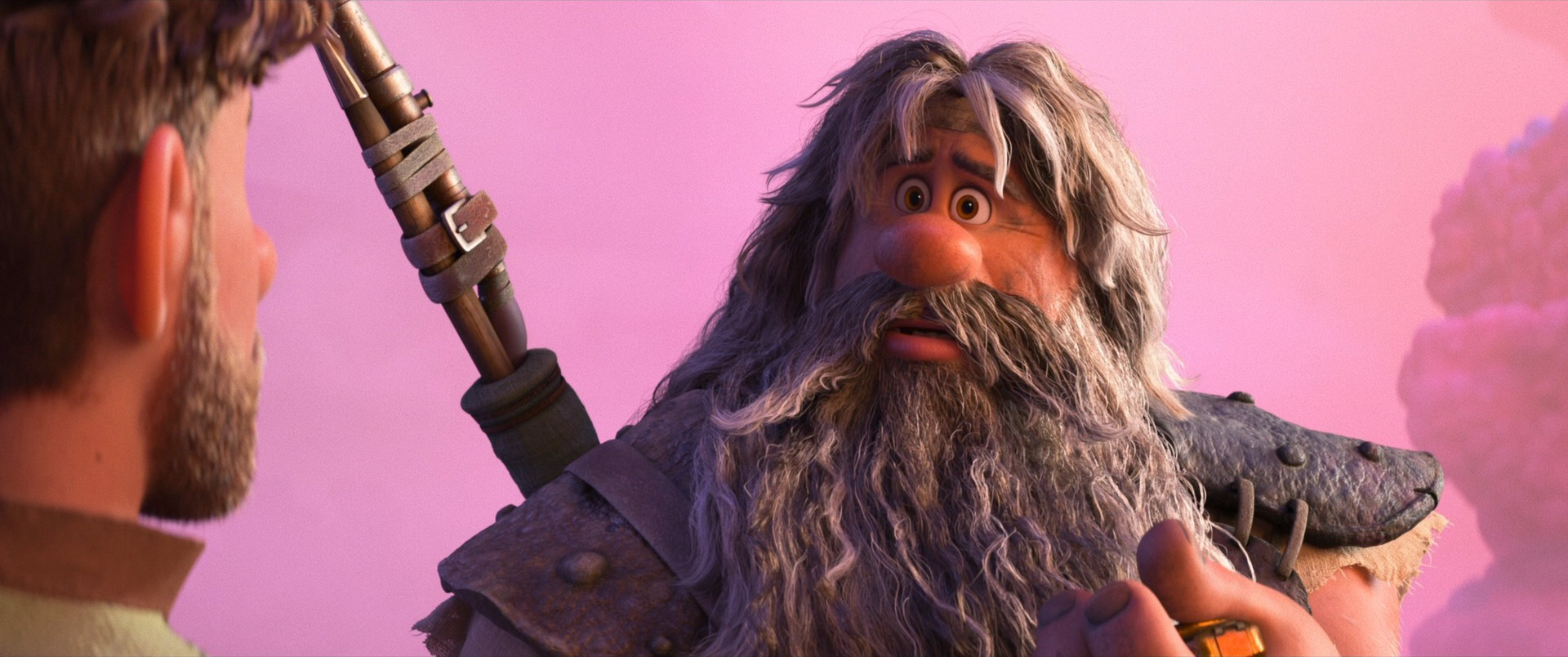
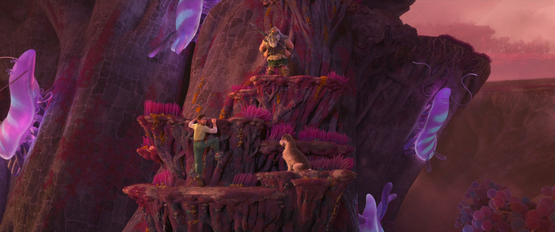
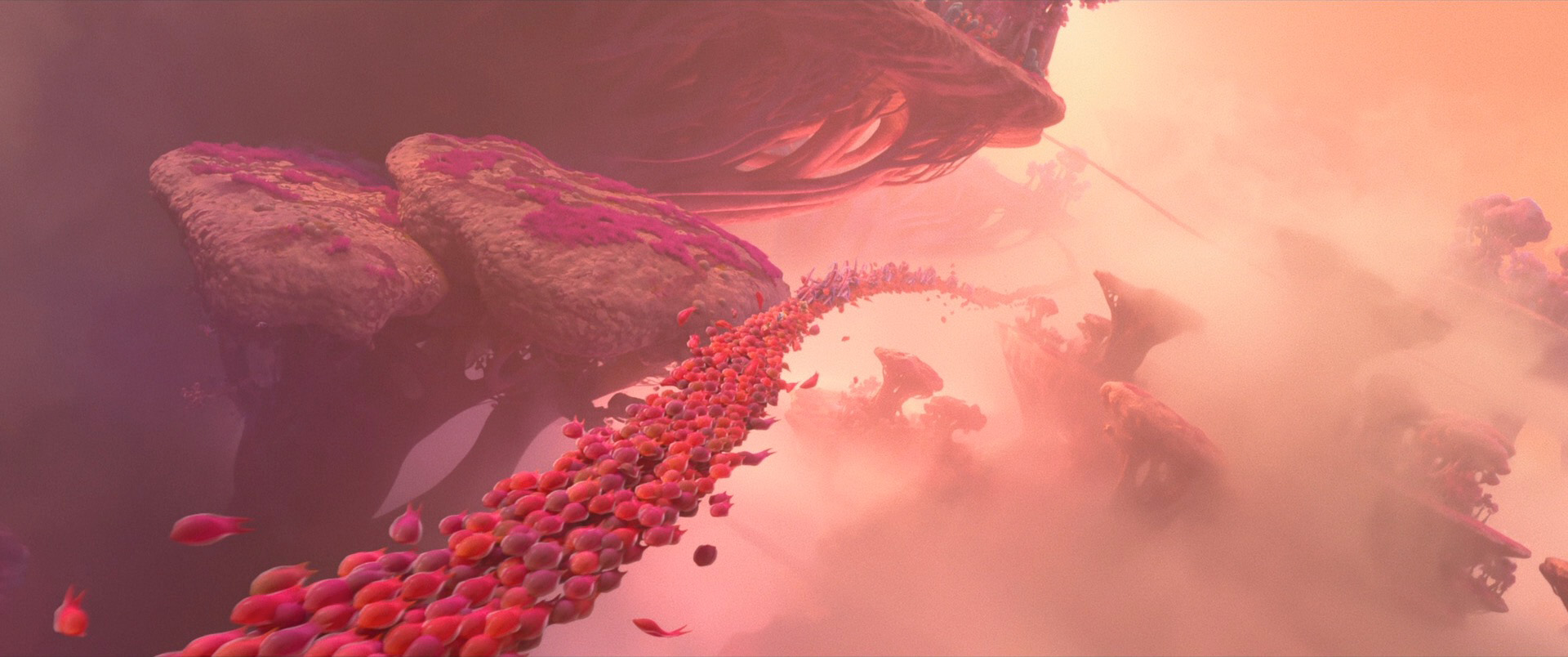
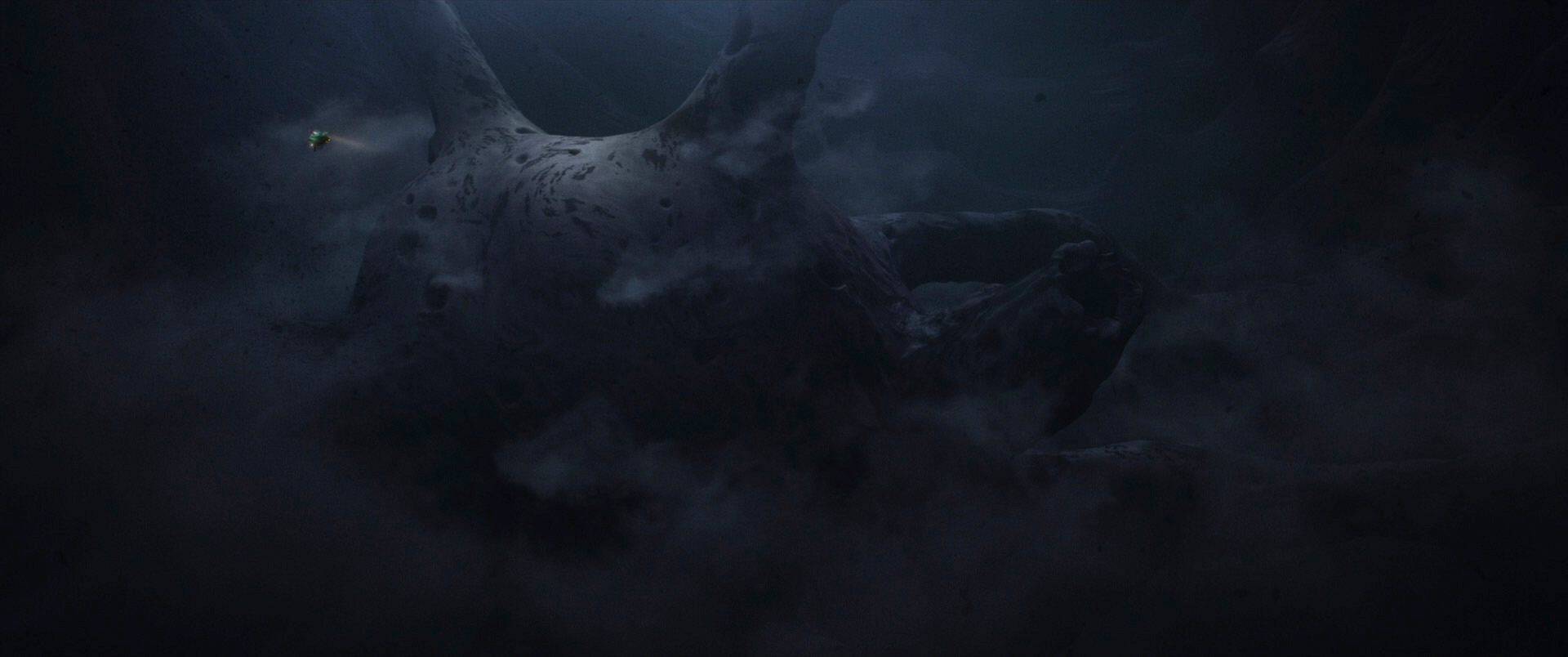
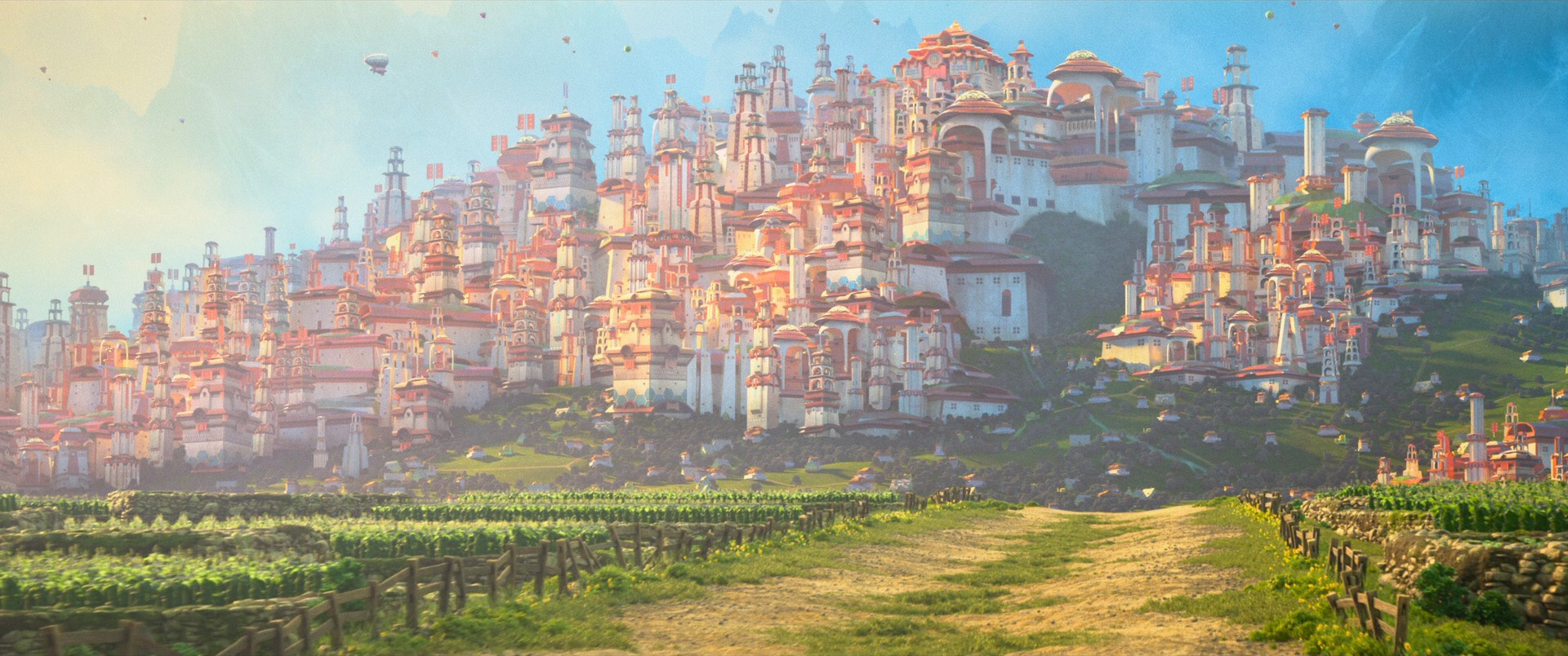
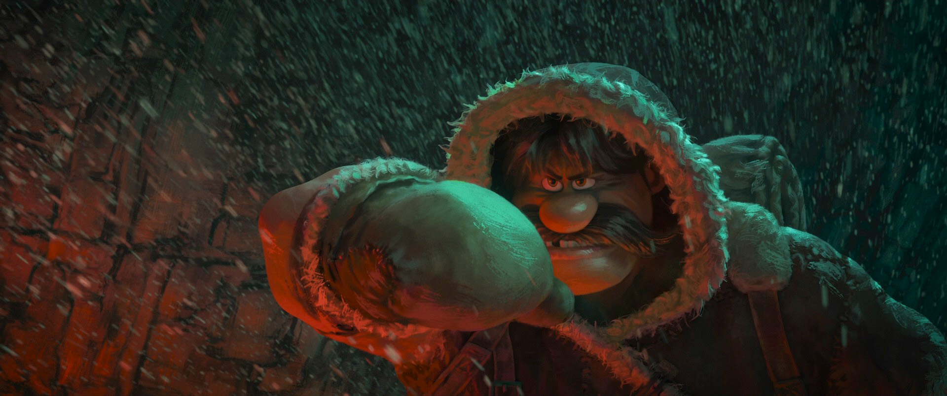
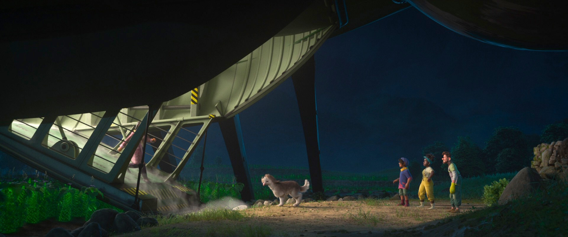
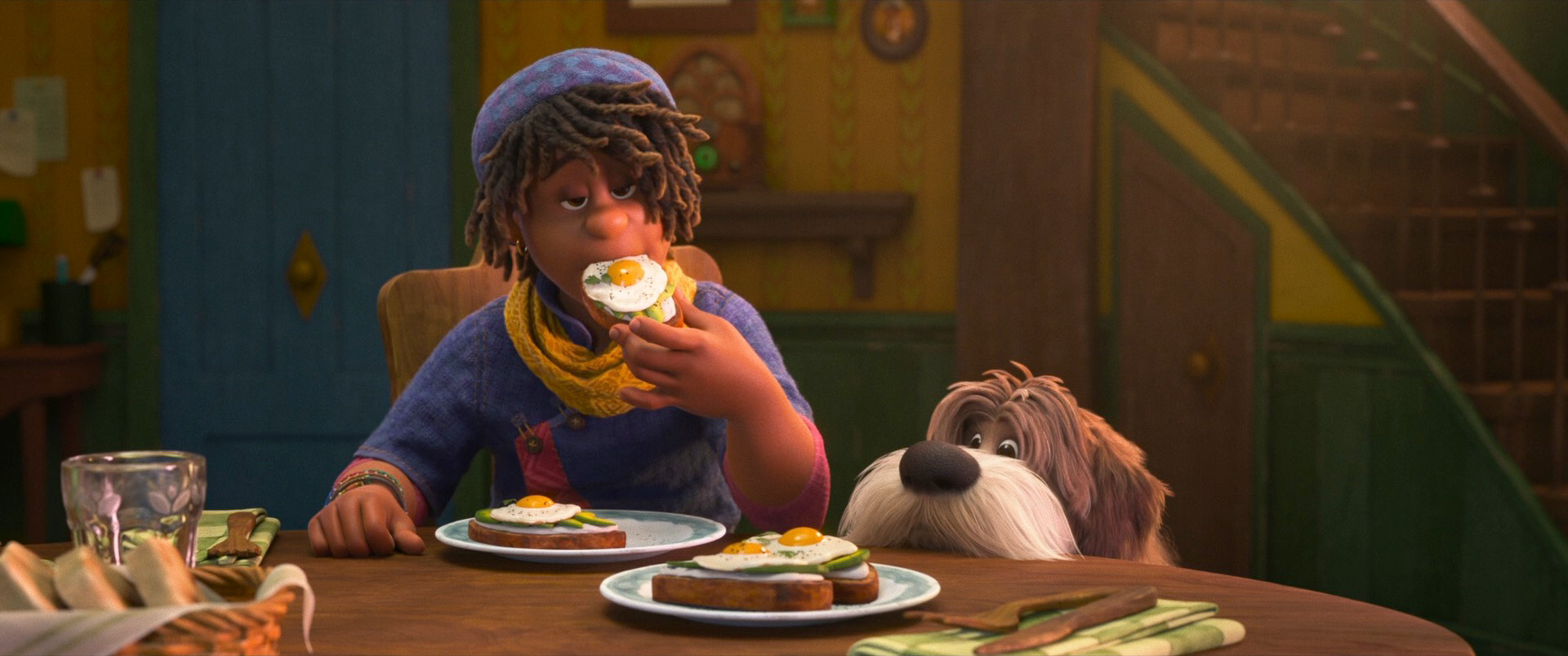
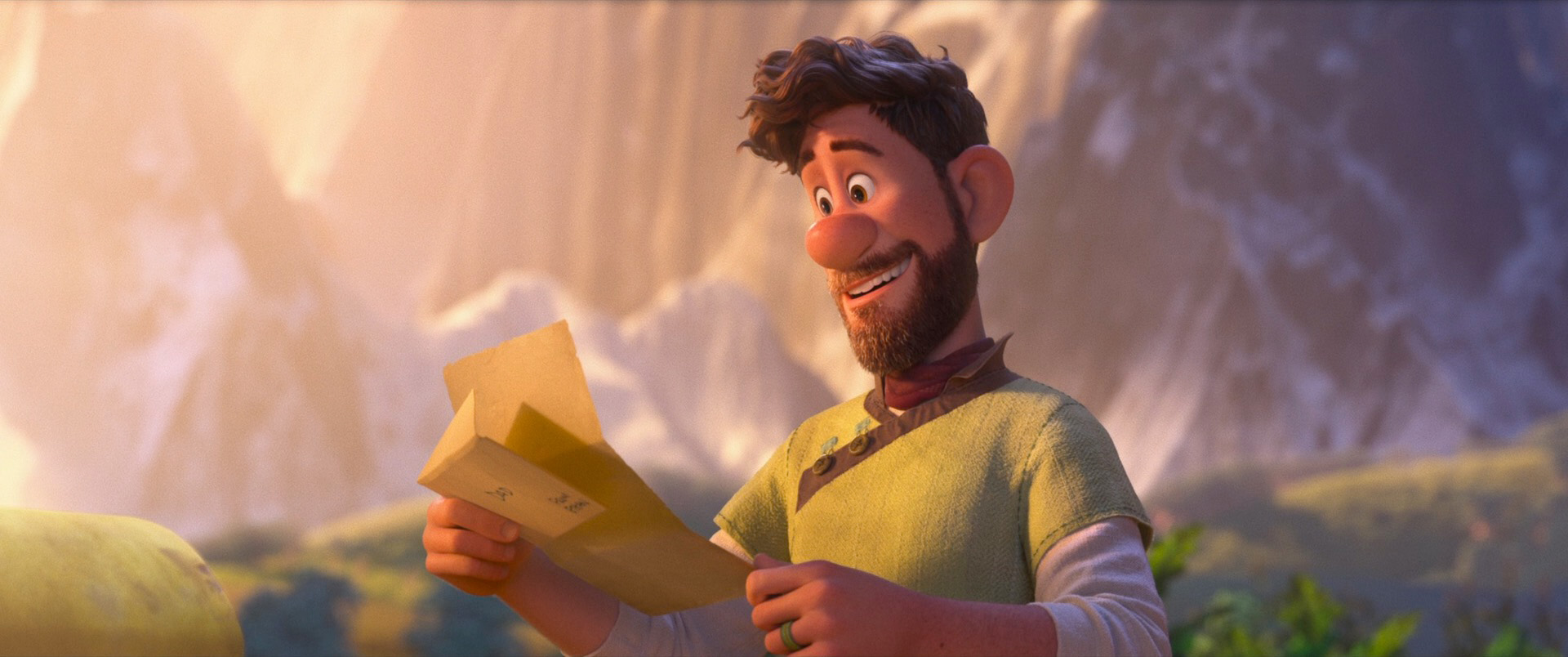
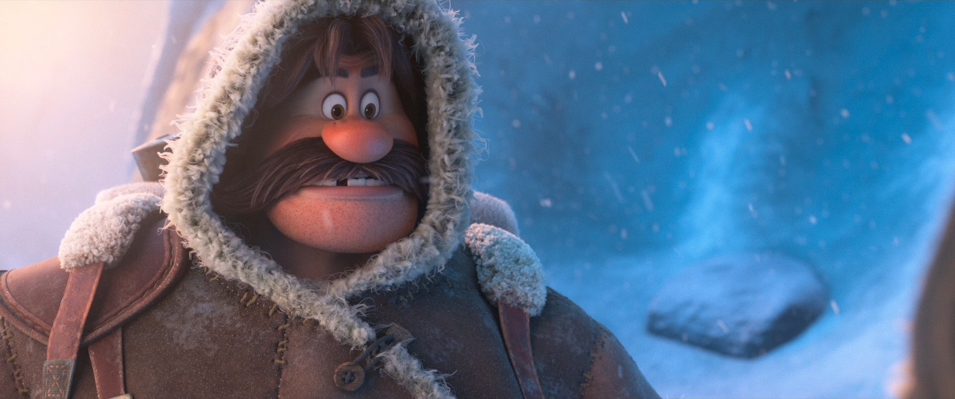
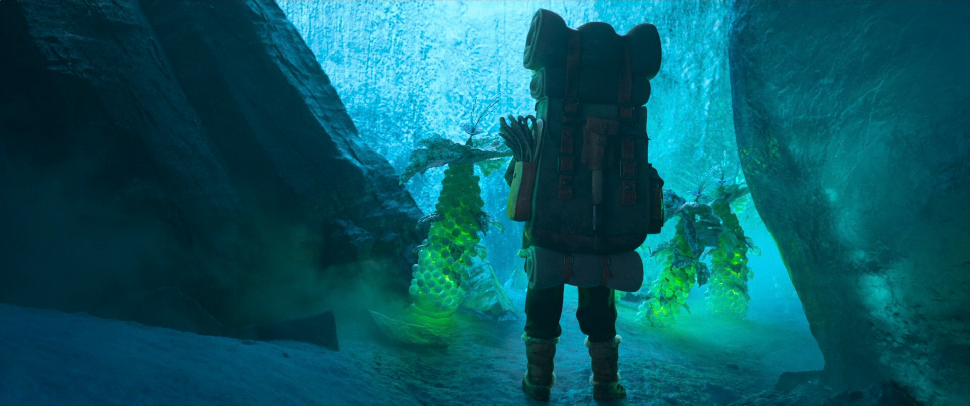
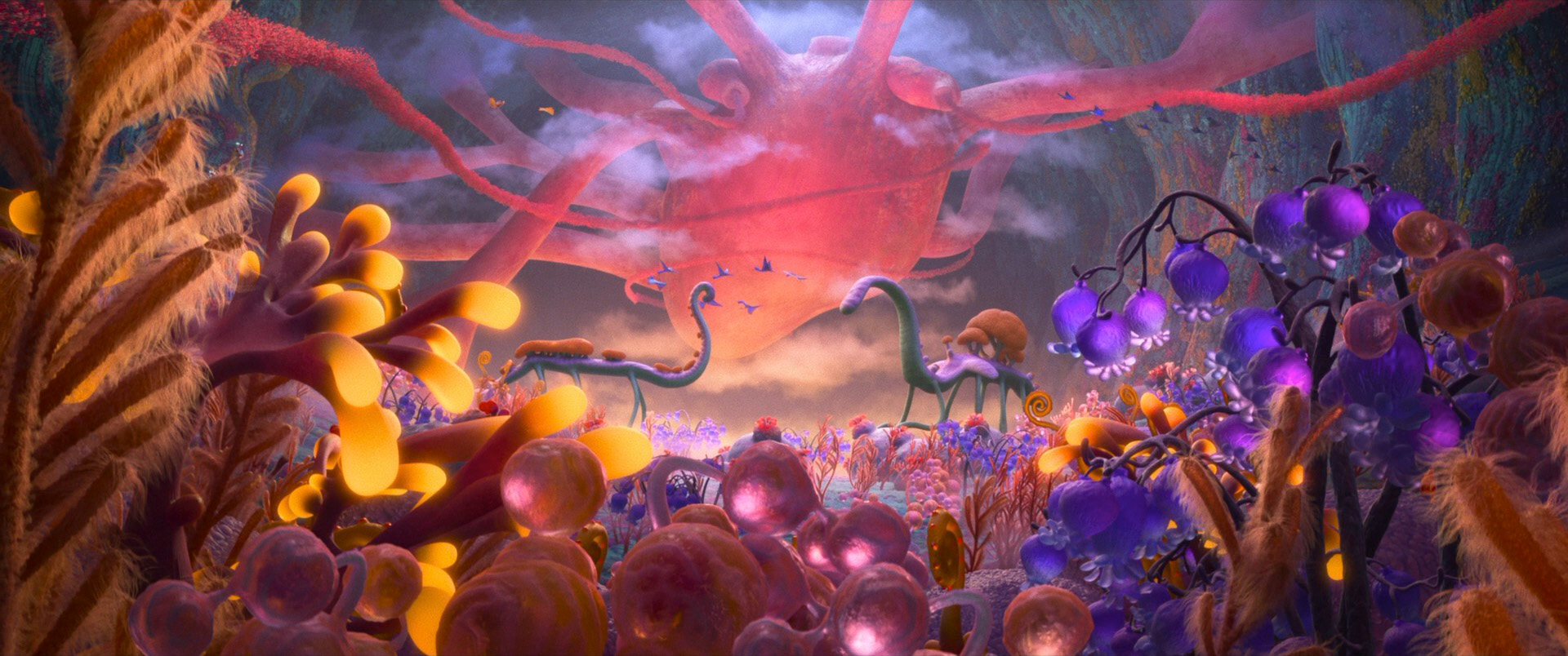
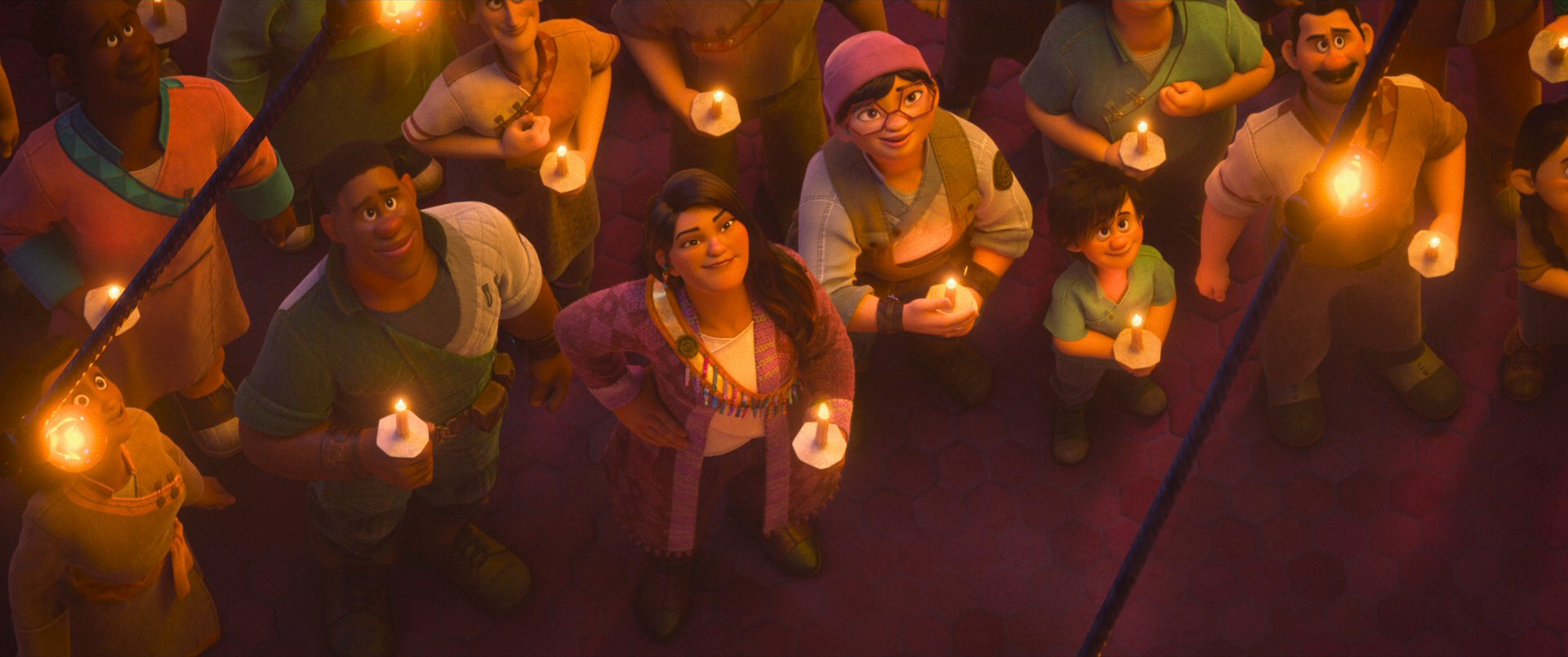
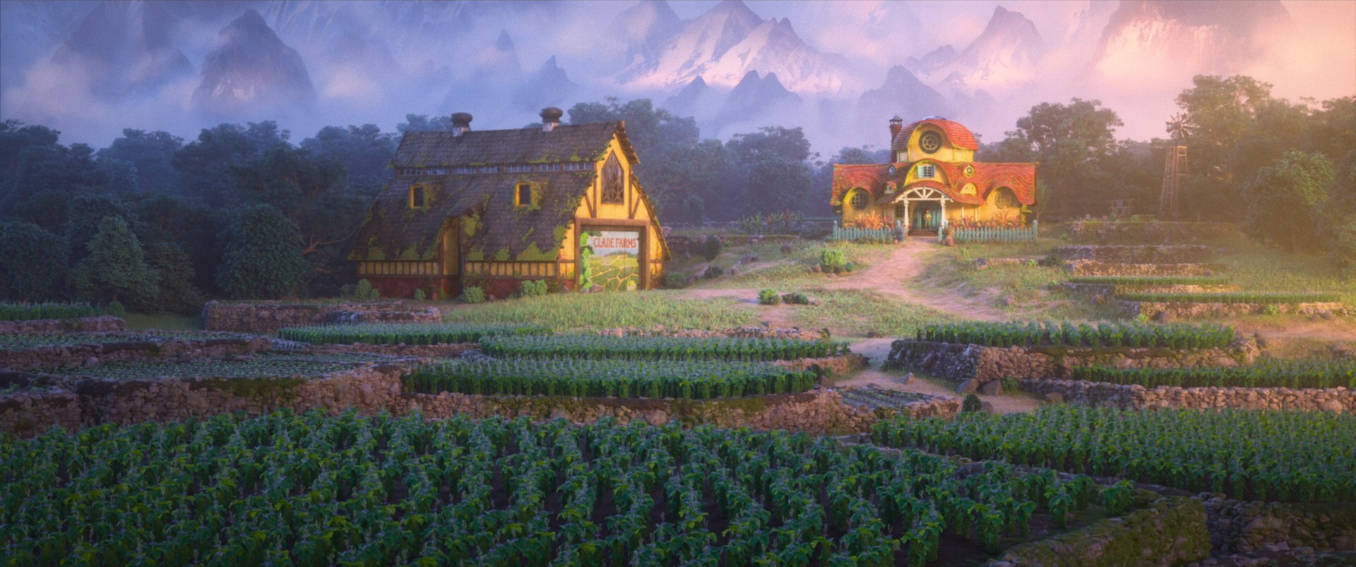
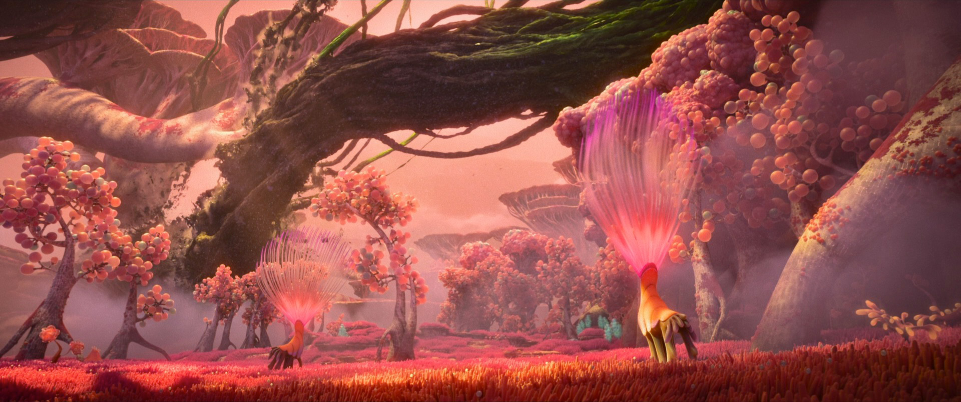
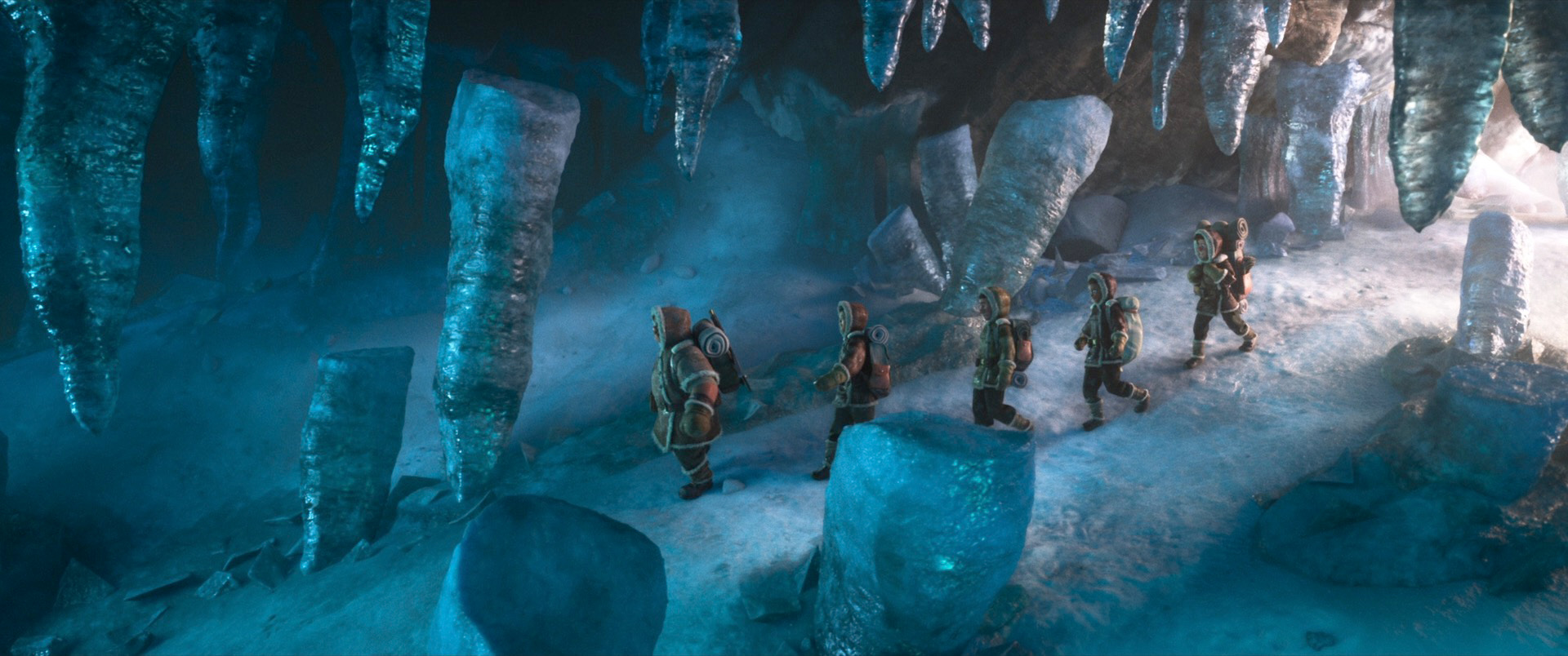
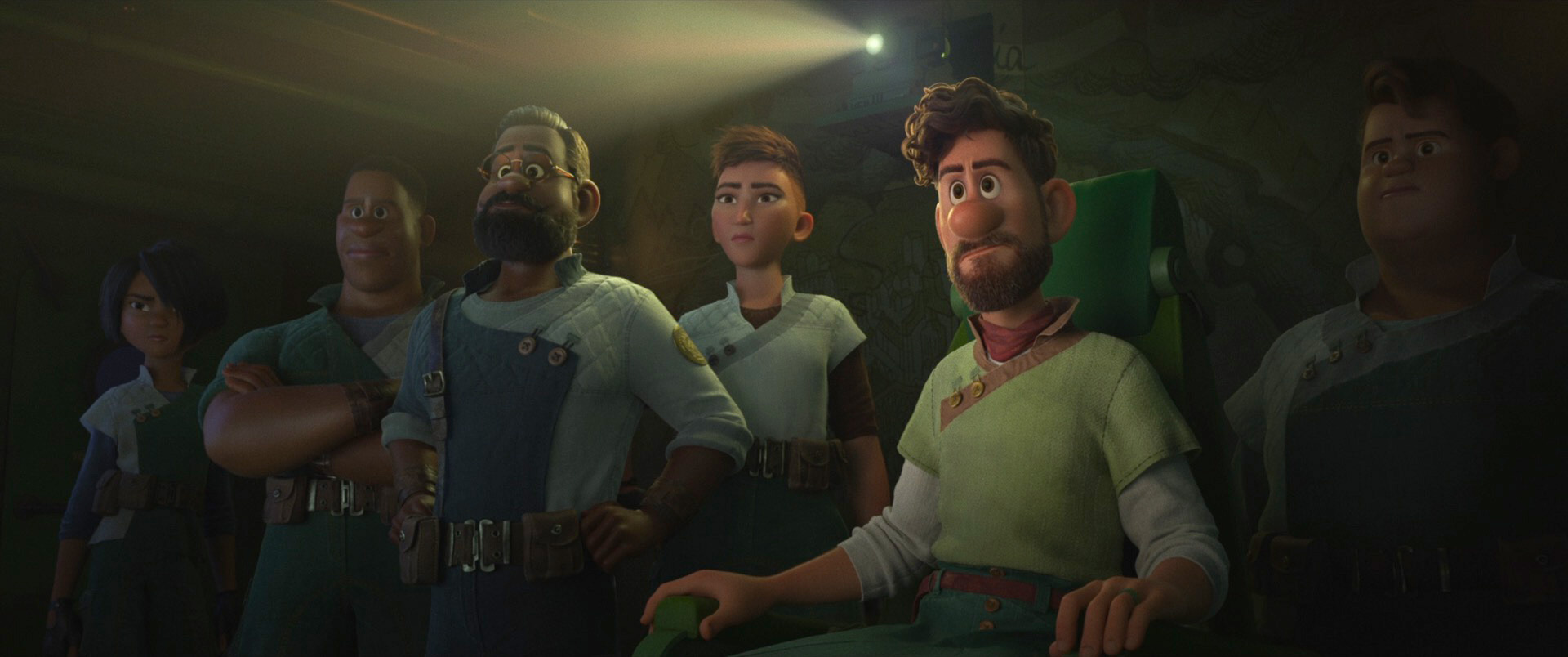
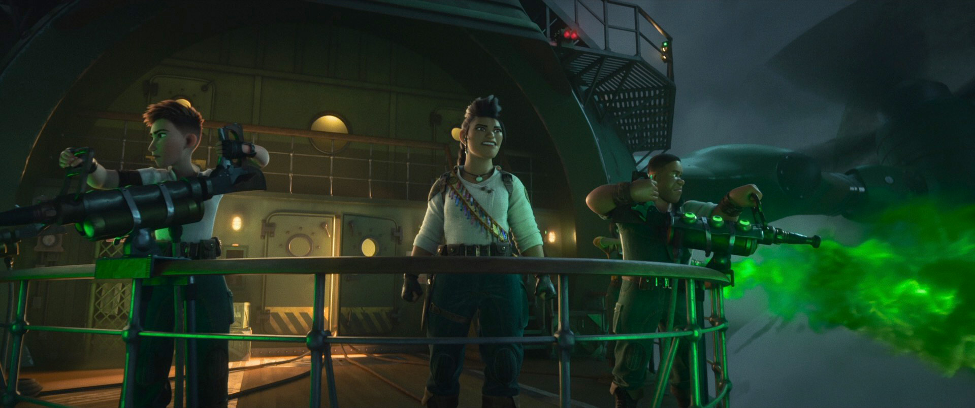
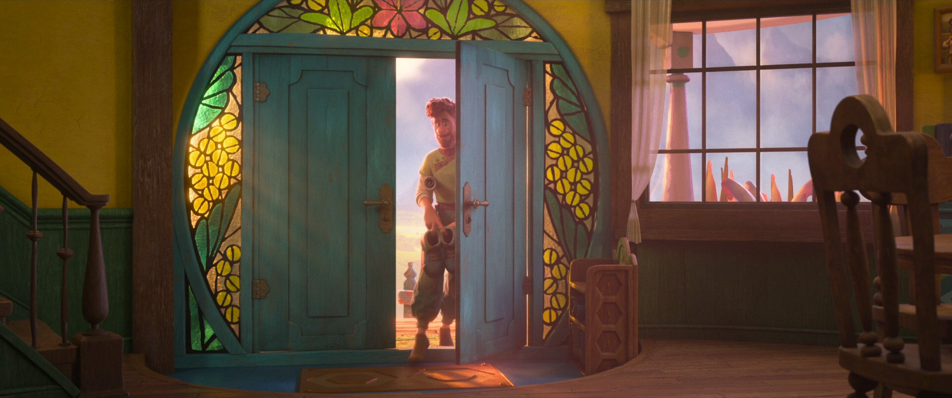
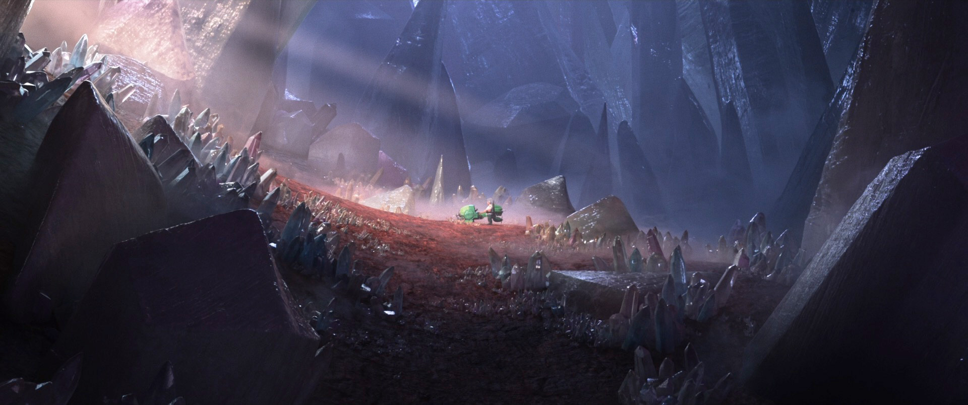
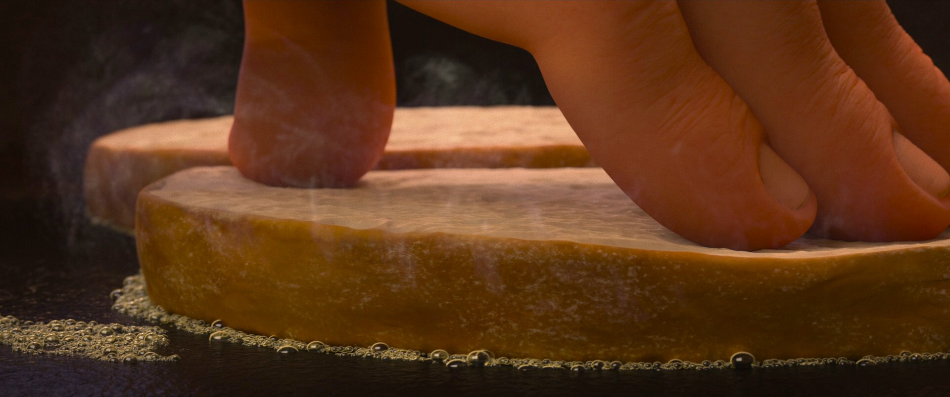
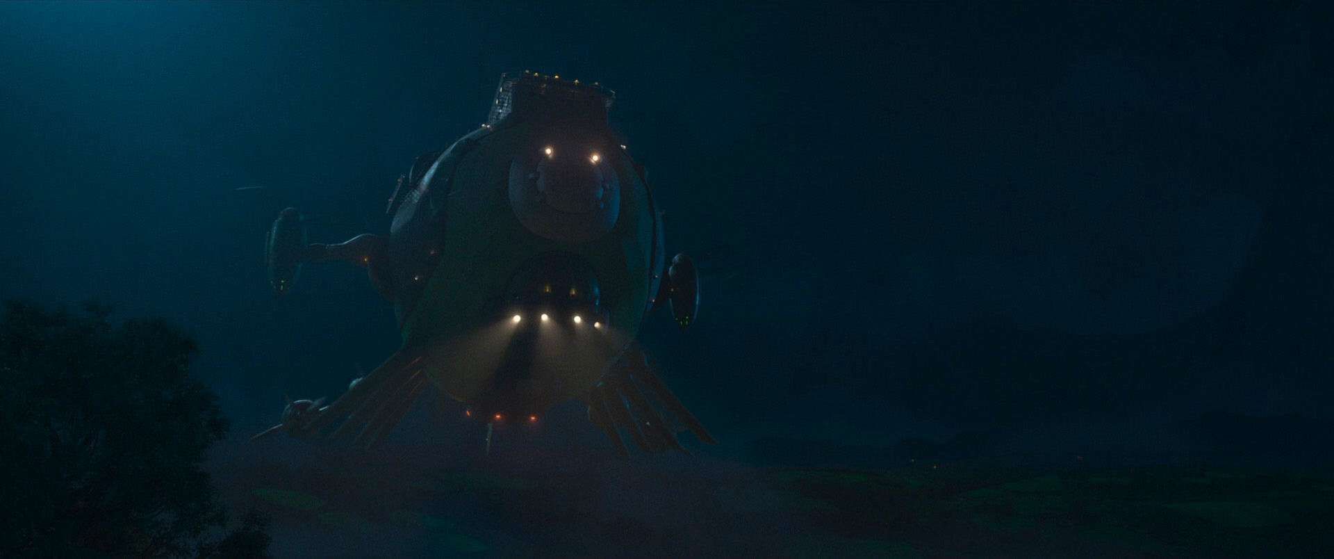
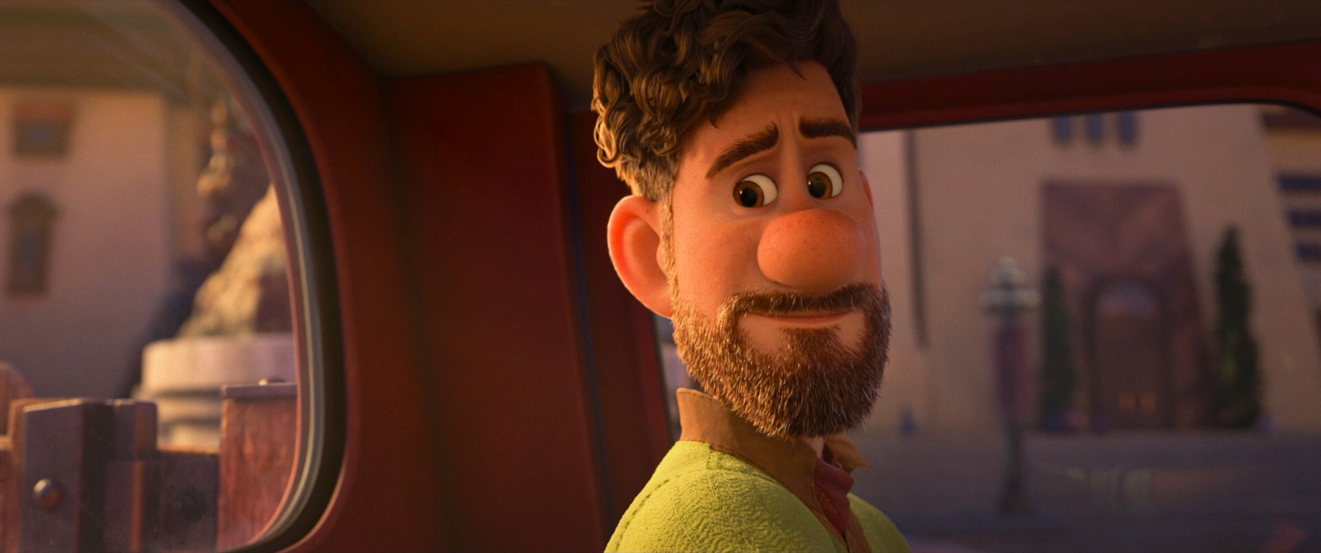
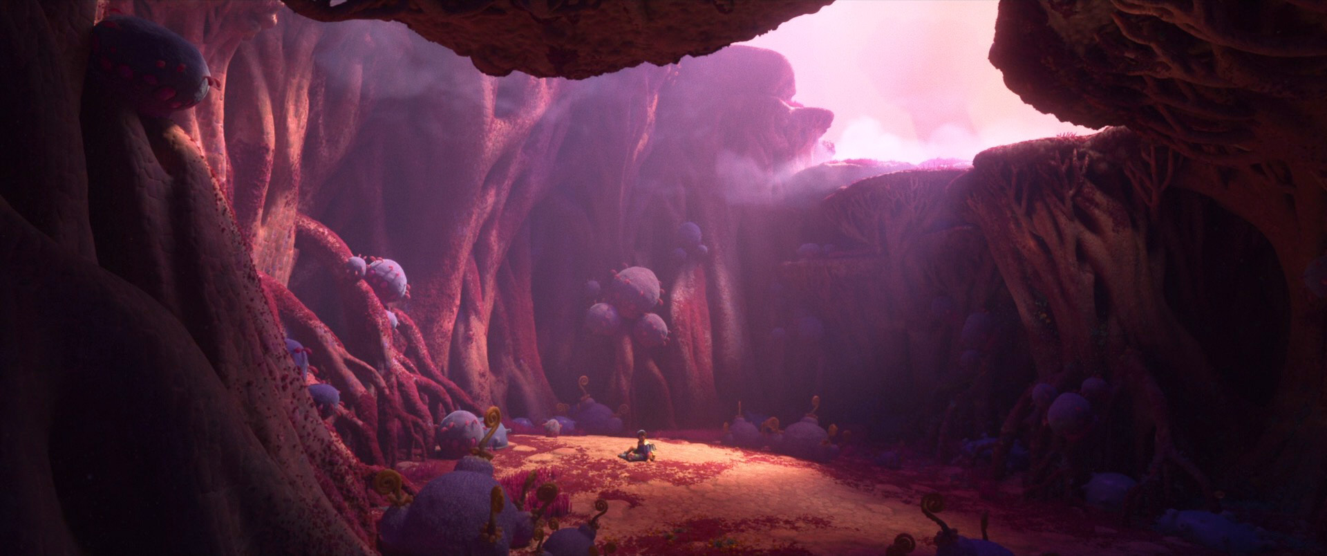
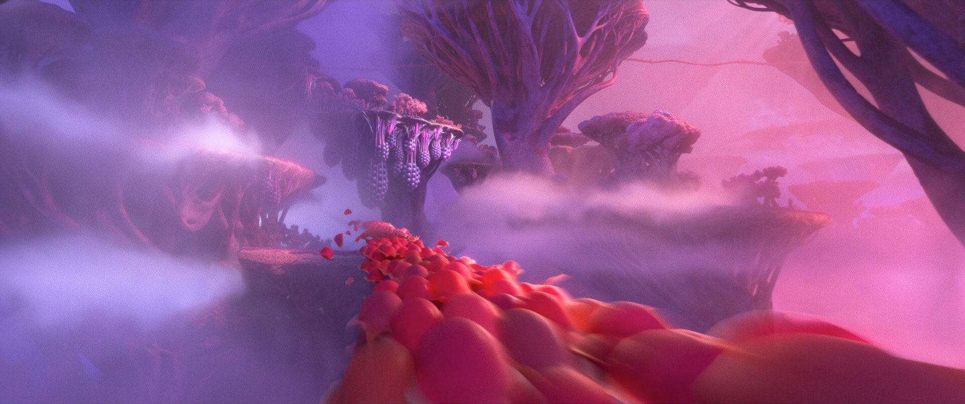
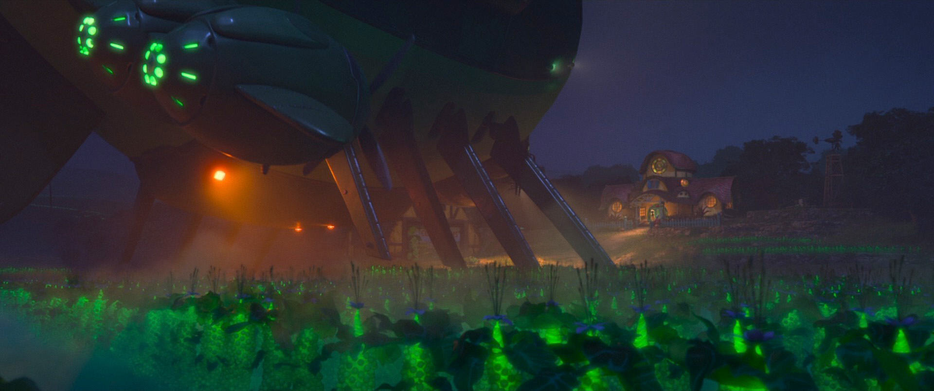
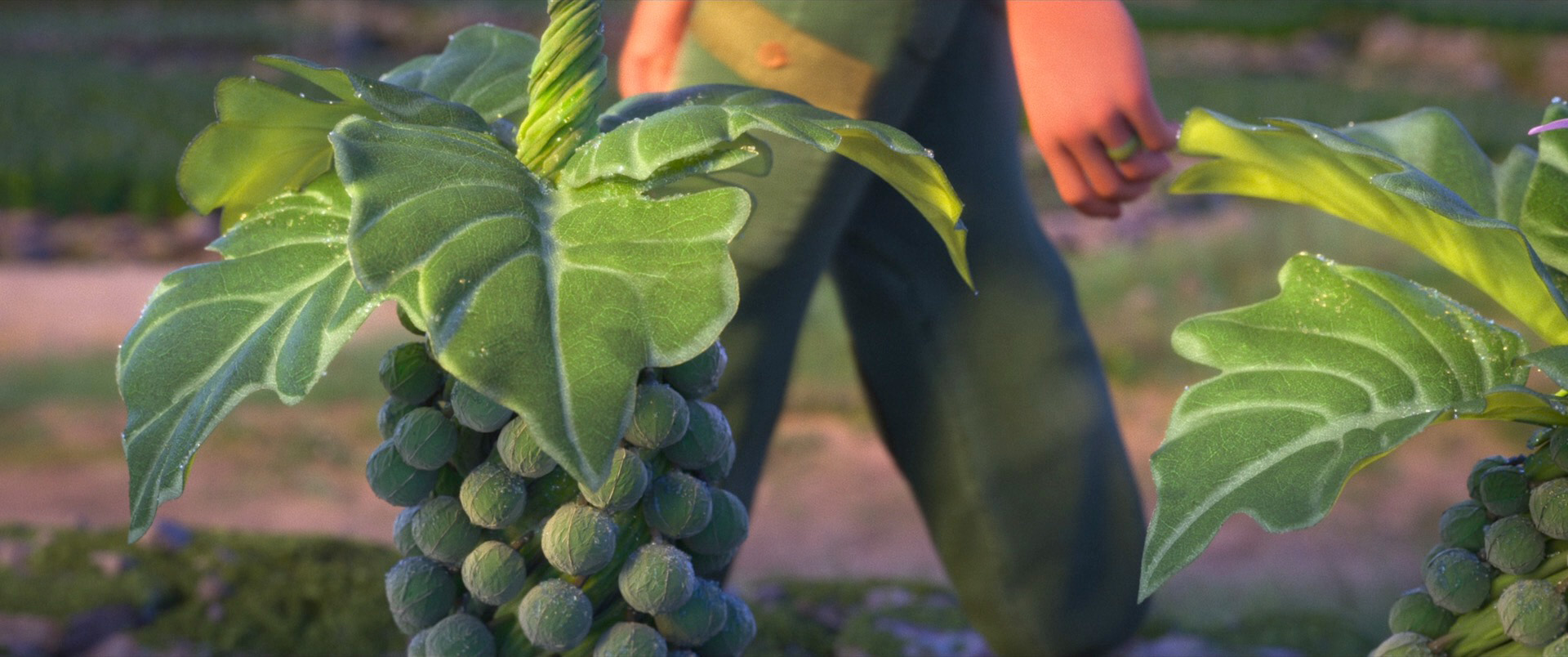
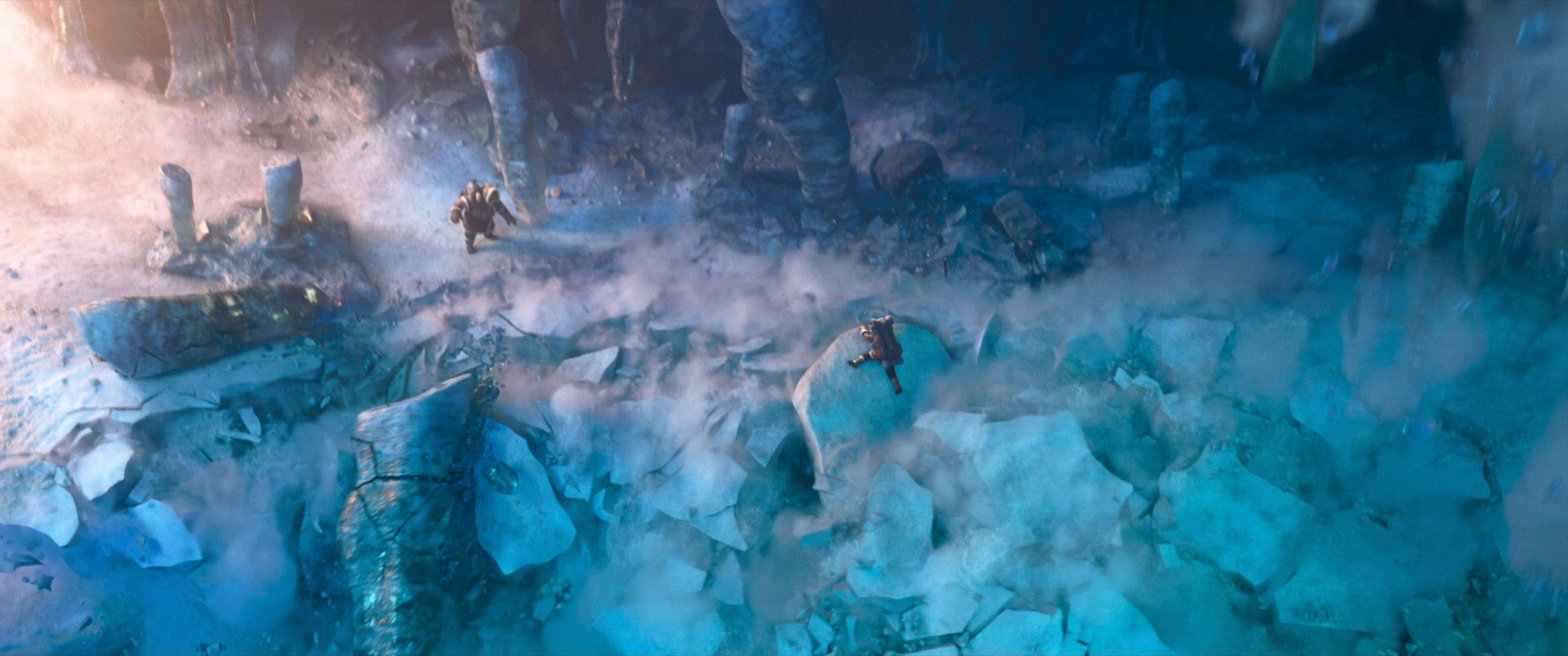
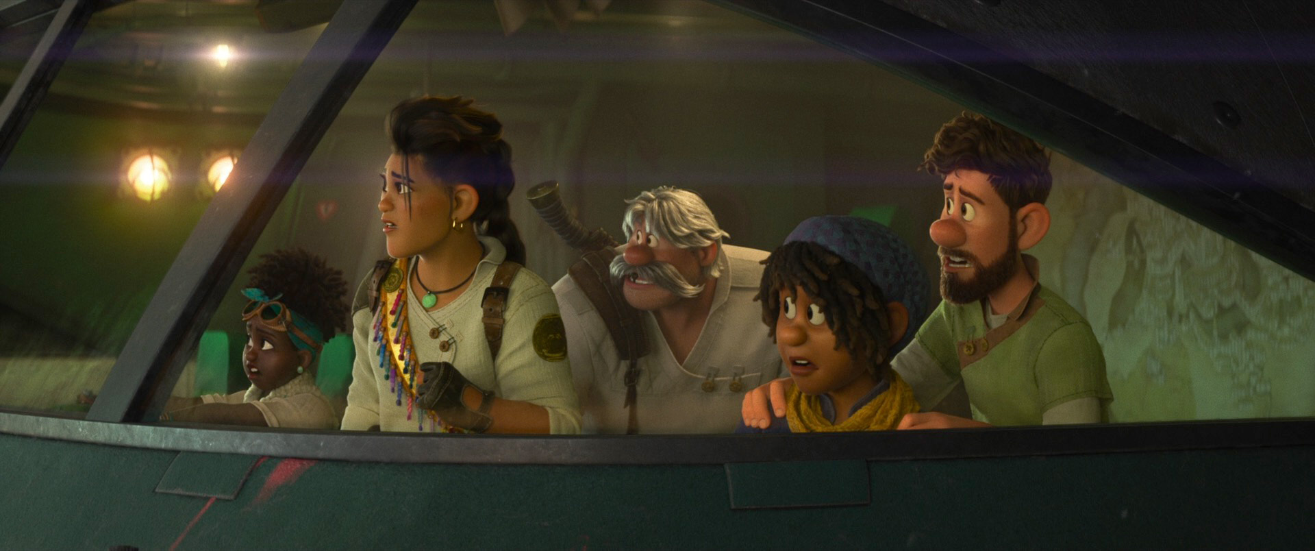
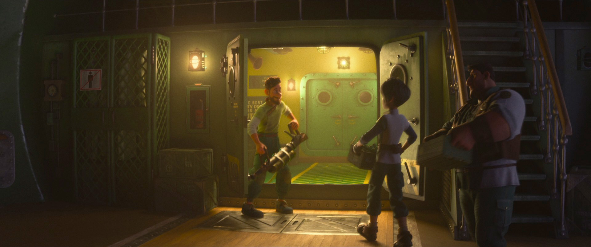
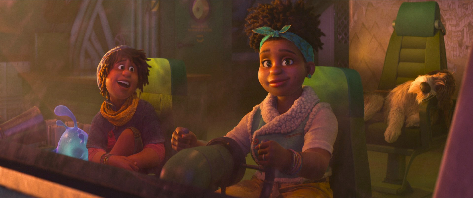
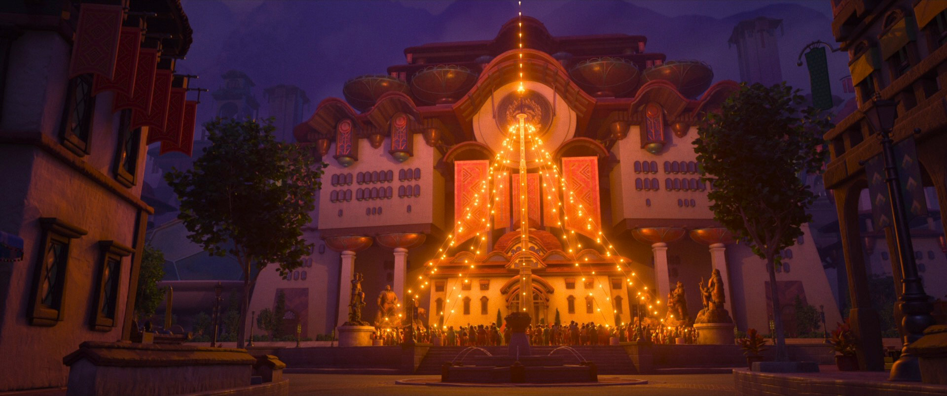
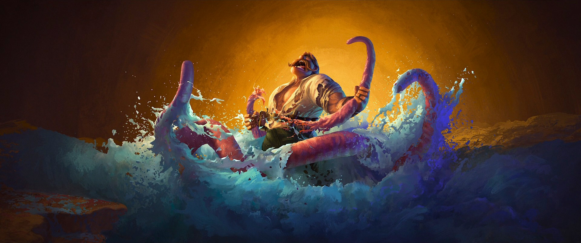
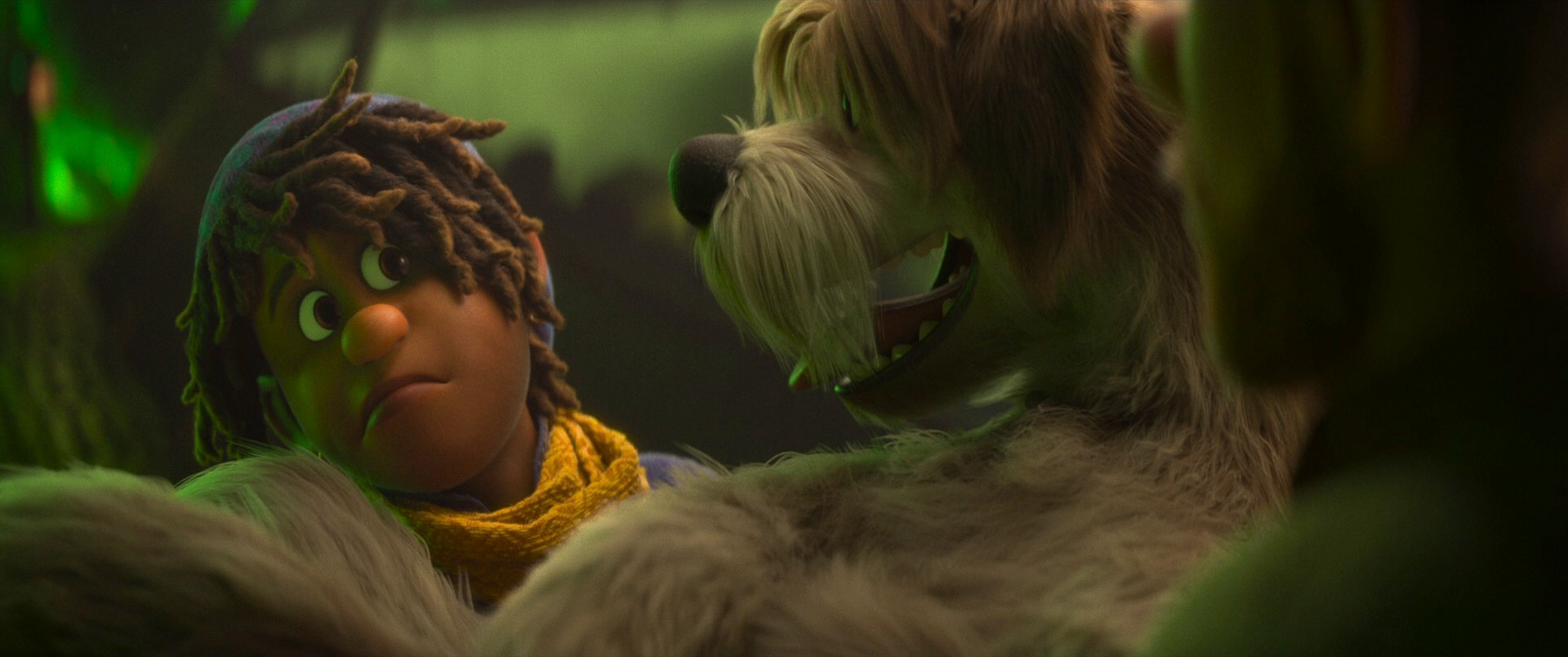
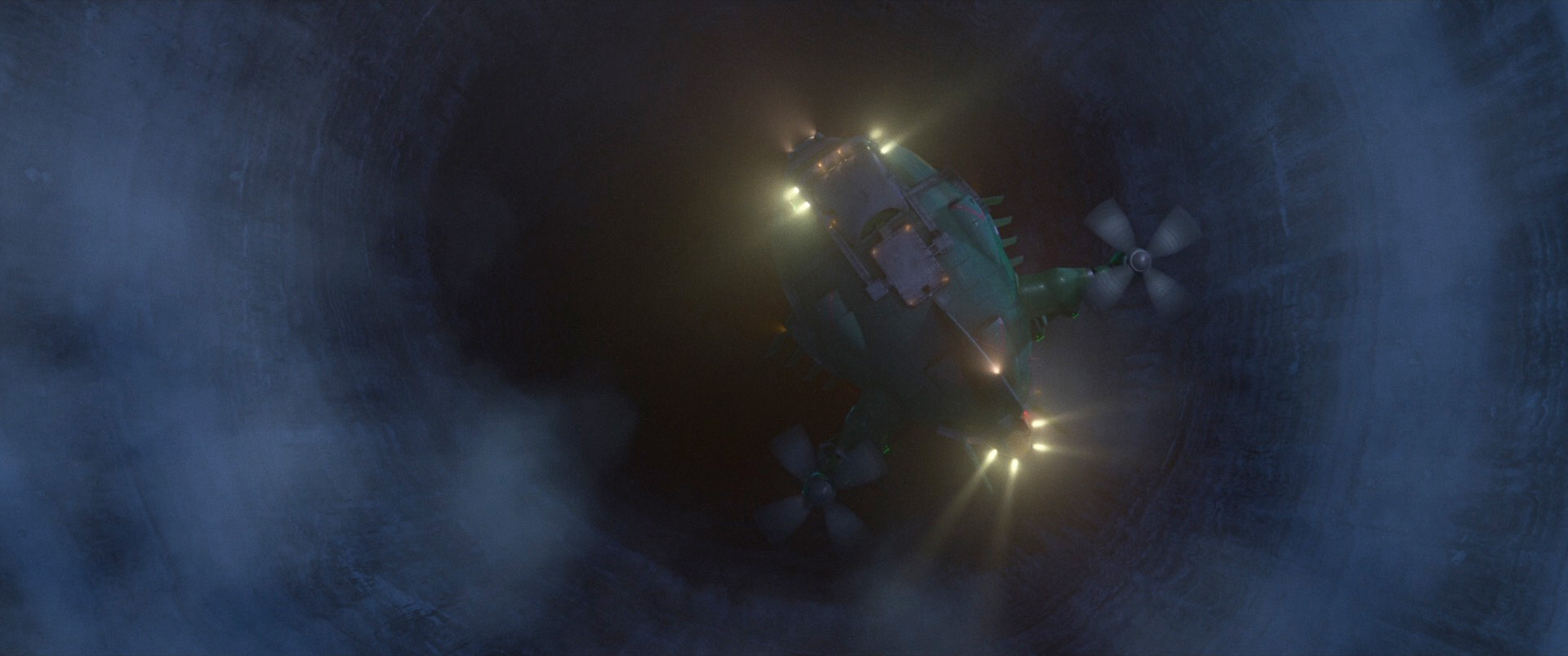
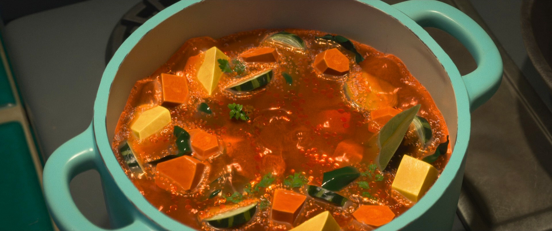
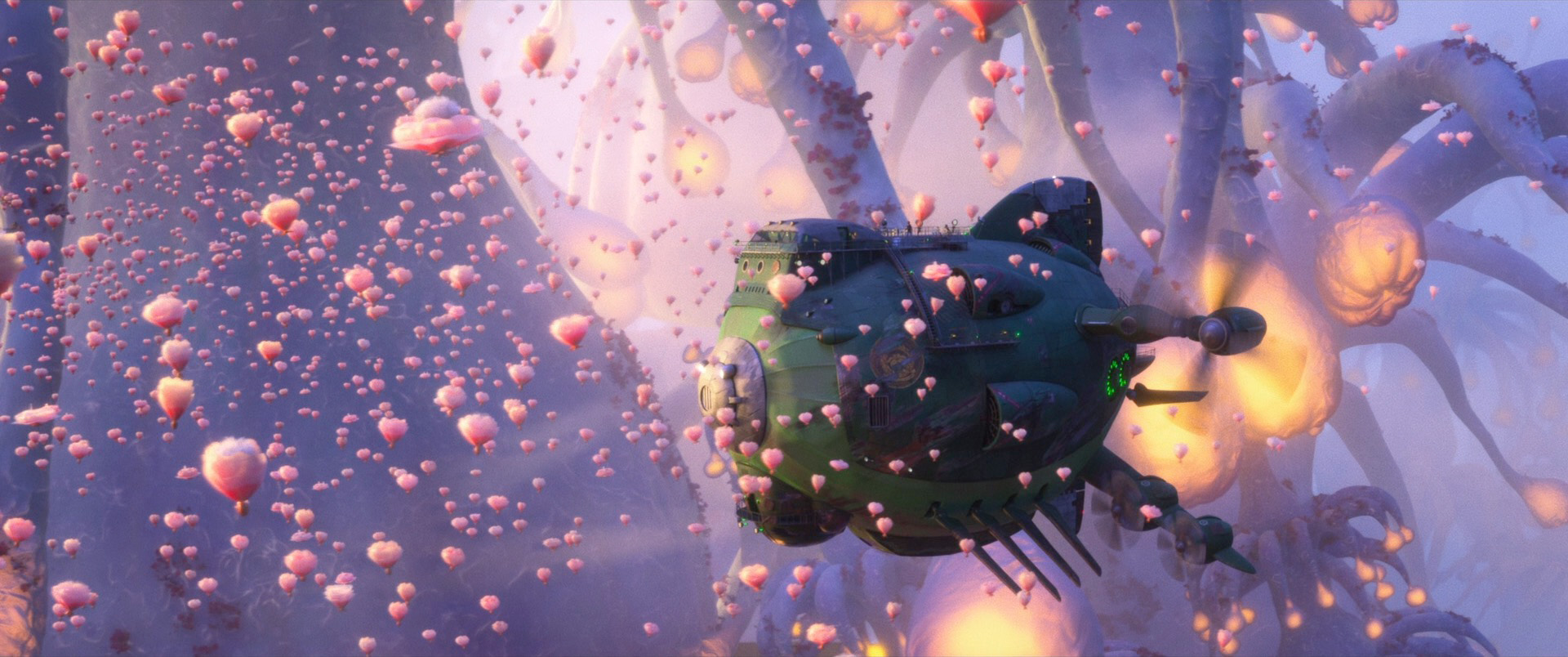
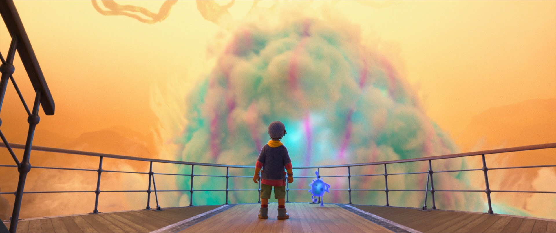
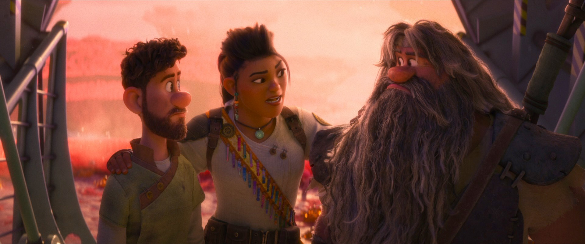
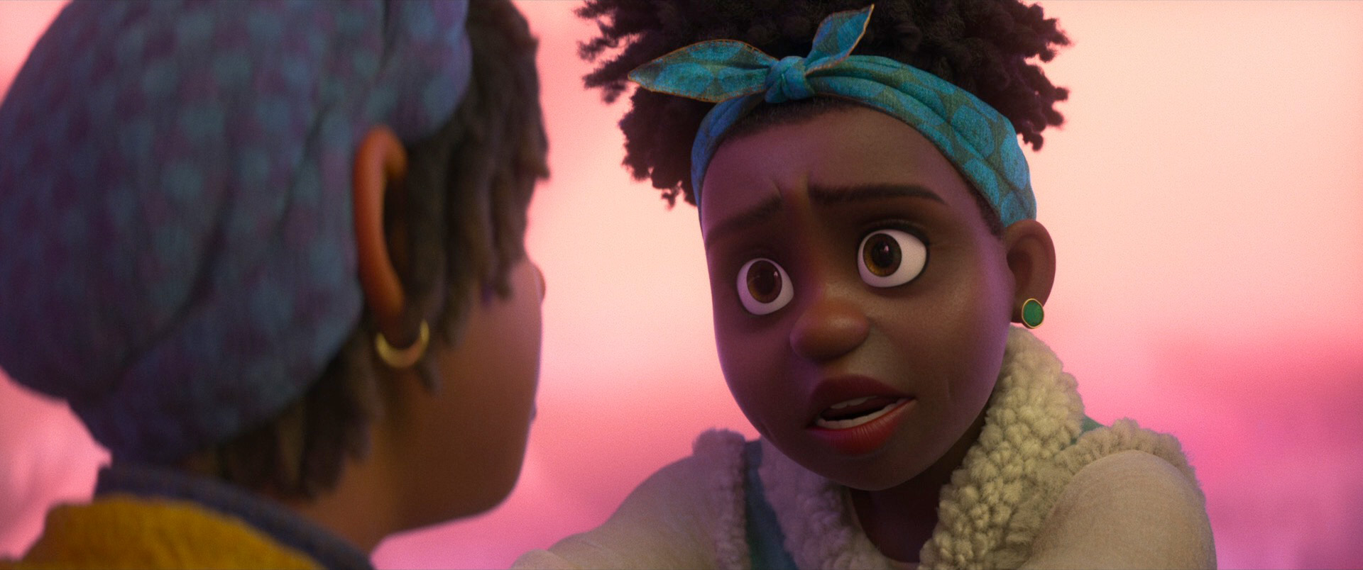
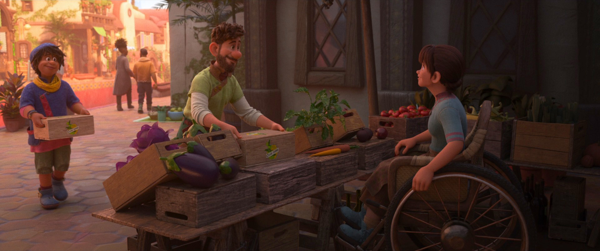
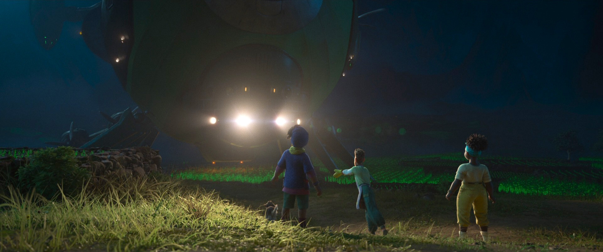
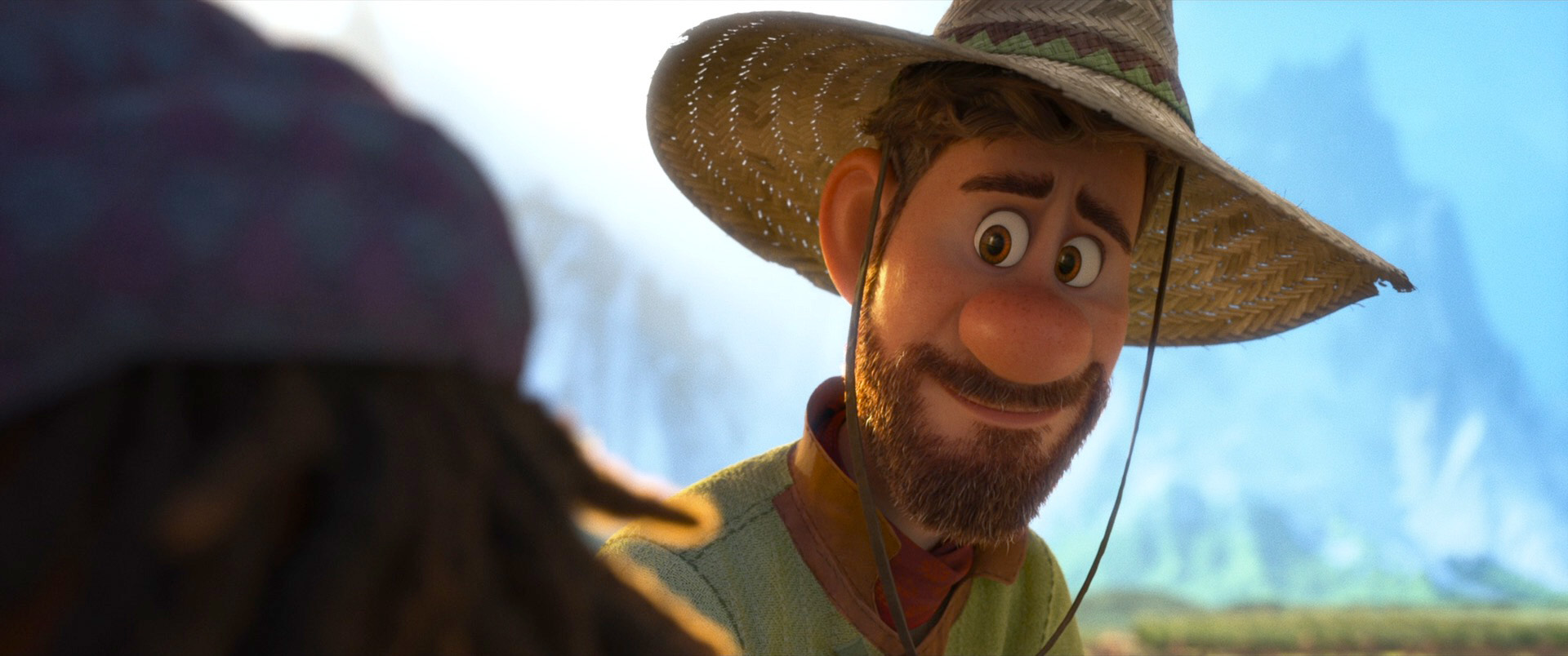
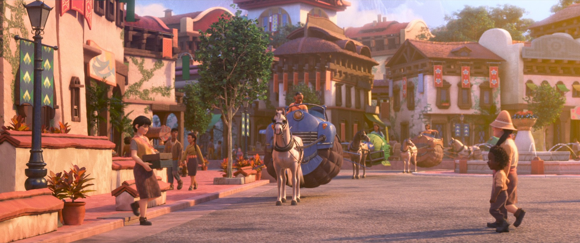
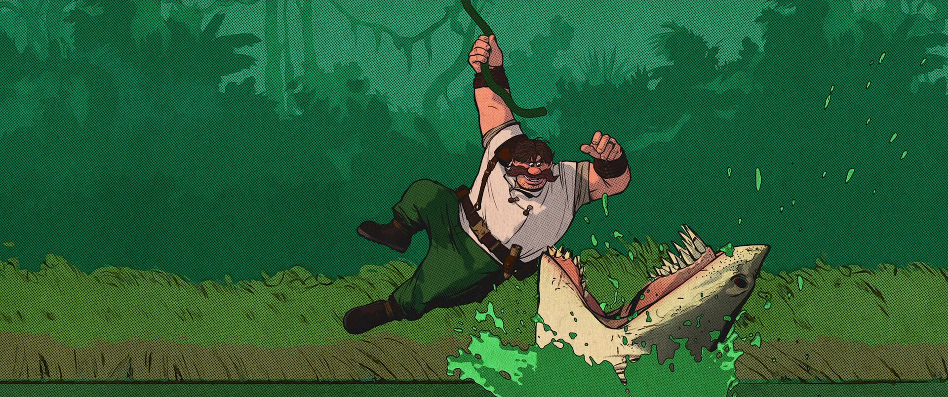
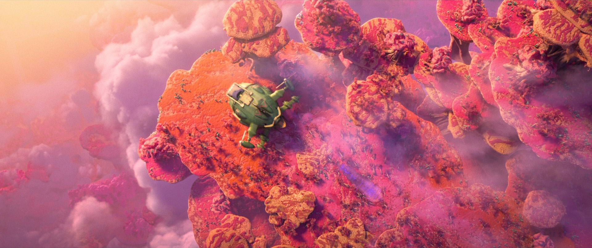
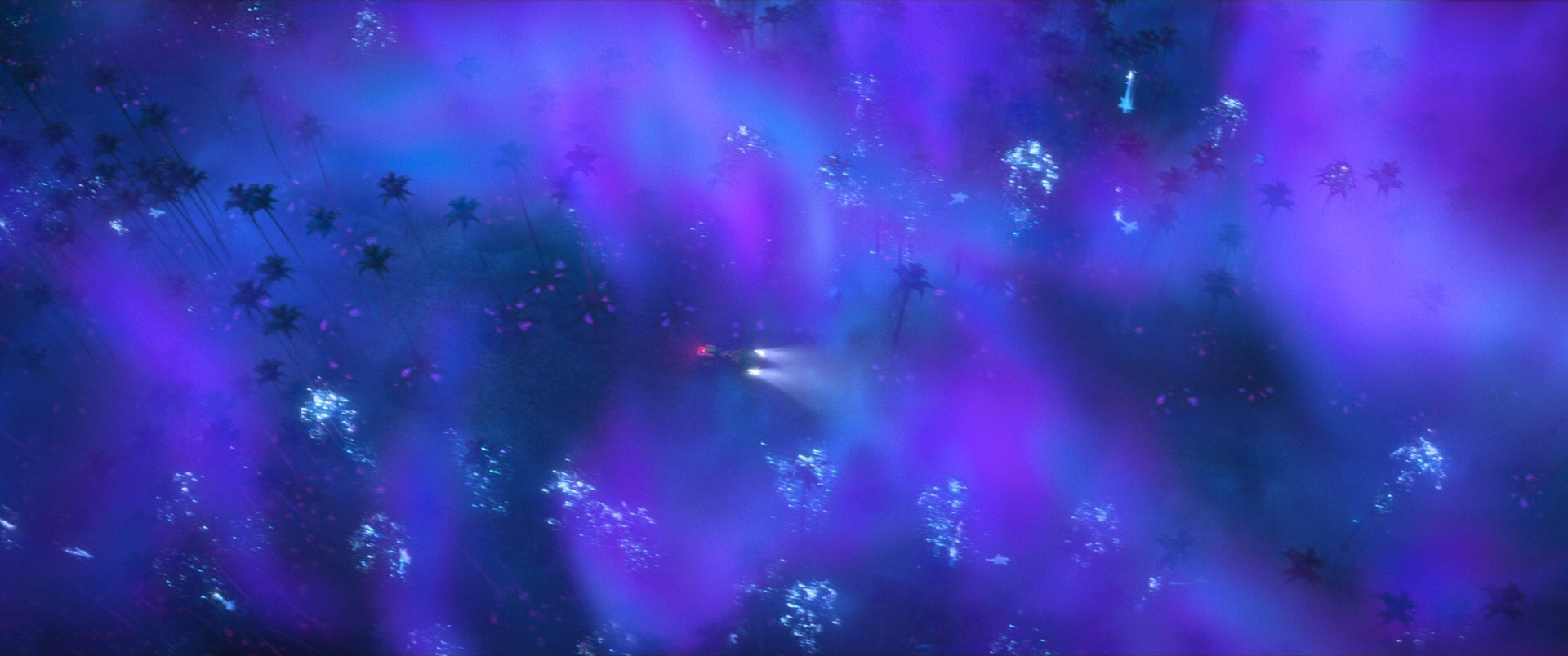
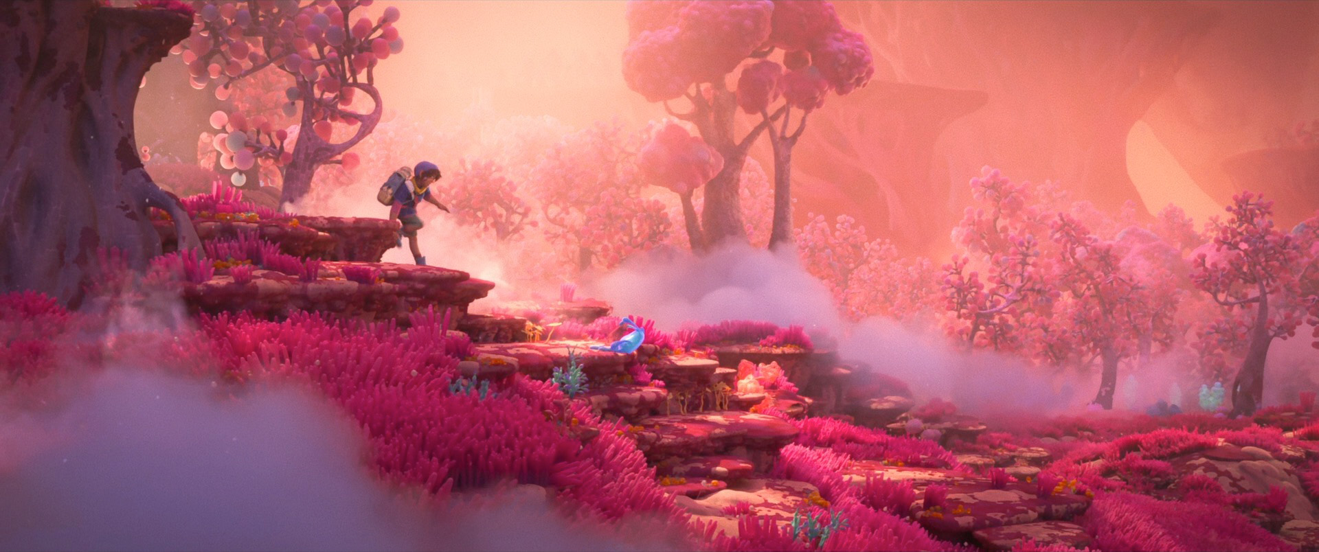
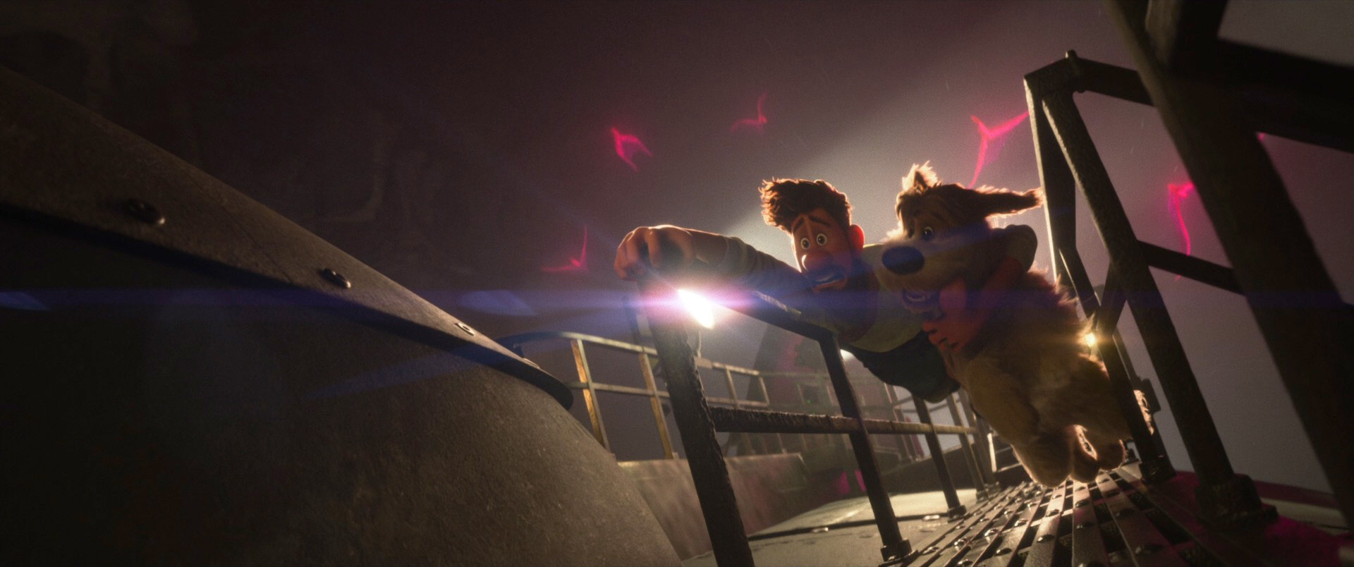
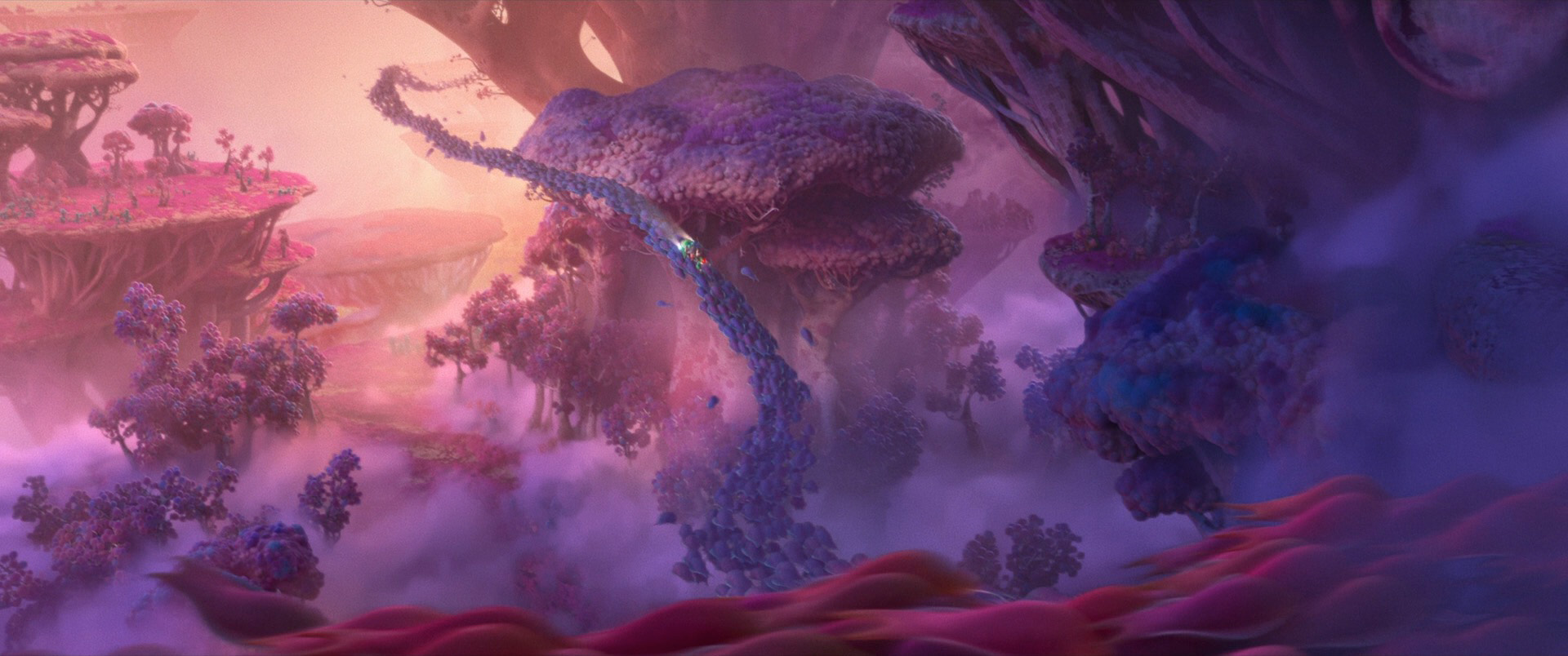
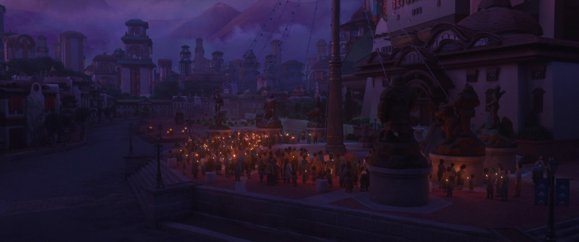
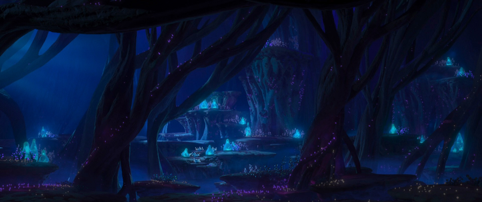
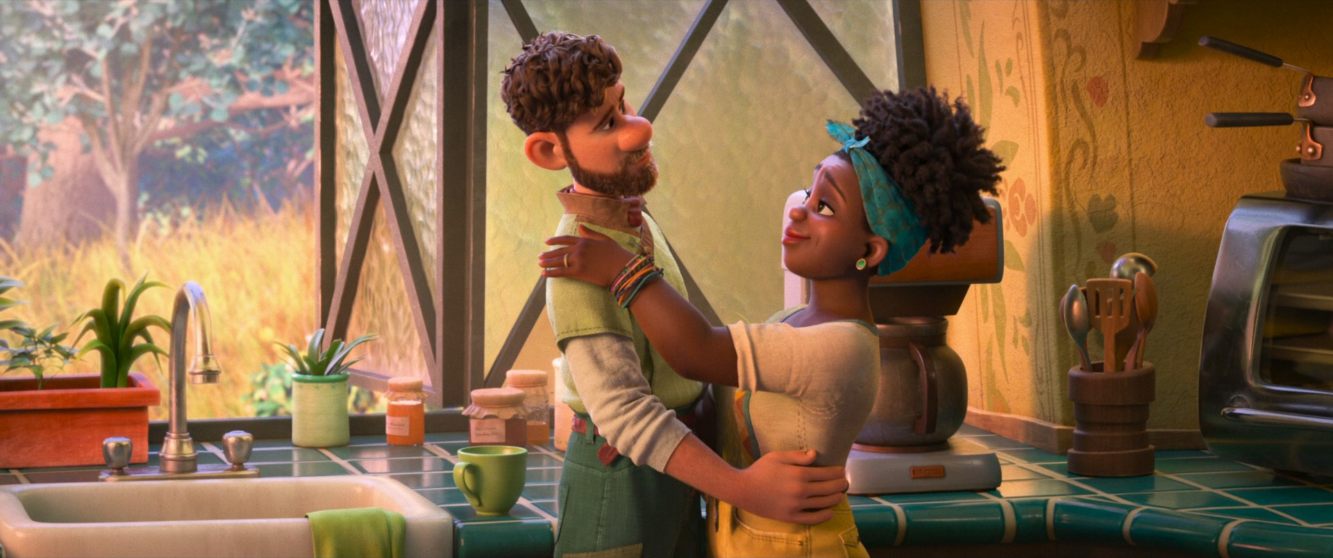
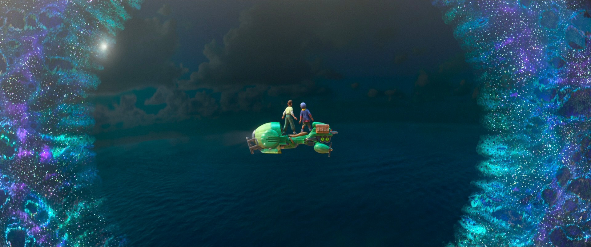
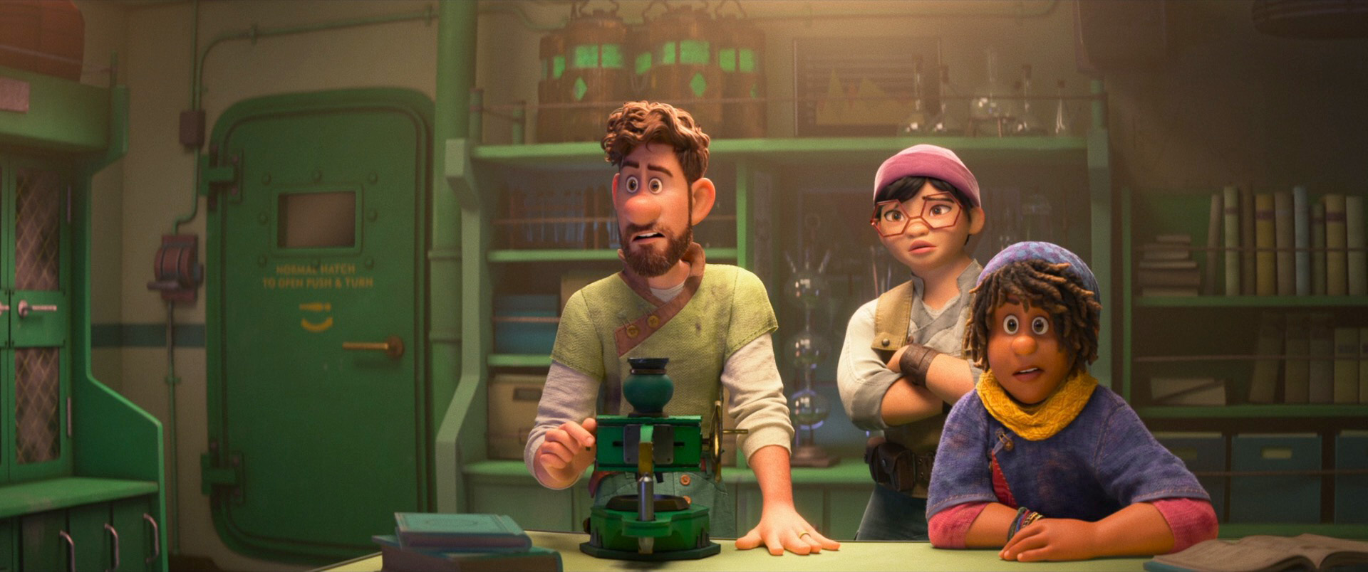
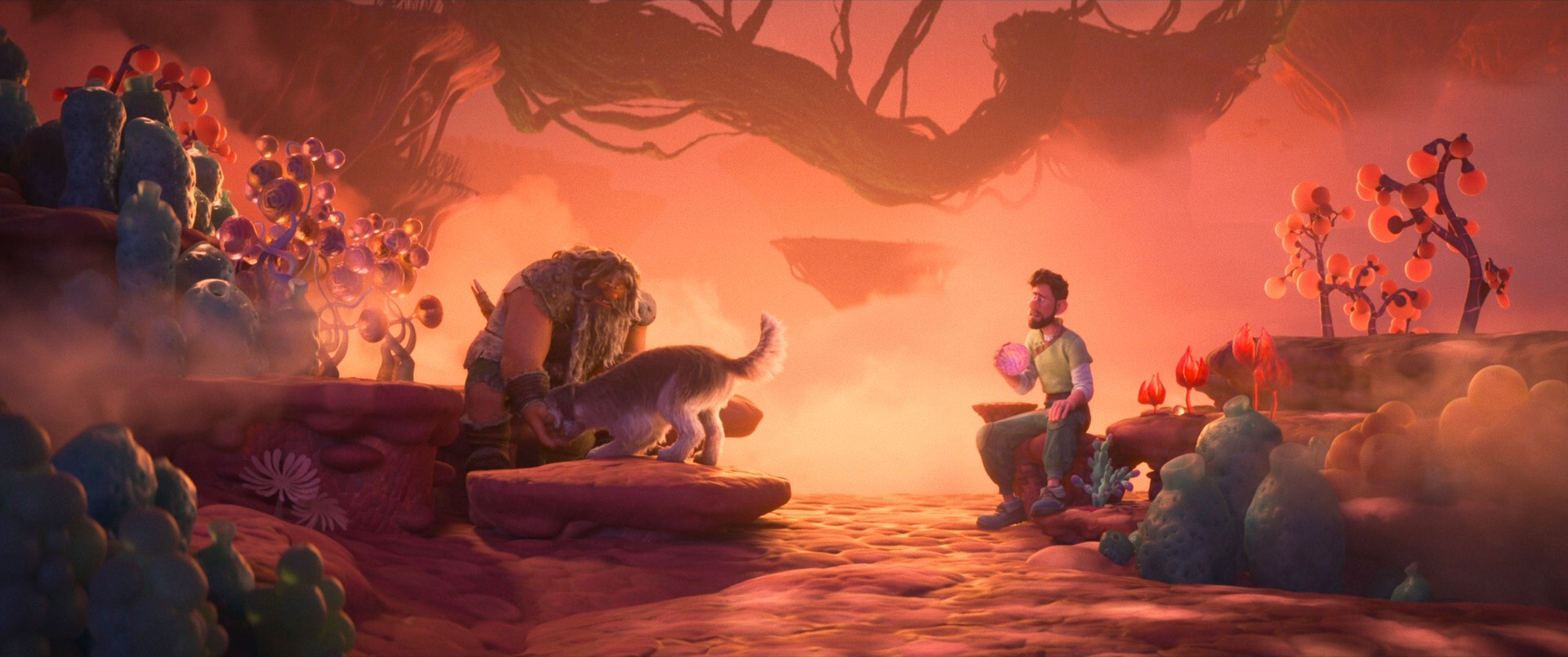
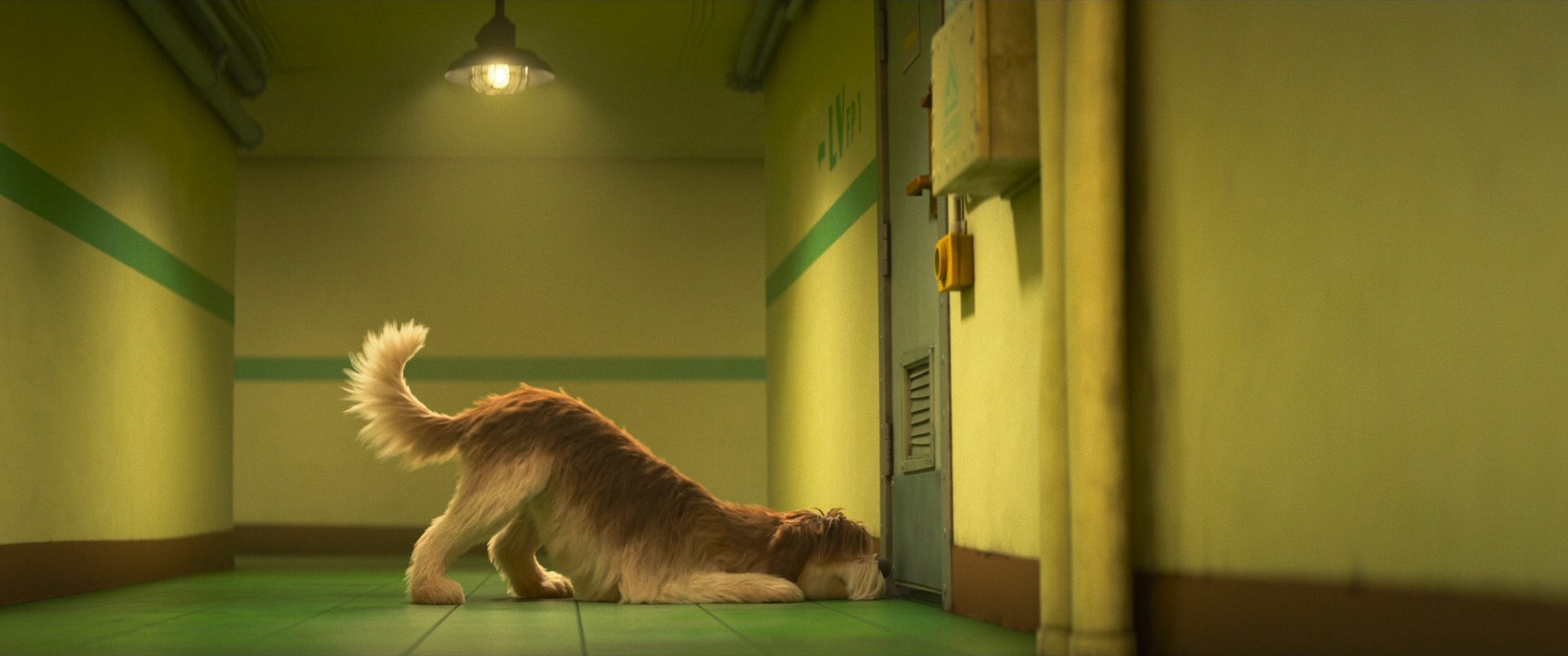
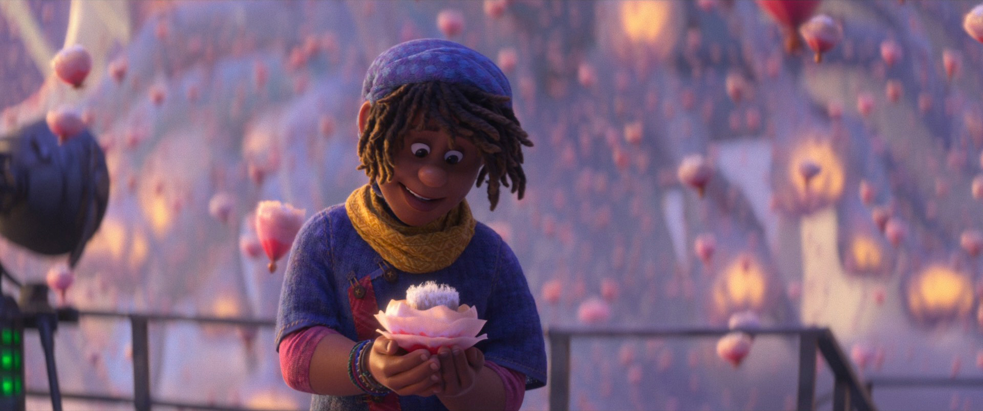
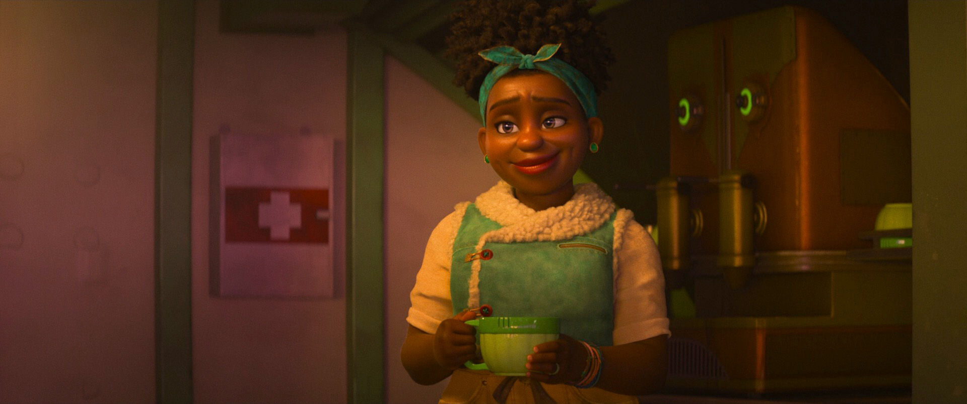
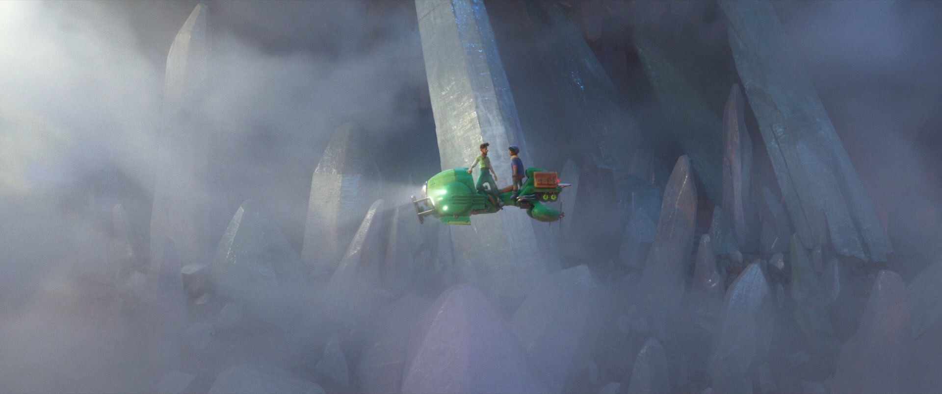
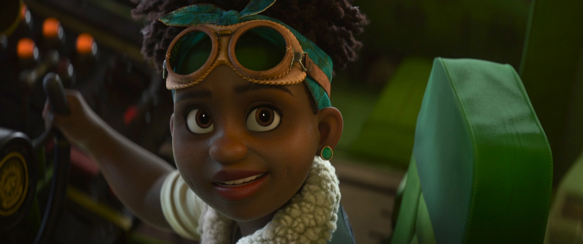
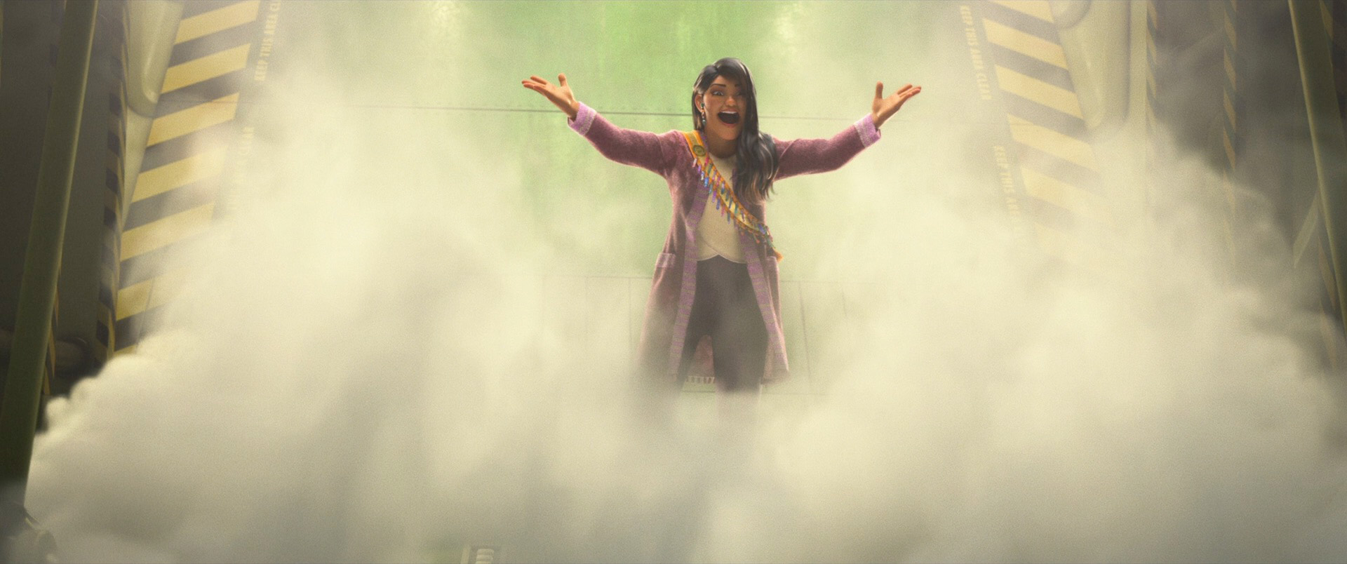
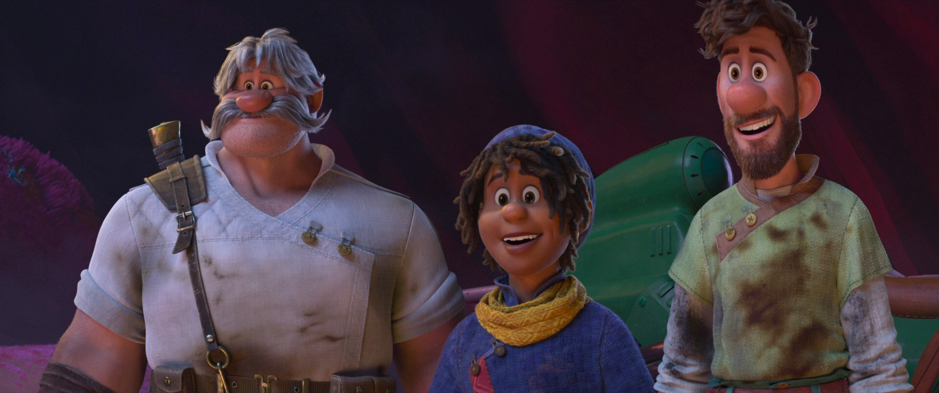
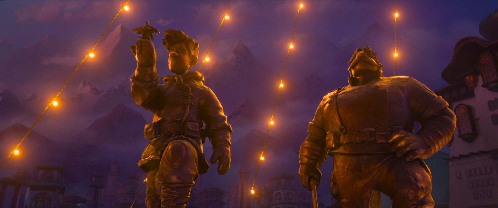
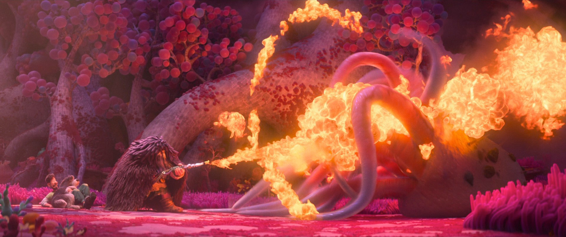
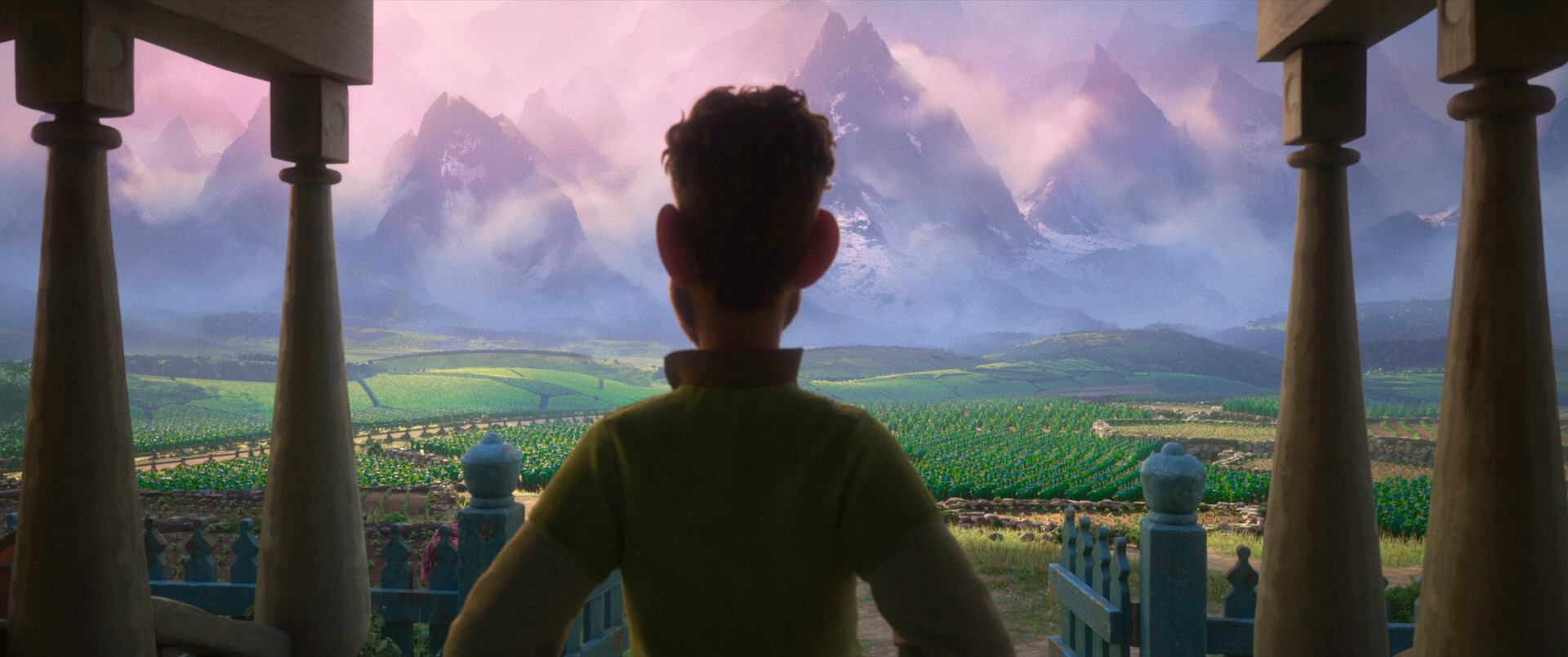
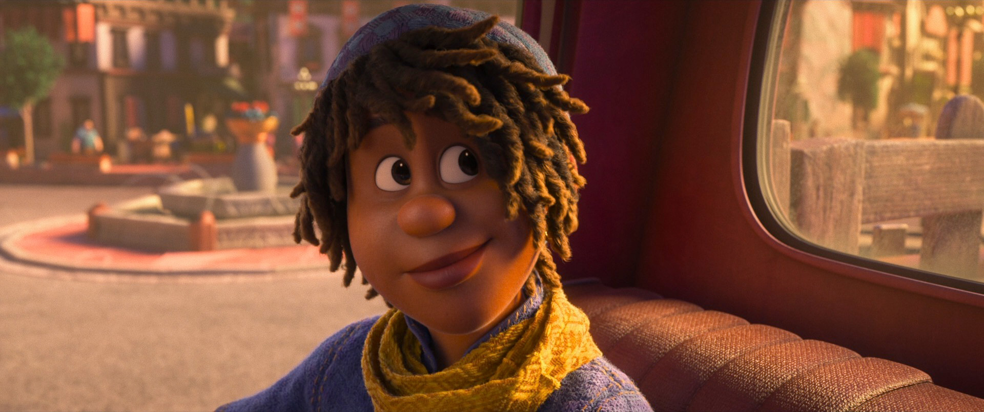
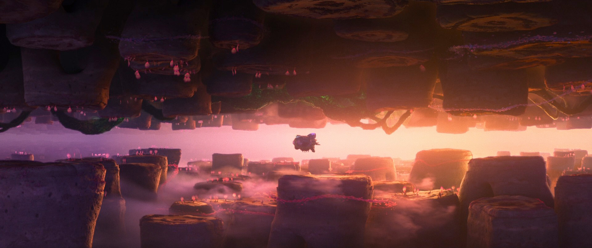
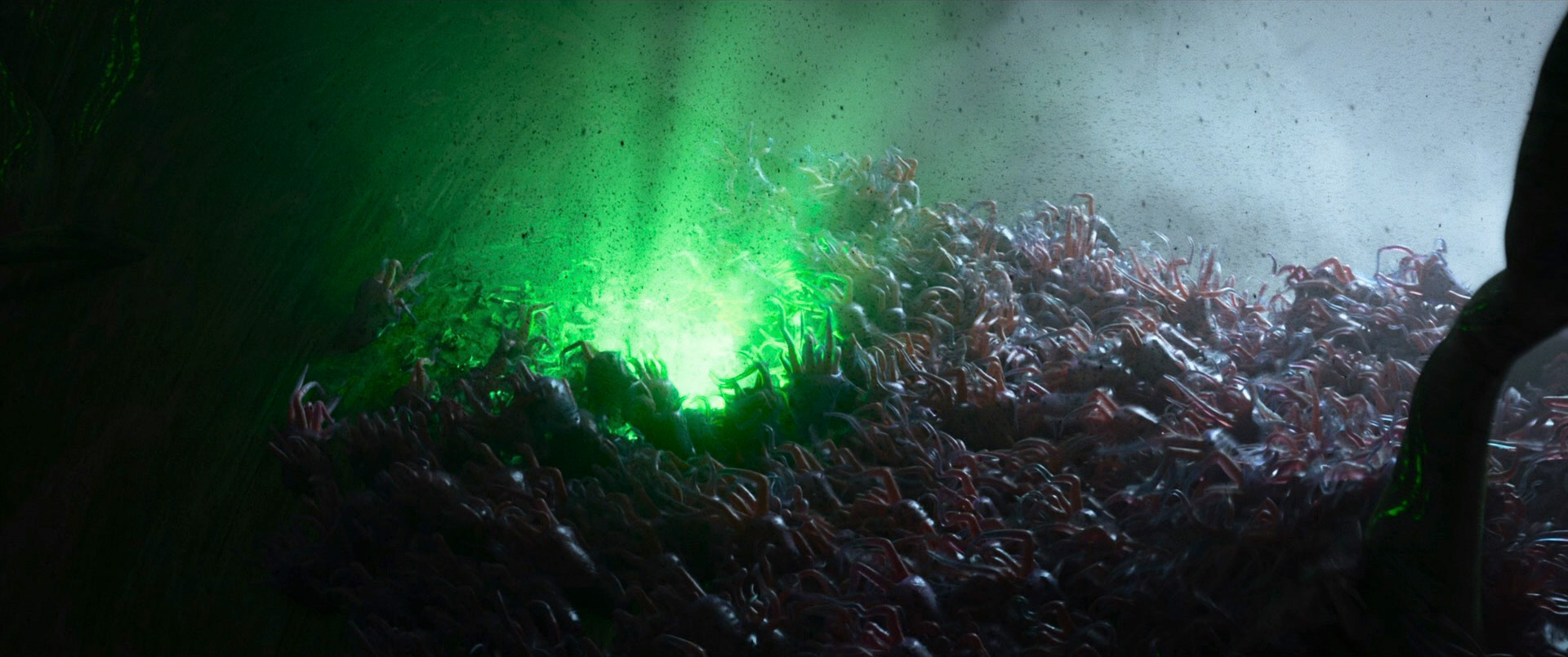
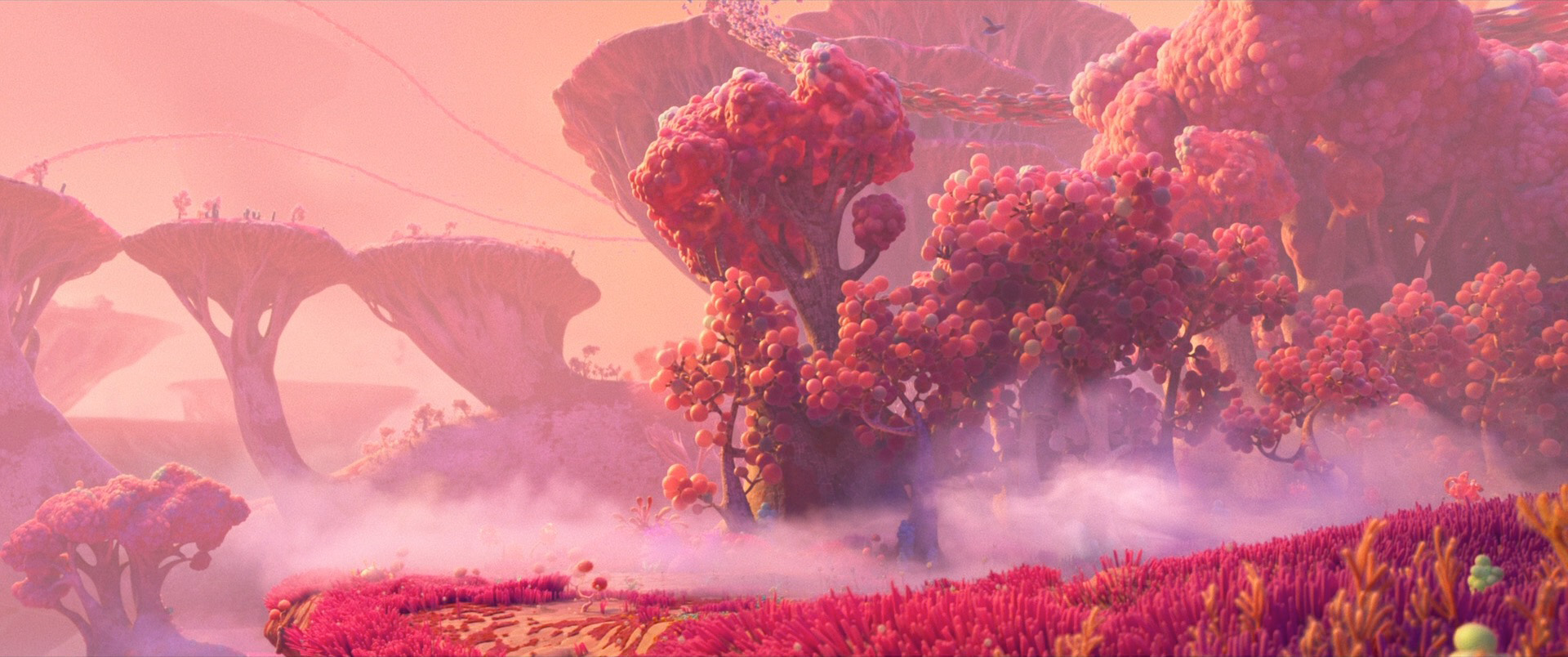
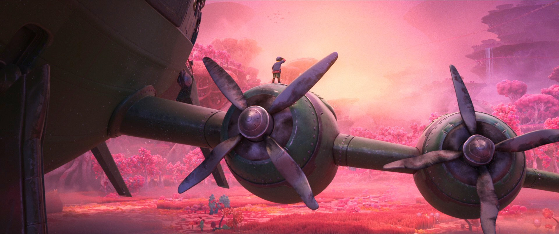
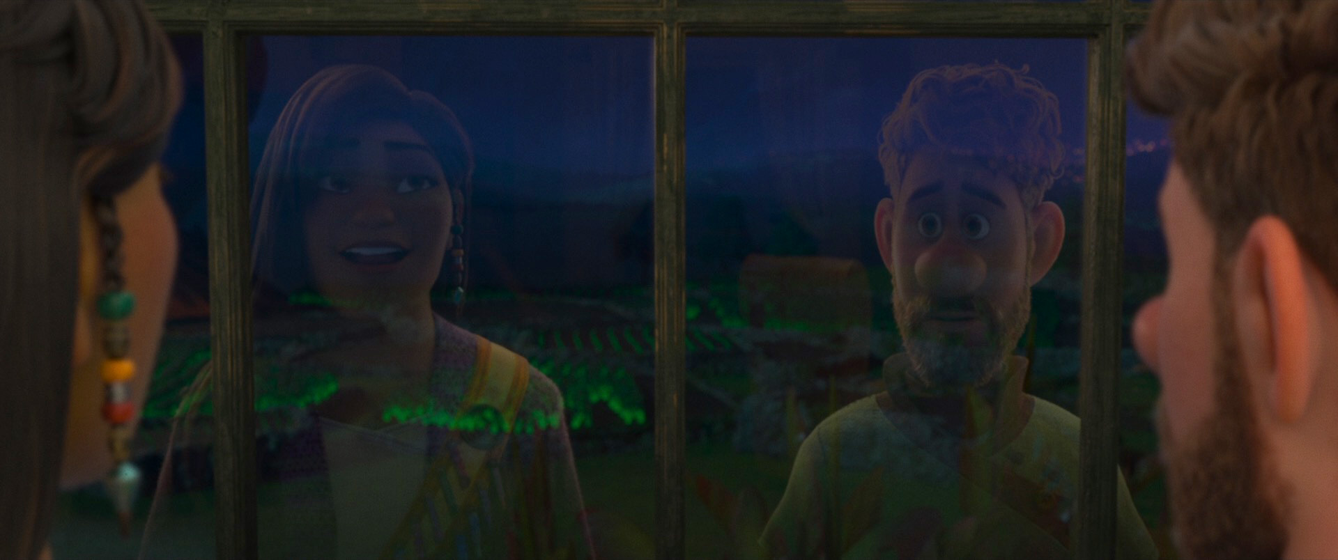
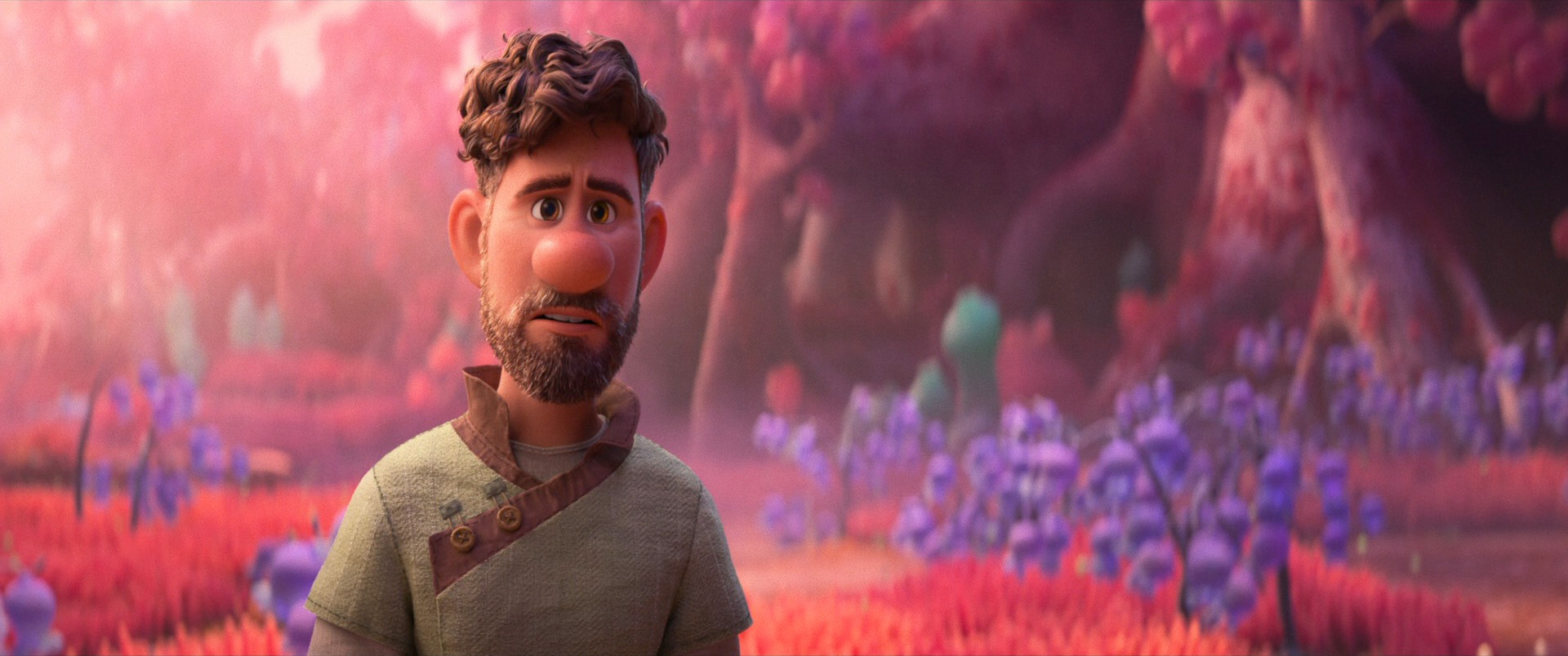
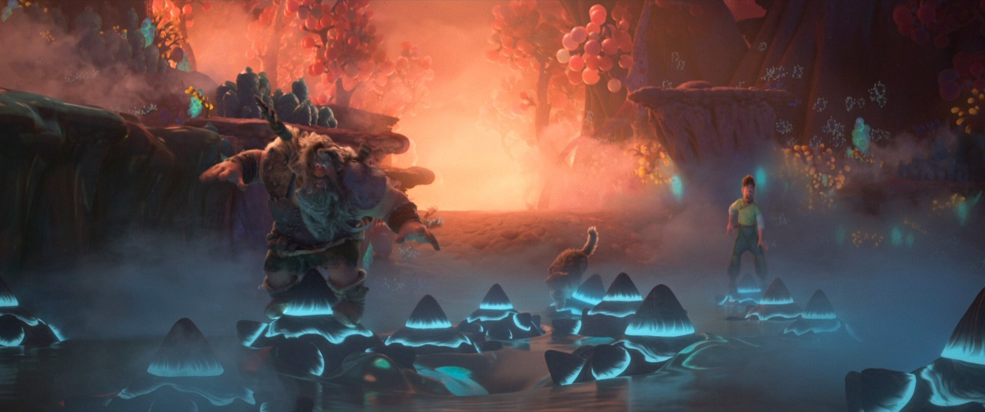
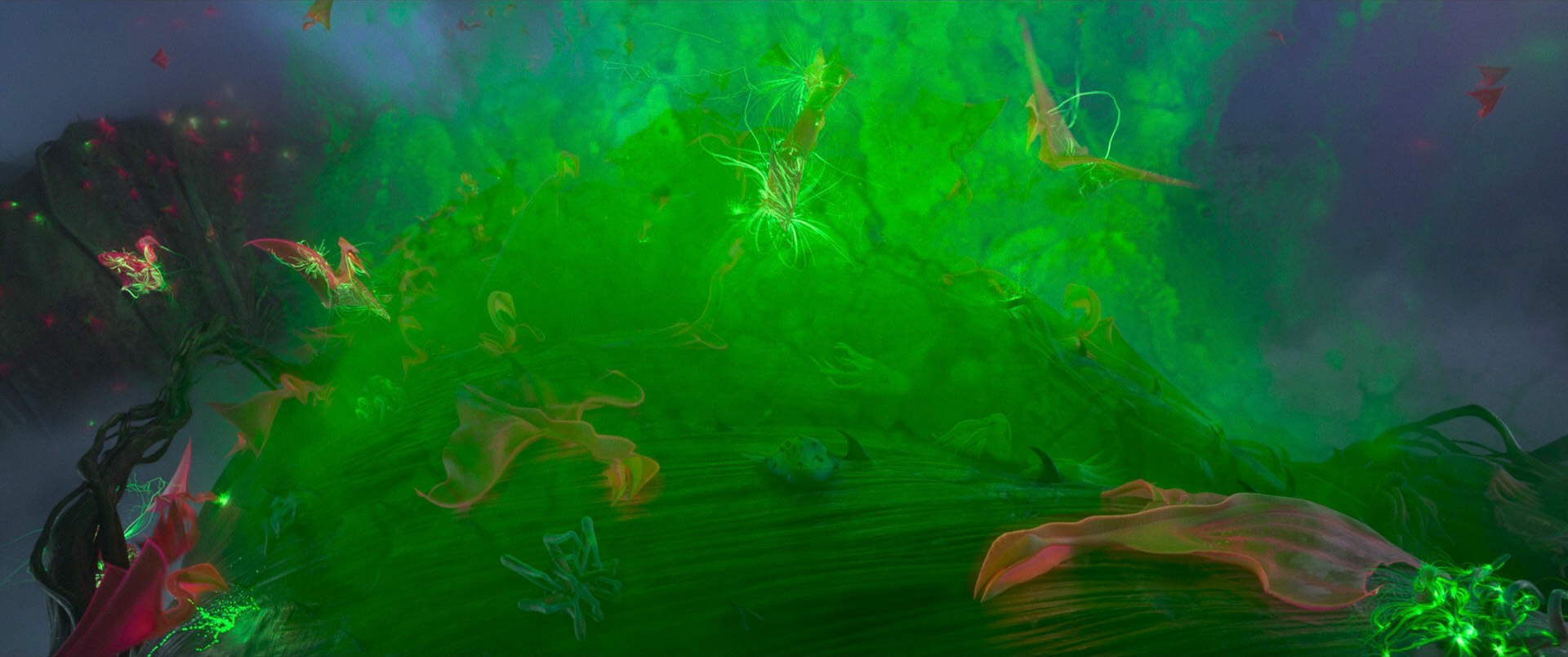
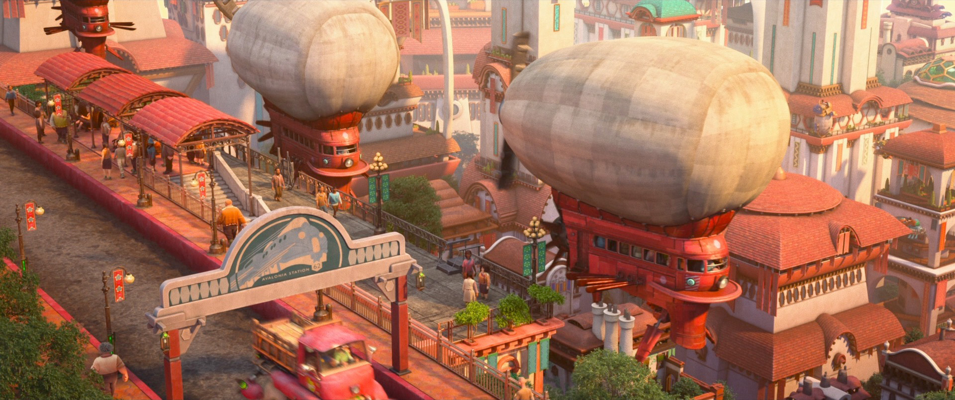
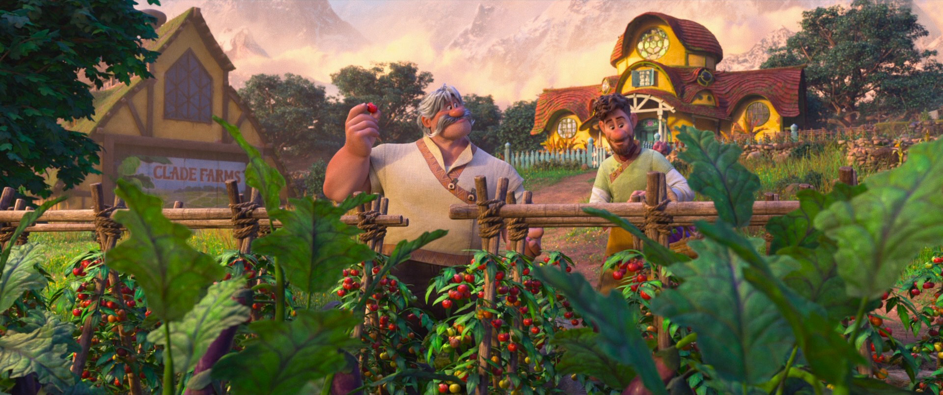
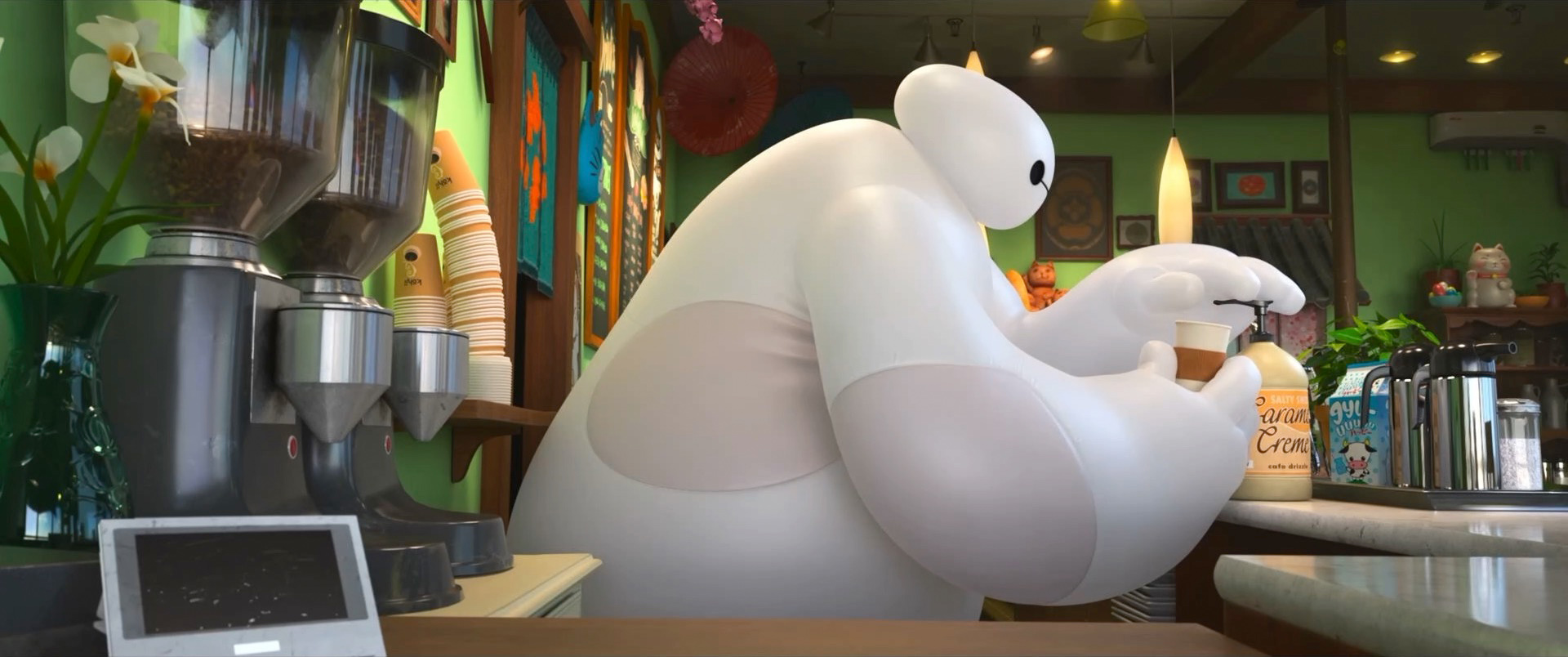
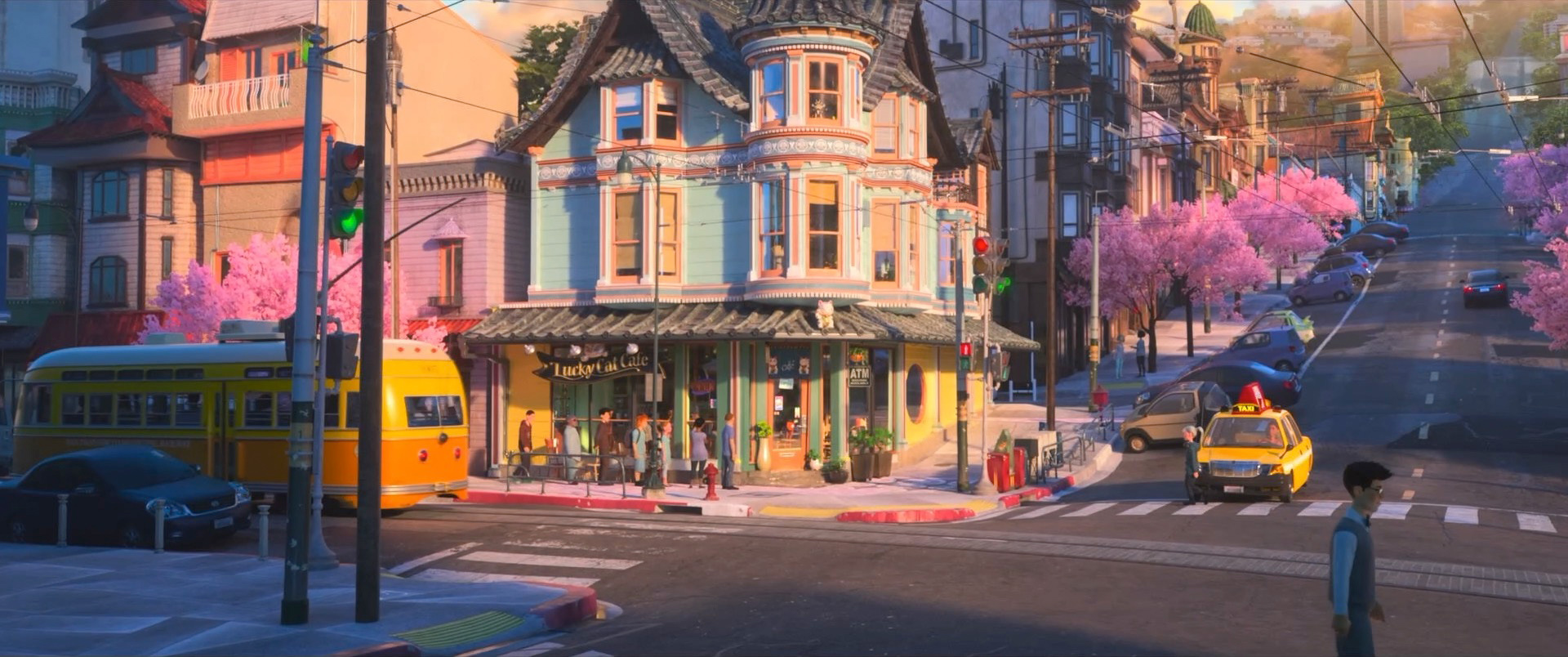
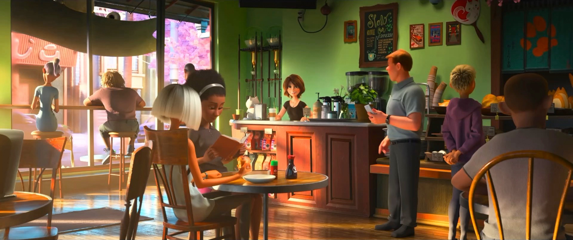
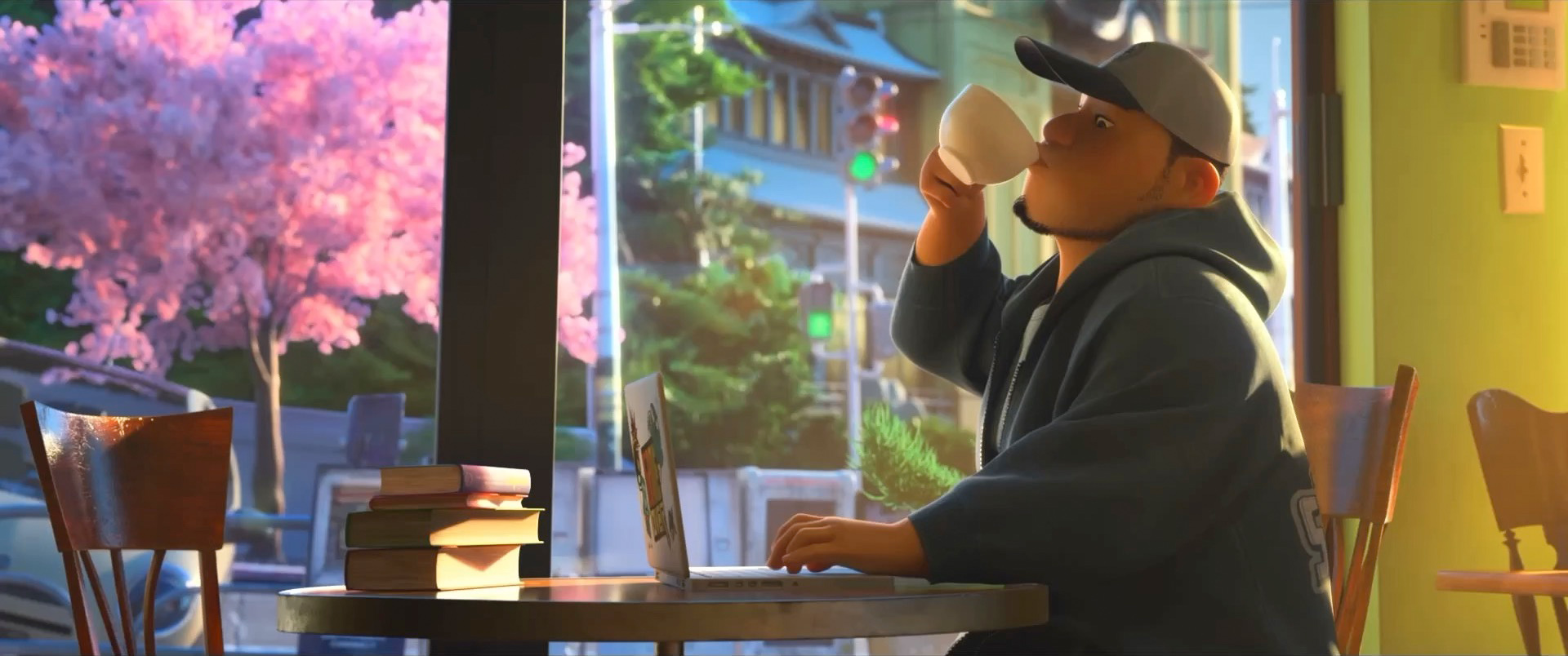
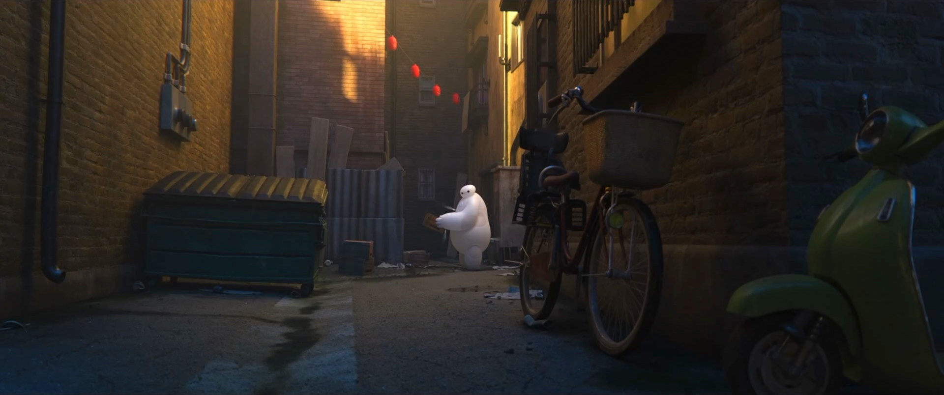
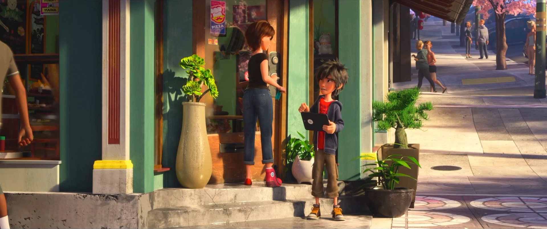
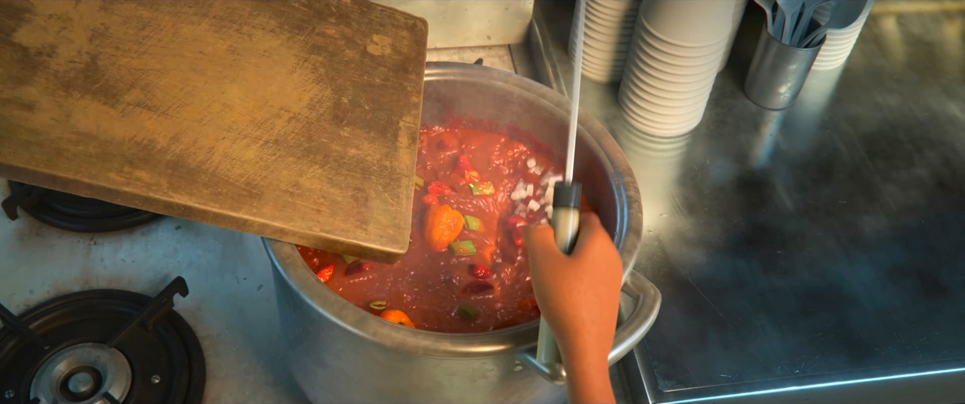
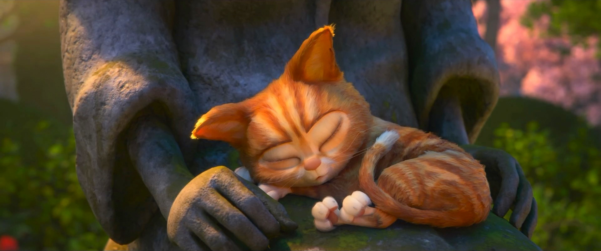
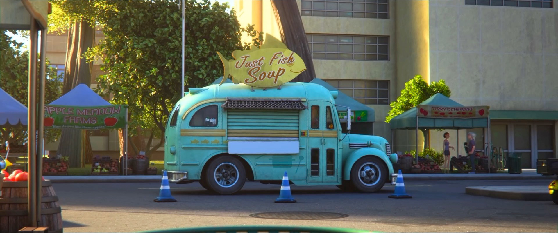
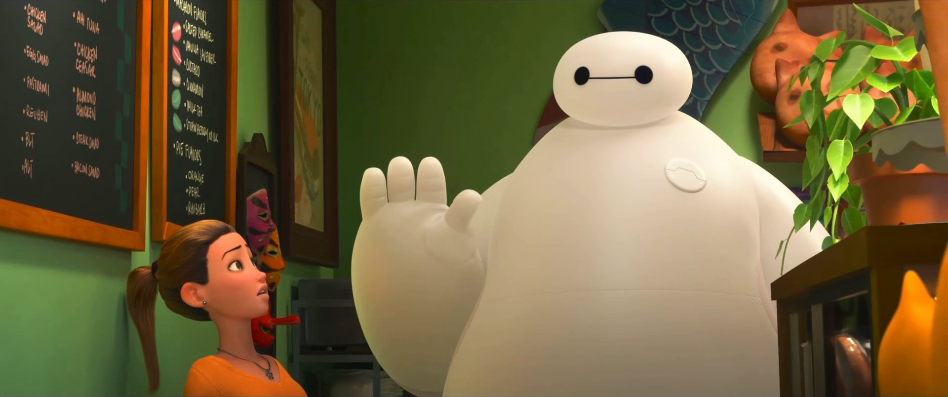
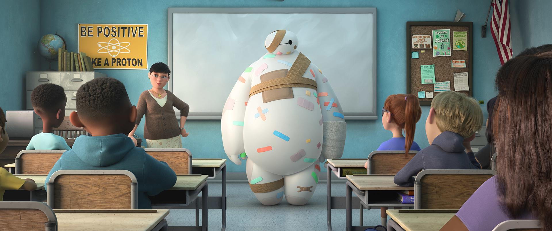
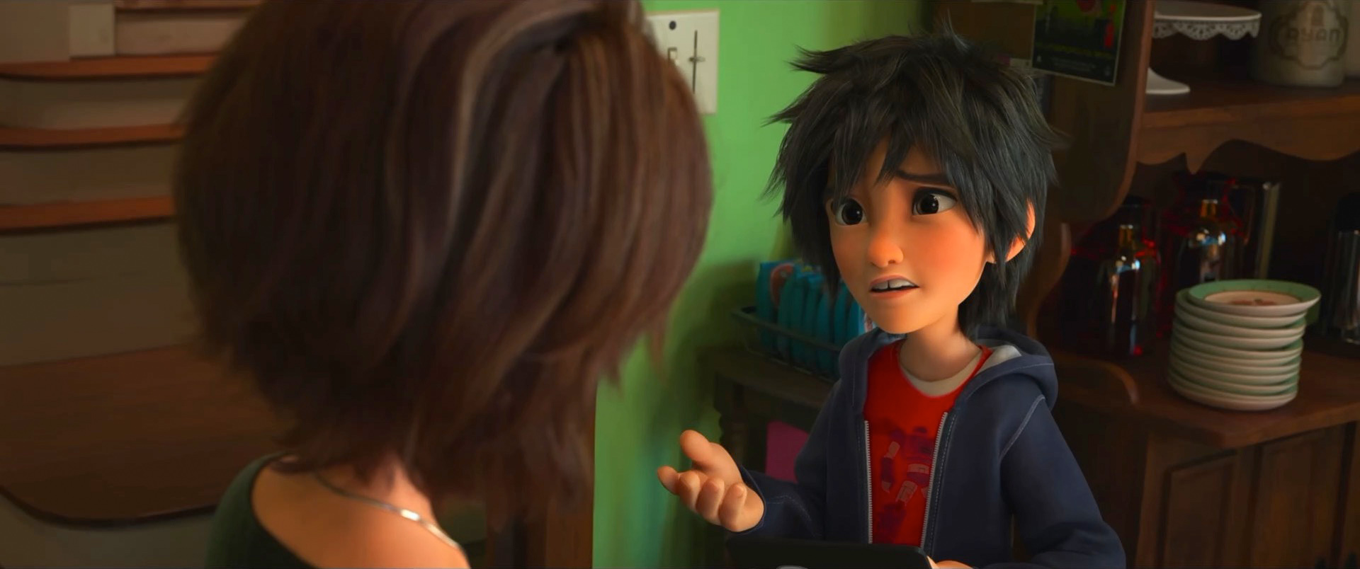
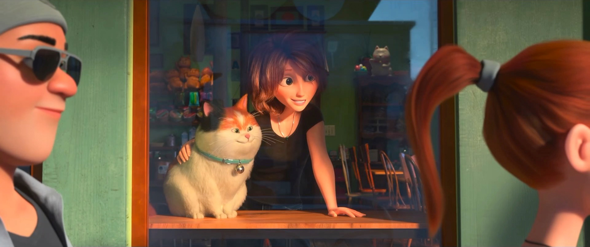
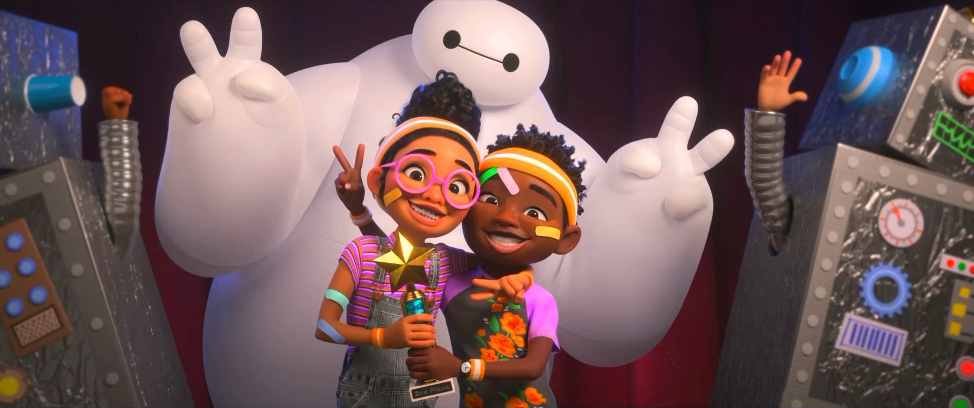
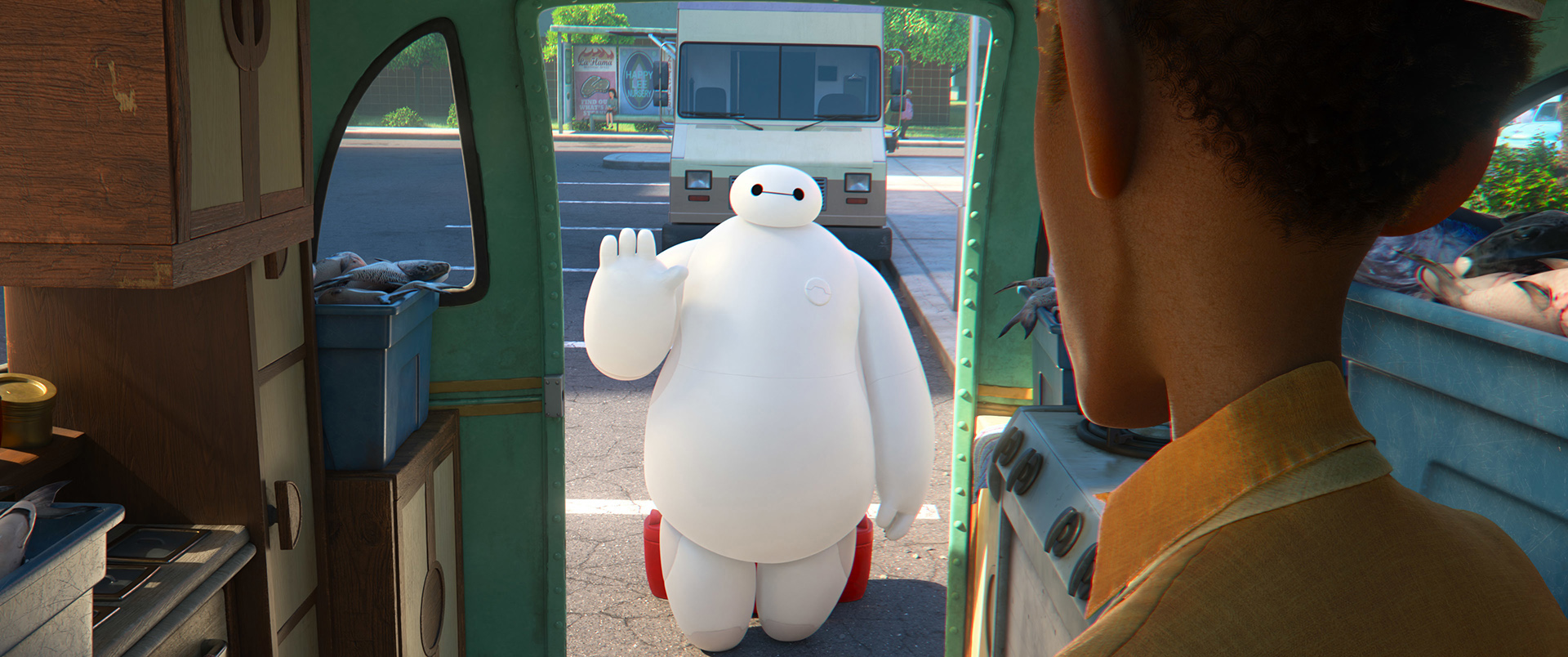
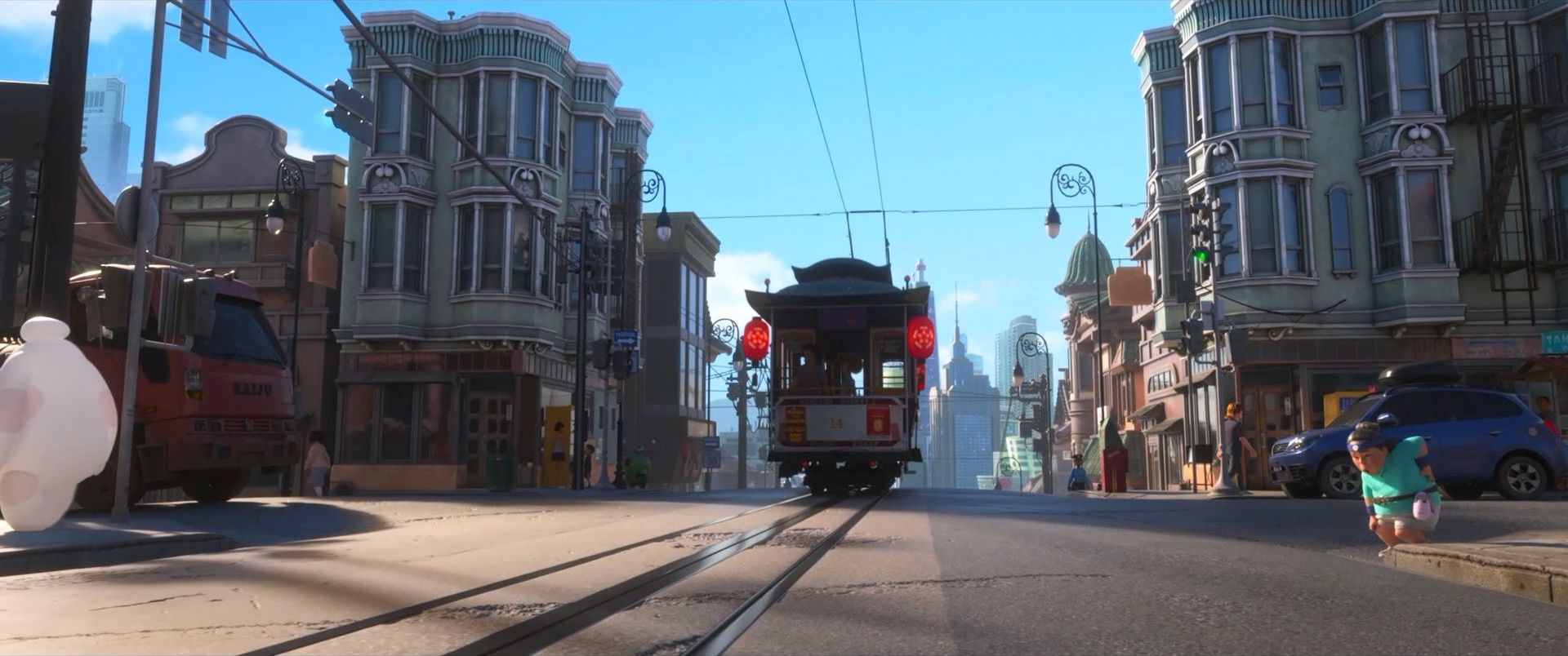
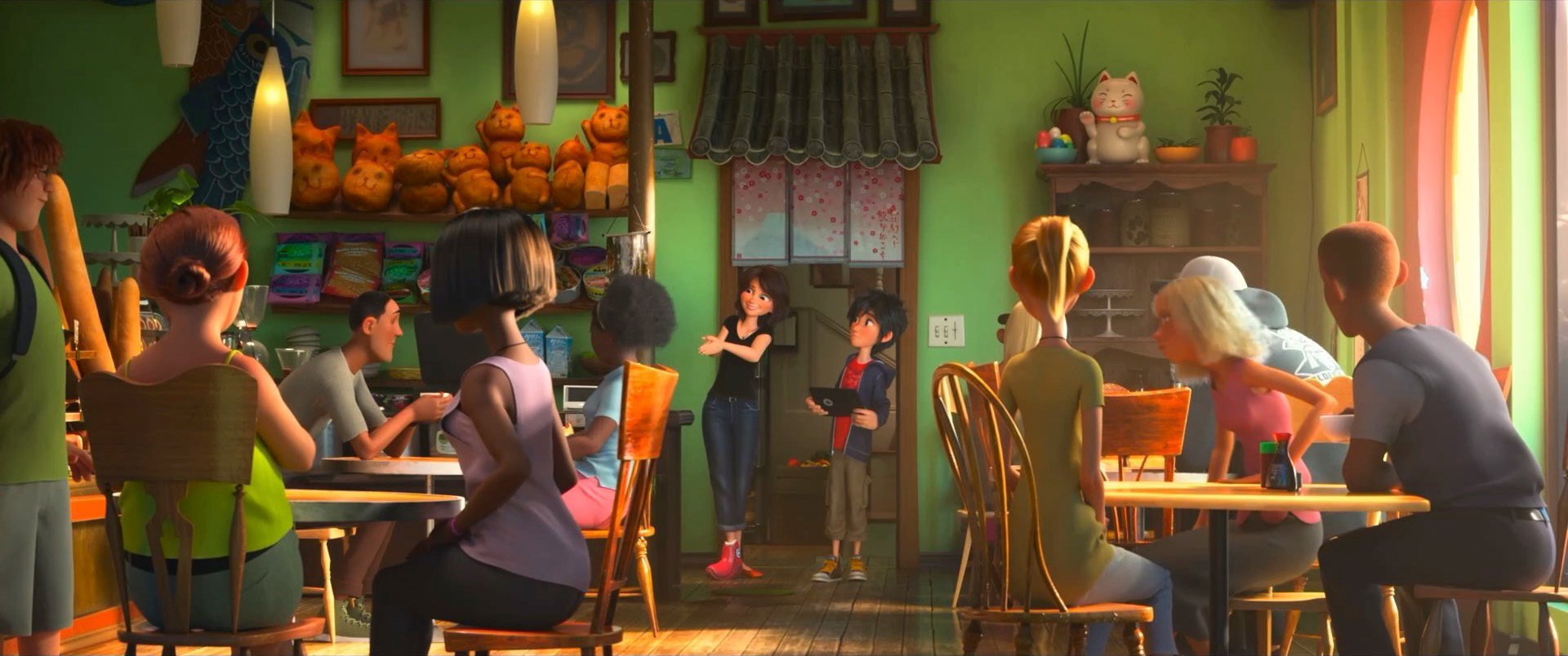
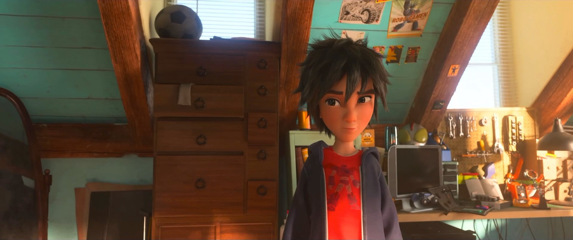
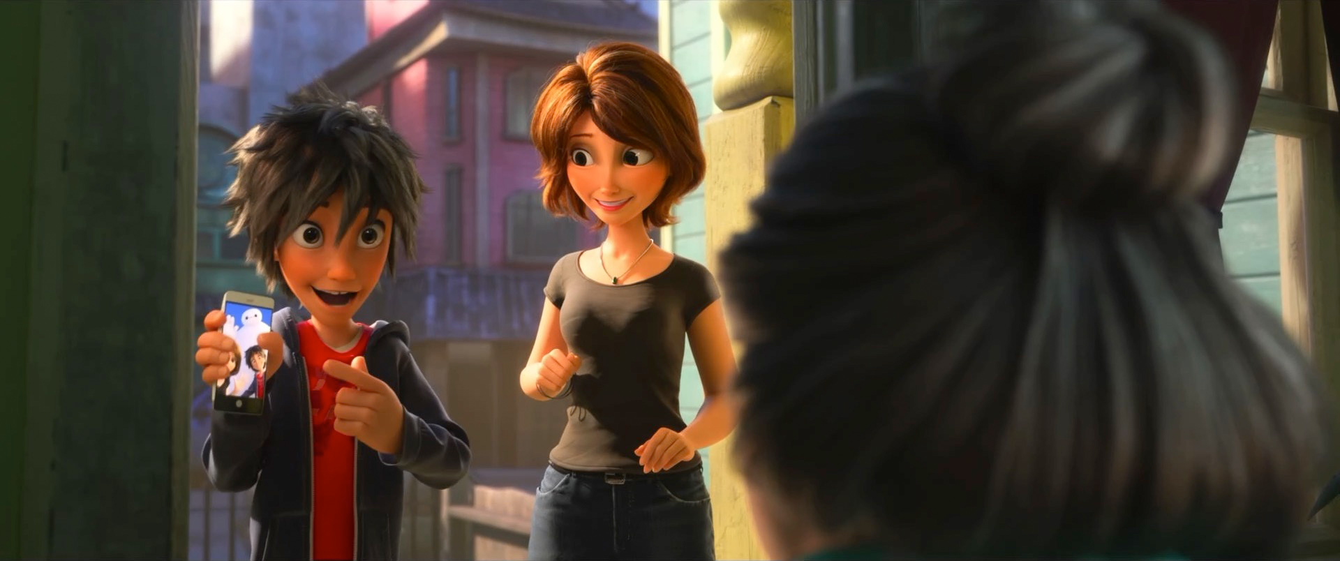
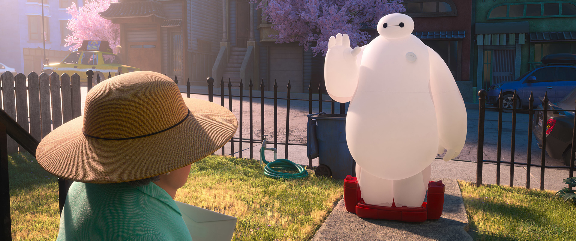
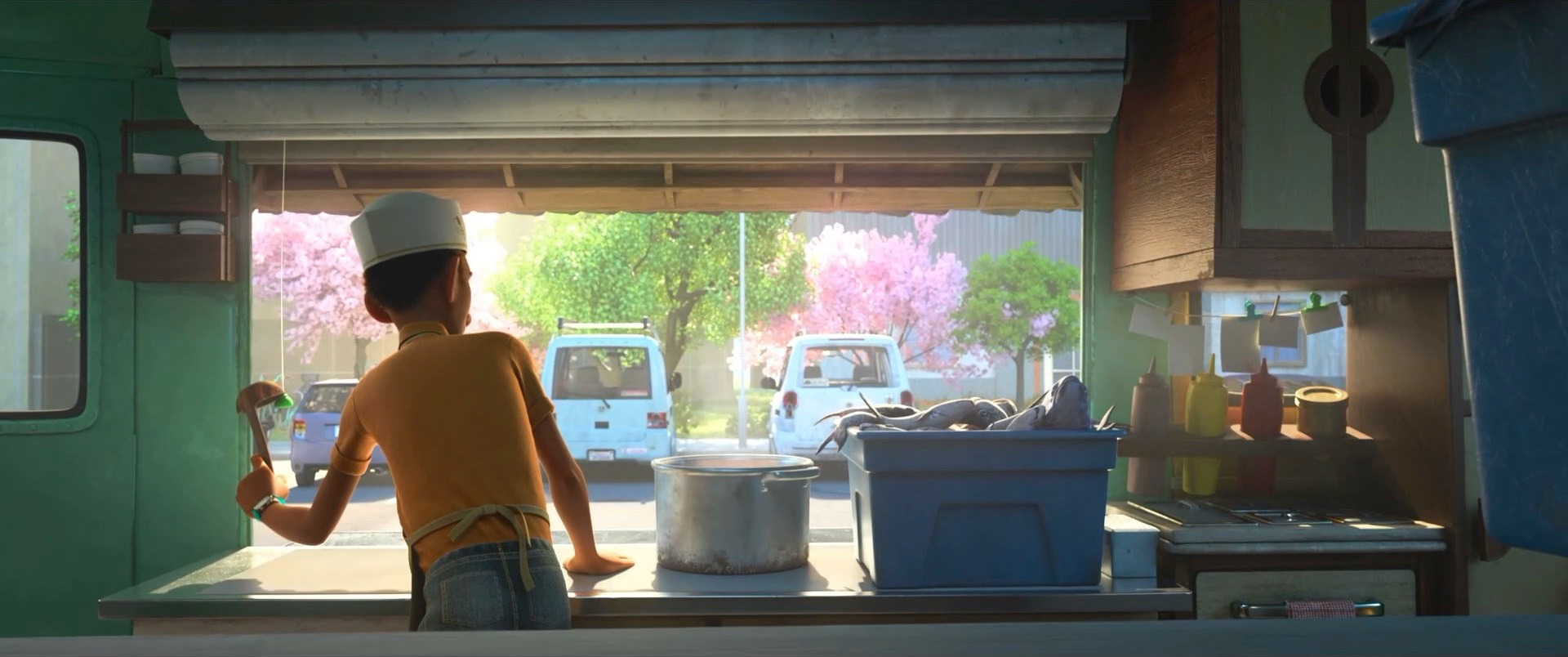
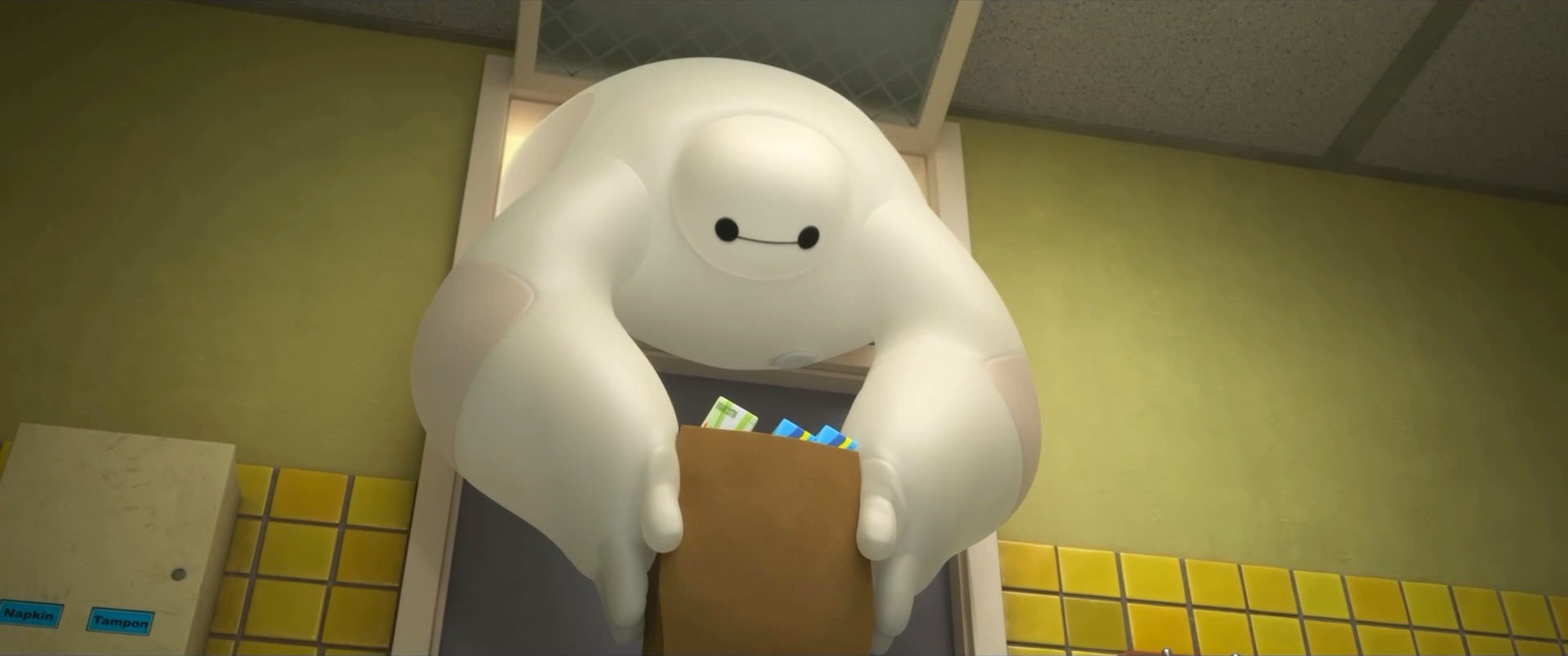
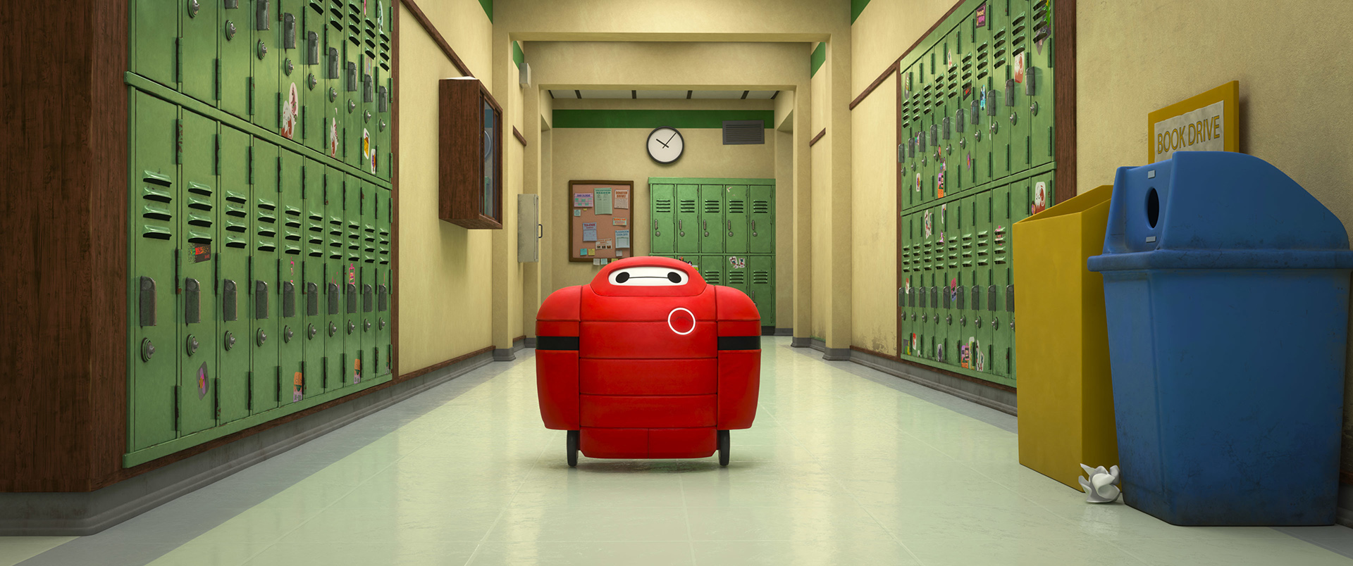
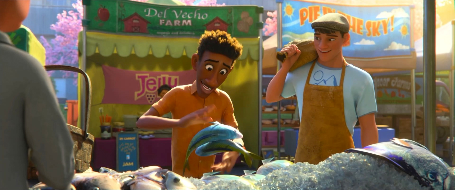
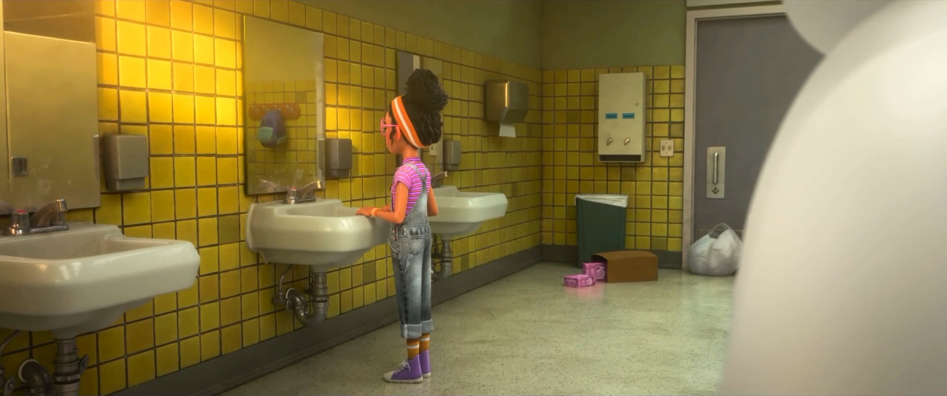
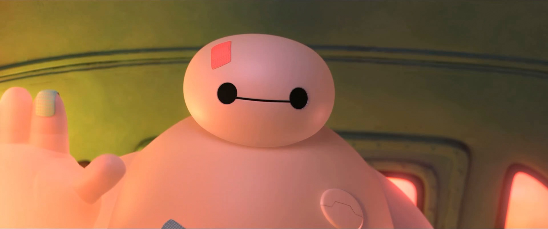
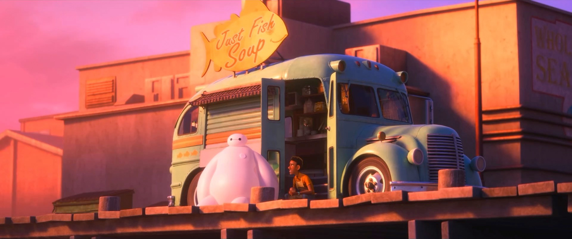
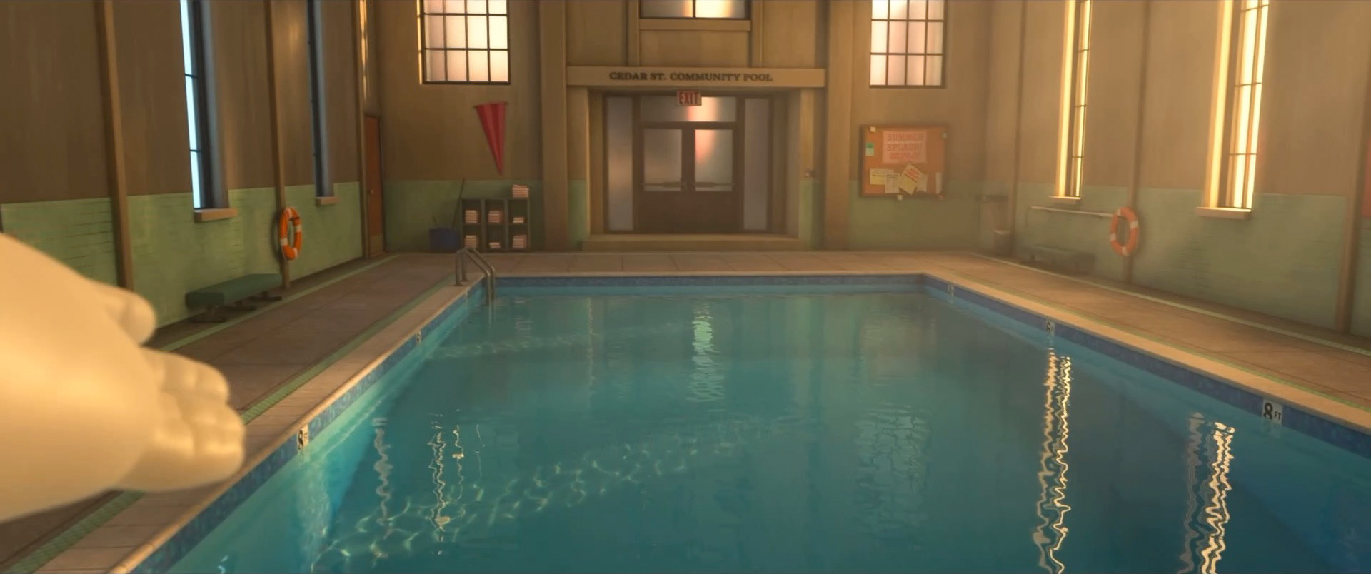
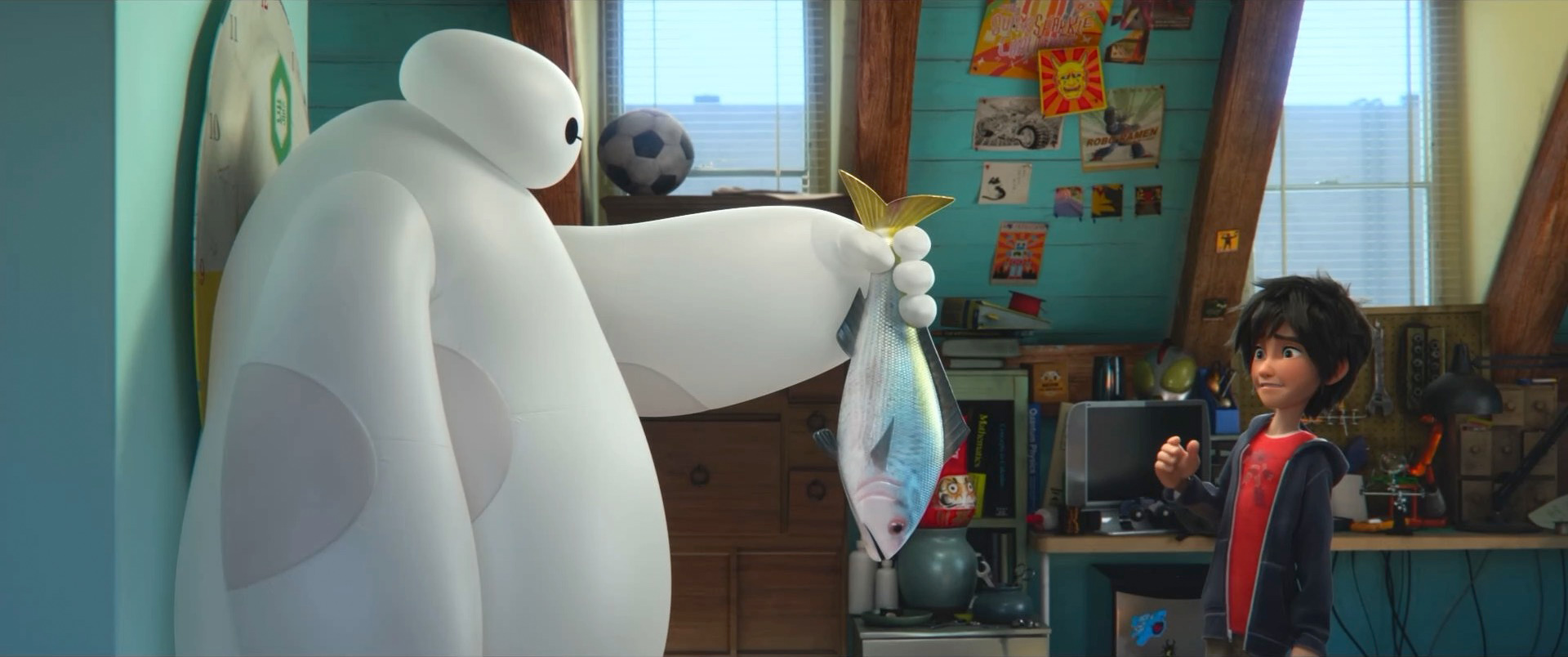
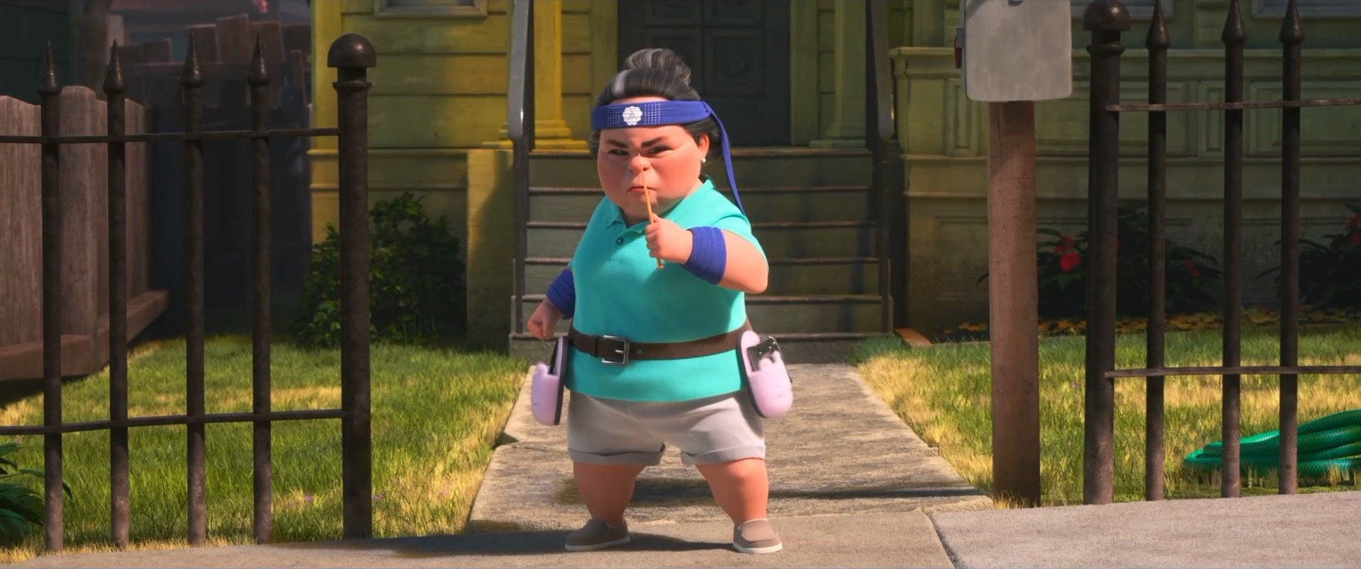
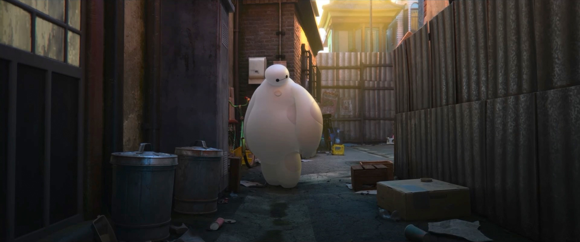
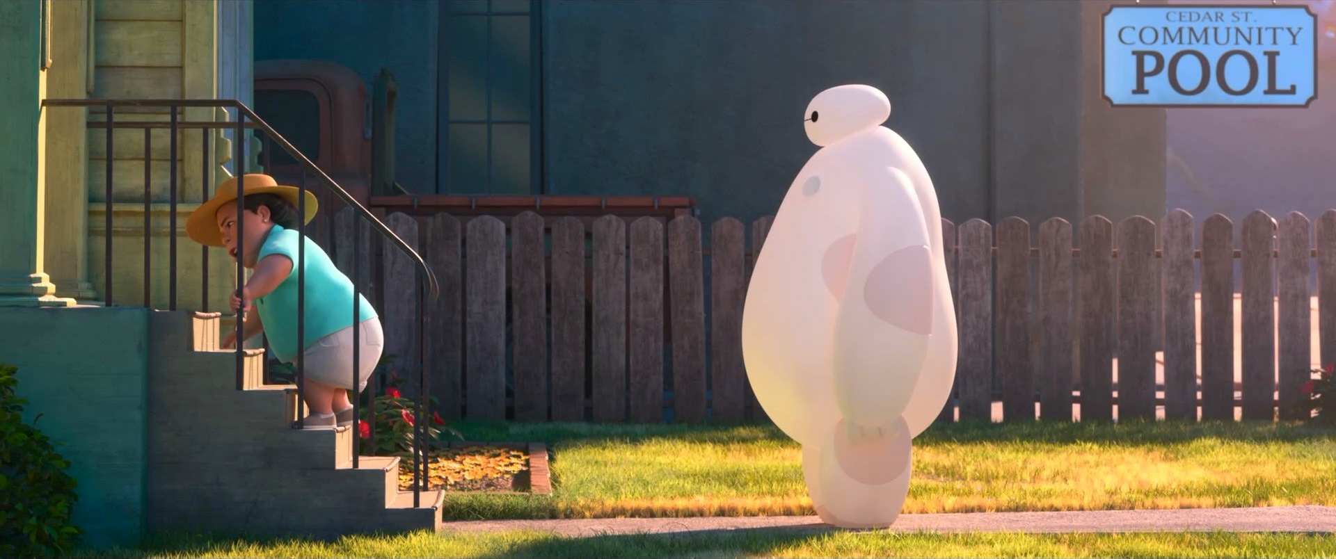
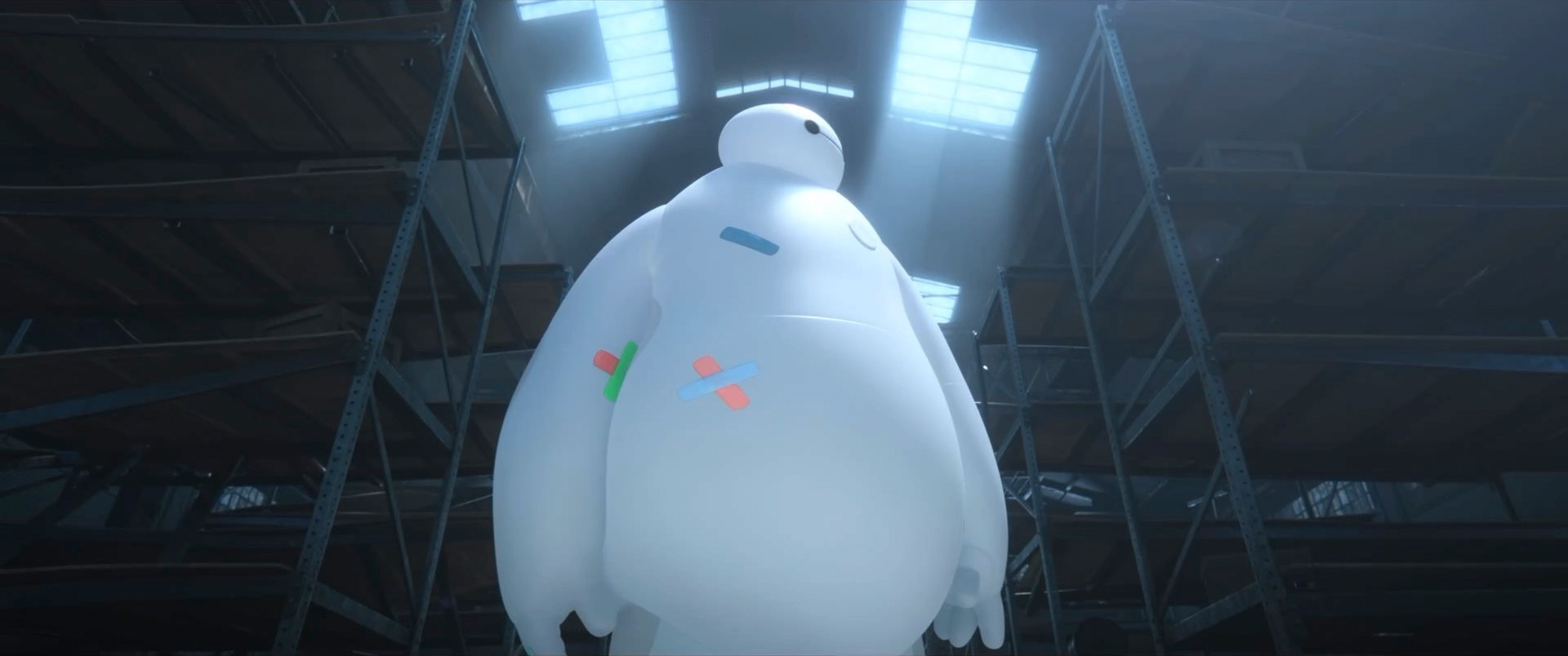
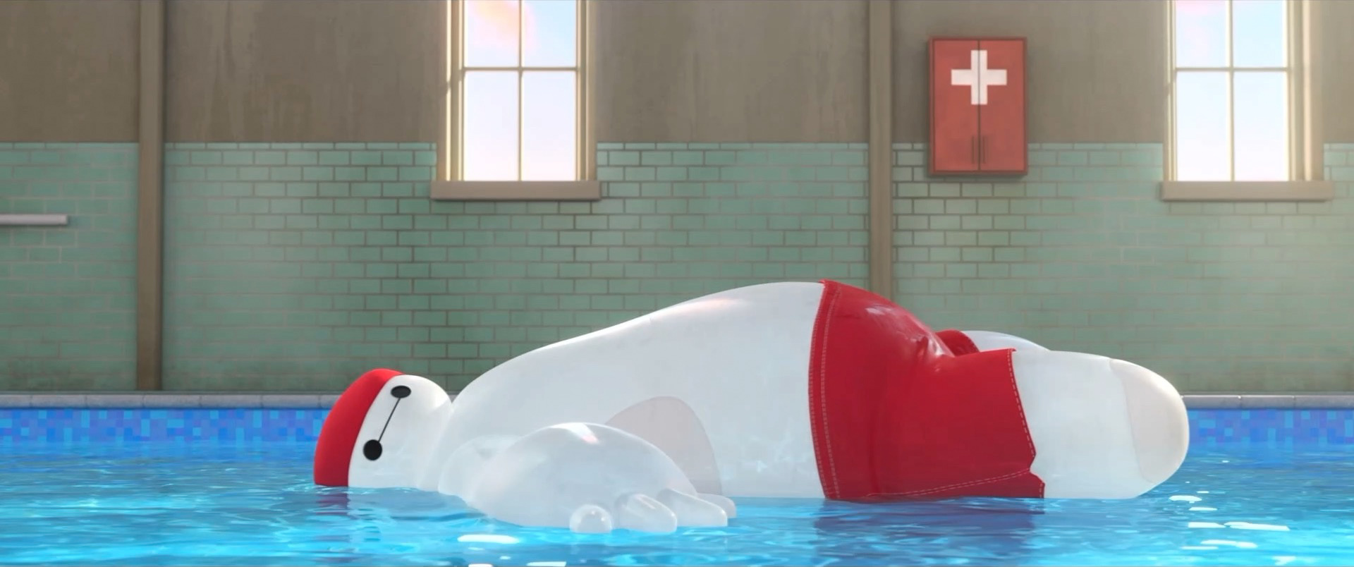
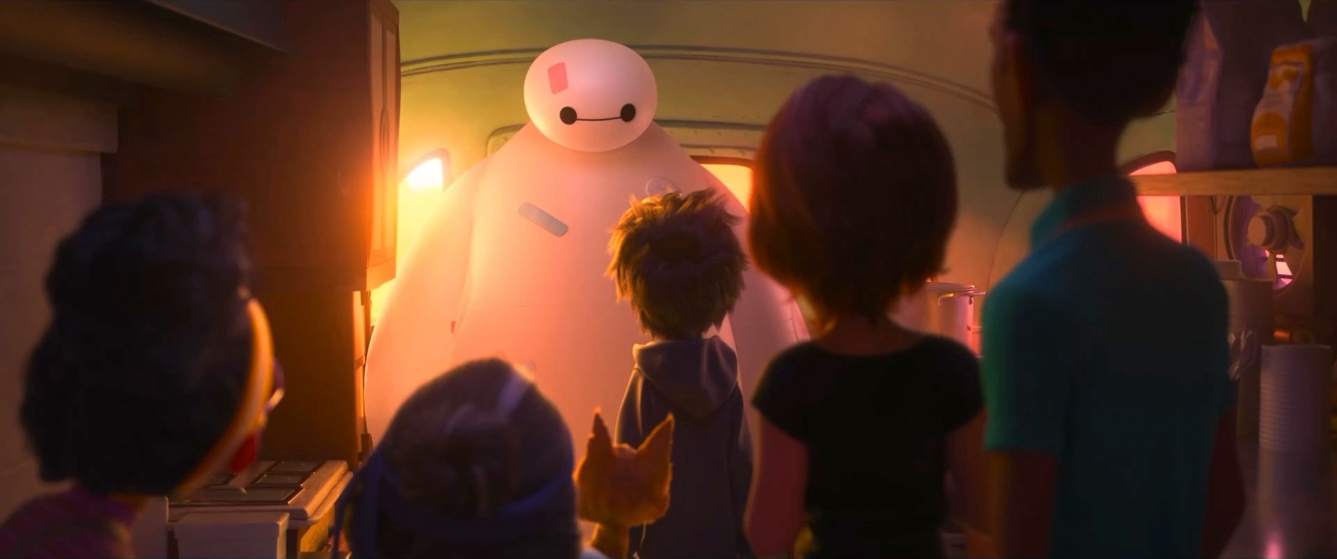
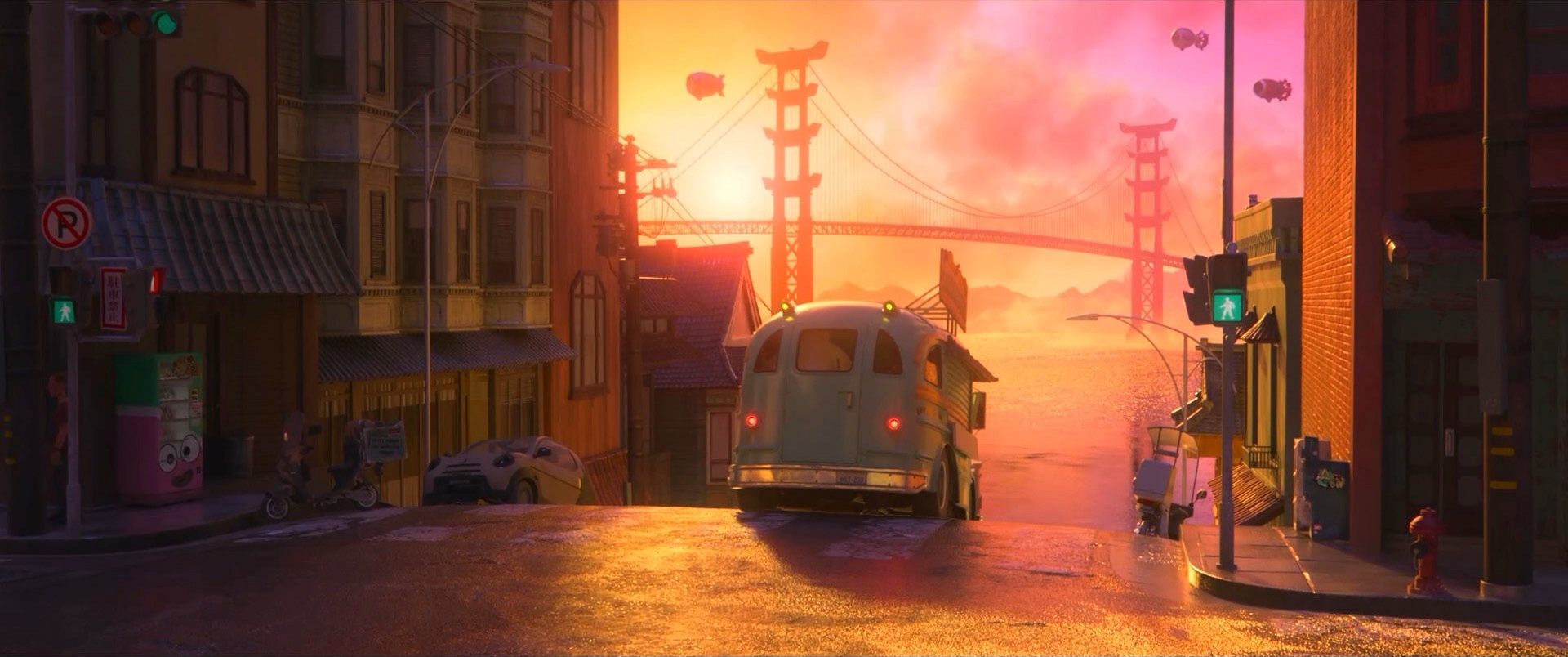
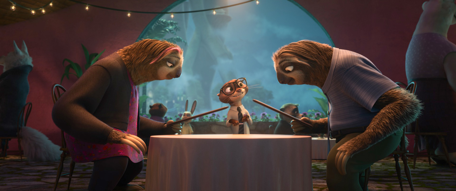
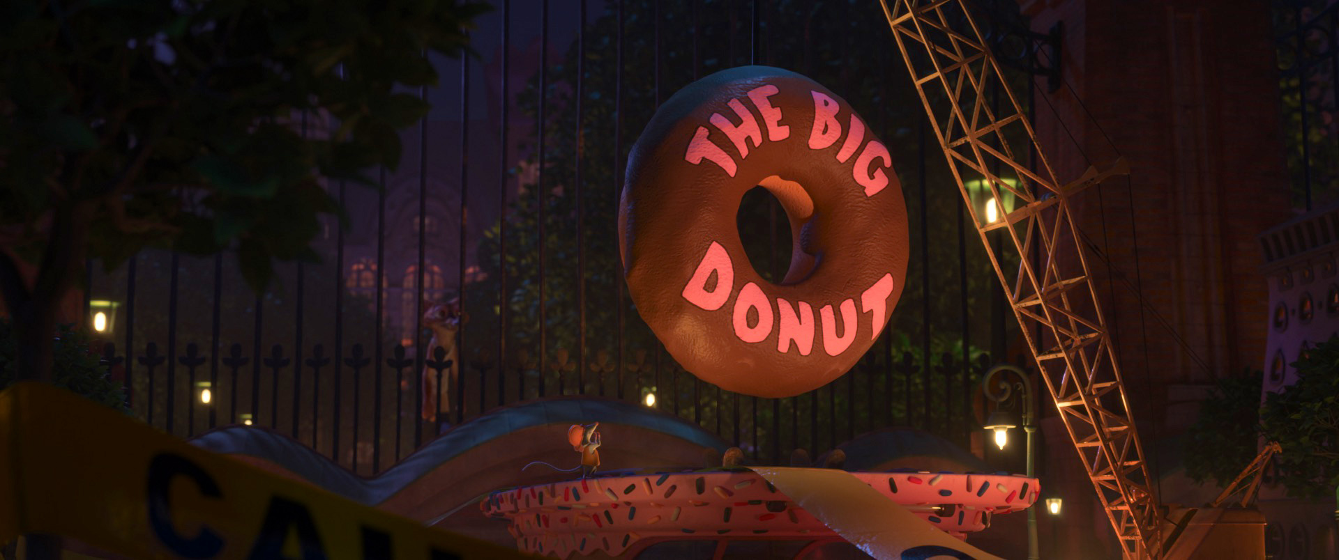
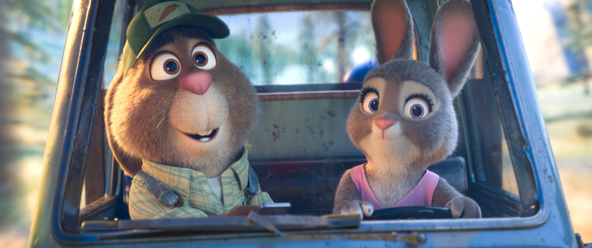
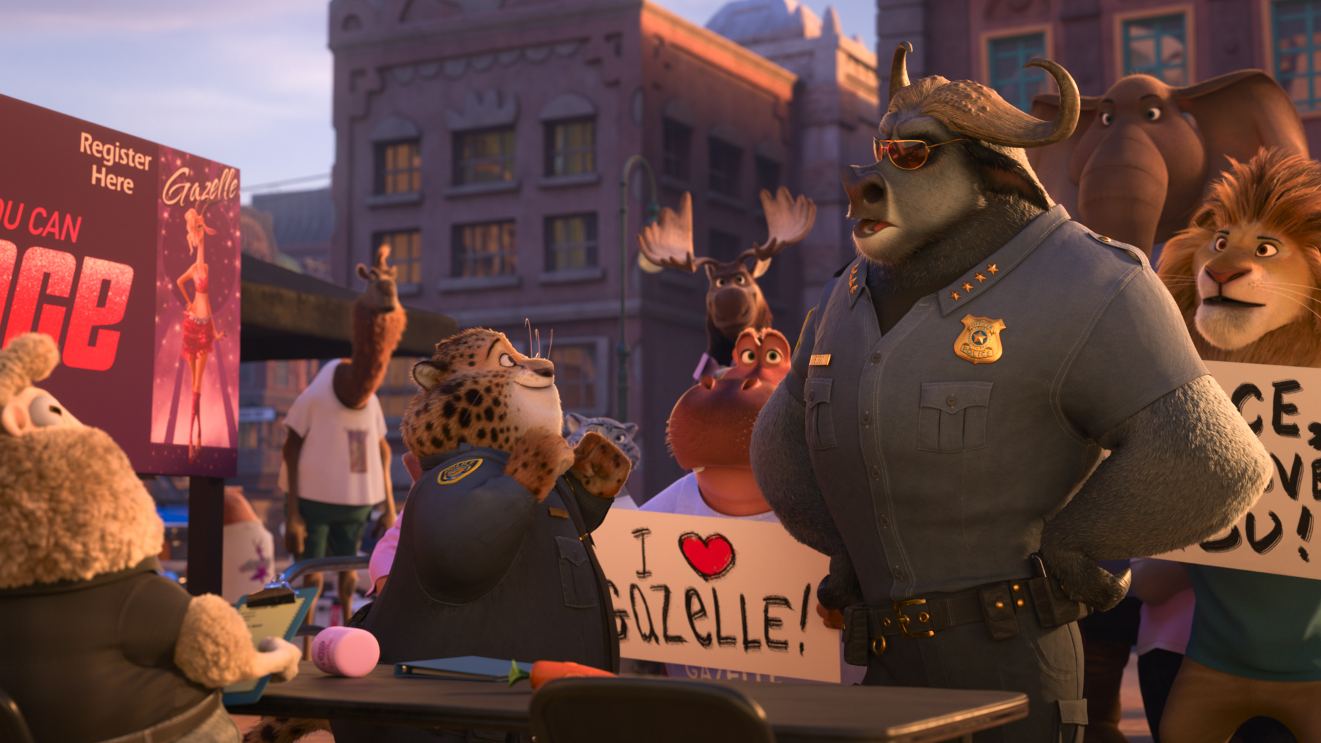
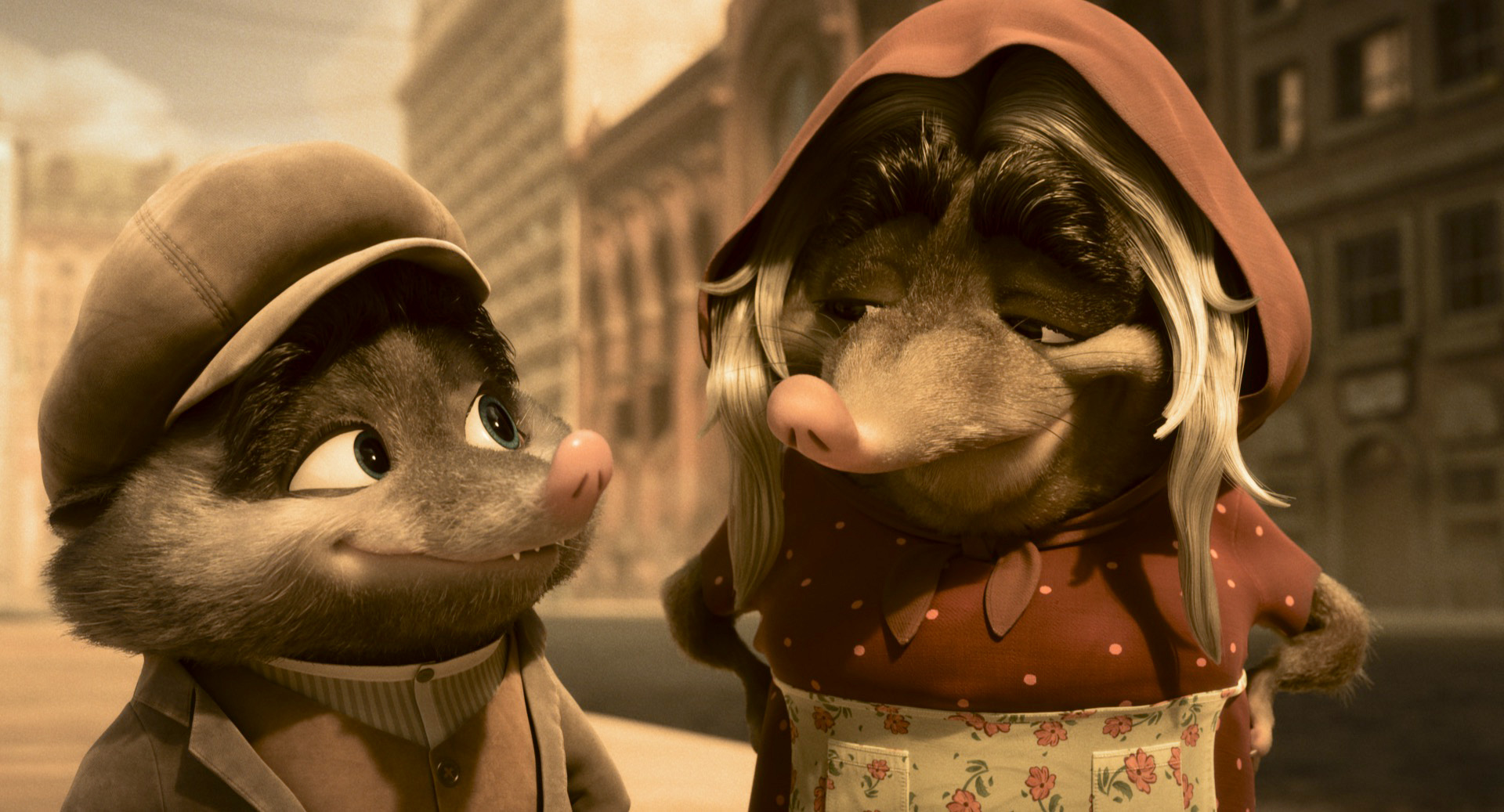
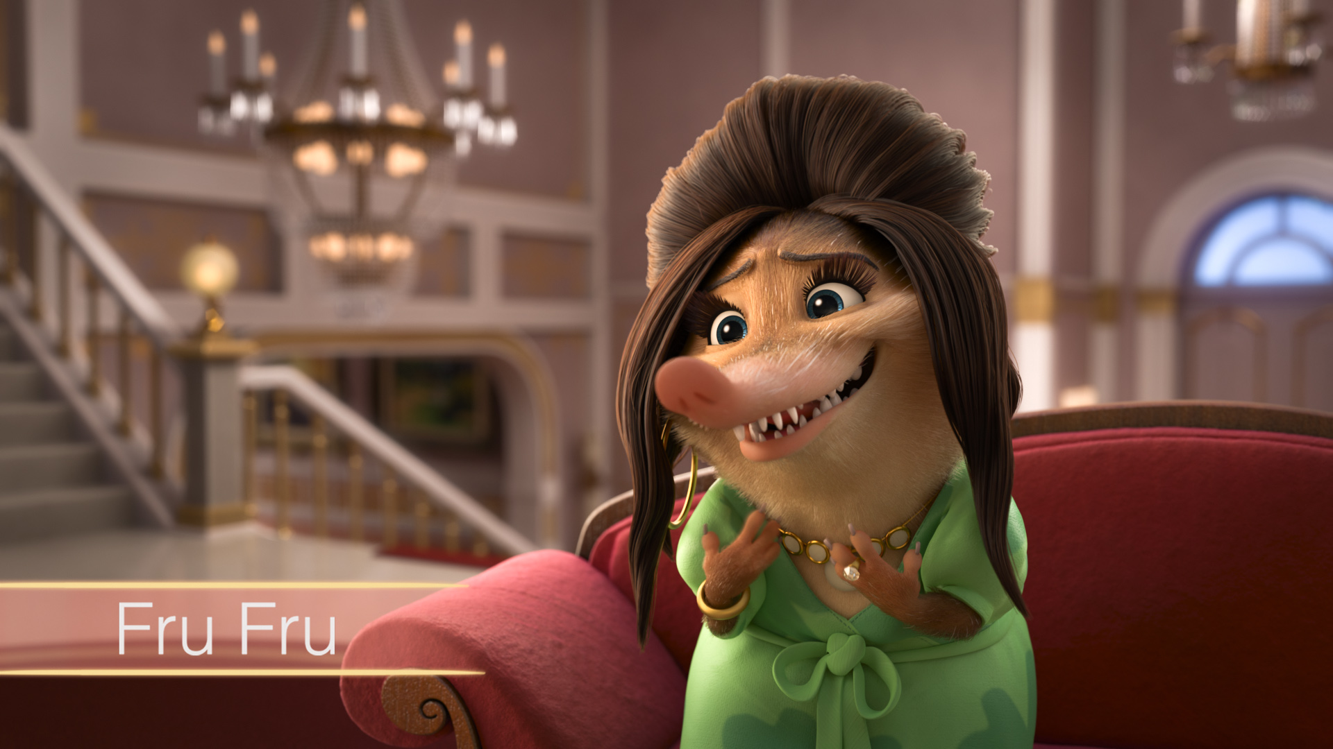
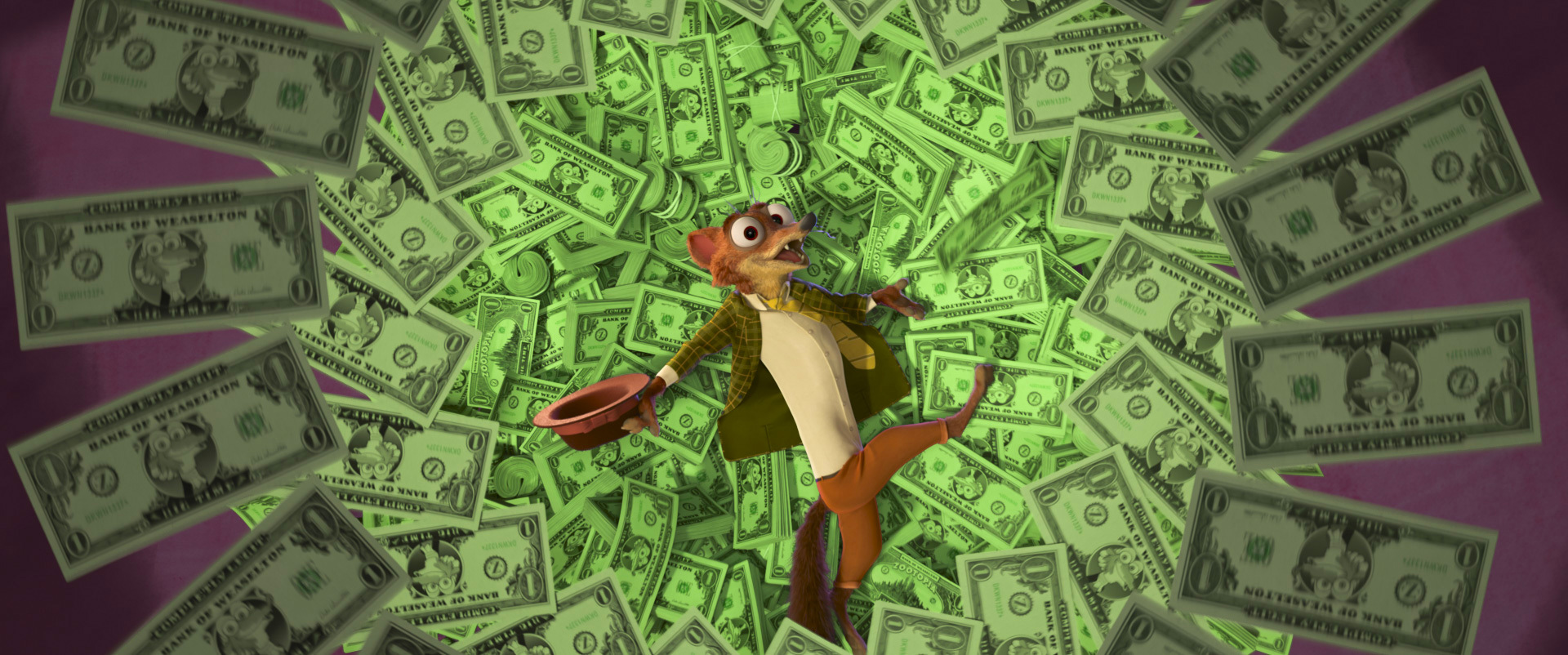
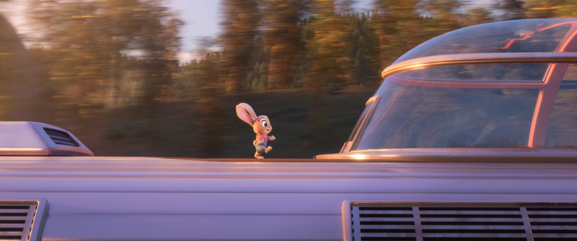
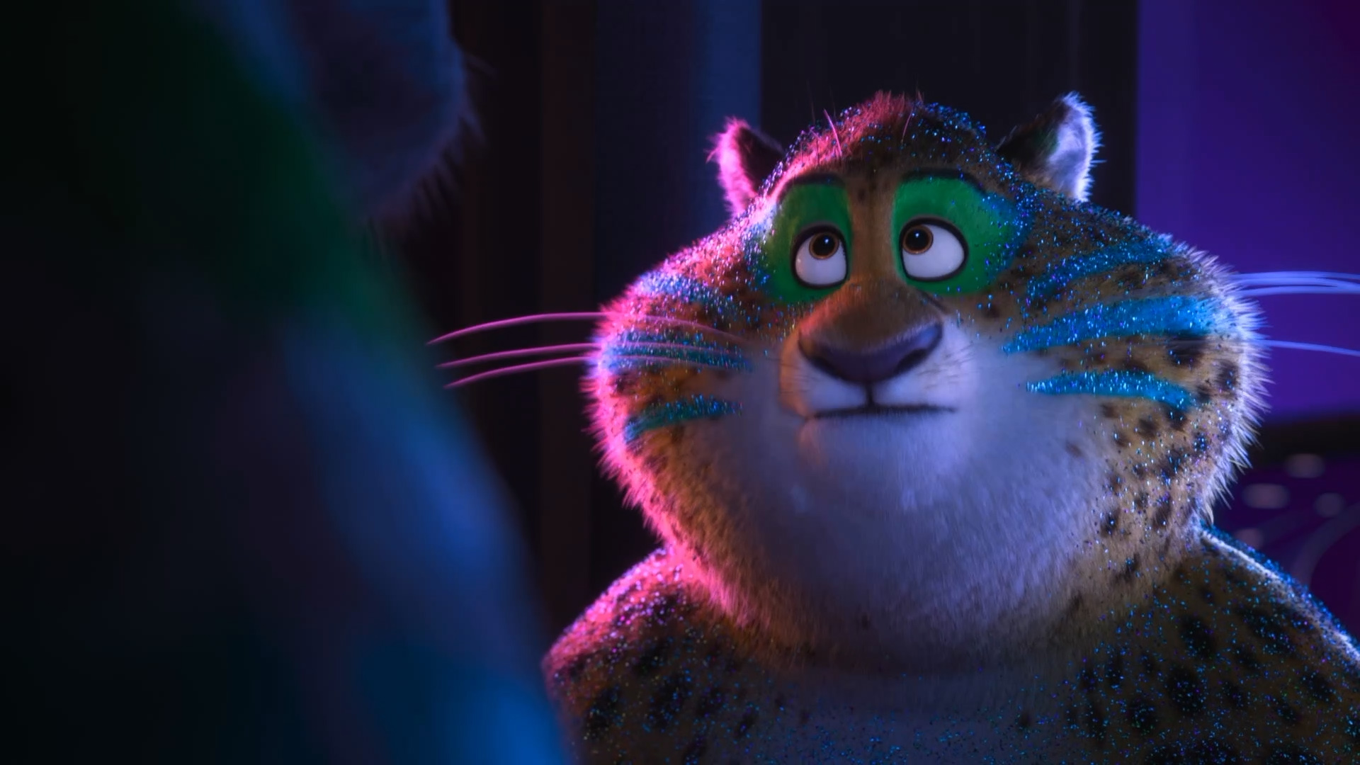
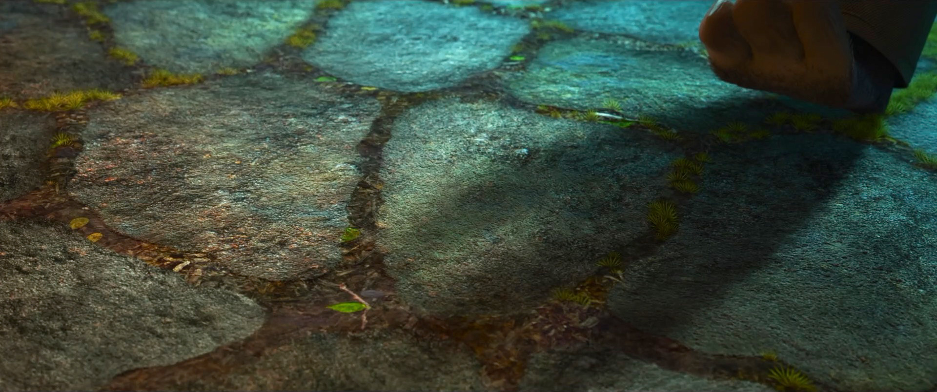
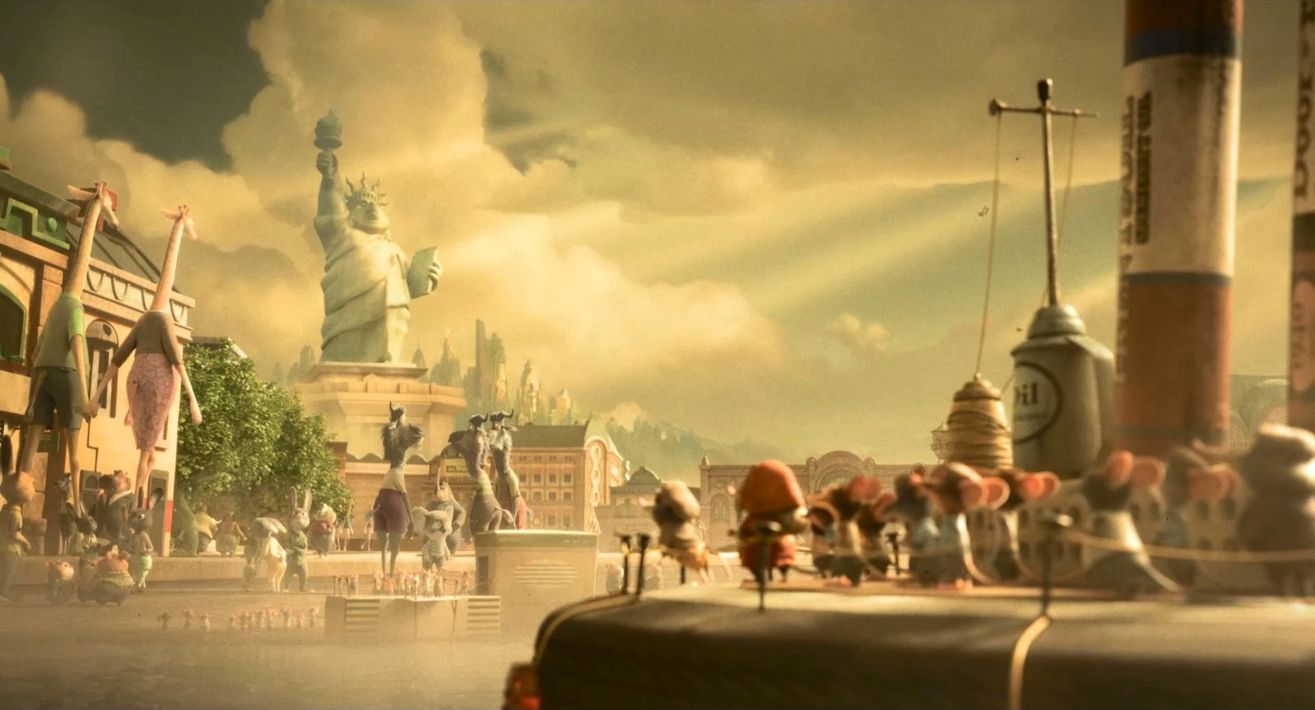
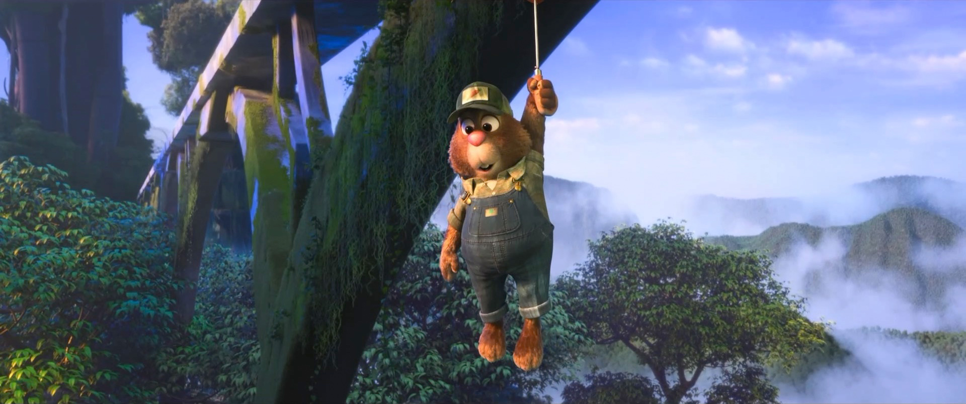
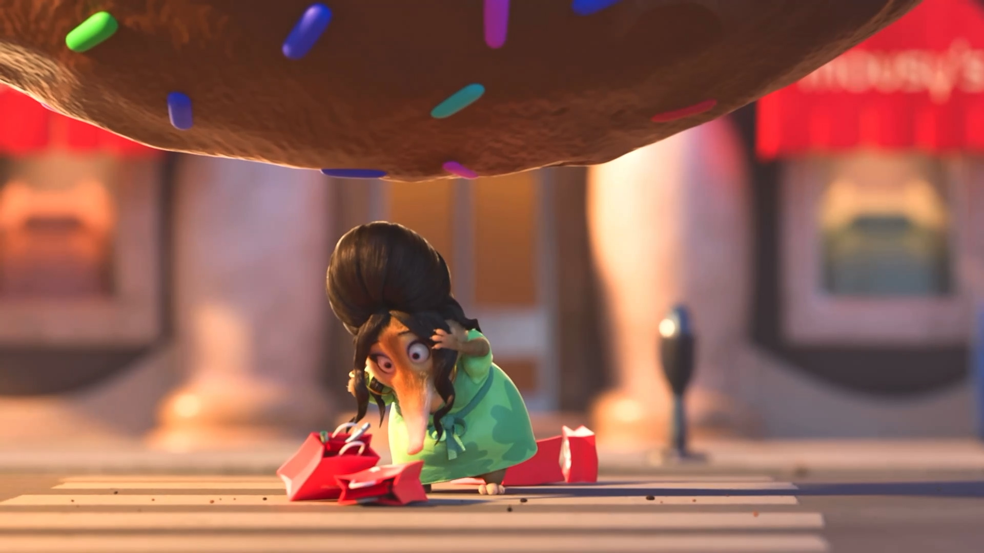
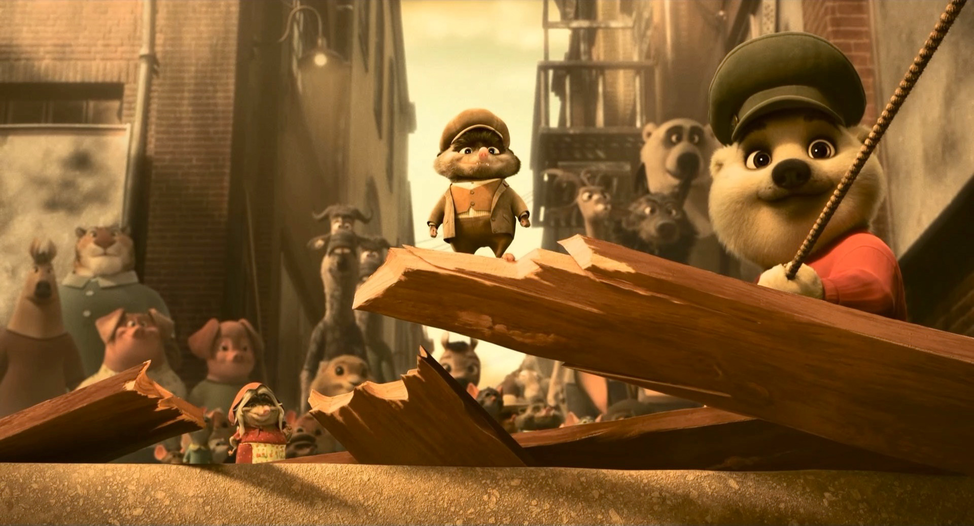
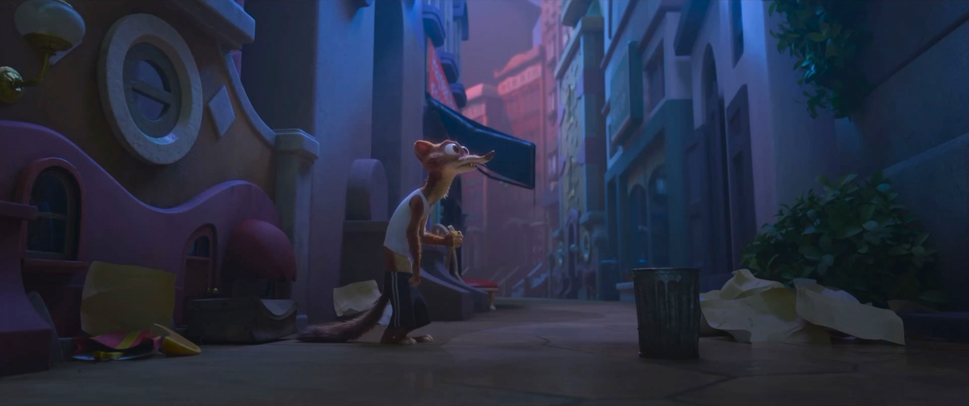
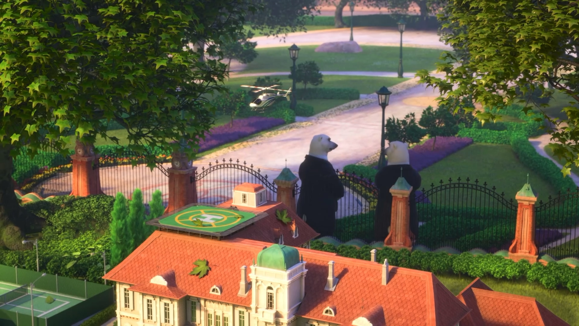
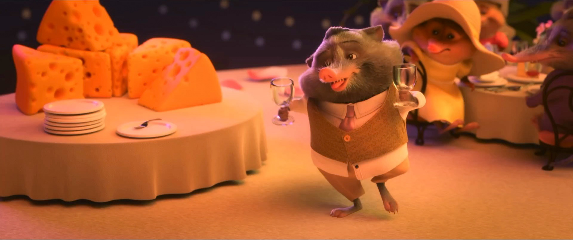
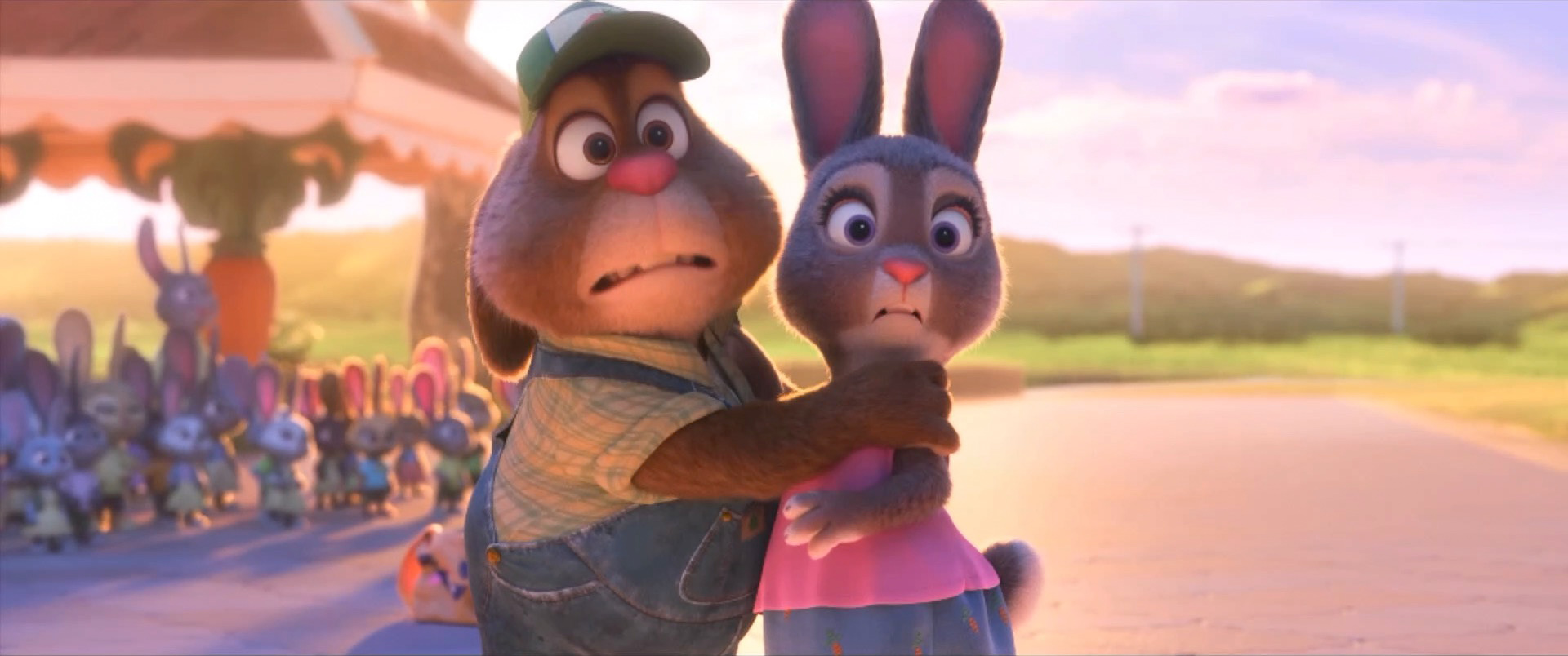
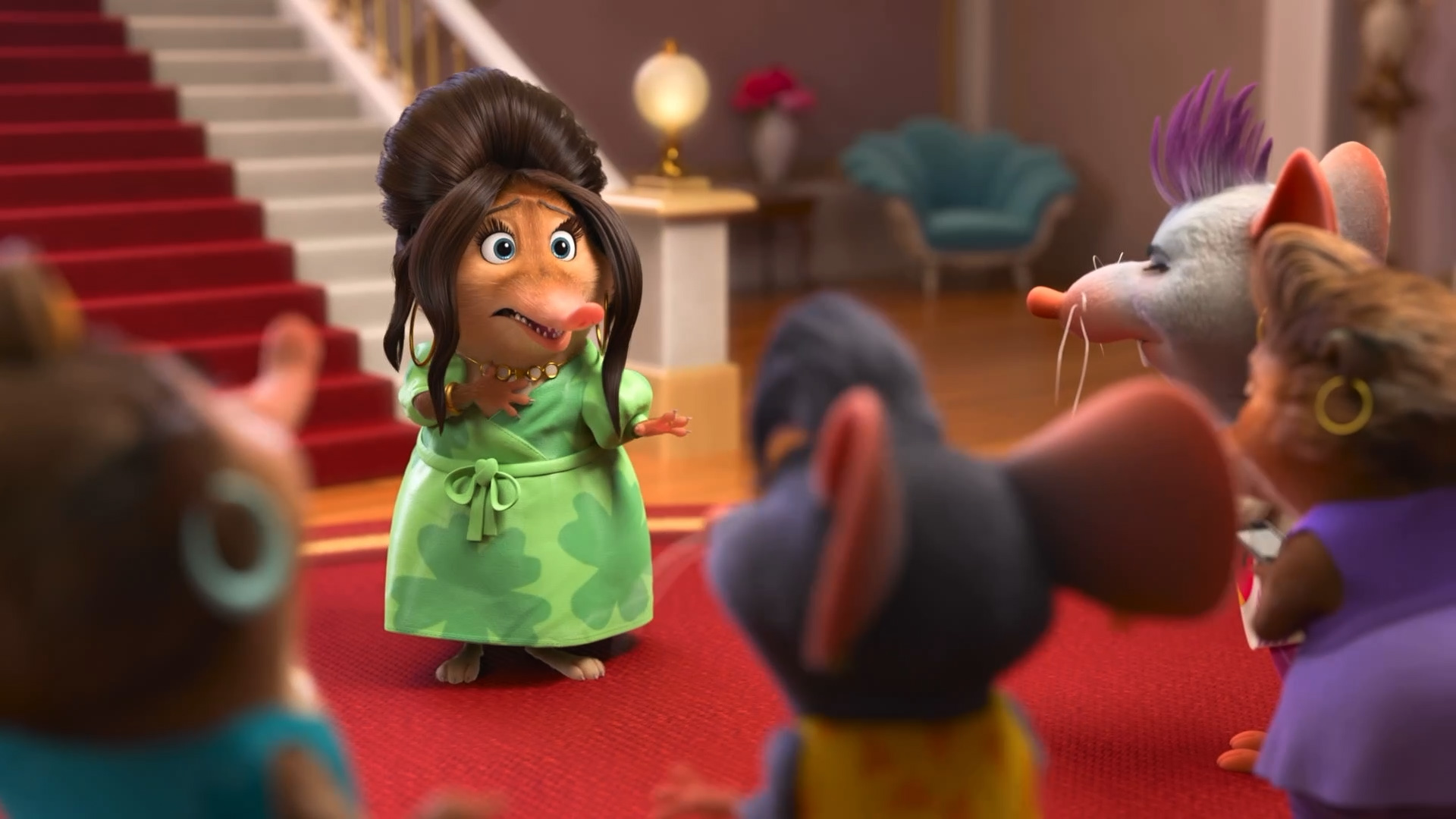
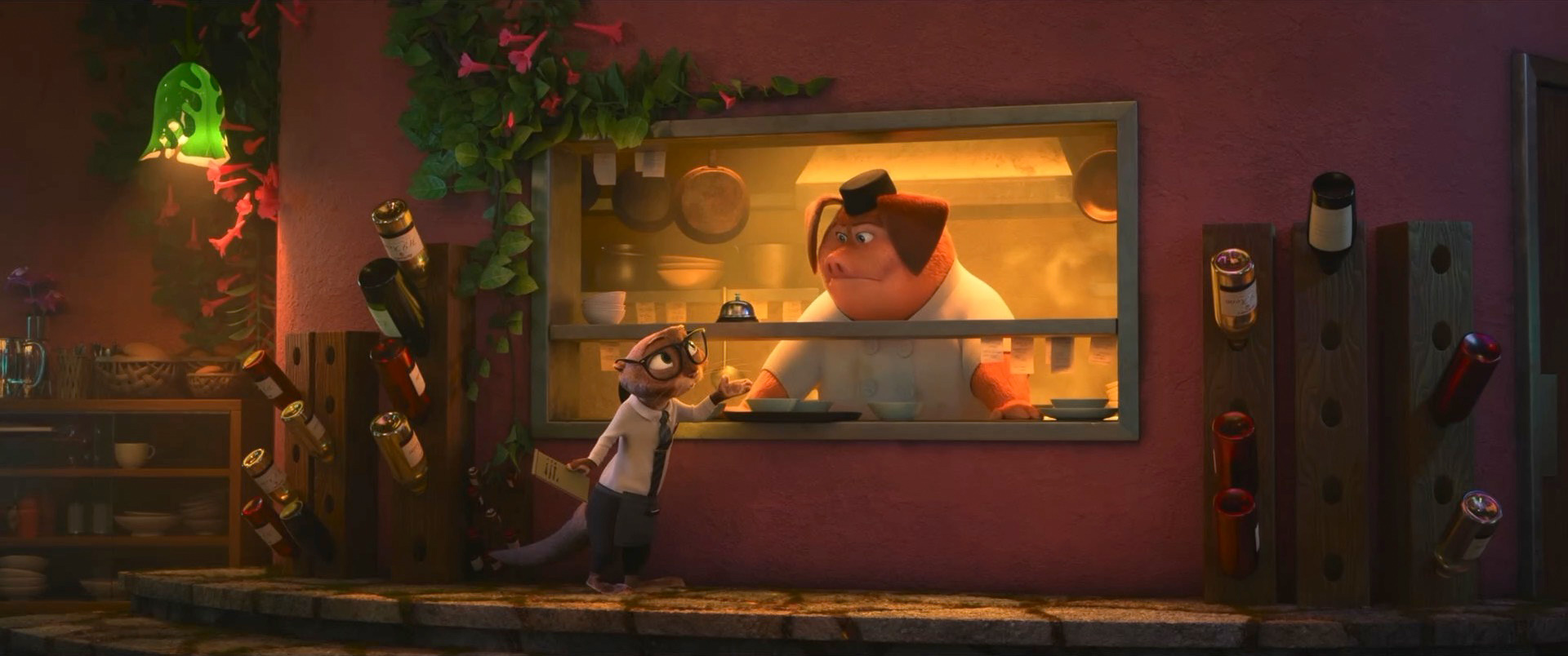
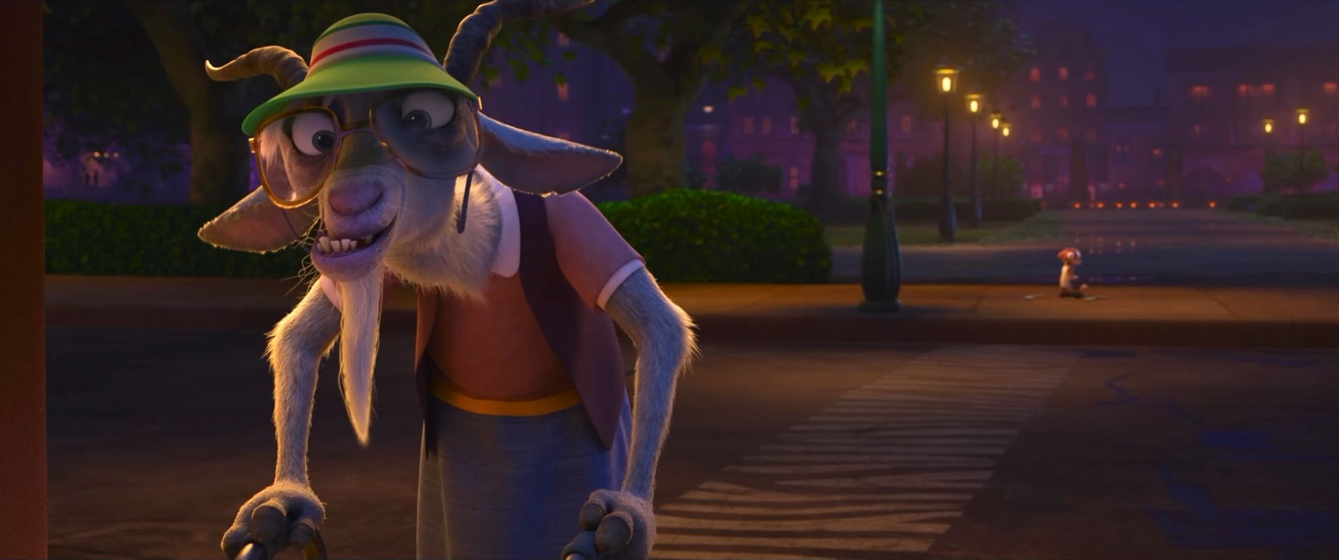
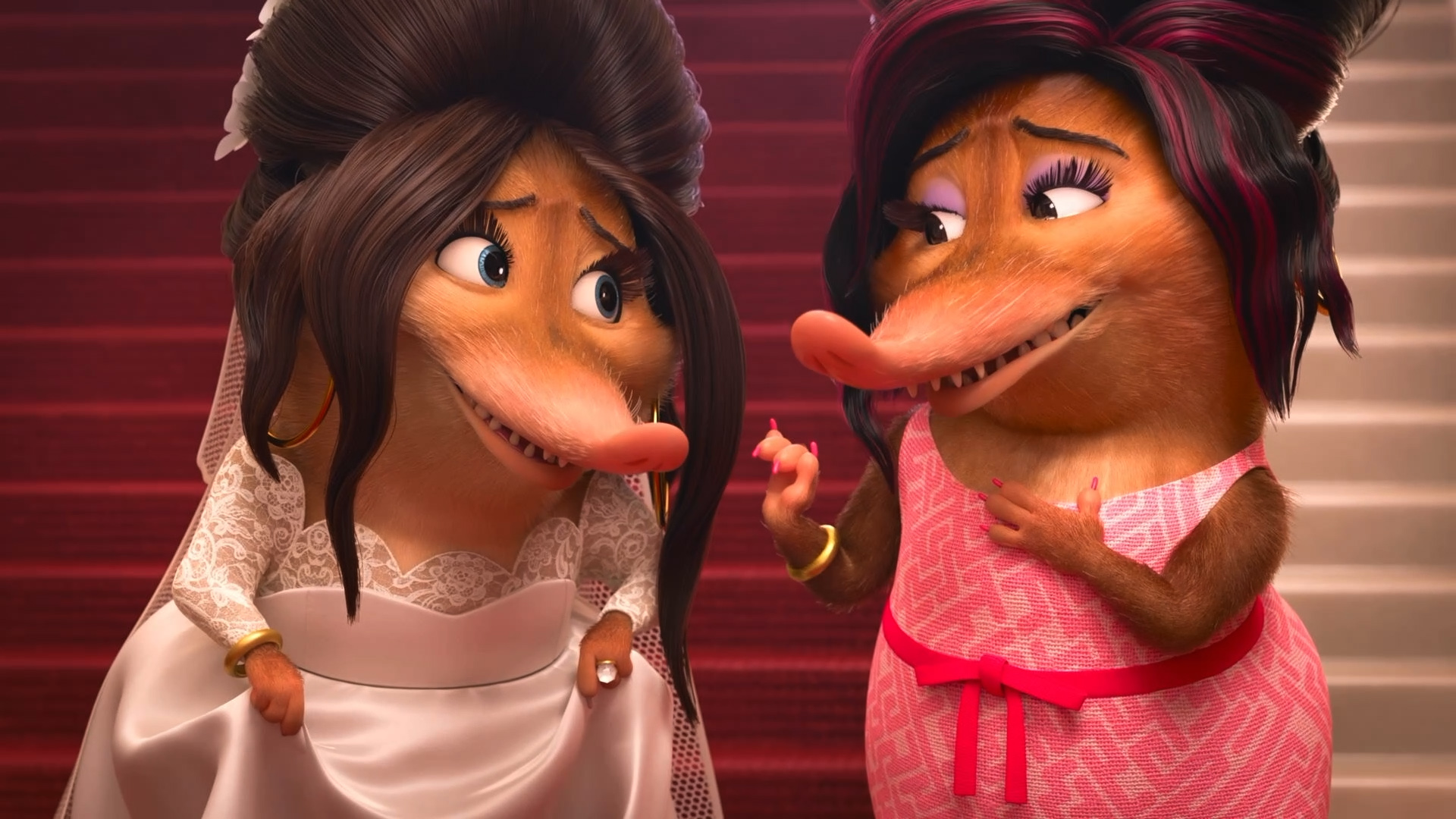
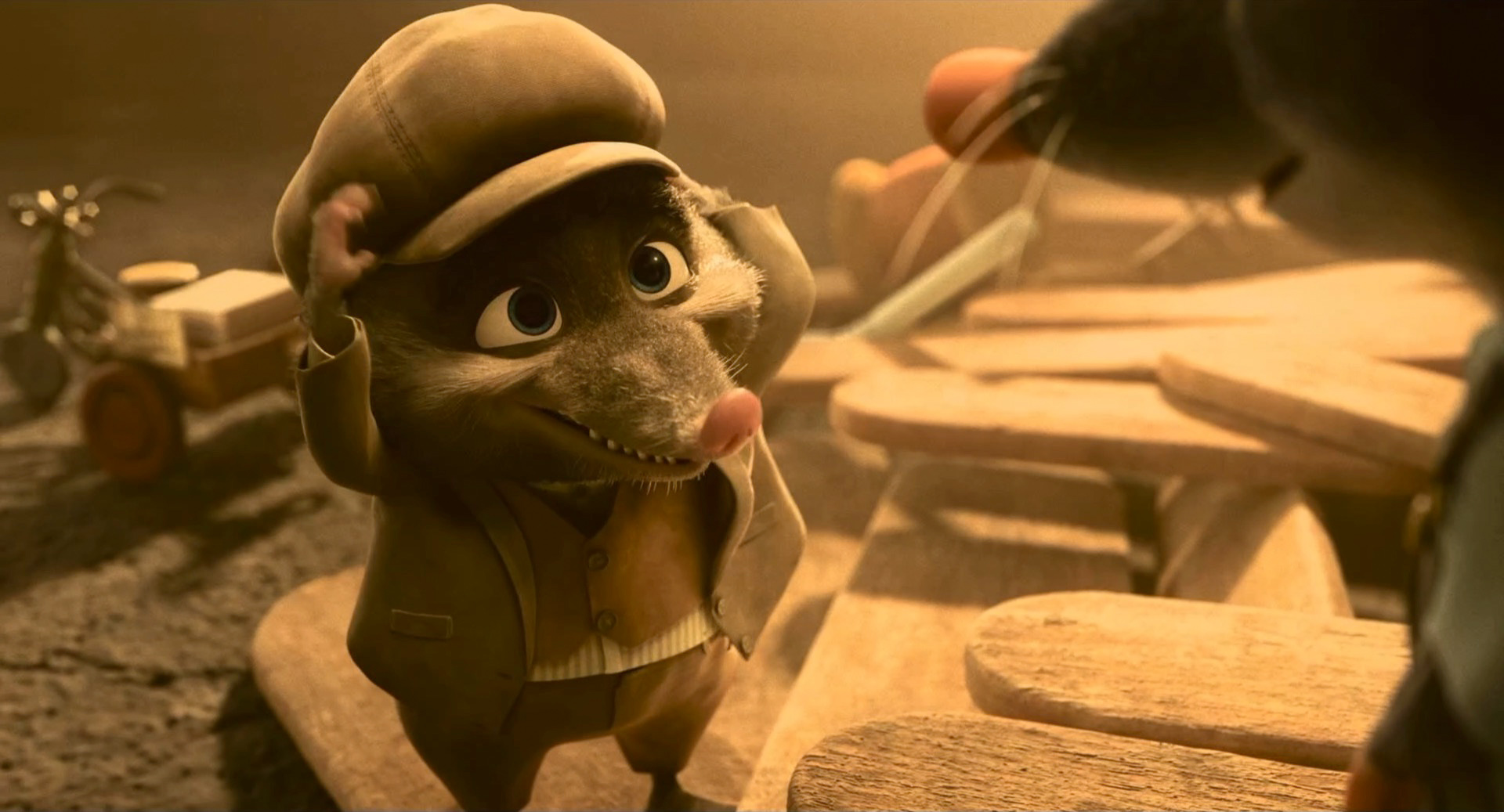
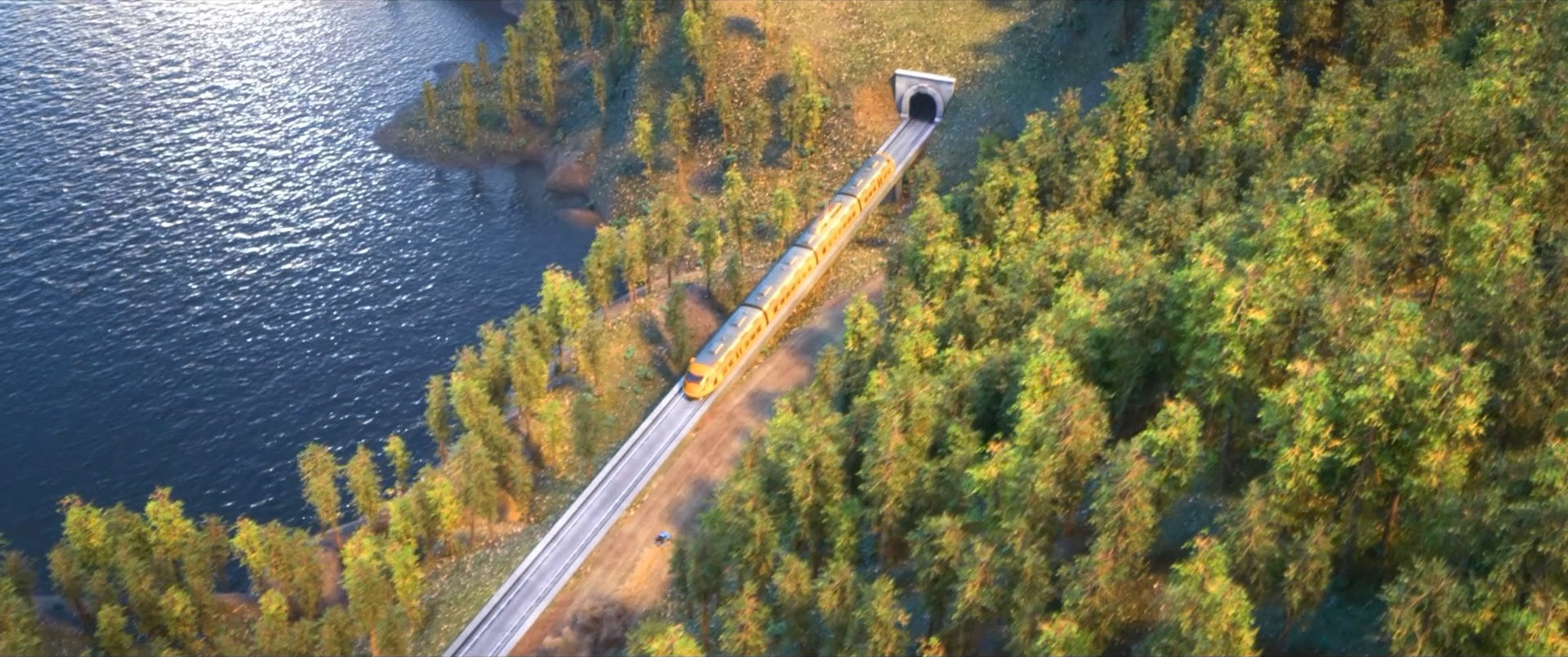
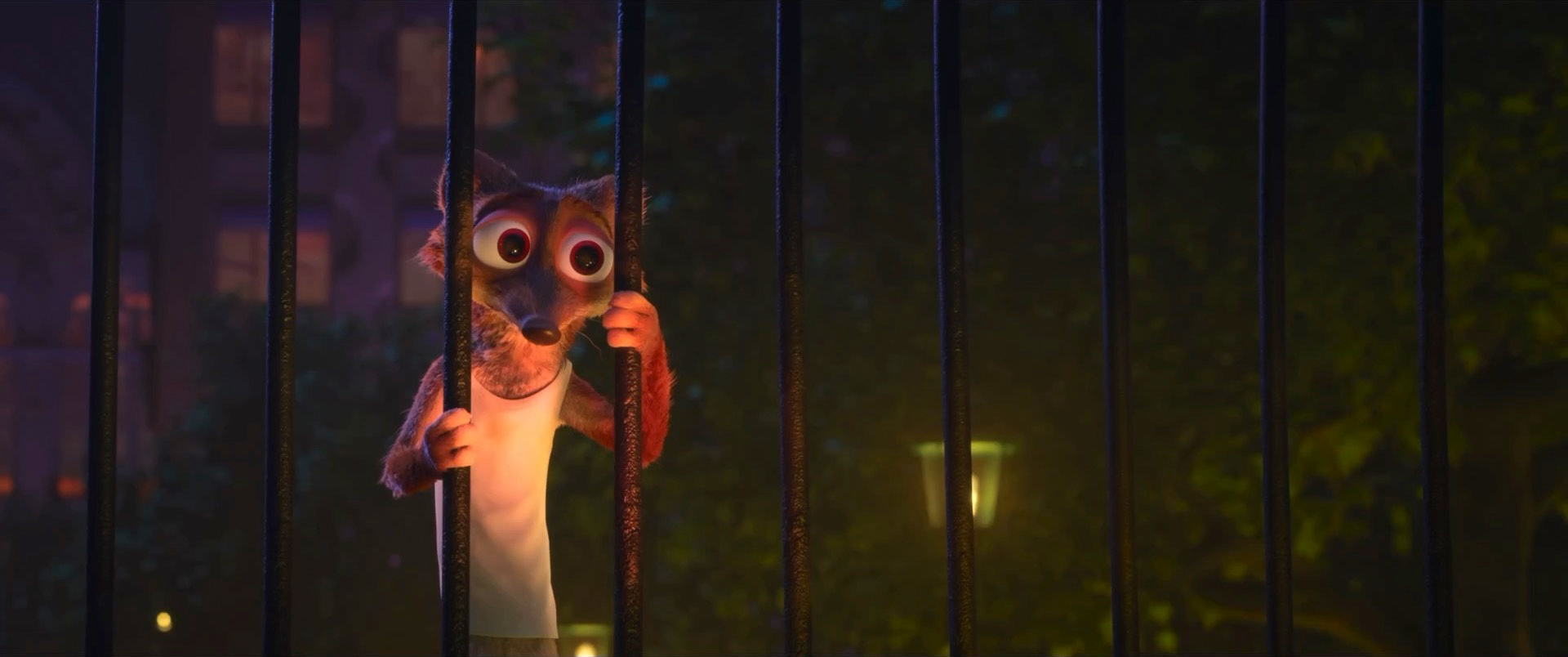
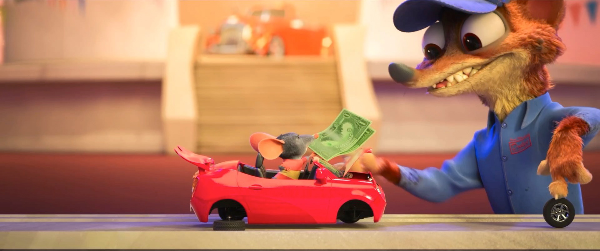
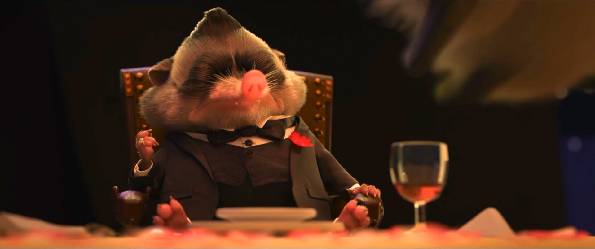
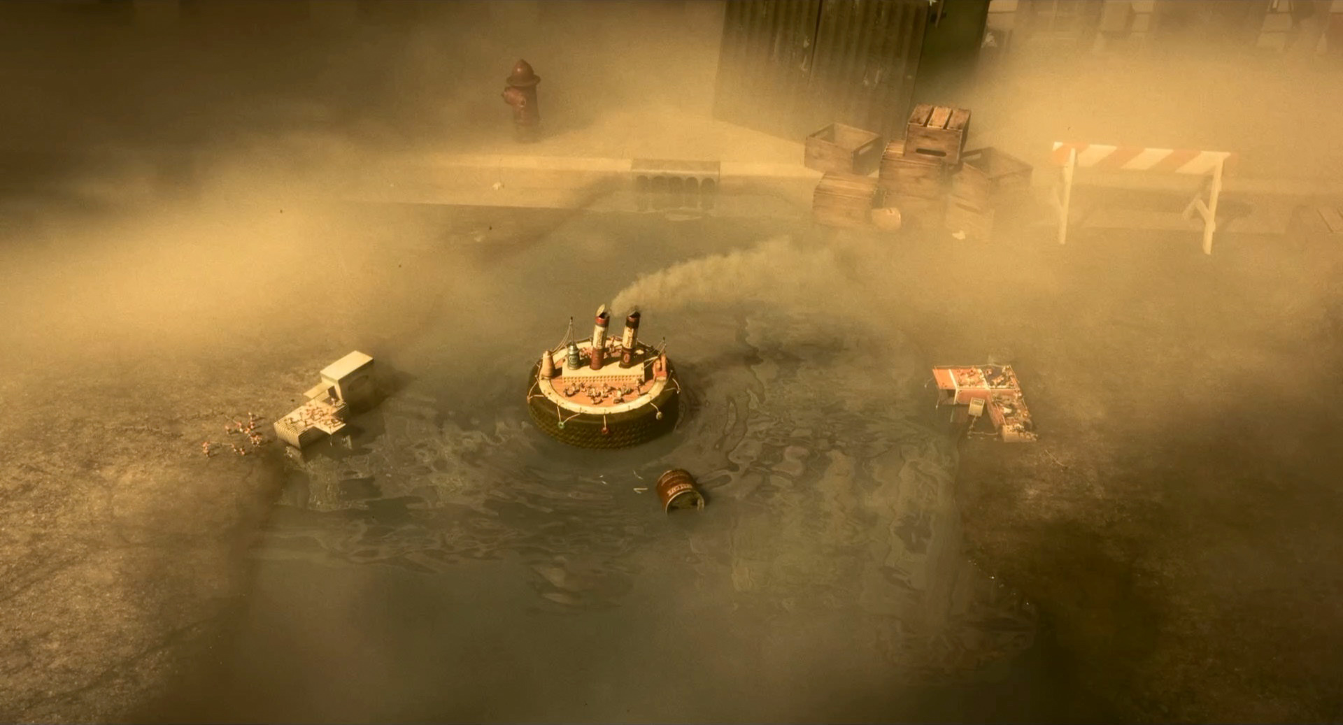
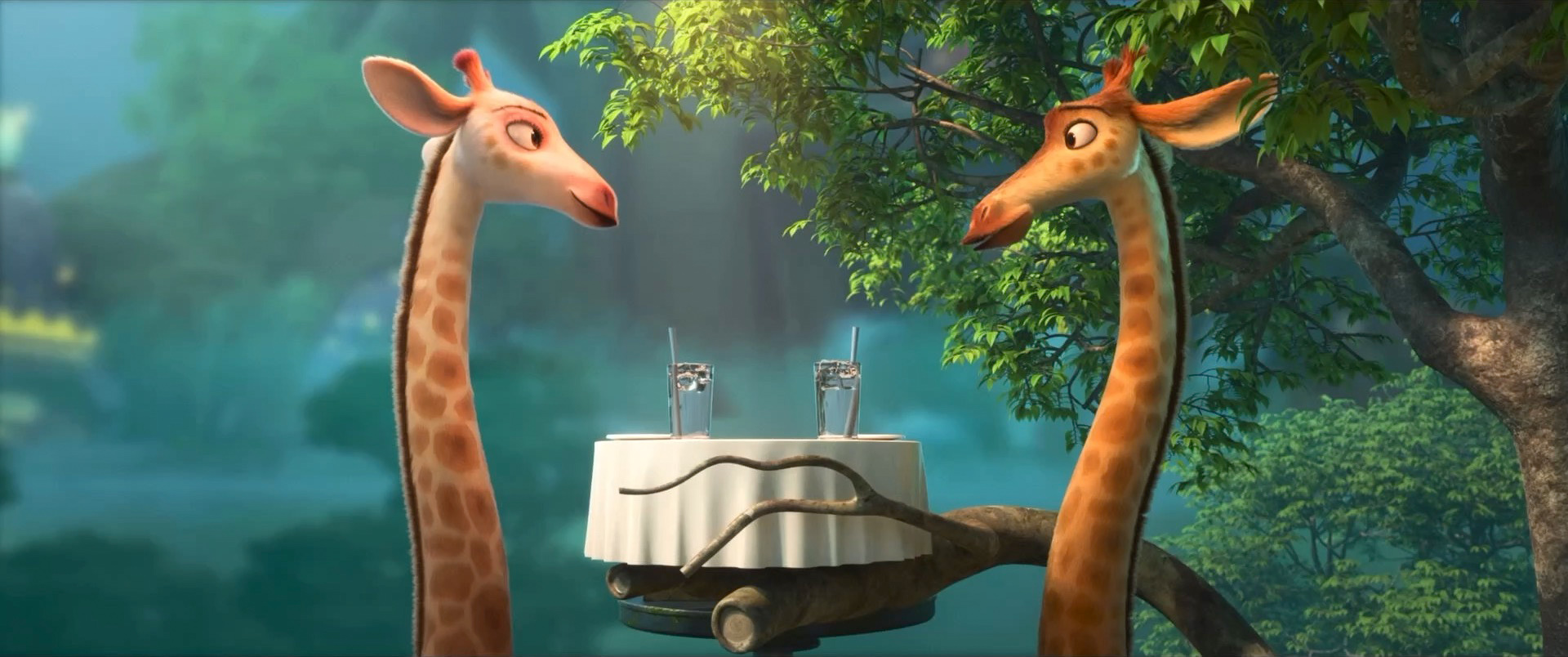
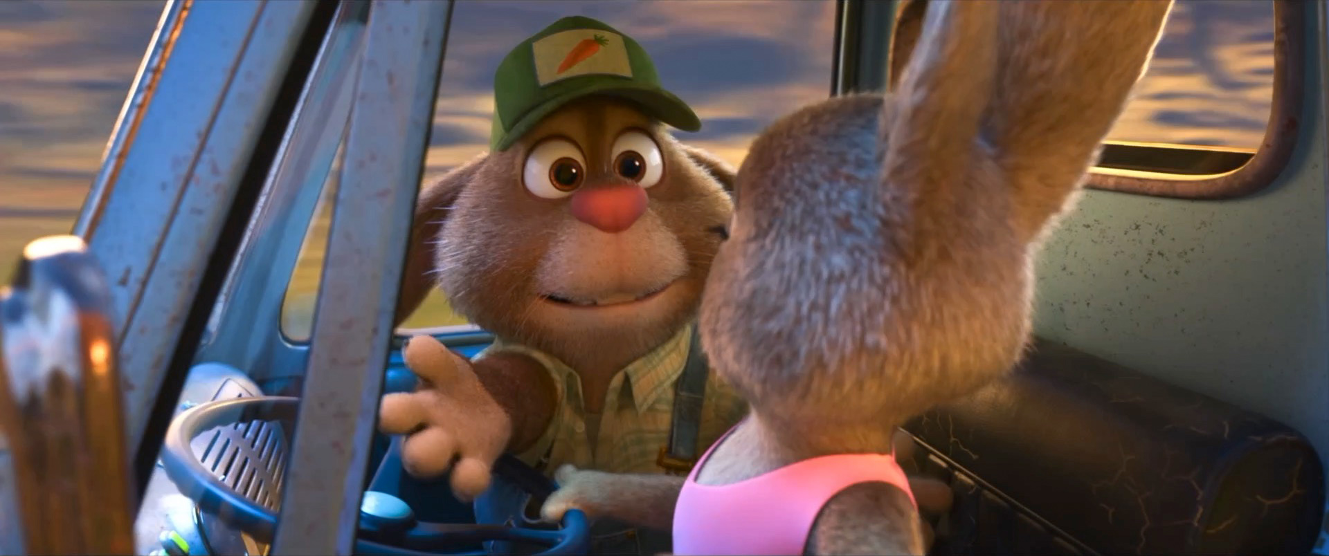
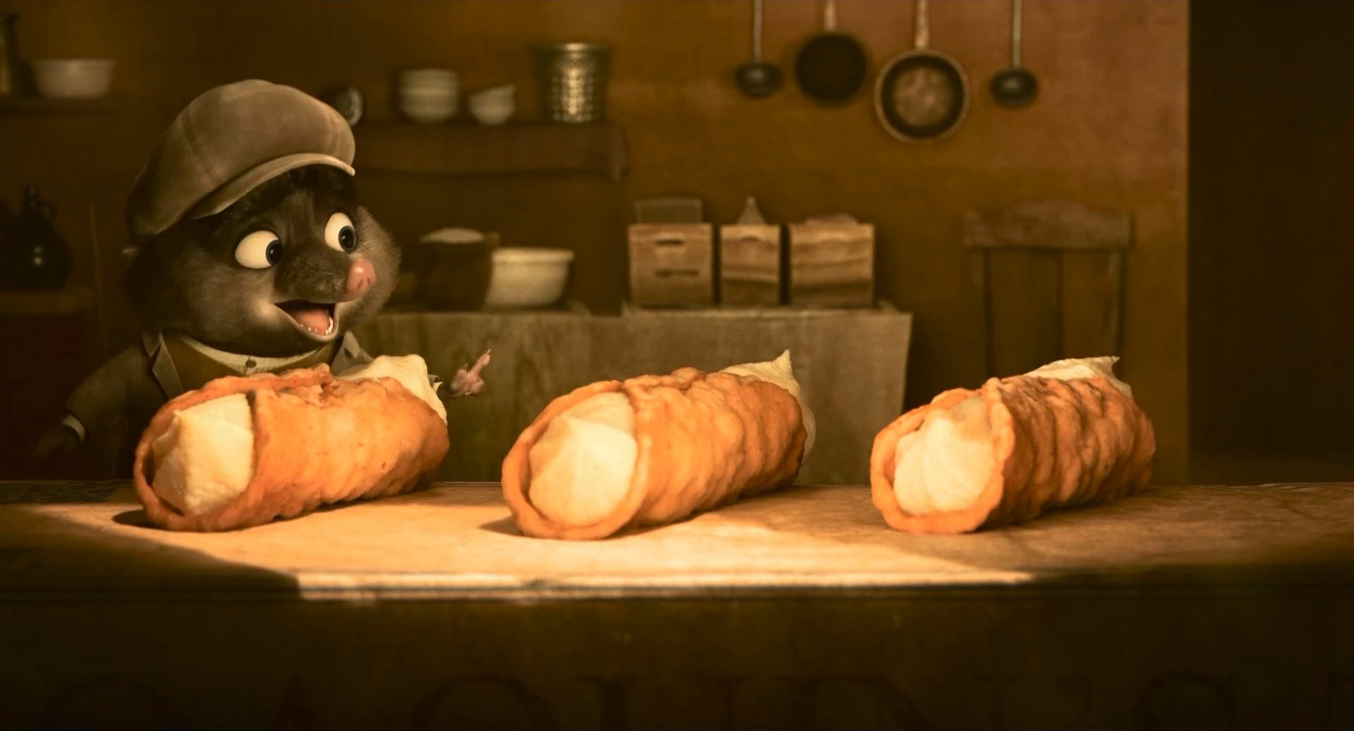
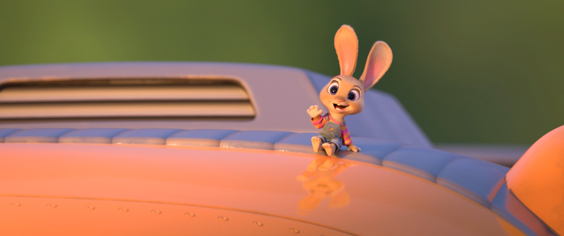
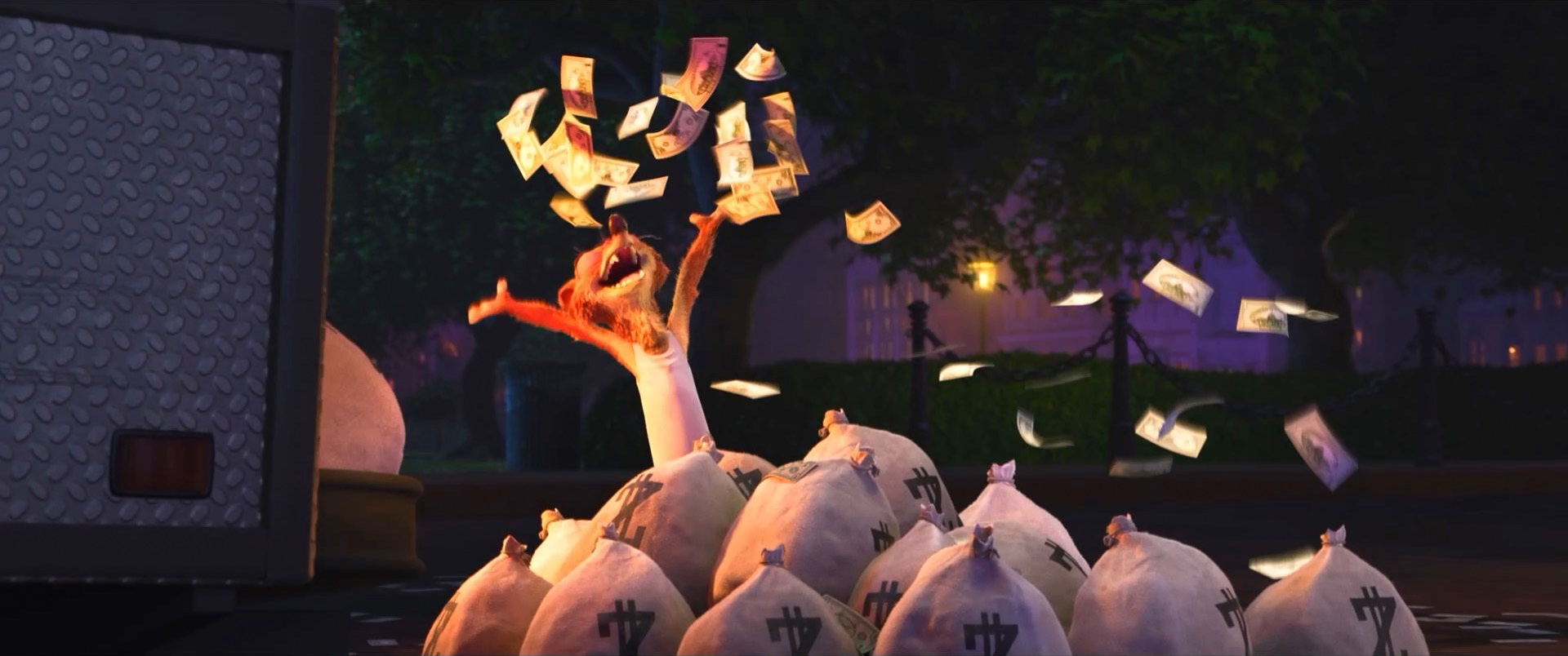
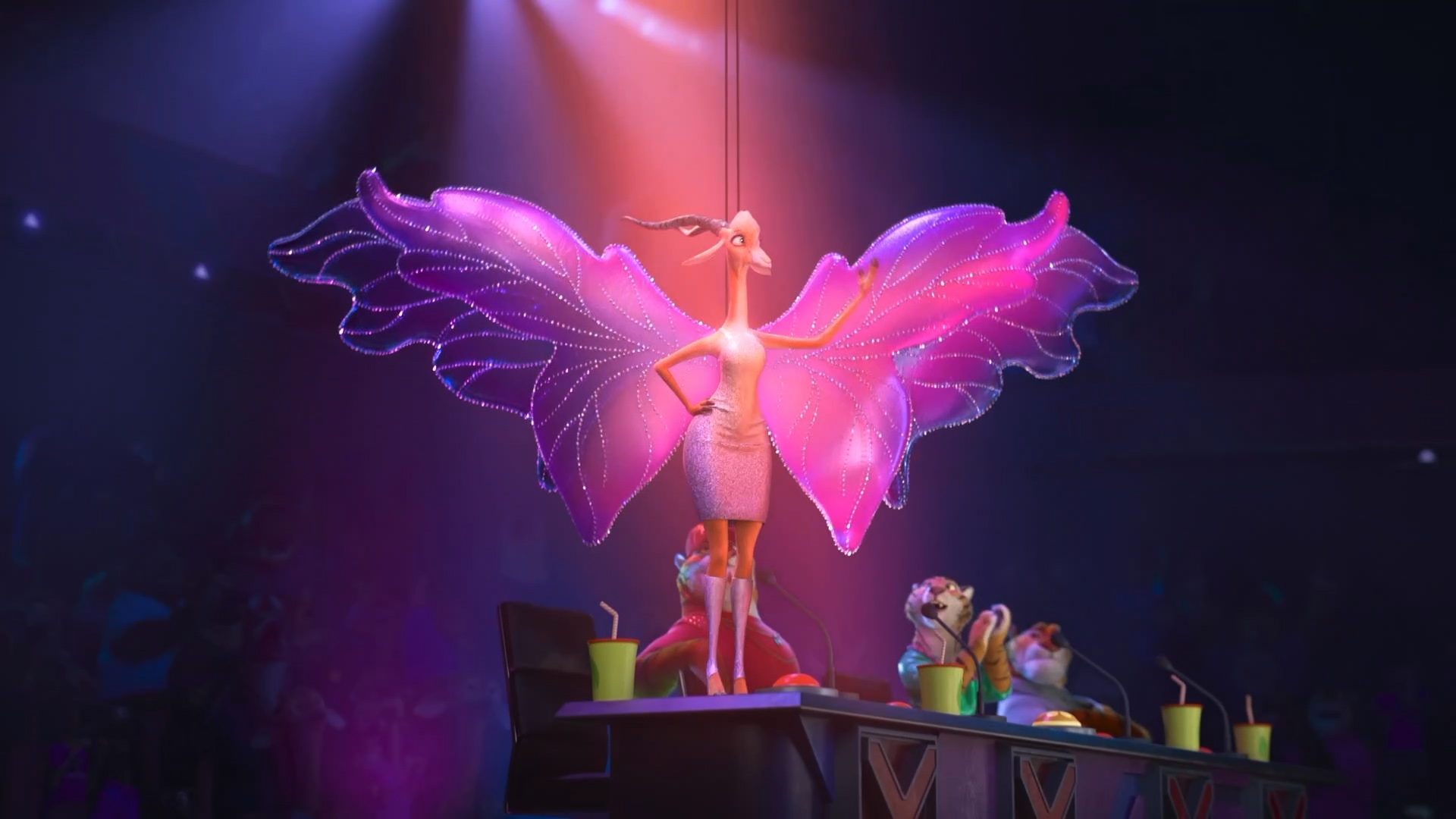
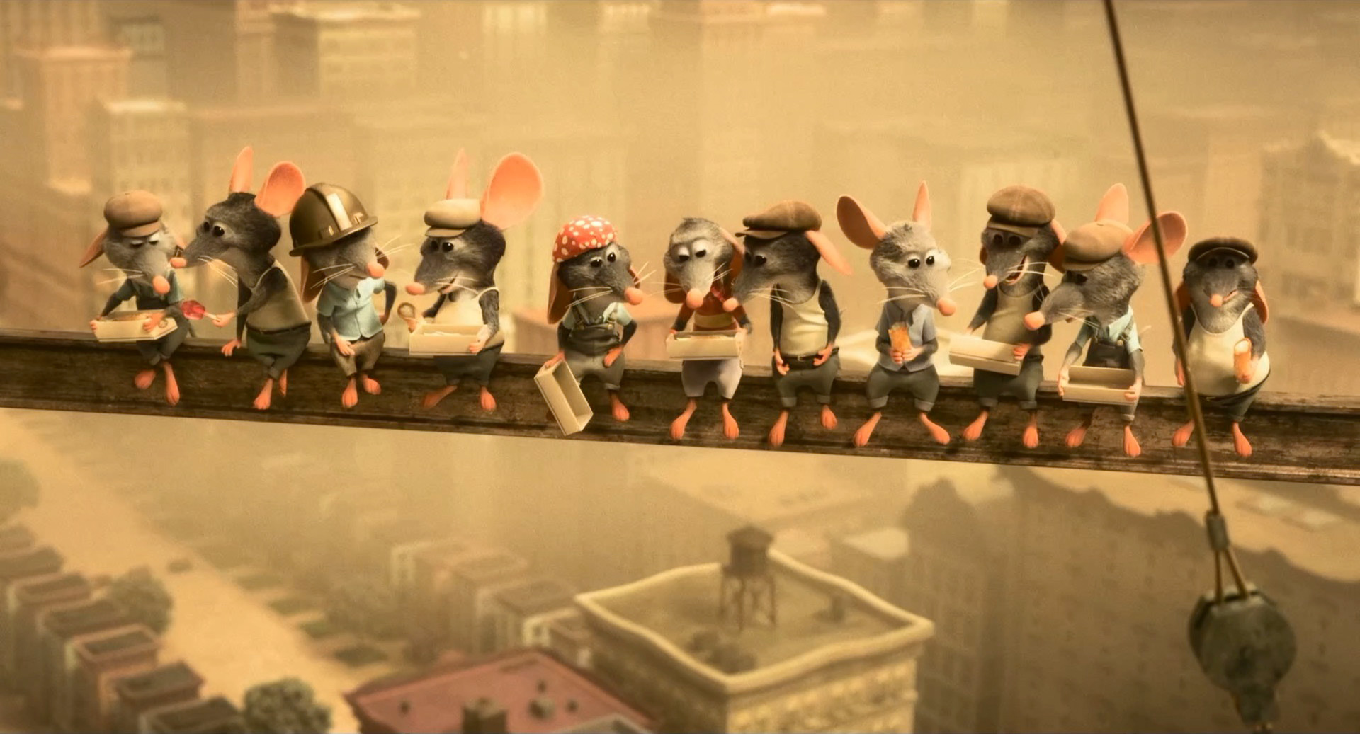
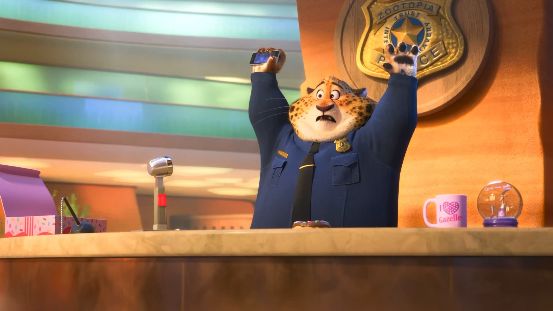
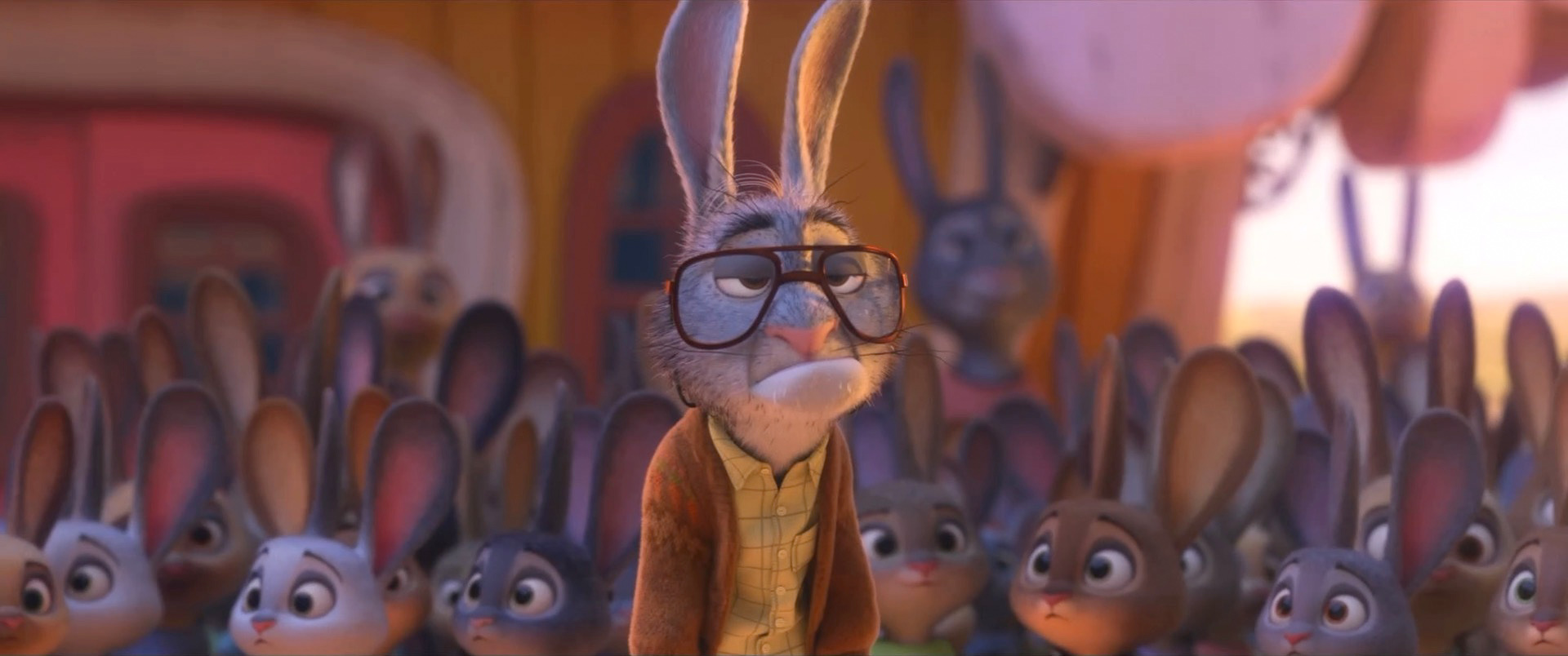
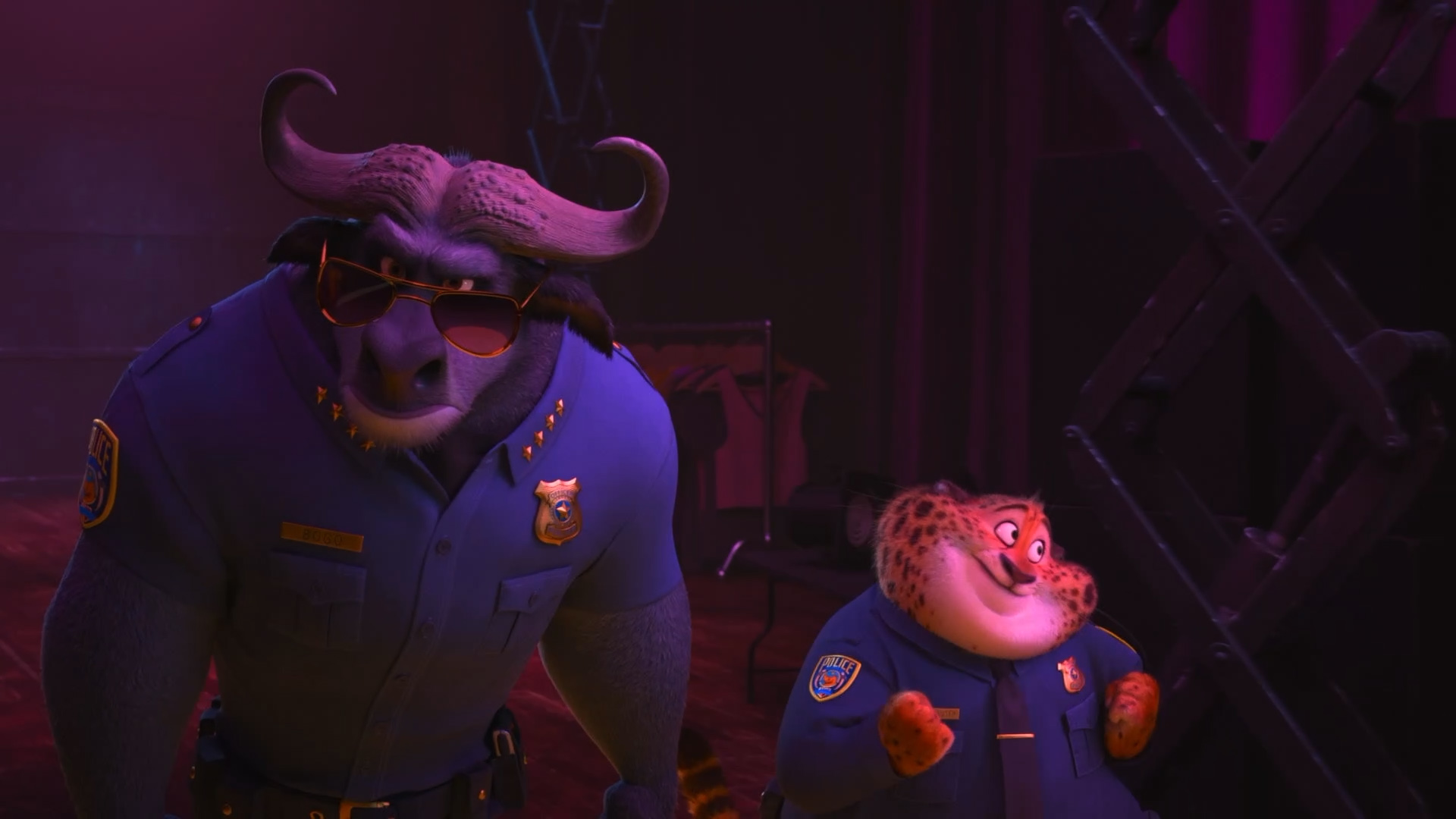
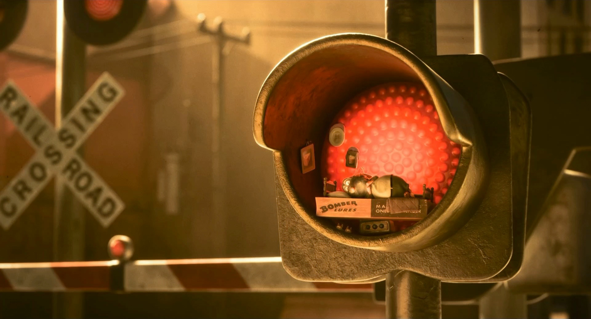
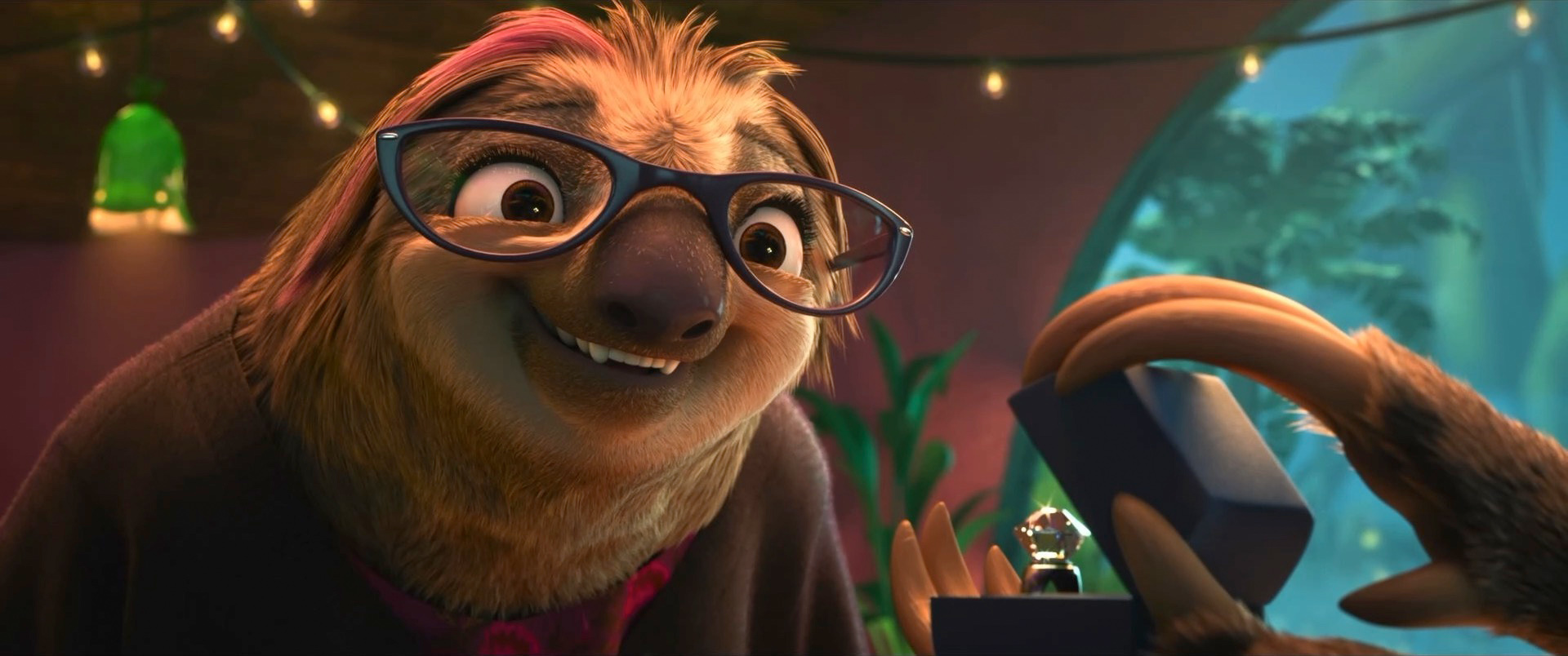
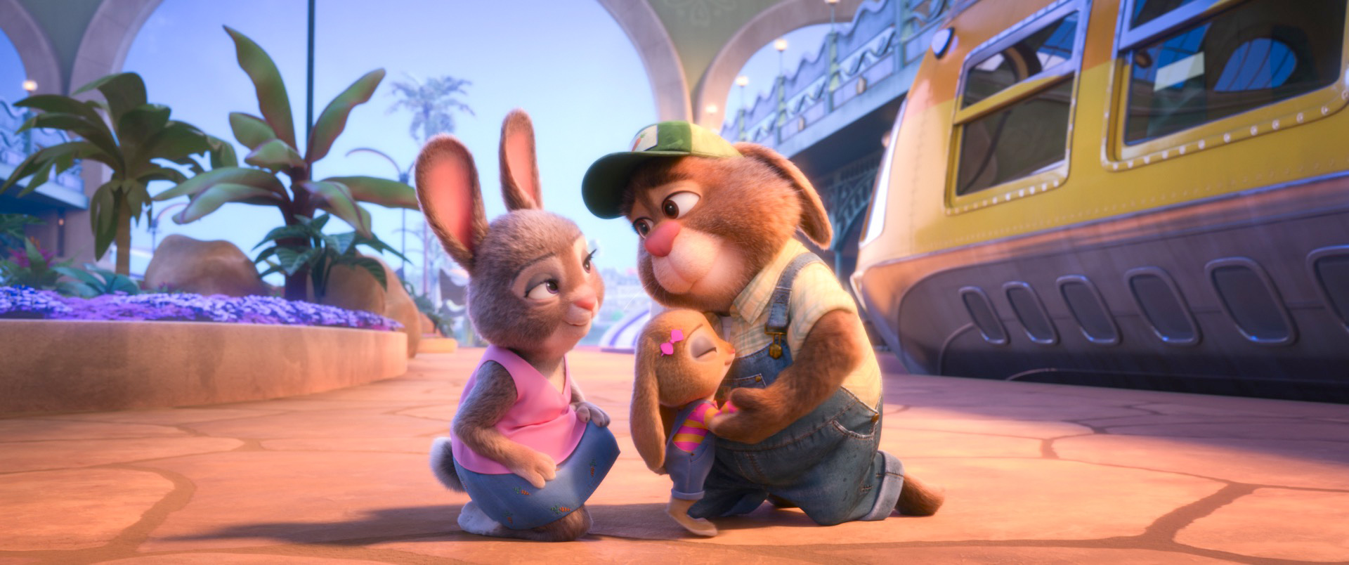
Zootopia+ is available for streaming on Disney+. My suggestion is always to watch on the largest screen you can, and Zootopia+ is no exception; the final animation and visuals are every bit feature film quality, and watching Zootopia+ back to back with Zootopia is a fun way to see how the two interleave. Here is a selection of stills from Disney+, presented in no particular order:
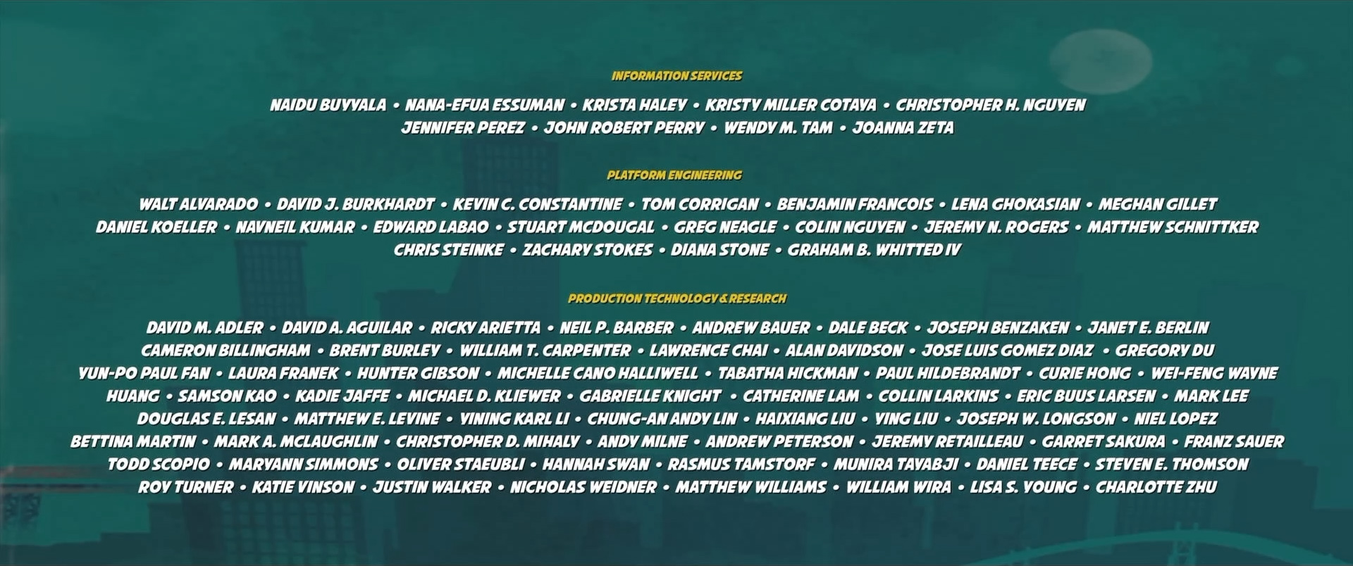
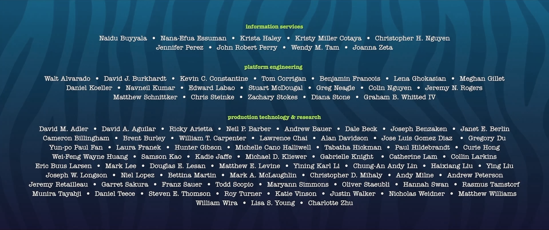
Here is the credits frame for the Hyperion team, which on Zootopia+ is presented together with the rest of the entire production technology department in a single credits block:
All images in this post are courtesy of and the property of Walt Disney Animation Studios.
References
Brent Burley. 2015. Extending the Disney BRDF to a BSDF with Integrated Subsurface Scattering. In ACM SIGGRAPH 2015 Course Notes: Physically Based Shading in Theory and Practice.
Brent Burley, David Adler, Matt Jen-Yuan Chiang, Ralf Habel, Patrick Kelly, Peter Kutz, Yining Karl Li, and Daniel Teece. 2017. Recent Advancements in Disney’s Hyperion Renderer. In ACM SIGGRAPH 2017 Course Notes: Path Tracing in Production Part 1. 26-34.
Brent Burley, David Adler, Matt Jen-Yuan Chiang, Hank Driskill, Ralf Habel, Patrick Kelly, Peter Kutz, Yining Karl Li, and Daniel Teece. 2018. The Design and Evolution of Disney’s Hyperion Renderer. ACM Transactions on Graphics 37, 3 (Jul. 2018), Article 33.
Matt Jen-Yuan Chiang, Benedikt Bitterli, Chuck Tappan, and Brent Burley. 2016. A Practical and Controllable Hair and Fur Model for Production Path Tracing. Computer Graphics Forum (Proc. of Eurographics) 35, 2 (May 2016), 275-283.
Matt Jen-Yuan Chiang, Peter Kutz, and Brent Burley. 2016. Practical and Controllable Subsurface Scattering for Production Path Tracing. In ACM SIGGRAPH 2016 Talks. Article 49.
Wei-Feng Wayne Huang, Peter Kutz, Yining Karl Li, and Matt Jen-Yuan Chiang. 2021. Unbiased Emission and Scattering Importance Sampling for Heterogeneous Volumes. In ACM SIGGRAPH 2021 Talks. Article 3.
Peter Kutz, Ralf Habel, Yining Karl Li, and Jan Novák. 2017. Spectral and Decomposition Tracking for Rendering Heterogeneous Volumes. ACM Transactions on Graphics (Proc. of SIGGRAPH) 36, 4 (Aug. 2017), Article 111.
Tad Miller, Harmony M. Li, Neelima Karanam, Nadim Sinno, and Todd Scopio. 2022. Making Encanto with USD: Rebuilding a Production Pipeline Working from Home. In ACM SIGGRAPH 2022 Talks. Article 12.
Iman Sadeghi, Heather Pritchett, Henrik Wann Jensen, and Rasmus Tamstorf. 2010. An Artist Friendly Hair Shading System. ACM Transactions on Graphics (Proc. of SIGGRAPH) 29, 4 (Jul. 2010), Article 56.
Greg Smith, Mark McLaughlin, Andy Lin, Evan Goldberg, and Frank Hanner. 2012. dRig: An Artist-Friendly, Object-Oriented Approach to Rig Building. In ACM SIGGRAPH 2012 Talks. Article 18.
George ElKoura. 2014. The Presto Execution System: Designing for Multithreading. In Multithreading for Visual Effects. 47-71.