Table of Contents
Introduction
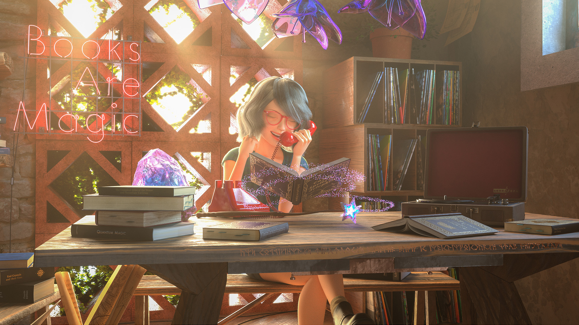
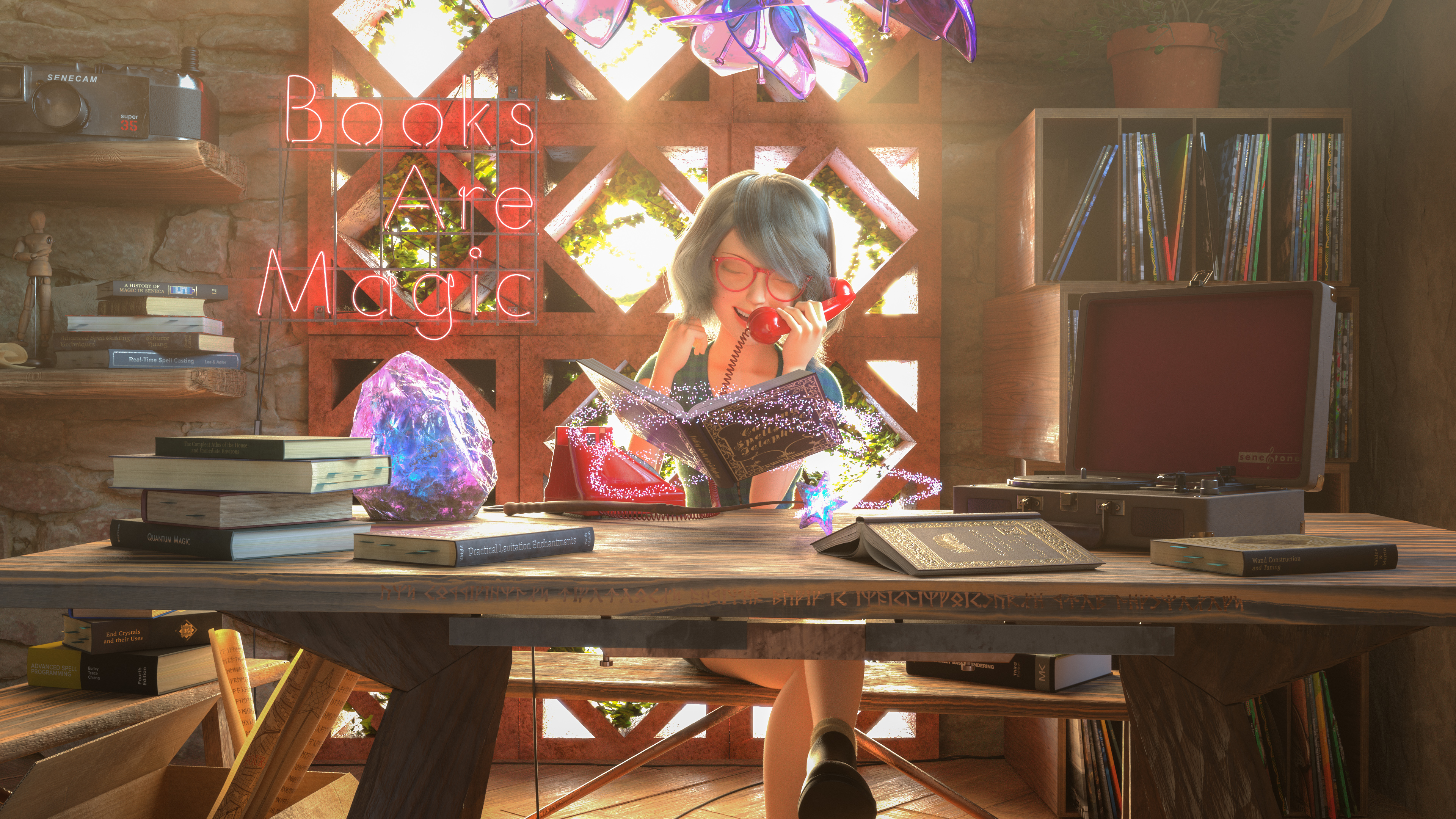
Last fall, I participated in my third Pixar’s RenderMan Art Challenge, “Magic Shop”!
I wasn’t initially planning on participating this time around due to not having as much free time on my hands, but after taking a look at the provided assets for this challenge, I figured that it looked fun and that I could learn some new things, so why not?
Admittedly participating in this challenge is why some technical content I had planned for this blog in the fall wound up being delayed, but in exchange, here’s another writeup of some fun CG art things I learned along the way!
This RenderMan Art Challenge followed the same format as usual: Pixar supplied some base models without any uvs, texturing, shading, lighting, etc, and participants had to start with the supplied base models and come up with a single final image.
Unlike in previous challenges though, this time around Pixar also provided a rigged character in the form of the popular open-source Mathilda Rig, to be incorporated into the final entry somehow.
Although my day job involves rendering characters all of the time, I have really limited experience with working with characters in my personal projects, so I got to try some new stuff!
Considering that I my time spent on this project was far more limited than on previous RenderMan Art Challenges, and considering that I didn’t really know what I was doing with the character aspect, I’m pretty happy that my final entry won third place in the contest!
Character Explorations
I originally wasn’t planning on entering this challenge, but I downloaded the base assets anyway because I was curious about playing with the rigged character a bit.
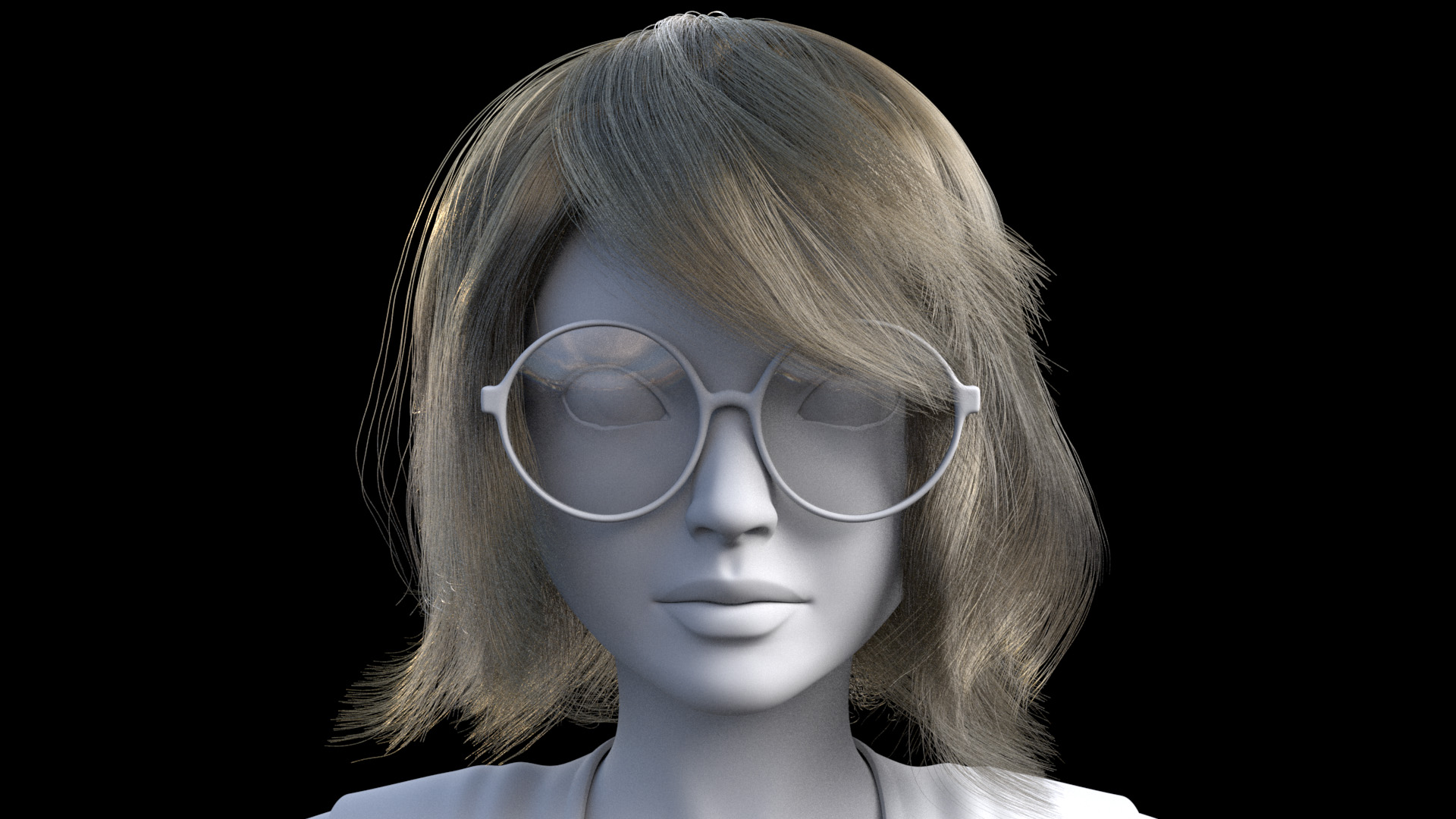
I discovered really quickly that the Mathilda rig is reasonably flexible, but the flexibility meant that the rig can go off model really fast, and also the face can get really creepy really fast.
I think part of the problem is just the overall character design; the rig is based on a young Natalie Portman’s character from the movie Léon: The Professional, and the character in that movie is… something of an unusual character, to say the least.
The model itself has a head that’s proportionally a bit on the large side, and the mouth is especially large, which is part of why the facial rig gets so creepy so fast.
One of the first things I discovered was that I had to scale down the rig’s mouth and teeth a bit just to bring things back into more normal proportions.
After playing with the rig for a few evenings, I started thinking about what I should make if I did enter the challenge after all.
I’ve gotten a lot busier recently with personal life stuff, so I knew I wasn’t going to have as much time to spend on this challenge, which meant I needed to come up with a relatively straightforward simple concept and carefully choose what aspects of the challenge I was going to focus on.
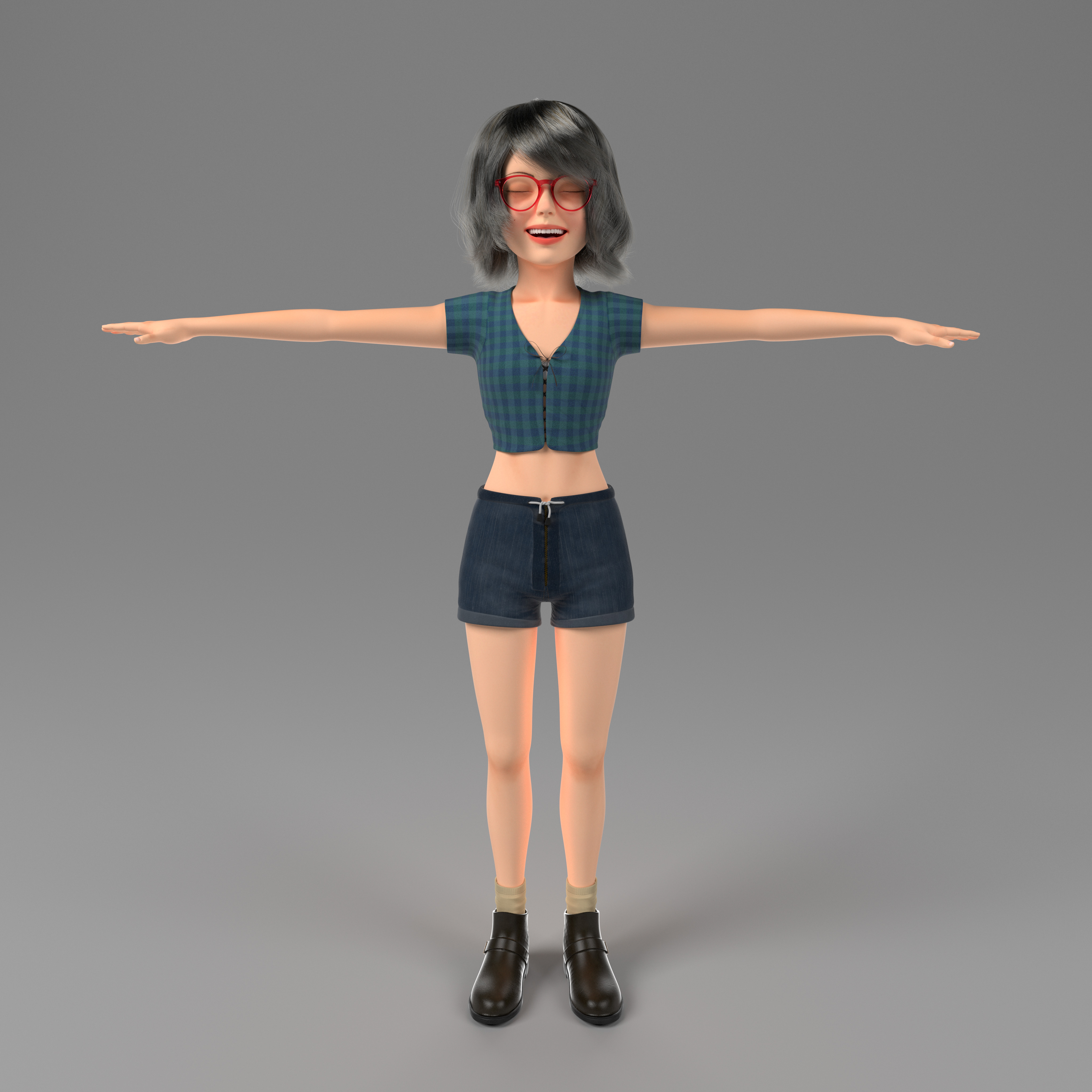
I figured that most of the other entries into the challenge were going to use the provided character in more or less its default configuration and look, so I decided that I’d try to take the rig further away from its default look and instead use the rig as a basis for a bit of a different character.
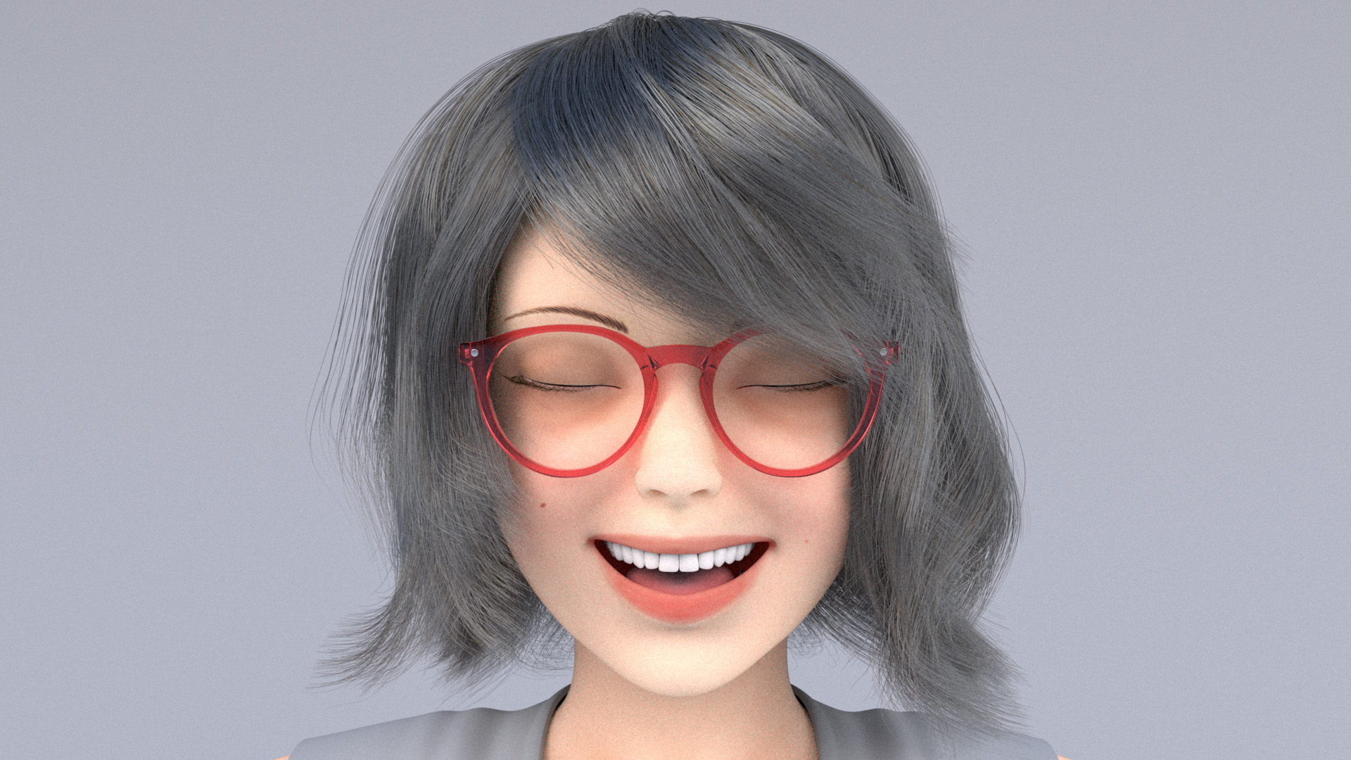
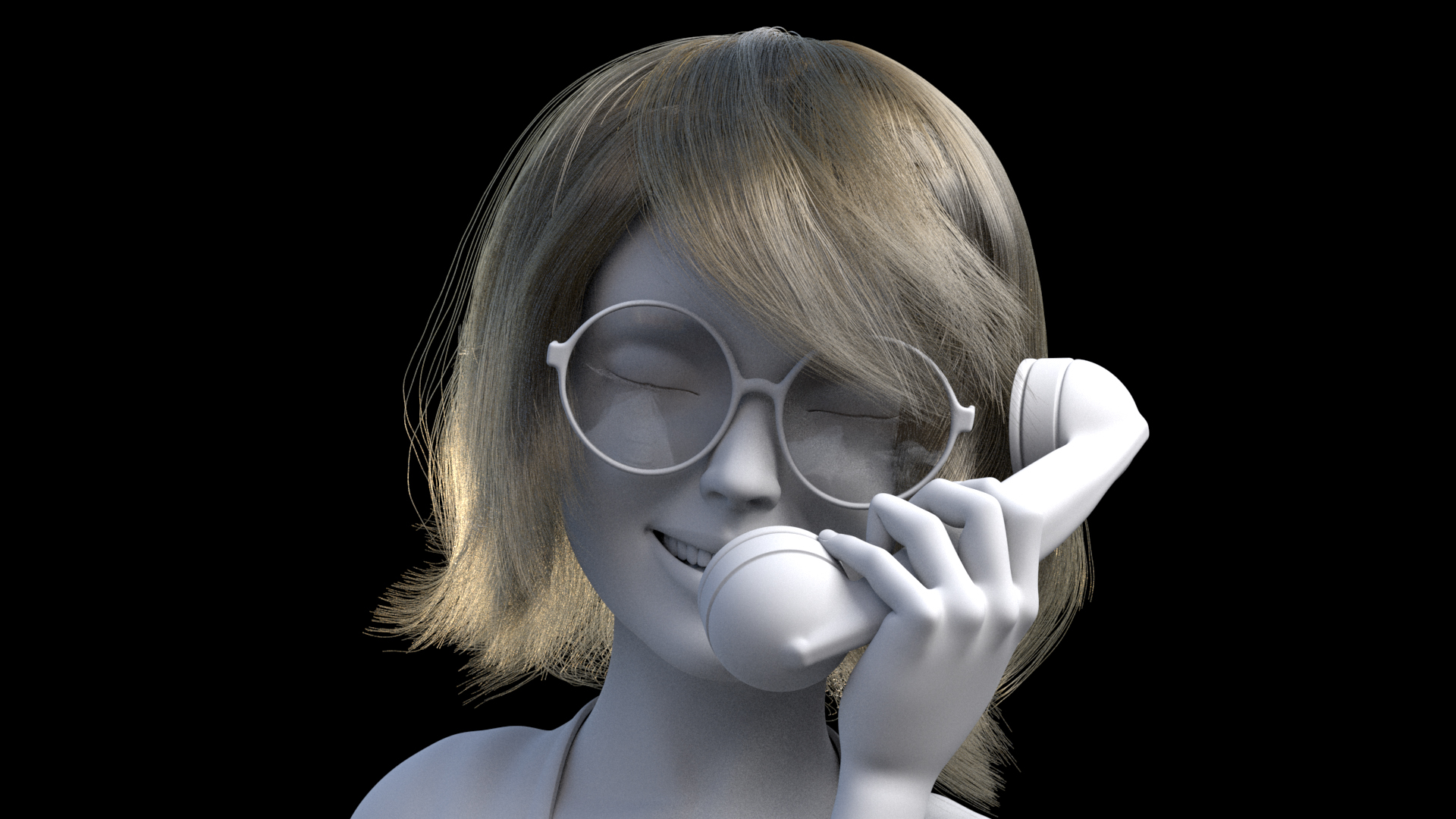
The major changes I wanted to make to take the rig away from its default look were to add glasses, completely redo the hair, simplify the outfit, and shade the outfit completely differently from its default appearance.
With this plan in mind, the first problem I tackled was creating a completely new hairstyle for the character.
The last time I did anything with making CG hair was about a decade ago, and I did a terrible job back then, so I wanted to figure out how to make passable CG hair first because I saw the hair as basically a make-or-break problem for this entire project.
To make the hair in this project, I chose to use Maya’s XGen plugin, which is a generator for arbitrary primitives, including but not limited to curves for things like hair and fur.
I chose to use XGen in part because it’s built into Maya, and also because I already have some familiarity with XGen thanks to my day job at Disney Animation.
XGen was originally developed at Disney Animation [Thompson et al. 2003] and is used extensively on Disney Animation feature films; Autodesk licensed XGen from Disney Animation and incorporated XGen into Maya’s standard feature set in 2011.
XGen’s origins as a Disney Animation technology explain why XGen’s authoring workflow uses Ptex [Burley and Lacewell 2008) for maps and SeExpr [Walt Disney Animation Studios 2011] for expressions.
Of course, since 2011, the internal Disney Animation version of XGen has developed along its own path and gained capabilities and features [Palmer and Litaker 2016] beyond Autodesk’s version of XGen, but the basics are still similar enough that I figured I wouldn’t have too difficult of a time adapting.
I found a great intro to XGen course from Jesus FC, which got me up and running with guides/splines XGen workflow.
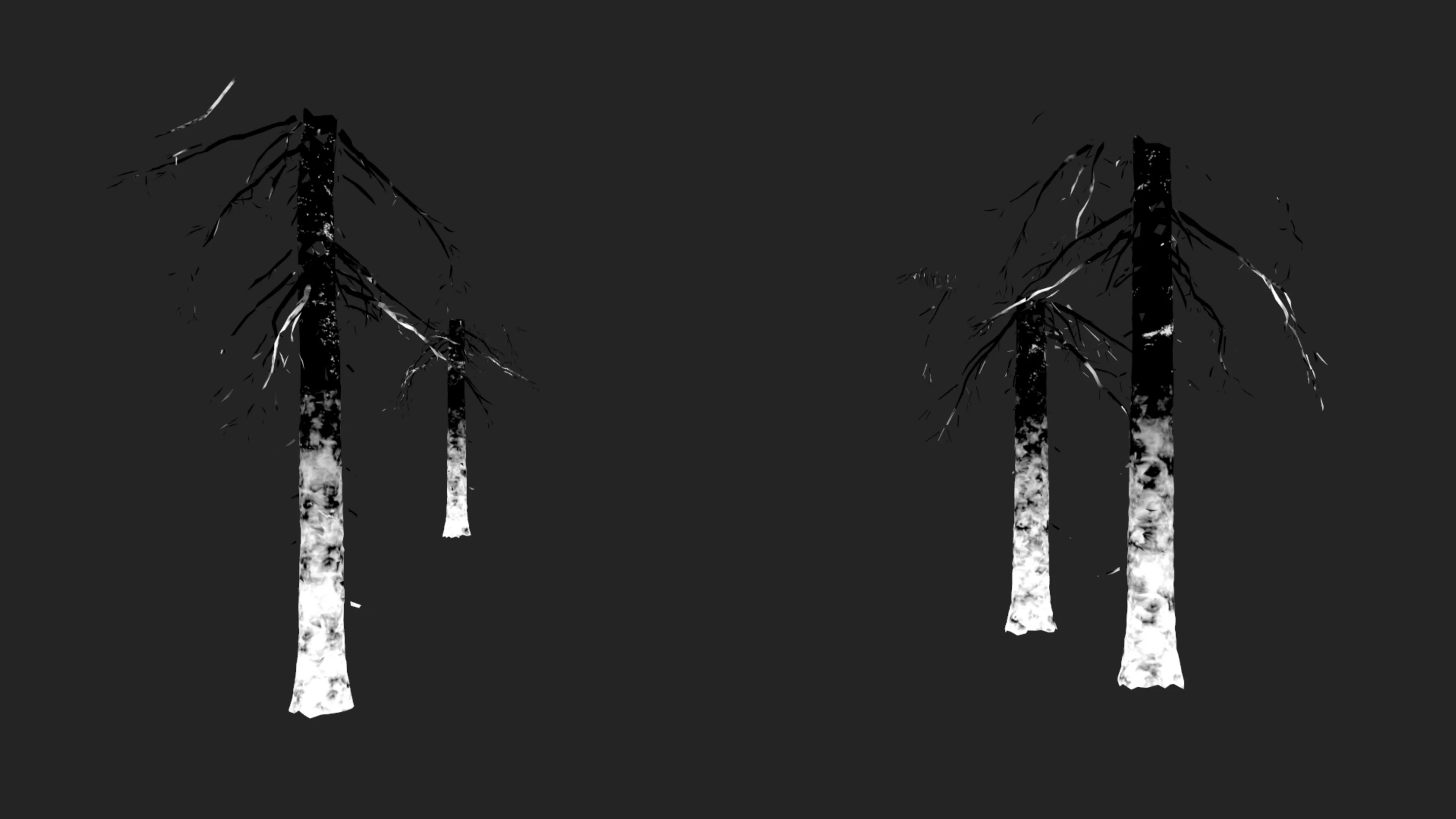
I eventually found that the workflow that worked best for me was to actually model sheets of hair using just regular polygonal modeling tools, and then use the modeled polygonal sheets as a base surface to help place guide curves on to drive the XGen splines.
After a ton of trial and error and several restarts from scratch, I finally got to something that… admittedly still was not very good, but at least was workable as a starting point.
One of the biggest challenges I kept running into was making sure that different “planes” of hair didn’t intersect each other, which produces grooms that look okay at first glance but then immediately look unnatural after anything more than just a moment.
Here are some early drafts of the custom hair groom:

To shade the hair, I used RenderMan’s PxrMarschnerHair shader, driven using RenderMan’s PxrHairColor node.
PxrHairColor implements d’Eon et al. [2011], which allow for realistic hair colors by modeling melanin concentrations in hair fibers, and PxrMarschnerHair [Hery and Ling 2017] implements a version of the classic Marschner et al. [2003] hair model improved using adaptive importance sampling [Pekelis et al. 2015].
In order to really make hair look good, some amount of randomization and color variation between different strands is necessary; PxrHairColor supports randomization and separately coloring stray flyaway hairs based on primvars.
In order to use the randomization features, I had to remember to check off the “id” and “stray” boxes under the “Primitive Shader Parameters” section of XGen’s Preview/Output tab.
Overall I found the PxrHairColor/PxrMarschnerHair system a little bit difficult to use; figuring out how a selected melanin color maps to a final rendered look isn’t exactly 1-to-1 and requires some getting used to.
This difference in authored hair color and final rendered hair color happens because the authored hair color is the color of a single hair strand, whereas the final rendered hair color is the result of multiple scattering between many hair strands combined with azimuthal roughness.
Fortunately, hair shading should get easier in future versions of RenderMan, which are supposed to ship with an implementation of Disney Animation’s artist-friendly hair model [Chiang et al. 2016].
The Chiang model uses a color re-parameterization that allows for the final rendered hair color to closely match the desired authored color by remapping the authored color to account for multiple scattering and azimuthal roughness; this hair model is what we use in Disney’s Hyperion Renderer of course, and is also implemented in Redshift and is the basis of VRay’s modern VRayHairNextMtl shader.
Skin Shading and Subsurface Scattering
For shading the character’s skin, the approach I took was to use the rig’s default textures as a starting point, modify heavily to get the textures that I actually wanted, and then use the modified textures to author new materials using PxrSurface.
The largest changes I made to the supplied skin textures are in the maps for subsurface; I basically had to redo everything to provide better inputs to subsurface color and mean free path to get the look that I wanted, since I used PxrSurface’s subsurface scattering set to exponential path-traced mode.
I generally like the controllability and predictability that path-traced SSS brings, but RenderMan 23’s PxrSurface implementation includes a whole bunch of different subsurface scattering modes, and the reason for this is interesting and worth briefly discussing.
Subsurface scattering models how light penetrates the surface of a translucent object, bounces around and scatters inside of the object, and exits at a different surface point from where it entered; this effect is exhibited by almost all organic and non-conductive materials to some degree.
However, subsurface scattering has existed in renderers for a long time; strong subsurface scattering support was actually a standout feature for RenderMan as early as 2002/2003ish [Hery 2003], when RenderMan was still a REYES rasterization renderer.
Instead of relying on brute-force path tracing, earlier subsurface scattering implementations relied on diffusion approximations, which approximate the effect of light scattering around inside of an object by modeling the aggregate behavior of scattered light over a simplified surface.
One popular way of implementing diffusion is through dipole diffusion [Jensen et al. 2001, d’Eon 2012, Hery 2012] and another popular technique is through the normalized diffusion model [Burley 2015, Christensen and Burley 2015] that was originally developed at Disney Animation for Hyperion.
These models are implemented in RenderMan 23’s PxrSurface as the “Jensen and d’Eon Dipoles” subsurface model and the “Burley Normalized” subsurface model, respectively.
Diffusion models were the state-of-the-art for a long time, but diffusion models require a number of simplifying assumptions to work; one of the fundamental key simplifications universal to all diffusion models is an assumption that subsurface scattering is taking place on a semi-infinite slab of material.
Thin geometry breaks this fundamental assumption, and as a result, diffusion-based subsurface scattering tends to loose more energy than it should in thin geometry.
This energy loss means that thin parts of geometry rendered with diffusion models tend to look darker than one would expect in reality.
Along with other drawbacks, this thin geometry energy loss drawback in diffusion models is one of the major reasons why most renderers have moved to brute-force path-traced subsurface scattering in the past half decade, and avoiding the artifacts from diffusion is exactly what the controllability and predictability that I mentioned earlier refers to.
Subsurface scattering is most accurately simulated by brute-force path tracing within a translucent object, but brute-force path-traced subsurface scattering has only really become practical for production in the past 5 or 6 years for two major reasons: first, computational cost, and second, the (up until recently) lack of an intuitive, artist-friendly parameterization for apparent color and scattering distance.
Much like how the final color of a hair model is really the result of the color of individual hair fibers and the aggregate multiple scattering behavior between many hair strands, the final color result of subsurface scattering arises from a complex interaction between single-scattering albedo, mean free path, and numerous multiple scattering events.
So, much like how an artist-friendly, controllable hair model requires being able to invert an artist-specified final apparent color to produce internally-used scattering albedos (this process is called albedo inversion), subsurface scattering similarly requires an albedo inversion step to allow for artist-friendly controllable parameterizations.
The process of albedo inversion for diffusion models is relatively straightforward and can be computed using nice closed-form analytical solutions, but the same is not true for path-traced subsurface scattering.
A major key breakthrough to making path-traced subsurface scattering practical was the development of a usable data-fitted albedo inversion technique [Chiang et al. 2016] that allows path-traced subsurface scattering and diffusion subsurface scattering to use the same parameterization and controls.
This technique was first developed at Disney Animation for Hyperion, and this technique was modified by Wrenninge et al. [2017] and combined with additional support for anisotropic scattering and non-exponential free flight to produce the “Multiple Mean Free Paths” and “path-traced” subsurface models in RenderMan 23’s PxrSurface.
In my initial standalone lookdev test setup, something that took a while was dialing the subsurface back from looking too gummy while at the same time trying to preserve something of a glow-y look, since the final scene I had in mind would be very glow-y.
From both personal and production experience, I’ve found that one of the biggest challenges in moving from diffusion or point based subsurface scattering solutions to brute-force path-traced subsurface scattering often is in having to readjust mean free paths to prevent characters from looking too gummy, especially in areas where the geometry gets relatively thin because of the aforementioned thin geometry problem that diffusion models suffer from.
In order to compensate for energy loss and produce a more plausible result, parameters and texture maps for diffusion-based subsurface scattering are often tuned to overcompensate for energy loss in thin areas.
However, applying these same parameters to an accurate brute-force path tracing model that already models subsurface scattering in thin areas correctly results in overly bright thin areas, hence the gummier look.
Since I started with the supplied skin textures for the character model, and the original skin shader for the character model was authored for a different renderer that used diffusion-based subsurface scattering, the adjustments I had to make where specifically to fight this overly glow-y gummy look in path-traced mode when using parameters authored for diffusion.
Clothes and Fuzz
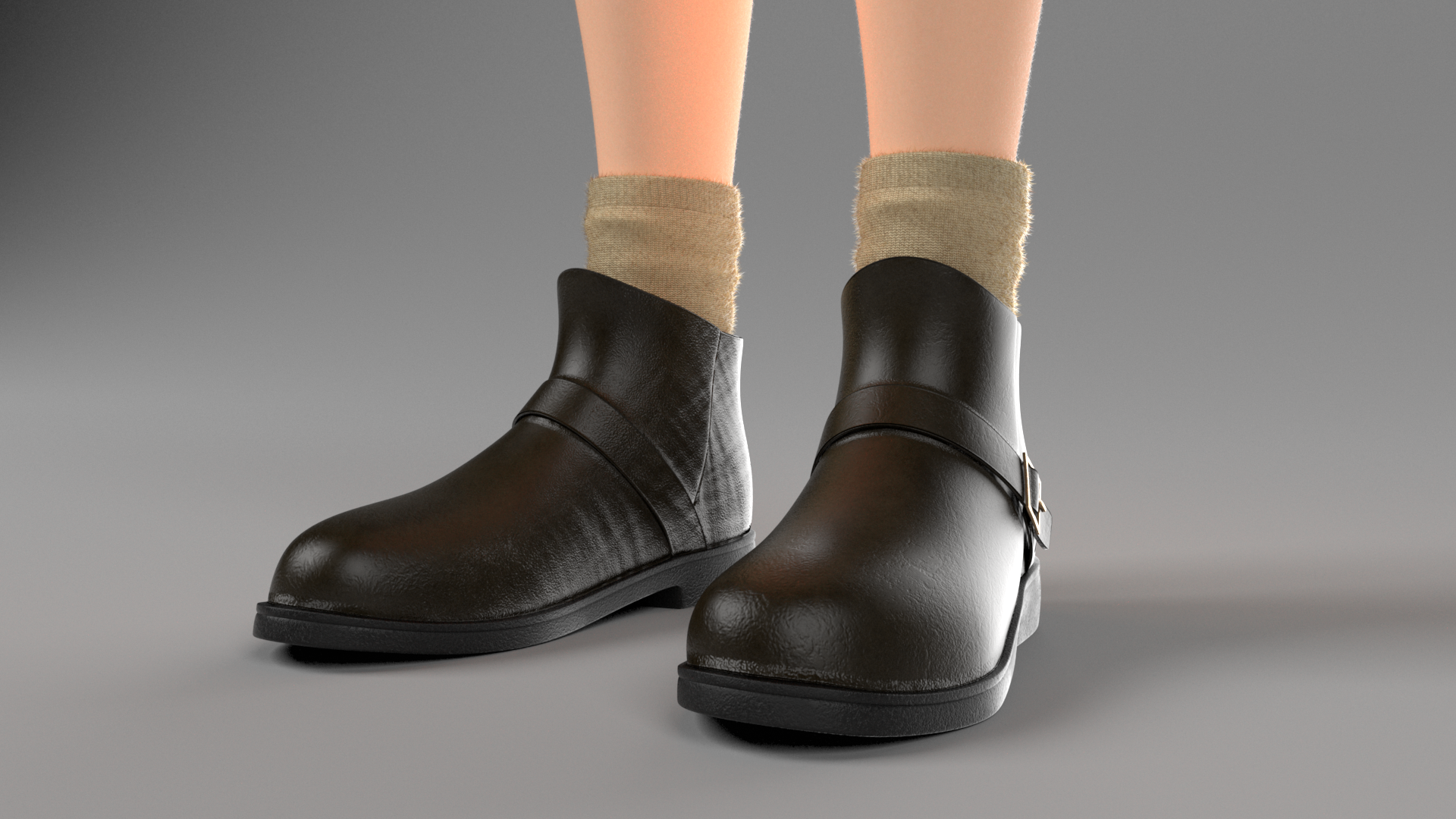
For the character’s clothes and shoes, I wanted to keep the outfit geometry to save time, but I also wanted to completely re-texture and re-shade the outfit to give it my own look.
I had a lot of trouble posing the character without getting lots of geometry interpenetration in the provided jacket, so I decided to just get rid of the jacket entirely.
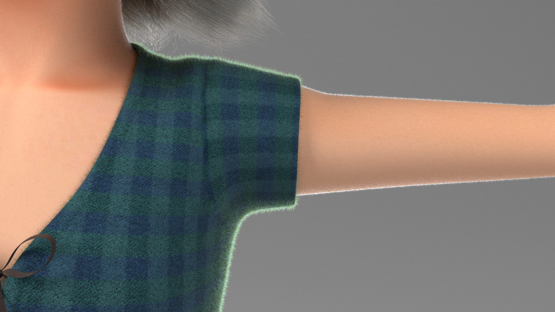
For the shirt, I picked a sort of plaid flannel-y look for no other reason than I like plaid flannel.
The character’s shorts come with this sort of crazy striped pattern, which I opted to replace with a much more simplified denim shorts look.
I used Substance Painter for texturing the clothes; Substance Painter comes with a number of good base fabric materials that I heavily modified to get to the fabrics that I wanted.
I also wound up redoing the UVs for the clothing completely; my idea was to lay out the UVs similar to how the sewing patterns for each piece of clothing might work if they were made in reality; doing the UVs this way allowed for quickly getting the textures to meet up and align properly as if the clothes were actually sewn together from fabric panels.
A nice added bonus is that Substance Painter’s smart masks and smart materials often use UV seams as hints for effects like wear and darkening, and all of that basically just worked out of the box perfectly with sewing pattern styled UVs.
Bringing everything back into RenderMan though, I didn’t feel that the flannel shirt looked convincingly soft and fuzzy and warm.
I tried using PxrSurface’s fuzz parameter to get more of that fuzzy look, but the results still didn’t really hold up.
The reason the flannel wasn’t looking right ultimately has to do with what the fuzz lobe in PxrSurface is meant to do, and where the fuzzy look in real flannel fabric comes from.
PxrSurface’s fuzz lobe can only really approximate the look of fuzzy surfaces from a distance, where the fuzz is small enough relative to the viewing position that they can essentially be captured as an aggregate microfacet effect.
Even specialized cloth BSDFs really only hold up at a relatively far distance from the camera, since they all attempt to capture cloth’s appearance as an aggregated microfacet effect; an enormous body of research exists on this topic [Schröder et al. 2011, Zhao et al. 2012, Zhao et al. 2016, Allaga et al. 2017, Deshmukh et al. 2017, Montazeri et al. 2020].
However, up close, the fuzzy look in real fabric isn’t really a microfacet effect at all- the fuzzy look really arises from multiple scattering happening between individual flyaway fuzz fibers on the surface of the fabric; while these fuzz fibers are very small to the naked eye, they are still a macro-scale effect when compared to microfacets.
The way feature animation studios such as Disney Animation and Pixar have made fuzzy fabric look really convincing over the past half decade is to… just actually cover fuzzy fabric geometry with actual fuzz fiber geometry [Crow et al. 2018].
In the past few years, Disney Animation and Pixar and others have actually gone even further.
On Frozen 2, embroidery details and lace and such were built out of actual curves instead of displacement on surfaces [Liu et al. 2020].
On Brave, some of the clothing made from very coarse fibers were rendered entirely as ray-marched woven curves instead of as subdivision surfaces and shaded using a specialized volumetric scheme [Child 2012], and on Soul, many of the hero character outfits (including ones made of finer woven fabrics) are similarly rendered as brute-force path-traced curves instead of as subdivision surfaces [Hoffman et al. 2020].
Animal Logic similarly renders hero cloth as actual woven curves [Smith 2018], and I wouldn’t be surprised if most VFX shops use a similar technique now.
Anyhow, in the end I decided to just bite the bullet in terms of memory and render speed and cover the flannel shirt in bazillions of tiny little actual fuzz fibers, instanced and groomed using XGen.
The fuzz fibers are shaded using PxrMarschnerHair and colored to match the fabric surface beneath.
I didn’t actually go as crazy as replacing the entire cloth surface mesh with woven curves; I didn’t have nearly enough time to write all of the custom software that would require, but fuzzy curves on top of the cloth surface mesh is a more-than-good-enough solution for the distance that I was going to have the camera at from the character.
The end result instantly looked vastly better, as seen in this comparison of before and after adding fuzz fibers:
Figure 5: Shirt before (left) and after (right) XGen fuzz. For a full screen comparison, click here.
Putting fuzz geometry on the shirt actually worked well enough that I proceeded to do the same for the character’s shorts and socks as well.
For the socks especially having actual fuzz geometry really helped sell the overall look.
I also added fine peach fuzz geometry to the character’s skin as well, which may sound a bit extreme, but has actually been standard practice in the feature animation world for several years now; Disney Animation began adding fine peach fuzz on all characters on Moana [Burley et al. 2017], and Pixar started doing so on Coco.
Adding peach fuzz to character skin ends up being really useful for capturing effects like rim lighting without the need for dedicated lights or weird shader hacks to get that distinct bright rim look; the rim lighting effect instead comes entirely from multiple scattering through the peach fuzz curves.
Since I wanted my character to be strongly backlit in my final scene, I knew that having good rim lighting was going to be super important, and using actual peach fuzz geometry meant that it all just worked!
Here is a comparison of my final character texturing/shading/look, backlit without and with all of the geometric fuzz.
The lighting setup is exactly the same between the two renders; the only difference is the presence of fuzz causing the rim effect.
This effect doesn’t happen when using only the fuzz lobe of PxrSurface!
Figure 6: Character backlit without and with fuzz. The rim lighting effect is created entirely by backlighting scattering through XGen fuzz on the character and the outfit. For a full screen comparison, click here. Click here and here to see the full 4K renders by themselves.
I used SeExpr expressions instead of using XGen’s guides/splines workflow to control all of the fuzz; the reason for using expressions was because I only needed some basic noise and overall orientation controls for the fuzz instead of detailed specific grooming.
Of course, adding geometric fuzz to all of a character’s skin and clothing does increase memory usage and render times, but not by as much as one might expect!
According to RenderMan’s stats collection system, adding geometric fuzz increased overall memory usage for the character by about 20%, and for the renders in Figure 8, adding geometric fuzz increased render time by about 11%.
Without the geometric fuzz, there are 40159 curves on the character, and with geometric fuzz the curve count increases to 1680364.
Even though there was a 41x increase in the number of curves, the total render time didn’t really increase by too much, thanks to logarithmic scaling of ray tracing with respect to input complexity.
In a rasterizer, adding 41x more geometry would slow the render down to a crawl due to the linear scaling of rasterization, but ray tracing makes crazy things like actual geometric fuzz not just possible, but downright practical.
Of course all of this can be made to work in a rasterizer with sufficiently clever culling and LOD and such, but in a ray tracer it all just works out of the box!
Here are a few closeup test renders of all of the fuzz:


Layout, Framing, and Building the Shop
After completing all of the grooming and re-shading work on the character, I finally reached a point where I felt confident enough in being able to make an okay looking character that I was willing to fully commit into entering this RenderMan Art Challenge.
I got to this decision really late in the process relative to on previous challenges!
Getting to this point late meant that I had actually not spent a whole lot of time thinking about the overall set yet, aside from a vague notion that I wanted backlighting and an overall bright and happy sort of setting.
For whatever reason, “magic shop” and “gloomy dark place” are often associated with each other (and looking at many of the other competitors’ entries, that association definitely seemed to hold on this challenge too).
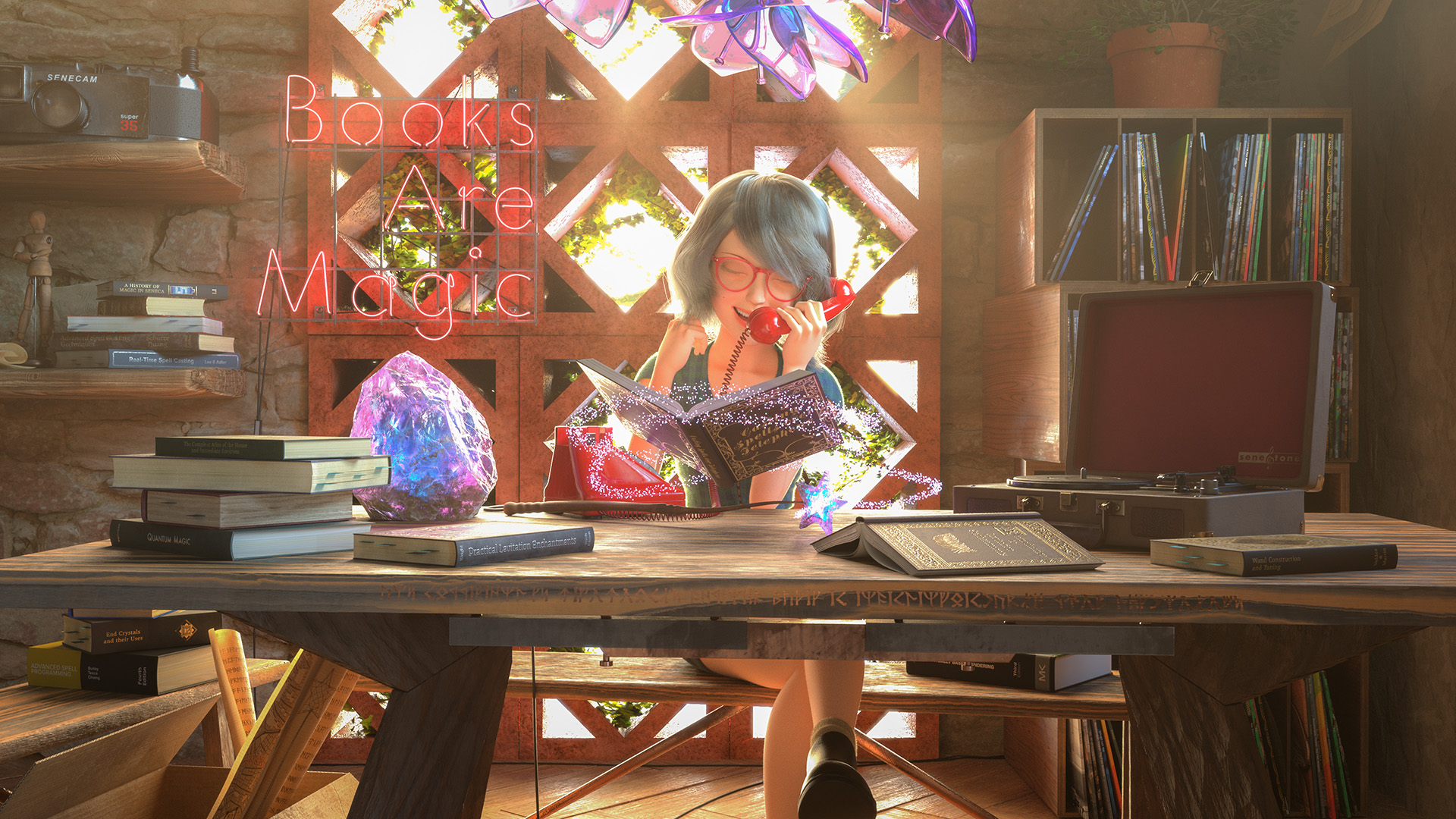
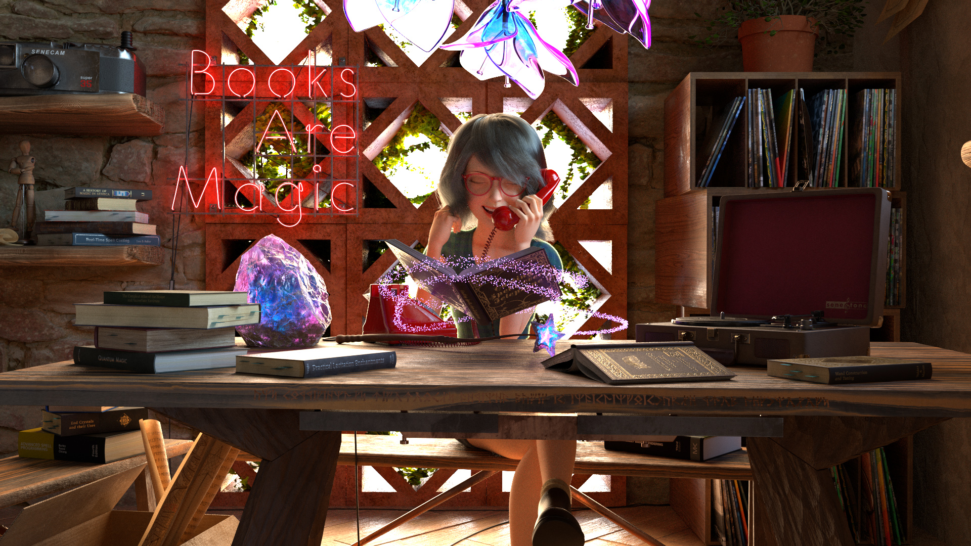
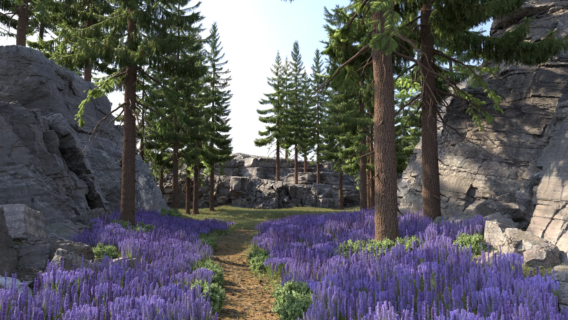
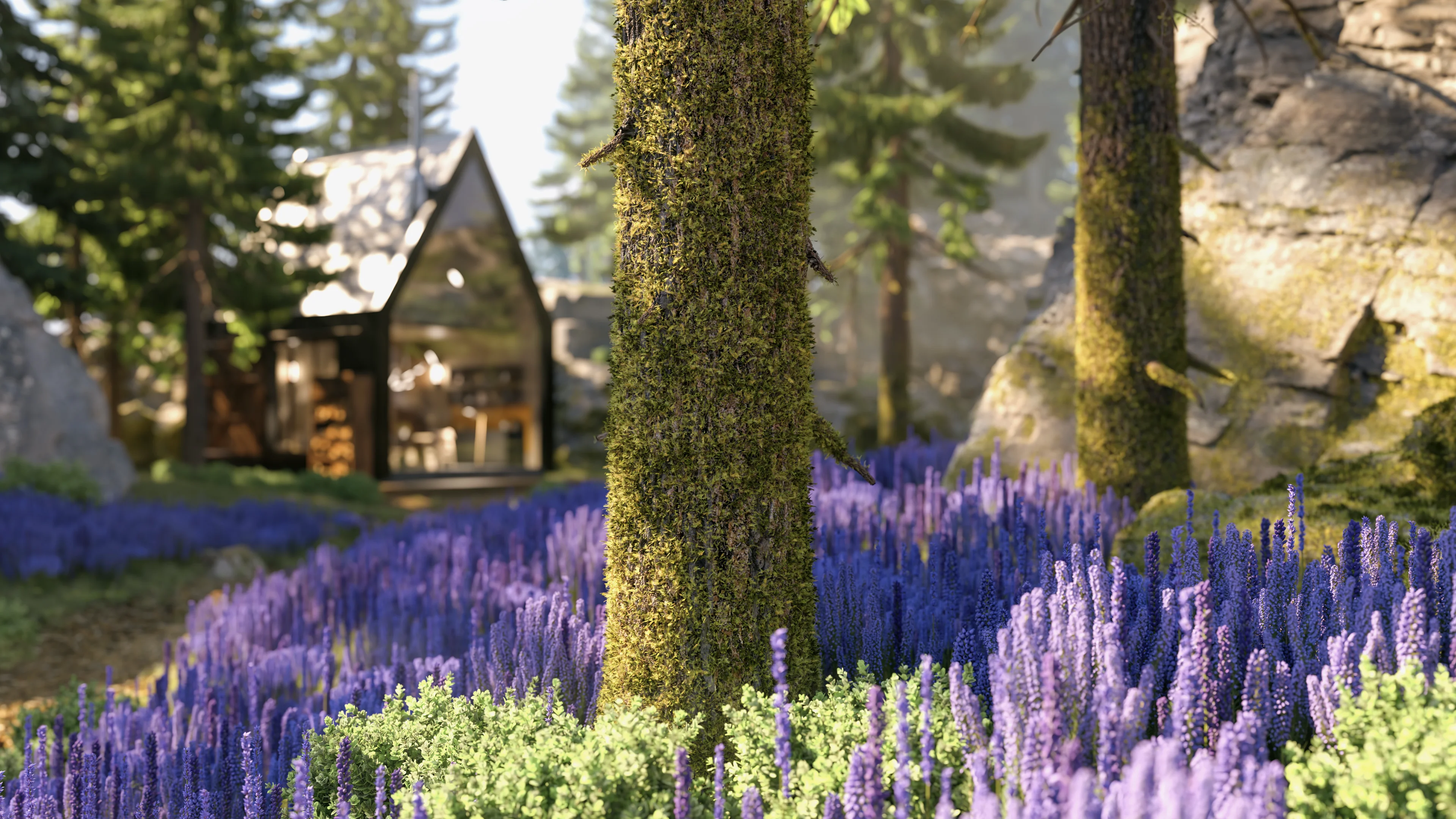
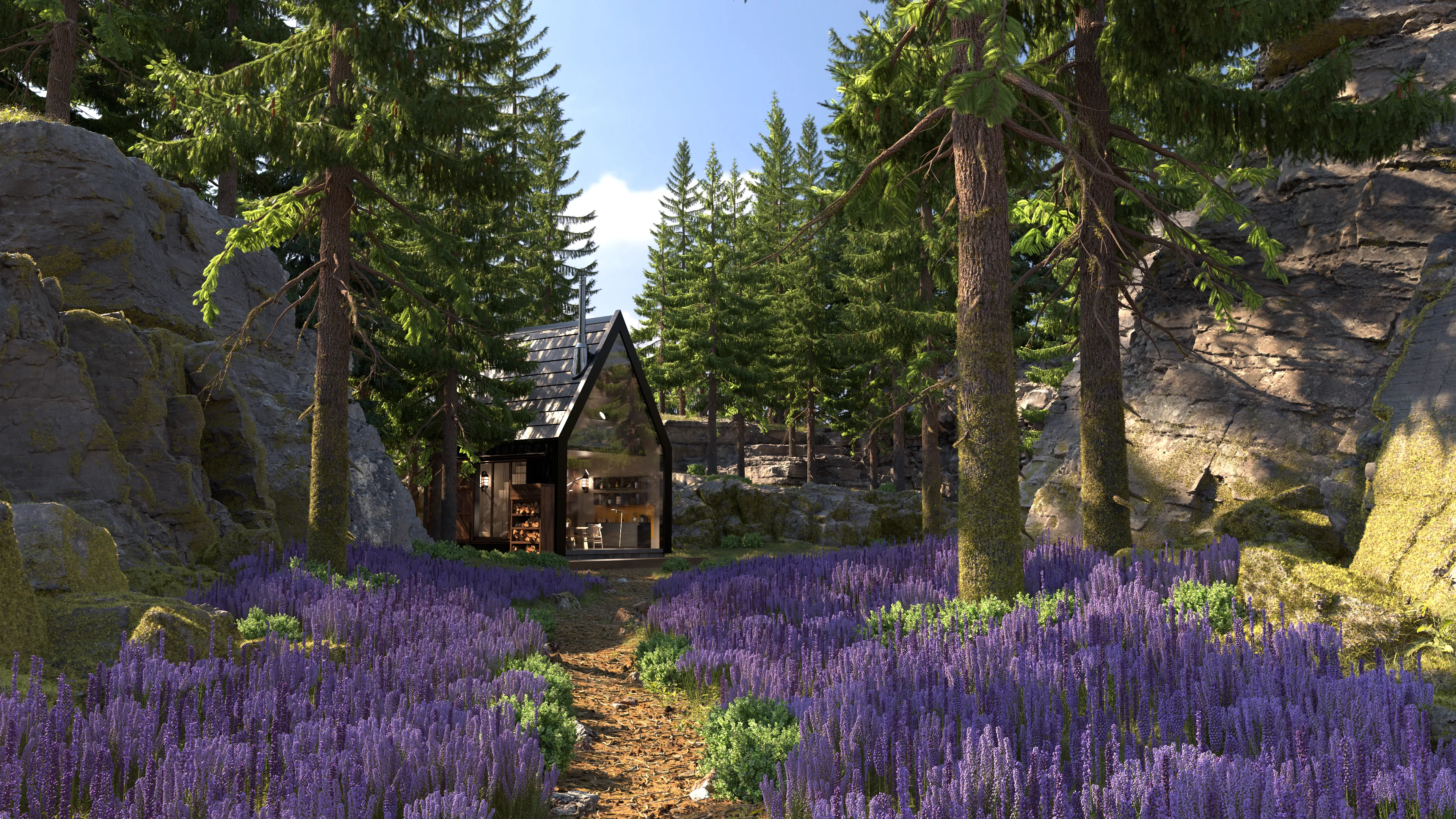
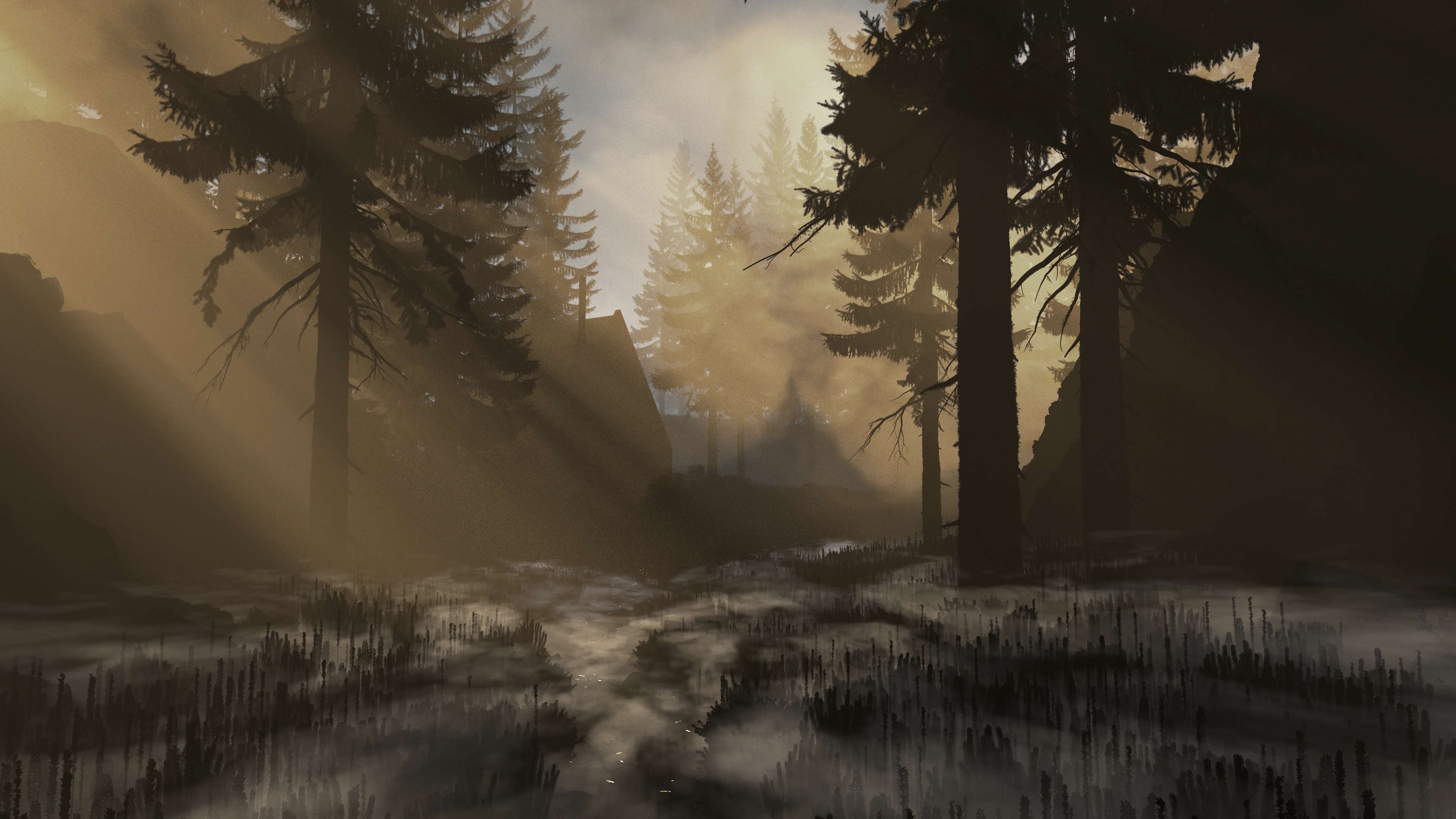
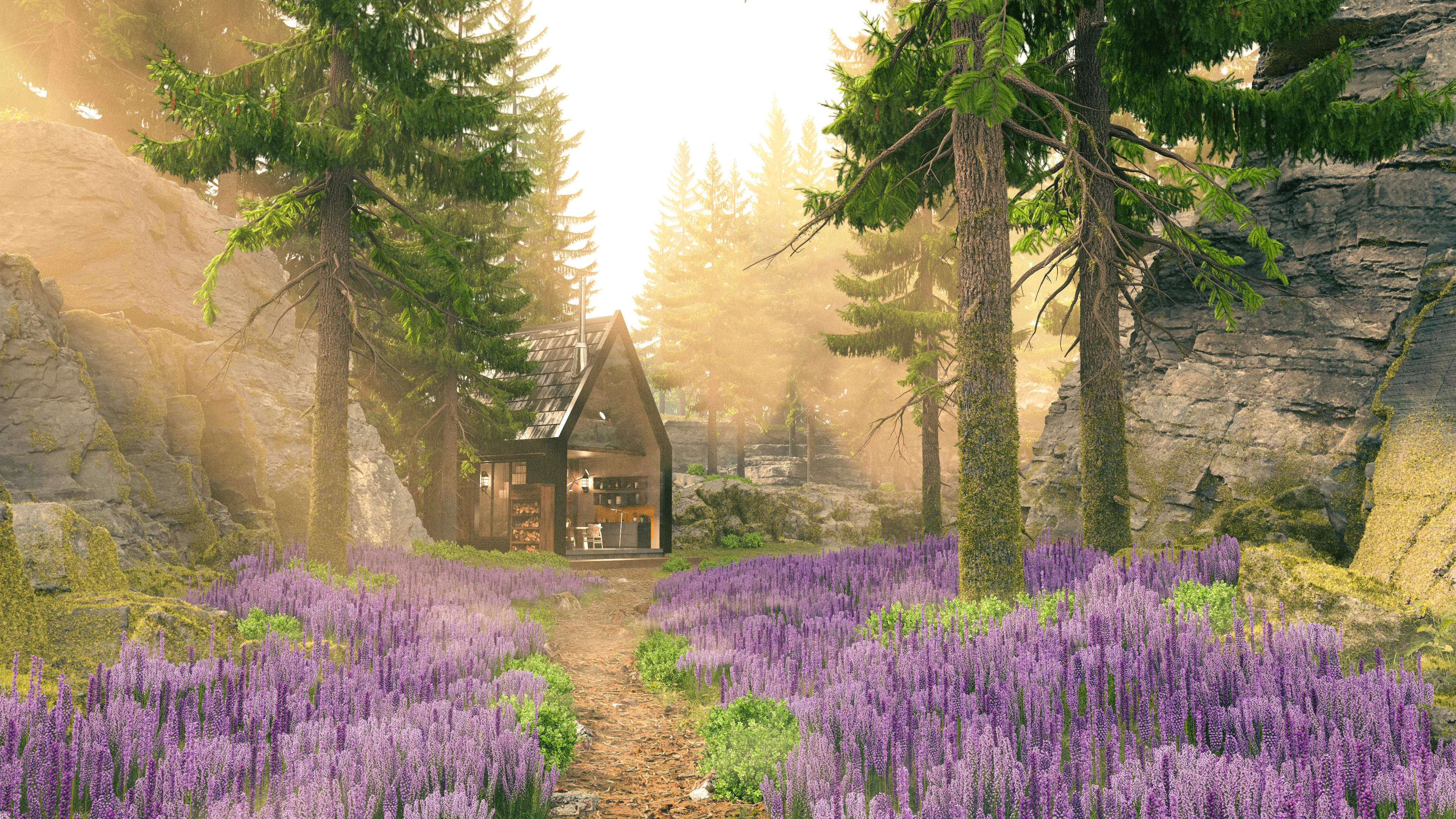
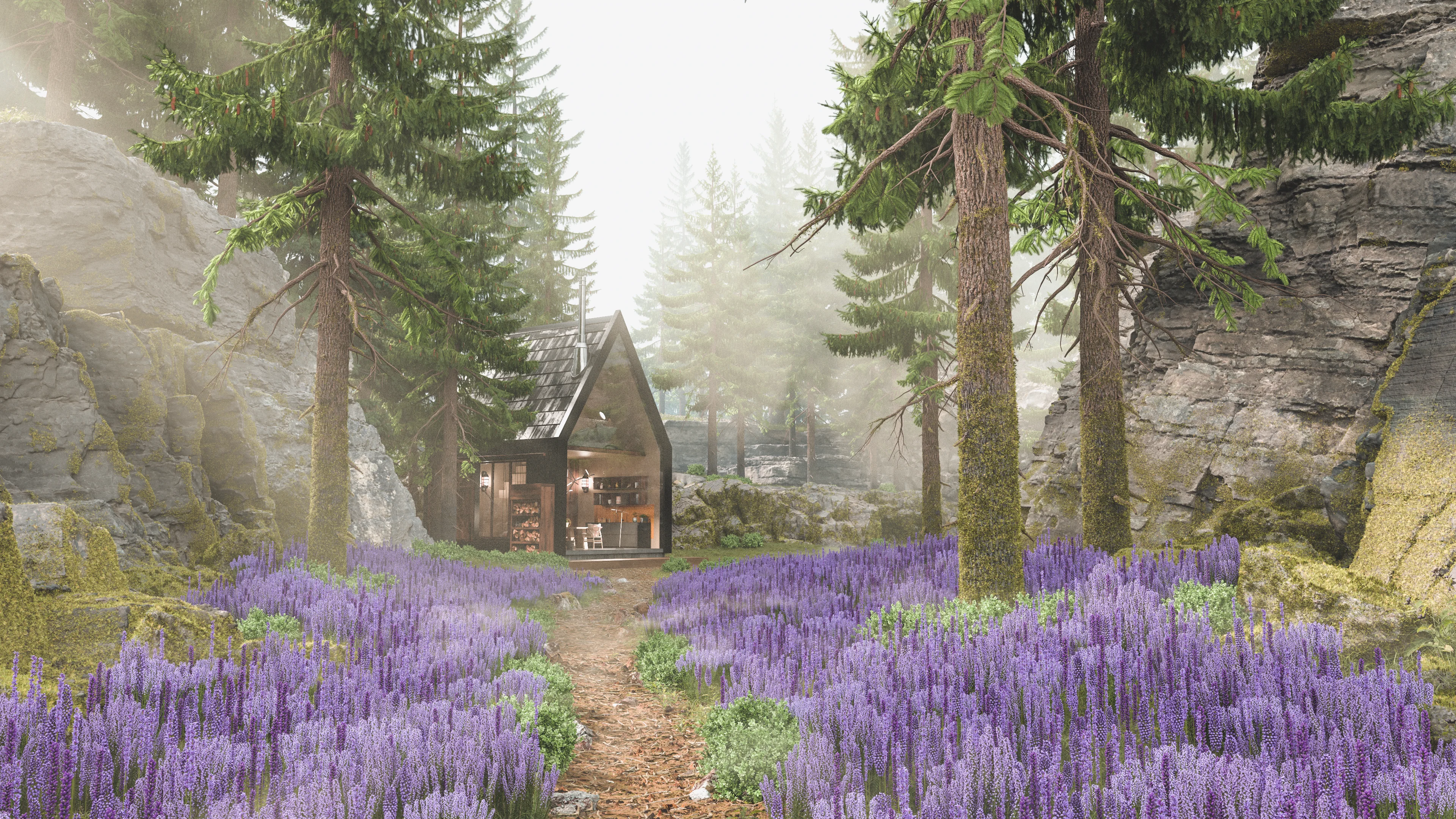
I wanted to steer away from “gloomy dark place”, so I decided I instead wanted more of a sunny magic bookstore with lots of interesting props and little details to tell an overall story.
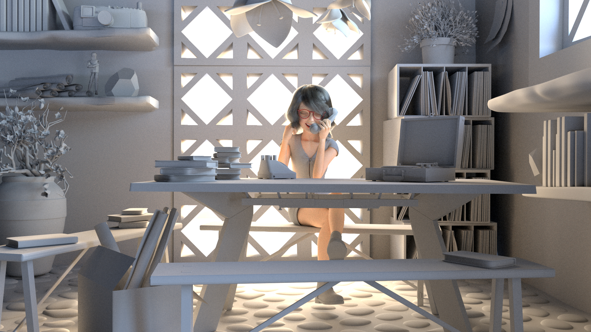
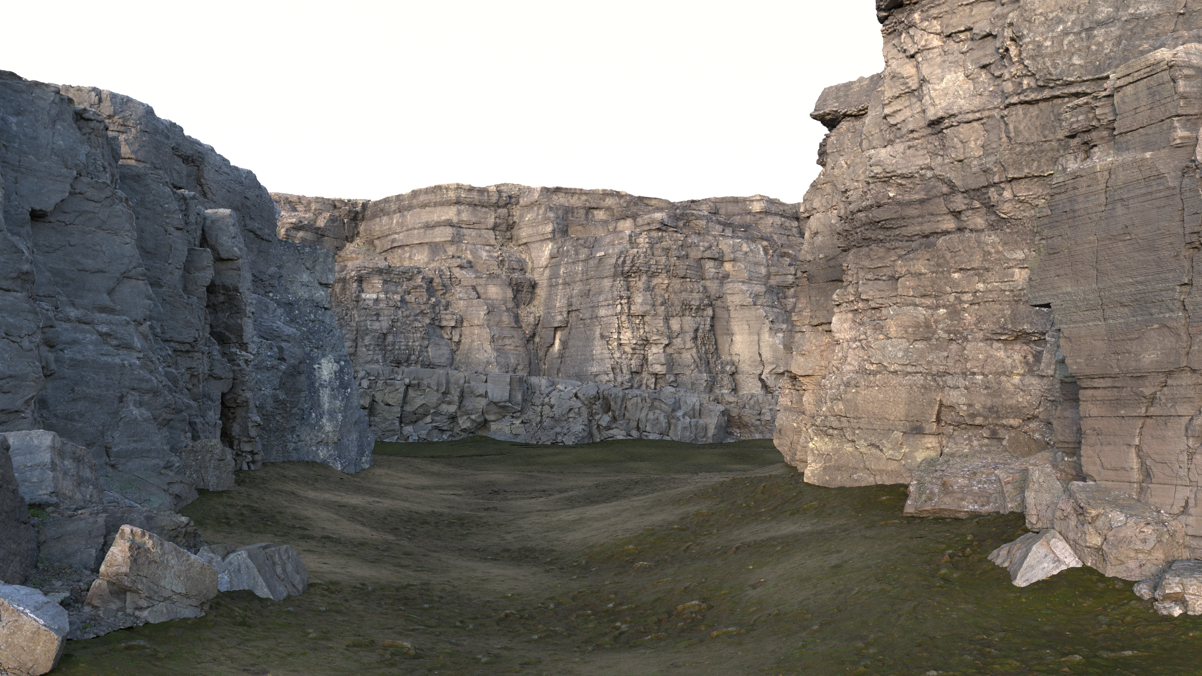
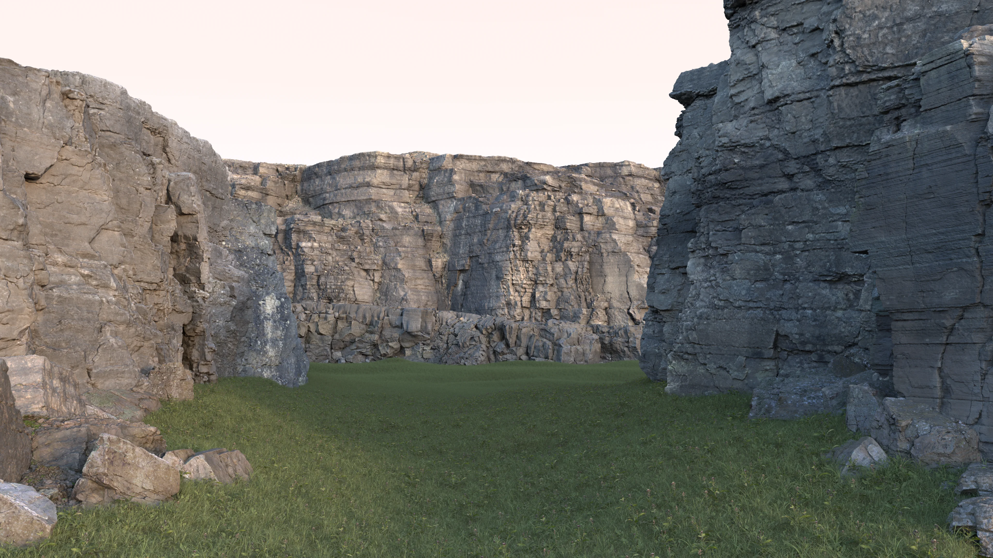
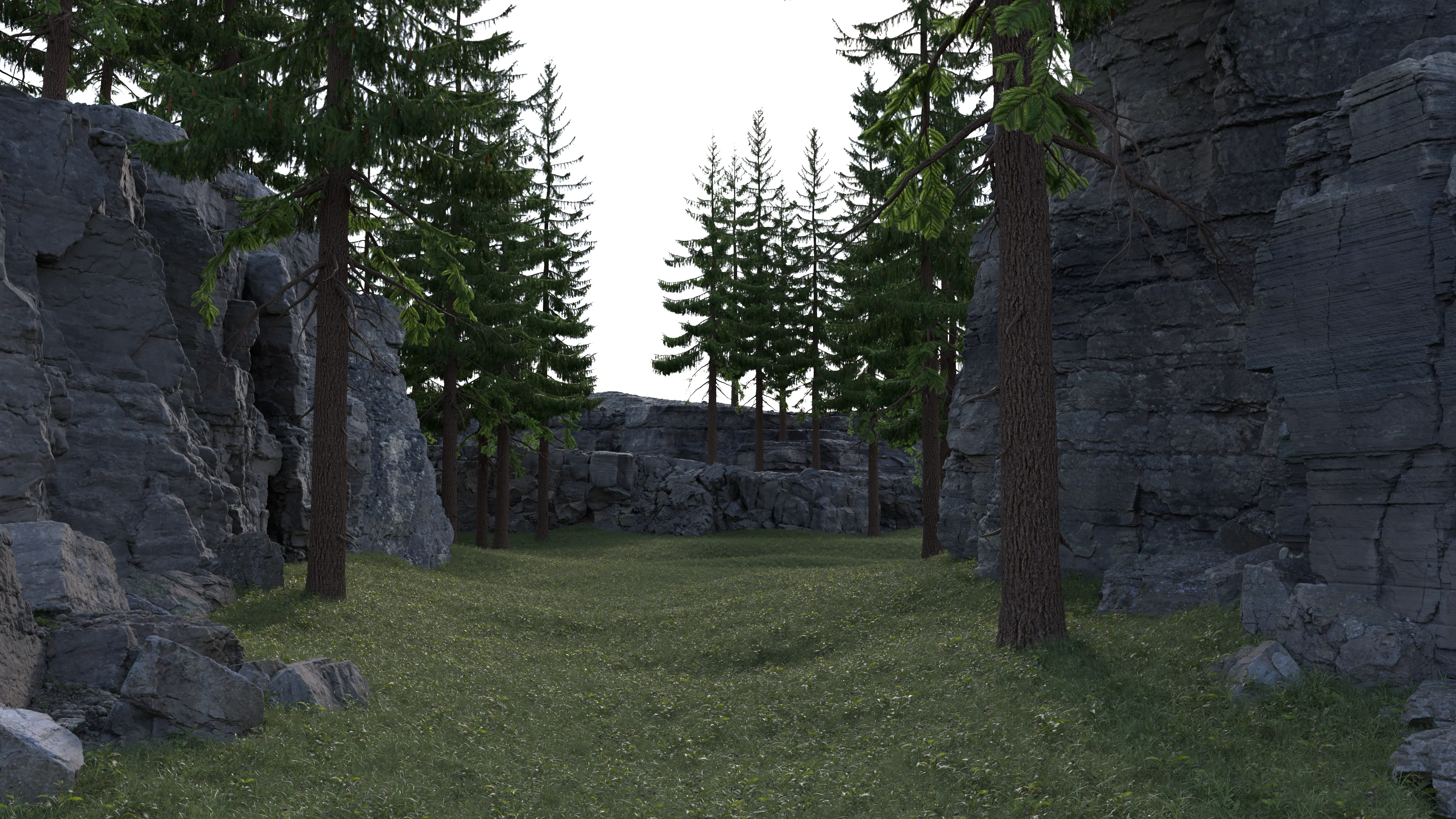
To build my magic bookstore set, I wound up remixing the provided assets fairly extensively; I completely dismantled the entire provided magic shop set and used the pieces to build a new corner set that would emphasize sunlight pouring in through windows.
I initially was thinking of placing the camera up somewhere in the ceiling of the shop and showing a sort of overhead view of the entire shop, but I abandoned the overhead idea pretty quickly since I wanted to emphasize the character more (especially after putting so much work into the character).
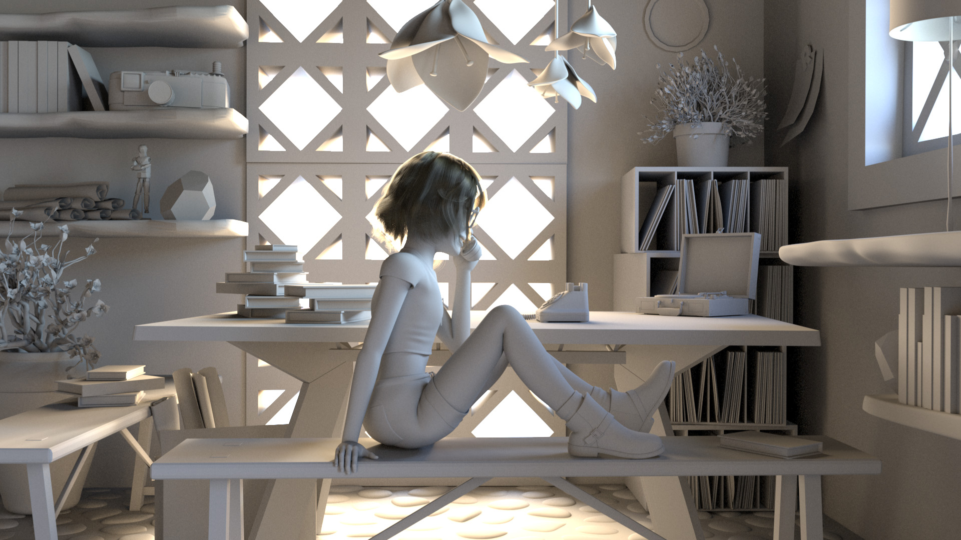
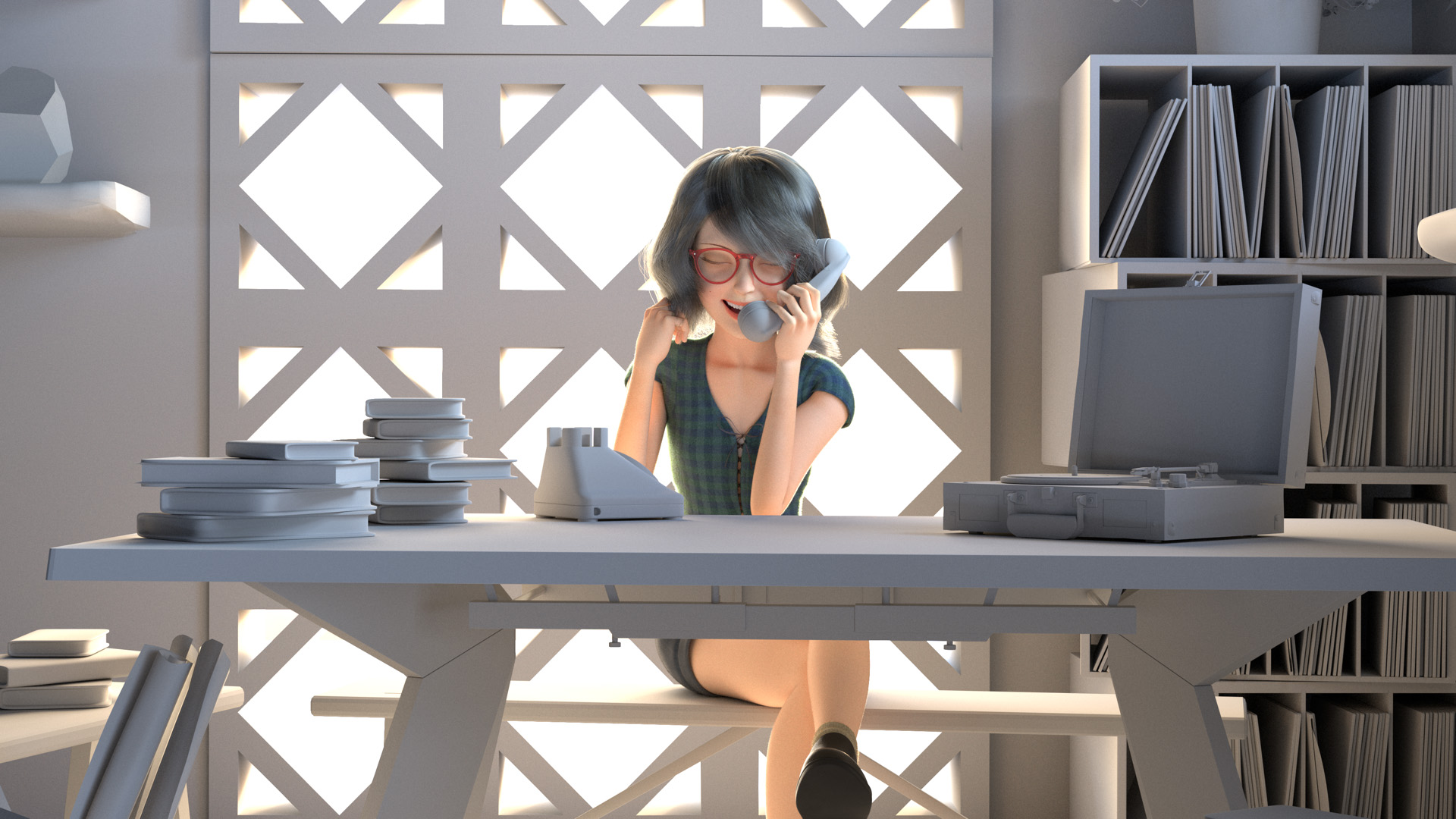
Once I decided that I wanted a more focused shot of the character with lots of bright sunny backlighting, I arrived at an overall framing and even set dressing that actually largely stayed mostly the same throughout the rest of the project, albeit with minor adjustments here and there.
Almost all of the props are taken from the original provided assets, with a handful of notable exceptions: in the final scene, the table and benches, telephone, and neon sign are my own models.
Figuring out where to put the character took some more experimentation; I originally had the character up front and center and sitting such that her side is facing the camera.
However, having the character up front and center made her feel not particularly integrated with the rest of the scene, so I eventually placed her behind the big table and changed her pose so that she’s sitting facing the camera.
Here are some major points along the progression of my layout and set dressing explorations:

One interesting change that I think had a huge impact on how the scene felt overall actually had nothing to do with the set dressing at all, but instead had to do with the camera itself.
At some point I tried pulling the camera back further from the character and using a much narrower lens, which had the overall effect of pulling the entire frame much closer and tighter on the character and giving everything an ever-so-slightly more orthographic feel.
I really liked how this lensing worked; to me it made the overall composition feel much more focused on the character.
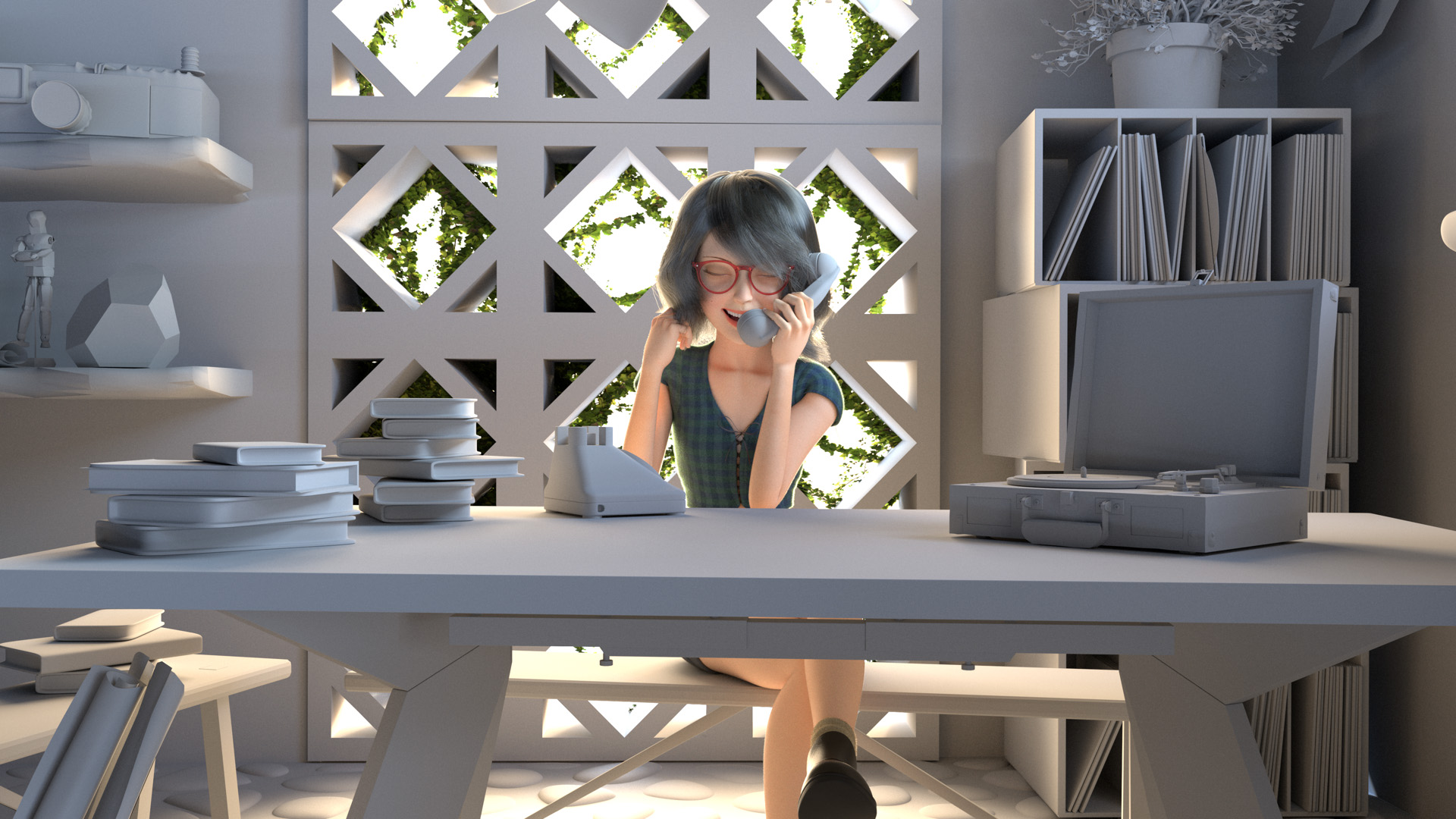
Also around this point is when I started integrating the character with completed shading and texturing and fuzz into the scene, and I was really happy to see how well the peach fuzz and clothing fuzz worked out with the backlighting:
Once I had the overall blocking of the scene and rough set dressing done, the next step was to shade and texture everything!
Since my scene is set indoors, I knew that global illumination coming off of the walls and floor and ceiling of the room itself was going to play a large role in the overall lighting and look of the final image, so I started the lookdev process with the room’s structure itself.
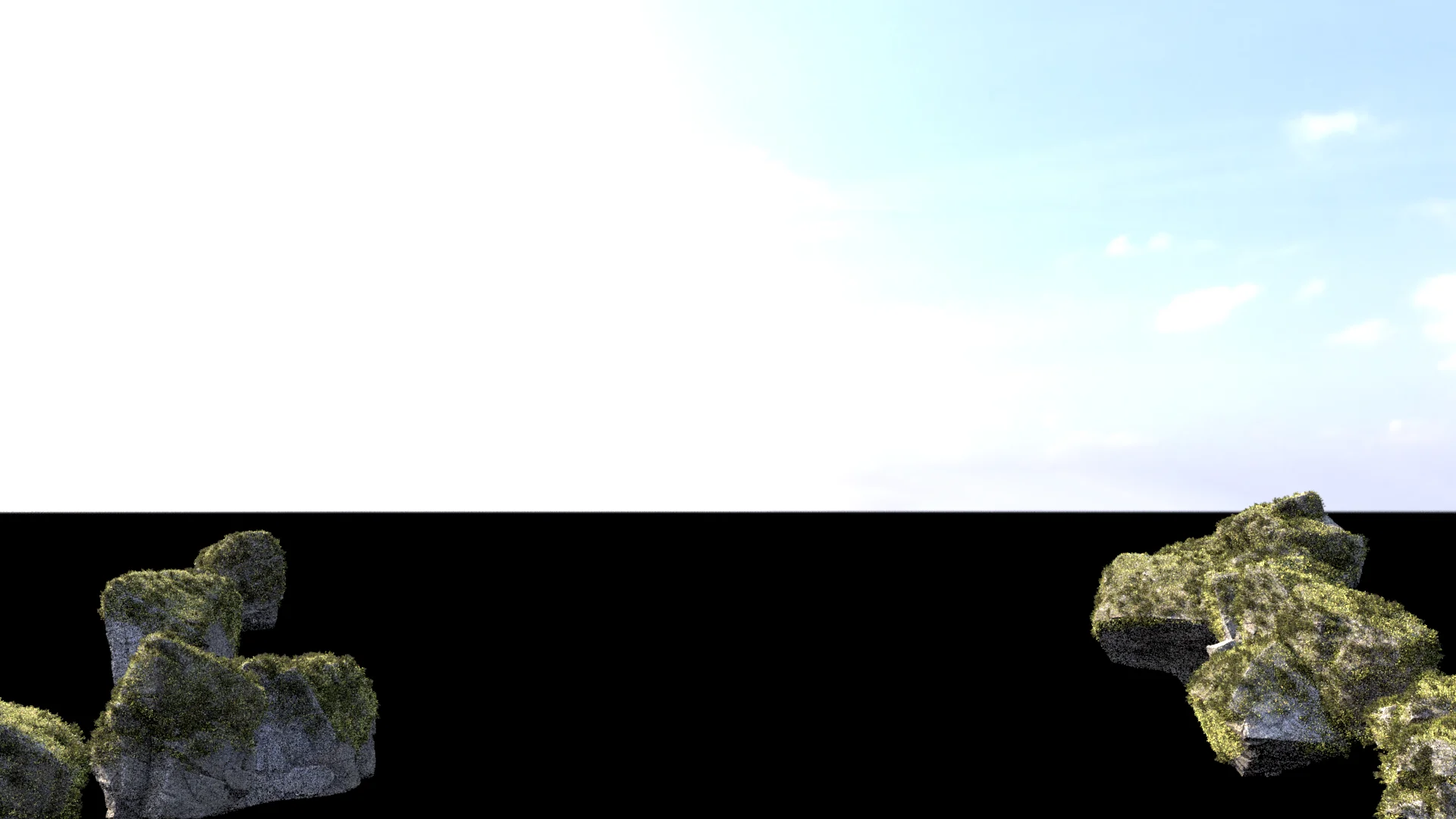
The first decision to tackle was whether or not to have glass in the big window thing behind the character.
I didn’t really want to put glass in the window, since most of the light for the scene was coming through the window and having to sample the primary light source through glass was going to be really bad for render times.
Instead, I decided that the window was going to be an interior window opening up into some kind of sunroom on the other side, so that I could get away with not putting glass in.
The story I made up in my head was that the sunroom on the other side, being a sunroom, would be bright enough that I could just blow it out entirely to white in the final image.
To help sell the idea, I thought it would be fun to have some ivy or vines growing through the window’s diamond-shaped sections; maybe they’re coming from a giant potted plant or something in the sunroom on the other side.
I initially tried creating the ivy vines using SpeedTree, but I haven’t really used SpeedTree too extensively before and the vines toolset was completely unfamiliar to me.
Since I didn’t have a whole lot of time to work on this project overall, I wound up tabling SpeedTree on this project and instead opted to fall back on a (much) older but more familiar tool: Thomas Luft’s standalone Ivy Generator program.
After several iterations to get an ivy growth pattern that I liked, I textured and shaded the vines and ivy leaves using some atlases from Quixel Megascans.
The nice thing about adding in the ivy was that it helped break up how overwhelmingly bright the entire window was:
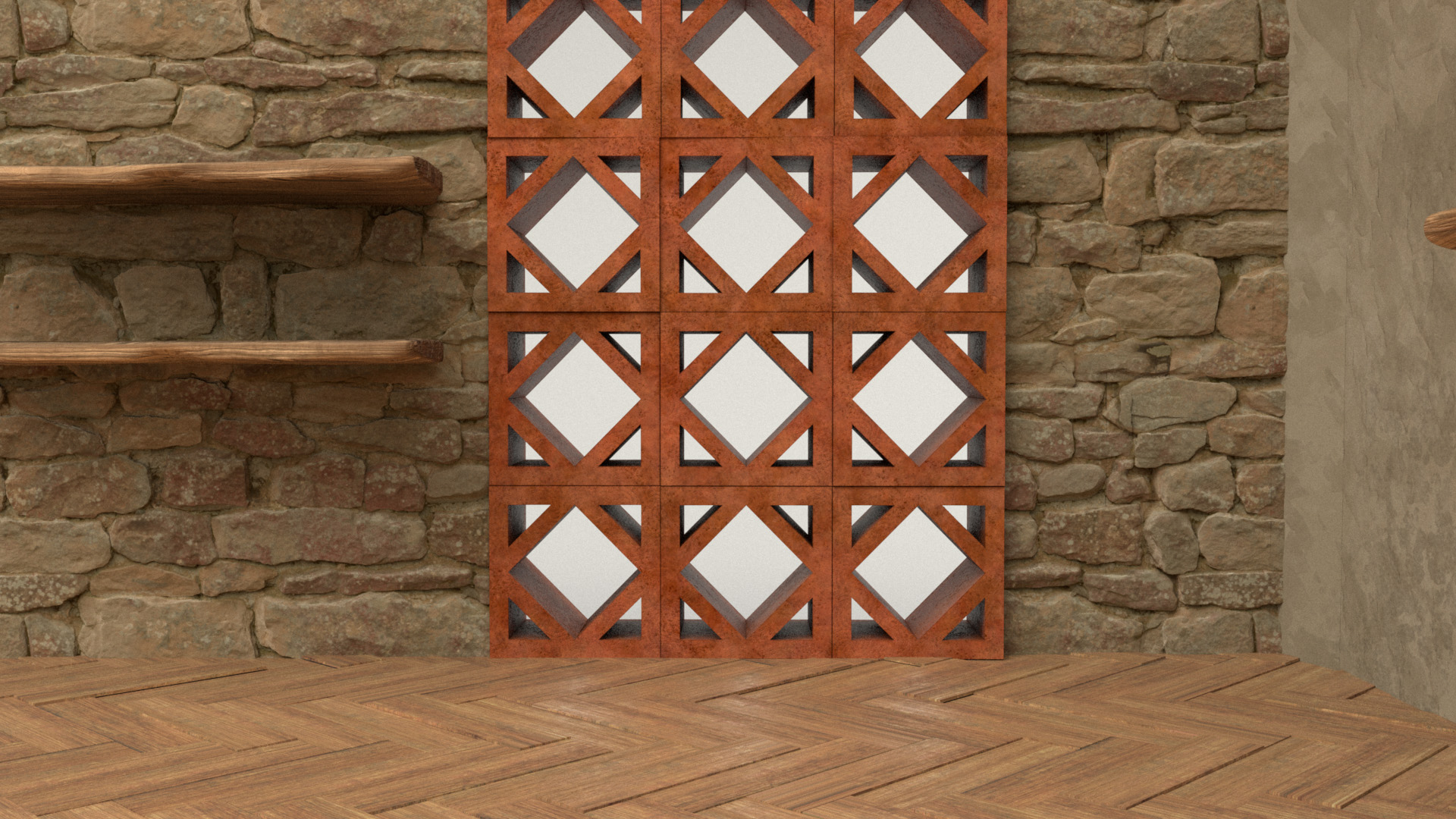
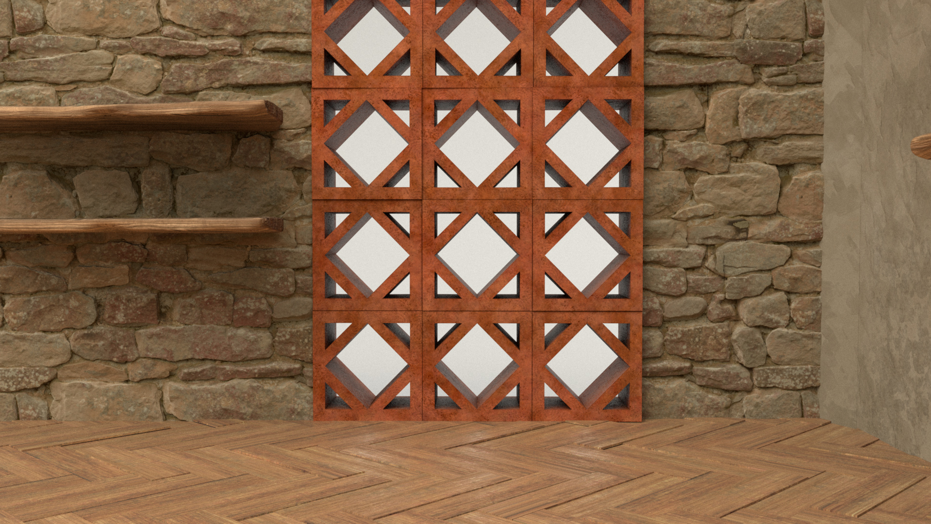
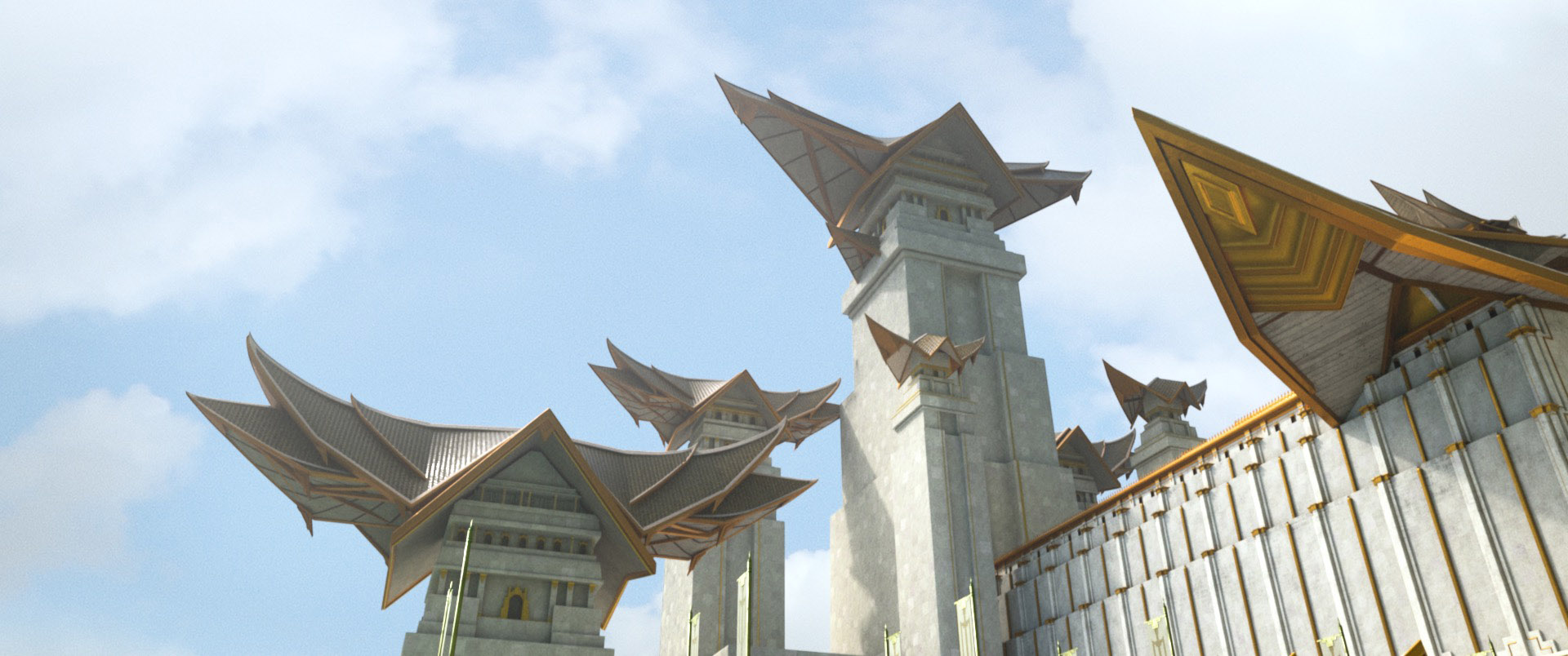
For the overall look of the room, I opted for a sort-of Mediterranean look inspired by the architecture of the tower that came with the scene (despite the fact that the tower isn’t actually in my image).
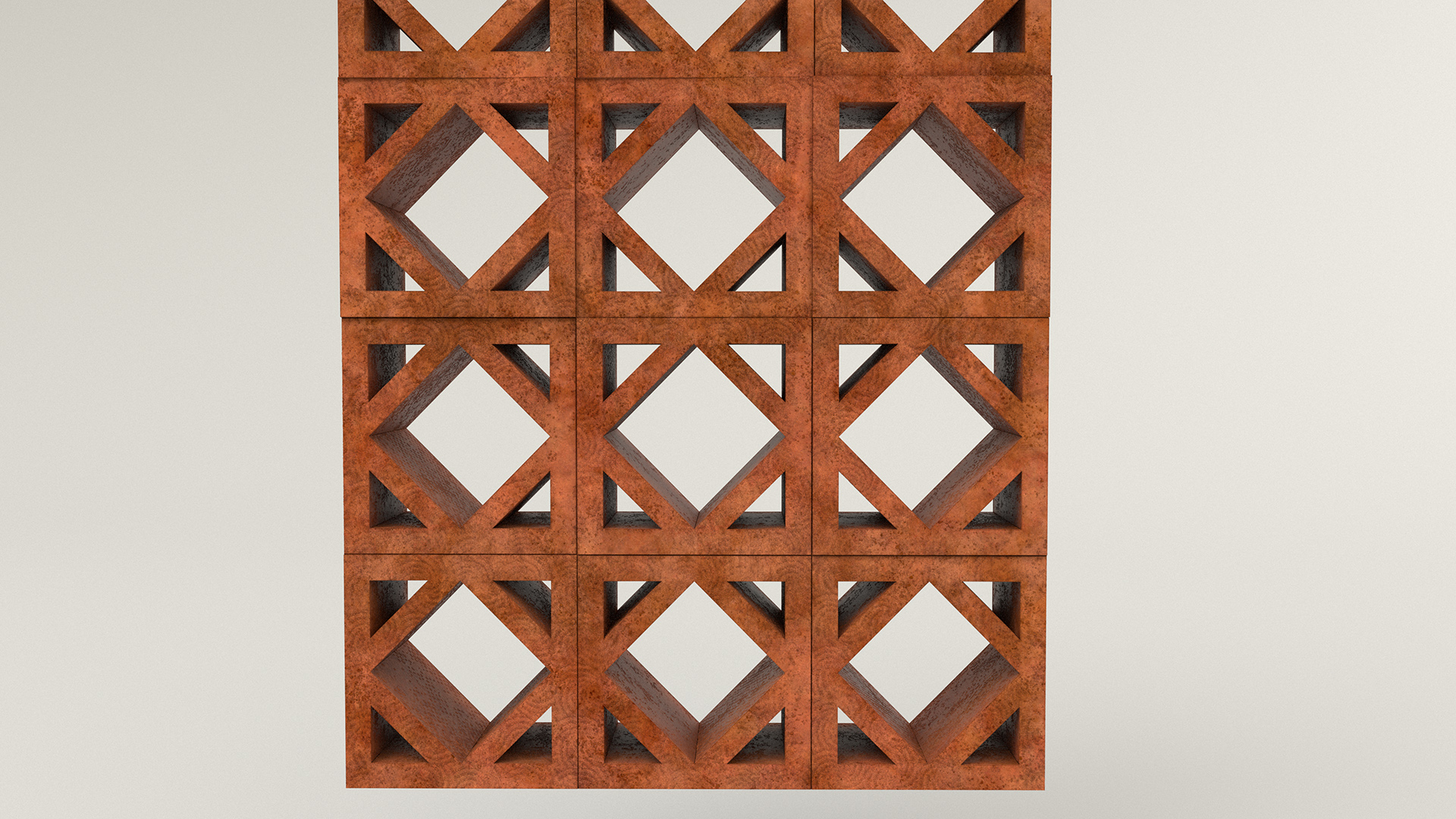
Based on the Mediterranean idea, I wanted to make the windows out of a fired terracotta brick sort of material and, after initially experimenting with brick walls, I decided to go with stone walls.
To help sell the look of a window made out of stacked fired terracotta blocks, I added a bit more unevenness to the window geometry, and I used fired orange terracotta clay flower pots as a reference for what the fired terracotta material should look like.
To help break up how flat the window geometry is and to help give the blocks a more handmade look, I added unique color unevenness per block and also added a bunch of swirly and dimply patterns to the material’s displacement:

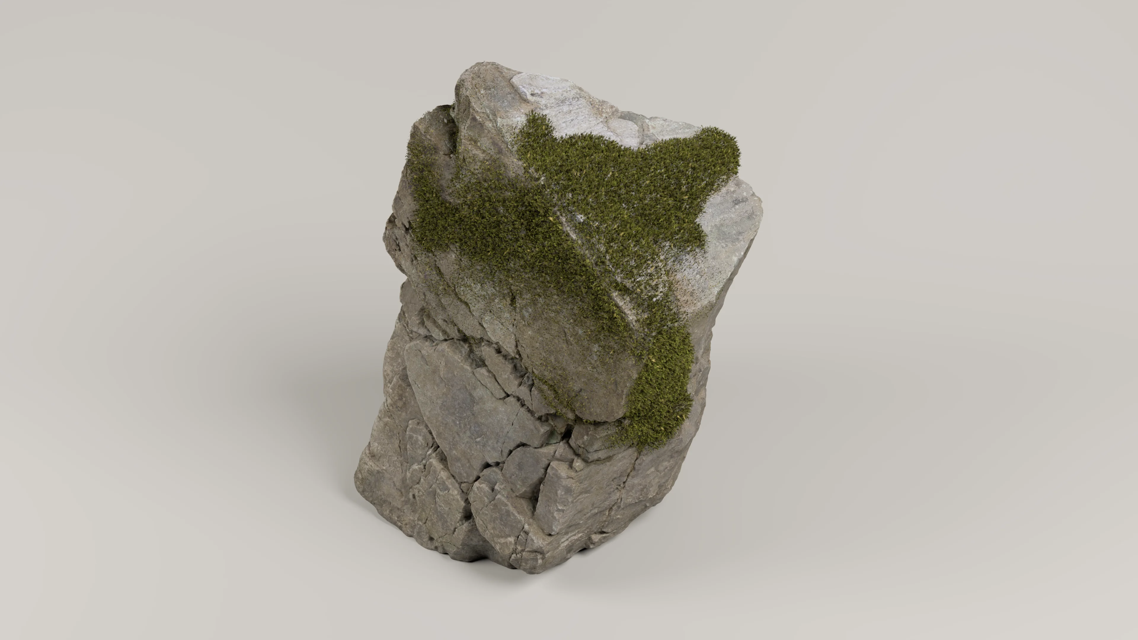
To create the stone walls, I just (heavily) modified a preexisting stone material that I got off of Substance Source; the final look relies very heavily on displacement mapping since the base geometry is basically just a flat plane.
I made only the back wall a stone wall; I decided to make the side wall on the right out of plaster instead just so I wouldn’t have to figure out how to make two stone walls meet up at a corner.
I also wound up completely replacing the stone floor with a parquet wood floor, since I wanted some warm bounce coming up from the floor onto the character.
Each plank in the parquet wood floor is a piece of individual geometry.
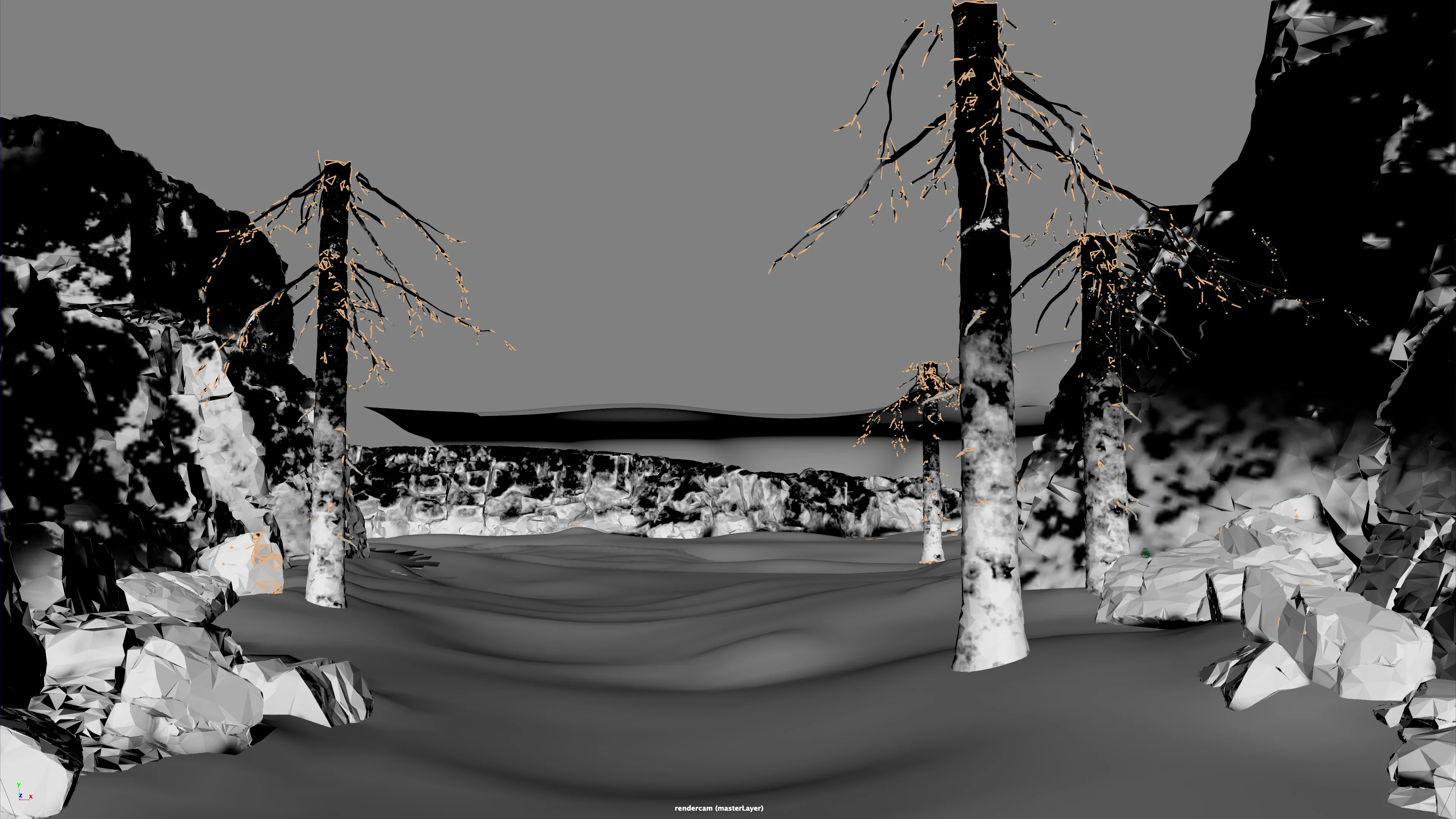
Putting it all together, here’s what the shading for the room structure looks like:
The actual materials in my final image are not nearly as diffuse looking as everything looks in the above test render; my lookdev test setup’s lighting setup is relatively diffuse/soft, which I guess didn’t really serve as a great predictor for how things looked in my actual scene since the lighting in my actual scene landed somewhere super strongly backlit.
Also, note how all of the places where different walls meet each other and where the walls meet the floor are super janky; I didn’t bother putting much effort in there since I knew that those areas were either going to be outside of the final frame or were going to be hidden behind props and furniture.
So Many Props!
With the character and room completed, all that was left to do for texturing and shading was just lots and lots of props.
This part was both the easiest and most difficult part of the entire project- easy because all of the miscellaneous props were relatively straightforward to texture and shade, but difficult simply because there were a lot of props.
However, the props were also the funnest part of the whole project!
Thinking about how to make each prop detailed and interesting and unique was an interesting exercise, and I also had fun sneaking in a lot of little easter eggs and references to things I like here and there.
My process for texturing and shading props was a very straightforward workflow that is basically completely unchanged from the workflow I settled into on the previous Shipshape RenderMan Art Challenge: use Substance Painter for texturing, UDIM tiles for high resolution textures, and PxrSurface as the shader for everything.
The only different from in previous projects was that I used a far lazier UV mapping process: almost every prop was just auto-UV’d with some minor adjustments here and there.
The reason I relied on auto-UVs this time was just because I didn’t have a whole lot of time on this project and couldn’t afford to spend the time to do precise careful high quality by-hand UVs for everything, but I figured that since all of the props would be relatively small in image space in the final frame, I could get away with hiding seams from crappy UVs by just exporting really high-resolution textures from Substance Painter.
Yes, this approach is extremely inefficient, but it worked well enough considering how little time I had.
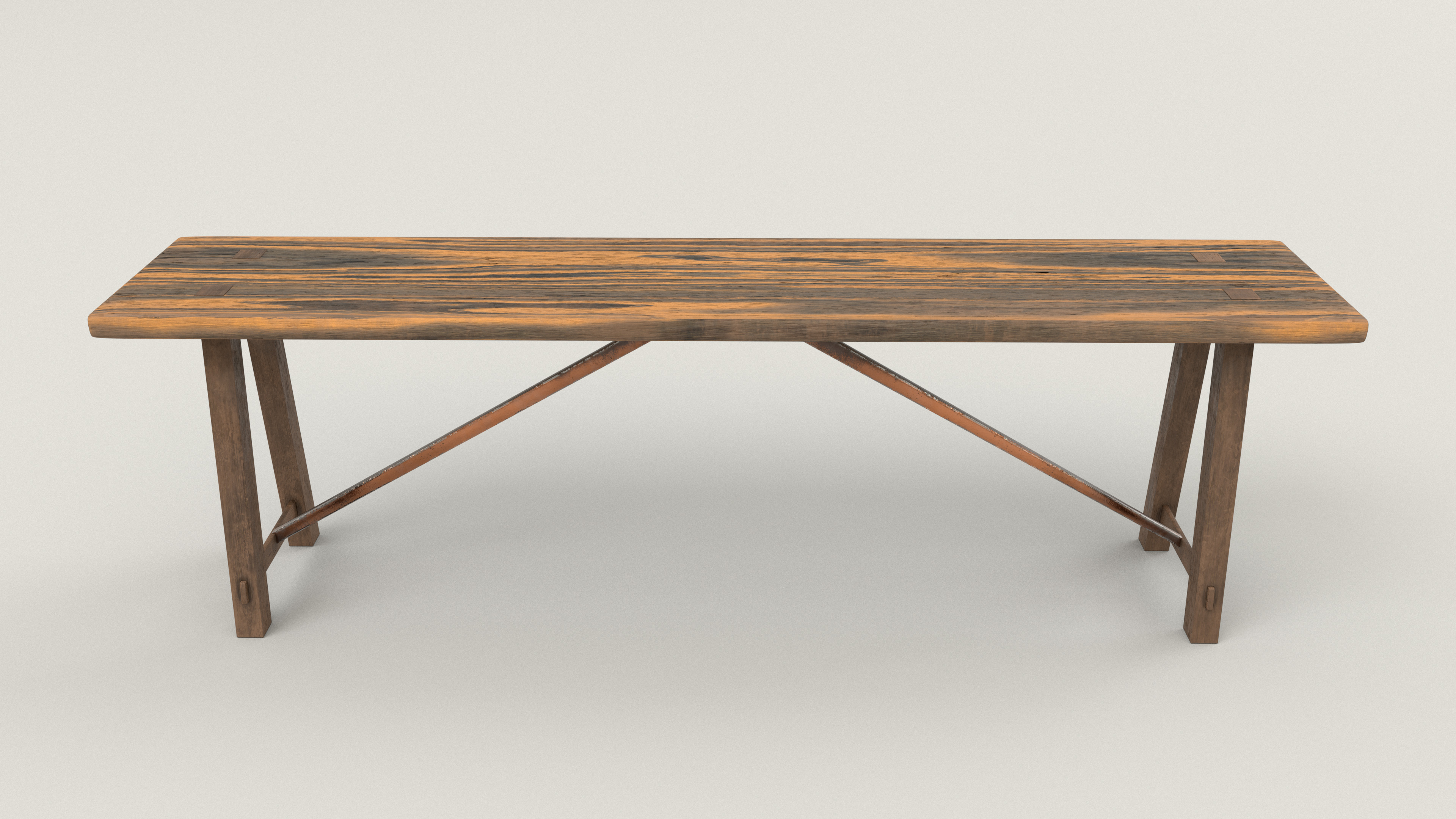
Since a lot of bounce lighting on the character’s face was going to have to come from the table, the first props I textured and shaded were the table and accompanying benches.
I tried to make the table and bench match each other; they both use a darker wood for the support legs and have metal bits in the frame, and have a lighter wood for the top.
I think I got a good amount of interesting wear and stuff on the benches on my first attempt, but getting the right amount of wear on the table’s top took a couple of iterations to get right.
Again, due to how diffuse my lookdev test setup on this project was, the detail and wear in the table’s top showed up better in my final scene than in these test renders:

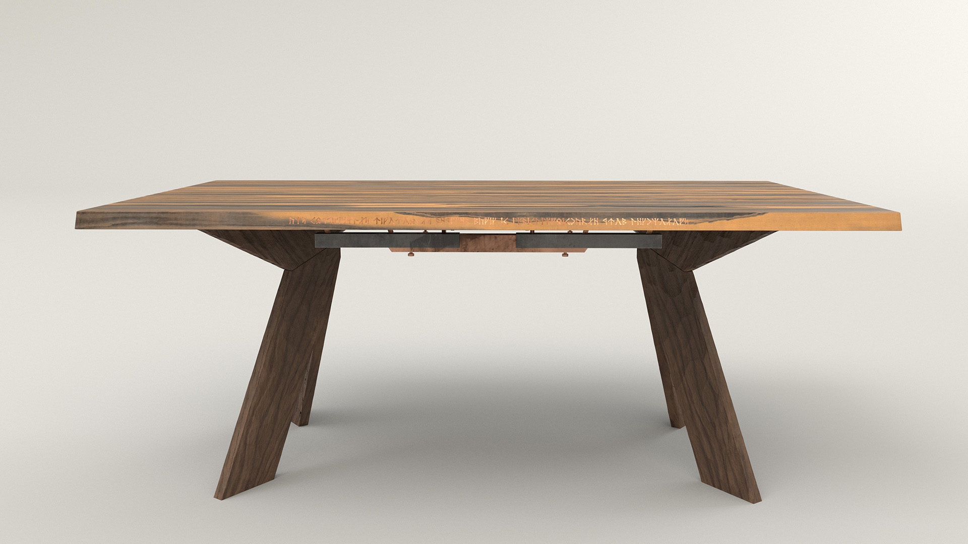
To have a bit of fun and add a slight tiny hint of mystery and magic into the scene, I put some inlaid gold runes into the side of the table.
The runes are a favorite scifi/fantasy quote of mine, which is an inversion of Clarke’s third law.
They read: “any sufficiently rigorously defined magic is indistinguishable from technology”; this quote became something of a driving theme for the props in the scene.
I wanted to give a sense that this shop is a bookshop specializing in books about magic, but the magic of this world is not arbitrary and random; instead, this world’s magic has been studied and systematized into almost another branch of science.
A lot of the props did require minor geometric modifications to make them more plausible.
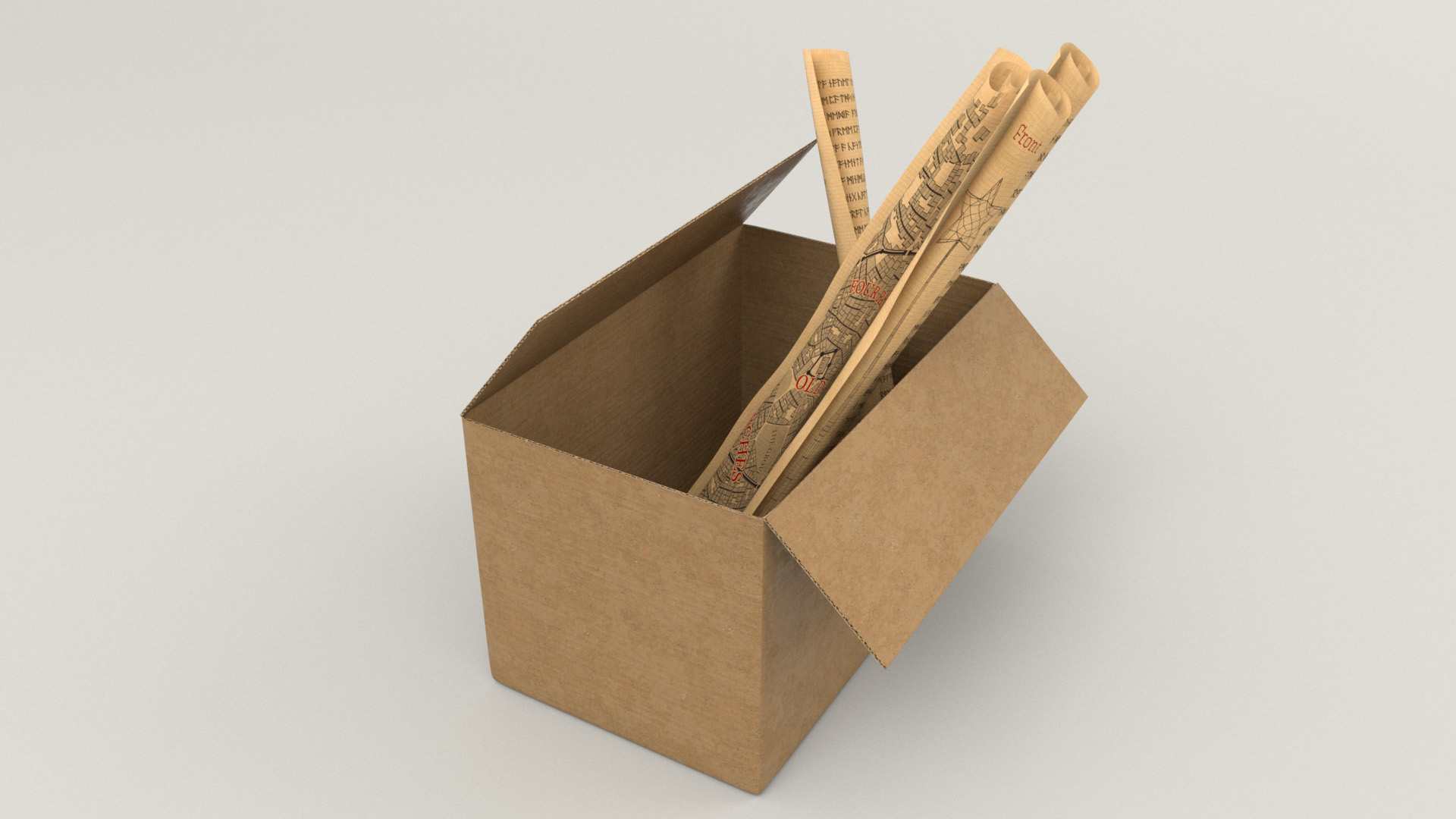
For example, the cardboard box was originally made entirely out of single-sided surfaces with zero thickness; I had to extrude the surfaces of the box in order to have enough thickness to seem convincing.
There’s not a whole lot else interesting to write about with the cardboard box; it’s just corrugated cardboard.
Although, I do have to say that I am pretty happy with how convincingly cardboard the cardboard boxes came out!
Similarly, the scrolls just use a simple paper texture and, as one would expect with paper, use some diffuse transmission as well.
Each of the scrolls has a unique design, which provided an opportunity for some fun personal easter eggs.
Two of the scrolls have some SIGGRAPH paper abstracts translated into the same runes that the inlay on the table uses.
One of the scrolls has a wireframe schematic of the wand prop that sits on the table in the final scene; my idea was that this scroll is one of the technical schematics that the character used to construct her wand.
To fit with this technical schematic idea, the two sheets of paper in the background on the right wall use the same paper texture as the scrolls and similarly have technical blueprints on them for the record player and camera props.
The last scroll in the box is a city map made using Oleg Dolya’s wonderful Medieval Fantasy City Generator tool, which is a fun little tool that does exactly what the name suggests and with which I’ve wasted more time than I’d like to admit generating and daydreaming about made up little fantasy towns.
The next prop I worked on was the mannequin, which was even more straightforward than the cardboard box and scrolls.
For the mannequin’s wooden components, I relied entirely on triplanar projections in Substance Painter oriented such that the grain of the wood would flow correctly along each part.
The wood material is just a modified version of a default Substance Painter smart material, with additional wear and dust and stuff layered on top to give everything a bit more personality:

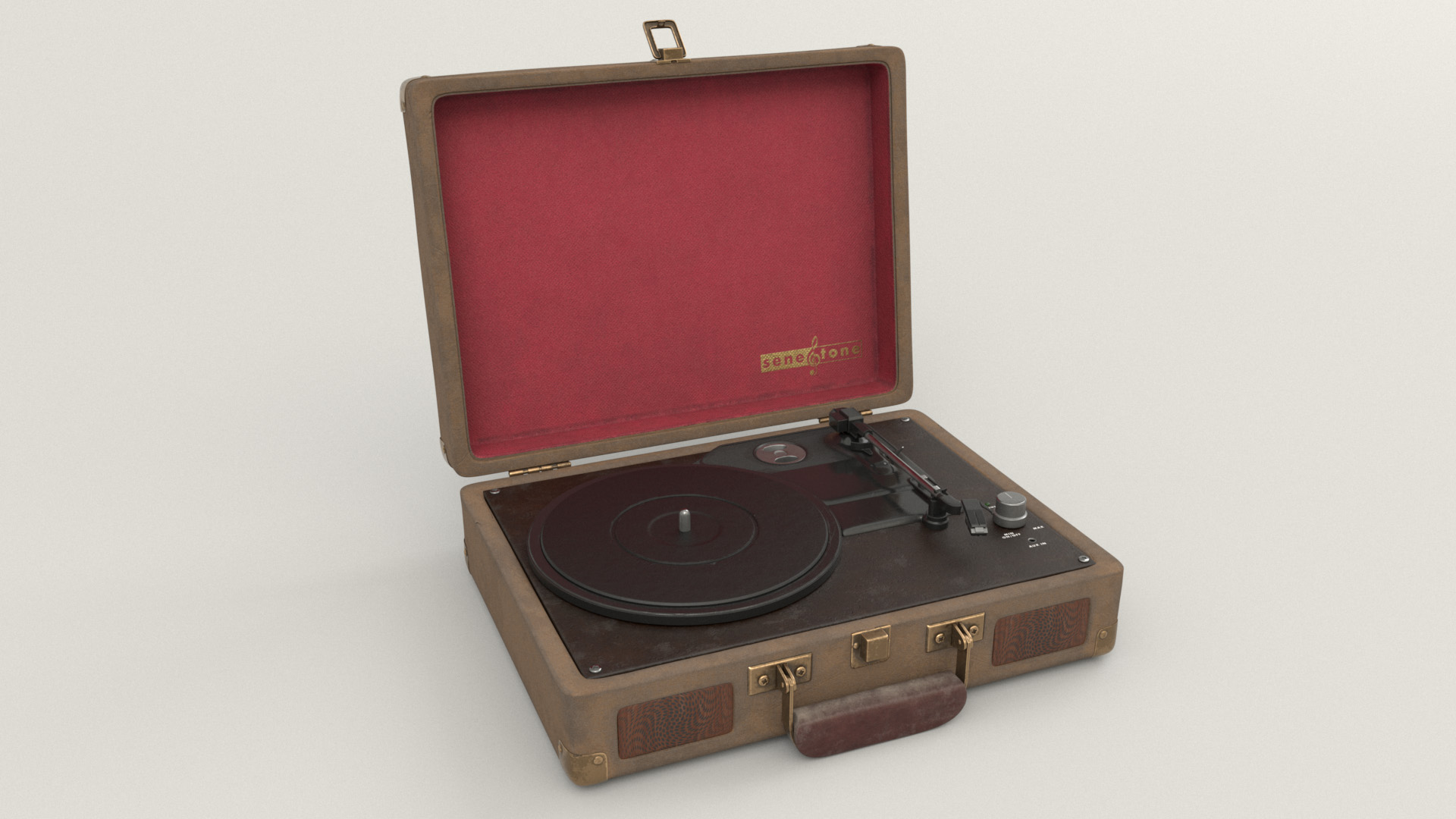
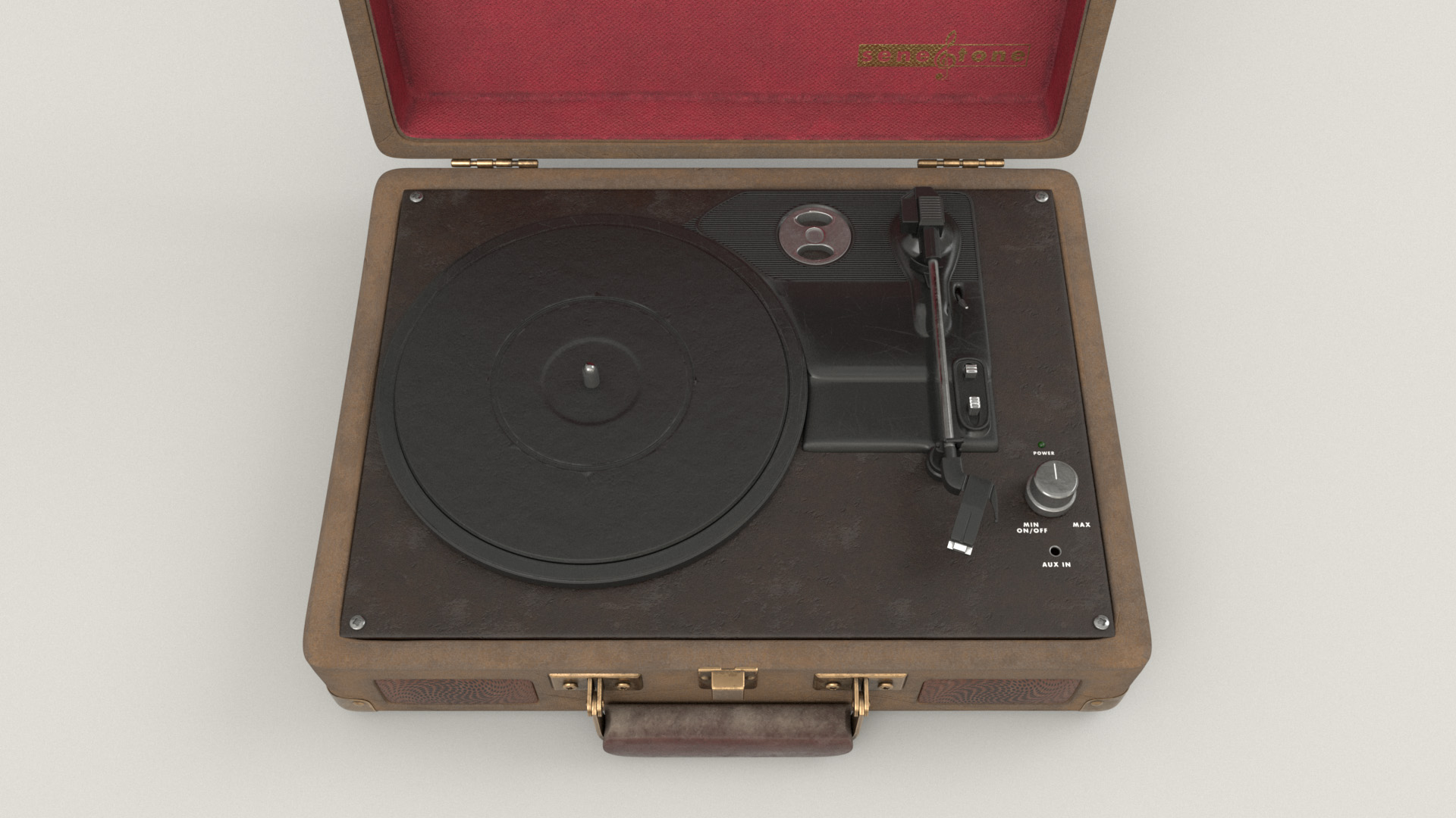
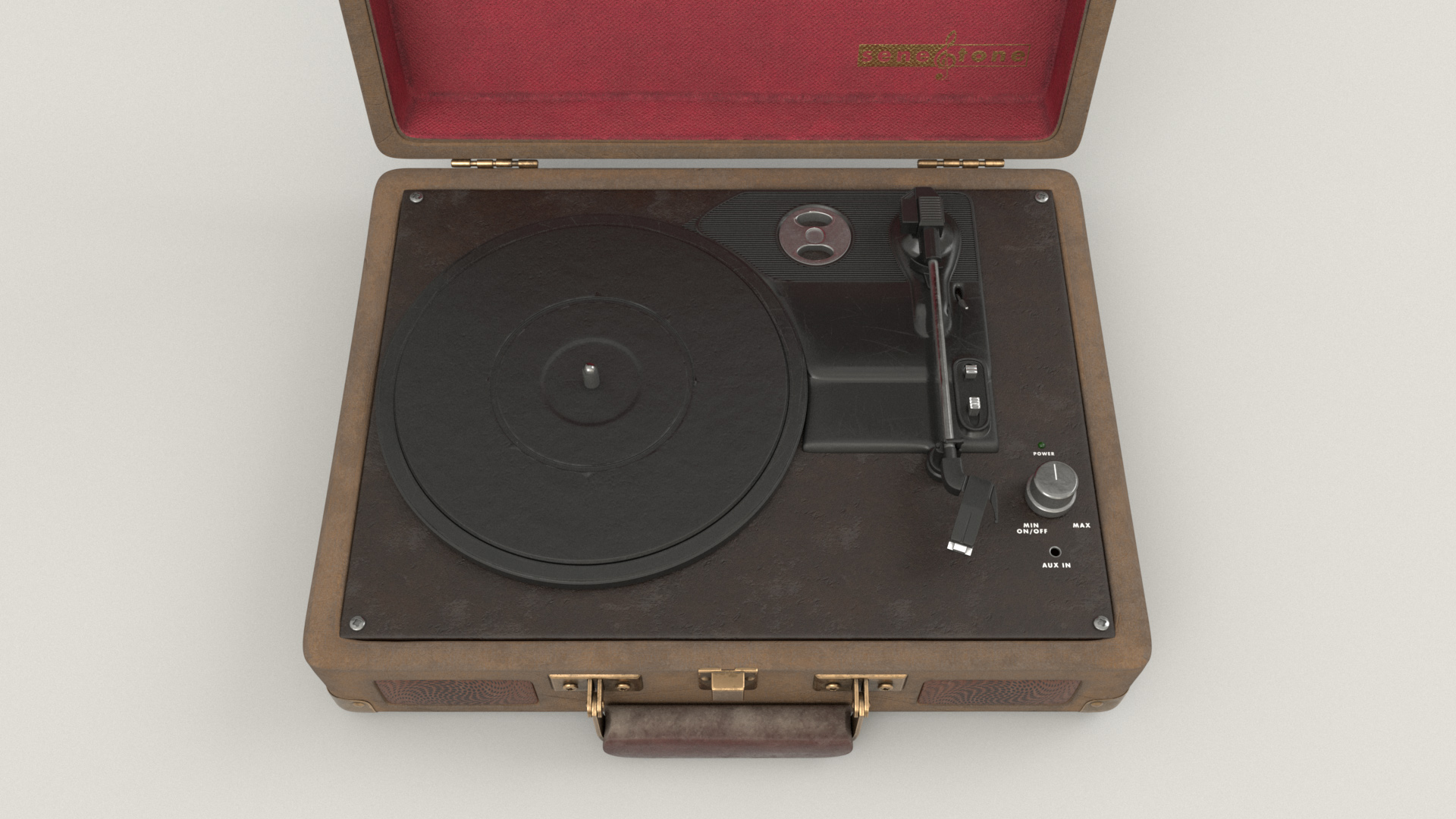
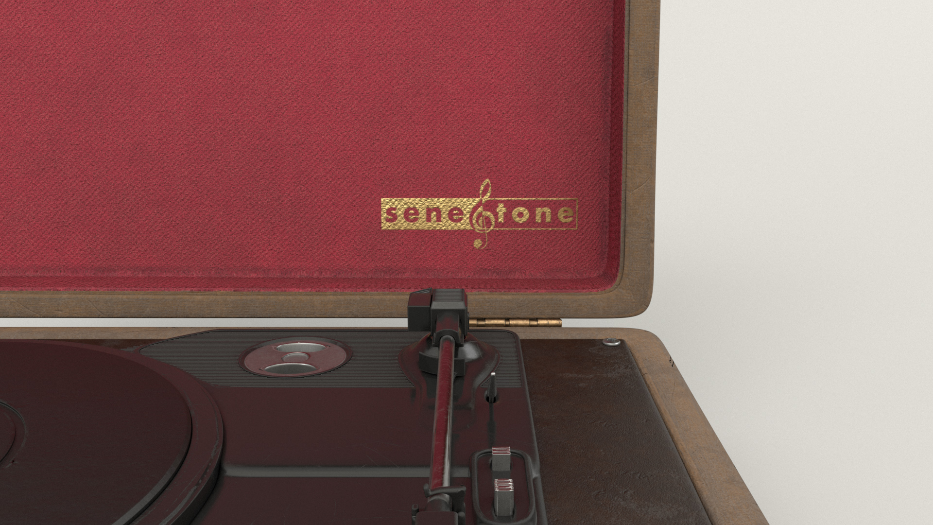
The record player was a fun prop the texture and shade, since there were a lot of components and a lot of room for adding little details and touches.
I found a bunch of reference online for briefcase record players and, based off of the reference, I chose to make the actual record player part of the briefcase out of metal, black leather, and black plastic.
The briefcase itself is made from a sort of canvas-like material stretched over a hard shell, with brass hardware for the clasps and corner reinforcements and stuff.
For the speaker openings, instead of going with a normal grid-like dot pattern, I put in an interesting swirly design.
The inside of the briefcase lid uses a red fabric, with a custom gold imprinted logo for an imaginary music company that I made up for this project: “SeneTone”.
I don’t know why, but my favorite details to do when texturing and shading props is stuff like logos and labels and stuff; I think that it’s always things like labels that you’d expect in real life that really help make something CG believable.

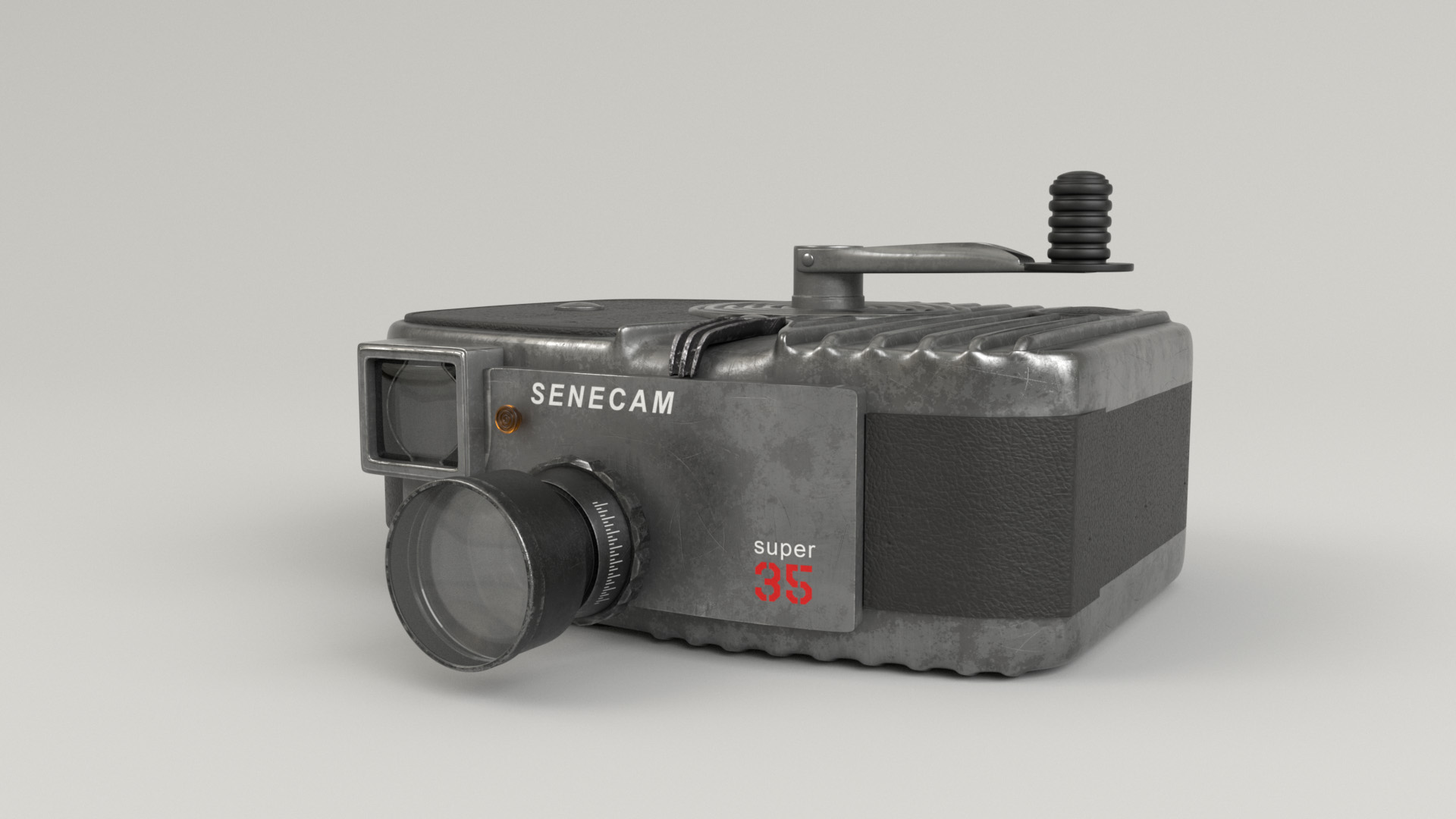
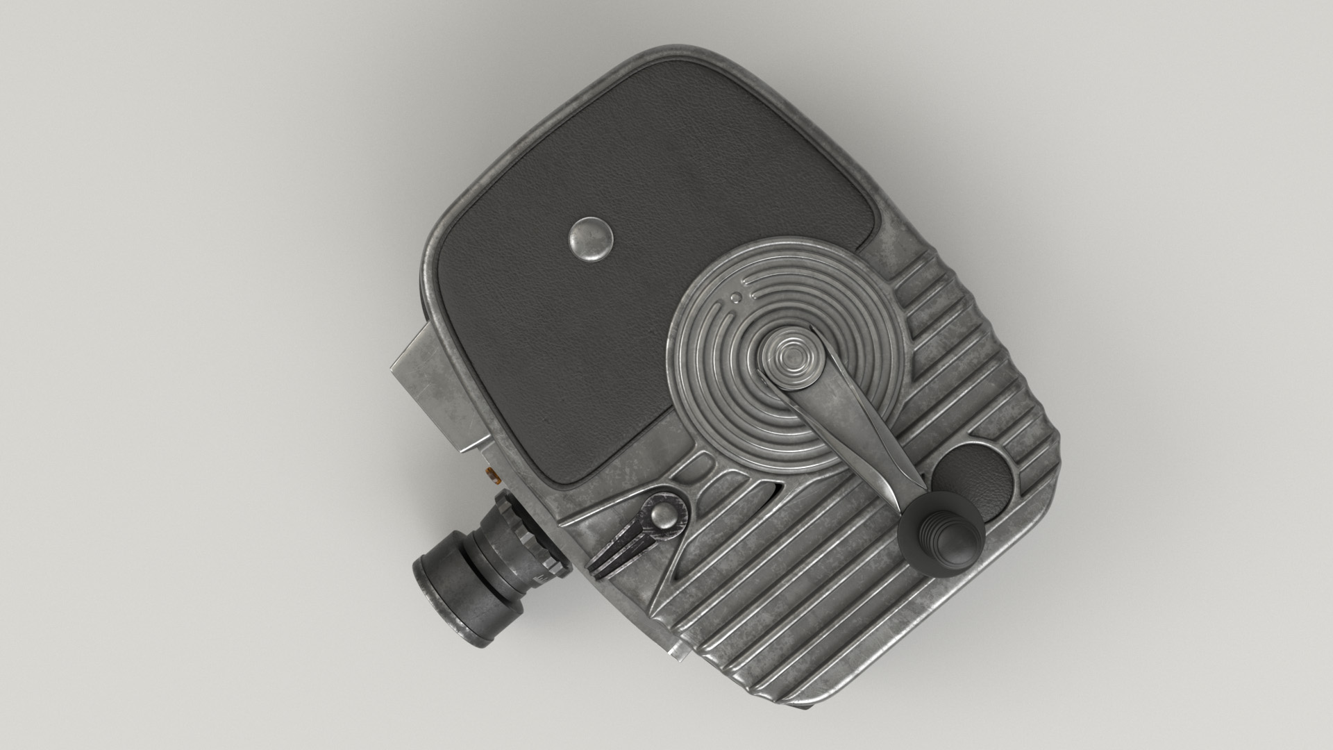
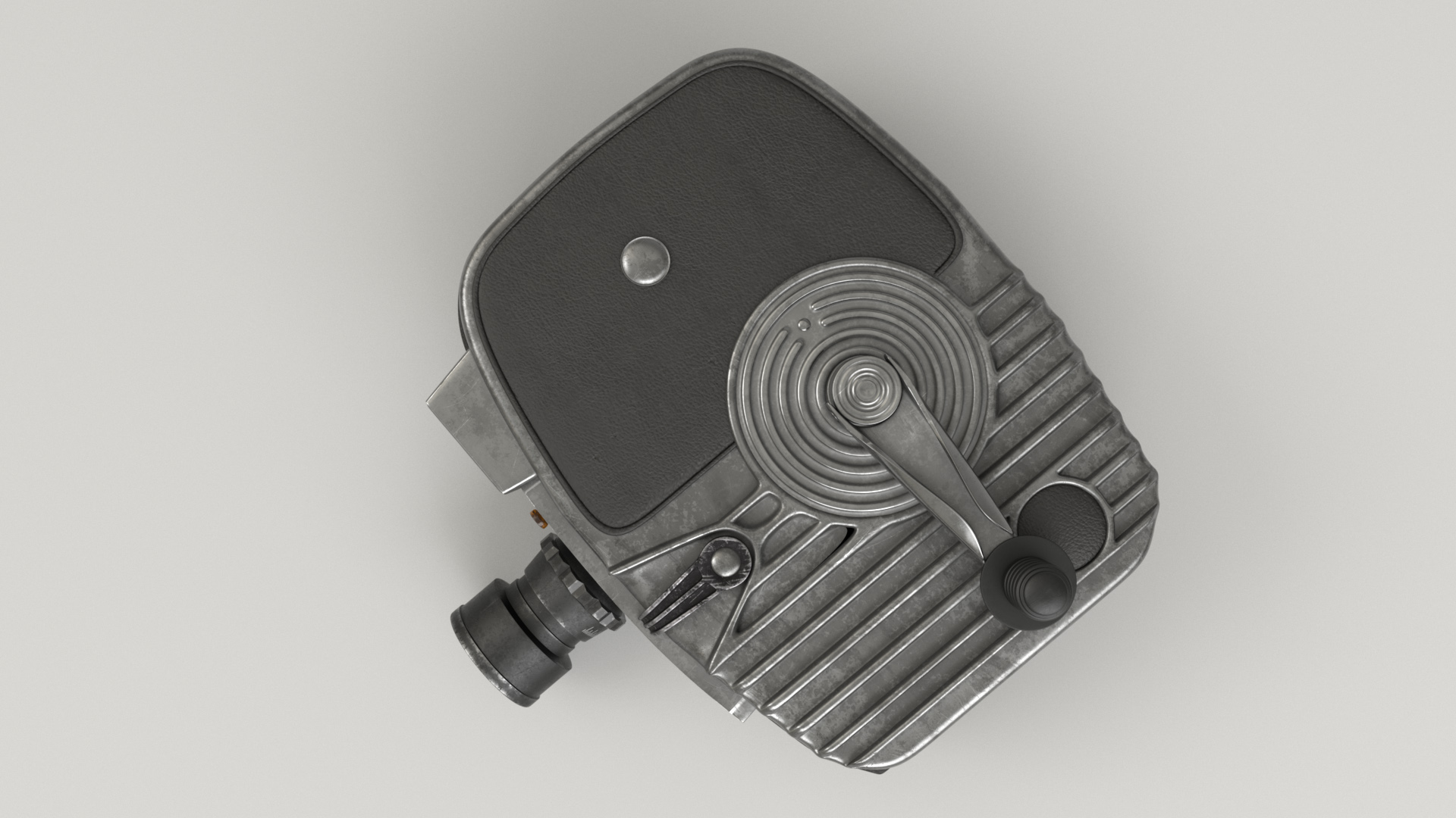
The camera prop took some time to figure out what to do with, mostly because I wasn’t actually sure whether it was a camera or a projector initially!
While this prop looks like an old hand-cranked movie camera. the size of the prop in the scene that Pixar provided threw me off; the prop is way larger than any references for hand-cranked movie cameras that I could find.
I eventually decided that the size could probably be handwaved away by explaining the camera as some sort of really large-format camera.
I decided to model the look of the camera prop after professional film equipment from roughly the 1960s, when high-end cameras and stuff were almost uniformly made out of steel or aluminum housings with black leather or plastic grips.
Modern high-end camera gear also tends to be made from metal, but in modern gear the metal is usually completely covered in plastic or colored power-coating, whereas the equipment from the 1960s I saw had a lot of exposed silvery-grey metal finishes with covering materials only in areas that a user would expect to touch or hold.
So, I decided to give the camera prop an exposed gunmetal finish, with black leather and black plastic grips.
I also reworked the lens and what I think is a rangefinder to include actual optical elements, so that they would look right when viewed from a straight-on angle.
As an homage to old film cinema, I made a little “Super 35” logo for the camera (even though the Super 35 film format is a bit anachronistic for a 1960s era camera).
The “Senecam” typemark is inspired by how camera companies often put their own typemark right across the top of the camera over the lens mount.
The crystal was really interesting to shade.
I wanted to give the internals of the crystal some structure, and I didn’t want the crystal to refract a uniform color throughout.
To get some interesting internal structure, I wound up just shoving a bunch of crumpled up quads inside of the crystal mesh.
The internal crumpled up geometry refracts a couple of different variants of blue and light blue, and the internal geometry has a small amount of emission as well to get a bit of a glowy effect.
The outer shell of the crystal refracts mostly pink and purple; this dual-color scheme gives the internals of the crystal a lot of interesting depth.
The back-story in my head was that this crystal came from a giant geode or something, so I made the bottom of the crystal have bits of a more stony surface to suggest where the crystal was once attached to the inside of a stone geode.
The displacement on the crystal is basically just a bunch of rocky displacement patterns piled on top of each other using triplanar projects in Substance Painter; I think the final look is suitably magical!
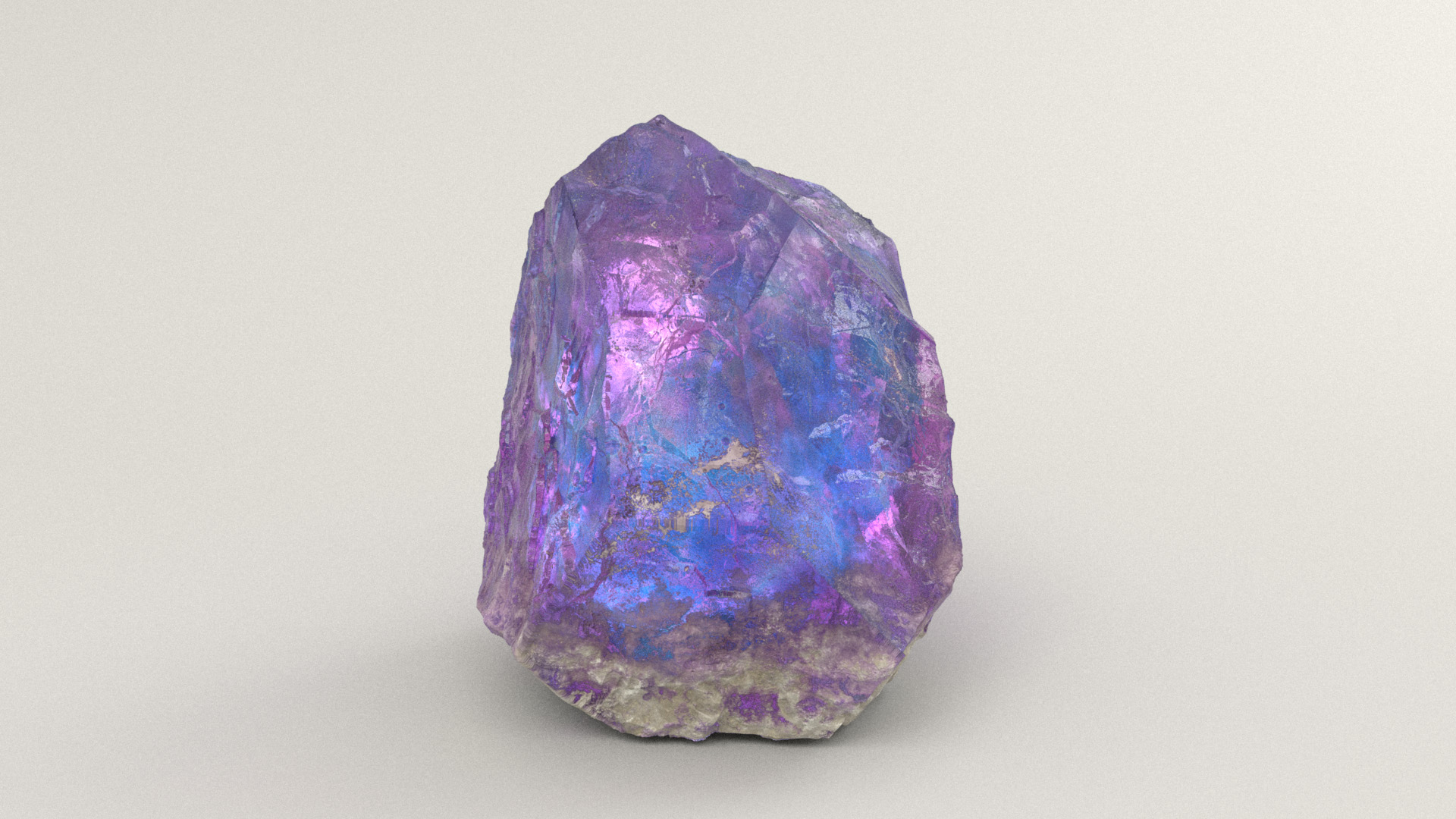
Originally the crystal was going to be on one of the back shelves, but I liked how the crystal turned out so much that I decided to promote it to a foreground prop and put it on the foreground table.
I then filled the crystal’s original location on the back shelf with a pile of books.
I liked the crystal look so much that I decided to make the star on the magic wand out of the same crystal material.
The story I came up with in my head is that in this world, magic requires these crystals as a sort of focusing or transmitting element.
The magic wand’s star is shaded using the same technique as the crystal: the inside has a bunch of crumpled up refractive geometry to produce all of the interesting color variation and appearance of internal fractures and cracks, and the outer surface’s displacement is just a bunch of rocky patterns randomly stacked on top of each other.

The flower-shaped lamps hanging above the table are also made from the same crystal material, albeit a much more simplified version.
The lamps are polished completely smooth and don’t have all of the crumpled up internal geometry since I wanted the lamps to be crack-free.
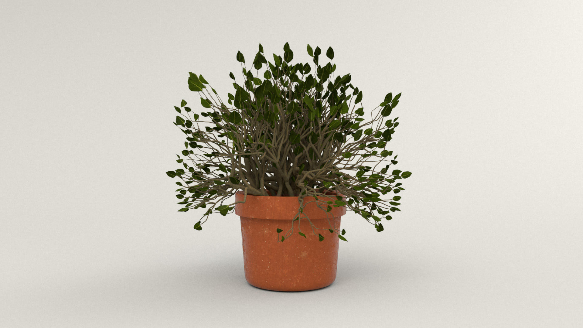
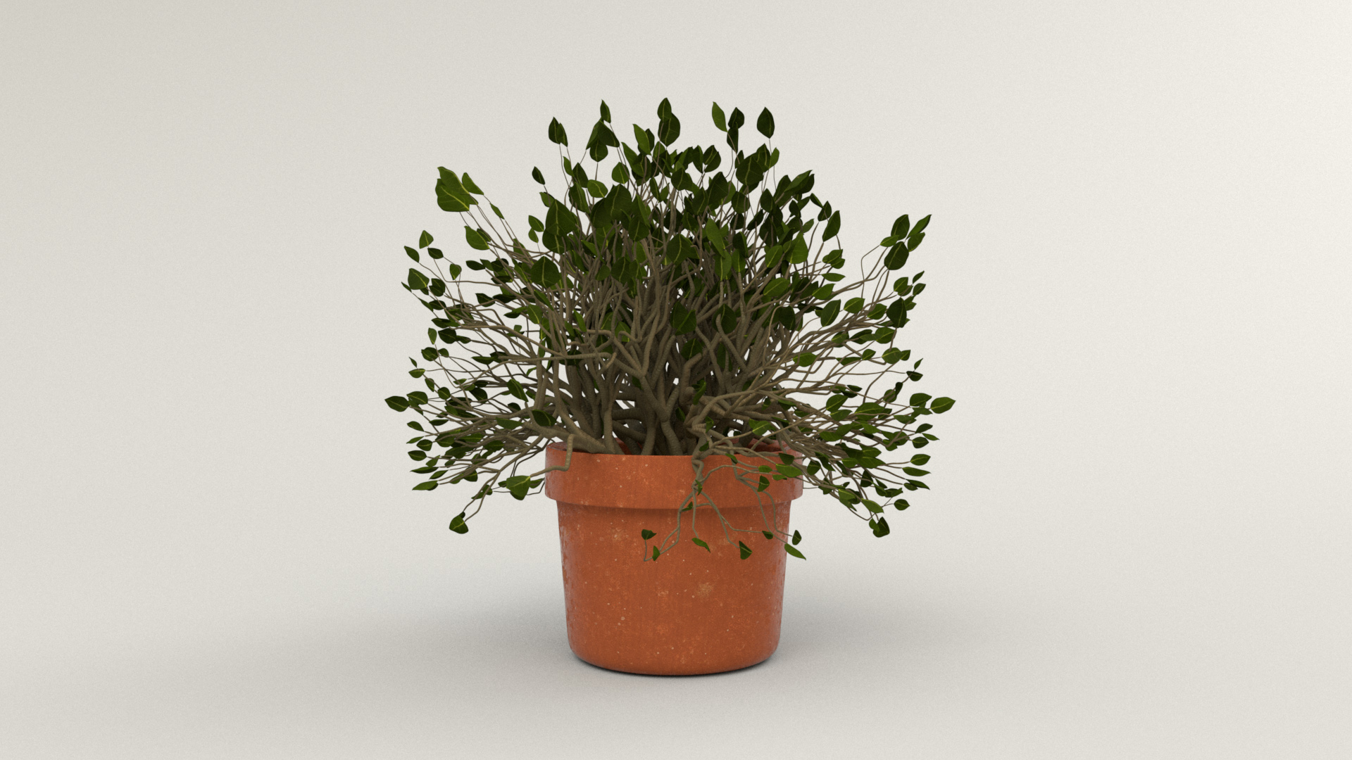
The potted plant on top of the stack of record crates was probably one of the easiest props to texture and shade.
The pot itself uses the same orange fired terracotta material as the main windows, but with displacement removed and with a bit less roughness.
The leaves and bark on the branches are straight from Quixel Megascans.
The displacement for the branches is actually slightly broken in both the test render below and in the final render, but since it’s a background prop and relatively far from the camera, I actually didn’t really notice until I was writing this post.
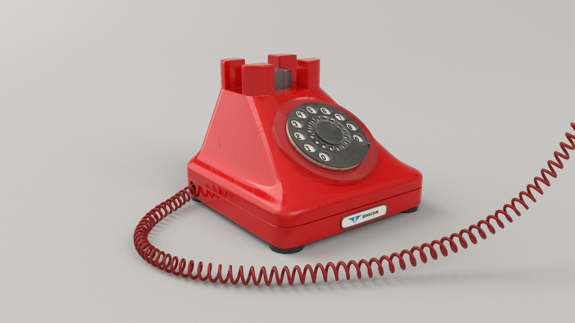
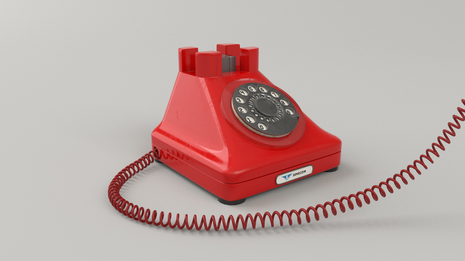
The reason that the character in my scene is talking on an old-school rotary dial phone is… actually, there isn’t a strong reason.
I originally was tinkering with a completely different idea on that did have a strong story reason for the phone, but I abandoned that idea very early on.
Somehow the phone always stayed in my scene though!
Since the setting of my final scene is a magic bookshop, I figured that maybe the character is working at the shop and maybe she’s casting a spell over the phone!
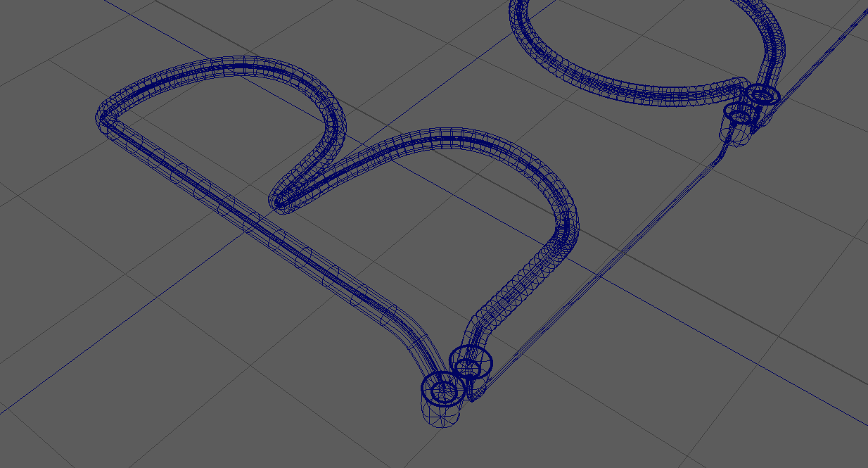
The phone itself is kit-bashed together from a stock model that I had in my stock model library.
I did have to create the cord from scratch, since the cord needed to stretch from the main phone set to the receiver in the character’s hand.
I modeled the cord in Maya by first creating a guide curve that described the path the cord was supposed to follow, and then making a helix and making it follow the guide curve using Animate -> Motion Paths -> Flow Path Object tool.
The Flow Path Object tool puts a lattice deformer around the helix and makes the lattice deformer follow the guide curve, which in turn deforms the helix to follow as well.
As with everything else in the scene, all of the shading and texturing for the phone is my own.
The phone is made from a simple red Bakelite plastic with some scuffs and scratches and fingerprints to make it look well used, while the dial and hook switch are made of a simple metal material.
I noticed that in some of the references images of old rotary phones that I found, the phones sometimes had a nameplate on them somewhere with the name of the phone company that provided the phone, so I made up yet another fictional logo and stuck it on the front of the phone.
The fictional phone company is “Senecom”; all of the little references to a place called Seneca hint that maybe this image is set in the same world as my entry for the previous RenderMan Art Challenge.
In the final image, you can’t actually see the Senecom logo though, but again at least I know it’s there!

Signs and Records and Books
While I was looking up reference for bookstores with shading books in mind, I came across an image of a sign reading “Books are Magic” from a bookstore in Brooklyn with that name.
Seeing that sign provided a good boost of inspiration for how I proceeded with theming my bookstore set, and I liked the sign so much that I decided to make a bit of an homage to it in my scene.
I wasn’t entirely sure how to make a neon sign though, so I had to do some experimentation.
I started by laying out curves in Adobe Illustrator and bringing them into Maya.
I then made each glass tube by just extruding a cylinder along each curve, and then I extruded a narrower cylinder along the same curve for the glowy part inside of the glass tube.
Each glass tube has a glass shader with colored refraction and uses the thin glass option, since real neon glass tubes are hollow.
The glowy part inside is a mesh light.
To make the renders converge more quickly, I actually duplicated each mesh light; one mesh light is white, is visible to camera, and has thin shadows disabled to provide to look of the glowy neon core, and the second mesh light is red, invisible to camera, and has thin shadows enabled to allow for casting colored glow outside of the glass tubes without introducing tons of noise.
Inside of Maya, this setup looks like the following:
After all of this setup work, I gave the neon tubes a test render, and to my enormous surprise and relief, it looks promising!
This was the first test render of the neon tubes; when I saw this, I knew that the neon sign was going to work out after all:

After getting the actual neon tubes part of the neon sign working, I added in a supporting frame and wires and stuff.
In the final scene, the neon sign is held onto the back wall using screws (which I actually modeled as well, even though as usual for all of the tiny things that I put way too much effort into, you can’t really see them).
Here is the neon sign on its frame:

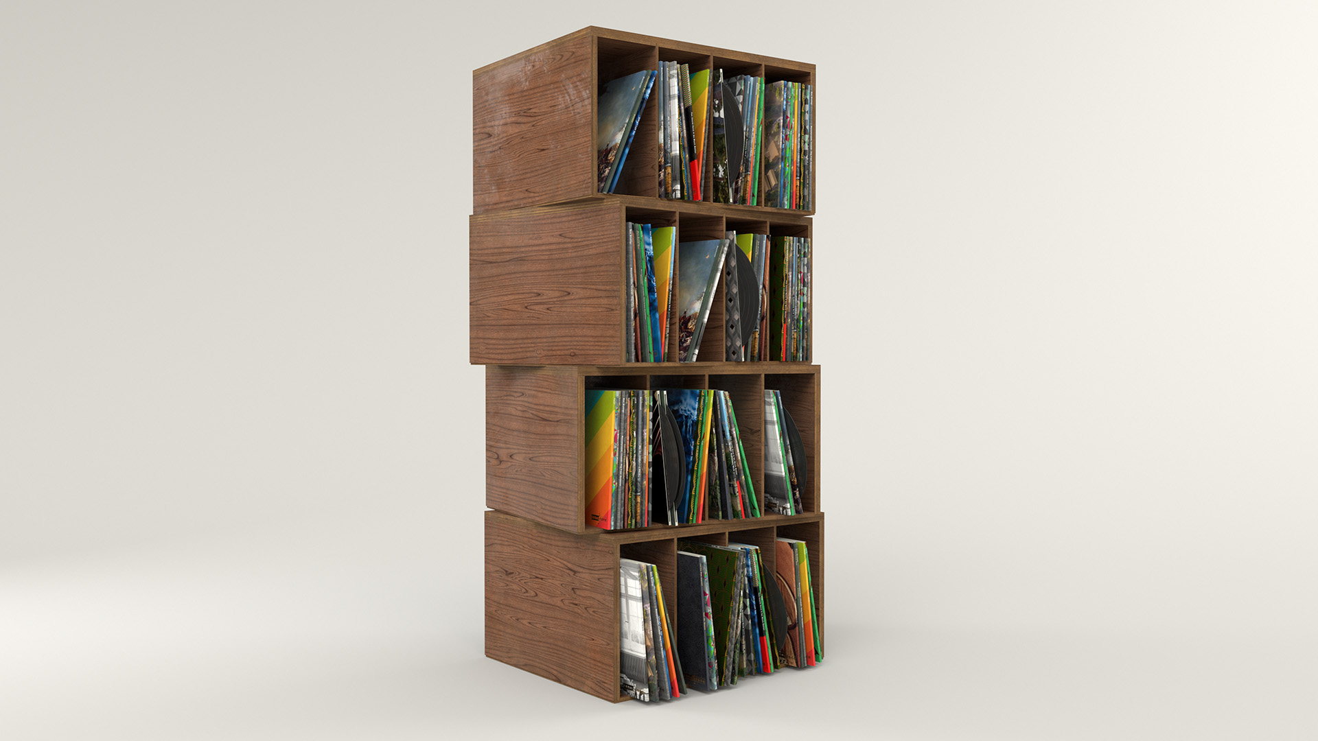
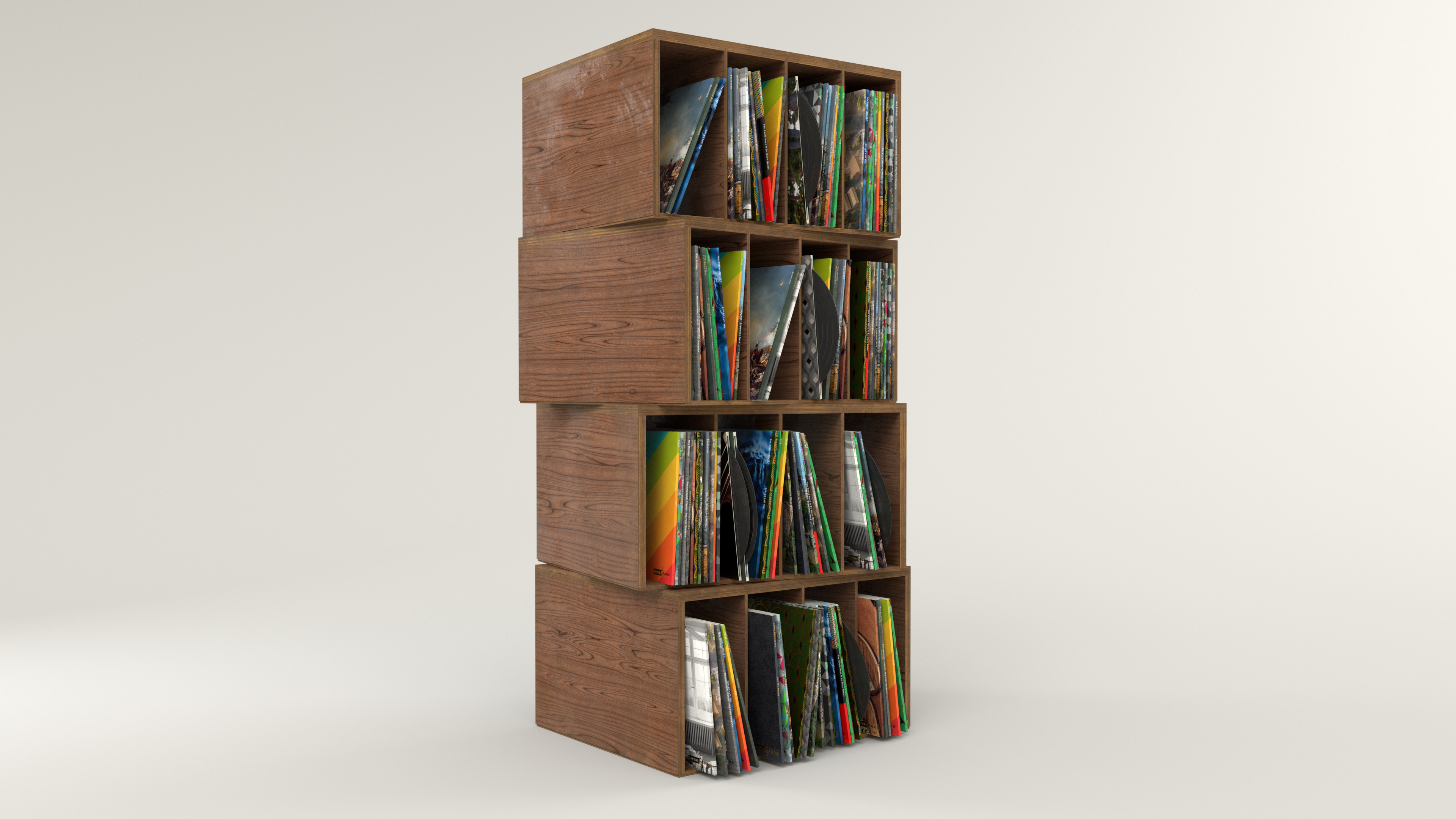
The single most time consuming prop in the entire project wound up being the stack of record crates behind the character to the right; I don’t know why I decided to make a stack of record crates, considering how many unique records I wound up having to make to give the whole thing a plausible feel.
In the end I made around twenty different custom album covers; the titles are borrowed from stuff I had recently listened to at the time, but all of the artwork is completely custom to avoid any possible copyright problems with using real album artwork.
The sharp-eyed long-time blog reader may notice that a lot of the album covers reuse renders that I’ve previously posted on this blog before!
For the record crates themselves, I chose a layered laminated wood, which I figured in real life is a sturdy but relatively inexpensive material.
Or course, instead of making all of the crates identical duplicates of each other, I gave each crate a unique wood grain pattern.
The vinyl records that are sticking out here and there have a simple black glossy plastic material with bump mapping for the grooves; I was pleasantly surprised at how well the grooves catch light given that they’re entirely done through bump mapping.
Coming up with all of the different album covers was pretty fun!
Different covers have different neat design elements; some have metallic gold leaf text, others have embossed designs, there are a bunch of different paper varieties, etc.
The common design element tying all of the album covers together is that they all have a “SeneTone” logo on them, to go with the “SeneTone” record player prop.
To create the album covers, I created the designs in Photoshop with separate masks for different elements like metallic text and whatnot, and then used the masks to drive different layers in Substance Painter.
In Substance Painter, I actually created different paper finishes for different albums; some have a matte paper finish, some have a high gloss magazine-like finish, some have rough cloth-like textured finishes, some have smooth finishes, and more.
I guess none of this really matters from a distance, but it was fun to make, and more importantly to myself, I know that all of those details are there!
After randomizing which records get which album covers, here’s what the record crates look like:
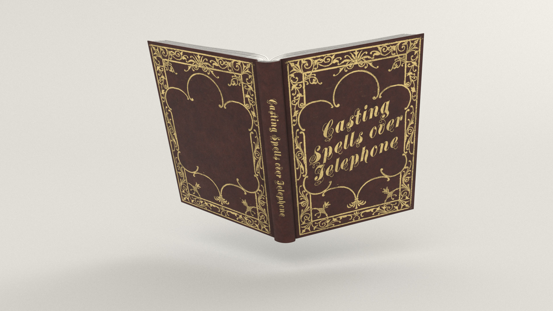
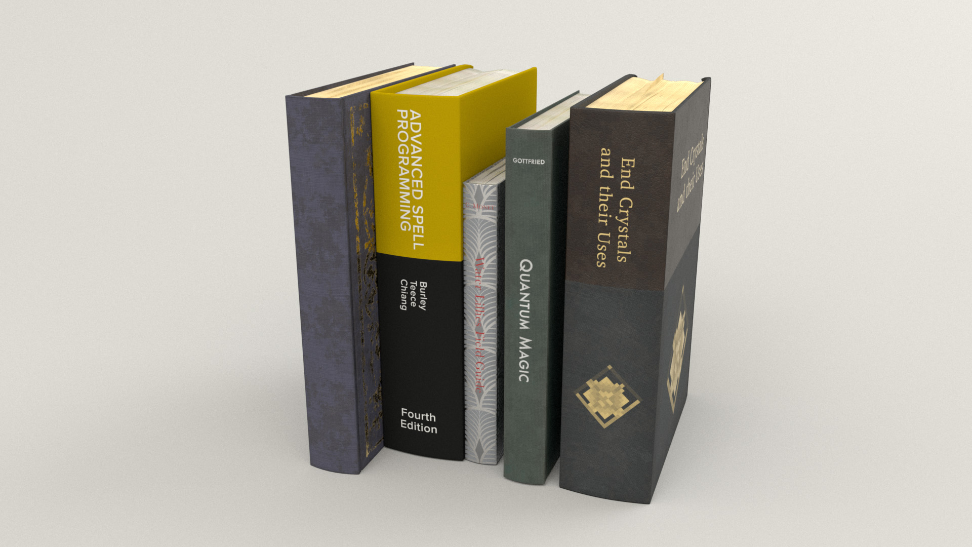
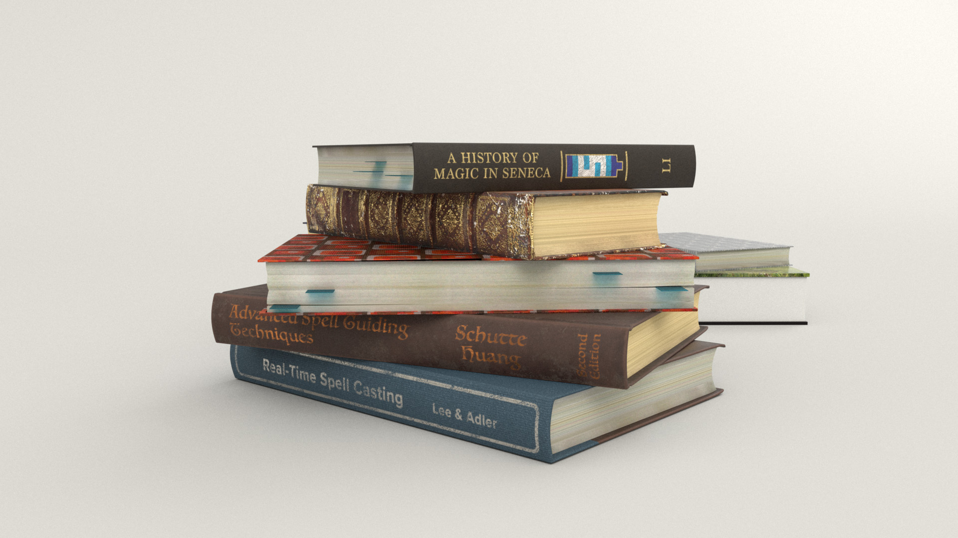
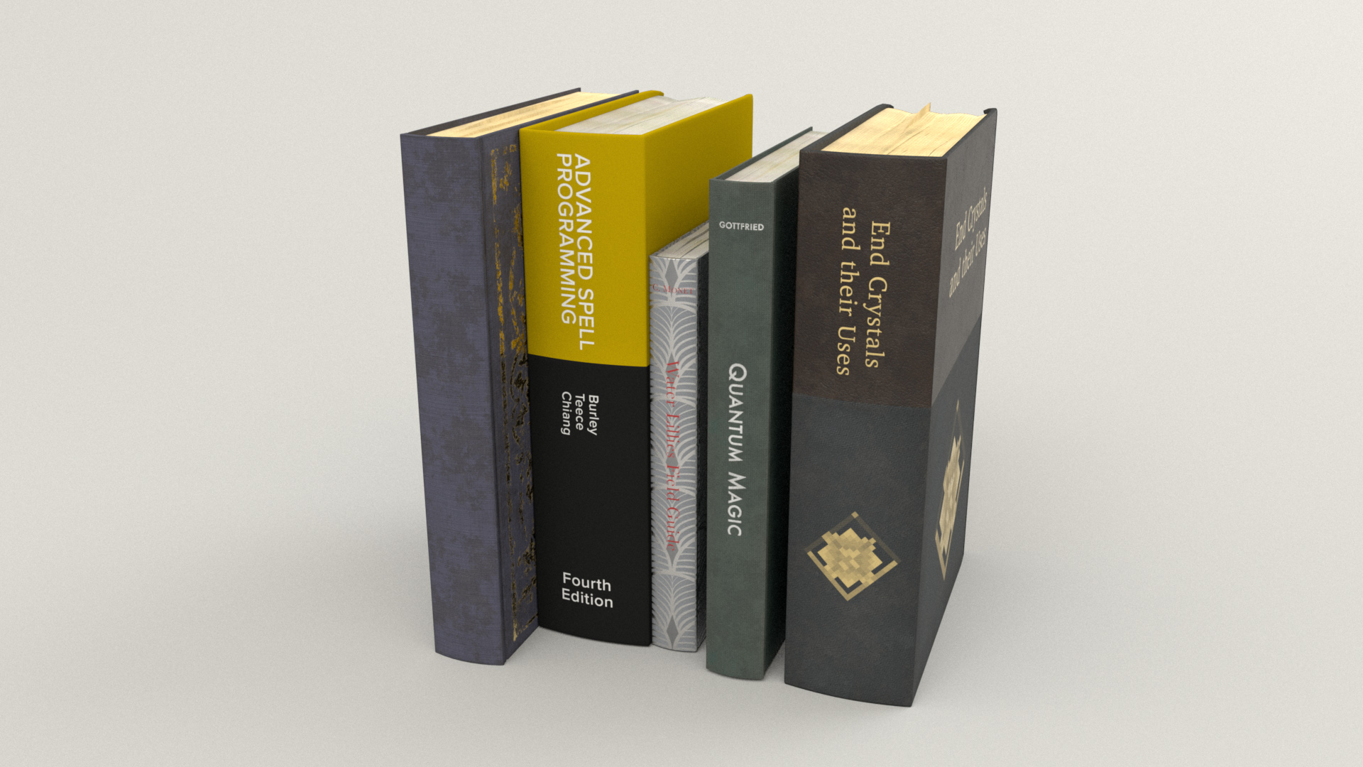
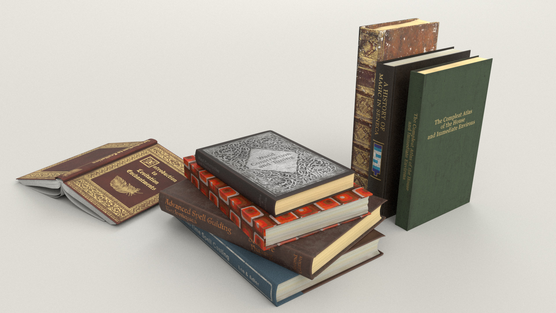
The various piles of books sitting around the scene also took a ton of time, for similar reasons to why the records took so much time: I wanted each book to be unique.
Much like the records, I don’t know why I chose to have so many books, because it sure took a long time to make around twenty different unique books!
My idea was to have a whole bunch of the books scattered around suggesting that the main character has been teaching herself how to build a magic wand and cast spells and such- quite literally “books are magic” because the books are textbooks for various magical topics
Here is one of the textbooks- this one about casting spells over the telephone, since the character is on the phone.
Maybe she’s trying to charm whoever is on the other end!
I wound up significantly modifying the provided book model; I created several different basic book variants and also a few open book variants, for which I had to also model some pages and stuff.
Because of how visible the books are in my framing, I didn’t want to have any obvious repeats in the books, so I textured every single one of them to be unique.
I also added in some little sticky-note bookmarks into the books, to make it look like they’re being actively read and referenced.
Creating all of the different books with completely different cover materials and bindings and page styles was a lot of fun!
Some of the most interesting covers to create were the ones with intricate gold or silver foil designs on the front; for many of these, I found pictures of really old books and did a bunch of Photoshop work to extract and clean up the cover design for use as a layer mask in Substance Painter.
Here are some of the books I made:


One fun part of making all of these books was that they were a great opportunity for sneaking in a bunch of personal easter eggs.
Many of the book titles are references to computer graphics and rendering concepts.
Some of the book authors are just completely made up or pulled from whatever book caught my eye off of my bookshelf at the moment, but also included among the authors are all of the names of the Hyperion team’s current members at the time that I did this project.
There is also, of course, a book about Seneca, and there’s a book referencing Minecraft.
The green book titled “The Compleat Atlas of the House and Immediate Environs” is a reference to Garth Nix’s “Keys to the Kingdom” series, which my brother and I loved when we were growing up and had a significant influence on how the type of kind-of-a-science magic I like in fantasy settings.
Also, of course, as is obligatory since I am a rendering engineer, there is a copy of Physically Based Rendering 3rd Edition hidden somewhere in the final scene; see if you can spot it!
Putting Everything Together
At this point, with all extra modeling completed and everything textured and shaded, the time came for final touches and lighting!
Since one of the books I made is about levitation enchantments, I decided to use that to justify making one of the books float in mid-air in front of the character.
To help sell that floating-in-air enchantment, I made some magical glowy pixie dust particles coming from the wand; the pixie dust is just some basic nParticles following a curve.
The pixie dust is shaded using PxrSurface’s glow parameter.
I used the particleId primvar to drive a PxrVary node, which in turn is used to randomize the pixie dust colors and opacity.
Putting everything together at this point looked like this:

I originally wanted to add some cobwebs in the corners of the room and stuff, but at this point I had so little time remaining that I had to move on directly to final shot lighting.
I did however have time for two small last-minute tweaks: I adjusted the character’s pose a slight amount to tilt her head towards the phone more, which is closer to how people actually talk on the phone, and I also moved up the overhead lamps a bit to try not to crowd out her head.
The final shot lighting is not actually that far of a departure from the lighting I had already roughed in at this point; mostly the final lighting just consisted of tweaks and adjustments here and there.
I added a bunch of PxrRodFilters to take down hot spots and help shape the lighting overall a bit more.
The rods I added were to bright down the overhead lamps and prevent the lamps from blowing out, to slightly brighten up some background shelf books, to knock down a hot spot on a foreground book, and to knock down hot spots on the floor and on the bench.
I also brought down the brightness of the neon sign a bit, since the brightness of the sign should be lower relative to how incredibly bright the windows were.
Here is what my Maya viewport looked like with all of the rods; everything green in this screenshot is a rod:
One of the biggest/trickiest changes I made to the lighting setup was actually for technical reasons instead of artistic reasons: the back window was originally so bright that the brightness was starting to break pixel filtering for any pixel that partially overlapped the back window.
To solve this problem, I split the dome light outside of the window into two dome lights; the two new lights added up to the same intensity as the old one, but the two lights split the energy such that one light had 85% of the energy and was not visible to camera while the other light had 15% of the energy and was visible to camera.
This change had the effect of preserving the overall illumination in the room while knocking down the actual whites seen through the windows to a level low enough that pixel filtering no longer broke as badly.
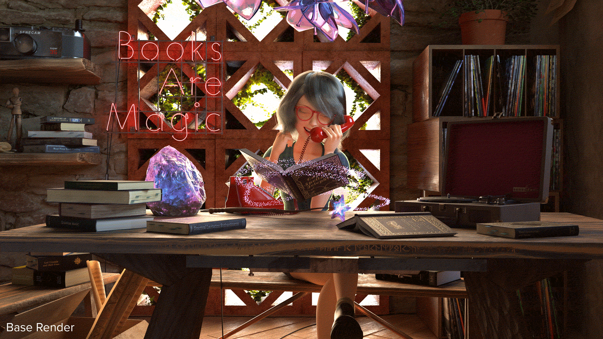
At this point I arrived at my final main beauty pass.
In previous RenderMan Art Challenges, I broke out lights into several different render passes so that I could adjust them separately in comp before recombining, but for this project, I just rendered out everything on a single pass:
Here is a comparison of the final beauty pass with the initial putting-everything-together render from Figure 40.
Note how the overall lighting is actually not too different, but there are many small adjustments and tweaks:
Figure 43: Before (left) and after (right) final lighting. For a full screen comparison, click here.
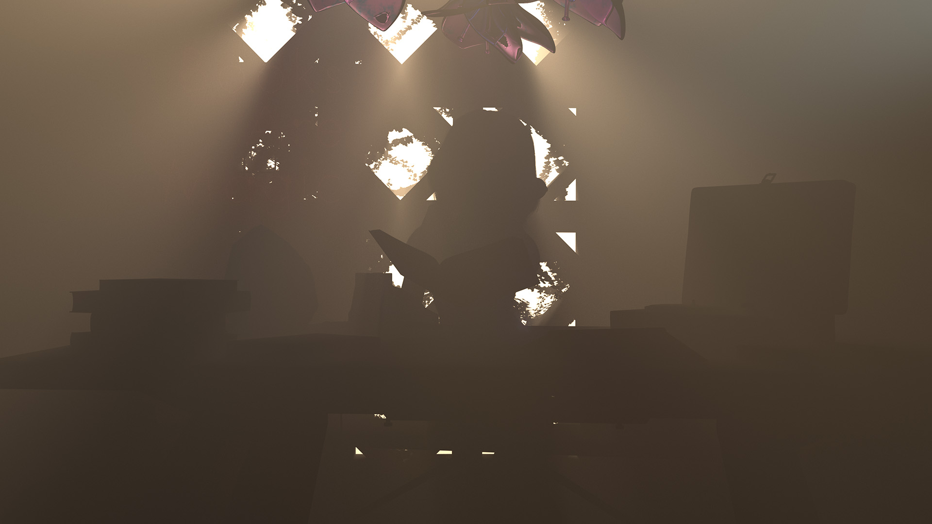
To help shape the lighting a bit more, I added a basic atmospheric volume pass.
Unlike in previous RenderMan Art Challenges where I used fancy VDBs and whatnot to create complex atmospherics and volumes, for this scene I just used a simple homogeneous volume box.
My main goal with the atmospheric volume pass was to capture some subtly godray-like lighting effects coming from the back windows:
For the final composite, I used the same Photoshop and Lightroom workflow that I used for the previous two RenderMan Art Challenges.
For future personal art projects I’ll be moving to a DaVinci Resolve/Fusion compositing workflow, but this time around I reached for what I already knew since I was so short on time.
Just like last time, I used basically only exposure adjustments in Photoshop, flattened out, and brought the image into Lightroom for final color grading.
In Lightroom I further brightened things a bit, made the scene warmer, and added just a bit more glowy-ness to everything.
Figure 45 is a gif that visualizes the compositing steps I took for the final image.
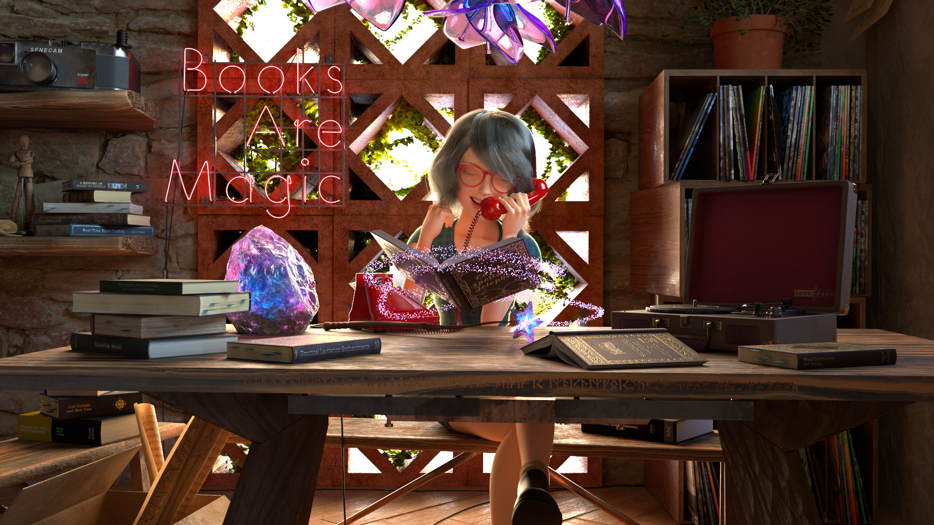
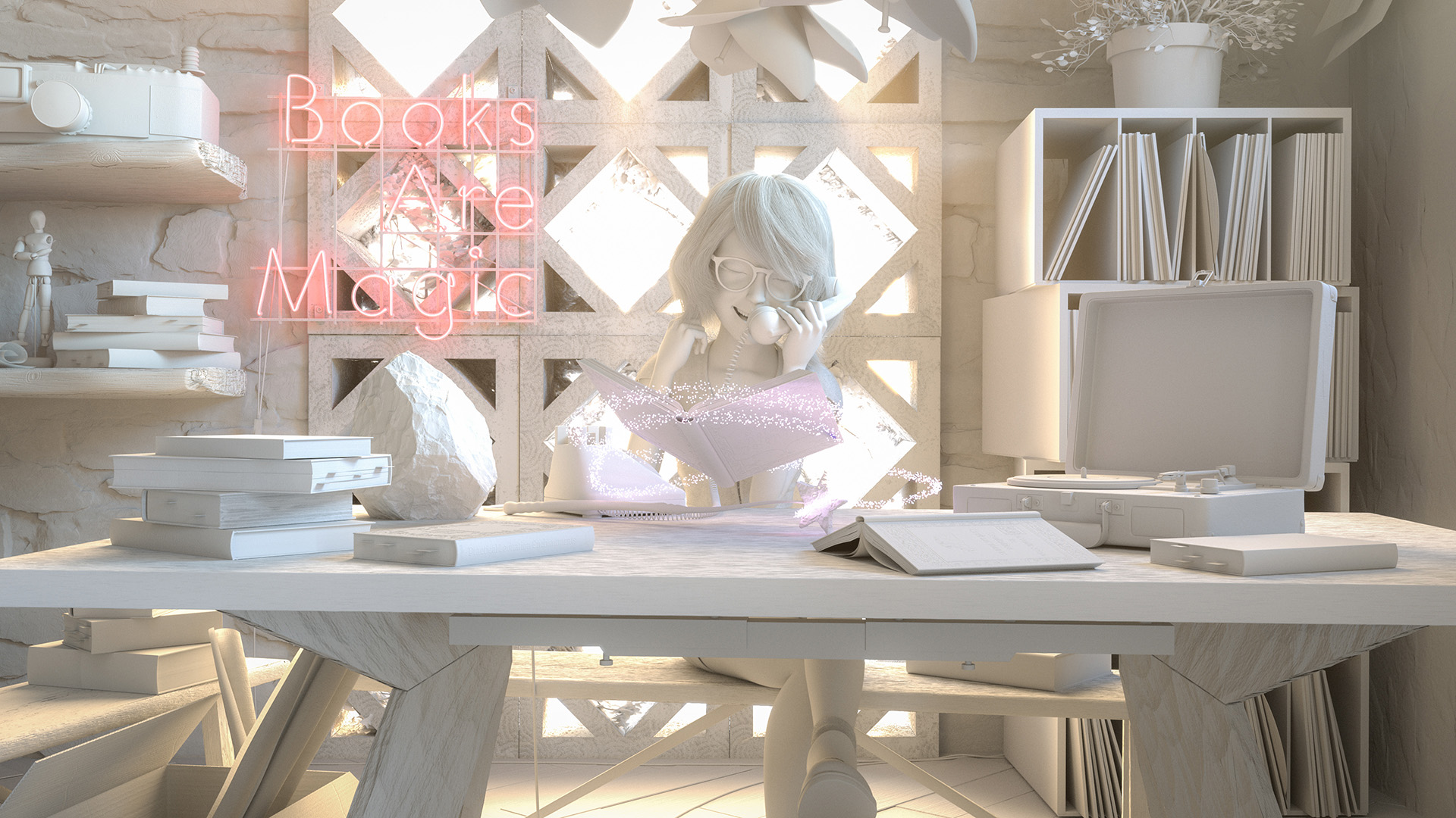
Figure 46 shows what all of the lighting, comp, and color grading looks like applied to a 50% grey clay shaded version of the scene, and Figure 47 repeats what the final image looks like so that you don’t have to scroll all the way back to the top of this post.
Conclusion
Despite having much less free time to work on this RenderMan Art Challenge, and despite not having really intended to even enter the contest initially, I think things turned out okay!
I certainly wasn’t expect to actually win a placed position again!
I learned a ton about character shading, which I think is a good step towards filling a major hole in my areas of experience.
For all of the props and stuff, I was pretty happy to find that my Substance Painter workflow is now sufficiently practiced and refined that I was able to churn through everything relatively efficiently.
At the end of the day, stuff like art simply requires practice to get better at, and this project was a great excuse to practice!
Here is a progression video I put together from all of the test and in-progress renders that I made throughout this entire project:
Figure 48: Progression reel made from test and in-progress renders leading up to my final image.
As usual with these art projects, I owe an enormous debt of gratitude to my wife, Harmony Li, both for giving invaluable feedback and suggestions (she has a much better eye than I do!), and also for putting up with me going off on another wild time-consuming art adventure.
Also, as always, Leif Pederson from Pixar’s RenderMan group provided lots of invaluable feedback, notes, and encouragement, as did everyone else in the RenderMan Art Challenge community.
Seeing everyone else’s entries is always super inspiring, and being able to work side by side with such amazing artists and such friendly people is a huge honor and very humbling.
If you would like to see more about my contest entry, check out the work-in-progress thread I kept on Pixar’s Art Challenge forum, and I also have an Artstation post for this project.
Finally, here’s a bonus alternate angle render of my scene. I made this alternate angle render for fun after the project and out of curiosity to see how well things held up from a different angle, since I very much “worked to camera” for the duration of the entire project.
I was pleasantly surprised that everything held up well from a different angle!
References
Carlos Allaga, Carlos Castillo, Diego Gutierrez, Miguel A. Otaduy, Jorge López-Moreno, and Adrian Jarabo. 2017. An Appearance Model for Textile Fibers. Computer Graphics Forum (Proc. of Eurographics Symposium on Rendering) 36, 4 (Jun. 2017), 35-45.
Brent Burley and Dylan Lacewell. 2008. Ptex: Per-face Texture Mapping for Production Rendering. Computer Graphics Forum (Proc. of Eurographics Symposium on Rendering) 27, 4 (Jun. 2008), 1155-1164.
Brent Burley. 2015. Extending the Disney BRDF to a BSDF with Integrated Subsurface Scattering. In ACM SIGGRAPH 2015 Course Notes: Physically Based Shading in Theory and Practice.
Brent Burley, David Adler, Matt Jen-Yuan Chiang, Ralf Habel, Patrick Kelly, Peter Kutz, Yining Karl Li, and Daniel Teece. 2017. Recent Advances in Disney’s Hyperion Renderer. In ACM SIGGRAPH 2017 Course Notes: Path Tracing in Production Part 1, 26-34.
Matt Jen-Yuan Chiang, Benedikt Bitterli, Chuck Tappan, and Brent Burley. 2016. A Practical and Controllable Hair and Fur Model for Production Path Tracing. Computer Graphics Forum (Proc. of Eurographics) 35, 2 (May 2016), 275-283.
Matt Jen-Yuan Chiang, Peter Kutz, and Brent Burley. 2016. Practical and Controllable Subsurface Scattering for Production Path Tracing. In ACM SIGGRAPH 2016 Talks. Article 49.
Philip Child. 2012. Ill-Loom-inating Brave’s Handmade Fabric. In ACM SIGGRAPH 2012 Talks.
Per H. Christensen and Brent Burley. 2015. Approximate Reflectance Profiles for Efficient Subsurface Scattering. Pixar Technical Memo #15-04.
Trent Crow, Michael Kilgore, and Junyi Ling. 2018. Dressed for Saving the Day: Finer Details for Garment Shading on Incredibles 2. In ACM SIGGRAPH 2018 Talks. Article 6.
Priyamvad Deshmukh, Feng Xie, and Eric Tabellion. 2017. DreamWorks Fabric Shading Model: From Artist Friendly to Physically Plausible. In ACM SIGGRAPH 2017 Talks. Article 38.
Eugene d’Eon. 2012. A Better Dipole. http://www.eugenedeon.com/project/a-better-dipole/
Eugene d’Eon, Guillaume Francois, Martin Hill, Joe Letteri, and Jean-Marie Aubry. 2011. An Energy-Conserving Hair Reflectance Model. Computer Graphics Forum (Proc. of Eurographics Symposium on Rendering) 30, 4 (Jun. 2011), 1181-1187.
Christophe Hery. 2003. Implementing a Skin BSSRDF. In ACM SIGGRAPH 2003 Course Notes: RenderMan, Theory and Practice. 73-88.
Christophe Hery. 2012. Texture Mapping for the Better Dipole Model. Pixar Technical Memo #12-11.
Christophe Hery and Junyi Ling. 2017. Pixar’s Foundation for Materials: PxrSurface and PxrMarschnerHair. In ACM SIGGRAPH 2017 Course Notes: Physically Based Shading in Theory and Practice.
Jonathan Hoffman, Matt Kuruc, Junyi Ling, Alex Marino, George Nguyen, and Sasha Ouellet. 2020. Hypertextural Garments on Pixar’s Soul. In ACM SIGGRAPH 2020 Talks. Article 75.
Henrik Wann Jensen, Steve Marschner, Marc Levoy, and Pat Hanrahan. 2001. A Practical Model for Subsurface Light Transport In Proc. of SIGGRAPH (SIGGRAPH 2001). 511-518.
Ying Liu, Jared Wright, and Alexander Alvarado. 2020. Making Beautiful Embroidery for “Frozen 2”. In ACM SIGGRAPH 2020 Talks. Article 73.
Steve Marschner, Henrik Wann Jensen, Mike Cammarano, Steve Worley, and Pat Hanrahan. 2003. Light Scattering from Human Hair Fibers. ACM Transactions on Graphics (Proc. of SIGGRAPH) 22, 3 (Jul. 2003), 780-791.
Zahra Montazeri, Søren B. Gammelmark, Shuang Zhao, and Henrik Wann Jensen. 2020. A Practical Ply-Based Appearance Model of Woven. ACM Transactions on Graphics (Proc. of SIGGRAPH Asia) 39, 6 (Dec. 2020), Article 251.
Sean Palmer and Kendall Litaker. 2016. Artist Friendly Level-of-Detail in a Fur-Filled World. In ACM SIGGRAPH 2016 Talks. Article 32.
Leonid Pekelis, Christophe Hery, Ryusuke Villemin, and Junyi Ling. 2015. A Data-Driven Light Scattering Model for Hair. Pixar Technical Memo #15-02.
Kai Schröder, Reinhard Klein, and Arno Zinke. 2011. A Volumetric Approach to Predictive Rendering of Fabrics. Computer Graphics Forum (Proc. of Eurographics Symposium on Rendering) 30, 4 (Jun. 2011), 1277-1286.
Brian Smith, Roman Fedetov, Sang N. Le, Matthias Frei, Alex Latyshev, Luke Emrose, and Jean Pascal leBlanc. 2018. Simulating Woven Fabrics with Weave. In ACM SIGGRAPH 2018 Talks. Article 12.
Thomas V. Thompson, Ernest J. Petti, and Chuck Tappan. 2003. XGen: Arbitrary Primitive Generator. In ACM SIGGRAPH 2003 Sketches and Applications.
Walt Disney Animation Studios. 2011. SeExpr.
Magnus Wrenninge, Ryusuke Villemin, and Christophe Hery. 2017. Path Traced Subsurface Scattering using Anisotropic Phase Functions and Non-Exponential Free Flighs. Pixar Technical Memo #17-07.
Shuang Zhao, Wenzel Jakob, Steve Marschner, and Kavita Bala. 2012. Structure-Aware Synthesis for Predictive Woven Fabric Appearance. ACM Transactions on Graphics (Proc. of SIGGRAPH) 31, 4 (Aug. 2012), Article 75.
Shuang Zhao, Fujun Luan, and Kavita Bala. 2016. Fitting Procedural Yarn Models for Realistic Cloth Rendering. ACM Transactions on Graphics (Proc. of SIGGRAPH) 35, 4 (Jul. 2016), Article 51.


